Category Archives: GIS

Shapefiles vs. Geodatabases

Ever wonder what the difference between a shapefile and a geodatabase is in GIS and why each storage format is used for different purposes?  It is important to decide which format to use before beginning your project so you do not have to convert many files midway through your project.

Basics About Shapefiles:

Shapefiles are simple storage formats that have been used in ArcMap since the 1990s when Esri created ArcView (the early version of ArcMap 10.3).  Therefore, shapefiles have many limitations such as:

  • Takes up more storage space on your computer than a geodatabase
  • Do not support names in fields longer than 10 characters
  • Cannot store date and time in the same field
  • Do not support raster files
  • Do not store NULL values in a field; when a value is NULL, a shapefile will use 0 instead

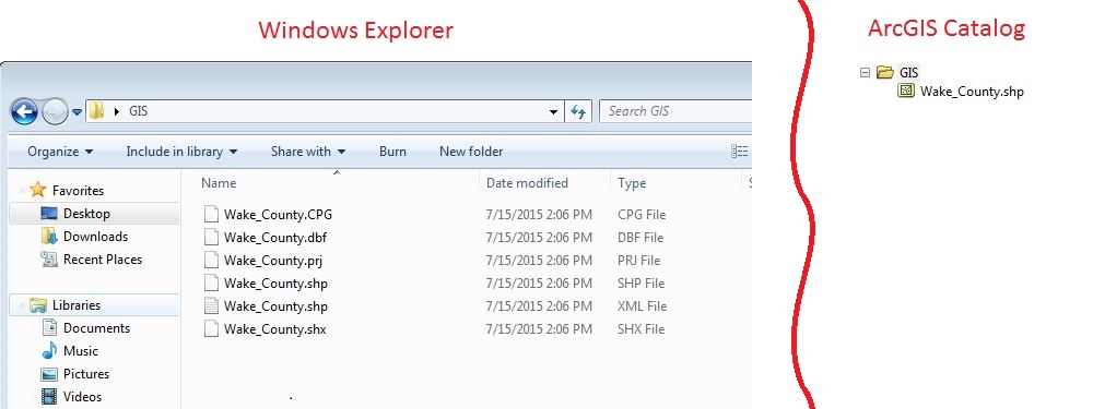
Users are allowed to create points, lines, and polygons with a shapefile.  One shapefile must have at least 3 files but most shapefiles have around 6 files.  A shapefile must have:

  • .shp – this file stores the geometry of the feature
  • .shx – this file stores the index of the geometry
  • .dbf – this file stores the attribute information for the feature

All files for the shapefile must be stored in the same location with the same name or else the shapefile will not load.  When a shapefile is opened in Windows Explorer it will look different than when opened in ArcCatalog.

Shapefile_Windows


Basics About Geodatabases:

Geodatabases allow users to thematically organize their data and store spatial databases, tables, and raster datasets.  There are two types of single user geodatabases: File Geodatabase and Personal Geodatabase.  File geodatabases have many benefits including:

  • 1 TB of storage limits of each dataset
  • Better performance capabilities than Personal Geodatabase
  • Many users can view data inside the File Geodatabase while the geodatabase is being edited by another user
  • The geodatabase can be compressed which helps reduce the geodatabases’ size on the disk

On the other hand, Personal Geodatabases were originally designed to be used in conjunction with Microsoft Access and the Geodatabase is stored as an Access file (.mdb).  Therefore Personal Geodatabases can be opened directly in Microsoft Access, but the entire geodatabase can only have 2 GB of storage.

To organize your data into themes you can create Feature Datasets within a geodatabase.  Feature datasets store Feature Classes (which are the equivalent to shapefiles) with the same coordinate system.  Like shapefiles, users can create points, lines, and polygons with feature classes; feature classes also have the ability to create annotation, and dimension features.

Geodatabase

In order to create advanced datasets (such as add a network dataset, a geometric network, a terrain dataset, a parcel fabric, or run topology on an existing layer) in ArcGIS, you will need to create a Feature Dataset.

You will not be able to access any files of a File geodatabase in Windows Explorer.  When you do, the Durham_County geodatabase shown above will look like this:

Windows2


Tips:

  • When you copy shapefiles anytime, use ArcCatalog. If you use Windows Explorer and do not select all the files for a shapefile, the shapefile will be corrupt and will not load.
  • When using a geodatabase, use a File Geodatabase. There is more storage capacity, multiple users can view/read the database at the same time, and the file geodatabase runs tools and queries faster than a Personal Geodatabase.
  • Use a shapefile when you want to read the attribute table or when you have a one or two tools/processes you need to do. Long-term projects should be organized into a File Geodatabase and Feature Datasets.
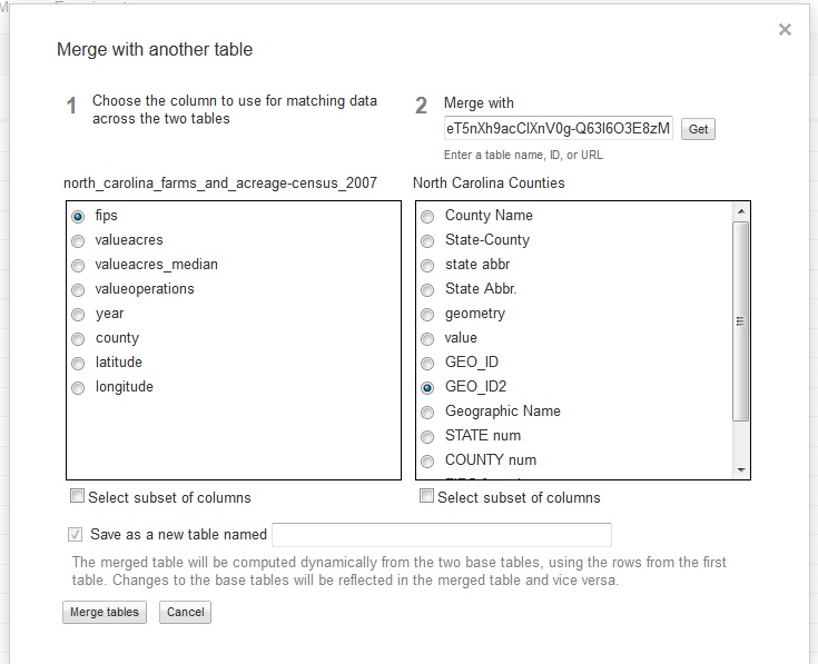
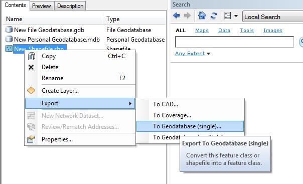
  • Many files downloaded from the internet are shapefiles. To convert them into your geodatabase, right click the shapefile, click “Export,” and select “To Geodatabase (single).”

Export_Shp

DVS Fall Workshops

GenericWorkshops-01Data and Visualization Services is happy to announce its Fall 2015 Workshop Series.  With a range of workshops covering basic data skills to data visualization, we have a wide range of courses for different interests and skill levels..  New (and redesigned) workshops include:

  • OpenRefine: Data Mining and Transformations, Text Normalization
  • Historical GIS
  • Advanced Excel for Data Projects
  • Analysis with R
  • Webscraping and Gathering Data from Websites

Workshop descriptions and registration information are available at:

library.duke.edu/data/news


Workshop
 

Date

OpenRefine: Data Mining and Transformations, Text Normalization
Sep 9
Basic Data Cleaning and Analysis for Data Tables
Sep 15
Introduction to ArcGIS
Sep 16
Easy Interactive Charts and Maps with Tableau
Sep 18
Introduction to Stata
Sep 22
Historical GIS
Sep 23
Advanced Excel for Data Projects
Sep 28
Easy Interactive Charts and Maps with Tableau
Sep 29
Analysis with R
Sep 30
ArcGIS Online
Oct 1
Web Scraping and Gathering Data from Websites
Oct 2
Advanced Excel for Data Projects
Oct 6
Basic Data Cleaning and Analysis for Data Tables
Oct 7
Introduction to Stata
Oct 14
Introduction to ArcGIS
Oct 15
OpenRefine: Data Mining and Transformations, Text Normalization
Oct 20
Analysis with R
Oct 20


ModelBuilder

Ever have trouble conceptualizing your project workflow?  ModelBuilder  allows you to plan your project before you run any tools.  When using ModelBuilder in ESRI’s ArcMap, you create a workflow of your project by adding the data and tools you need.  To open ModelBuilder, click the ModelBuilder icon     (MB_Icon) in the Standard Toolbar.

MBIcon

Key Points Before You Build Your Model

ModelBuilder can only be created and saved in a toolbox.  In order to create your model, you first need to create a new toolbox in the Toolboxes, MyToolboxes folders in ArcCatalog.  Once you have a new toolbox, you will need to create a new Model; to do this, right click your newly created toolbox and select New, then Model.  When you wish to open an existing ModelBuilder, find your toolbox, right click your Model and select Edit.

In order to find the results of your model and the data created in the middle of your project workflow (also known as intermediate data), you will need to direct the data to any workspace or a Scratch Geodatabase.  To set your data results to a Scratch Geodatabase in ModelBuilder, click Model, then Model Properties.  A dialog box will open and you will want to select the Environments tab, Workspace category, and check Scratch Workspace.  Before closing the dialog box, select “Values” and navigate to your workspace or your geodatabase.

Set_Workspace

Building and Running a Model

To create a model, click the Add Data or Tool button (AddData).  Navigate to the SystemToolboxes, find the tool you wish to run, and add it to your model.  Double click the tool within the Model and its parameters will open.  Fill out the appropriate fields for the tool and select OK.

When the tools or variables are ready for processing, they will be colored blue, green, or yellow.  Blue variables are inputs, yellow variables are tools, and green variables are outputs.  When there is an error or the parameters have not been chosen, the variables will have no color.

ModelBlog_Good

Once you have your model built, click the Run icon (MBRun) to run the model.  Depending on the data and the amount of tools you run, the Model can take seconds or minutes to run.  You can also run one tool at a time; to do this, right click the tool and select “Run.”  When the Model is done running, the tools and outputs will have a gray background.  To find the results of your model, navigate to the Scratch Workspace you have set and add the shapefile or table to ArcMap or right-click the output variable before running the model and select “Add to Display.”

Applying ModelBuilder

The model above demonstrates how to take nationwide county data, North Carolina landmark data and North Carolina major roads data and find landmarks in Wake County that are within 1 mile of major roads.  The first tool in the model (Select Layer by Attribute tool) extracts Wake County from the nationwide counties polygon layer. 1

Once Wake County is extracted to a new layer, the North Carolina landmarks layer is clipped to the Wake County layer using the Clip tool2 The result of this tool creates a landmarks point layer in Wake County.  The third tool uses the Buffer tool on the primary roads layer in North Carolina.  Within the Buffer tool parameters, a distance of 1 mile is chosen and a new polygon layer is created.


Finally, the Wake County landmarks layer is intersected with the buffered major roads layer to create a final output using the Interect tool.4  Using ModelBuilder has many benefits: you document the steps you used to create your project and you can easily rerun the tool with different inputs after the model is built.  ModelBuilder allows users to easily determine if and where problems in the workflow are.  When there is an error in the workflow, a “Failed to Execute” message will appear and tell users which tool was unable to execute.  ModelBuilder also lets users easily change parameters.  In the model used above, you could change the Expression in the Select Layer by Attribute tool from ‘Wake’ to ‘Durham’ and find landmarks within 1 mile of major roads in Durham County.

New Year- New Data and Visualization Lab!

Data and Visualization Services is happy to announce our new Data and Visualization Lab in Duke Libraries new Edge research space.  Located on the first floor of the Bostock Library, the Brandaleone Family Lab for Data and Visualization Services offers a dedicated space for researchers working on data driven projects.

The lab features three distinct areas for supporting data driven research.

Data and Visualization Lab Space

Data and Visualization Lab Computing Zone

Our lab space features twelve high end workstations with dual monitors with the latest software for data visualization, digital mapping, statistics, and qualitative research.  All of the machines have two dedicated displays to encourage collaborative work and data consultations.  Additionally, all twelve machines have a dedicated power port located conveniently under the edge of the table for powering a laptop or usb powered device.

Bloomberg Professional “Bar”

bloom

Since the launch of our Bloomberg terminals, we have seen a steady increase in both individual and team based usage of Bloomberg financial data.  Our three Bloomberg Professional workstations are now located on a dedicated “bar” across from our lab machines.  The  new Bloomberg zone will facilitate collaborate work and provide a base for groups such as the Duke University Investment Club and Duke Financial Economics Center.

Consult and Collaborative SpaceCollaboration Zone

Our third lab space provides a set of four rolling tables for small groups to collaborate or for projects that don’t require a fixed computing space.   An 85″ flat panel display near this zone features data visualizations and other data driven research projects at Duke.

Come See Us!

With ample natural light,  almost 24/7 availability, and a welcoming staff eager to work with you on your next data driven project.  We look forward to working with you in the upcoming year!

Mapping in Google Spreadsheets

Screen Shot 2014-06-04 at 4.33.57 PM
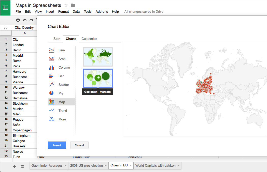
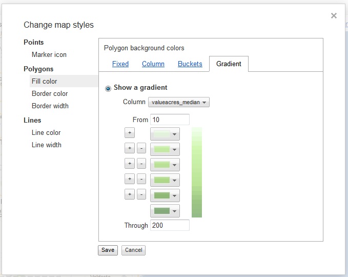
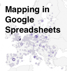
Here at Data & GIS Services, we love finding new ways to map things.  Earlier this semester I was researching how the Sheets tool in Google Drive could be used as a quick and easy visualization tool when I re-discovered its simple map functionality.  While there are plenty of more powerful mapping tools if you want to have a lot of features (e.g., ArcGIS, QGIS, Google Fusion Tables, Google Earth, GeoCommons, Tableau, CartoDB), you might consider just sticking with a spreadsheet for some of your simpler projects.

I’ve created a few examples in a public Google Sheet, so you can see what the data and final maps look like.  If you’d like to try creating these maps yourself, you can use this template (you’ll have to log into your Google account first, and then click on the “Use this template” button to get your own copy of the spreadsheet).

Organizing Your Data

The main thing to remember when trying to create any map or chart in a Google sheet is that the tool is very particular about the order of columns.  For any map, you will need (exactly) two columns.  According to the error message that pops up if your columns are problematic: “The first column should contain location names or addresses. The second column should contain numeric values.”

Of course, I was curious about what counts as “location names” and wanted to test the limits of this GeoMap chart.  If you have any experience with the Google Charts API, you might expect the Google Sheet GeoMap chart to work like the Geo Chart offered there.  In the spreadsheet, however, you have only a small set of options compared to the charts API.  You do have two map options — a “region” (or choropleth) map and a “marker” (or proportional symbol) map — but the choices for color shading and bubble size are built-in or limited.

Screen Shot 2014-06-04 at 4.36.54 PM
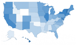
Region maps (Choropleths)

Region maps are fairly restrictive, because Google needs to know the exact boundary of the country or state that you’re interested in.  In a nutshell, a region map can either use country names (or abbreviations) or state names (or abbreviations).  The ISO 3166-1 alpha-2 codes seem to work exceptionally well for countries (blazing fast speeds!), but the full country name works well, too.  For US states, I also recommend the two letter state abbreviation instead of the full state name. If you ever want to switch the map from “region” to “marker”, the abbreviations are much more specific than the name of the state.  (For example, when I switch my “2008 US pres election” map to marker, Washington state turns into a bubble over Washington DC.)

Screen Shot 2014-06-04 at 4.37.57 PM
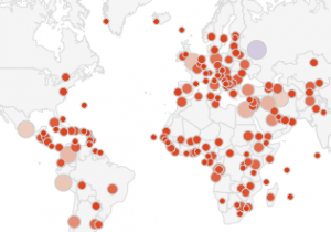
Marker maps (Proportional symbol maps)

Marker maps, on the other hand, allow for much more flexibility.  In fact, the marker map in Google Sheets will actually geocode street addresses for you.  In general, the marker map will work best if the first column (the location column) includes information that is as specific as possible.  As I mentioned before, the word “Washington” will go through a search engine and will get matched to Washington DC before Washington state.  Same with New York.  But the marker map will basically do the search on any text, so the spreadsheet cell can say “NY”, or “100 State Street, Ithaca, NY”, or even the specific latitude and longitude of a place. (See the “World Capitals with lat/lon” sheet; I just put latitude and longitude in a single column, separated with a comma.)  As long as the location information is in a single column, it should work, but the more specific the information is, the better.

Procedure

Screen Shot 2014-06-04 at 4.31.56 PMWhen you have your data ready and want to create a map, just select the correct two columns in your spreadsheet, making sure that the first one has appropriate location information and the second one has some kind of numerical data.  Then click on the “Insert” menu and go down to “Chart…”  You’ll get the chart editor.  The first screen will be the “Start” tab, and Google will try to guess what chart you’re trying to use.  It probably won’t guess a map on the first try, so just click on the “Charts” tab at the top to manually select a map.  Map is one of the lower options on the left hand side, and then you’ll be given a choice between the regions and markers maps.  After you select the map, you can either stick with the defaults or go straight to the final tab, “Customize,” to change the colors or to zoom your map into a different region.  (NB: As far as I can tell, the only regions that actually work are “World,” “United States,” “Europe,” and “Asia”.)

Screen Shot 2014-06-04 at 4.33.35 PMThe default color scale goes from red to white to green.  You’ll notice that the maps automatically have a “mid” value for the color.  If you’d rather go straight from white to a dark color, just choose something in the middle for the “mid” color.

And there you have it!  You can’t change anything beyond the region and the colors, so once you’ve customized those you can click “Update” and check out your map.  Don’t like something?  Click on the map and a little arrow will appear in the upper right corner.  Click there to open the menu, then click on “Advanced edit…” to get back to the chart editor.  If you want a bigger version of the map, you can select “Move to own sheet…” from that same menu.

Pros and Cons

So, what are these maps good for?  Well, firstly, they’re great if you have state or country data and you want a really quick view of the trends or errors in the data.  Maybe you have a country missing and you didn’t even realize it.  Maybe one of the values has an extra zero at the end and is much larger than expected.  This kind of quick and dirty map might be exactly what you need to do some initial exploration of your data, all while staying in a spreadsheet program.

Another good use of this tool is to make a map where you need to geocode addresses but also have proportional symbols.  Google Fusion Tables will geocode addresses for you, but it is best for point maps where all the points are the same size or for density maps that calculate how tightly clusters those points are.  If you want the points to be sized (and colored) according to a data variable, this is possibly the easiest geocoder I’ve found.  It’ll take a while to search for all of the locations, though, and there is probably an upper limit of a couple of hundred rows.

If this isn’t the tool for you, don’t despair!  Make an appointment through email (askdata@duke.edu) or stop in to see us (walk-in schedule) to learn about other mapping tools, or you can even check out these 7 Ways to Make a Google Map Using Spreadsheet Data.

Data and GIS Services Spring 2014 Workshop Series

DGSwkshpExplore network analysis, text mining, online mapping, data visualization, and statistics in our spring 2014 workshop series.  Our workshops provide a chance to explore new tools or refresh your memory on effective strategies for managing digital research.  Interested in keeping up to date with workshops and events in Data and GIS?  Subscribe to the dgs-announce listserv or follow us on Twitter (@duke_data).

Currently Scheduled Workshops

 Thu, Jan 9 2:00 PM – 3:30 PM  Data Management Plans – Grants, Strategies, and Considerations

 Mon, Jan 13 2:00 PM – 3:30 PM Webinar: Social Science Data Management and Curation

 Mon, Jan 13 3:00 PM – 4:00 PM Google Fusion Tables

 Tue, Jan 14 3:00 PM – 4:00 PM Open (aka Google) Refine 

 Wed, Jan 15 1:00 PM – 3:00 PM Stata for Research

 Thu, Jan 16 3:00 PM – 5:00 PM Analysis with R

 Tue, Jan 21 1:00 PM – 3:00 PM Introduction to ArcGIS

 Wed, Jan 22 1:00 PM – 3:00 PM ArcGIS Online

 Wed, Jan 22 3:00 PM – 4:00 PM Open (aka Google) Refine 

 Mon, Jan 27 2:00 PM – 3:30 PM Introduction to Text Analysis

 Wed, Jan 29 1:00 PM – 3:00 PM Analysis with R

 Thu, Jan 30 2:00 PM – 4:00 PM Stata for Research

 Mon, Feb 3 1:00 PM – 2:00 PM  Data Visualization on the Web

 Mon, Feb 3 2:00 PM – 3:00 PM  Data Visualization on the Web (Advanced)

 Tue, Feb 11 2:00 PM – 4:00 PM Using Gephi for Network Analysis and Visualization

 Wed, Feb 12 1:00 PM – 3:00 PM Introduction to ArcGIS

 Tue, Feb 18 2:00 PM – 3:30 PM Introduction to Tableau Public 8

 Tue, Feb 25 1:00 PM – 3:00 PM ArcGIS Online

 Thu, Feb 27 1:00 PM – 3:00 PM Historical GIS

 Mon, Mar 3 2:00 PM – 3:30 PM  Designing Academic Figures and Posters

 Tue, Mar 4 1:00 PM – 3:00 PM  Useful R Packages: Extensions for Data Analysis, Management, and Visualization

Announcing the 2014 Student Data Visualization Contest

Student Data Visualization ContestData & GIS Services will soon be accepting submissions to its 2nd annual student data visualization contest.  If you have a course project that involves visualization, start thinking about your submission now!

The purpose of the contest is to highlight outstanding student data visualization work at Duke University. Data & GIS Services wants to give you a chance to showcase the hard work that goes into your visualization projects.

Data visualization here is broadly defined, encompassing everything from charts and graphs to 3D models to maps to data art.  Data visualizations may be part of a larger research project or may be developed specifically to communicate a trend or phenomenon. Some are static images, while others may be animated simulations or interactive web experiences.  Browse through last year’s submissions to get an idea of the range of work that counts as visualization.

The Student Data Visualization Contest is sponsored by Data & GIS Services, Perkins Library, Scalable Computing Support Center, Office of Information Technology, and the Office of the Vice Provost for Research.

For more details, see the 2014 Student Data Visualization Contest page.   Please address all additional questions to Angela Zoss (angela.zoss@duke.edu), Data Visualization Coordinator, 226 Perkins Library.

Data and GIS Fall 2013 Newsletter

Analyze, discover, manage, map, and visualize your data with Duke Libraries Data and GIS Services.  Our team of five consultants provides a broad range of support in areas ranging from data analysis, data visualization, geographic information systems, financial data, statistical software and data storage and management.  Our lab provides 12 workstations with the latest data software and three Bloomberg Professional workstations nearly 24/7 for the Duke community.

Data and GIS Workshop Series

All are welcome to the Data and GIS Workshop Series.  Analyze, communicate, clean, map, represent and visualize your data with a wide range of workshops on data based research methods and tools.  Details and registration for each class are available at the links that follow.  (Interested in keeping up to date with workshops and events in Data and GIS?  Just go to https://lists.duke.edu/sympa/info/dgs-announce and click on the “Subscribe” link at the bottom left.)

    Tue, Sep 3, 2013      1:00 PM - 3:00 PM    Introduction to ArcGIS    
    Wed, Sep 4, 2013     10:00 AM - 11:30 AM   Stata for Research    
    Wed, Sep 11, 2013    10:00 AM - 11:00 AM   Open (aka Google) Refine     
    Thu, Sep 12, 2013     1:00 PM - 3:00 PM    Analysis with R    
    Tue, Sep 17, 2013     1:00 PM - 2:30 PM    Introduction to Tableau Public 8    
    Thu, Sep 19, 2013    10:00 AM - 11:00 AM   Google Fusion Tables    
    Mon, Sep 23, 2013     1:00 PM - 2:30 PM    Introduction to Tableau Public 8    
    Tue, Sep 24, 2013     1:00 PM - 2:30 PM    Stata for Research    
    Mon, Sep 30, 2013    10:00 AM - 11:00 AM   Top 10 Dos and Don'ts for Charts and Graphs    
    Mon, Sep 30, 2013     1:00 PM - 3:00 PM    Introduction to ArcGIS    
    Tue, Oct 8, 2013      1:00 PM - 2:30 PM    Introduction to Text Analysis    
    Thu, Oct 10, 2013     1:00 PM - 3:00 PM    ArcGIS Special Topics: Geocoding & Proximity Analysis    
    Thu, Oct 17, 2013     1:00 PM - 3:00 PM    Historical GIS    
    Mon, Oct 28, 2013     1:00 PM - 2:00 PM    Designing Academic Figures and Posters    
    Tue, Oct 29, 2013     1:00 PM - 3:00 PM    Web GIS Applications

Data and GIS also offers instruction tailored to courses or research teams. Please contact askdata@duke.edu to schedule a session!

Data Management

Data Management Planning – DMPTool – Get 24/7 online help for your next data management plan, including information about Duke resources available for your data work.

Statistical Software Updates

Explore all of our Data and GIS Lab resources on our site at http://library.duke.edu/data/about/lab.html or come visit us on the second floor of Perkins Library.

Job Opportunities in Data and GIS Services

Data & GIS Services is hiring!  We have two open positions for student web programmers interested in working on data visualization projects.  See the Library Student employment page (http://library.duke.edu/jobs/students.html) for more information on how to apply.  (The job can be found by searching for requisition number “DUL14-AMZ02”.)

New Data and Map Collections

CPS on Web (CPS Utilities Online)
CPS on Web is a set of utilities enabling you to access CPS data and documentation from this website.   You may make tables and graphs from the CPS data, download data extractions, make estimations, get summaries and statistical measures, search the documentation, and make your own variables as functions of the existing ones.

Global Financial Data
Global Financial Data is a collection of financial and economic data provided in ASCII or Excel format. Data includes: long-term historical indices on stock markets; Total Return data on stocks, bonds, and bills; interest rates; exchange rates; inflation rates; bond indices; commodity indices and prices; consumer price indices; gross domestic product; individual stocks; sector indices; treasury bill yields; wholesale price indices; and unemployment rates covering over 200 countries.

LandScan Global
The LandScan Global Population Database provides global population distribution in a gridded GIS format at 30 arc-second resolution (approximately 1×1 km cells). Oak Ridge National Laboratory developed modeling techniques to disaggregate and interpolate census data within administrative boundaries to create a GIS layer showing population distribution as accurately and as timely as possible. EastView provides this data to use in GIS software as a WMS (Web Mapping Service) or as a WCS (Web Coverage Service) to allow a user to incorporate population distribution into GIS mapping and analysis.

Contact Us

email: askdata@duke.edu
twitter: duke_data or duke_vis

Free Tableau Licenses for Students

tableau

Tableau is a data visualization software application that allows you to easily create and share interactive charts, graphs, and maps. While the free version of this tool, Tableau Public, has offered wonderful opportunities for generating and publishing data visualizations, there are file size and format limits that make it difficult for some researchers to use the public tool.

For some time, the company has had a program to offer temporary licenses to teachers and students who use Tableau in the classroom (Tableau for Teaching). Now, the company is giving full-time students free access to Tableau Desktop for one year.

With the recent release of Tableau 8 and its many new features, this is a wonderful time to start visualizing your data!

Online Data Mapping Tools – Google Fusion Tables

Visualizing spatial data can be challenging. Specialized software tools like ArcGIS produce excellent results, but often seem complex for relatively simple tasks. Several online tools have emerged recently that provide relatively easy alternatives for the display of spatial data. In this post, we examine Google Fusion Tables, which combines visualizations, including spatial visualizations, with a database back end. The key advantages to Fusion Tables are easy display of latitude/longitude data or data that is included with address information. In addition, Fusion Tables provides a one-stop location for producing visualizations other than maps, such as line charts or tables.

Uploading Data

Figure 1
Figure 2
Figure 3
Figure 4
Figure 5
Figure 6
Figure 7
Figure 8

Uploaded to Fusion Tables is easy through Google Docs.  Simply log in if you have an account, create a new Table, and on the next screen, point to the file you wish to upload.  Excel and CSV files are the two most commonly used, and KML files allow for upload of maps that contain spatial information, such as locations or polygon definitions.

One thing to note about Google products is that they are often in a state of flux.  Limits and restrictions noted below may change in the future.  For further information regarding Google Fusion Tables, please consult this Libguide authored by Mark Thomas.

Geocoding Addresses

A complete list of geographic data types can be found at the Google support site.  In this post, two of the more common geocoding types will be addressed, address data and data that applies to states, counties, and similar objects.

Address data is pretty easy to work with.  Addresses should contain as much information as possible with items separated by spaces only, no commas.  For example, 134 Chapel Drive Durham NC 27708 should produce a pretty good geocoding result.  In the following example, Durham gun crimes for 2011 were downloaded from the Durham Police Department.  The data only came with address information, so city and state data were subsequently added and combined in Excel (location field).  In Figure 1, highlighted fields indicate spatial information.

To geocode the addresses, select “Map” under the “Visualize” tab.  The program will automatically begin geocoding based on the left-most field containing spatial information, which is city in this case.  Changing the field to “location,” which contains the full address information, will correctly geocode these addresses (Figure 2).

Once complete, the geocoded points are plotted on a map (Figure 3).  As with other mapping applications, you may apply a symbology to the points in order to visualize your data.

This particular dataset contains a numeric field that identifies 5 general types of crime (crime_cat_num).  Under the “Configure styles” link at the top, navigate to “Buckets” and divided the data into five buckets (Figure 4).

Once saved, each color will represent a different type of crime and shown in Figure 5 (red indicates robbery, yellow, assault and so on).

Note that only numeric fields can be used to categorize data, so you may wish to create these fields prior to upload.

Geocoding Polygons

Working with polygon data can be a bit trickier because the polygons must be spatially defined.  Fusion Tables does this by using kml, which is basically a large piece of text containing all of the coordinates, in order, that define a boundary.  For example, in this table, each boundary is defined in the geometry field. Google provides a variety of boundary types, which are available here.  If your data match one of these existing boundary types, you may upload data and merge it with the correct table, which will basically import the boundary definitions into your dataset.  Otherwise, you will have to locate suitable boundaries in a kml file and import those boundaries before merging.

This dataset displays acreage and farms for each county in North Carolina and originally came from the Census of Agriculture.  Note that there must be a field in common between your data and the data containing boundary definitions in order to merge.  In addition, merge fields can only be text fields.  FIPS codes uniquely identify counties and are contained in both tables.  Unfortunately, Google didn’t set up their FIPS fields correctly, so a cleaned up North Carolina county file is located here.

Next, click the merge tab.  Copy and paste the URL for the boundaries table and click the “Get” button.  In Figure 6, I merged  my data to the boundary file using the fips field, which is called “fips” in table 1 and “GEO_ID2” in table 2.  A merge will produce a new table, so be sure to name that new table at the bottom.Once complete, styling the map is comparable to point data. First, select “Map” under the “Visualize” tab, and be sure to point the location field at the top left to “geometry” where the boundary definitions are stored. Next, click the configure styles link. Then, select Fill color under the Polygons section.

In Figure 7, I am showing median farm size (in acres) along a gradient.  It’s important to note the lower and upper limits to your data in advance as the program will not automatically sense this.  In this case, median farm size ranges from 10 to 191.  Figure 8 shows the output.

Sharing Maps

As withsimilar online programs, Fusion Tables allows sharing of data and maps through a variety of avenues, from links to embeddable script to email.  The links below point to the two maps produced in this posting.

Durham gun crimes map

North Carolina median farm acreage, 2007

Other Notes

This overview provides only a brief introduction to the mapping capabilities of Fusion Tables.  A broad gallery of applications is located at this site, and it contains a variety of geography types.  Some of these use the Fusion Tables API, which is a nice feature that allows for application development with some programming experience.  As with the other tools reviewed by this blog, non-standard boundaries are generally absent and can be difficult to locate.  For example, a researcher with country-level data from the 1700s may have difficulty finding a country border map from that time.  However, maps are available on Fusion Tables for counties, states, countries, and congressional districts, and additional maps can be found on the Internet.