Tag Archives: gis

Celebrating GIS Day 2020

About GIS Day

GIS Day is an international celebration of geographic information systems (GIS) technology. The event provides an opportunity for users of geospatial data and tools to build knowledge, share their work, and explore the benefits of GIS in their communities. Since its establishment in 1999, GIS Day events have been organized by nonprofit organizations, universities, schools, public libraries, and government agencies at all levels.

Held annually on the third Wednesday of November, this year GIS Day is officially today. Happy GIS Day! CDVS has participated in Duke GIS Day activities on campus in past years, but with COVID-19, we had to find other ways to celebrate.

A (Virtual) Map ShowcaseThe English Civil Wars - Story Map

To mark GIS Day this year, CDVS is launching an ArcGIS StoryMaps showcase! We invite any students, faculty, and staff to submit a story map to highlight their mapping and GIS work. Send us an email at askdata@duke.edu if you would like to add yours to the collection. We are keen to showcase the variety of GIS projects happening across Duke, and we will add contributions to the collection as we receive them. Our first entry is a story map created by Kerry Rork as part of a project for undergraduate students that used digital mapping to study the English Civil Wars.

Why Story Maps?

If you aren’t familiar with ArcGIS StoryMaps, this easy-to-use web application integrates maps with narrative text, images, and video. The platform’s compelling, interactive format can be an effective communication tool for any project with a geographic component. We have seen a surge of interest in story maps at Duke, with groups using them to present research, give tours, provide instruction. Check out the learning resources to get started, or contact us at askdata@duke.edu to schedule a consultation with one of our GIS specialists.

Maps in Tableau

Making Maps with Tableau

Tableau LogoOne of the attractive features of Tableau for visualization is that it can produce maps in addition to standard charts and graphs. While Tableau is far from being a full-fledged GIS application, it continues to expand its mapping capabilities, making it a useful option to show where something is located or to show how indicators are spatially distributed.

Here, we’re going to go over a few of the Tableau’s mapping capabilities. We’ve recorded a workshop with examples relating to this blog post’s discussion:

For a more general introduction to Tableau (including some mapping examples), you should check out one of these other past CDVS workshops:

Concepts to Keep in Mind

Tableau is a visualization tool: Tableau can quickly and effectively visualize your data, but it will not do specialized statistical or spatial analysis.

Tableau makes it easy to import data:  A big advantage of Tableau is the simplicity of tasks such as changing variable definitions between numeric, string, and date, or filtering out unneeded columns. You can easily do this at the time you connect to the data (“connect” is Tableau’s term for importing data into the program).

Tableau is quite limited for displaying multiple data layers: Tableau wants to display one layer, so you need to use join techniques to connect multiple tables or layers together. You can join data tables based on common attribute values, but to overlay two geographic layers (stack them), you must spatially join one layer to one other layer based on their common location.

Tableau uses a concept that it calls a “dual-axis” map to allow two indicators to display on the same map or to overlay two spatial layers. If, however, you do need to overlay a lot of data on the same map, consider using proper GIS software.

Dual-Axis map
Overlay spatial files using dual-axis maps

Displaying paths on a map requires a special data structure:  In order for tabular data with coordinate values (latitude/longitude) to display as lines on a map, you need to include a field that indicates drawing order. Tableau constructs the lines like connect-the-dots, each row of data being a dot, and the drawing order indicating how the dots are connected.

Lines
Using drawing order to create lines from points

You might use this, for instance, with hurricane tracking data, each row representing measurements and location collected sequentially at different times. The illustration above shows Paris metro lines with the station symbol diameter indicating passenger volume. See how to do this in Tableau’s tutorial.

You can take advantage of Tableau’s built-in geographies: Tableau has many built-in geographies (e.g., counties, states, countries), making it easy to plot tabular data that has an attribute with values for these geographic locations, even if you don’t have latitude/longitude coordinates or geographic files — Tableau will look up the places for you!  (It won’t, however, look up addresses.)

Tableau also has several built-in base maps available for your background.

Tableau uses the “Web Mercator” projection: This is the same as Google Earth/Maps. Small-scale maps (i.e., large area of coverage) may look stretched out in an unattractive way since it greatly exaggerates the size of areas near the poles.

Useful Mapping Capabilities

Plot points: Tableau works really well for plotting coordinate data (Longitude (X) and Latitude (Y) values) as points.  The coordinates must have values in decimal degrees with negative longitudes being east of Greenwich and negative latitudes being south of the equator.

Points with time slider
Point data with time slider

Time slider: If you move a categorical “Dimension” variable onto Tableau’s Pages Card, you can get a value-based slider to filter your data by that variable’s values (date, for instance, as in Google Earth). This is shown in the image above.

Heatmap of point distribution: You can choose Tableau’s “Density” option on its Marks card to create a heatmap, which may display the concentration of your data locations in a smoother manner.

Filter a map’s features: Tableau’s Filter card is akin to ArcGIS’s Definition Query, to allow you to look at just a subset of the features in a data table.

Shade polygons to reflect attribute values: Choropleth maps (polygons shaded to represent values of a variable) are easy to make in Tableau. Generally, you’ll have a field with values that match a built-in geography, like countries of the world or US counties.  But you can also connect to spatial files (e.g., Esri shapefiles or GeoJSON files), which is especially helpful if the geography isn’t built into Tableau (US Census Tracts are an example).

Choropleth Map
Filled map using color to indicate values

Display multiple indicators: Visualizing two variables on the same map is always problematic because the data patterns often get hidden in the confusion, but it is possible in Tableau.  Use the “dual-axis” map concept mentioned above.  An example might be pies for one categorical variable (with slices representing the categories) on top of choropleth polygons that visualize a continuous numeric variable.

Multiple variables
Two variables using filled polygons and pies

Draw lines from tabular data: Tableau can display lines if your data is structured right, as discussed and illustrated previously, with a field for drawing order. You could also connect to a spatial line file, such as a shapefile or a GeoJSON file.

Help Resources

We’ve just given an overview of some of Tableau’s capabilities regarding spatial data. The developers are adding features in this area all the time, so stay tuned!

Telling Stories with Maps: Esri Story Maps at Duke

Developing interactive maps that incorporate text, images, video, and audio can be time-consuming and require specialized technical skills. Fortunately, at Duke we have access to Esri Story Maps, a web-based tool that helps you quickly design engaging narratives around your maps, no coding required.

We have seen a variety of creative uses of Story Maps at Duke, including:

  • Presentations to communicate research
  • Student assignments, as an alternative to a midterm or paper
  • Tours and guides of campus
  • Tutorials to explain a topic with a spatial component
  • Portfolios to showcase projects that include maps

Krakow Story MapChristine Liu, a graduate student in the Department of Art, Art History & Visual Studies, created this Story Map to illustrate a journey through Kraków under Nazi occupation.

If you are interested in building a Story Map, we recommend first spending some time exploring Esri’s curated gallery of stories to find inspiration and understand the platform’s capabilities. You can also review their collection of resources, which includes training videos, FAQs, and useful advice.

When you are ready to get started,  you can contact one of our GIS specialists (by emailing askdata@duke.edu) to schedule an appointment. We are always happy to answer questions and provide recommendations specific to your project. We also offer workshops to guide you through the process of building a basic online map, making it visually effective, and combining it with other materials to publish a Story Map.

If you already have a Story Map you want to show off, please share it with us! We are assembling a gallery of stories made at Duke and would love to feature your project.

Announcing Tidyverse workshops for Winter 2018

Coming this winter the Data & Visualization Services Department will once again host a workshop series on the R programming language. Our spring offering is modeled on our well received R we having fun yet‽ (Rfun) fall workshop series. The four-part series will introduce R as a language for modern data manipulation by highlighting a set of tidyverse packages that enable functional data science. We will approach R using the free RStudio IDE, an intent to make reproducible literate code, and a bias towards the tidyverse. We believe this open tool-set provides a context that enables and reinforces reproducible workflows, analysis, and reporting.

This six-part series will introduce R as a language for modern data manipulation by highlighting a set of tidyverse packages that enable functional data science.

January Line-up

Title Date Registration Past Workshop
Intro to R Jan 19
1 – 3pm
register Resources
R Markdown
with Dr. Çetinkaya-Rundel
Jan 23
9am
register
Shiny
with Dr. Çetinkaya-Rundel
Jan 25
9am
register
Mapping with R Jan 25
1-3pm
register Resources
Reproducibility & Git Jan 29
1-3pm
register Resources
Visualizationg with ggplot2 Feb 1
9:30-11:30am
register Resources

An official announcement with links to registration is forthcoming. Feel free to subscribe to the Rfun or DVS-Announce lists. Or look to the DVS Workshop page for official registration links as soon as they are available.

Workshop Arrangement

This workshop series is intended to be iterative and recursive. We recommend starting with the Introduction to R. Proceed through the remaining three workshops in any order of interest.

Recordings and Past Workshops

We presented a similar version of this workshop series last fall and recorded each session whenever possible. You can stream past workshops and engage with the shareable data sets at your-own-pace (see the Past Workshop resources links, above.) Alternatively, all the past workshop resource links are presented in one listicle: Rfun recap.

Fall Data and Visualization Workshops

2017 Data and Visualization Workshops

Visualize, manage, and map your data in our Fall 2017 Workshop Series.  Our workshops are designed for researchers who are new to data driven research as well as those looking to expand skills with new methods and tools. With workshops exploring data visualization, digital mapping, data management, R, and Stata, the series offers a wide range of different data tools and techniques. This fall, we are extending our partnership with the Graduate School and offering several workshops in our data management series for RCR credit (please see course descriptions for further details).

Everyone is welcome at Duke Libraries workshops.  We hope to see you this fall!

Workshop Series by Theme

Data Management

09-13-2017 – Data Management Fundamentals
09-18-2017 – Reproducibility: Data Management, Git, & RStudio 
09-26-2017 – Writing a Data Management Plan
10-03-2017 – Increasing Openness and Reproducibility in Quantitative Research
10-18-2017 – Finding a Home for Your Data: An Introduction to Archives & Repositories
10-24-2017 – Consent, Data Sharing, and Data Reuse 
11-07-2017 – Research Collaboration Strategies & Tools 
11-09-2017 – Tidy Data Visualization with Python

Data Visualization

09-12-2017 – Introduction to Effective Data Visualization 
09-14-2017 – Easy Interactive Charts and Maps with Tableau 
09-20-2017 – Data Visualization with Excel
09-25-2017 – Visualization in R using ggplot2 
09-29-2017 – Adobe Illustrator to Enhance Charts and Graphs
10-13-2017 – Visualizing Qualitative Data
10-17-2017 – Designing Infographics in PowerPoint
11-09-2017 – Tidy Data Visualization with Python

Digital Mapping

09-12-2017 – Intro to ArcGIS Desktop
09-27-2017 – Intro to QGIS 
10-02-2017 – Mapping with R 
10-16-2017 – Cloud Mapping Applications 
10-24-2017 – Intro to ArcGIS Pro

Python

11-09-2017 – Tidy Data Visualization with Python

R Workshops

09-11-2017 – Intro to R: Data Transformations, Analysis, and Data Structures  
09-18-2017 – Reproducibility: Data Management, Git, & RStudio 
09-25-2017 – Visualization in R using ggplot2 
10-02-2017 – Mapping with R 
10-17-2017 – Intro to R: Data Transformations, Analysis, and Data Structures
10-19-2017 – Developing Interactive Websites with R and Shiny 

Stata

09-20-2017 – Introduction to Stata
10-19-2017 – Introduction to Stata 


Data and Visualization Spring 2016 Workshops

Spring 2016 DVS WorkshopsSPRING 2016: Data and Visualization Workshops 

Interested in getting started in data driven research or exploring a new approach to working with research data?  Data and Visualization Services’ spring workshop series features a range of courses designed to showcase the latest data tools and methods.  Begin working with data in our Basic Data Cleaning/Analysis or the new Structuring Humanities Data  workshop.  Explore data visualization in the Making Data Visual class.  Our wide range of workshops offers a variety of approaches for the meeting the challenges of 21st century data driven research.   Please join us!

Workshop by Theme

DATA SOURCES

DATA CLEANING AND ANALYSIS

DATA ANALYSIS

MAPPING AND GIS

DATA VISUALIZATION

* – For these workshops, no prior experience with data projects is necessary!  These workshops are great introductions to basic data practices.

DVS Fall Workshops

GenericWorkshops-01Data and Visualization Services is happy to announce its Fall 2015 Workshop Series.  With a range of workshops covering basic data skills to data visualization, we have a wide range of courses for different interests and skill levels..  New (and redesigned) workshops include:

  • OpenRefine: Data Mining and Transformations, Text Normalization
  • Historical GIS
  • Advanced Excel for Data Projects
  • Analysis with R
  • Webscraping and Gathering Data from Websites

Workshop descriptions and registration information are available at:

library.duke.edu/data/news


Workshop
 

Date

OpenRefine: Data Mining and Transformations, Text Normalization
Sep 9
Basic Data Cleaning and Analysis for Data Tables
Sep 15
Introduction to ArcGIS
Sep 16
Easy Interactive Charts and Maps with Tableau
Sep 18
Introduction to Stata
Sep 22
Historical GIS
Sep 23
Advanced Excel for Data Projects
Sep 28
Easy Interactive Charts and Maps with Tableau
Sep 29
Analysis with R
Sep 30
ArcGIS Online
Oct 1
Web Scraping and Gathering Data from Websites
Oct 2
Advanced Excel for Data Projects
Oct 6
Basic Data Cleaning and Analysis for Data Tables
Oct 7
Introduction to Stata
Oct 14
Introduction to ArcGIS
Oct 15
OpenRefine: Data Mining and Transformations, Text Normalization
Oct 20
Analysis with R
Oct 20


New Year- New Data and Visualization Lab!

Data and Visualization Services is happy to announce our new Data and Visualization Lab in Duke Libraries new Edge research space.  Located on the first floor of the Bostock Library, the Brandaleone Family Lab for Data and Visualization Services offers a dedicated space for researchers working on data driven projects.

The lab features three distinct areas for supporting data driven research.

Data and Visualization Lab Space

Data and Visualization Lab Computing Zone

Our lab space features twelve high end workstations with dual monitors with the latest software for data visualization, digital mapping, statistics, and qualitative research.  All of the machines have two dedicated displays to encourage collaborative work and data consultations.  Additionally, all twelve machines have a dedicated power port located conveniently under the edge of the table for powering a laptop or usb powered device.

Bloomberg Professional “Bar”

bloom

Since the launch of our Bloomberg terminals, we have seen a steady increase in both individual and team based usage of Bloomberg financial data.  Our three Bloomberg Professional workstations are now located on a dedicated “bar” across from our lab machines.  The  new Bloomberg zone will facilitate collaborate work and provide a base for groups such as the Duke University Investment Club and Duke Financial Economics Center.

Consult and Collaborative SpaceCollaboration Zone

Our third lab space provides a set of four rolling tables for small groups to collaborate or for projects that don’t require a fixed computing space.   An 85″ flat panel display near this zone features data visualizations and other data driven research projects at Duke.

Come See Us!

With ample natural light,  almost 24/7 availability, and a welcoming staff eager to work with you on your next data driven project.  We look forward to working with you in the upcoming year!

ArcGIS Tutorial – Georeferencing Imagery

One of the limitations of computer mapping technology is that it is new. There is little historical imagery and data available as a result, although this has started to change. The integration of paper and imaged maps into computer mapping technology is possible, and this tutorial will walk through the process of georeferencing.

Georeferencing is the process of placing an image into two dimensional space. In essence, georeferencing pins a scanned map to particular geographical coordinates.

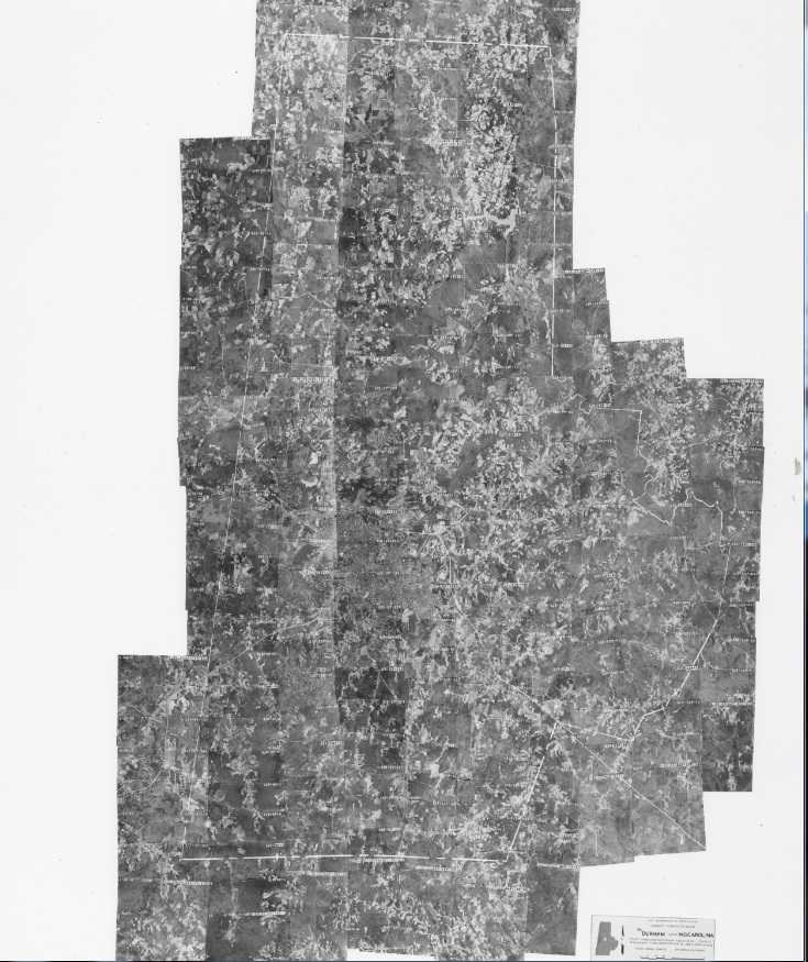
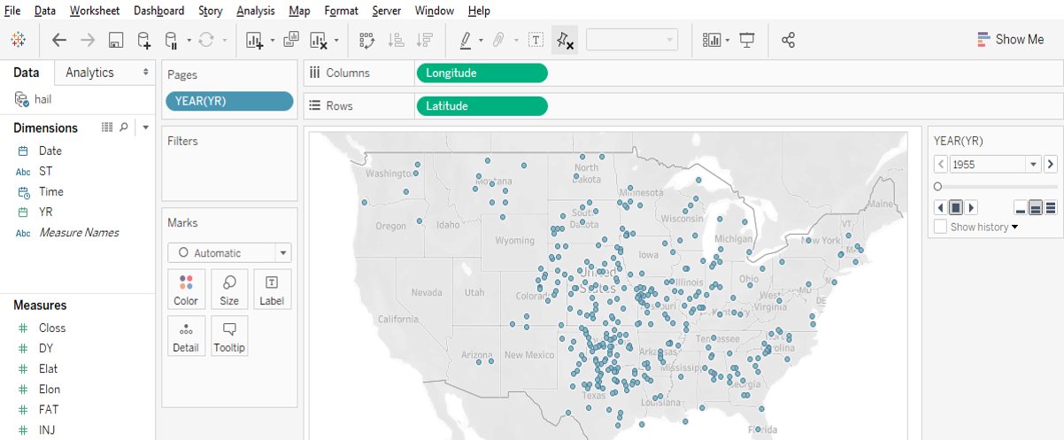
This tutorial will georeference a map of Durham County from 1955. In addition to the scanned map, we will use two current layers as referents: the Durham roads layer, and the Durham county boundary. Note that because the layers are more recent than the historical map, many roads will not exist in the image. Georeferencing historical imagery requires familiarity with geographic characteristics and changes.


Step 1: Enable Georeferencing

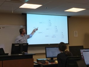
First, under the “Customize” Menu Bar option, navigate to “Toolbar” and select Georeferencing. The figure to the right displays the Georeferencing toolbar.


Step 2: Add Data and Image Layers

Next, add the shapefiles that you will use as referents for the image.

Once this is done, add the image to be georeferenced.  Note that you will almost certainly not see that image, as it lacks spatial coordinates. However, the image will appear in the Table of Contents.

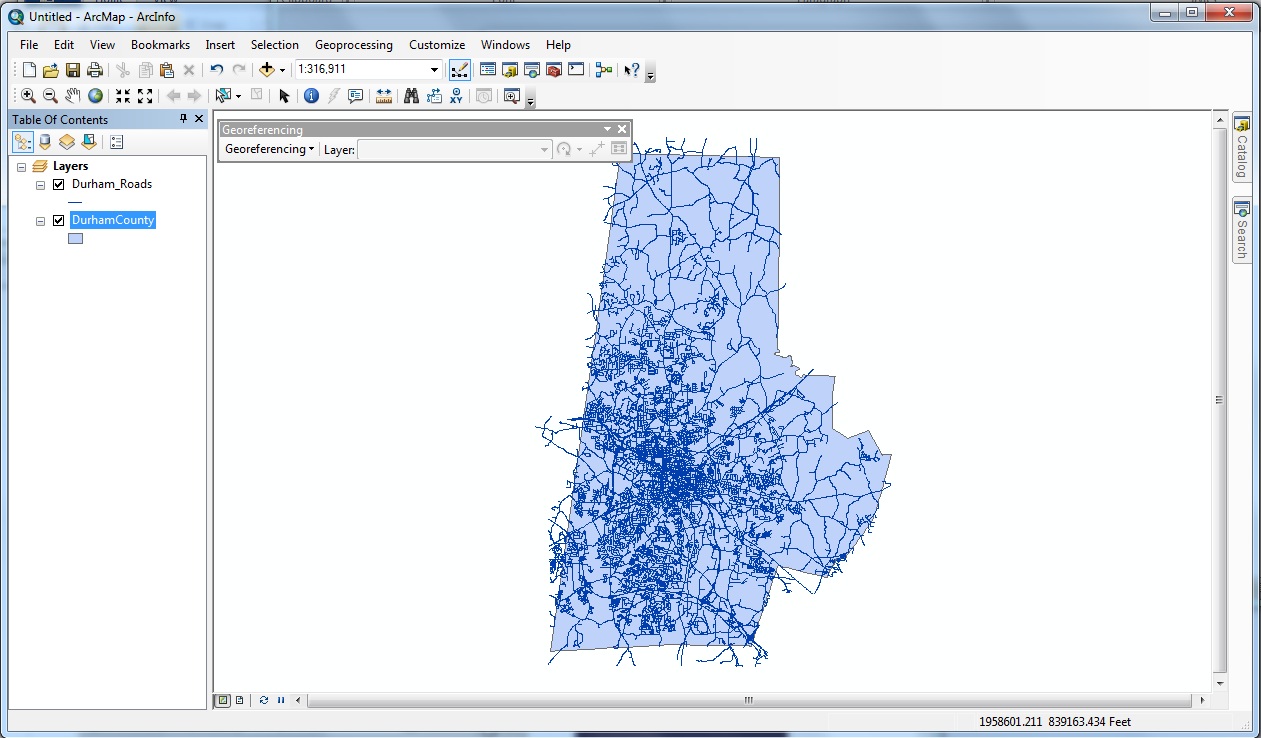
In this example, I have added Durham County (blue polygon) and the Durham roads layer (blue lines).


Step 3: Fitting the Image to the Layers

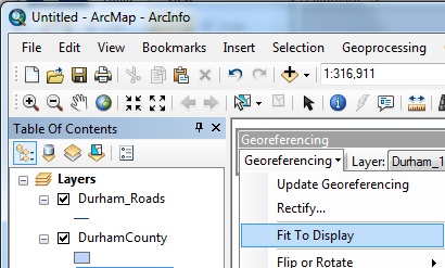
The next step will relocate the image to the center of your current window and will expand the image only to the point where the entire image is visible. In this case, Durham County is taller than it is wide, so vertical space will be maximized.

First, it is a good idea to zoom, if necessary, so that your current view roughly matches where the image will be place. In this case, zooming to the full extent of the Durham county boundary will accomplish this.

Second, under the Georeferencing toolbar, click “Georeferencing” and select “Fit to Display.” The image should be roughly aligned to the data layers, though if not, this is not problematic.

As you can see from the image to the right, there is some distance between the county boundaries of today (red lines) to the hand-drawn county boundaries located in the image (white lines).


Step 4: Adjusting the Map

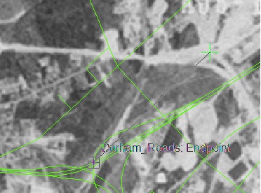
ArcGIS georeferences images through the addition of control points. The control points tool (to the right) operates through two mouse clicks: the first mouse click selects a point on the image, and the second mouse click pins that point to a location within a data layer.

For example, in the image to the right, I have selected a major intersection that likely has not changed in the last 60 years. After my first click, where I’ve selected a point near the top of the intersection, a green crosshair is placed. As I move the mouse, ArcGIS will pin my current crosshair to a proximate layer, in this case, the Durham roads layer.

Once you click a second time, the map will move to conform to the new control points. Control points work in combination, so as you add new control points, your image will (ideally) match more closely to your referents.

There is a limit to how much each subsequent control point will improve fit as more points are added. Generally, it’s a good idea to zoom in to improve accuracy and to create control points across the extent of the image.

After about 15 control points, we can compare the image to the included shapefiles. As you can see, if we assume that major roads have not changed, the green lines correspond well to the image, while the county boundary does to a lesser extent.


Step 5: Statistics and Transformations

Before saving the results, it is also a good idea to evaluate the results. Open the Table of Points to see each of your control points and the root mean squared error of all control points.

The Root Mean Square error (RMS) provides a rough guide to how consistent your control points are to one another with reference to the map.  Note that a low value does not mean that you’ve necessarily georeferenced the image well, it means you’ve georeferenced consistently.  High RMS errors indicate that your control points are less consistent with one another in comparison with a low RMS error.  One way to address this issue is to identify especially probelmatic control points and either replace or remove these points.  However, always reevaluate how well your image maps to the referent shapefiles.

You may delete control points or add new points at this stage. In addition, you may also try different transformations, although second- or third-order transformations are rarely needed.


Step 6: Saving the Results

Under the Georeferencing tab of the Georeferencing toolbar, select “Update Georeferencing.” Spatial information is saved in two new files that MUST accompany the image, an “.aux” file and a “.thw” file.


General Tips

– Zoom close to the layer resolution in order to improve accuracy

– Use more than 1 referent if possible. In this example, the county boundary provided a rough guide with respect to how far off the image initially is, but was not used to actually georeference the image.

– Georeference to accurate features. In this example, the county boundary was hand-drawn on the image and is not as precise as photographed features, like roads.
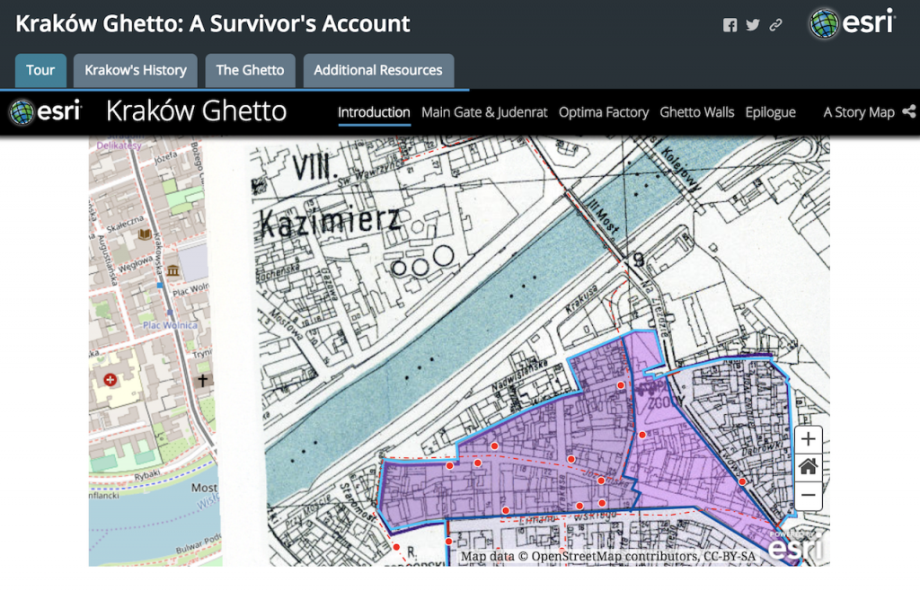