 Here at Data & GIS Services, we love finding new ways to map things. Earlier this semester I was researching how the Sheets tool in Google Drive could be used as a quick and easy visualization tool when I re-discovered its simple map functionality. While there are plenty of more powerful mapping tools if you want to have a lot of features (e.g., ArcGIS, QGIS, Google Fusion Tables, Google Earth, GeoCommons, Tableau, CartoDB), you might consider just sticking with a spreadsheet for some of your simpler projects.
I’ve created a few examples in a public Google Sheet, so you can see what the data and final maps look like. If you’d like to try creating these maps yourself, you can use this template (you’ll have to log into your Google account first, and then click on the “Use this template” button to get your own copy of the spreadsheet).
Organizing Your Data
The main thing to remember when trying to create any map or chart in a Google sheet is that the tool is very particular about the order of columns. For any map, you will need (exactly) two columns. According to the error message that pops up if your columns are problematic: “The first column should contain location names or addresses. The second column should contain numeric values.”
Of course, I was curious about what counts as “location names” and wanted to test the limits of this GeoMap chart. If you have any experience with the Google Charts API, you might expect the Google Sheet GeoMap chart to work like the Geo Chart offered there. In the spreadsheet, however, you have only a small set of options compared to the charts API. You do have two map options — a “region” (or choropleth) map and a “marker” (or proportional symbol) map — but the choices for color shading and bubble size are built-in or limited.
 Region maps (Choropleths)
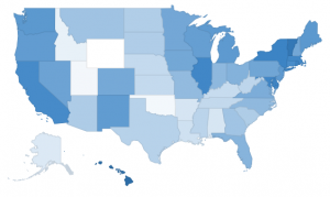
Region maps are fairly restrictive, because Google needs to know the exact boundary of the country or state that you’re interested in. In a nutshell, a region map can either use country names (or abbreviations) or state names (or abbreviations). The ISO 3166-1 alpha-2 codes seem to work exceptionally well for countries (blazing fast speeds!), but the full country name works well, too. For US states, I also recommend the two letter state abbreviation instead of the full state name. If you ever want to switch the map from “region” to “marker”, the abbreviations are much more specific than the name of the state. (For example, when I switch my “2008 US pres election” map to marker, Washington state turns into a bubble over Washington DC.)
 Marker maps (Proportional symbol maps)
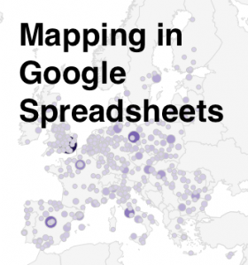
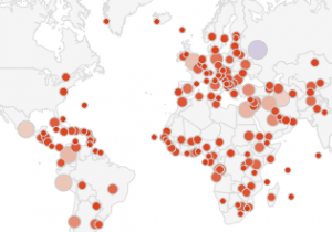
Marker maps, on the other hand, allow for much more flexibility. In fact, the marker map in Google Sheets will actually geocode street addresses for you. In general, the marker map will work best if the first column (the location column) includes information that is as specific as possible. As I mentioned before, the word “Washington” will go through a search engine and will get matched to Washington DC before Washington state. Same with New York. But the marker map will basically do the search on any text, so the spreadsheet cell can say “NY”, or “100 State Street, Ithaca, NY”, or even the specific latitude and longitude of a place. (See the “World Capitals with lat/lon” sheet; I just put latitude and longitude in a single column, separated with a comma.) As long as the location information is in a single column, it should work, but the more specific the information is, the better.
Procedure
 When you have your data ready and want to create a map, just select the correct two columns in your spreadsheet, making sure that the first one has appropriate location information and the second one has some kind of numerical data. Then click on the “Insert” menu and go down to “Chart…” You’ll get the chart editor. The first screen will be the “Start” tab, and Google will try to guess what chart you’re trying to use. It probably won’t guess a map on the first try, so just click on the “Charts” tab at the top to manually select a map. Map is one of the lower options on the left hand side, and then you’ll be given a choice between the regions and markers maps. After you select the map, you can either stick with the defaults or go straight to the final tab, “Customize,” to change the colors or to zoom your map into a different region. (NB: As far as I can tell, the only regions that actually work are “World,” “United States,” “Europe,” and “Asia”.)
 The default color scale goes from red to white to green. You’ll notice that the maps automatically have a “mid” value for the color. If you’d rather go straight from white to a dark color, just choose something in the middle for the “mid” color.
And there you have it! You can’t change anything beyond the region and the colors, so once you’ve customized those you can click “Update” and check out your map. Don’t like something? Click on the map and a little arrow will appear in the upper right corner. Click there to open the menu, then click on “Advanced edit…” to get back to the chart editor. If you want a bigger version of the map, you can select “Move to own sheet…” from that same menu.
Pros and Cons
So, what are these maps good for? Well, firstly, they’re great if you have state or country data and you want a really quick view of the trends or errors in the data. Maybe you have a country missing and you didn’t even realize it. Maybe one of the values has an extra zero at the end and is much larger than expected. This kind of quick and dirty map might be exactly what you need to do some initial exploration of your data, all while staying in a spreadsheet program.
Another good use of this tool is to make a map where you need to geocode addresses but also have proportional symbols. Google Fusion Tables will geocode addresses for you, but it is best for point maps where all the points are the same size or for density maps that calculate how tightly clusters those points are. If you want the points to be sized (and colored) according to a data variable, this is possibly the easiest geocoder I’ve found. It’ll take a while to search for all of the locations, though, and there is probably an upper limit of a couple of hundred rows.
If this isn’t the tool for you, don’t despair! Make an appointment through email (askdata@duke.edu) or stop in to see us (walk-in schedule) to learn about other mapping tools, or you can even check out these 7 Ways to Make a Google Map Using Spreadsheet Data.


If I have latitude and longitude data instead of address, how do I plot it on the map in spreadsheet ?
If you create a single column with latitude and longitude together, separated by a comma, it seems to work.
Nice article. I’m curious whether there is option to zoom in on a proportional symbol map to a specific area of the united states (e.g., west coast). I don’t see options to do this. I can see the world, but the target areas in the United States are really tiny. If it helps, I have geo locations (lat/lon) for all my locations.
Thanks.
Benjamin
Hi Benjamin,
No, I don’t think Google Spreadsheets offers the option of zooming in. If you already have lat/lon, I’d probably recommend CartoDB or Tableau (or other similar tools) for creating proportional symbol web maps. Google spreadsheets is pretty limited.
Best,
Angela
If you go to Customize in the Chart Editor and click Geo, you can select continents.
Another tool worth checking out for making a map from a spreadsheet is GeoSheets (http://www.geosheets.com). It makes it easy to do lightweight GIS tasks like geocoding a bunch of addresses and making a custom map. It’s an add-on for Google Spreadsheets, so usage is as simple as listing some locations (addresses, lat/lng’s, whatever) in your spreadsheet and typing =GEO_MAP(A1:A10,”map”).
No matter how I have tried I am unable to create a region map for US states, attempted with, input formats such as:
Oregon
US-OR
USA-OR
USA-Oregon
US – OR
US – Oregon
USA:Oregon
Oregon, USA
OR-US
…..
I think I did every permutation of above. Would appreciate your help.
Hi Matt,
Actually, I bet most of those options will work, but you have to manually select the “United States” map. When you’re first selecting the region map, you have to look for the “Customization” tab at the top. By default the “Region” will be set to “World,” but if you manually change that to “United States,” it actually reinterprets the text as relating to the US only. I was able to get states to fill in with the full state name (“Oregon”), the abbreviation (“OR”), and also “US-OR”.
Hope that helps,
Angela
Same here, with weird results. Using the two letter postal abbreviations seemed to identify CA as Canada, PA as Panama, etc.
Using the state name didn’t work; that’s what I tried first.
Deeply frustrated.
My marker maps seem to be broken in google spreadsheet since recently. I also do not see any markers anymore in your example public sheet. Just empty maps instead. Any idea why?
Hi Dominik,
Yes, I’m seeing that, too. Apparently the most recent update to Google Sheets has changed how the marker-style maps work.
There seems to be an answer to why the old lat/lon map no longer works. The GeoChart documentation (https://developers.google.com/chart/interactive/docs/gallery/geochart) says:
“Marker location [Required]
The first column is a specific string address (for example, “1600 Pennsylvania Ave”).
OR
The first two columns are numeric, where the first column is the latitude, and the second column is the longitude.”
So now lat and lon have to be two separate columns. I tried that with the sample data, and while it seems to produce a map, there is an error when you go to edit chart, and I’m not sure how to fix it.
In the other tab in my Google Sheet, it looks like Cities in EU still works, but I have no idea why that would work and the comparable World Capitals map doesn’t. Sometimes it takes a little time for Google to do the search to find all of the location names, so you could try with just a couple of locations at first to see if it’s working, but maybe something else has changed.
The document above does also make a note about what works best for markers:
“Note: Although we recommend ISO 3166 codes to be used for ‘regions’ mode, ‘markers’ mode works best with longer names for regions (like Germany, Panama, etc). This is because geocharts, when in ‘markers’ mode, uses Google Maps for geocoding the locations (converting a string location to a latitude and longitude). This may result in ambiguous locations not getting geocoded as you might expect; such as ‘DE’ standing for Germany or Delaware, or ‘PA’ standing for Panama or Pennsylvania.”
I do have longer names for the cities in both the EU and World Capitals sheets, but for some reason it’s only working for the EU map. Sorry I haven’t been able to figure out why!
I spent a lot of time to locate something like this
Same here, with weird results. Using the two letter postal abbreviations seemed to identify CA as Canada, PA as Panama, etc.
Then I found this on YouTube: https://youtu.be/PnfeuB60XTM
It shows how to limit the map to the United States (or other continents/regions) and when I did that it accepted my state names.