In 2024, the GIS software ArcGIS Desktop (also known as ArcMap) will no longer be available through Duke’s education license. Esri has been encouraging users to upgrade to their more modern GIS software, ArcGIS Pro, or cloud-based platforms such as ArcGIS Online. CDVS’s GIS workshop series has not included an ArcMap session for the past several years, and we have been encouraging anyone interested in learning GIS software to start with ArcGIS Pro. You can read more details about the process in Esri’s blog post, ArcMap Retirement in Education Programs.
While the transition away from ArcMap has been moving forward, we occasionally hear from students and faculty who are still using this software. If you have yet to make the switch from ArcMap to ArcGIS Pro or ArcGIS Online, please consider doing so this semester.
Fortunately, there are many resources available to help you navigate the shift. Esri provides dozens of free, self-paced online tutorials about ArcGIS Pro and ArcGIS Online. You may also want to explore their tutorial series Modern GIS. For those looking for a more personal and interactive learning experience, we are offering several GIS workshops in Fall 2023. Finally, the in-depth Migrate to ArcGIS Pro (log-in required) documentation includes a training video and guide that address topics like migrating Python scripts and importing styles from ArcMap.
These guides should explain everything you might want to know (and much more) about the change. If you still have questions or want to learn more about other software options, please don’t hesitate to contact one of our GIS specialists by sending an email to askdata@duke.edu.
You’re probably aware that voting in the United States is managed in a very decentralized manner compared to most other countries. There are limited sources that comprehensively compile local-level results or geographic data showing local voting precincts. We’ll discuss several selected projects have come about to try to pull all this data together to provide one-stop repositories, as well as state and local sources for election data. Some of these are free resources, and some are licensed by us for the use of Duke affiliates.
Election Returns
The Princeton University Library has an excellent guide to elections returns and related data in their Elections and Voting Data Guide: United States (U.S.) and International, compiled by their Politics Librarian, Jeremy Darrington. This is a good first place to look for repositories of voting data, both U.S. and international. We’ll discuss a few of the most useful of these sources that the Duke community has access to.
The CQ Voting and Elections Collection (Duke users only) has results data on Presidential, Congressional, and gubernatorial elections, some back to the 19th century. Results are generally given down to the county level of detail.
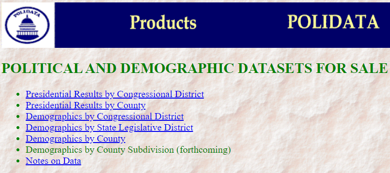
Polidata presents presidential election result data by congressional district and county in STATA, Excel, or CSV format, with data dictionaries as text files and documentation in PDF format. The Duke Libraries has obtained some of their data, curating the 1992-2008 District-level Polidata.
Geographic Data (GIS Layers)
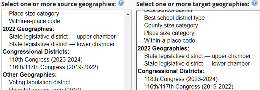
Geographies that relate specifically to election data are Congressional or Legislative Districts, as well as voting precincts. The Census Bureau’s Voting Tabulation District (VTD) boundaries closely parallel precincts but are based on the Census Block geographies. They may not exactly match all locally created precincts, but may be all you can get electronically.
NHGIS (National Historical GIS) has the most election-related GIS boundary files, back to 1990 for VTDs, to 2000 for state legislative districts, and into the late 1980s for U.S. Congressional Districts. The Census Bureau has a scattered collection of these as well, at least for more recent years, usually on a state-by-state- or county-by-county (for the VTDs) basis. See either their web interface or their FTP site.
Election Results and GIS layers Together
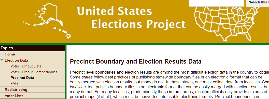
A good all-in-one source is The United States Elections Project, with lead contributors from the Voting and Election Science Team at the University of Florida and Wichita State University. It includes both election results and GIS shapefiles down to the precinct level, mostly from the last decade (as recently as some 2021 elections). For those interested in redistricting issues and gerrymandering, precinct-level data is essential.
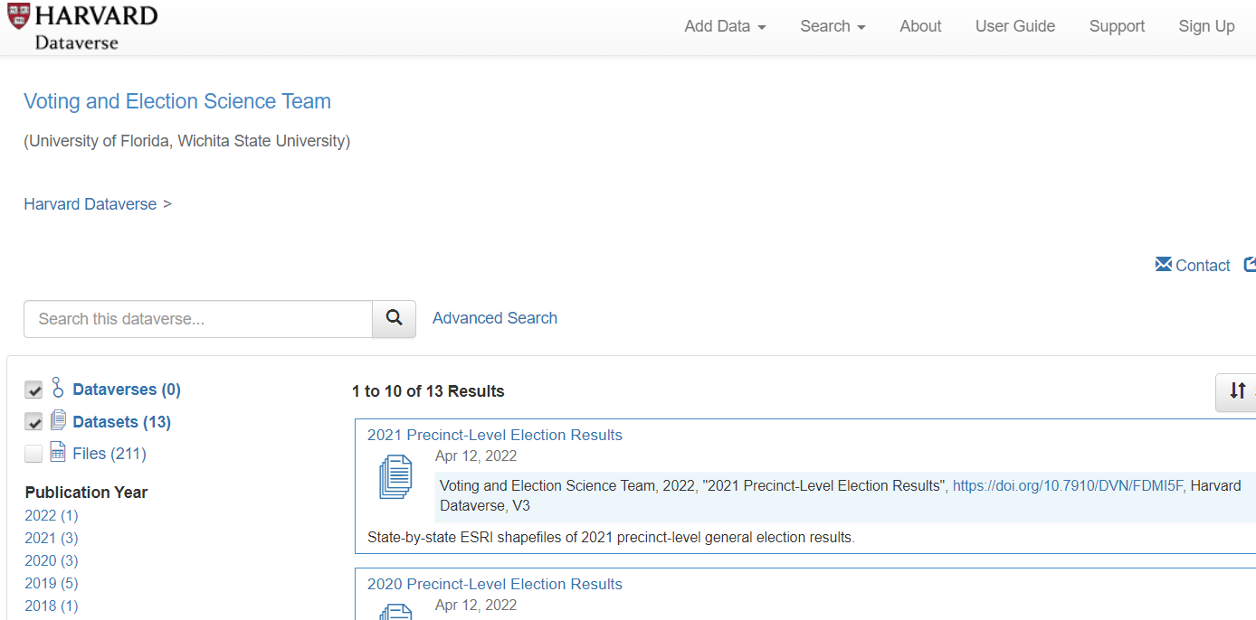
Their data is stored in the Harvard Dataverse, a data publishing platform that includes several election-related projects (election results and sometimes GIS files). It is a rich, if somewhat scattershot, repository with a lot of hidden gems. You can use the Advanced Search interface to find some of these datasets.
State and Local Sources
Sometimes, you need to find state, county, and city sources for election data, either for local elections or for geographically granular data results, like voting precincts. The National Association of Secretaries of State (NASS) website indexes the Secretaries of State websites, which may or may not have actual election results data.
The state elections offices may only have information on registration and on voting locations, but sometimes may include results data. For instance, the North Carolina State Board of Elections has some pretty thorough data at the precinct level for recent years, with good documentation.
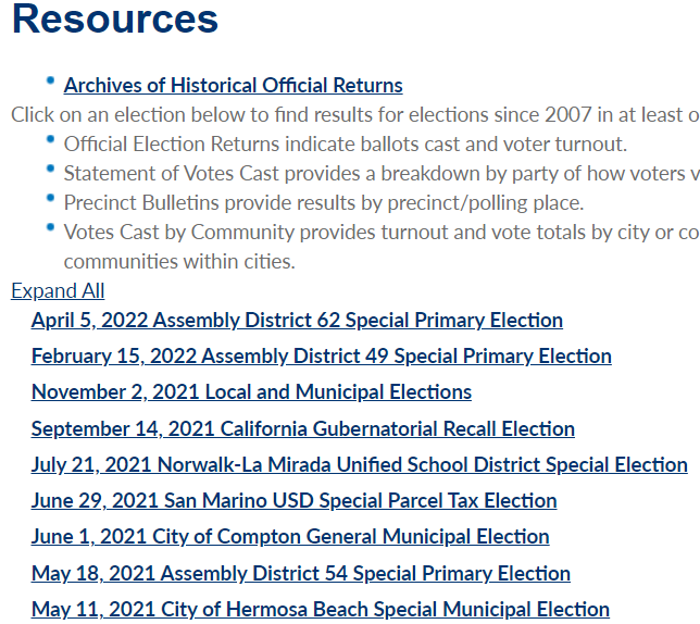
Some local governments are good about releasing election data at the precinct level. They may include data for such elections as municipal offices, school districts, and bond initiatives that you’d probably never find compiled at a national site. This example is from Los Angeles County.
Tools
If you need statistical or GIS tools to analyze the data, be sure to contact us at askdata@duke.edu for advice. Here, I’ll mention the Geocorr utility at the Missouri Census Data Center, which you can use to reaggregate data into different geographic areas. You can create correspondence tables between geographies such as voting tabulation districts or legislative districts and Census geographies, say, if you need to analyze demographics and socioeconomic factors. The correspondence tables include weighting factors indicating the percent of one area within another.
We’ve only scratched the surface on the data sources related to U.S. elections. If you want more suggestions or have specialized needs not covered here, please contact us at askdata@duke.edu for other ideas.
GIS Day is an international celebration of geographic information systems (GIS) technology. The event provides an opportunity for users of geospatial data and tools to build knowledge, share their work, and explore the benefits of GIS in their communities. Since its establishment in 1999, GIS Day events have been organized by nonprofit organizations, universities, schools, public libraries, and government agencies at all levels.
Held annually on the third Wednesday of November, this year GIS Day is officially today. Happy GIS Day! CDVS has participated in Duke GIS Day activities on campus in past years, but with COVID-19, we had to find other ways to celebrate.
A (Virtual) Map Showcase
To mark GIS Day this year, CDVS is launching an ArcGIS StoryMaps showcase! We invite any students, faculty, and staff to submit a story map to highlight their mapping and GIS work. Send us an email at askdata@duke.edu if you would like to add yours to the collection. We are keen to showcase the variety of GIS projects happening across Duke, and we will add contributions to the collection as we receive them. Our first entry is a story map created by Kerry Rork as part of a project for undergraduate students that used digital mapping to study the English CivilWars.
Why Story Maps?
If you aren’t familiar with ArcGIS StoryMaps, this easy-to-use web application integrates maps with narrative text, images, and video. The platform’s compelling, interactive format can be an effective communication tool for any project with a geographic component. We have seen a surge of interest in story maps at Duke, with groups using them to present research, give tours, provide instruction. Check out the learning resources to get started, or contact us at askdata@duke.edu to schedule a consultation with one of our GIS specialists.
One of the attractive features of Tableau for visualization is that it can produce maps in addition to standard charts and graphs. While Tableau is far from being a full-fledged GIS application, it continues to expand its mapping capabilities, making it a useful option to show where something is located or to show how indicators are spatially distributed.
Here, we’re going to go over a few of the Tableau’s mapping capabilities. We’ve recorded a workshop with examples relating to this blog post’s discussion:
Tableau is a visualization tool: Tableau can quickly and effectively visualize your data, but it will not do specialized statistical or spatial analysis.
Tableau makes it easy to import data: A big advantage of Tableau is the simplicity of tasks such as changing variable definitions between numeric, string, and date, or filtering out unneeded columns. You can easily do this at the time you connect to the data (“connect” is Tableau’s term for importing data into the program).
Tableau is quite limited for displaying multiple data layers: Tableau wants to display one layer, so you need to use join techniques to connect multiple tables or layers together. You can join data tables based on common attribute values, but to overlay two geographic layers (stack them), you must spatially join one layer to one other layer based on their common location.
Tableau uses a concept that it calls a “dual-axis” map to allow two indicators to display on the same map or to overlay two spatial layers. If, however, you do need to overlay a lot of data on the same map, consider using proper GIS software.
Overlay spatial files using dual-axis maps
Displaying paths on a map requires a special data structure: In order for tabular data with coordinate values (latitude/longitude) to display as lines on a map, you need to include a field that indicates drawing order. Tableau constructs the lines like connect-the-dots, each row of data being a dot, and the drawing order indicating how the dots are connected.
Using drawing order to create lines from points
You might use this, for instance, with hurricane tracking data, each row representing measurements and location collected sequentially at different times. The illustration above shows Paris metro lines with the station symbol diameter indicating passenger volume. See how to do this in Tableau’s tutorial.
You can take advantage of Tableau’s built-in geographies: Tableau has many built-in geographies (e.g., counties, states, countries), making it easy to plot tabular data that has an attribute with values for these geographic locations, even if you don’t have latitude/longitude coordinates or geographic files — Tableau will look up the places for you! (It won’t, however, look up addresses.)
Tableau also has several built-in base maps available for your background.
Tableau uses the “Web Mercator” projection: This is the same as Google Earth/Maps. Small-scale maps (i.e., large area of coverage) may look stretched out in an unattractive way since it greatly exaggerates the size of areas near the poles.
Useful Mapping Capabilities
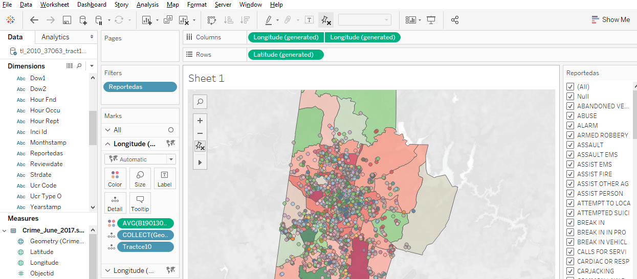
Plot points: Tableau works really well for plotting coordinate data (Longitude (X) and Latitude (Y) values) as points. The coordinates must have values in decimal degrees with negative longitudes being east of Greenwich and negative latitudes being south of the equator.
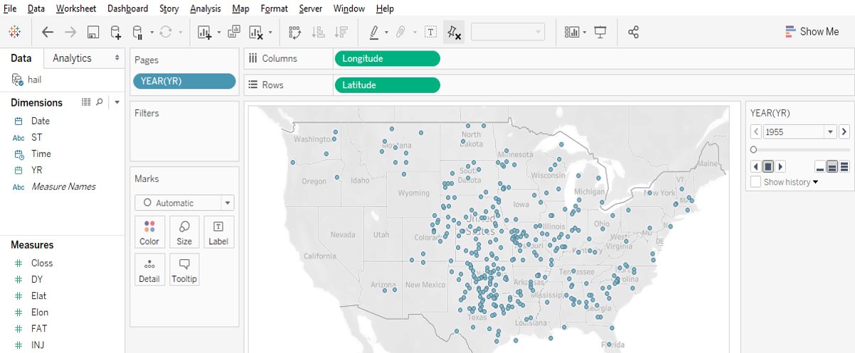
Point data with time slider
Time slider: If you move a categorical “Dimension” variable onto Tableau’s Pages Card, you can get a value-based slider to filter your data by that variable’s values (date, for instance, as in Google Earth). This is shown in the image above.
Heatmap of point distribution: You can choose Tableau’s “Density” option on its Marks card to create a heatmap, which may display the concentration of your data locations in a smoother manner.
Filter a map’s features: Tableau’s Filter card is akin to ArcGIS’s Definition Query, to allow you to look at just a subset of the features in a data table.
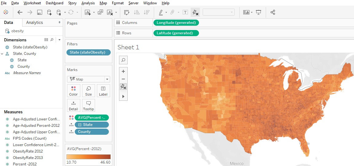
Shade polygons to reflect attribute values: Choropleth maps (polygons shaded to represent values of a variable) are easy to make in Tableau. Generally, you’ll have a field with values that match a built-in geography, like countries of the world or US counties. But you can also connect to spatial files (e.g., Esri shapefiles or GeoJSON files), which is especially helpful if the geography isn’t built into Tableau (US Census Tracts are an example).
Filled map using color to indicate values
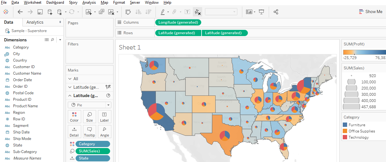
Display multiple indicators: Visualizing two variables on the same map is always problematic because the data patterns often get hidden in the confusion, but it is possible in Tableau. Use the “dual-axis” map concept mentioned above. An example might be pies for one categorical variable (with slices representing the categories) on top of choropleth polygons that visualize a continuous numeric variable.
Two variables using filled polygons and pies
Draw lines from tabular data: Tableau can display lines if your data is structured right, as discussed and illustrated previously, with a field for drawing order. You could also connect to a spatial line file, such as a shapefile or a GeoJSON file.
Help Resources
We’ve just given an overview of some of Tableau’s capabilities regarding spatial data. The developers are adding features in this area all the time, so stay tuned!
As data driven research has grown at Duke, Data and Visualization Services receives an increasing number of requests for partnerships, instruction, and consultations. These requests have deepened our relationships with researchers across campus such that we now regularly interact with researchers in all of Duke’s schools, disciplines, and interdepartmental initiatives.
In order to expand the Libraries commitment to partnering with researchers on data driven research at Duke, Duke University Libraries is elevating the Data and Visualization Services department to the Center for Data and Visualization Sciences (CDVS). The change is designed to enable the new Center to:
Expand partnerships for research and teaching
Augment the ability of the department to partner on grant, development, and funding opportunities
Develop new opportunities for research, teaching, and collections – especially in the areas of data science, data visualization, and GIS/mapping research
Recognize the breadth and demand for the Libraries expertise in data driven research support
Enhance the role of CDVS activities within Bostock Libraries’ Edge Research Commons
We believe that the new Center for Data and Visualization Sciences will enable us to partner with an increasingly large and diverse range of data research interests at Duke and beyond through funded projects and co-curricular initiatives at Duke. We look forward to working with you on your next data driven project!
The Data and Visualization Services (DVS) Department can help you locate and extract many types of data, including data about companies and industries. These may include data on firm location, aggregated data on the general business climate and conditions, or specific company financials. In addition to some freely available resources, Duke subscribes to a host of databases providing business data.
Directories of Business Locations
You may need to identify local outlets and single-location companies that sell a particular product or provide a particular service. You may also need information on small businesses (e.g., sole proprietorships) and private companies, not just publicly traded corporations or contact information for a company’s headquarters. A couple of good sources for such local data are the ReferenceUSA Businesses Database and SimplyAnalytics.
From these databases, you can extract lists of locations with geographic coordinates for plotting in GIS software, and SimplyAnalytics also lets you download data already formatted as GIS layers. Researchers often use this data when needing to associate business locations with the demographics and socio-economic characteristics of neighborhoods (e.g., is there a lack of full-service grocery stores in poor neighborhoods?).
SimplyAnalytics
When searching these resources (or any business data source), it often helps to use an industry classification code to focus your search. Examples are the North American Industry Classification System (NAICS) and the Standard Industrial Classification (SIC) (no longer revised, but still commonly used). You can determine a code using a keyword search or drilling down through a hierarchy.
Aggregated Business and Marketing Data
Government surveys ask questions of businesses or samples of businesses. The data is aggregated by industry, location, size of company, and other criteria and typically include information on the characteristics of each industry, such as employment, wages, and productivity.
Macroeconomic indicators relate to the overall business climate, and a good source for macro data is Global Financial Data. Its data series includes many stock exchange and bond indexes from around the world.
Private firms also collect market research data through sample surveys. These are often from a consumer perspective, for instance to help gauge demand for specific products and services. Be aware that the numbers for small geographies (e.g., Census Tracts or Block Groups) are typically imputed from small nationwide samples, based on correlations with demographic and socioeconomic indicators. Examples of resources with such data are SimplyAnalytics (with data from EASI and Simmons) and Statista (mostly national-level data).
Firm-Level Data
You may be interested in comparing numbers between companies, ranking them based on certain indicators, or gathering time-series data on a company to follow changes over time. Always be aware of whether the company is a publicly traded corporation or is privately held, as the data sources and availability of information may vary.
Their EDGAR service is the source of the corporate financials repackaged by commercial data providers, and you might find additional context and narrative analysis with products such as Mergent Online, Thomson One, or S&P Global NetAdvantage. The Bloomberg Professional Service in the DVS computer lab contains a vast amount of data, news, and analysis on firms and economic conditions worldwide. You can find many more sources for firm- and industry-specific data from the library’s guide on Company and Industry Research, and of course at the Ford Library at the Fuqua School of Business.
All of these sources provide tabular download options.
For help finding any sort of business or industry data, don’t hesitate to contact us at askdata@duke.edu.
Developing interactive maps that incorporate text, images, video, and audio can be time-consuming and require specialized technical skills. Fortunately, at Duke we have access to Esri Story Maps, a web-based tool that helps you quickly design engaging narratives around your maps, no coding required.
We have seen a variety of creative uses of Story Maps at Duke, including:
Presentations to communicate research
Student assignments, as an alternative to a midterm or paper
Tours and guides of campus
Tutorials to explain a topic with a spatial component
Portfolios to showcase projects that include maps
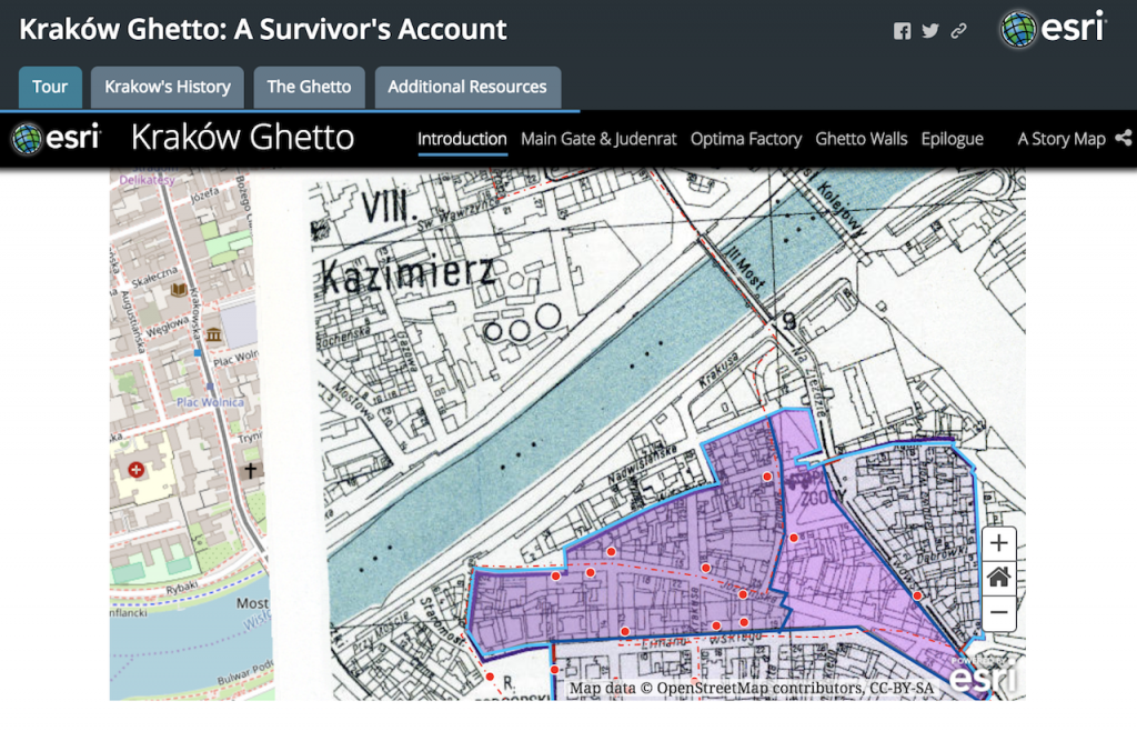
Christine Liu, a graduate student in the Department of Art, Art History & Visual Studies, created this Story Map to illustrate a journey through Kraków under Nazi occupation.
If you are interested in building a Story Map, we recommend first spending some time exploring Esri’s curated gallery of stories to find inspiration and understand the platform’s capabilities. You can also review their collection of resources, which includes training videos, FAQs, and useful advice.
When you are ready to get started, you can contact one of our GIS specialists (by emailing askdata@duke.edu) to schedule an appointment. We are always happy to answer questions and provide recommendations specific to your project. We also offer workshops to guide you through the process of building a basic online map, making it visually effective, and combining it with other materials to publish a Story Map.
If you already have a Story Map you want to show off, please share it with us! We are assembling a gallery of stories made at Duke and would love to feature your project.
Visualize, manage, and map your data in our Fall 2017 Workshop Series. Our workshops are designed for researchers who are new to data driven research as well as those looking to expand skills with new methods and tools. With workshops exploring data visualization, digital mapping, data management, R, and Stata, the series offers a wide range of different data tools and techniques. This fall, we are extending our partnership with the Graduate School and offering several workshops in our data management series for RCR credit (please see course descriptions for further details).
Everyone is welcome at Duke Libraries workshops. We hope to see you this fall!
Data and Visualization Services is happy to announce its Fall 2016 Workshop Series. Learn new ways of enhancing your research with a wide range of data driven research methods, data tools, and data sources.
Can’t attend a session? We record and share most of our workshops online. We are also happy to consult on any of the topics above in person. We look forward to seeing you in the workshops, in the library, or online!
Interested in getting started in data driven research or exploring a new approach to working with research data? Data and Visualization Services’ spring workshop series features a range of courses designed to showcase the latest data tools and methods. Begin working with data in our Basic Data Cleaning/Analysis or the new Structuring Humanities Data workshop. Explore data visualization in the Making Data Visual class. Our wide range of workshops offers a variety of approaches for the meeting the challenges of 21st century data driven research. Please join us!


 Christine Liu, a graduate student in the Department of Art, Art History & Visual Studies, created this Story Map to illustrate a journey through Kraków under Nazi occupation.