We are happy to announce expanded features for the public sharing of large scale data in the Duke Research Data Repository! The importance of open science for the public good is more relevant than ever and scientific research is increasingly happening at scale. Relatedly, journals and funding agencies are requiring researchers to share the data produced during the course of their research (for instance see the newly released NIH Data Management and Sharing Policy). In response to this growing and evolving data sharing landscape, the Duke Research Data Repository team has partnered with Research Computing and OIT to integrate the Globus file transfer system to streamline the public sharing of large scale data generated at Duke. The new RDR features include:
A streamlined workflow for depositing large scale data to the repository
An integrated process for downloading large scale data (datasets over 2GB) from the repository
New options for exporting smaller datasets directly through your browser
New support for describing and using collections to highlight groups of datasets generated by a project or group (see this example)
Additional free storage (up to 100 GB per deposit) to the Duke community during 2021!
While using Globus for both upload and download requires a few configuration steps by end users, we have strived to simplify this process with new user documentation and video walk-throughs. This is the perfect time to share those large(r) datasets (although smaller datasets are also welcome!).
Felipe Álvarez de Toledo López-Herrera is a Ph.D. candidate at the Art, Art History, and Visual Studies Department at Duke University and a Digital Humanities Graduate Assistant for Humanities Unbounded, 2019-2020. Contact him at askdata@duke.edu.
Over the 2019-2020 academic year, I am serving as a Humanities Unbounded graduate assistant in Duke Libraries’ Center for Data and Visualization Sciences. As one of the three Humanities Unbounded graduate assistants, I will partner on Humanities Unbounded projects and focus on developing skills that are broadly applicable to support humanities projects at Duke. In this blog post, I would like to introduce myself and give readers a sense of my skills and interests. If you think my profile could address some of the needs of your group, please reach out to me through the email above!
My own dissertation project began with a data dilemma. 400 years ago, paintings were shipped across the Atlantic by the thousands. They were sent by painters and dealers in places like Antwerp or Seville, for sale in the Spanish colonies. But most of these paintings were not made to last. Cheap supports and shifting fashions guaranteed a constant renewal of demand, and thus more work for painters, in a sort of proto-industrial planned obsolescence.[1]As a consequence, the canvas, the traditional data point of art history, was not a viable starting point for my own research, rendering powerless many of the tools that art history has developed for studying painting. I was interested in examining the market for paintings as it developed in Seville, Spain from 1500-1700; it was a major productive center which held the idiosyncratic role of controlling all trade to the Spanish colonies for more than 200 years. But what could I do when most of the work produced within it no longer exists?
This problem drives my research here at Duke, where I apply an interdisciplinary, data-driven approach. My own background is the product of two fields: I obtained a bachelor’s degree in Economics in my hometown of Barcelona, Spain in 2015 from the Universitat Pompeu Fabra, and simultaneously attended art history classes in the University of Barcelona. This combination found a natural mid-way point in the study of art markets. I came to Duke to be a part of DALMI, the Duke, Art, Law and Markets Initiative, led by Professor Hans J. Van Miegroet, where I was introduced to the methodologies of data-driven art historical research.
Documents in Seville’s archives reveal a stunning diversity of production that encompasses the religious art for which the city is known, but also includes still lives, landscapes and genre scenes whose importance has been understated and of which few examples remain [Figures 1 & 2]. But analysis of individual documents, or small groups of them, yields limited information. Aggregation, with an awareness of the biases and limitations in the existing corpus of documents, seems to me a way to open up alternative avenues for research. I am creating a database of painters in the city of Seville from 1500-1699, where I pool known archival documentation relating to painters and painting in this city and extract biographical, spatial and productive data to analyze the industry. I explore issues such as the industry’s size and productive capacity, its organization within the city, reactions to historical change and, of course, its participation in transatlantic trade.
This approach has obliged me to become familiar with a wide range of digital tools. I use OpenRefine for cleaning data, R and Stata for statistical analysis, Tableau for creating visualizations and ArcGIS for visualizing and generating spatial data (see examples of my own work below [Figures 3-4]). I have also learned the theory behind relational databases and am learning to use MySQL for my own project; similarly, for the data-gathering process I am interested in learning data-mining techniques through machine learning. I have been using a user-friendly software called RapidMiner to simplify some of my own data gathering.
A rare example of a Sevillian landscape. Ignacio de Iriarte, Landscape with Shepherds (1665)
Another example of Sevillian genre production. Francisco de Zurbarán, Still Life with Lemons, Oranges and a Rose (1633)
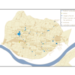
Map of painter addresses, 1676. Size represents the number of apprentices they held in that year.
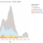
Number of apprentices in Seville by place of origin, 1650-1699. Based on documents in Duncan T. Kinkead, Pintores y Doradores en Sevilla, 1650-1699: Documentos (2007).
Thus, I am happy to help any groups that have a data set and want to learn how to visualize it graphically, whether through graphs, charts or maps. I am also happy to help groups think about their data gathering and storage. I like to consider data in the broadest terms: almost anything can be data, if we correctly conceptualize how to gather and utilize it realistically within the limits of a project. I would like to point out that this does not necessarily need to result in visualization; this is also applicable if a group has a corpus of documents that they want to store digitally. If any groups have an interest in text mining and relational databases, we can learn simultaneously—I am very interested in developing these skills myself because they apply to my own project.
I can:
Help you consider potential data sources and the best way to extract the information they contain
Help you make them usable: teach you to structure, store and clean your data
And of course, help you analyze and visualize them
With Tableau: for graphs and infographics that can be interactive and can easily be embedded into dashboards on websites.
With ArcGIS: for maps that can also be interactive and embedded onto websites or in their Stories function.
Help you plan your project through these steps, from gathering to visualization.
Once again, if you think any of these areas are useful to you and your project, please do not hesitate to contact me. I look forward to collaborating with you!
Over the last six years, Data and Visualization Services (DVS) has expanded support for data visualization in the Duke community under the expert guidance of Angela Zoss. In this period, Angela developed Duke University Libraries’ visualization program through a combination of thoughtful consultations, training, and events that expanded the community of data visualization practice at Duke while simultaneously increasing the impact of Duke research.
As of May 1st, Duke Libraries is happy to announce that Angela will expand her role in promoting data visualization in the Duke community by transitioning to a new position in the library’s Assessment and User Experience department. In her new role, Angela will support a larger effort in Duke Libraries to increase data-driven decision making. In Data and Visualization Services, Eric Monson will take the lead on research consultation and training for data visualization in the Duke community. Eric, who has been a data visualization analyst with DVS since 2015 and has a long history of supporting data visualization at Duke, will serve as DVS’ primary contact for data visualization.
DVS wishes Angela success in her new position. We look forward to continuing to work with the Duke community to expand data visualization research on campus.
Love Data Week is here again! Love Data Week is an international social media campaign to raise awareness and build community to engage on topics related to research data management, sharing, preservation, reuse, and library-based research data services.
This year the theme for Love Data Week is Data Stories, with a focus on four topics:
Stories about data
Telling stories with data
Connected conversations across different data communities
We are data: seeing the people behind the data
Since last year, we have some new data stories at Duke Libraries. The Duke Digital Repository now contains nearly 30 data sets that Duke researchers have shared for preservation and reuse. There are 23 Duke-affiliated projects in the Open Science Framework, a free web app developed by the Center for Open Science that facilitates good project and data management practices. And our Research Data Management team has continued to offer consultation and instruction services to a variety of researchers on campus.
We invite you to join the data story by attending data related events coming up at Duke during Love Data Week:
Wednesday, February 14: Introduction to the Open Science Framework*: Learn how this free, open source tool can help you manage and share your research data. Story Maps with ArcGIS Online: Learn how to tell your data story with an interactive map that integrates other media (photos, text, videos) and shows changes over space and time. Qualitative Data Analysis Workshop at the Social Science Research Institute: Learn how to transform interview scripts into analyzable data and other foundational skills in qualitative data analysis.
Thursday, February 15: Data Dialogue at the Information Initiative at Duke: Design intuition, ethnography, and data science
Friday, February 16: Visualization Friday Forum: Invisible Visualization: Making data visualizations accessible to the blind and other people with disabilities
*In honor of Love Data Week, chocolate will be offered at this event.
Keep an eye on additional workshops coming up for the rest of the spring semester!
Contact us at askdata@duke.edu for help with your data story, and follow the conversation at #lovedata18
Citation: Nurnberger, A., Coates, H. L., Condon, P., Koshoffer, A. E., Doty, J., Zilinski, L., … Foster, E. D. (2017). Love Data Week [image files]. Retrieved from https://osf.io/r8tht
On behalf of Duke Libraries and the Social Science Research Institute, I am happy to welcome Mara Sedlins to Duke. As the library and SSRI work to develop a rich set of data management, analysis, and archiving strategies for Duke researchers, Mara’s postdoctoral position provides a unique opportunity to work closely with researchers across campus to improve both training and workflows for data curation at Duke. – Joel Herndon, Head of Data and Visualization Services, Duke Libraries
I am excited to join the Data and Visualization Services team this fall as a postdoctoral fellow in data curation for the social sciences (sponsored by CLIR and funded by the Alfred P. Sloan Foundation). For the next two years, I will be working with Duke Libraries and the Social Science Research Institute to develop best practices for managing a variety of research data in the social sciences.
My research background is in social and personality psychology. I received my PhD at the University of Washington, where I worked to develop and validate a new measure of automatic social categorization – to what extent do people, automatically and without conscious awareness, sort faces into socially constructed categories like gender and race? The measure has been used in studies examining beliefs about human genetic variation and the racial labels people assign to multiracial celebrities like President Barack Obama.
While in Seattle, I was also involved in several projects at Microsoft Research assessing computer-supported cooperative work technologies, focusing on people’s preferences for different types of avatar representations, compared to video or audio-only conferencing. I also have experience working with data from a study of risk factors for intimate partner violence, managing a database of donors and volunteers for a historical archive, and organizing thousands of high-resolution images for a large-scale digital comic art restoration project.
I look forward to applying the insights gained from working on a diverse array of data-intensive projects to the problem of developing and promoting best practices for data management throughout the research lifecycle. I am particularly interested in questions such as:
How can researchers write actionable data management plans that improve the quality of their research?
What strategies can be used to organize and document data files during a project so that it’s easy to find and understand them later?
What steps need to be taken so that data can be discovered and re-used effectively by other researchers?
These are just a few of the questions that are central to the rapidly evolving field of data curation for the sciences and beyond.
Data and Visualization Services is happy to announce its Fall 2016 Workshop Series. Learn new ways of enhancing your research with a wide range of data driven research methods, data tools, and data sources.
Can’t attend a session? We record and share most of our workshops online. We are also happy to consult on any of the topics above in person. We look forward to seeing you in the workshops, in the library, or online!
Duke Libraries are happy to welcome the 2016 ASA DataFest to the Edge on April 1-3rd. As part of DataFest 2016, the Edge is hosting five DataFest related workshops designed to help teams and others interested in data driven research expand their skills. All workshops will meet in the Edge Workshop Room (1st Floor Bostock Library). Laptops are required for all workshops.
We wish all the teams success in the competition and hope to see you in the next few weeks!
DataFest Workshop Series
Data Analysis with Python Tuesday, March 22
6:00-9:00 PM
This will be a hands-on class focused on performing data analysis with Python. We’ll help participants set-up their Jupyter Notebook development environment, cover the basic functions for reading and manipulating data, show examples of common statistical models and useful packages and show some of the python visualization tools.
Introduction to R
Wednesday March 23
6:00-8:00 PM
Introduction to R as a statistical programming language. This session will introduce the basics of R syntax, getting data into R, various data types and classes, etc. The session assumes no or little background in R.
Data Munging with R and dplyr Monday, March 28
6:00-8:00 PM
This session will demonstrate tools for data manipulation and cleaning of data in R. Majority of the session will use the dplyr and tidyr packages. Some background in R is recommended. If you are not familiar with R, make sure to first attend the first R workshop in the series.
Data visualization with R, ggplot2, and shiny
Wednesday, March 30
6:00-8:00 PM
This session will demonstrate tools for static and interactive data visualization in R using ggplot2 and shiny packages. Some background in R is recommended. If you are not familiar with R, make sure to first attend the first R workshop in the series.
EDA and Interactive Predictive Modeling with JMP
Thursday, March 31
4:00-6:00 PM
JMP® Statistical Discovery Software is dynamic, visual and interactive desktop software for Windows and Mac. In this hands-on workshop we see tools for exploring, visualizing and preparing data in JMP. We’ll also learn how to fit a variety of predictive models, including multiple regression, logistic regression, classification and regression trees, and neural networks. A six month license of JMP will be provided.
“Story maps” are a popular method of telling place-themed stories and engaging with your audience over the web. Story maps are highly interactive, allowing users to follow along a path or time-line with links to content along the way. They’re also a great way to visualize current events and news topics in a way that brings perspective and context to important issues. As a student or researcher, you can use maps to tell a story about your research study area. In that sense, they can be a great tool for drawing attention to your work, and you could consider it another form of social media.
Creating a web map may seem like a challenge if you’ve never done it before, but there are several tools available online that can quickly and easily generate a story map. For this post, I’ll introduce you to two different types of story maps and suggest some free tools for creating your own.
Mapping Places or Events
Story maps that cover a series of events are useful for contextualizing news events, giving an online tour, or linking to almost any kind of location specific information. Story maps of this style are fun to use because they typically provide both a map and multimedia content. The user accesses the information in an interactive format -which is a great way for your message to sink in!
For example, I created this story map that links historic building photos of the Construction of Duke University to their locations on a map.
Some applications for this type of story map are publishing information about research areas, adding new points of access for digital humanities, or documenting travel or a field expedition.
Thematic Maps
Another popular style of story map is one that presents a series of thematic maps. These types of maps often depict how changes have occurred over time in a place or perhaps the unfolding of a news event. Side-by-side comparison of maps can also be a visually interesting way to illustrate an important issue. An interesting comparison map might show US Census demographic data from different census years in a city to show how people have changed.
This map illustrates how manufacturing jobs have changed around Flint Michigan from 1990 to 2010.
Some great tools are available to the Duke community and freely on the web that let you create these types of “story maps” with minimal training. Here are three tools you can use and what each does best…
StoryMap JS is a completely free and open access tool by the Knight Lab at Northwestern University. A Google account is necessary because StoryMap JS actually saves the maps you create in the recent folder of your Google Drive. StoryMap JS is incredibly easy to use, too. It has a very simple and intuitive interface that will let you start making your map in minutes. You can also use StoryMap JS for non-cartographic visual materials, and there is a cool off-shoot that allows your to instantly map 20 recent geo-tagged Instagram photos from any user account. Best Uses: Try using StoryMap JS when you’re telling a story that unfolds over a path or timeline. It’s also great for linking to media like photos or YouTube content.
Social ExplorerYou may have used Social Explorer before to gather US Census data, but you can also create thematic maps that you can share or embed in a website. With your Duke credentials, you have access to the Professional Edition. The data is pre-loaded, so you’re just a few clicks away from a beautifully shaded thematic map of US Census Data that you can share over the web. The map interface is user-friendly and has a “Change Layout” button at the bottom center that creates side-by-side and swipe comparison maps. You can also create an annotated presentation that let’s the user cycle through a series of maps. Here is a quick example of a map presentation I made in Social Explorer. Best Uses: Social Explorer’s best use is for mapping US Census data. The “Tell a Story” function allows you to join graphs and other media to your map and create interactive presentation slides.
ESRI ArcGIS Online For more advanced users, or just those looking for more customization options, ArcGIS Online offers an abundance of tools and templates for creating attractive and engaging map presentations. ArcGIS Online Story Maps require an account with ESRI. You can sign up for a free public account, or, for more advanced features, you can request a free organizational account that is available to the Duke community. To take advantage of all ArcGIS Online has to offer, you will need to familiarize yourself with the how to use it. Once you’ve made a few maps, you can load maps and multimedia content into any of ESRI’s Story Map Apps. Take a look at this gallery of to view some examples of what you can do with Story Maps in ArcGIS Online. Even though there is a bit of a learning curve to ArcGIS Online, the pay off is huge.
Here is a customized slider map I made using the Story Map Swipe App that shows changes in North Carolina’s Congressional District Boundaries following the 2012 redistricting. Use the slider to swipe between views.
Best Uses: Fully customized story maps of any type. Great for telling place-based stories and presenting a series of thematic maps complete with multimedia content.
I hope you enjoyed viewing some of these story maps! I’m sure you can see that there are many different uses for this type of media. If you’ve made a cool story map, feel free to share it with us in the comments!
Analyze, discover, manage, map, and visualize your data with Duke Libraries Data and GIS Services. Our team of five consultants provides a broad range of support in areas ranging from data analysis, data visualization, geographic information systems, financial data, statistical software and data storage and management. Our lab provides 12 workstations with the latest data software and three Bloomberg Professional workstations nearly 24/7 for the Duke community.
Data and GIS Workshop Series
All are welcome to the Data and GIS Workshop Series. Analyze, communicate, clean, map, represent and visualize your data with a wide range of workshops on data based research methods and tools. Details and registration for each class are available at the links that follow. (Interested in keeping up to date with workshops and events in Data and GIS? Just go to https://lists.duke.edu/sympa/info/dgs-announce and click on the “Subscribe” link at the bottom left.)
Data and GIS also offers instruction tailored to courses or research teams. Please contact askdata@duke.edu to schedule a session!
Data Management
Data Management Planning – DMPTool – Get 24/7 online help for your next data management plan, including information about Duke resources available for your data work.
Statistical Software Updates
Stata 13 is now available in our lab and training room
QSR’s Nvivo qualitative software is available on all machines
Data & GIS Services is hiring! We have two open positions for student web programmers interested in working on data visualization projects. See the Library Student employment page (http://library.duke.edu/jobs/students.html) for more information on how to apply. (The job can be found by searching for requisition number “DUL14-AMZ02”.)
New Data and Map Collections
CPS on Web (CPS Utilities Online) CPS on Web is a set of utilities enabling you to access CPS data and documentation from this website. You may make tables and graphs from the CPS data, download data extractions, make estimations, get summaries and statistical measures, search the documentation, and make your own variables as functions of the existing ones.
Global Financial Data Global Financial Data is a collection of financial and economic data provided in ASCII or Excel format. Data includes: long-term historical indices on stock markets; Total Return data on stocks, bonds, and bills; interest rates; exchange rates; inflation rates; bond indices; commodity indices and prices; consumer price indices; gross domestic product; individual stocks; sector indices; treasury bill yields; wholesale price indices; and unemployment rates covering over 200 countries.
LandScan Global
The LandScan Global Population Database provides global population distribution in a gridded GIS format at 30 arc-second resolution (approximately 1×1 km cells). Oak Ridge National Laboratory developed modeling techniques to disaggregate and interpolate census data within administrative boundaries to create a GIS layer showing population distribution as accurately and as timely as possible. EastView provides this data to use in GIS software as a WMS (Web Mapping Service) or as a WCS (Web Coverage Service) to allow a user to incorporate population distribution into GIS mapping and analysis.
Clean your data with Google Refine. Use digital maps to explore the present and past. Analyze data with R or Stata. Visualize your research with one of our data visualization courses. The Data and GIS Workshops offer a range of research strategies for data based questions. Register online for our courses or schedule a session for your course by emailing askdata@duke.edu
Are you a current Duke University undergraduate or graduate student? Have you used data visualization in a past or current research project to help solve a problem, tell a story, or highlight an interesting trend? Write up a short description and you’ll have a submission for the contest and a chance to win a $500 technology prize.
As mentioned in the fall – with 12 workstations with dual 24″ monitors and 16 gigs of memory, the new Data and GIS lab is ready to take on the most challenging statistical, mapping, and visualization research projects. The new lab also features a flatbed scanner for projects moving from print to digital data. Lab hours are the same hours as Perkins Library (almost 24/7).
Puzzled by data management planning? Not sure what to include in your grants data management plan? Data and GIS has launched a guide that supports researchers looking for advice on data management plans now required by several granting agencies. The guide provides examples of sample plans, key concepts involved in writing a plan, and contact information for groups on campus providing data management advice.
Come visit us in Perkins 226 for a consultation or contact us online (email: askdata@duke.edu or twitter: duke_data OR duke_vis). Our consultants are available weekdays 8-5 by appointment or offer drop in hours as well We look forward to working with you on your next data driven project.