Category Archives: GIS

Wrangle, Refine, and Represent

Data visualization and data management represented the core themes of the 2011 Computer Assisted Reporting (CAR) Conference that met in Raleigh from February 24-27.  Bringing together journalists, computer scientists, and faculty, the conference united a number of communities that share a common interest in gathering and representing empirical evidence online (and in print).

While the conference featured luminaries in data visualization (Amanda Cox, David Huynh , Michal Migurski, Martin Wattenberg) who gave sage advice on how to best represent data online, web based data visualization tools provided a central focus for the conference.

Notable tools that may be of interest to the Duke research (and teaching) community include:

DataWrangler – An interactive data cleaning tool much like Google Refine (see below)

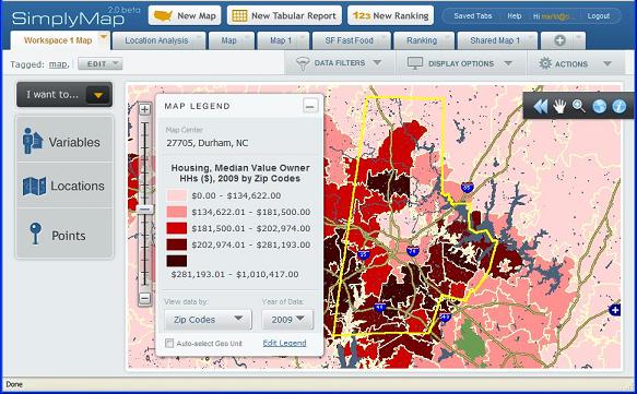
Google Fusion Tables – “manage large collections of tabular data in the cloud” – Fusion tables provides convenient access to google’s data visualization and mapping services.  The service also allows groups to annotate data online.

Google Refine – Refine is primarily a data cleaning tool that simplifies the process of cleaning data for further processing or analysis.  While users of existing data management tools may not be convinced to leave their current data management tool, Refine provides a rich suite of tools that will likely attract many new converts.

Many Eyes – One of the premier online visualization tools hosted by IBM.  Visualizations range from pie charts to digital maps to text analysis.  Many Eye’s versatility is one of its key strengths.

Polymaps – Billed as a “javascript library for image- and vector-tiled maps” – Polymaps allows the creating of custom lightweight map services on the web.

SIMILE Project (Semantic Interoperability of Metadata and Information in unLike Environments) – The SIMILE Project is a collection of different research projects designed to “enhance inter-operability” among digital assets.  At the conference, the Exhibit Project received particular attention for its ability to produce data rich visualization with very little coding required.

Timeflow –  Presented by Sarah Cohen and designed by Martin Wattenberg- Timeflow provides a convenient application for visualizing temporal data.

SimplyMap! – Census and business data made easier

Online mapping and data access has become even easier with the launch of SimplyMap 2.0.  A long time favorite of Economics and Public Policy courses (and faculty) at Duke, this program provides a straight forward interface for web-based mapping and data extraction application that lets users create thematic maps and reports using US census, business, and marketing data.

Screenshot
SimplyMap 2.0 map interface

Version 2.0 includes improvements designed to make it easier to find and analyze data and create professional looking GIS-style thematic maps.

Significant changes include:

  • A new multi-tab interface to allow you to easily switch between your projects
  • Interactive wizards to guide you through making maps and reports
  • Can choose to automatically select the geographic unit displayed on a map based on the zoom level
  • Easier searching and browsing to choose data variables
  • Assign keyword tags to organize your maps and reports
  • Share your work with other users of SimplyMap (send a URL that lets them open a copy of your map or report)
  • Data filters (greater than, less than, etc.) can now be applied to both maps and reports
  • More export options: Data: Excel, DBF, CSV;  Maps: GIF, PDF, Shapefiles (boundaries only, no attributes)
  • Faster performance

Give SimplyMap 2.0 a try and let us know what you think.  Support is always available in Perkins Data and GIS.

Policy Paradox: Mapping Residential Restrictions

Do residential restrictions placed on convicted sex offenders serve to protect the public?  Duke Economics Ph.D. candidate Songman Kang, has been using the analytical capabilities of geographic information software to help determine the extent to which the restrictions affect residential locations of sex offenders: computing the area covered by a restriction and determining which offenders had to relocate due to a restriction.

According to Kang, the residential restrictions are designed to reduce recidivism among sex offenders and prevent their presence near places where children regularly congregate.  Neither of these claims has been found consistent with empirical evidence though, and it is unclear whether the restrictions have been successful in reducing the rates of repeat sex offenses.  On the other hand, the restrictions severely limit residential location choices, and may force offenders to relocate away from employment opportunities and supportive networks of family and friends.  As a result of the deteriorated economic conditions, the offenders who had to relocate may become more likely to commit non-sex offenses.

The following maps illustrate some of the restricted zones in Miami and in the Triangle area of North Carolina studied by Mr. Kang.

Figure 1: Residential Restricted Zones in Miami

Figure 2: Triangle Restricted Residences

Making Data Flow

As water quality and questions of water supply have grown more salient in the Triangle, Duke researchers have tried to contribute to the growing debate over water quality using the latest digital mapping (GIS) tools.  In the fall of 2009, Data and GIS Services in Perkins Library provided GIS analysis support for a stream and watershed assessment project that developed strategies to reverse the impact of poor urban stormwater management, degraded water quality, and the loss of natural habitats on the Duke campus.

Data/GIS helped the researchers access critical spatial data for the characterization of the contributing watershed’s current land use patterns.  This data enabled the students to analyze the watershed’s area of impervious surface and hydrologic flow paths, and helped inform the understanding of the water quality issues faced at the stream site.

The GIS map below illustrates how digital mapping tools can be used to summarize a large amount of complex data into a compelling presentation.

Special thanks to the interdisciplinary team of environmental and civil engineers, biology and environmental science majors, and a Nicholas MEM student who shared their project results: Alicia Burtner, Matt Ball, Nari Sohn, Avni Patel, Will Bierbower, Adam Nathan, Mike Schallmo, Justine Jackson-Ricketts, and Jai Singh.