
Introduction
ArcGIS 10 makes it easy to manage and visualize time-series data to identify trends and create compelling visualizations. Creating a visualization of time-series data requires only a few additional steps beyond those needed to produce any map.
Step 1: Data Formatting
Time-series data contains records, each of which is specific to both an individual and to a single point in time. The following example uses employment data for the textile industry in North Carolina from 2000 through 2009.
 In this example, “fips” corresponds to each county’s unique FIPS code, “industry” corresponds to the textile industry’s unique NAICS code representation, “t” denotes the year. Establishments, employment, and annual pay, our data items, are stored in the fields “est”, “emp”, and “pay_ann”. All missing values were coded ‘-1’.
Tip: Make sure each record has a value. Records without values will not be drawn in ArcGIS.
Tip: Do not name the time field “year,” as it is a reserved name in ArcGIS.
We suggest based on experience that the storage of data in a Microsoft Access database provides the greatest degree of reliability.
Step 2: Add Data to Map in ArcGIS
Once the data is formatted, join the data to a geographic layer. For help in finding a geographic layer, please consult the Perkins Data and GIS Services Department.
Tip: When joining layers, it is good practice to Verify the join selection before approving. The program will inform you of any errors.
Step 3: Enabling Time
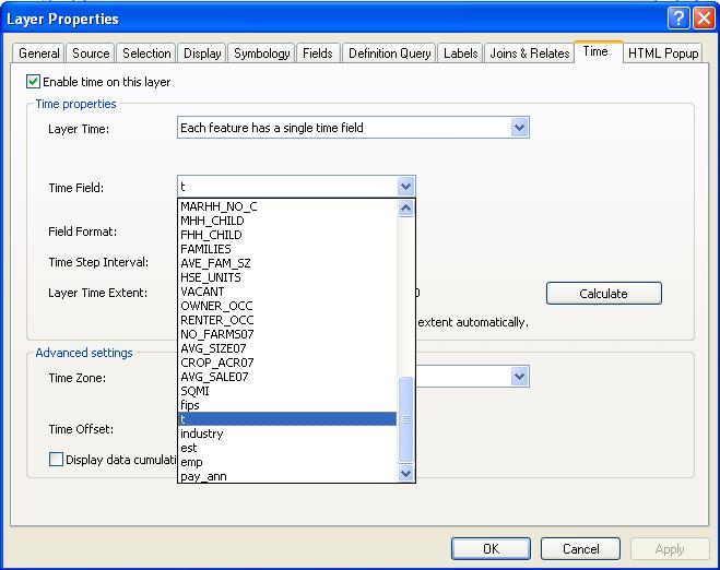
 Once the data are joined to a layer, enter the layer properties by right-clicking the layer name in the Table of Contents pane.
Navigate to the Time tab and check the box. ArcGIS will want to know which field contains time information, as well as the format. If the join was successful, you will see the fields that represent the data joined to the geographic layer. In this example, the time field is labeled “t”.
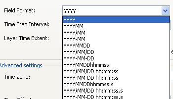
You must also specify the date/time format. Available time formats are listed to the right.
Finally, you will have to enable time on the data table as well. To do this, right-click the data table in the Table of Contents pane. Follow the same steps as presented for the geographic layer.
Step 4: Enable Time Display
![]() Now that ArcGIS understands the data structure, you may enable time visualization. The “Tools” toolbar, which contains the most commonly used tools, contains the button highlighted below, “Open Time Slider Window”. Select this button.
Now that ArcGIS understands the data structure, you may enable time visualization. The “Tools” toolbar, which contains the most commonly used tools, contains the button highlighted below, “Open Time Slider Window”. Select this button.
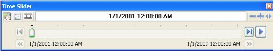 The time slider window (left) will appear. The slider spans the time range of the data, identifies what point in this range is currently displayed on the map, and allows for access to a variety of playback and recording options. To access these options, click the options button.
![]()
![]() This button is the equivalent of “Play.” It will display the data from the first time point to the last.
This button is the equivalent of “Play.” It will display the data from the first time point to the last.
![]() Buttons with both arrows and vertical lines are one-step increments. This particular button moves forward one time increment, the other one moves back.
Buttons with both arrows and vertical lines are one-step increments. This particular button moves forward one time increment, the other one moves back.
![]() This button exports the display to video. This is the final step.
This button exports the display to video. This is the final step.
Step 5: Configure Options and Visual Display
Before you export to video, you will want to configure the appearance of the map. This example will focus on new options that come with time series data.
First, select “Options” in the Time Slider toolbar. Under the “Time Display” tab, you can alter the format of the displayed date to conform to your data. In this example, I selected 2011 (yyyy) because we are using annual data.
Second, under the “Playback” tab, you can specify a length of time for playback. This example contains 10 years of data. If I specify 5 seconds playback, each data year will be displayed for one-half second. If I specify 10 second, each year will be visible for 1 second.
Third, I will display the year in order to make clear to the viewer the time point that is visible. To do this, I will go to “Insert” “Dynamic Text” “Data Frame Time.”
Tip: Alternatively, you can insert the data frame time into the title or other display object by including the following in the text of the object: <dyn type=”dataFrame” name=”Layers” property=”time” emptyStr=”[off]”/>
 After some trial and error, I successfully integrated the time currently visible into the title. The image to the left shows its appearance.
Step 6: Export to Video
Once the appearance of the map is satisfactory, you can export the map to video or to sequential images. Click the “Export to Video” button on the time slider window.
Tip: maximize the ArcGIS window, switch to Layout View, zoom the layout to 100%, and clear any toolbars that may obstruct the layout view to improve video appearance.
First, you will be asked for a file or folder location and the export format. Videos are exported as AVI files, while sequential images are exported to a folder either as bitmaps or JPEGS.
Second, if you exported to video, you will be asked to select a codec, which essentially encodes and compresses the outputted video. The codec selection depends on the individual machine, and some codecs work with ArcGIS better than others.
Finally, you may have to produce a video several times before it comes out as expected. Be sure to watch for missing time points, as this frequently happens. Fixing the video length to a specific play duration per time point (one-half second or one second) helps you watch for these missing time points.
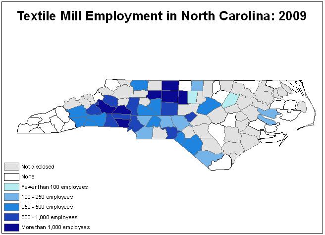
The following example is a 5-second video that displays employment in the textiles industry in North Carolina from 2000 through 2009. Note that declining employment is signified by colors that change from dark to light.
