Tag Archives: data visualization

Jon Schwabish – Excel Data Visualization Hero!

Two data visualization topics that people occasionally request are presentation design and Excel skills. We have a couple older videos on Basic Data Cleaning and Analysis for Data Tables, and Advanced Excel for Data Projects in our CDVS Online Learning page; and the storytelling and graphic design principles I cover in my Effective Academic Posters presentation apply equally well to presentations; but in case you haven’t heard of him before, I want to tell you about a master of these topics, one of my data visualization heroes, Jon Schwabish, founder of PolicyViz.

Besides his emphasis on clear communication of results, one of the things I admire most about Schwabish is his focus on Microsoft Excel as a legitimate tool for crafting that communication. While not free and open-source, it’s a piece of software that many people have access to, and despite some of its limitations (e.g. reproducibility issues), it is a very capable tool for data processing and visualization. If you want to make lots of people better communicators, teach them how to use the tools they already have!

Of course, visit policyviz.com and the PolicyViz YouTube channel to access the plethora of resources Jon is constantly generating, but to get you started I want to point out a few of my favorites.

I get frustrated that Excel doesn’t have a built-in, easy way to make horizontal dot plots with error bars. (On the med-side they tend to call these Forest plots, although they are useful whenever you have categories and a quantity with confidence intervals. Don’t just create a table – make it visual with a plot!) Jon’s Labeling Dot Plots blog post and accompanying YouTube video was super useful – it taught me a general approach for using scatterplots in Excel to create a variety of chart types that Excel doesn’t support natively! The method is a pain the first time you do it, and I get a bit belligerent because I hate that you have to employ this workaround, but it’s so brilliant and flexible that I’m tempted to teach a CDVS workshop on just this one chart type. More broadly, he also has an Excel Tutorials section of his YouTube channel, and he sells a PDF on his website called A Step-by-Step Guide to Advanced Data Visualization in Excel 2016.One of the best ways to become a better visualizer and communicator is to get feedback on your work and iterate through multiple drafts. To compliment that, it’s wonderful to get an expert’s take on a published visualization, along with proposed alternatives. For years Jon has been publishing brillant visualization redesigns on his blog. He doesn’t just criticize – he shows you alternatives and talks about their strengths and weaknesses. There is also a DataViz Critiques section on his YouTube channel.

In early 2021 he released over 50 daily videos in a series called One Chart at a Time where visualization experts “expand your graphic literacy” and “help you learn about more than just the standard bar, line, and pie chart.”

Along with Alice Feng, Schwabish published in 2021 the “Do No Harm Guide: Applying Equity Awareness in Data Visualization”. You can download the report at urban.org and listen to a talk they gave about it on YouTube to get their reflections on “how data practitioners can approach their work through a lens of diversity, equity, and inclusion … to encourage thoughtfulness in how analysts work with and present their data.”

Finally, people are always asking me what books they should read to get better at visualization. Take a look at Schwabish’s books, along with his lists of recommended DataViz books and Presentation books!

CDVS Data Workshops: Spring 2022

As we begin the new year, the Center of Data and Visualization Sciences is happy to announce a series of twenty-one data workshops designed to empower you to reach your goals in 2022. With a focus on data management, data visualization, and data science, we hope to provide a diverse set of approaches that can save time, increase the impact of your research, and further your career goals.

While the pandemic has shifted most of our data workshops online, we remain keenly interested in offering workshops that reflect the needs and preferences of the Duke research community. In November, we surveyed our 2021 workshop participants to understand how we can better serve our attendees this spring. We’d like to thank those who participated in our brief email survey and share a few of our observations based on the response that we received.

Workshops Formats

While some of our workshops participants (11%) prefer in-person workshops and others (24%) expressed a preference for hybrid workshops, a little over half of the survey respondents (52%) expressed a preference for live zoom workshops. Our goal for the spring is to continue offering “live” zoom sessions while continuing to explore possibilities for increasing the number of hybrid and in-person options. We hope to reevaluate our workshops communities preferences later this year and will continue to adjust formats as appropriate.

Workshop format preferences
52% of respondents prefer online instruction, while another 24% would like to hybrid options

Participant Expectations

With the rapid shift to online content in the last two years coupled with a growing body of online training materials, we are particularly interested in how our workshop attendees evaluate online courses and their expectations for these courses.  More specifically, we were curious about whether registering for an online session includes more than simply the expectation of attending the online workshop.

While we are delighted to learn that the majority of our respondents (87%) intend to attend the workshop (our turnout rate has traditionally been about 50%), we learned that a growing number of participants had other expectations (note: for this question, participants could choose more than one response). Roughly sixty-seven percent of the sample indicated they expected to have a recording of the session available. While another sixty-six percent indicated that they expected a copy of the workshop materials (slides, data, code) even if they were unable to attend.

As a result of our survey, CDVS will make an increasing amount of our content available online this spring..  In 2021, we launched a new webpage designed to showcase our learning materials. In addition to our online learning site, CDVS maintains a github site (CDVS) as well as site focused on R learning materials (Rfun).

We appreciate your feedback on the data workshops and look forward to working with you in the upcoming year!

Maps in Tableau

Making Maps with Tableau

Tableau LogoOne of the attractive features of Tableau for visualization is that it can produce maps in addition to standard charts and graphs. While Tableau is far from being a full-fledged GIS application, it continues to expand its mapping capabilities, making it a useful option to show where something is located or to show how indicators are spatially distributed.

Here, we’re going to go over a few of the Tableau’s mapping capabilities. We’ve recorded a workshop with examples relating to this blog post’s discussion:

For a more general introduction to Tableau (including some mapping examples), you should check out one of these other past CDVS workshops:

Concepts to Keep in Mind

Tableau is a visualization tool: Tableau can quickly and effectively visualize your data, but it will not do specialized statistical or spatial analysis.

Tableau makes it easy to import data:  A big advantage of Tableau is the simplicity of tasks such as changing variable definitions between numeric, string, and date, or filtering out unneeded columns. You can easily do this at the time you connect to the data (“connect” is Tableau’s term for importing data into the program).

Tableau is quite limited for displaying multiple data layers: Tableau wants to display one layer, so you need to use join techniques to connect multiple tables or layers together. You can join data tables based on common attribute values, but to overlay two geographic layers (stack them), you must spatially join one layer to one other layer based on their common location.

Tableau uses a concept that it calls a “dual-axis” map to allow two indicators to display on the same map or to overlay two spatial layers. If, however, you do need to overlay a lot of data on the same map, consider using proper GIS software.

Dual-Axis map
Overlay spatial files using dual-axis maps

Displaying paths on a map requires a special data structure:  In order for tabular data with coordinate values (latitude/longitude) to display as lines on a map, you need to include a field that indicates drawing order. Tableau constructs the lines like connect-the-dots, each row of data being a dot, and the drawing order indicating how the dots are connected.

Lines
Using drawing order to create lines from points

You might use this, for instance, with hurricane tracking data, each row representing measurements and location collected sequentially at different times. The illustration above shows Paris metro lines with the station symbol diameter indicating passenger volume. See how to do this in Tableau’s tutorial.

You can take advantage of Tableau’s built-in geographies: Tableau has many built-in geographies (e.g., counties, states, countries), making it easy to plot tabular data that has an attribute with values for these geographic locations, even if you don’t have latitude/longitude coordinates or geographic files — Tableau will look up the places for you!  (It won’t, however, look up addresses.)

Tableau also has several built-in base maps available for your background.

Tableau uses the “Web Mercator” projection: This is the same as Google Earth/Maps. Small-scale maps (i.e., large area of coverage) may look stretched out in an unattractive way since it greatly exaggerates the size of areas near the poles.

Useful Mapping Capabilities

Plot points: Tableau works really well for plotting coordinate data (Longitude (X) and Latitude (Y) values) as points.  The coordinates must have values in decimal degrees with negative longitudes being east of Greenwich and negative latitudes being south of the equator.

Points with time slider
Point data with time slider

Time slider: If you move a categorical “Dimension” variable onto Tableau’s Pages Card, you can get a value-based slider to filter your data by that variable’s values (date, for instance, as in Google Earth). This is shown in the image above.

Heatmap of point distribution: You can choose Tableau’s “Density” option on its Marks card to create a heatmap, which may display the concentration of your data locations in a smoother manner.

Filter a map’s features: Tableau’s Filter card is akin to ArcGIS’s Definition Query, to allow you to look at just a subset of the features in a data table.

Shade polygons to reflect attribute values: Choropleth maps (polygons shaded to represent values of a variable) are easy to make in Tableau. Generally, you’ll have a field with values that match a built-in geography, like countries of the world or US counties.  But you can also connect to spatial files (e.g., Esri shapefiles or GeoJSON files), which is especially helpful if the geography isn’t built into Tableau (US Census Tracts are an example).

Choropleth Map
Filled map using color to indicate values

Display multiple indicators: Visualizing two variables on the same map is always problematic because the data patterns often get hidden in the confusion, but it is possible in Tableau.  Use the “dual-axis” map concept mentioned above.  An example might be pies for one categorical variable (with slices representing the categories) on top of choropleth polygons that visualize a continuous numeric variable.

Multiple variables
Two variables using filled polygons and pies

Draw lines from tabular data: Tableau can display lines if your data is structured right, as discussed and illustrated previously, with a field for drawing order. You could also connect to a spatial line file, such as a shapefile or a GeoJSON file.

Help Resources

We’ve just given an overview of some of Tableau’s capabilities regarding spatial data. The developers are adding features in this area all the time, so stay tuned!

Introducing Felipe Álvarez de Toledo, 2019-2020 Humanities Unbounded Digital Humanities Graduate Assistant

Felipe Álvarez de Toledo López-Herrera is a Ph.D. candidate at the Art, Art History, and Visual Studies Department at Duke University and a Digital Humanities Graduate Assistant for Humanities Unbounded, 2019-2020.  Contact him at askdata@duke.edu.

Over the 2019-2020 academic year, I am serving as a Humanities Unbounded graduate assistant in Duke Libraries’ Center for Data and Visualization Sciences. As one of the three Humanities Unbounded graduate assistants, I will partner on Humanities Unbounded projects and focus on developing skills that are broadly applicable to support humanities projects at Duke. In this blog post, I would like to introduce myself and give readers a sense of my skills and interests. If you think my profile could address some of the needs of your group, please reach out to me through the email above!

My own dissertation project began with a data dilemma. 400 years ago, paintings were shipped across the Atlantic by the thousands.  They were sent by painters and dealers in places like Antwerp or Seville, for sale in the Spanish colonies. But most of these paintings were not made to last. Cheap supports and shifting fashions guaranteed a constant renewal of demand, and thus more work for painters, in a sort of proto-industrial planned obsolescence.[1]As a consequence, the canvas, the traditional data point of art history, was not a viable starting point for my own research, rendering powerless many of the tools that art history has developed for studying painting. I was interested in examining the market for paintings as it developed in Seville, Spain from 1500-1700; it was a major productive center which held the idiosyncratic role of controlling all trade to the Spanish colonies for more than 200 years. But what could I do when most of the work produced within it no longer exists?

This problem drives my research here at Duke, where I apply an interdisciplinary, data-driven approach. My own background is the product of two fields: I obtained a bachelor’s degree in Economics in my hometown of Barcelona, Spain in 2015 from the Universitat Pompeu Fabra, and simultaneously attended art history classes in the University of Barcelona. This combination found a natural mid-way point in the study of art markets. I came to Duke to be a part of DALMI, the Duke, Art, Law and Markets Initiative, led by Professor Hans J. Van Miegroet, where I was introduced to the methodologies of data-driven art historical research.

Documents in Seville’s archives reveal a stunning diversity of production that encompasses the religious art for which the city is known, but also includes still lives, landscapes and genre scenes whose importance has been understated and of which few examples remain [Figures 1 & 2]. But analysis of individual documents, or small groups of them, yields limited information. Aggregation, with an awareness of the biases and limitations in the existing corpus of documents, seems to me a way to open up alternative avenues for research. I am creating a database of painters in the city of Seville from 1500-1699, where I pool known archival documentation relating to painters and painting in this city and extract biographical, spatial and productive data to analyze the industry. I explore issues such as the industry’s size and productive capacity, its organization within the city, reactions to historical change and, of course, its participation in transatlantic trade.

This approach has obliged me to become familiar with a wide range of digital tools. I use OpenRefine for cleaning data, R and Stata for statistical analysis, Tableau for creating visualizations and ArcGIS for visualizing and generating spatial data (see examples of my own work below [Figures 3-4]). I have also learned the theory behind relational databases and am learning to use MySQL for my own project; similarly, for the data-gathering process I am interested in learning data-mining techniques through machine learning. I have been using a user-friendly software called RapidMiner to simplify some of my own data gathering.

Thus, I am happy to help any groups that have a data set and want to learn how to visualize it graphically, whether through graphs, charts or maps. I am also happy to help groups think about their data gathering and storage. I like to consider data in the broadest terms: almost anything can be data, if we correctly conceptualize how to gather and utilize it realistically within the limits of a project. I would like to point out that this does not necessarily need to result in visualization; this is also applicable if a group has a corpus of documents that they want to store digitally. If any groups have an interest in text mining and relational databases, we can learn simultaneously—I am very interested in developing these skills myself because they apply to my own project.

I can:

  • Help you consider potential data sources and the best way to extract the information they contain
  • Help you make them usable: teach you to structure, store and clean your data
  • And of course, help you analyze and visualize them
    • With Tableau: for graphs and infographics that can be interactive and can easily be embedded into dashboards on websites.
    • With ArcGIS: for maps that can also be interactive and embedded onto websites or in their Stories function.
  • Help you plan your project through these steps, from gathering to visualization.

Once again, if you think any of these areas are useful to you and your project, please do not hesitate to contact me. I look forward to collaborating with you!

[1]Miegroet, Hans J. Van, and Marchi, ND. “Flemish Textile Trade and New Imagery in Colonial Mexico (1524-1646).” Painting for the Kingdoms. Ed. J Brown. Fomento Cultural BanaMex, Mexico City, 2010. 878-923.


Expanding Support for Data Visualization in Duke Libraries

Angela ZossOver the last six years, Data and Visualization Services (DVS) has expanded support for data visualization in the Duke community under the expert guidance of Angela Zoss. In this period, Angela developed Duke University Libraries’ visualization program through a combination of thoughtful consultations, training, and events that expanded the community of data visualization practice at Duke while simultaneously increasing the impact of Duke research.

As of May 1st, Duke Libraries is happy to announce that Angela will expand her role in promoting data visualization in the Duke community by transitioning to a new position in the library’s Assessment and User Experience department. In her new role, Angela will support a larger effort in Duke Libraries to increase data-driven decision making. In Data and Visualization Services, Eric Monson will take the lead on research consultation and training for data visualization in the Duke community. Eric, who has been a data visualization analyst with DVS since 2015 and has a long history of supporting data visualization at Duke, will serve as DVS’ primary contact for data visualization.

DVS wishes Angela success in her new position. We look forward to continuing to work with the Duke community to expand data visualization research on campus.

Using Tableau with Qualtrics data at Duke

Logos for Qualtrics and Tableau
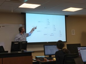
The end of the spring semester always brings presentations of final projects, some of which may have been in the works since the fall or even the summer. Tableau, a software application designed specially for visualization, is a great option for projects that would benefit from interactive charts and maps.

Visualizing survey data, however, can be a bit of a pain. If your project uses Qualtrics, for example, you may be having trouble getting the data ready for visualization and analysis. Qualtrics is an extremely powerful survey tool, but the data it creates can be very complicated, and typical data analysis tools aren’t designed to handle that complexity.

Luckily, here at Duke, Tableau users can use Tableau’s Web Data Connector to pull Quatrics data directly into Tableau! It’s so easy, you may never analyze your Qualtrics data another way again.

Process

Here are the basics. There are also instructions from Qualtrics.

In Qualtrics: Copy your survey URLScreenshot of Tableau URL in Qualtrics

  • Go to your Duke Qualtrics account
  • Click on the survey of interest
  • Click on the Data & Analysis tab at the top
  • Click on the Export & Import button
  • Select Export Data
  • Click on Tableau
  • Copy the URL

In Tableau (Public or Desktop): Paste your survey URL

Tableau Web Data Connection

  • Under Connect, click on Web Data Connector (may be under “More…” for Tableau Public or “To a server… More…” for Tableau Desktop)
  • Paste the survey URL into the web data connector URL box and hit enter/return
  • When a login screen appears, click the tiny “Api Token Login” link, which should be below the green Log in button

In Qualtrics: Create and copy your API token

Generate Qualtrics API Token

  • Go to your Duke Qualtrics account
  • Click on your account icon in the upper-right corner
  • Select Account Settings…
  • On the Account Settings page, click on the Qualtrics IDs tab
  • Under API, check for a token. If you don’t have one yet, click on Generate Token
  • Copy your token

In Tableau (Public or Desktop): Paste your API token

  • Paste in your API token and click the Login button
  • Select the data fields you would like to import

Note: there is an option to “transpose” some of the fields on import. This is useful for many of the types of visualizations you might want to create from survey data. Typically, you want to transpose fields that represent the questions asked in the survey, but you may not want to transpose demographics data or identifiers. See also the Qualtrics tips on transposing data.

Resources

For more tips on how to use Tableau with Qualtrics data, check out the resources below:

Fall 2016 DVS Workshop Series

GenericWorkshops-01Data and Visualization Services is happy to announce its Fall 2016 Workshop Series. Learn new ways of enhancing your research with a wide range of data driven research methods, data tools, and data sources.

Can’t attend a session?  We record and share most of our workshops online.  We are also happy to consult on any of the topics above in person.  We look forward to seeing you in the workshops, in the library, or online!

Data Sources
 
Data Cleaning and Analysis
 
Data Analysis
Introduction to Stata (Two sessions: Sep 21, Oct 18)
 
Mapping and GIS
Introduction to ArcGIS (Two sessions: Sep 14, Oct 13)
ArcGIS Online (Oct 17)
 
Data Visualization

Visualizing Qualitative Data (Oct 19)
Visualizing Basic Survey Data in Tableau – Likert Scales (Nov 10)

Data and Visualization Spring 2016 Workshops

Spring 2016 DVS WorkshopsSPRING 2016: Data and Visualization Workshops 

Interested in getting started in data driven research or exploring a new approach to working with research data?  Data and Visualization Services’ spring workshop series features a range of courses designed to showcase the latest data tools and methods.  Begin working with data in our Basic Data Cleaning/Analysis or the new Structuring Humanities Data  workshop.  Explore data visualization in the Making Data Visual class.  Our wide range of workshops offers a variety of approaches for the meeting the challenges of 21st century data driven research.   Please join us!

Workshop by Theme

DATA SOURCES

DATA CLEANING AND ANALYSIS

DATA ANALYSIS

MAPPING AND GIS

DATA VISUALIZATION

* – For these workshops, no prior experience with data projects is necessary!  These workshops are great introductions to basic data practices.

DVS Fall Workshops

GenericWorkshops-01Data and Visualization Services is happy to announce its Fall 2015 Workshop Series.  With a range of workshops covering basic data skills to data visualization, we have a wide range of courses for different interests and skill levels..  New (and redesigned) workshops include:

  • OpenRefine: Data Mining and Transformations, Text Normalization
  • Historical GIS
  • Advanced Excel for Data Projects
  • Analysis with R
  • Webscraping and Gathering Data from Websites

Workshop descriptions and registration information are available at:

library.duke.edu/data/news


Workshop
 

Date

OpenRefine: Data Mining and Transformations, Text Normalization
Sep 9
Basic Data Cleaning and Analysis for Data Tables
Sep 15
Introduction to ArcGIS
Sep 16
Easy Interactive Charts and Maps with Tableau
Sep 18
Introduction to Stata
Sep 22
Historical GIS
Sep 23
Advanced Excel for Data Projects
Sep 28
Easy Interactive Charts and Maps with Tableau
Sep 29
Analysis with R
Sep 30
ArcGIS Online
Oct 1
Web Scraping and Gathering Data from Websites
Oct 2
Advanced Excel for Data Projects
Oct 6
Basic Data Cleaning and Analysis for Data Tables
Oct 7
Introduction to Stata
Oct 14
Introduction to ArcGIS
Oct 15
OpenRefine: Data Mining and Transformations, Text Normalization
Oct 20
Analysis with R
Oct 20


New Year- New Data and Visualization Lab!

Data and Visualization Services is happy to announce our new Data and Visualization Lab in Duke Libraries new Edge research space.  Located on the first floor of the Bostock Library, the Brandaleone Family Lab for Data and Visualization Services offers a dedicated space for researchers working on data driven projects.

The lab features three distinct areas for supporting data driven research.

Data and Visualization Lab Space

Data and Visualization Lab Computing Zone

Our lab space features twelve high end workstations with dual monitors with the latest software for data visualization, digital mapping, statistics, and qualitative research.  All of the machines have two dedicated displays to encourage collaborative work and data consultations.  Additionally, all twelve machines have a dedicated power port located conveniently under the edge of the table for powering a laptop or usb powered device.

Bloomberg Professional “Bar”

bloom

Since the launch of our Bloomberg terminals, we have seen a steady increase in both individual and team based usage of Bloomberg financial data.  Our three Bloomberg Professional workstations are now located on a dedicated “bar” across from our lab machines.  The  new Bloomberg zone will facilitate collaborate work and provide a base for groups such as the Duke University Investment Club and Duke Financial Economics Center.

Consult and Collaborative SpaceCollaboration Zone

Our third lab space provides a set of four rolling tables for small groups to collaborate or for projects that don’t require a fixed computing space.   An 85″ flat panel display near this zone features data visualizations and other data driven research projects at Duke.

Come See Us!

With ample natural light,  almost 24/7 availability, and a welcoming staff eager to work with you on your next data driven project.  We look forward to working with you in the upcoming year!