Category Archives: event

Duke welcomes artist/illustrator Jennifer McCormick

McCormick_PortraitOn the last day of classes, December 4, the Duke community will have a very special treat: a visit from artist and certified medical illustrator Jennifer McCormick.  Jennifer has been actively exhibiting and speaking about her work for several years, including a recent TEDx talk at Wake Forest University and an exhibit at the Durham Arts Council.

knee_combined
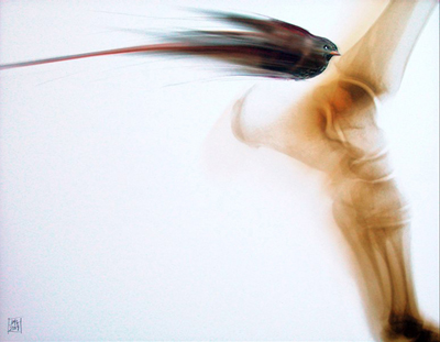
In Jennifer’s work as a medical illustrator, she partners with attorneys to create visualizations that explain complex injuries and medical procedures to jury members.  In her fine art, however, she builds on the histories and x-rays of patients to explore “an opportunity for healing, hope, and acceptance.”  Her unique pieces transform the original clinical imagery of the injury into gorgeous, natural, holistic scenes.  In her artist talks, she speaks of “the power of intention” and “our forgotten superpowers” to raise awareness of the importance of art and spirituality for healing.

McCormick-6WEBJennifer will join us for the final Visualization Friday Forum of the semester.  It will be an opportunity for visualization enthusiasts, clinicians, medical imaging specialists, legal scholars, and those interested in the intersection between health and art to gather together for a presentation and conversation.  The talk will occur in the standard time slot for the Visualization Friday Forum — noon on Friday, December 4 — but the location is changing to accommodate a larger audience.  For one week only, we will meet in Duke Hospital Lecture Hall 2003.

The Visualization Friday Forum is sponsored by the Duke University Libraries (Data and Visualization Services), Duke Information Science + Studies (ISS), and the DiVE group. Jennifer’s visit will also be sponsored by the Trent Center for Bioethics, Humanities & History of Medicine and Duke Law – Academic Technologies.

We are so excited Jennifer has agreed to travel to Duke for a visit.  Please mark your calendars for this event.  If you would like to speak with Jennifer about medical illustrations or the intersection between medicine and spirituality, please contact Angela Zoss.

2015 Student Data Visualization Contest Winners

Our third year of the Duke Student Data Visualization Contest has come and gone, and we had another amazing group of submissions this year.  The 19 visualizations submitted covered a very broad range of subject matter and visualization styles. Especially notable this year was the increase in use of graphic design software like Illustrator, Photoshop, and Inkscape to customize the design of the submissions.  The winners and other submissions to the contest will soon be featured on the Duke Data Visualization Flickr Gallery.

As in the past, the submissions were judged on the basis of five criteria: insightfulness, broad appeal, aesthetics, technical merit, and novelty.  The three winning submissions this year exemplify all of these and tell rich stories about three very different types of research projects. The winners will be honored at a public reception on Friday, April 10, from 2:00 p.m. to 3:00 p.m, in the Brandaleone Lab for Data and Visualization Services (in the Edge).  They will each receive an Amazon gift card, and a poster version of the projects will be displayed in the lab.  We are very grateful to Duke University Libraries and the Sanford School of Public Policy for sponsoring this year’s contest.

First place:

Social Circles of Primary Caregivers / Tina Chen

Presentation2

Second place:

Crystal Structure of Human Proliferating Cell Nuclear Antigen (PCNA) for in silico Drug Screen / Yuqian Shi

DVC

Third place:

Deep and Extensive Impacts to Watershed Shape and Structure from Mountaintop Mining in West Virginia / Matthew Ross

DukeViz_MR

Please join us in celebrating the outstanding work of these students, as well as the closing of the Places & Spaces: Mapping Science exhibit, on April 10 in the Edge.

Visualization Exhibit and Events

2015-01-07 16.32.31

ps_logoThis semester, Duke is proud to host the Places & Spaces: Mapping Science exhibit, visiting from Indiana University.  Places & Spaces is a 10-year effort by Dr. Katy Börner (director of the Cyberinfrastructure for Network Science Center) to bring focus to visualization as a medium of scholarly communication.

20150105_105415The exhibit includes 100 maps from various disciplines and cultures and highlights myriad visualization techniques that have been used to communicate science to a broader public. The maps are divided among three spaces on campus: The Edge (newly opened on the first floor of Bostock Library), Smith Warehouse (on the second floor of Bay 11), and Gross Hall (on the third floor).

KatyBorner_weblrgTo celebrate the opening, Dr. Börner will visit Duke on January 21st and 22nd.  She will give a keynote presentation on Wednesday, January 21, at 4pm, in the Edge.  A reception will follow.

Additional events next week and throughout the semester will celebrate the exhibit and promote ongoing visualization work at Duke.  All events are open to the public!

Upcoming events

Wednesday, January 21

Thursday, January 22

Friday, January 23

More information about the exhibit and related events is available at:
http://sites.duke.edu/scimaps/ and
http://scimaps.org/duke

Please contact Angela Zoss (angela.zoss@duke.edu) with any questions or suggestions.  We hope you can join us in celebrating and enjoying this exhibit!

Enter the 2015 Student Data Visualization Contest

contest_blog-01Calling all Duke undergrad and grad students! Have you worked on a course or research project that included some kind of visualization? Maybe you made a map for a history class paper. Maybe you invented a new type of chart to summarize the results of your experiment. Maybe you played around with an infographic builder just for fun.

Now is the time to start thinking about submitting those visualizations to the Duke Student Data Visualization Contest. It’s easy — just grab a screenshot or export an image of your visualization, write up a short description explaining how you made it, and submit it using our Sakai project site (search for “2015 DataVis Contest”). The deadline is right after finals this fall, so just block in a little extra time at the end of the semester once you’re done with your final assignments and projects.

Not sure what would work as a good submission? Check out our Flickr gallery with examples from the past two years.

Not sure if you’re eligible? If were a Duke student (that is, enrolled in a degree granting program, so no post-docs) any time during 2014, and you did the work while you were a student, you’re golden!

Want to know more about the technical details and submission instructions? Check out the full contest instructions.

Duke welcomes Francesca Samsel, April 17-18

samselOn Thursday, April 17 and Friday, April 18, Duke University will host a visit from Francesca Samsel, a visual artist who uses technology to develop work on the fulcrum between art and science.  Francesca works as Research Assistant Faculty in the Computer Science department of the University of Texas at El Paso, is a Research Affiliate with the Center for Agile Technologies at the University of Texas at Austin, and is also a long-term collaborating partner with Jim Ahrens’ Visualization Research Team at Los Alamos National Labs.

Francesca will give two presentations during her visit.  A presentation on Thursday afternoon for the Media Arts + Sciences Rendezvous series will address the humanities community and present recommendations for work with scientists and visualization teams.  A presentation over lunchtime on Friday for the Visualization Friday Forum will describe a variety of collaborations with scientific teams and address the benefits that can come from incorporating artists into a scientific research team.

Francesca’s visit is sponsored by Information Science + Information Studies (ISIS), with additional support from Media Arts + Sciences.  We hope you can join us for one or both of the presentations!

Creating Mutually-Beneficial Multiple-Outcome Collaborations
Thursday, April 17
4:15 pm (talk starts at 4:30)
Smith Warehouse, Bay 10 classroom (2nd floor – enter through Bays 9 or 11)
Drinks and light snacks provided

Many artists draw on the scientific community as sources for their work. Research community are exploding with rich material connected to our contemporary lives.  Given that art – science collaborations require weeks, realistically months, in a lab, shoulder to shoulder with the scientists, access is a huge barrier.  Francesca Samsel will discuss her history of collaborations with visualization teams and scientists, what worked, what didn’t and how to get in the door.

An Artist, No Thanks! Employing Design and Color Theory to Increase Clarity, Perception and Depth within Scientific Visualization
Friday, April 18, 2014
12:00p.m. to 1:00p.m. (lunch provided)
Levine Science Research Center, Room D106 (near the Research Drive entrance), in conjunction with the Visualization Friday Forum
Live stream

Francesca Samsel will discuss her ongoing work with Los Alamos National Labs, Research Visualization Team and why they hired an artist to help them design the next generation of scientific visualization tools.  Their recent work focuses on developing algorithmically generated color maps to extract the maximum perceivable detail within exa-scale data sets. She will also discuss collaborations with the Visualization Division of the Texas Advanced Computing Center; hydrogeologists, neurologists, environmental research teams and more.

2_11BlGr2 copy

2014 Student Data Visualization Contest Winners

contest-reception-blog-01The second annual Duke Student Data Visualization Contest brought in another round of beautiful and insightful submissions from students across the university.  The judging panel of five members of the Duke community evaluated the submission based on insightfulness, broad appeal, aesthetics, technical merit, and novelty.  This year, the panel awarded a first place, second place, and two third place awards.

Each of these winners will be honored at a reception on Friday, April 4, from 2:00 p.m. to 4:00 p.m, in the Brandaleone Center for Data and GIS Services (Perkins 226).  They will each receive a poster version of their projects and an Amazon gift card.  The winners and other submissions to the contest will soon be featured on the Duke Data Visualization Flickr Gallery.

First place:

TrafficNetwork
US Passenger Traffic: Connectivity and Regional Integration, by S. Joshua Mendelsohn

Second place:

SennettDataVis
Mapping the 1968 Protest of the Venice Biennale, by Phia Sennett

Third place (tie):

Emily McLean - Relatedness between social groups of female baboons
Relatedness Between Social Groups of Female Baboons, by Emily McLean

Third place (tie):

Image_File_DATAVIS 2014
3D Visualization of Prostate Cancer in MRI and ARFI Imaging, by Tyler Glass

Please join us on the 4th to celebrate another year of exciting visualization work at Duke!

Announcing the 2014 Student Data Visualization Contest

Student Data Visualization ContestData & GIS Services will soon be accepting submissions to its 2nd annual student data visualization contest.  If you have a course project that involves visualization, start thinking about your submission now!

The purpose of the contest is to highlight outstanding student data visualization work at Duke University. Data & GIS Services wants to give you a chance to showcase the hard work that goes into your visualization projects.

Data visualization here is broadly defined, encompassing everything from charts and graphs to 3D models to maps to data art.  Data visualizations may be part of a larger research project or may be developed specifically to communicate a trend or phenomenon. Some are static images, while others may be animated simulations or interactive web experiences.  Browse through last year’s submissions to get an idea of the range of work that counts as visualization.

The Student Data Visualization Contest is sponsored by Data & GIS Services, Perkins Library, Scalable Computing Support Center, Office of Information Technology, and the Office of the Vice Provost for Research.

For more details, see the 2014 Student Data Visualization Contest page.   Please address all additional questions to Angela Zoss (angela.zoss@duke.edu), Data Visualization Coordinator, 226 Perkins Library.

Dr. Christopher Healey to Present at Visualization Friday Forum

Dr. Christopher G. HealeyOn Friday, October 4, Dr. Christopher G. Healey will visit Duke University to speak at the Visualization Friday Forum.

Christopher G. Healey is an Associate Professor in the Department of Computer Science at North Carolina State University. He received a B.Math from the University of Waterloo in Waterloo, Canada, and an M.Sc. and Ph.D. from the University of British Columbia in Vancouver, Canada. He is an Associate Editor for ACM Transactions on Applied Perception. His research interests include visualization, graphics, visual perception, and areas of applied mathematics, databases, artificial intelligence, and aesthetics related to visual analysis and data management.

We hope you can join us at the Friday Forum!

Visualizing Tweet Sentiment
Friday, October 4, 2013
12:00p.m. to 1:00p.m. (lunch provided)

Levine Science Research Center, Room D106 (near the Research Drive entrance), in conjunction with the Visualization Friday Forum

During this talk I will discuss a new project that focuses on ways to visualize text, specifically short text snippets like those found in tweets, SMS text messages, or Facebook wall posts. Our visualizations present text collections using a combination of numerous approaches: sentiment analysis, topic clusters, tag clouds, affinity graphs, volume timelines, and sentiment heatmaps. A second aspect of this project involves web-based visualization. We are implementing our visualization tools in Javascript, HTML, and CSS, allowing us to distribute our visualizations through any modern web browser, without the need for plug-ins. This also offers an opportunity to assess the strengths and limitations of current web-based visualization and user
interface libraries.

We chose Twitter as a testbed for our techniques. Twitter’s publicly accessible APIs allow us to query collections of recent tweets for user-chosen keywords, or to tap into the real-time tweet stream—the “firehose”—to capture tweets by keyword as they are posted. To assess the practical usefulness and usability of our visualizations, we partnered with WRAL TV, the CBS/Fox network affiliate for the Raleigh, North Carolina broadcast region. WRAL ran our Twitter visualizations on their web site during the each of the recent U.S. Presidential debates. This allowed viewers to watch the debate, and at the same time to monitor the volume, sentiment, and content of tweets about the debate as they were posted in real-time. WRAL reporters used a modified version of the visualization tool to perform post-analysis of the captured tweet stream. Interesting findings were included in news stories they published following the debates.

Upcoming MATLAB Training at Duke

MATLAB is an integrated technical computing environment that combines numeric computation, advanced graphics and visualization, and a high-level programming language.  Duke’s license agreement offers MATLAB licenses to faculty and staff for work or personal computers, as well as students through on-campus use.  The Duke Office of Information Technology (OIT) maintains instructions on installing MATLAB at Duke.  MATLAB is used by many communities at Duke, including Engineering, Econometrics, Medical Sciences, Computational Biology, and Business.

On Tuesday, June 18, OIT in partnership with Duke University Libraries will host a one-day course on MATLAB that focuses on using this software for Data Processing and Visualization.  The course will cover importing data, organizing data, and visualizing data in a hands-on format (detailed outline).  Seats are limited to 20; please register soon to reserve your spot.

MATLAB for Data Processing and Visualization
(outline)
Laura Proctor, Academic Training Engineer at MathWorks
Tuesday, June 18
8:30 a.m. to 4:30 p.m. (lunch break from 12:00 p.m. to 1:00 p.m., lunch not provided)
Library Computer Classroom, Bostock 023
Registration (seats limited to 20)

The course assumes some existing familiarity with MATLAB.  New potential MATLAB users may want to attend an overview seminar on the software that will be held on Thursday, May 30.  This overview will not be hands on, but it will include live demonstrations and examples of both MATLAB and Simulink, an environment for multi-domain simulation and model-based design.

Introduction to Data Analysis and Visualization with MATLAB & Simulink
(details and registration)
Mehernaz Savai, Applications Engineer at MathWorks
Thursday, May 30
1:00 p.m. to 4:00 p.m.
FCIEMAS Building, Schiciano Auditorium – side A

If you would like to begin learning to use MATLAB, MathWorks offers a self-directed MATLAB Fundamentals course, and the Duke library collection also includes several introductory MATLAB texts, such as MATLAB Primer and MATLAB: A Practical Approach.

Duke welcomes Dr. Christopher Collins, April 4-5

Dr. Christopher CollinsOn Thursday, April 4 and Friday, April 5, Duke University will host a visit from Dr. Christopher Collins, Assistant Professor of Computer Science at the University of Ontario Institute of Technology (UOIT), where he directs The Visualization for Information Analysis lab (vialab). While at Duke, Dr. Collins will give two public presentations and will be available for meetings with groups and individuals. His visit is sponsored by Information Science + Information Studies (ISIS).

Dr. Collins engages in interdisciplinary research, combining information visualization and human-computer interaction with natural language processing to address the challenges of information management and the problems of information overload. His publications, including the DocuBurst document content visualization system, have helped to open a new and thriving area of research in “Linguistic Visualization”. Dr. Collins has been awarded a Discovery Grant from NSERC, providing 5 years of funding for research on “Text and Multimedia Document Visualization”. His research interests include: visualization of natural language data, interaction techniques for information visualization (including multi-touch interaction), scientific visual analytics, and social implications of computing / ethics & philosophy of computing.

Dr. Collins will give the following public presentations:

Humanizing Data:
Enabling Linguistic Insight with Information Visualization

Thursday, April 4, 2013
12:00p.m. to 1:00p.m. (lunch provided)
Smith Warehouse, Bay 4, in the FHI Garage

While linguistic skill is a hallmark of humanity, the increasing volume of linguistic data each of us faces is causing individual and societal problems – ‘information overload’ is a commonly discussed condition. Big data has enabled new tasks, such as finding the most appropriate information online, engaging in historical study using language data on the level of millions of documents, and tracking trends in sentiment and opinion in real time. These tasks need not cause stress and feelings of overload: the human intellectual capacity is not the problem. Rather, the current technological supports are inappropriate for these tasks. Linguistic information overload is not a new phenomenon: throughout history, the pace of information creation and storage has exceeded the pace of development of management strategies.

Drawing on a variety of qualitative and quantitative methods, my research aims to bring new, richly interactive interfaces to the forefront of information management, in order to keep up with the current challenges of ‘big data’ and the growing power of linguistic computing algorithms. In this talk I will present the results of several design studies spanning investigations of patterns in millions of real passwords to using visualization to analyze the written history of the court system. Each project aims to bridge what I call the ‘linguistic visualization divide’ – the practical disconnect between the sophistication of natural language processing and the power of interactive visualization. In conclusion, I will present some general challenges and opportunities for the future of text and language visualization.

Designing Multiple Relation Visualizations:
Case Studies from Text Analytics

Friday, April 5, 2013
12:00p.m. to 1:00p.m. (lunch provided)
Levine Science Research Center, Room D106 (near the Research Drive entrance), in conjunction with the Visualization Friday Forum

Datasets often have both explicit relations (e.g. citations between papers in a data set, links in a parse tree), and implicit relations (e.g. papers by the same author, words that start with the same letter). Drawing on grounding research into the real-world problems faced by computational linguists, in this talk I will explore several examples of visualizations designed to support simultaneous exploration of both explicit and implicit relations in data. I will suggest the concept of ‘spatial rights’ – the primacy of the spatial visual encoding, and present several methods for enhancing visualizations through adding implicit relation information without disrupting the spatialization of the explicit relation. The techniques have been generalized by others beyond the linguistic domain to be used in bioinformatics, finance, and general statistical charts.

There are also blocks of time in his schedule available for individual and group meetings. If you would like to meet with Dr. Collins, please contact Angela Zoss (angela.zoss@duke.edu) or Eric Monson (emonson@cs.duke.edu).

Select Research Projects