McCall Pitcher joined CDVS at the end of October 2024 and is delighted to start her first full semester supporting Duke students, faculty, and staff as they create effective data visualizations. McCall comes to Duke from George Washington University, where she spent two years teaching data visualization to graduate students in the Trachtenberg School of Public Policy and Public Administration. Her course equipped students with core theoretical approaches around graphical communication, data storytelling principles, and foundational R programming techniques to clean and visualize data.
McCall brings nearly five years of experience from American Institutes for Research, where she built many data visualizations and diagrams for clients including the U.S. Department of Education’s National Center for Education Statistics and the Bill & Melinda Gates Foundation. She has also worked as a data visualization contractor for researchers and professors at the University of Maryland and the Aspen Economic Strategy Group.
Passionate about making graphics clean and clear, McCall looks forward to consulting and instructing in a way that prioritizes both aesthetic and story. In her short time in this role, McCall has already been blown away by the Duke community’s talent and subject matter expertise — she can’t wait to continue helping all these brilliant minds visually communicate their exciting findings and ideas.
As part of the university’s historic centennial celebration, we are excited to announce the Research Data Visualization Competition & Showcase, where creativity and data meet to mark 100 years of academic excellence and innovation.
We invite the Duke University research community to submit data visualizations that interpret or touch on the theme of “Through Time.” Whether you are studying human history, molecular evolution, or the flow of water through a tributary, we invite you to share your data storytelling skills. This competition is an opportunity to both celebrate our rich history and envision our promising future.
Submission Deadline: January 8th, 5pm
Don’t miss this chance to be a part of our centennial celebration and make your mark on history!
Besides his emphasis on clear communication of results, one of the things I admire most about Schwabish is his focus on Microsoft Excel as a legitimate tool for crafting that communication. While not free and open-source, it’s a piece of software that many people have access to, and despite some of its limitations (e.g. reproducibility issues), it is a very capable tool for data processing and visualization. If you want to make lots of people better communicators, teach them how to use the tools they already have!
Of course, visit policyviz.com and the PolicyViz YouTube channel to access the plethora of resources Jon is constantly generating, but to get you started I want to point out a few of my favorites.
I get frustrated that Excel doesn’t have a built-in, easy way to make horizontal dot plots with error bars. (On the med-side they tend to call these Forest plots, although they are useful whenever you have categories and a quantity with confidence intervals. Don’t just create a table – make it visual with a plot!) Jon’s Labeling Dot Plots blog post and accompanying YouTube video was super useful – it taught me a general approach for using scatterplots in Excel to create a variety of chart types that Excel doesn’t support natively! The method is a pain the first time you do it, and I get a bit belligerent because I hate that you have to employ this workaround, but it’s so brilliant and flexible that I’m tempted to teach a CDVS workshop on just this one chart type. More broadly, he also has an Excel Tutorials section of his YouTube channel, and he sells a PDF on his website called A Step-by-Step Guide to Advanced Data Visualization in Excel 2016.One of the best ways to become a better visualizer and communicator is to get feedback on your work and iterate through multiple drafts. To compliment that, it’s wonderful to get an expert’s take on a published visualization, along with proposed alternatives. For years Jon has been publishing brillant visualization redesigns on his blog. He doesn’t just criticize – he shows you alternatives and talks about their strengths and weaknesses. There is also a DataViz Critiques section on his YouTube channel.
In early 2021 he released over 50 daily videos in a series called One Chart at a Time where visualization experts “expand your graphic literacy” and “help you learn about more than just the standard bar, line, and pie chart.”
Along with Alice Feng, Schwabish published in 2021 the “Do No Harm Guide: Applying Equity Awareness in Data Visualization”. You can download the report at urban.org and listen to a talk they gave about it on YouTube to get their reflections on “how data practitioners can approach their work through a lens of diversity, equity, and inclusion … to encourage thoughtfulness in how analysts work with and present their data.”
Finally, people are always asking me what books they should read to get better at visualization. Take a look at Schwabish’s books, along with his lists of recommended DataViz books and Presentation books!
As we begin the new year, the Center of Data and Visualization Sciences is happy to announce a series of twenty-one data workshops designed to empower you to reach your goals in 2022. With a focus on data management, data visualization, and data science, we hope to provide a diverse set of approaches that can save time, increase the impact of your research, and further your career goals.
While the pandemic has shifted most of our data workshops online, we remain keenly interested in offering workshops that reflect the needs and preferences of the Duke research community. In November, we surveyed our 2021 workshop participants to understand how we can better serve our attendees this spring. We’d like to thank those who participated in our brief email survey and share a few of our observations based on the response that we received.
Workshops Formats
While some of our workshops participants (11%) prefer in-person workshops and others (24%) expressed a preference for hybrid workshops, a little over half of the survey respondents (52%) expressed a preference for live zoom workshops. Our goal for the spring is to continue offering “live” zoom sessions while continuing to explore possibilities for increasing the number of hybrid and in-person options. We hope to reevaluate our workshops communities preferences later this year and will continue to adjust formats as appropriate.
52% of respondents prefer online instruction, while another 24% would like to hybrid options
Participant Expectations
With the rapid shift to online content in the last two years coupled with a growing body of online training materials, we are particularly interested in how our workshop attendees evaluate online courses and their expectations for these courses. More specifically, we were curious about whether registering for an online session includes more than simply the expectation of attending the online workshop.
While we are delighted to learn that the majority of our respondents (87%) intend to attend the workshop (our turnout rate has traditionally been about 50%), we learned that a growing number of participants had other expectations (note: for this question, participants could choose more than one response). Roughly sixty-seven percent of the sample indicated they expected to have a recording of the session available. While another sixty-six percent indicated that they expected a copy of the workshop materials (slides, data, code) even if they were unable to attend.
As a result of our survey, CDVS will make an increasing amount of our content available online this spring.. In 2021, we launched a new webpage designed to showcase our learning materials. In addition to our online learning site, CDVS maintains a github site (CDVS) as well as site focused on R learning materials (Rfun).
We appreciate your feedback on the data workshops and look forward to working with you in the upcoming year!
One of the attractive features of Tableau for visualization is that it can produce maps in addition to standard charts and graphs. While Tableau is far from being a full-fledged GIS application, it continues to expand its mapping capabilities, making it a useful option to show where something is located or to show how indicators are spatially distributed.
Here, we’re going to go over a few of the Tableau’s mapping capabilities. We’ve recorded a workshop with examples relating to this blog post’s discussion:
Tableau is a visualization tool: Tableau can quickly and effectively visualize your data, but it will not do specialized statistical or spatial analysis.
Tableau makes it easy to import data: A big advantage of Tableau is the simplicity of tasks such as changing variable definitions between numeric, string, and date, or filtering out unneeded columns. You can easily do this at the time you connect to the data (“connect” is Tableau’s term for importing data into the program).
Tableau is quite limited for displaying multiple data layers: Tableau wants to display one layer, so you need to use join techniques to connect multiple tables or layers together. You can join data tables based on common attribute values, but to overlay two geographic layers (stack them), you must spatially join one layer to one other layer based on their common location.
Tableau uses a concept that it calls a “dual-axis” map to allow two indicators to display on the same map or to overlay two spatial layers. If, however, you do need to overlay a lot of data on the same map, consider using proper GIS software.
Overlay spatial files using dual-axis maps
Displaying paths on a map requires a special data structure: In order for tabular data with coordinate values (latitude/longitude) to display as lines on a map, you need to include a field that indicates drawing order. Tableau constructs the lines like connect-the-dots, each row of data being a dot, and the drawing order indicating how the dots are connected.
Using drawing order to create lines from points
You might use this, for instance, with hurricane tracking data, each row representing measurements and location collected sequentially at different times. The illustration above shows Paris metro lines with the station symbol diameter indicating passenger volume. See how to do this in Tableau’s tutorial.
You can take advantage of Tableau’s built-in geographies: Tableau has many built-in geographies (e.g., counties, states, countries), making it easy to plot tabular data that has an attribute with values for these geographic locations, even if you don’t have latitude/longitude coordinates or geographic files — Tableau will look up the places for you! (It won’t, however, look up addresses.)
Tableau also has several built-in base maps available for your background.
Tableau uses the “Web Mercator” projection: This is the same as Google Earth/Maps. Small-scale maps (i.e., large area of coverage) may look stretched out in an unattractive way since it greatly exaggerates the size of areas near the poles.
Useful Mapping Capabilities
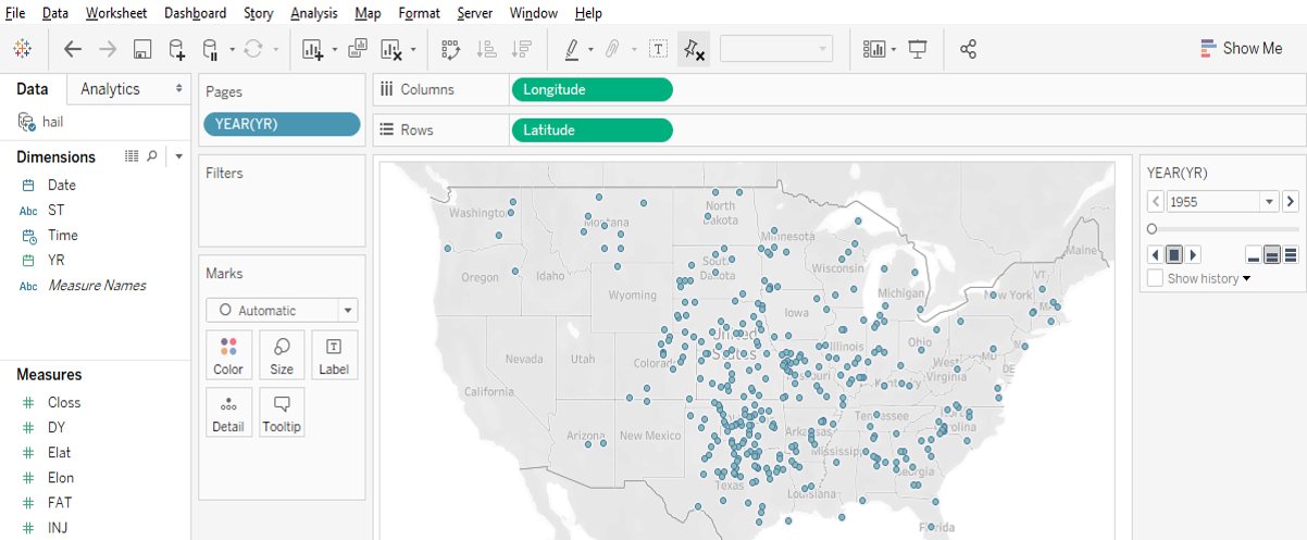
Plot points: Tableau works really well for plotting coordinate data (Longitude (X) and Latitude (Y) values) as points. The coordinates must have values in decimal degrees with negative longitudes being east of Greenwich and negative latitudes being south of the equator.
Point data with time slider
Time slider: If you move a categorical “Dimension” variable onto Tableau’s Pages Card, you can get a value-based slider to filter your data by that variable’s values (date, for instance, as in Google Earth). This is shown in the image above.
Heatmap of point distribution: You can choose Tableau’s “Density” option on its Marks card to create a heatmap, which may display the concentration of your data locations in a smoother manner.
Filter a map’s features: Tableau’s Filter card is akin to ArcGIS’s Definition Query, to allow you to look at just a subset of the features in a data table.
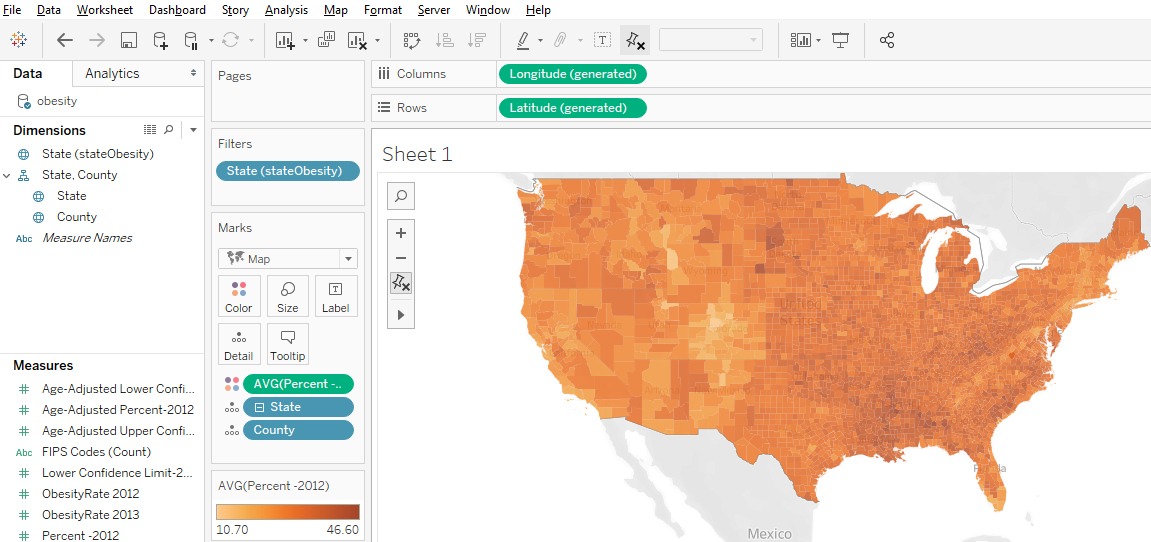
Shade polygons to reflect attribute values: Choropleth maps (polygons shaded to represent values of a variable) are easy to make in Tableau. Generally, you’ll have a field with values that match a built-in geography, like countries of the world or US counties. But you can also connect to spatial files (e.g., Esri shapefiles or GeoJSON files), which is especially helpful if the geography isn’t built into Tableau (US Census Tracts are an example).
Filled map using color to indicate values
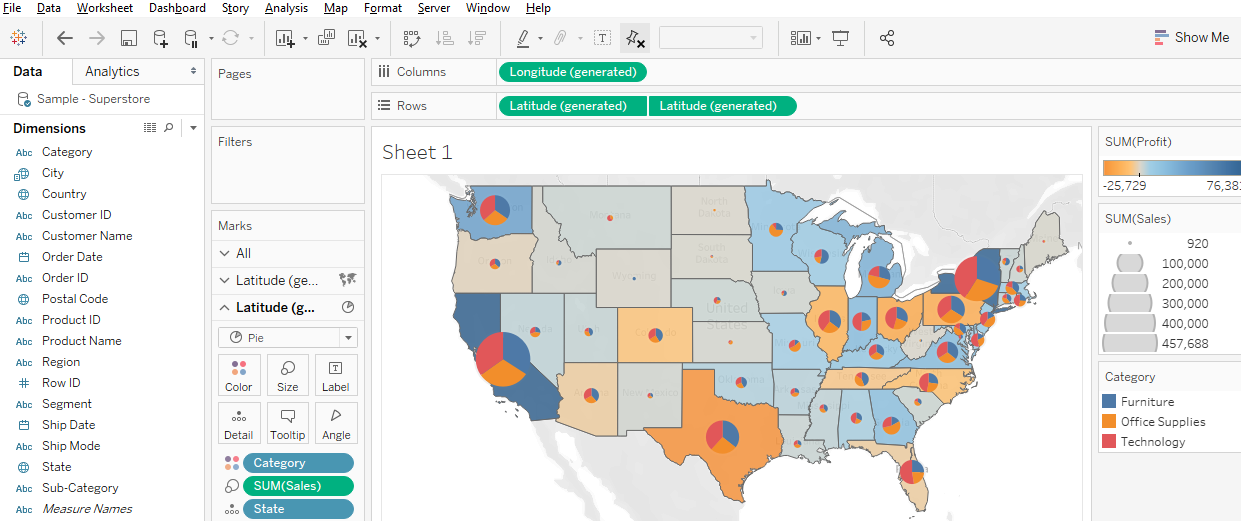
Display multiple indicators: Visualizing two variables on the same map is always problematic because the data patterns often get hidden in the confusion, but it is possible in Tableau. Use the “dual-axis” map concept mentioned above. An example might be pies for one categorical variable (with slices representing the categories) on top of choropleth polygons that visualize a continuous numeric variable.
Two variables using filled polygons and pies
Draw lines from tabular data: Tableau can display lines if your data is structured right, as discussed and illustrated previously, with a field for drawing order. You could also connect to a spatial line file, such as a shapefile or a GeoJSON file.
Help Resources
We’ve just given an overview of some of Tableau’s capabilities regarding spatial data. The developers are adding features in this area all the time, so stay tuned!
Interested in attending the 2020 RStudio Conference, but unable to travel to San Francisco? With the generous support of RStudio and the Department of Statistical Science, Duke Libraries will host a livestream of the annual RStudio conference starting on Wednesday, January 29th at 11AM. See the latest in machine learning, data science, data visualization, and R. Registration links and information about sessions follow. Registration is required for the first session and keynote presentations. Please see the links in the agenda that follows.
Education Track (registration is not required) Meet you where you R – Lauren Chadwick, R Studio.
Data Science Education in 2022 (Karl Howe and Greg Wilson, R Studio)
Data science education as an economic and public health intervention in East Baltimore (Jeff Leek, Johns Hopkins)
Of Teacups, Giraffes, & R Markdown (Desiree Deleon, Emory)
Location: Edge Workshop Room – Bostock 127
5:15 – 6:45
All About Shiny (registration is not required)
Production-grade Shiny Apps with golem (Colin Fay, ThinkR)
Making the Shiny Contest (Duke’s own Mine Cetinkaya-Rundel)
Styling Shiny Apps with Sass and Bootstrap 4(Joe Cheng, RStudio)
Reproducible Shiny Apps with shinymeta (Carson Stewart, RStudio)
7:00 – 8:30
Learning and Using R (registration is not required)
Learning and using R: Flipbooks (Evangeline Reynolds, U Denver)
Learning R with Humorous Side Projects (Ryan Timpe, Lego Group)
Toward a grammar of psychological Experiments (Danielle, Navaro, University of New South Wales)
R for Graphical Clinical Trial Reporting(Frank Harrell, Vanderbilt)
Data Visualization Track (registration is not required) The Glamour of Graphics (William Chase, University of Pennsylvania)
3D ggplots with rayshader (Dr. Tyler Morgan-Wall, Institute for Defense Analyses)
Designing Effective Visualizations (Miriah Meyer, University of Utah)
Tidyverse 2019-2020 (Hadley Wickham, RStudio)
3:00 – 4:00
Livestream of Rstudio Conference Sessions (registration is not required)
4:00 – 5:30
Data Visualization Track 2 (registration is not required)
Spruce up your ggplot2 visualizations with formatted text (Claus Wilke, UT Austin)
The little package that could: taking visualizations to the next level with the scales package (Dana Seidel, Plenty Unlimited)
Extending your ability to extend ggplot2 (Thomas Lin Pedersen, RStudio)
5:45 – 6:30
Career Advice for Data Scientists Panel Discussion (registration is not required)
Felipe Álvarez de Toledo López-Herrera is a Ph.D. candidate at the Art, Art History, and Visual Studies Department at Duke University and a Digital Humanities Graduate Assistant for Humanities Unbounded, 2019-2020. Contact him at askdata@duke.edu.
Over the 2019-2020 academic year, I am serving as a Humanities Unbounded graduate assistant in Duke Libraries’ Center for Data and Visualization Sciences. As one of the three Humanities Unbounded graduate assistants, I will partner on Humanities Unbounded projects and focus on developing skills that are broadly applicable to support humanities projects at Duke. In this blog post, I would like to introduce myself and give readers a sense of my skills and interests. If you think my profile could address some of the needs of your group, please reach out to me through the email above!
My own dissertation project began with a data dilemma. 400 years ago, paintings were shipped across the Atlantic by the thousands. They were sent by painters and dealers in places like Antwerp or Seville, for sale in the Spanish colonies. But most of these paintings were not made to last. Cheap supports and shifting fashions guaranteed a constant renewal of demand, and thus more work for painters, in a sort of proto-industrial planned obsolescence.[1]As a consequence, the canvas, the traditional data point of art history, was not a viable starting point for my own research, rendering powerless many of the tools that art history has developed for studying painting. I was interested in examining the market for paintings as it developed in Seville, Spain from 1500-1700; it was a major productive center which held the idiosyncratic role of controlling all trade to the Spanish colonies for more than 200 years. But what could I do when most of the work produced within it no longer exists?
This problem drives my research here at Duke, where I apply an interdisciplinary, data-driven approach. My own background is the product of two fields: I obtained a bachelor’s degree in Economics in my hometown of Barcelona, Spain in 2015 from the Universitat Pompeu Fabra, and simultaneously attended art history classes in the University of Barcelona. This combination found a natural mid-way point in the study of art markets. I came to Duke to be a part of DALMI, the Duke, Art, Law and Markets Initiative, led by Professor Hans J. Van Miegroet, where I was introduced to the methodologies of data-driven art historical research.
Documents in Seville’s archives reveal a stunning diversity of production that encompasses the religious art for which the city is known, but also includes still lives, landscapes and genre scenes whose importance has been understated and of which few examples remain [Figures 1 & 2]. But analysis of individual documents, or small groups of them, yields limited information. Aggregation, with an awareness of the biases and limitations in the existing corpus of documents, seems to me a way to open up alternative avenues for research. I am creating a database of painters in the city of Seville from 1500-1699, where I pool known archival documentation relating to painters and painting in this city and extract biographical, spatial and productive data to analyze the industry. I explore issues such as the industry’s size and productive capacity, its organization within the city, reactions to historical change and, of course, its participation in transatlantic trade.
This approach has obliged me to become familiar with a wide range of digital tools. I use OpenRefine for cleaning data, R and Stata for statistical analysis, Tableau for creating visualizations and ArcGIS for visualizing and generating spatial data (see examples of my own work below [Figures 3-4]). I have also learned the theory behind relational databases and am learning to use MySQL for my own project; similarly, for the data-gathering process I am interested in learning data-mining techniques through machine learning. I have been using a user-friendly software called RapidMiner to simplify some of my own data gathering.
A rare example of a Sevillian landscape. Ignacio de Iriarte, Landscape with Shepherds (1665)
Another example of Sevillian genre production. Francisco de Zurbarán, Still Life with Lemons, Oranges and a Rose (1633)
Map of painter addresses, 1676. Size represents the number of apprentices they held in that year.
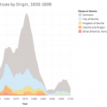
Number of apprentices in Seville by place of origin, 1650-1699. Based on documents in Duncan T. Kinkead, Pintores y Doradores en Sevilla, 1650-1699: Documentos (2007).
Thus, I am happy to help any groups that have a data set and want to learn how to visualize it graphically, whether through graphs, charts or maps. I am also happy to help groups think about their data gathering and storage. I like to consider data in the broadest terms: almost anything can be data, if we correctly conceptualize how to gather and utilize it realistically within the limits of a project. I would like to point out that this does not necessarily need to result in visualization; this is also applicable if a group has a corpus of documents that they want to store digitally. If any groups have an interest in text mining and relational databases, we can learn simultaneously—I am very interested in developing these skills myself because they apply to my own project.
I can:
Help you consider potential data sources and the best way to extract the information they contain
Help you make them usable: teach you to structure, store and clean your data
And of course, help you analyze and visualize them
With Tableau: for graphs and infographics that can be interactive and can easily be embedded into dashboards on websites.
With ArcGIS: for maps that can also be interactive and embedded onto websites or in their Stories function.
Help you plan your project through these steps, from gathering to visualization.
Once again, if you think any of these areas are useful to you and your project, please do not hesitate to contact me. I look forward to collaborating with you!
As data driven research has grown at Duke, Data and Visualization Services receives an increasing number of requests for partnerships, instruction, and consultations. These requests have deepened our relationships with researchers across campus such that we now regularly interact with researchers in all of Duke’s schools, disciplines, and interdepartmental initiatives.
In order to expand the Libraries commitment to partnering with researchers on data driven research at Duke, Duke University Libraries is elevating the Data and Visualization Services department to the Center for Data and Visualization Sciences (CDVS). The change is designed to enable the new Center to:
Expand partnerships for research and teaching
Augment the ability of the department to partner on grant, development, and funding opportunities
Develop new opportunities for research, teaching, and collections – especially in the areas of data science, data visualization, and GIS/mapping research
Recognize the breadth and demand for the Libraries expertise in data driven research support
Enhance the role of CDVS activities within Bostock Libraries’ Edge Research Commons
We believe that the new Center for Data and Visualization Sciences will enable us to partner with an increasingly large and diverse range of data research interests at Duke and beyond through funded projects and co-curricular initiatives at Duke. We look forward to working with you on your next data driven project!
Over the last six years, Data and Visualization Services (DVS) has expanded support for data visualization in the Duke community under the expert guidance of Angela Zoss. In this period, Angela developed Duke University Libraries’ visualization program through a combination of thoughtful consultations, training, and events that expanded the community of data visualization practice at Duke while simultaneously increasing the impact of Duke research.
As of May 1st, Duke Libraries is happy to announce that Angela will expand her role in promoting data visualization in the Duke community by transitioning to a new position in the library’s Assessment and User Experience department. In her new role, Angela will support a larger effort in Duke Libraries to increase data-driven decision making. In Data and Visualization Services, Eric Monson will take the lead on research consultation and training for data visualization in the Duke community. Eric, who has been a data visualization analyst with DVS since 2015 and has a long history of supporting data visualization at Duke, will serve as DVS’ primary contact for data visualization.
DVS wishes Angela success in her new position. We look forward to continuing to work with the Duke community to expand data visualization research on campus.
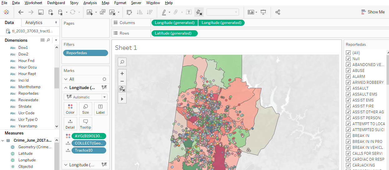
The end of the spring semester always brings presentations of final projects, some of which may have been in the works since the fall or even the summer. Tableau, a software application designed specially for visualization, is a great option for projects that would benefit from interactive charts and maps.
Visualizing survey data, however, can be a bit of a pain. If your project uses Qualtrics, for example, you may be having trouble getting the data ready for visualization and analysis. Qualtrics is an extremely powerful survey tool, but the data it creates can be very complicated, and typical data analysis tools aren’t designed to handle that complexity.
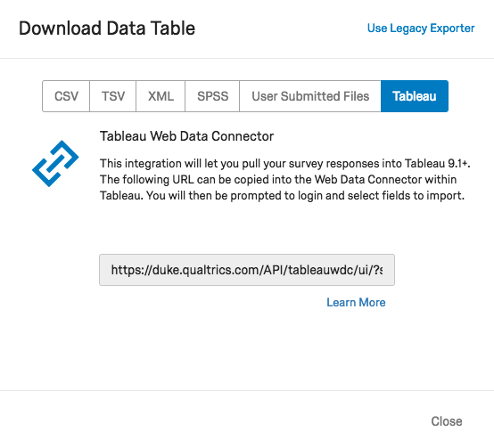
Luckily, here at Duke, Tableau users can use Tableau’s Web Data Connector to pull Quatrics data directly into Tableau! It’s so easy, you may never analyze your Qualtrics data another way again.
Click on your account icon in the upper-right corner
Select Account Settings…
On the Account Settings page, click on the Qualtrics IDs tab
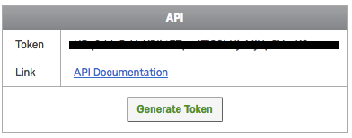
Under API, check for a token. If you don’t have one yet, click on Generate Token
Copy your token
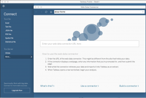
In Tableau (Public or Desktop): Paste your API token
Paste in your API token and click the Login button
Select the data fields you would like to import
Note: there is an option to “transpose” some of the fields on import. This is useful for many of the types of visualizations you might want to create from survey data. Typically, you want to transpose fields that represent the questions asked in the survey, but you may not want to transpose demographics data or identifiers. See also the Qualtrics tips on transposing data.
Resources
For more tips on how to use Tableau with Qualtrics data, check out the resources below:

 McCall Pitcher joined CDVS at the end of October 2024 and is delighted to start her first full semester supporting Duke students, faculty, and staff as they create effective data visualizations. McCall comes to Duke from George Washington University, where she spent two years teaching data visualization to graduate students in the Trachtenberg School of Public Policy and Public Administration. Her course equipped students with core theoretical approaches around graphical communication, data storytelling principles, and foundational R programming techniques to clean and visualize data.
 Passionate about making graphics clean and clear, McCall looks forward to consulting and instructing in a way that prioritizes both aesthetic and story. In her short time in this role, McCall has already been blown away by the Duke community’s talent and subject matter expertise — she can’t wait to continue helping all these brilliant minds visually communicate their exciting findings and ideas.


 The end of the spring semester always brings presentations of final projects, some of which may have been in the works since the fall or even the summer.