All posts by Angela Zoss

Using Tableau with Qualtrics data at Duke

Logos for Qualtrics and TableauThe end of the spring semester always brings presentations of final projects, some of which may have been in the works since the fall or even the summer. Tableau, a software application designed specially for visualization, is a great option for projects that would benefit from interactive charts and maps.

Visualizing survey data, however, can be a bit of a pain. If your project uses Qualtrics, for example, you may be having trouble getting the data ready for visualization and analysis. Qualtrics is an extremely powerful survey tool, but the data it creates can be very complicated, and typical data analysis tools aren’t designed to handle that complexity.

Luckily, here at Duke, Tableau users can use Tableau’s Web Data Connector to pull Quatrics data directly into Tableau! It’s so easy, you may never analyze your Qualtrics data another way again.

Process

Here are the basics. There are also instructions from Qualtrics.

In Qualtrics: Copy your survey URLScreenshot of Tableau URL in Qualtrics

  • Go to your Duke Qualtrics account
  • Click on the survey of interest
  • Click on the Data & Analysis tab at the top
  • Click on the Export & Import button
  • Select Export Data
  • Click on Tableau
  • Copy the URL

In Tableau (Public or Desktop): Paste your survey URL

Tableau Web Data Connection

  • Under Connect, click on Web Data Connector (may be under “More…” for Tableau Public or “To a server… More…” for Tableau Desktop)
  • Paste the survey URL into the web data connector URL box and hit enter/return
  • When a login screen appears, click the tiny “Api Token Login” link, which should be below the green Log in button

In Qualtrics: Create and copy your API token

Generate Qualtrics API Token

  • Go to your Duke Qualtrics account
  • Click on your account icon in the upper-right corner
  • Select Account Settings…
  • On the Account Settings page, click on the Qualtrics IDs tab
  • Under API, check for a token. If you don’t have one yet, click on Generate Token
  • Copy your token

In Tableau (Public or Desktop): Paste your API token

  • Paste in your API token and click the Login button
  • Select the data fields you would like to import

Note: there is an option to “transpose” some of the fields on import. This is useful for many of the types of visualizations you might want to create from survey data. Typically, you want to transpose fields that represent the questions asked in the survey, but you may not want to transpose demographics data or identifiers. See also the Qualtrics tips on transposing data.

Resources

For more tips on how to use Tableau with Qualtrics data, check out the resources below:

2016 Student Data Visualization Contest Winners

Thanks to an earlier fall deadline, we are already ready to announce the winners of our fourth year of the Duke Student Data Visualization Contest.  The 14 visualizations submitted highlighted some very exciting visualization work being done by students of all ages here at Duke. The winners and other submissions to the contest will soon be featured on the Duke Data Visualization Flickr Gallery.

As in the past, the submissions were judged on the basis of five criteria: insightfulness, broad appeal, aesthetics, technical merit, and novelty.  The three winning submissions this year exemplify all of these and tell rich stories about three very different types of research projects. The winning submissions will be converted to larger poster versions and hung in the Brandaleone Lab for Data and Visualization Services (in the Edge).  Be on the look out later this semester for a reception to celebrate their hard work!  The winners will also receive Amazon gift cards.  We are very grateful to Duke University Libraries for their continuing support of the contest.

First place:

Global Flows of Agriculture and Forestry Feedstocks
Brandon Morrison, Ph.D. Candidate (Division of Earth & Ocean Sciences, NSOE)

2016 Data Visualization Contest-Morrison&Golden

Second place:

Feature Interpretations from Ground Penetrating Radar at Vulci, Italy
Katherine McCusker, Ph.D. Student (Art History)

McCusker_DataVisualization_Vulci_sm

Third place:

Simulated Sediment Deposition at Continental Margins
Candise Henry, Ph.D. Student (Division of Earth & Ocean Sciences, NSOE

henryc_figure

Please join us in celebrating the outstanding work of these students!

Duke welcomes artist/illustrator Jennifer McCormick

McCormick_PortraitOn the last day of classes, December 4, the Duke community will have a very special treat: a visit from artist and certified medical illustrator Jennifer McCormick.  Jennifer has been actively exhibiting and speaking about her work for several years, including a recent TEDx talk at Wake Forest University and an exhibit at the Durham Arts Council.

knee_combinedIn Jennifer’s work as a medical illustrator, she partners with attorneys to create visualizations that explain complex injuries and medical procedures to jury members.  In her fine art, however, she builds on the histories and x-rays of patients to explore “an opportunity for healing, hope, and acceptance.”  Her unique pieces transform the original clinical imagery of the injury into gorgeous, natural, holistic scenes.  In her artist talks, she speaks of “the power of intention” and “our forgotten superpowers” to raise awareness of the importance of art and spirituality for healing.

McCormick-6WEBJennifer will join us for the final Visualization Friday Forum of the semester.  It will be an opportunity for visualization enthusiasts, clinicians, medical imaging specialists, legal scholars, and those interested in the intersection between health and art to gather together for a presentation and conversation.  The talk will occur in the standard time slot for the Visualization Friday Forum — noon on Friday, December 4 — but the location is changing to accommodate a larger audience.  For one week only, we will meet in Duke Hospital Lecture Hall 2003.

The Visualization Friday Forum is sponsored by the Duke University Libraries (Data and Visualization Services), Duke Information Science + Studies (ISS), and the DiVE group. Jennifer’s visit will also be sponsored by the Trent Center for Bioethics, Humanities & History of Medicine and Duke Law – Academic Technologies.

We are so excited Jennifer has agreed to travel to Duke for a visit.  Please mark your calendars for this event.  If you would like to speak with Jennifer about medical illustrations or the intersection between medicine and spirituality, please contact Angela Zoss.

Enter the 2016 Student Data Visualization Contest

2016 Student Data Visualization ContestCalling all Duke undergrad and grad students! Have you worked on a course or research project that included some kind of visualization? Maybe you made a map for a history class paper. Maybe you invented a new type of chart to summarize the results of your experiment. Maybe you played around with an infographic builder just for fun.

Now is the time to start thinking about submitting those visualizations to the Duke Student Data Visualization Contest. It’s easy — just grab a screenshot or export an image of your visualization, write up a short description explaining how you made it, and submit it using our Sakai project site (search for “2016 DataVis Contest”). The deadline is right after finals this fall, so just block in a little extra time at the end of the semester once you’re done with your final assignments and projects.

Not sure what would work as a good submission? Check out our Flickr gallery with examples from the past two years.

Not sure if you’re eligible? If were a Duke student (that is, enrolled in a degree-granting program, so no post-docs) any time during 2015, and you did the work while you were a student, you’re golden!

Want to know more about the technical details and submission instructions? Check out the full contest instructions.

Welcoming our new Data Visualization Analyst — Eric Monson

EMonson2Data and Visualization Services is proud and excited to welcome Eric Monson, Ph.D., our newest staff member. Eric joins the team as our Data Visualization Analyst, working with Angela Zoss to provide support for data visualization across Duke’s campus and community.

Eric worked for several years under the supervision of Rachael Brady, who was the head of the Visualization Technology Group (now the Visualization and Interactive Systems group), the founder of the DiVE, and a hub for the visualization community at Duke. Though transitioning from work in applied physics, Eric quickly became an active member of the broader visualization research community, sharing his experiences developing interactive visualization applications through online forums and professional organizations. His natural design sense contributes to an elegant portfolio of past work, and his work on projects in both the sciences and the humanities gives him an extremely wide range of experience with different datasets, tools, and techniques.

ipca_webSince DVS began offering visualization services in 2012, Eric has been an active supporter and collaborator. While continuing to work as a Research Scientist, Eric has co-organized the Visualization Friday Forum speaker series, teamed up with Angela on instructional sessions, and been an active supporter of visualization events and initiatives. He is an experienced and patient instructor and will bring many years of consulting experience to bear in this new role.

Over the past three years, demand for visualization support has steadily increased at Duke. With an active workshop series, guest lectures in a variety of courses, individual and small-group consultations, and programming such as the Student Data Visualization Contest, DVS is very happy to be able to boast two staff members with visualization expertise. In the near future, we hope to increase our visualization workshop offerings and continue to identify powerful but easy-to-use tools and techniques that will meet the needs of Duke visualizers. Taking advantage of Eric’s background in sciences and humanities, DVS looks forward to being able to answer a broader range of questions and offer a more diverse set of solutions.

Please join us in welcoming Eric to the team!  As always, feel free to contact askdata@duke.edu with any questions or data-driven research needs.

2015 Student Data Visualization Contest Winners

Our third year of the Duke Student Data Visualization Contest has come and gone, and we had another amazing group of submissions this year.  The 19 visualizations submitted covered a very broad range of subject matter and visualization styles. Especially notable this year was the increase in use of graphic design software like Illustrator, Photoshop, and Inkscape to customize the design of the submissions.  The winners and other submissions to the contest will soon be featured on the Duke Data Visualization Flickr Gallery.

As in the past, the submissions were judged on the basis of five criteria: insightfulness, broad appeal, aesthetics, technical merit, and novelty.  The three winning submissions this year exemplify all of these and tell rich stories about three very different types of research projects. The winners will be honored at a public reception on Friday, April 10, from 2:00 p.m. to 3:00 p.m, in the Brandaleone Lab for Data and Visualization Services (in the Edge).  They will each receive an Amazon gift card, and a poster version of the projects will be displayed in the lab.  We are very grateful to Duke University Libraries and the Sanford School of Public Policy for sponsoring this year’s contest.

First place:

Social Circles of Primary Caregivers / Tina Chen

Presentation2

Second place:

Crystal Structure of Human Proliferating Cell Nuclear Antigen (PCNA) for in silico Drug Screen / Yuqian Shi

DVC

Third place:

Deep and Extensive Impacts to Watershed Shape and Structure from Mountaintop Mining in West Virginia / Matthew Ross

DukeViz_MR

Please join us in celebrating the outstanding work of these students, as well as the closing of the Places & Spaces: Mapping Science exhibit, on April 10 in the Edge.

Visualization Exhibit and Events

2015-01-07 16.32.31

ps_logoThis semester, Duke is proud to host the Places & Spaces: Mapping Science exhibit, visiting from Indiana University.  Places & Spaces is a 10-year effort by Dr. Katy Börner (director of the Cyberinfrastructure for Network Science Center) to bring focus to visualization as a medium of scholarly communication.

20150105_105415The exhibit includes 100 maps from various disciplines and cultures and highlights myriad visualization techniques that have been used to communicate science to a broader public. The maps are divided among three spaces on campus: The Edge (newly opened on the first floor of Bostock Library), Smith Warehouse (on the second floor of Bay 11), and Gross Hall (on the third floor).

KatyBorner_weblrgTo celebrate the opening, Dr. Börner will visit Duke on January 21st and 22nd.  She will give a keynote presentation on Wednesday, January 21, at 4pm, in the Edge.  A reception will follow.

Additional events next week and throughout the semester will celebrate the exhibit and promote ongoing visualization work at Duke.  All events are open to the public!

Upcoming events

Wednesday, January 21

Thursday, January 22

Friday, January 23

More information about the exhibit and related events is available at:
http://sites.duke.edu/scimaps/ and
http://scimaps.org/duke

Please contact Angela Zoss (angela.zoss@duke.edu) with any questions or suggestions.  We hope you can join us in celebrating and enjoying this exhibit!

Enter the 2015 Student Data Visualization Contest

contest_blog-01Calling all Duke undergrad and grad students! Have you worked on a course or research project that included some kind of visualization? Maybe you made a map for a history class paper. Maybe you invented a new type of chart to summarize the results of your experiment. Maybe you played around with an infographic builder just for fun.

Now is the time to start thinking about submitting those visualizations to the Duke Student Data Visualization Contest. It’s easy — just grab a screenshot or export an image of your visualization, write up a short description explaining how you made it, and submit it using our Sakai project site (search for “2015 DataVis Contest”). The deadline is right after finals this fall, so just block in a little extra time at the end of the semester once you’re done with your final assignments and projects.

Not sure what would work as a good submission? Check out our Flickr gallery with examples from the past two years.

Not sure if you’re eligible? If were a Duke student (that is, enrolled in a degree granting program, so no post-docs) any time during 2014, and you did the work while you were a student, you’re golden!

Want to know more about the technical details and submission instructions? Check out the full contest instructions.

Mapping in Google Spreadsheets

Screen Shot 2014-06-04 at 4.33.57 PM
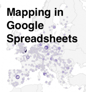
Here at Data & GIS Services, we love finding new ways to map things.  Earlier this semester I was researching how the Sheets tool in Google Drive could be used as a quick and easy visualization tool when I re-discovered its simple map functionality.  While there are plenty of more powerful mapping tools if you want to have a lot of features (e.g., ArcGIS, QGIS, Google Fusion Tables, Google Earth, GeoCommons, Tableau, CartoDB), you might consider just sticking with a spreadsheet for some of your simpler projects.

I’ve created a few examples in a public Google Sheet, so you can see what the data and final maps look like.  If you’d like to try creating these maps yourself, you can use this template (you’ll have to log into your Google account first, and then click on the “Use this template” button to get your own copy of the spreadsheet).

Organizing Your Data

The main thing to remember when trying to create any map or chart in a Google sheet is that the tool is very particular about the order of columns.  For any map, you will need (exactly) two columns.  According to the error message that pops up if your columns are problematic: “The first column should contain location names or addresses. The second column should contain numeric values.”

Of course, I was curious about what counts as “location names” and wanted to test the limits of this GeoMap chart.  If you have any experience with the Google Charts API, you might expect the Google Sheet GeoMap chart to work like the Geo Chart offered there.  In the spreadsheet, however, you have only a small set of options compared to the charts API.  You do have two map options — a “region” (or choropleth) map and a “marker” (or proportional symbol) map — but the choices for color shading and bubble size are built-in or limited.

Screen Shot 2014-06-04 at 4.36.54 PM
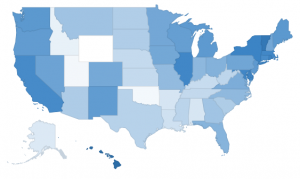
Region maps (Choropleths)

Region maps are fairly restrictive, because Google needs to know the exact boundary of the country or state that you’re interested in.  In a nutshell, a region map can either use country names (or abbreviations) or state names (or abbreviations).  The ISO 3166-1 alpha-2 codes seem to work exceptionally well for countries (blazing fast speeds!), but the full country name works well, too.  For US states, I also recommend the two letter state abbreviation instead of the full state name. If you ever want to switch the map from “region” to “marker”, the abbreviations are much more specific than the name of the state.  (For example, when I switch my “2008 US pres election” map to marker, Washington state turns into a bubble over Washington DC.)

Screen Shot 2014-06-04 at 4.37.57 PM
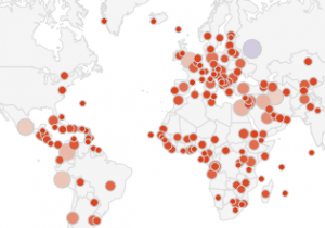
Marker maps (Proportional symbol maps)

Marker maps, on the other hand, allow for much more flexibility.  In fact, the marker map in Google Sheets will actually geocode street addresses for you.  In general, the marker map will work best if the first column (the location column) includes information that is as specific as possible.  As I mentioned before, the word “Washington” will go through a search engine and will get matched to Washington DC before Washington state.  Same with New York.  But the marker map will basically do the search on any text, so the spreadsheet cell can say “NY”, or “100 State Street, Ithaca, NY”, or even the specific latitude and longitude of a place. (See the “World Capitals with lat/lon” sheet; I just put latitude and longitude in a single column, separated with a comma.)  As long as the location information is in a single column, it should work, but the more specific the information is, the better.

Procedure

Screen Shot 2014-06-04 at 4.31.56 PM
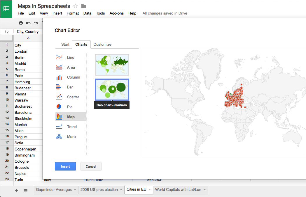
When you have your data ready and want to create a map, just select the correct two columns in your spreadsheet, making sure that the first one has appropriate location information and the second one has some kind of numerical data.  Then click on the “Insert” menu and go down to “Chart…”  You’ll get the chart editor.  The first screen will be the “Start” tab, and Google will try to guess what chart you’re trying to use.  It probably won’t guess a map on the first try, so just click on the “Charts” tab at the top to manually select a map.  Map is one of the lower options on the left hand side, and then you’ll be given a choice between the regions and markers maps.  After you select the map, you can either stick with the defaults or go straight to the final tab, “Customize,” to change the colors or to zoom your map into a different region.  (NB: As far as I can tell, the only regions that actually work are “World,” “United States,” “Europe,” and “Asia”.)

Screen Shot 2014-06-04 at 4.33.35 PMThe default color scale goes from red to white to green.  You’ll notice that the maps automatically have a “mid” value for the color.  If you’d rather go straight from white to a dark color, just choose something in the middle for the “mid” color.

And there you have it!  You can’t change anything beyond the region and the colors, so once you’ve customized those you can click “Update” and check out your map.  Don’t like something?  Click on the map and a little arrow will appear in the upper right corner.  Click there to open the menu, then click on “Advanced edit…” to get back to the chart editor.  If you want a bigger version of the map, you can select “Move to own sheet…” from that same menu.

Pros and Cons

So, what are these maps good for?  Well, firstly, they’re great if you have state or country data and you want a really quick view of the trends or errors in the data.  Maybe you have a country missing and you didn’t even realize it.  Maybe one of the values has an extra zero at the end and is much larger than expected.  This kind of quick and dirty map might be exactly what you need to do some initial exploration of your data, all while staying in a spreadsheet program.

Another good use of this tool is to make a map where you need to geocode addresses but also have proportional symbols.  Google Fusion Tables will geocode addresses for you, but it is best for point maps where all the points are the same size or for density maps that calculate how tightly clusters those points are.  If you want the points to be sized (and colored) according to a data variable, this is possibly the easiest geocoder I’ve found.  It’ll take a while to search for all of the locations, though, and there is probably an upper limit of a couple of hundred rows.

If this isn’t the tool for you, don’t despair!  Make an appointment through email (askdata@duke.edu) or stop in to see us (walk-in schedule) to learn about other mapping tools, or you can even check out these 7 Ways to Make a Google Map Using Spreadsheet Data.
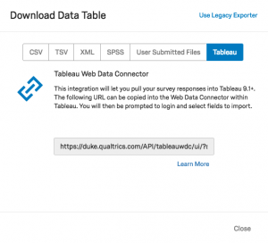
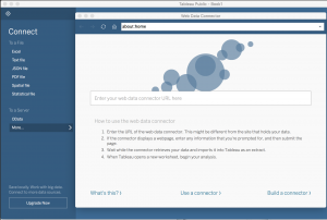
Duke welcomes Francesca Samsel, April 17-18

samselOn Thursday, April 17 and Friday, April 18, Duke University will host a visit from Francesca Samsel, a visual artist who uses technology to develop work on the fulcrum between art and science.  Francesca works as Research Assistant Faculty in the Computer Science department of the University of Texas at El Paso, is a Research Affiliate with the Center for Agile Technologies at the University of Texas at Austin, and is also a long-term collaborating partner with Jim Ahrens’ Visualization Research Team at Los Alamos National Labs.

Francesca will give two presentations during her visit.  A presentation on Thursday afternoon for the Media Arts + Sciences Rendezvous series will address the humanities community and present recommendations for work with scientists and visualization teams.  A presentation over lunchtime on Friday for the Visualization Friday Forum will describe a variety of collaborations with scientific teams and address the benefits that can come from incorporating artists into a scientific research team.

Francesca’s visit is sponsored by Information Science + Information Studies (ISIS), with additional support from Media Arts + Sciences.  We hope you can join us for one or both of the presentations!

Creating Mutually-Beneficial Multiple-Outcome Collaborations
Thursday, April 17
4:15 pm (talk starts at 4:30)
Smith Warehouse, Bay 10 classroom (2nd floor – enter through Bays 9 or 11)
Drinks and light snacks provided

Many artists draw on the scientific community as sources for their work. Research community are exploding with rich material connected to our contemporary lives.  Given that art – science collaborations require weeks, realistically months, in a lab, shoulder to shoulder with the scientists, access is a huge barrier.  Francesca Samsel will discuss her history of collaborations with visualization teams and scientists, what worked, what didn’t and how to get in the door.

An Artist, No Thanks! Employing Design and Color Theory to Increase Clarity, Perception and Depth within Scientific Visualization
Friday, April 18, 2014
12:00p.m. to 1:00p.m. (lunch provided)
Levine Science Research Center, Room D106 (near the Research Drive entrance), in conjunction with the Visualization Friday Forum
Live stream

Francesca Samsel will discuss her ongoing work with Los Alamos National Labs, Research Visualization Team and why they hired an artist to help them design the next generation of scientific visualization tools.  Their recent work focuses on developing algorithmically generated color maps to extract the maximum perceivable detail within exa-scale data sets. She will also discuss collaborations with the Visualization Division of the Texas Advanced Computing Center; hydrogeologists, neurologists, environmental research teams and more.

2_11BlGr2 copy