Category Archives: tutorial

5 CDVS Online Learning Things

Within the Center for Data and Visualization Sciences (CDVS) we pride ourselves on providing numerous educational opportunities for the Duke community. Like many others during the COVID-19 pandemic, we have spent a large amount of time considering how to translate our in-person workshops to online learning experiences, explored the use of flipped classroom models, and learned together about the wonderful (and sometimes not so wonderful) features of common technology platforms (we are talking about you, Zoom).

Online learning setupWe also wanted to more easily surface the various online learning resources we have developed over the years via the web. Recognizing that learning takes place both synchronously and asynchronously, we have made available numerous guides, slide decks, example datasets, and both short-form and full-length workshops on our Online Learning Page. Below we highlight 5 online learning resources that we thought others interested in data driven research may wish to explore:

  • Mapping & GIS: R has become a popular and reproducible option for mapping and spatial analysis. Our Geospatial Data in R guide and workshop video introduce the use of the R language for producing maps. We cover the advantages of a code-driven approach such as R for visualizing geospatial data and demonstrate how to quickly and efficiently create a variety of map types for a website, presentation, or publication. 
  • Data Visualization: Visualization is a powerful way to reveal patterns in data, attract attention, and get your message across to an audience quickly and clearly. But, there are many steps in that journey from exploration to information to influence, and many choices to make when putting it all together to tell your story. In our Effective Data Visualization workshop, we cover some basic guidelines for effective visualization, point out a few common pitfalls to avoid, and run through a critique and iterations of an existing visualization to help you start seeing better choices beyond the program defaults.
  • Data ScienceQuickStart with R is our beginning data science module focusing on the Tidyverse — a data-first approach to data wrangling, analysis, and visualization.  Beyond introducing the Tidyverse approach to reproducible data workflows, we offer a rich allotment of other R learning resources at our Rfun site: workshop videos, case studies, shareable data, and code. Links to all our data science materials can also be found collated on our Online Learning page (above).
  • Data Management: Various stakeholders are stressing the importance of practices that make research more open, transparent, and reproducible including NIH who has released a new data management & sharing policy. In collaboration with the Office of Scientific Integrity, our Meeting Data Management Plan Requirements workshop presents details on the new NIH policy, describes what makes a strong plan, and where to find guidance, tools, resources, and assistance for building funder-based plans.
  • Data Sources: The U.S. Census has been collecting information on persons and businesses since the late 18th century, and tackling this huge volume of data can be daunting. Our guide to U.S. Census data highlights many useful places to view or download this data, with the Product Comparisons tab providing in chart form a quick overview of product contents and features. Other tabs provide more details about these dissemination products, as well as about sources for Economic Census data.

In the areas of data science, mapping & GIS, data visualization, and data management, we cover many other topics and tools including ArcGIS, QGIS, Tableau, Python for tabular data and visualization, Adobe Illustrator, MS PowerPoint, effective academic posters, reproducibility, ethics of data management and sharing, and publishing research data. Access more resources and past recordings on our online learning page or go to our upcoming workshops list to register for a synchronous learning opportunity.

Relational Thinking: Database Re-Modeling for Humanists

Author: Dr. Kaylee P. Alexander
Website: www.kayleealexander.com
Twitter: @kpalex91

Since the summer of 2018 I have been working with a set of nineteenth-century commercial almanacs for the city of Paris. As my dissertation focused heavily on the production of stone funerary markers during this period, I wanted to consult these almanacs to get a sense of how many workers were active in this field of production. Classified as marbriers (stonecutters), the makers of funerary monuments were often one in the same as those who executed various other stone goods and constructions. These almanacs represented a tremendous source of industry information, consistently recording enterprise names and addresses, as well as, at times, specific information about the types of products the enterprise specialized in and any awards they might have won for their work, and what types of new technologies they employed. An so I decided to make a database.

As a Humanities Unbounded graduate assistant with the Center for Data and Visualization Sciences during the summer of 2020, I had the opportunity to explore some of the issues related to database construction and management faced by humanists working on data-based research projects. In order to work out some of these issues, I worked to set up a MySQL database using my commercial almanacs data as a test case to determine which platforms and methods for creating queryable databases would be best suited for those working primarily in the humanities. In the process of setting up this database what became increasingly clear was the need to make clear the usefulness of this process for other humanists undertaking data-driven projects, as well as identify ways of transforming single spreadsheets of data into relational data models without needing to know how to code. Thus, in this blog post I offer a few key points about relational database models that may be useful for scholars in the humanities and share my experiences in constructing a MySQL database from a single Excel spreadsheet.

First of all, some key terms and concepts. MySQL is an open-source relational database management system that uses SQL (Structured Query Language) to create, modify, manage and extract data from a relational database. A relational data model organizes data into a series of tables containing columns (‘attributes’) and rows (‘records’) with unique keys identifying each record. Each table (or, ‘relation’) represents a single entity type and its corresponding attributes. When working with a relational data model you want to make sure that your tables are normalized, or organized in such a way that reduces redundancy in the data set, increases consistency, and facilitates querying.

Although for the purposes of efficient data gathering, I had initially collected all of the information from the commercial almanacs in a single Excel spreadsheet, I knew that I ultimately wanted to reconfigure my data using a relational model that could be shared with and queried efficiently by others. The main benefits of a relational model include ensuring consistency as well as performing combinations of queries to understand various relationships that exist among the information contained in the various tables that would be otherwise difficult to determine from a single spreadsheet. An additional benefit to this system is the ability to add records and edit information without the risk of compromising other information contained in the database.

The first question I needed to ask myself was which entities from my original spreadsheet would become the basis for my relational database. In other words, how would my relational model be organized? What different relationships existed within the dataset, and which variables functioned as entities rather than attributes? One of the key factors in determining which variables would become the entities of my relational model, was the question of whether or not a given variable contained repeated values throughout the master sheet. Ultimately determining the entities wasn’t the trickiest part. It because rather clear early on that it would be best to first create separate tables for businesses and business locations, which would be related via a table for annual activity (in the process of splitting my tables I would end up making more tables, but these were the key starting points).

The most difficult question I encountered was how I would go about splitting all this information as someone with very limited coding experience. How could identify unique values and populate tables with relevant attributes without having to teach myself Python in a pinch, but also without having to retype over one hundred years’ worth of business records? Ultimately, I came up with a rather convoluted system that had me going back and forth between OpenRefine and Excel. Once I got the hang of my system it became almost second nature to me but explaining it to others was another story. This made it abundantly clear that there was a lack of resources for demonstrating how one could create what were essentially a series of normalized tables from a flat data model. So, to make a very long story short, I broke down my convoluted process into a series of simple steps that required nothing more that Excel to transform a flat data model into a relational data model using the UNIQUE() and VLOOKUP() functions. This processes is detailed in a library tutorial I developed geared towards humanists, consisting of both a video demonstrating the process and a PDF containing written instructions.

In the end, all I needed to do was construct the database itself. In order to do this I worked with phpMyAdmin, a free web-based user interface for constructing and querying MySQL databases. Using phpMyAdmin, I was able to easily upload my normalized data tables, manage and query my database, and easily connect to Tableau for data visualization purposes using phpMyAdmin’s user management capabilities.


Kaylee Alexander portrait

Dr. Kaylee P. Alexander is a graduate of the Department of Art, Art History & Visual Studies, where she was also a research assistant with the Duke Art, Law & Markets Initiative (DALMI). Her dissertation research focuses on the visual culture of the cemetery and the market for funerary monuments in nineteenth-century Paris. In the summer of 2020, she served as a Humanities Unbounded graduate assistant with the Center for Data and Visualization Sciences at Duke University Libraries.

R Open Labs – open hours to learn more R

New this fall…

R fun: An R Learning Series
An R workshop series by the Center for Data and Visualization Sciences.

You are invited to stop by the Edge Workshop Room on Mondays for a new Rfun program, the R Open Labs,  6-7pm, Sept. 16 through Oct. 28. No need to register although you are encouraged to double-check the R Open Labs schedule/hoursBring your laptop!

This is your chance to polish R skills in a comfortable and supportive setting.  If you’re a bit more advanced, come and help by demonstrating the supportive learning community that R is known for.

No Prerequisites, but please bring your laptop with R/RStudio installed. No skill level expected. Beginners, intermediate, and advanced are all welcome. One of the great characteristics of the R community is the supportive culture. While we hope you have attended our Intro to R workshop (or watched the video, or equivalent). This is an opportunity to learn more about R and to demystify some part of R that your find confusing.

FAQ

What are Open Labs

Open labs are semi-structured workshops designed to help you learn R. Each week brief instruction will be provided, followed by time to practice, work together, ask questions and get help. Participants can join the lab any time during the session, and are welcome to work on unrelated projects.

The Open Labs model was established by our colleagues at Columbia and adopted by UNC Chapel Hill. We’re giving this a try as well. Come help us define our direction and structure. Our goal is to connect researchers and foster a community for R users on campus.

How do I Get Started?

Attend an R Open Lab. Labs occur on Mondays, 6pm-7pm in the Edge Workshop Room in the Bostock Library. In our first meeting we will decide, as a group, which resource will guide us. We will pick one of the following resources…

  1. R for Data Science by Hadley Wickham & Garrett Grolemund (select chapters, workbook problems, and solutions)
  2. The RStudio interactive R Primers
  3. Advanced R by Hadley Wickham (select chapters and workbook problems)
  4. Or, the interactive dataquest.io learning series on R

Check our upcoming Monday schedule and feel free to RSVP.  We will meet for 6 nearly consecutive Mondays during the fall semester.

Please bring a laptop with R and R Studio installed.  If you have problems installing the software, we can assist you with installation as time allows. Since we’re just beginning with R Open Labs, we think there will be time for one-on-one attention as well through learning and community building.

How to install R and R Studio

If you are getting started with R and haven’t already installed anything, consider using using these installation instructions.  Or simply skip the installation and use one of these free cloud environments:

Begin Working in R

We’ll start at the beginning, however, R Open Labs recommends that you attend our Intro to R workshop or watch the recorded video. Being a beginner makes you part of our target audience so come ready to learn and ask questions. We also suggest working through materials from our other workshops, or any of the resource materials listed in the Attend an R Open Lab section (above).  But don’t let lack of experience stop you from attending.  The resources mentioned above will be the target of our learning and exploration.

Is R help available outside of Open Labs?

If you require one-on-one help with R outside of the Open Labs, in-person assistance is available from the Library’s Center for Data & Visualization Sciences, our Center’s Rfun workshops, or our walk-in consulting in the Brandaleone Data and Visualization Lab (floormap. 1st Floor Bostock Library).


Using Tableau with Qualtrics data at Duke

Logos for Qualtrics and TableauThe end of the spring semester always brings presentations of final projects, some of which may have been in the works since the fall or even the summer. Tableau, a software application designed specially for visualization, is a great option for projects that would benefit from interactive charts and maps.

Visualizing survey data, however, can be a bit of a pain. If your project uses Qualtrics, for example, you may be having trouble getting the data ready for visualization and analysis. Qualtrics is an extremely powerful survey tool, but the data it creates can be very complicated, and typical data analysis tools aren’t designed to handle that complexity.

Luckily, here at Duke, Tableau users can use Tableau’s Web Data Connector to pull Quatrics data directly into Tableau! It’s so easy, you may never analyze your Qualtrics data another way again.

Process

Here are the basics. There are also instructions from Qualtrics.

In Qualtrics: Copy your survey URLScreenshot of Tableau URL in Qualtrics

  • Go to your Duke Qualtrics account
  • Click on the survey of interest
  • Click on the Data & Analysis tab at the top
  • Click on the Export & Import button
  • Select Export Data
  • Click on Tableau
  • Copy the URL

In Tableau (Public or Desktop): Paste your survey URL

Tableau Web Data Connection

  • Under Connect, click on Web Data Connector (may be under “More…” for Tableau Public or “To a server… More…” for Tableau Desktop)
  • Paste the survey URL into the web data connector URL box and hit enter/return
  • When a login screen appears, click the tiny “Api Token Login” link, which should be below the green Log in button

In Qualtrics: Create and copy your API token

Generate Qualtrics API Token

  • Go to your Duke Qualtrics account
  • Click on your account icon in the upper-right corner
  • Select Account Settings…
  • On the Account Settings page, click on the Qualtrics IDs tab
  • Under API, check for a token. If you don’t have one yet, click on Generate Token
  • Copy your token

In Tableau (Public or Desktop): Paste your API token

  • Paste in your API token and click the Login button
  • Select the data fields you would like to import

Note: there is an option to “transpose” some of the fields on import. This is useful for many of the types of visualizations you might want to create from survey data. Typically, you want to transpose fields that represent the questions asked in the survey, but you may not want to transpose demographics data or identifiers. See also the Qualtrics tips on transposing data.

Resources

For more tips on how to use Tableau with Qualtrics data, check out the resources below:

Fall Data and Visualization Workshops

2017 Data and Visualization Workshops

Visualize, manage, and map your data in our Fall 2017 Workshop Series.  Our workshops are designed for researchers who are new to data driven research as well as those looking to expand skills with new methods and tools. With workshops exploring data visualization, digital mapping, data management, R, and Stata, the series offers a wide range of different data tools and techniques. This fall, we are extending our partnership with the Graduate School and offering several workshops in our data management series for RCR credit (please see course descriptions for further details).

Everyone is welcome at Duke Libraries workshops.  We hope to see you this fall!

Workshop Series by Theme

Data Management

09-13-2017 – Data Management Fundamentals
09-18-2017 – Reproducibility: Data Management, Git, & RStudio 
09-26-2017 – Writing a Data Management Plan
10-03-2017 – Increasing Openness and Reproducibility in Quantitative Research
10-18-2017 – Finding a Home for Your Data: An Introduction to Archives & Repositories
10-24-2017 – Consent, Data Sharing, and Data Reuse 
11-07-2017 – Research Collaboration Strategies & Tools 
11-09-2017 – Tidy Data Visualization with Python

Data Visualization

09-12-2017 – Introduction to Effective Data Visualization 
09-14-2017 – Easy Interactive Charts and Maps with Tableau 
09-20-2017 – Data Visualization with Excel
09-25-2017 – Visualization in R using ggplot2 
09-29-2017 – Adobe Illustrator to Enhance Charts and Graphs
10-13-2017 – Visualizing Qualitative Data
10-17-2017 – Designing Infographics in PowerPoint
11-09-2017 – Tidy Data Visualization with Python

Digital Mapping

09-12-2017 – Intro to ArcGIS Desktop
09-27-2017 – Intro to QGIS 
10-02-2017 – Mapping with R 
10-16-2017 – Cloud Mapping Applications 
10-24-2017 – Intro to ArcGIS Pro

Python

11-09-2017 – Tidy Data Visualization with Python

R Workshops

09-11-2017 – Intro to R: Data Transformations, Analysis, and Data Structures  
09-18-2017 – Reproducibility: Data Management, Git, & RStudio 
09-25-2017 – Visualization in R using ggplot2 
10-02-2017 – Mapping with R 
10-17-2017 – Intro to R: Data Transformations, Analysis, and Data Structures
10-19-2017 – Developing Interactive Websites with R and Shiny 

Stata

09-20-2017 – Introduction to Stata
10-19-2017 – Introduction to Stata 


Mapping in Google Spreadsheets

Screen Shot 2014-06-04 at 4.33.57 PM
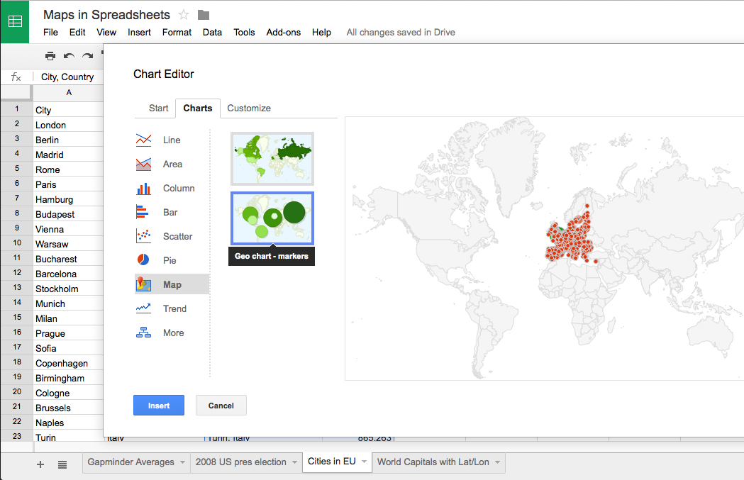
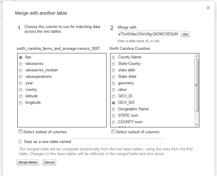
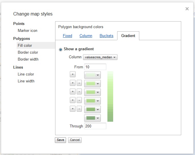
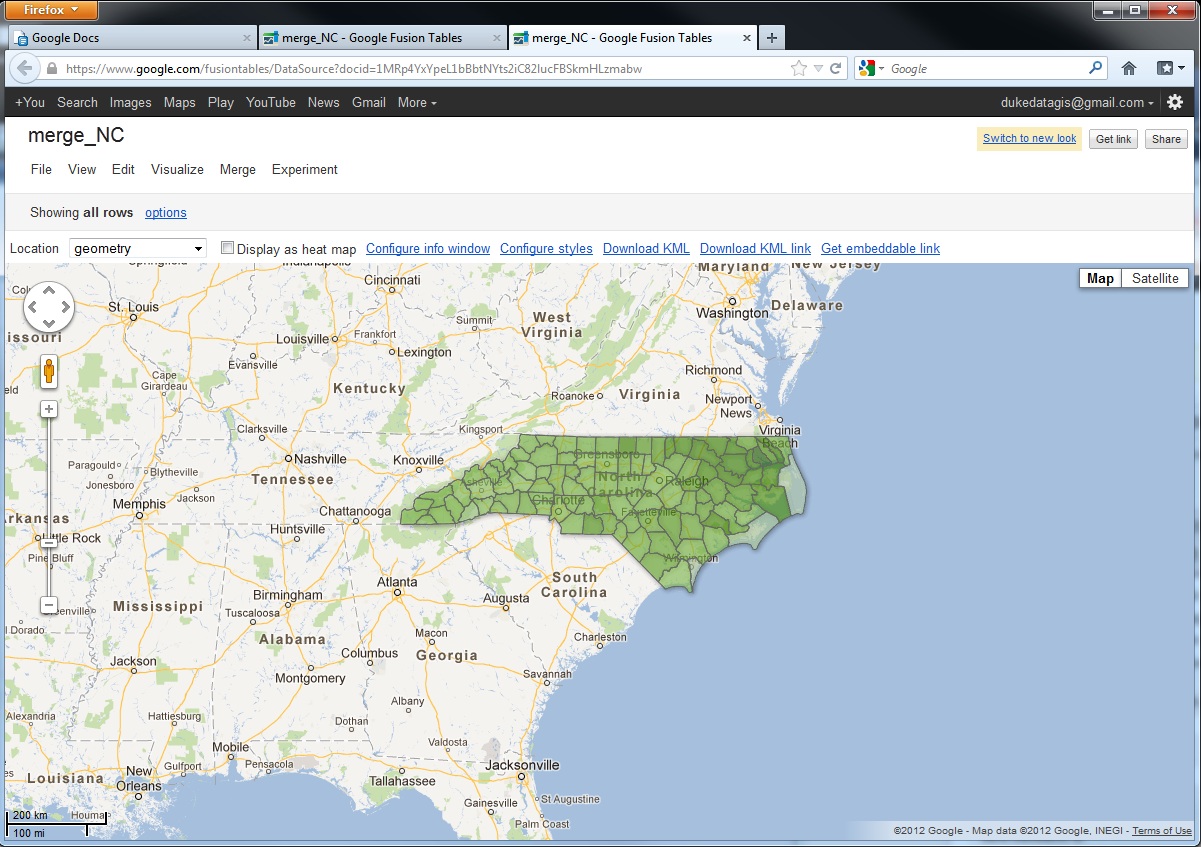
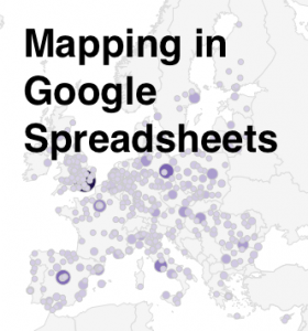
Here at Data & GIS Services, we love finding new ways to map things.  Earlier this semester I was researching how the Sheets tool in Google Drive could be used as a quick and easy visualization tool when I re-discovered its simple map functionality.  While there are plenty of more powerful mapping tools if you want to have a lot of features (e.g., ArcGIS, QGIS, Google Fusion Tables, Google Earth, GeoCommons, Tableau, CartoDB), you might consider just sticking with a spreadsheet for some of your simpler projects.

I’ve created a few examples in a public Google Sheet, so you can see what the data and final maps look like.  If you’d like to try creating these maps yourself, you can use this template (you’ll have to log into your Google account first, and then click on the “Use this template” button to get your own copy of the spreadsheet).

Organizing Your Data

The main thing to remember when trying to create any map or chart in a Google sheet is that the tool is very particular about the order of columns.  For any map, you will need (exactly) two columns.  According to the error message that pops up if your columns are problematic: “The first column should contain location names or addresses. The second column should contain numeric values.”

Of course, I was curious about what counts as “location names” and wanted to test the limits of this GeoMap chart.  If you have any experience with the Google Charts API, you might expect the Google Sheet GeoMap chart to work like the Geo Chart offered there.  In the spreadsheet, however, you have only a small set of options compared to the charts API.  You do have two map options — a “region” (or choropleth) map and a “marker” (or proportional symbol) map — but the choices for color shading and bubble size are built-in or limited.

Screen Shot 2014-06-04 at 4.36.54 PM
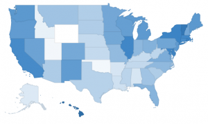
Region maps (Choropleths)

Region maps are fairly restrictive, because Google needs to know the exact boundary of the country or state that you’re interested in.  In a nutshell, a region map can either use country names (or abbreviations) or state names (or abbreviations).  The ISO 3166-1 alpha-2 codes seem to work exceptionally well for countries (blazing fast speeds!), but the full country name works well, too.  For US states, I also recommend the two letter state abbreviation instead of the full state name. If you ever want to switch the map from “region” to “marker”, the abbreviations are much more specific than the name of the state.  (For example, when I switch my “2008 US pres election” map to marker, Washington state turns into a bubble over Washington DC.)

Screen Shot 2014-06-04 at 4.37.57 PM
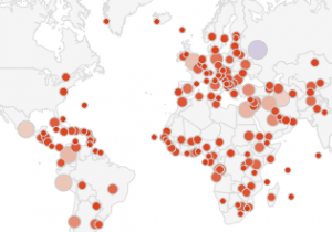
Marker maps (Proportional symbol maps)

Marker maps, on the other hand, allow for much more flexibility.  In fact, the marker map in Google Sheets will actually geocode street addresses for you.  In general, the marker map will work best if the first column (the location column) includes information that is as specific as possible.  As I mentioned before, the word “Washington” will go through a search engine and will get matched to Washington DC before Washington state.  Same with New York.  But the marker map will basically do the search on any text, so the spreadsheet cell can say “NY”, or “100 State Street, Ithaca, NY”, or even the specific latitude and longitude of a place. (See the “World Capitals with lat/lon” sheet; I just put latitude and longitude in a single column, separated with a comma.)  As long as the location information is in a single column, it should work, but the more specific the information is, the better.

Procedure

Screen Shot 2014-06-04 at 4.31.56 PMWhen you have your data ready and want to create a map, just select the correct two columns in your spreadsheet, making sure that the first one has appropriate location information and the second one has some kind of numerical data.  Then click on the “Insert” menu and go down to “Chart…”  You’ll get the chart editor.  The first screen will be the “Start” tab, and Google will try to guess what chart you’re trying to use.  It probably won’t guess a map on the first try, so just click on the “Charts” tab at the top to manually select a map.  Map is one of the lower options on the left hand side, and then you’ll be given a choice between the regions and markers maps.  After you select the map, you can either stick with the defaults or go straight to the final tab, “Customize,” to change the colors or to zoom your map into a different region.  (NB: As far as I can tell, the only regions that actually work are “World,” “United States,” “Europe,” and “Asia”.)

Screen Shot 2014-06-04 at 4.33.35 PMThe default color scale goes from red to white to green.  You’ll notice that the maps automatically have a “mid” value for the color.  If you’d rather go straight from white to a dark color, just choose something in the middle for the “mid” color.

And there you have it!  You can’t change anything beyond the region and the colors, so once you’ve customized those you can click “Update” and check out your map.  Don’t like something?  Click on the map and a little arrow will appear in the upper right corner.  Click there to open the menu, then click on “Advanced edit…” to get back to the chart editor.  If you want a bigger version of the map, you can select “Move to own sheet…” from that same menu.

Pros and Cons

So, what are these maps good for?  Well, firstly, they’re great if you have state or country data and you want a really quick view of the trends or errors in the data.  Maybe you have a country missing and you didn’t even realize it.  Maybe one of the values has an extra zero at the end and is much larger than expected.  This kind of quick and dirty map might be exactly what you need to do some initial exploration of your data, all while staying in a spreadsheet program.

Another good use of this tool is to make a map where you need to geocode addresses but also have proportional symbols.  Google Fusion Tables will geocode addresses for you, but it is best for point maps where all the points are the same size or for density maps that calculate how tightly clusters those points are.  If you want the points to be sized (and colored) according to a data variable, this is possibly the easiest geocoder I’ve found.  It’ll take a while to search for all of the locations, though, and there is probably an upper limit of a couple of hundred rows.

If this isn’t the tool for you, don’t despair!  Make an appointment through email (askdata@duke.edu) or stop in to see us (walk-in schedule) to learn about other mapping tools, or you can even check out these 7 Ways to Make a Google Map Using Spreadsheet Data.

Online Data Mapping Tools – Google Fusion Tables

Visualizing spatial data can be challenging. Specialized software tools like ArcGIS produce excellent results, but often seem complex for relatively simple tasks. Several online tools have emerged recently that provide relatively easy alternatives for the display of spatial data. In this post, we examine Google Fusion Tables, which combines visualizations, including spatial visualizations, with a database back end. The key advantages to Fusion Tables are easy display of latitude/longitude data or data that is included with address information. In addition, Fusion Tables provides a one-stop location for producing visualizations other than maps, such as line charts or tables.

Uploading Data

Figure 1
Figure 2
Figure 3
Figure 4
Figure 5
Figure 6
Figure 7
Figure 8

Uploaded to Fusion Tables is easy through Google Docs.  Simply log in if you have an account, create a new Table, and on the next screen, point to the file you wish to upload.  Excel and CSV files are the two most commonly used, and KML files allow for upload of maps that contain spatial information, such as locations or polygon definitions.

One thing to note about Google products is that they are often in a state of flux.  Limits and restrictions noted below may change in the future.  For further information regarding Google Fusion Tables, please consult this Libguide authored by Mark Thomas.

Geocoding Addresses

A complete list of geographic data types can be found at the Google support site.  In this post, two of the more common geocoding types will be addressed, address data and data that applies to states, counties, and similar objects.

Address data is pretty easy to work with.  Addresses should contain as much information as possible with items separated by spaces only, no commas.  For example, 134 Chapel Drive Durham NC 27708 should produce a pretty good geocoding result.  In the following example, Durham gun crimes for 2011 were downloaded from the Durham Police Department.  The data only came with address information, so city and state data were subsequently added and combined in Excel (location field).  In Figure 1, highlighted fields indicate spatial information.

To geocode the addresses, select “Map” under the “Visualize” tab.  The program will automatically begin geocoding based on the left-most field containing spatial information, which is city in this case.  Changing the field to “location,” which contains the full address information, will correctly geocode these addresses (Figure 2).

Once complete, the geocoded points are plotted on a map (Figure 3).  As with other mapping applications, you may apply a symbology to the points in order to visualize your data.

This particular dataset contains a numeric field that identifies 5 general types of crime (crime_cat_num).  Under the “Configure styles” link at the top, navigate to “Buckets” and divided the data into five buckets (Figure 4).

Once saved, each color will represent a different type of crime and shown in Figure 5 (red indicates robbery, yellow, assault and so on).

Note that only numeric fields can be used to categorize data, so you may wish to create these fields prior to upload.

Geocoding Polygons

Working with polygon data can be a bit trickier because the polygons must be spatially defined.  Fusion Tables does this by using kml, which is basically a large piece of text containing all of the coordinates, in order, that define a boundary.  For example, in this table, each boundary is defined in the geometry field. Google provides a variety of boundary types, which are available here.  If your data match one of these existing boundary types, you may upload data and merge it with the correct table, which will basically import the boundary definitions into your dataset.  Otherwise, you will have to locate suitable boundaries in a kml file and import those boundaries before merging.

This dataset displays acreage and farms for each county in North Carolina and originally came from the Census of Agriculture.  Note that there must be a field in common between your data and the data containing boundary definitions in order to merge.  In addition, merge fields can only be text fields.  FIPS codes uniquely identify counties and are contained in both tables.  Unfortunately, Google didn’t set up their FIPS fields correctly, so a cleaned up North Carolina county file is located here.

Next, click the merge tab.  Copy and paste the URL for the boundaries table and click the “Get” button.  In Figure 6, I merged  my data to the boundary file using the fips field, which is called “fips” in table 1 and “GEO_ID2” in table 2.  A merge will produce a new table, so be sure to name that new table at the bottom.Once complete, styling the map is comparable to point data. First, select “Map” under the “Visualize” tab, and be sure to point the location field at the top left to “geometry” where the boundary definitions are stored. Next, click the configure styles link. Then, select Fill color under the Polygons section.

In Figure 7, I am showing median farm size (in acres) along a gradient.  It’s important to note the lower and upper limits to your data in advance as the program will not automatically sense this.  In this case, median farm size ranges from 10 to 191.  Figure 8 shows the output.

Sharing Maps

As withsimilar online programs, Fusion Tables allows sharing of data and maps through a variety of avenues, from links to embeddable script to email.  The links below point to the two maps produced in this posting.

Durham gun crimes map

North Carolina median farm acreage, 2007

Other Notes

This overview provides only a brief introduction to the mapping capabilities of Fusion Tables.  A broad gallery of applications is located at this site, and it contains a variety of geography types.  Some of these use the Fusion Tables API, which is a nice feature that allows for application development with some programming experience.  As with the other tools reviewed by this blog, non-standard boundaries are generally absent and can be difficult to locate.  For example, a researcher with country-level data from the 1700s may have difficulty finding a country border map from that time.  However, maps are available on Fusion Tables for counties, states, countries, and congressional districts, and additional maps can be found on the Internet.

Adding Colored Regions to Excel Charts

Time series data is easy to display as a line chart, but drawing an interesting story out of the data may be difficult without additional description or clever labeling. One option, however, is to add regions to your time series charts to indicate historical periods or visualization binary data.

Here is an example where a chart of annual U.S. national economic indicators has been enhanced with regions that also indicate contractions in the U.S. business cycle – roughly speaking, economic recessions.

A time series with colored regions in the background, created in Excel.

To create this chart, all of the indicators were averaged by year and, where necessary, adjusted for inflation using a conversion factor. Download the time series data Excel file for the data and the chart to follow along.

First, to set up the basic line chart, hold Ctrl (PC) or Cmd (Mac) while you select the following columns:

  • D (stock price index over CF…)
  • E (avg. annual unemployment…)
  • G (GDP over CF…)
  • I (debt over CF…)
  • K (interest rate * 10)
  • L (years economy is in decline)

Youll notice that the columns are color coded. Some colors apply to multiple columns; this is because the values that appear on the chart have been calculated by transforming the raw data in some way. Each line on the final chart thus corresponds to one or more columns of data used to produce the values. Transforming the values helps us by normalizing the values (i.e., adjusting for inflation) or scaling the data series itself (making it possible to see the relationships between many different indicators on a single graph, despite wide variations in the ranges of values).

When we select the six columns above and insert a line chart, we get a rather ugly line chart.

The chart as it looks with the default Excel settings.

We’ll make several changes to improve this:

  • Change the “years… in decline” series to an area chart
  • Select and adjust the x axis labels and ticks
  • Adjust the y axis range
  • Customize the color, label, and order of the data series

The basic mechanism of the colored regions on the chart is to use Excel’s “area chart” to create rectangular areas. The area chart essentially takes a line chart and fills the area under the line with a color. If we have a continuous horizontal line as a data series, we will create a large colored rectangle on the chart. To have breaks in the rectangle, we simply need to leave some of the years blank (without values in the cells). To select the appropriate values for column L, we first found the maximum value for the other data series and determined that a value of 20 would create bars starting above the other data series.

To produce the colored regions that indicate contractions in the business cycle, we take the series that was created from column L and turn it into an area chart.

  1. Right-click on any data point in the series or on the legend entry
  2. Select “Change Series Chart Type…”
    Changing the chart type for a particular data series.
  3. Select the standard Area chart from the ribbon
    Select Area from the ribbon.

The chart now fills in the area under the original lines with a default fill color.

After changing one series to an Area chart.

At this point, you can right click on the series again, select “Format Data Series…”, and change the Fill color to a light gray.

Changing the fill color of the Area series.

Next, we tell the x axis what the correct labels are (the “Year” column) and have the labels show up every 4 years. (Our data series start on an election year, so the labels will always appear on election years.)

      1. Right click inside the chart somewhere and select “Select Data…”
      2. Select any of the data series in the “Series” list, then go over to the “Category (X) axis labels” box and select the “Year” column. Click “OK”.
        Changing the X axis labels.
      3. Right-click on the x axis and select “Format Axis…”.
      4. Under “Scale”:
        1. Change the default interval between labels from 3 to 4
        2. Change the interval between tick marks to 4 as well
        3. Uncheck the box next to “Vertical axis crosses between categories”
          Changing the X axis scale.
      5. Under “Text Box”, select the text direction of “Rotate to 90 deg Counterclockwise”. Click “OK”.
        Changing the X axis text.

The x axis should have appropriate year labels now. The y axis can similarly be adjusted to show just the range of values we’re most interested in.

      1. Right-click on the axis and select “Format Axis…”.
      2. Under “Scale”, unselect the check box next to “Maximum:” and change the value to 20.
        Changing the Y axis scale.

The rest of the changes are simply formatting changes. Right-click on the individual data series to change the colors, line widths, etc. Use the formatting options or the Chart tools on the Excel ribbon to change the font of any text, adjust the grid lines, add labels and titles, etc. The data series names in the legend can be adjusted by using the “Select Data…” option and typing in custom text in the “Name” field.

The final product should have colored regions and look something like the chart below.

A time series with colored regions in the background, created in Excel.

In another post, we will show how to spice this chart up even more using Adobe Illustrator.