All posts by Mark Thomas

Economic and Political Risk

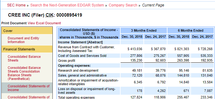
Students and researchers often ask CDVS for data on risk assessments of countries and risk comparisons between them. Some of the data sources relating to risk provide index numbers in downloadable tabular format measuring different aspects of risk, such as economic or political. They may include a few index numbers, or even thousands of nuanced indicators and changes over many years. Some of the sources provide graphic representations to compare different risk components, different countries, or changes over time. Other sources provide a more narrative discussion of risk, typically including tables and visuals, rather than downloadable datasets. The resources highlighted below present examples of each of these presentation methods and should provide researchers needing risk information with meaningful data.

ICRG Researchers Dataset (from the PRS Group)

ICRG Codebook
ICRG Codebook

Covering 141 developed, emerging, and frontier countries, and offshore financial centers, ICRG presents monthly political, economic, financial and composite risk ratings and forecasts, provided in Excel format. The focus is on risks related to doing business in a country, although the index numbers have broader applicability. Index numbers fall within a 0-4 to a 0-12 range depending on the indicator, with the lower numbers for a given indicator representing more risk, and a codebook describes how the points are assigned.

For each country, the data includes monthly index numbers back to 1984. Duke has holdings of the Historical Political (Table 3B), Financial (4B), and Economic (5B) datasets, through 2016, which we occasionally update.  The ICRG Researchers Dataset – Table 3B provides annual averages of the components of ICRG’s Political Risk Ratings (government stability, socioeconomic conditions, the investment profile, internal conflict, external conflict, corruption, military in politics, religions tensions, and law and order).


QoG (Quality of Government Institute at the University of Gothenburg, Sweden)

QOG Standard Dataset Codebook
Variable availability by country, from Standard Dataset codebook

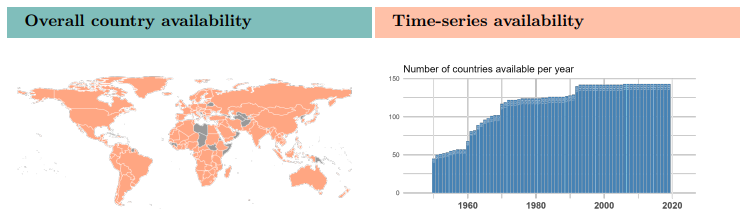
Compiled from open-source data, this free, extensive, and well-documented data collection includes their flagship Standard Dataset, with around 2100 variables. These are grouped into the following categories: Bureaucratic Structure, Civil Society/Population/Culture, Conflict, Education, Energy and Infrastructure, Environment, Gender Equality, Health, History, Judicial, Labour Market, Media, Migration, Political Parties and Elections, Political System, Private Economy, Public Economy, Quality of Government, Religion, and Welfare.

The Standard Dataset comes in a cross-section version, with recent data, and a time-series dataset covering 1946 to 2023. Formats include Stata (.dta), CSV, Excel (.xlsx), and SPSS (.sav).  The codebook for the Standard Dataset is nearly 1700 pages. The QoG Basic Dataset contains the most frequently used variables from the Standard Dataset, and QOG also has datasets relating to the OECD, the EU, and for environmental indicators.


Political Risk Yearbooks (from the PRS Group)

Political Risk Yearbook
From a Political Risk Yearbook

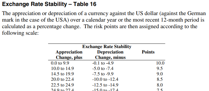
From the same company that creates the ICRG data (see above), the Political Risk Yearbooks provide a more narrative assessment of country-by-country risk factors, with probability forecasts for political, social, and economic trends for 100 countries.

The Political Rick Yearbooks are included in the Business Source Complete database from EBSCO since 2003. In the Advanced Search interface, choose the “SO Publication Name” field in the dropdown and search <Political Risk Yearbook [name of country]> to find issues from a particular country.


Passport (Euromonitor)

Country Report in Passport
Navigating to a Country Report

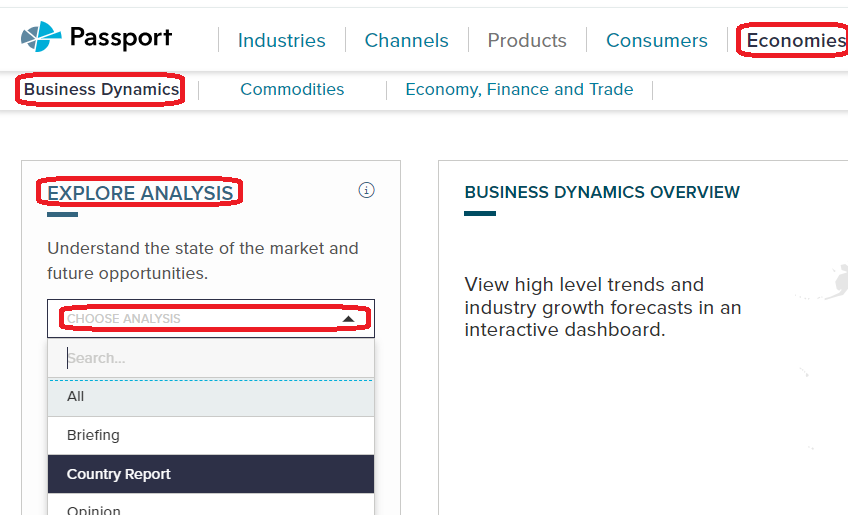
In Passport, Country Report is an option under several of the menus. One good assessment of risk can be found in the Country Reports under Economies … Business Dynamics. Under Explore Analysis, choose Country Reports in the Choose Analysis drop-down.

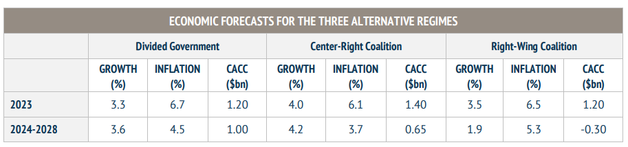
Also under the Economies tab, if you choose Economy, Finance and Trade, then choose Country Report under Explore Analysis as above, a useful report for risk outlook is the PEST analysis report (political, economic, social, and technological). These reports describe a framework of macro-environmental factors to use as a tools for environment scanning, understanding risks and opportunities, market growth or decline, business position, and potential and direction for operations, focusing on ways to help companies to become more competitive.  The PEST reports discuss opportunities and challenges for each of the four facets.

Country Report from Passport
From a Country Report in Passport

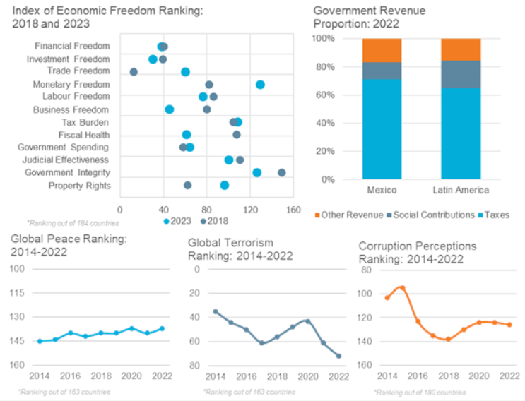
You might find other useful assessments of risk in other reports in Passport, so feel free to explore. Charts and analysis in the reports draw data from IGOs like the IMF and the ILO, as well as from think tanks with an interest in economic and political freedom, like the Heritage Foundation. Be sure to check the sources they use in their reports.


Global Risks Report (World Economic Forum)

Global Risk Report
From WTO’s Global Risk Report

The annual Global Risks Report explores some of the most severe risks we may face in the coming years. Underpinned by the Forum’s Global Risks Perception Survey, the report brings together leading insights from over 1,200 experts across the world. The focus is on a narrative discussion of risks (economic, climate, political, etc.) facing the world as a whole, but there are some visuals or maps comparing countries or regions.

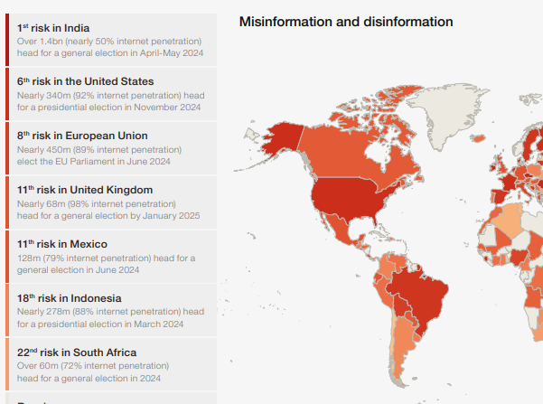
Each annual report has a summary with key findings. Data from the Perception Survey is presented as charts and graphs in the areas of Current Risks, Severity, the Global Risk Landscape, the Outlook for the World, Political Cooperation, Risk Governance, and Risk Profile.  The WEF does not provide the actual raw data from the survey.  “Shareables” include visuals on topics such as the “Top 10 Risks” and in “Interconnections” graphic of the global risks landscape.


OECD Economic Surveys

OECD Economic Survey
From an OECD Economic Survey

These country-level reports are thorough assessments of a country’s economy and its economic prospects. They are in PDF format, but the data used in the graphs and charts can be downloaded in Excel format from within the PDFs.  The 100+ page reports cover OECD member countries and some leading trade partners (such as China) and are published frequently, although not necessarily every year.  For some countries, the series goes back as far as 1962.


Election Data

You’re probably aware that voting in the United States is managed in a very decentralized manner compared to most other countries. There are limited sources that comprehensively compile local-level results or geographic data showing local voting precincts.  We’ll discuss several selected projects have come about to try to pull all this data together to provide one-stop repositories, as well as state and local sources for election data. Some of these are free resources, and some are licensed by us for the use of Duke affiliates.

Election Returns

Princeton Voting Data GuideThe Princeton University Library has an excellent guide to elections returns and related data in their Elections and Voting Data Guide: United States (U.S.) and International, compiled by their Politics Librarian, Jeremy Darrington. This is a good first place to look for repositories of voting data, both U.S. and international. We’ll discuss a few of the most useful of these sources that the Duke community has access to.


CQ Voting and Elections CollectionThe CQ Voting and Elections Collection (Duke users only) has results data on Presidential, Congressional, and gubernatorial elections, some back to the 19th century.  Results are generally given down to the county level of detail.


PoliDataPolidata presents presidential election result data by congressional district and county in STATA, Excel, or CSV format, with data dictionaries as text files and documentation in PDF format.  The Duke Libraries has obtained some of their data, curating the 1992-2008 District-level Polidata.


Geographic Data (GIS Layers)

NHGIS VTDsGeographies that relate specifically to election data are Congressional or Legislative Districts, as well as voting precincts. The Census Bureau’s Voting Tabulation District (VTD) boundaries closely parallel precincts but are based on the Census Block geographies. They may not exactly match all locally created precincts, but may be all you can get electronically.

NHGIS (National Historical GIS) has the most election-related GIS boundary files, back to 1990 for VTDs, to 2000 for state legislative districts, and into the late 1980s for U.S. Congressional Districts. The Census Bureau has a scattered collection of these as well, at least for more recent years, usually on a state-by-state- or county-by-county (for the VTDs) basis. See either their web interface or their FTP site.


Election Results and GIS layers Together

United States Elections ProjectA good all-in-one source is The United States Elections Project, with lead contributors from the Voting and Election Science Team at the University of Florida and Wichita State University. It includes both election results and GIS shapefiles down to the precinct level, mostly from the last decade (as recently as some 2021 elections). For those interested in redistricting issues and gerrymandering, precinct-level data is essential.

Harvard DataverseTheir data is stored in the Harvard Dataverse, a data publishing platform that includes several election-related projects (election results and sometimes GIS files).  It is a rich, if somewhat scattershot, repository with a lot of hidden gems. You can use the Advanced Search interface to find some of these datasets.


State and Local Sources

NASSSometimes, you need to find state, county, and city sources for election data, either for local elections or for geographically granular data results, like voting precincts.  The National Association of Secretaries of State (NASS) website indexes the Secretaries of State websites, which may or may not have actual election results data.


NC State Board of ElectionsThe state elections offices may only have information on registration and on voting locations, but sometimes may include results data. For instance, the North Carolina State Board of Elections has some pretty thorough data at the precinct level for recent years, with good documentation.


Los Angeles election dataLA County Registrar-RecorderSome local governments are good about releasing election data at the precinct level. They may include data for such elections as municipal offices, school districts, and bond initiatives that you’d probably never find compiled at a national site.  This example is from Los Angeles County.


Tools

GeocorrIf you need statistical or GIS tools to analyze the data, be sure to contact us at askdata@duke.edu for advice.  Here, I’ll mention the Geocorr utility at the Missouri Census Data Center, which you can use to reaggregate data into different geographic areas. You can create correspondence tables between geographies such as voting tabulation districts or legislative districts and Census geographies, say, if you need to analyze demographics and socioeconomic factors.  The correspondence tables include weighting factors indicating the percent of one area within another.

We’ve only scratched the surface on the data sources related to U.S. elections. If you want more suggestions or have specialized needs not covered here, please contact us at askdata@duke.edu for other ideas.

Standardizing the U.S. Census

Census Tract Boundary Changes
(https://datasparkri.org/maps/)

The questions asked in the U.S. Census have changed over time to reflect both the data collecting needs of federal agencies and evolving societal norms. Census geographies have also evolved in this time period to reflect population change and shifting administrative boundaries in the United States.


Attempts to Provide Standardized Data

For the researcher who needs to compare demographic and socioeconomic data over time, this variability in data and geography can be problematic. Various data providers have attempted to harmonize questions and to generate standard geographies using algorithms that allow for comparisons over time. Some of the projects mentioned in this post have used sophisticated weighting techniques to make more accurate estimates. See, for instance, some of the NHGIS documentation on standardizing data from 1990 and from 2000 to 2010 geography.

NHGIS

The NHGIS Time Series Tables link census summary statistics across time and may require two types of integration: attribute integration, ensuring that the measured characteristics in a time series are comparable across time, and geographic integration, ensuring that the areas summarized by time series are comparable across time.

For attribute integration, NHGIS often uses “nominally integrated tables,” where the aggregated data is presented as it was compiled. For instance, comparing “Durham County” data from 1960 and 2000 based on the common name of the county.

For geographically standardized tables,  when data from one year is aggregated to geographic areas from another year, NHGIS provides documentation with details on the weighting algorithms they use:

1990 to 2010 Tract changes in Cincinnati
(https://www.nhgis.org/documentation/time-series/1990-blocks-to-2010-geog)

NHGIS has resolved discrepancies in the electronic boundary files, as they illustrate here (an area of Cincinnati).

Social Explorer

The Social Explorer Comparability Data is similar to the NHGIS Time Series Tables, but with more of a drill-down consumer interface. (Go to Tables and scroll down to the Comparability Data.) Only 2000 to 2010 data are available at the state, county, and census tract level.  It provides data reallocated from the 2000 U.S. decennial census to the 2010 geographies, so you can get the earlier data in 2010 geographies for better comparison with 2010 data.

LTDB

The Longitudinal Tract Database (LTDB) developed at Brown University provides normalized boundaries at the census tract level for 1970-2010.  Question coverage over time varies. The documentation for the project are available online:

NC State has translated this data into ArcGIS geodatabase format.  They provide a README file, a codebook, and the geodatabase available for download.

Do-It-Yourself

If you need to normalize data that isn’t yet available this way, GIS software may be able to help. Using intersection and re-combining techniques, this software may be able to generate estimates of older data in more recent geographies.  In ArcGIS, this involves setting the ratio policy when creating a feature layer, to allow apportioning numeric values in attributes among the various overlapping geographies. This involves an assumption of an even geographic distribution of the variable across the entire area (which is not as sophisticated as some of the algorithms used by groups such as NHGIS).

Another research strategy employs crosswalks to harmonize census data over time. Crosswalks are tables that let you proportionally assign data from one year to another or to re-aggregate from one type of geography to another.  Some of these are provided by the NHGIS geographic crosswalk files, the Census Bureau’s geographic relationship files, and the Geocorr utility from the Missouri Census Data Center.

You can contact CDVS at askdata@duke.edu to inquire about the options for your project.


Maps in Tableau

Making Maps with Tableau

Tableau LogoOne of the attractive features of Tableau for visualization is that it can produce maps in addition to standard charts and graphs. While Tableau is far from being a full-fledged GIS application, it continues to expand its mapping capabilities, making it a useful option to show where something is located or to show how indicators are spatially distributed.

Here, we’re going to go over a few of the Tableau’s mapping capabilities. We’ve recorded a workshop with examples relating to this blog post’s discussion:

For a more general introduction to Tableau (including some mapping examples), you should check out one of these other past CDVS workshops:

Concepts to Keep in Mind

Tableau is a visualization tool: Tableau can quickly and effectively visualize your data, but it will not do specialized statistical or spatial analysis.

Tableau makes it easy to import data:  A big advantage of Tableau is the simplicity of tasks such as changing variable definitions between numeric, string, and date, or filtering out unneeded columns. You can easily do this at the time you connect to the data (“connect” is Tableau’s term for importing data into the program).

Tableau is quite limited for displaying multiple data layers: Tableau wants to display one layer, so you need to use join techniques to connect multiple tables or layers together. You can join data tables based on common attribute values, but to overlay two geographic layers (stack them), you must spatially join one layer to one other layer based on their common location.

Tableau uses a concept that it calls a “dual-axis” map to allow two indicators to display on the same map or to overlay two spatial layers. If, however, you do need to overlay a lot of data on the same map, consider using proper GIS software.

Dual-Axis map
Overlay spatial files using dual-axis maps

Displaying paths on a map requires a special data structure:  In order for tabular data with coordinate values (latitude/longitude) to display as lines on a map, you need to include a field that indicates drawing order. Tableau constructs the lines like connect-the-dots, each row of data being a dot, and the drawing order indicating how the dots are connected.

Lines
Using drawing order to create lines from points

You might use this, for instance, with hurricane tracking data, each row representing measurements and location collected sequentially at different times. The illustration above shows Paris metro lines with the station symbol diameter indicating passenger volume. See how to do this in Tableau’s tutorial.

You can take advantage of Tableau’s built-in geographies: Tableau has many built-in geographies (e.g., counties, states, countries), making it easy to plot tabular data that has an attribute with values for these geographic locations, even if you don’t have latitude/longitude coordinates or geographic files — Tableau will look up the places for you!  (It won’t, however, look up addresses.)

Tableau also has several built-in base maps available for your background.

Tableau uses the “Web Mercator” projection: This is the same as Google Earth/Maps. Small-scale maps (i.e., large area of coverage) may look stretched out in an unattractive way since it greatly exaggerates the size of areas near the poles.

Useful Mapping Capabilities

Plot points: Tableau works really well for plotting coordinate data (Longitude (X) and Latitude (Y) values) as points.  The coordinates must have values in decimal degrees with negative longitudes being east of Greenwich and negative latitudes being south of the equator.

Points with time slider
Point data with time slider

Time slider: If you move a categorical “Dimension” variable onto Tableau’s Pages Card, you can get a value-based slider to filter your data by that variable’s values (date, for instance, as in Google Earth). This is shown in the image above.

Heatmap of point distribution: You can choose Tableau’s “Density” option on its Marks card to create a heatmap, which may display the concentration of your data locations in a smoother manner.

Filter a map’s features: Tableau’s Filter card is akin to ArcGIS’s Definition Query, to allow you to look at just a subset of the features in a data table.

Shade polygons to reflect attribute values: Choropleth maps (polygons shaded to represent values of a variable) are easy to make in Tableau. Generally, you’ll have a field with values that match a built-in geography, like countries of the world or US counties.  But you can also connect to spatial files (e.g., Esri shapefiles or GeoJSON files), which is especially helpful if the geography isn’t built into Tableau (US Census Tracts are an example).

Choropleth Map
Filled map using color to indicate values

Display multiple indicators: Visualizing two variables on the same map is always problematic because the data patterns often get hidden in the confusion, but it is possible in Tableau.  Use the “dual-axis” map concept mentioned above.  An example might be pies for one categorical variable (with slices representing the categories) on top of choropleth polygons that visualize a continuous numeric variable.

Multiple variables
Two variables using filled polygons and pies

Draw lines from tabular data: Tableau can display lines if your data is structured right, as discussed and illustrated previously, with a field for drawing order. You could also connect to a spatial line file, such as a shapefile or a GeoJSON file.

Help Resources

We’ve just given an overview of some of Tableau’s capabilities regarding spatial data. The developers are adding features in this area all the time, so stay tuned!

Boost Your Energy

Energy at Duke

With the launch of the Duke University Energy Intiative (EI) several years ago, the Center for Data and Visualization Sciences (CDVS) has seen an increased demand for all sorts of data and information related to energy generation, distribution, and pricing.  The EI is a university-wide, interdisciplinary hub that advances an accessible, affordable, reliable, and clean energy system.  It involves researchers and students from the Pratt School of Engineering, the Nicholas School of the Environment, the Sanford School of Public Policy, the Duke School of Law, the Fuqua School of Business, and departments in the Trinity College of Arts & Sciences.

The creation of the EI included development of an Undergraduate Certificate in Energy and Environment and an Undergraduate Minor in Energy Engineering in the Pratt School.  An Energy Data Analytics PhD Student Fellows program is affiliated with the EI’s Energy Data Analytics Lab, and  Duke’s BassConnections program includes several Energy & Environment teams led by the Energy Initiative.

The EI website provides links to energy-related data sources, particularly datasets that have proven useful in Duke energy research projects. We will discuss below some more key sources for finding energy-related data.

Energy resources and potentials

The sources for locating energy data will vary depending on the type of energy and the spot on the source-to-consumption continuum that interests you.

The US Department of Energy’s (DoE’s) Energy Information Administration (EIA) has a nice outline of energy sources, with explanations of each, in their Energy Explained web pages. These include nonrenewable sources such as petroleum, gas, gas liquids, coal, and nuclear.  The EIA also discusses a number of renewable sources such as hydropower (e.g., dams, tidal, or wave action), biomass (e.g., waste or wood), biofuels (e.g., ethanol or biodiesel), wind, geothermal, and solar. Hydrogen is another fuel source discussed on these pages.

Besides renewability, a you might be interested in a source’s carbon footprint. Note that some of the sources the EIA lists as renewables may be carbon creating (such as biomass or biofuels), and some non-renewables may be carbon neutral (such as nuclear).  Any type of energy source clearly has environmental implications, and the Union of Concerned Scientists has a discussion of the Environmental Impacts of Renewable Energy Technologies.

The US Geological Survey’s Energy Resources Program measures resource potentials for all types of energy sources.  The Survey is a great place to find data relating to their traditional focus of fossil fuel reserves, but also for some renewables such as geothermal.  The EIA provides access to GIS layers relating to energy, not only reserves and renewable potentials, but also infrastructure layers.

The DOE’s Office of Scientific and Technical Information (OSTI) is well known as a repository of technical reports, but it also hosts the DOE Data Explorer. This includes hidden gems like the REPLICA database (Rooftop Energy Potential of Low Income Communities in America), which has geographic granularity down to the Census Tract level.

For more on renewables, check out the NREL (National Renewable Energy Laboratory), which disseminates GIS data relating to renewable energy in the US (e.g., wind speeds, wave energy, solar potential), along with some international data. The DoE’s Open Data Catalog is also particularly strong on datasets (tabular and GIS) relating to renewables.  The data ranges from very specific studies to US nationwide data.

REexplorer, showing wind speed in Kenya

For visualizing energy-related map layers from selected non-US countries, the Renewable Energy Data Explorer (REexplorer) provides an online mapping tool. Most layers can be downloaded as GIS files. The International Renewable Energy Agency (IRENA) also has statistics on renewables. Besides downloadable data, summary visualizations can be viewed online using Tableau Dashboards.

Price and production data

The US DOE “Energy Economy” web pages will introduce you to all things relating to the economics of energy, and their EIA (mentioned above) is the main US source for fossil fuel pricing, from both the production and the retail standpoint.

Internationally, the OECD’s International Energy Agency (IEA) collects supply, demand, trade, production and consumption data, including price and tax data, relating to oil, gas, and coal, as well as renewables.  In the OECD iLibrary go to Statistics tab to find many detailed IEA databases as well as PDF book series such as World Energy Balances, World Energy Outlook, and World Energy Statistics. For more international data (particularly in the developing world), you might want to try Energydata.info.  This includes geospatial data and a lot on renewables, especially solar potential.

Finally, a good place to locate tabular data of all sorts is the database ProQuest Statistical Insight. It indexes publications from government agencies at all levels, IGOs and NGOs, and trade associations, usually providing the data tables or links to the data.

Infrastructure (Generation, Transportation/Distribution, and Storage)

ArcGIS Pro using EPA’s eGRID data

Besides the EIA’s GIS layers relating to energy, mentioned above, another excellent source for US energy infrastructure data is the Homeland Infrastructure Foundation-Level Data (HIFLD), which includes datasets on energy infrastructure from many government agencies. These include geospatial data layers (GIS data) for pipelines, power plants, electrical transmission and more. For US power generation, the Environmental Protection Agency has their Emissions & Generation Resource Integrated Database (eGRID).  eGRID data includes the locations of all types of US electrical power generating facilities, including fuel used, generation capacity, and detailed effluent data. For international power plant data, the World Resources Institute’s (WRI’s) Global Power Plant Database includes data on around 30,000 plants, and some of WRI’s other datasets also relate to energy topics.

Energy storage can include the obvious battery technologies, but also pumped hydroelectric systems and even more novel schemes.  The US DoE has a Global Energy Storage Database with information on “grid-connected energy storage projects and relevant state and federal policies.”

Businesses

For data or information relating to individual companies in the energy sector, as well as for more qualitative assessments of industry segments, you can begin with the library’s Company and Industry Research Guide. This leads to some of the key business sources that the Duke Libraries provide access to.

Trade Associations

Trade associations that promote the interests of companies in particular industries can provide effective leads to data, particularly when you’re having trouble locating it from government agencies and IGOs/NGOs. If they don’t provide data or much other information on their websites, be sure to contact them to see what they might be willing to share with academic researchers. Most of the associations below focus on the United States, but some are global in scope.

These are just a few of the sources and strategies for locating data on energy.  For more assistance, please contact the Center for Data and Visualization Sciences: askdata@duke.edu

Minding Your Business: Locating Company and Industry Data

The Data and Visualization Services (DVS) Department can help you locate and extract many types of data, including data about companies and industries.  These may include data on firm location, aggregated data on the general business climate and conditions, or specific company financials.  In addition to some freely available resources, Duke subscribes to a host of databases providing business data.

Directories of Business Locations

You may need to identify local outlets and single-location companies that sell a particular product or provide a particular service.  You may also need information on small businesses (e.g., sole proprietorships) and private companies, not just publicly traded corporations or contact information for a company’s headquarters.  A couple of good sources for such local data are the ReferenceUSA Businesses Database and SimplyAnalytics.

From these databases, you can extract lists of locations with geographic coordinates for plotting in GIS software, and SimplyAnalytics also lets you download data already formatted as GIS layers. Researchers often use this data when needing to associate business locations with the demographics and socio-economic characteristics of neighborhoods (e.g., is there a lack of full-service grocery stores in poor neighborhoods?).

SimplyAnalytics
SimplyAnalytics

When searching these resources (or any business data source), it often helps to use an industry classification code to focus your search. Examples are the North American Industry Classification System (NAICS) and the Standard Industrial Classification (SIC) (no longer revised, but still commonly used). You can determine a code using a keyword search or drilling down through a hierarchy.

Aggregated Business and Marketing Data

Government surveys ask questions of businesses or samples of businesses. The data is aggregated by industry, location, size of company, and other criteria and typically include information on the characteristics of each industry, such as employment, wages, and productivity.

Sample Government Resources

Macroeconomic indicators relate to the overall business climate, and a good source for macro data is Global Financial Data. Its data series includes many stock exchange and bond indexes from around the world.

Private firms also collect market research data through sample surveys. These are often from a consumer perspective, for instance to help gauge demand for specific products and services. Be aware that the numbers for small geographies (e.g., Census Tracts or Block Groups) are typically imputed from small nationwide samples, based on correlations with demographic and socioeconomic indicators. Examples of resources with such data are SimplyAnalytics (with data from EASI and Simmons) and Statista (mostly national-level data).

Firm-Level Data

You may be interested in comparing numbers between companies, ranking them based on certain indicators, or gathering time-series data on a company to follow changes over time.  Always be aware of whether the company is a publicly traded corporation or is privately held, as the data sources and availability of information may vary.

For firm-level financial detail, public corporations traded in the US are required to submit data to the U.S. Securities and Exchange Commission (SEC).

EDGAR
SEC’s EDGAR Service

Their EDGAR service is the source of the corporate financials repackaged by commercial data providers, and you might find additional context and narrative analysis with products such as Mergent Online, Thomson One, or S&P Global NetAdvantage.  The Bloomberg Professional Service in the DVS computer lab contains a vast amount of data, news, and analysis on firms and economic conditions worldwide. You can find many more sources for firm- and industry-specific data from the library’s guide on Company and Industry Research, and of course at the Ford Library at the Fuqua School of Business.

All of these sources provide tabular download options.

For help finding any sort of business or industry data, don’t hesitate to contact us at askdata@duke.edu.

Bloomberg Has Arrived

No, it’s not Michael Bloomberg, New York City’s mayor, but the financial data service that he founded back in 1981.

The Data & GIS Services Department of Perkins Library is pleased to announce the installation of three Bloomberg Terminals in the Data/GIS Computer Cluster (Perkins Room 226). The terminals are made possible with the generous assistance of the Duke Financial Economics Center in the Duke Department of Economics.

In the past, West Campus users would need to travel to the Ford Library at the Fuqua School of Business.  This new arrangement allows them to access the Bloomberg service whenever Perkins Library is open.  The service is available only to Duke students, faculty, and staff.

Data and NewsBloomberg Monitors

Bloomberg Professional is an online service providing current and historical financial data on individual equities, stock market indices, fixed-income securities, currencies, commodities, futures, and foreign exchange for both international and domestic markets.

It also provides news on worldwide financial markets and industries as well as economic data for the countries of the world.  Additionally, it provides company profiles, company financial statements and filings, analysts’ forecasts, and audio and video interviews and presentations by key players in business and finance (the Bloomberg Forum).

The Bloomberg Excel Add-in is a tool that delivers Bloomberg data directly into an Excel spreadsheet for custom analysis and calculations.

Bloomberg keyboard

Hardware

The dual monitors at each workstation provide plenty of real estate, enabling multiple windows for your research.

The Bloomberg keyboard is customized and color-coded to allow users to access quickly and easily the information contained in the Bloomberg system and to perform specific functions.

  • The red keys are used to login or logout of the system.
  • The yellow keys represent market sectors.
  • Green keys are action keys, to request the system to do something.

Often when using Bloomberg, your command might look something like this:
[TICKER] < MARKET > [FUNCTION CODE] < GO >

The system also allows standard mouse-clicking on the screens to activate many functions.

Bloomberg Certification

You may wish to become Bloomberg Certified, which requires the successful completion of several online Bloomberg Essential courses: 4 core courses plus 1 market sector found under the BESS command.  Complete these at your own pace, but you only have two chances to pass the test.  Certification will provide documentation that you’ve gained comprehensive knowledge of the Bloomberg Professional service.

Limitations

Bloomberg for Education doesn’t have the full functionality of the commercial version of Bloomberg Professional.  For instance, there is a lag in stock quotes and data that makes it incompatible for real-time analysis or trading, it has more limited downloading capabilities, and of course there’s no online trading.

Login

You need to create your own personal login when you first access the system and will need to be near a cell phone to complete registration.  You will get either a phone call or a text message with a validation code.

Once your personal login is validated and you open the Bloomberg Service, you can open Excel and then install the Excel Add-in (move mouse to lower edge of screen to activate Windows Start button, choose All Programs … Bloomberg … Install Excel Add-in).  Then close and reopen Excel to display the Bloomberg tab for added functionality.

Cheat Sheet to log in to Bloomberg at the Library

Assistance

For help, please contact staff in the Library’s Data & GIS Services Dept.  To tide us over while we gather further documentation, besides the green Help key on the Bloomberg keyboard, the EASY command, and the CHEAT command, please take a look at some of the following help guides that have been compiled at other libraries. (Be aware that some of the instructions regarding access and logging in are specific to these other institutions.)

Where There’s Smoke …

A team of Duke undergraduates participating in the Global Health Capstone course was awarded the “Outstanding Capstone Research Project” for their examination of state and congressional district characteristics that might influence the outcome of legislative efforts to raise cigarette excise taxes in North Carolina, South Carolina, and Mississippi.  Sarah Chapin and Gregory Morrison used GIS mapping tools in the Library’s Data & GIS Services Department to illuminate the relationships between county demographics and state legislators’ votes for or against cigarette tax hikes. Brian Clement, Alexa Monroy, and Katherine Roemer were other members of the research group.  Congratulations!

Regional Focus
The recent cigarette excise tax increases Mississippi (2009), North Carolina (2009), and South Carolina (2010) served as case studies from which to draw components of successful strategies to develop a regional legislative toolkit for those wishing to increase cigarette excise taxes in the Southeast.  In all of these states, the tax increase was controversial. The Southeast in general is tax averse, which presents a systemic challenge to those who advocate raising taxes on cigarettes.

Senate Votes & Poverty by CountyThe researchers examined state characteristics which might influence the outcome of efforts to raise excise taxes, such as coalitions for and against proposed increases, the facts each side brought to bear and the nature of the discourse mobilized by different groups, the economic impact in each state of both smoking and the proposed excise taxes, and local political realities. The students restricted the area of interest to the Southeast because this region has a shared history and, consequently, similar challenges when it comes to race, poverty, and rural populations. They are also, broadly speaking, politically similar and have had a similar experience with both tobacco use and government regulation.

This multi-disciplinary analysis provides a reference point for state legislators or interest groups wishing to pass cigarette tax increases.  The deliverable provided a model of past voting trends, suggestions for framing political dimensions of the issue, and strategies to overcome opposition in state legislatures.

Comparing Legislative Districts and County Data
Senate Votes & Party AffiliationThe bulk of the research involved mapping the political landscape surrounding cigarette tax legislation.  In doing so, researchers looked at voting records, interest group politics, campaigns, and state ideology. Broadly, the research entailed charting the electoral geography by overlaying state house and senate districts with county-level data.  Districts were coded based on voting history, party affiliation, smoking rates, and constituent demographics.  State legislature websites were used to find representatives’ voting histories, allowing the researchers to match legislators by county when constructing a GIS dataset.  County party affiliations are available through the state board of elections.  Finally, county demographics came from the 2010 Census data.

Senate Votes & Percent Black by County

Overcoming Ideology
Besides using GIS mapping to illustrate these relationships, the researchers analyzed the involvement of major interest groups, specifically, lobbying expenditures and campaign contributions to map the involvement of both pro- and anti-tobacco interest groups.  Additionally, they examined the impact of state ideology on the framing of political dimensions, looking at editorials, opinion pieces, newspapers, and committee markups, as well as interviews (both previous interviews and ones they conducted) with state legislators and interest groups.  Overcoming state ideology, both political and social, is a major factor in passing cigarette excise tax legislation, especially in a region with such dominant tobacco influence.

Again, the purpose of the research is not merely to understand the political landscapes surrounding the passage of cigarette tax bills, but to apply these findings to the creation of a legislative toolbox for representatives or interests groups concerned with pushing similar legislation.

SimplyMap! – Census and business data made easier

Online mapping and data access has become even easier with the launch of SimplyMap 2.0.  A long time favorite of Economics and Public Policy courses (and faculty) at Duke, this program provides a straight forward interface for web-based mapping and data extraction application that lets users create thematic maps and reports using US census, business, and marketing data.

Screenshot
SimplyMap 2.0 map interface

Version 2.0 includes improvements designed to make it easier to find and analyze data and create professional looking GIS-style thematic maps.

Significant changes include:

  • A new multi-tab interface to allow you to easily switch between your projects
  • Interactive wizards to guide you through making maps and reports
  • Can choose to automatically select the geographic unit displayed on a map based on the zoom level
  • Easier searching and browsing to choose data variables
  • Assign keyword tags to organize your maps and reports
  • Share your work with other users of SimplyMap (send a URL that lets them open a copy of your map or report)
  • Data filters (greater than, less than, etc.) can now be applied to both maps and reports
  • More export options: Data: Excel, DBF, CSV;  Maps: GIF, PDF, Shapefiles (boundaries only, no attributes)
  • Faster performance

Give SimplyMap 2.0 a try and let us know what you think.  Support is always available in Perkins Data and GIS.

Policy Paradox: Mapping Residential Restrictions

Do residential restrictions placed on convicted sex offenders serve to protect the public?  Duke Economics Ph.D. candidate Songman Kang, has been using the analytical capabilities of geographic information software to help determine the extent to which the restrictions affect residential locations of sex offenders: computing the area covered by a restriction and determining which offenders had to relocate due to a restriction.

According to Kang, the residential restrictions are designed to reduce recidivism among sex offenders and prevent their presence near places where children regularly congregate.  Neither of these claims has been found consistent with empirical evidence though, and it is unclear whether the restrictions have been successful in reducing the rates of repeat sex offenses.  On the other hand, the restrictions severely limit residential location choices, and may force offenders to relocate away from employment opportunities and supportive networks of family and friends.  As a result of the deteriorated economic conditions, the offenders who had to relocate may become more likely to commit non-sex offenses.

The following maps illustrate some of the restricted zones in Miami and in the Triangle area of North Carolina studied by Mr. Kang.

Figure 1: Residential Restricted Zones in Miami

Figure 2: Triangle Restricted Residences