Category Archives: Data Visualization

Can’t we just make a Venn diagram?

When I’m teaching effective visualization principles, one of the most instructive processes is critiquing published visualizations and reviewing reworks done by professionals. I’ll often show examples from Cole Nussbaumer Knaflic’s blog, Storytelling with Data, and Jon Schwabish’s blog, The Why Axis. Both brilliant! (Also, check out my new favorite blog Uncharted, by Lisa Charlotte Rost, for wonderful visualization discussions and advice!)

What we don’t usually get to see is the progression of an individual visualization throughout the design process, from data through rough drafts to final product. I thought it might be instructive to walk through an example from one of my recent consults. Some of the details have been changed because the work is unpublished and the jargon doesn’t help the story.

Data full of hits and misses

Five tests data, hits and misses per patient 
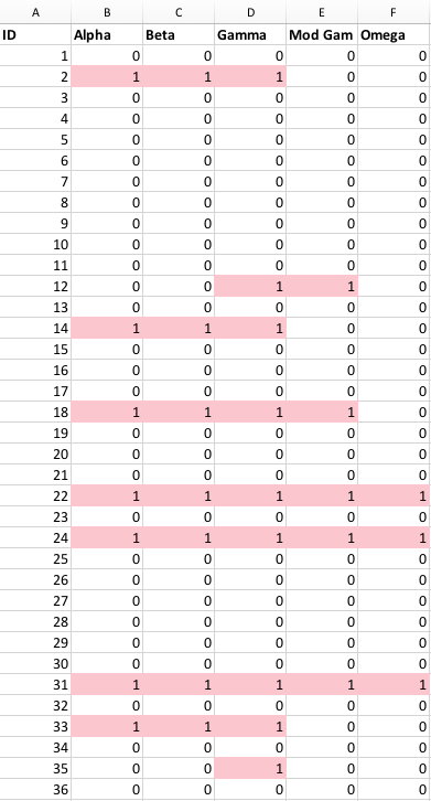
A researcher came to me for help with an academic paper figure. He and his collaborator were comparing five literature-accepted methods for identifying which patients might have a certain common disease from their medical records. Out of 60,000 patients, about 10% showed a match with at least one of the tests. The resulting data was a spreadsheet with a column of patient IDs, and five columns of tests, with a one if a patient was identified as having the disease by that particular test, and a zero if their records didn’t match for that test. As you can see in the figure, there were many inconsistencies between who seemed to have the disease across the five tests!

So you want to build a snowman

Five tests overlap, original Venn diagram The researchers wanted a visualization to represent the similarities and differences between the test results. Specifically, they wanted to make a Venn diagram, which consists of ellipsoids representing overlapping sets. They had an example they’d drawn by hand, but wanted help making it into an accurate depiction of their data. I resisted, explaining that I didn’t know of a program that would accomplish what he wanted, and that it is likely to be mathematically impossible to take their five-dimensional data set and represent it quantitatively as a Venn diagram in 2D. Basically, you can’t get the areas of all of the overlapping regions to be properly proportional to the number of patients that had hits on all of the combinations of the five tests. The Venn diagram works fine schematically, as a way to get across an idea of set overlap, but it would never be a data visualization that would reveal quantitative patterns from their findings. At worst, it would be a misleading distortion of their results.

Count me in

Five tests data pairwise table with colored cells His other idea was to show the results as a table of numbers in the form of a matrix. Each of the five tests were listed across the top and the side, and the cell contents showed the quantity of patients who matched on that pair of tests. The number matching on a single test was listed on the diagonal. Those patterns can be made more visual by coloring the cells with “conditional formatting” in Excel, but the main problem with the table is that it hides a bunch of interesting data! We don’t see any of the numbers for people who hit on the various combinations of three tests, or four, or the ones that hit on all five.

Five test data heatmap and number of tests hit per patient

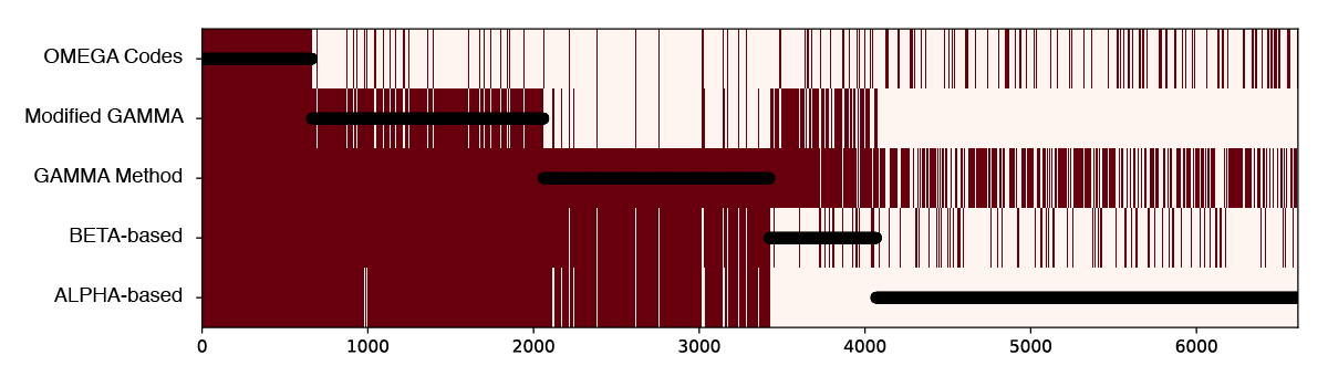
I suggested we start exploring the hit combinations by creating a heatmap of the original data, but sort the patients (along the horizontal axis) by how many tests tests they hit (listing the tests up the vertical axis). Black circles are overlaid showing the number of tests hit for any given patient.

There are too many patients / lines here to show clearly the combinations of tests, but this visualization already illuminated two things that made sense to the researchers. First, there is a lot of overlap between ALPHA (a) and BETA-based (b) tests, and between GAMMA Method (c) and Modified GAMMA (d), because these test pairs are variations of each other. Second, the overlaps indicate a way the definitions are logically embedded in each other; (a) is a subset of (b), and (b) is for the most part a subset of (c).

Five tests combinations Tableau bubble plot

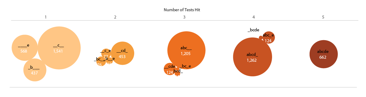
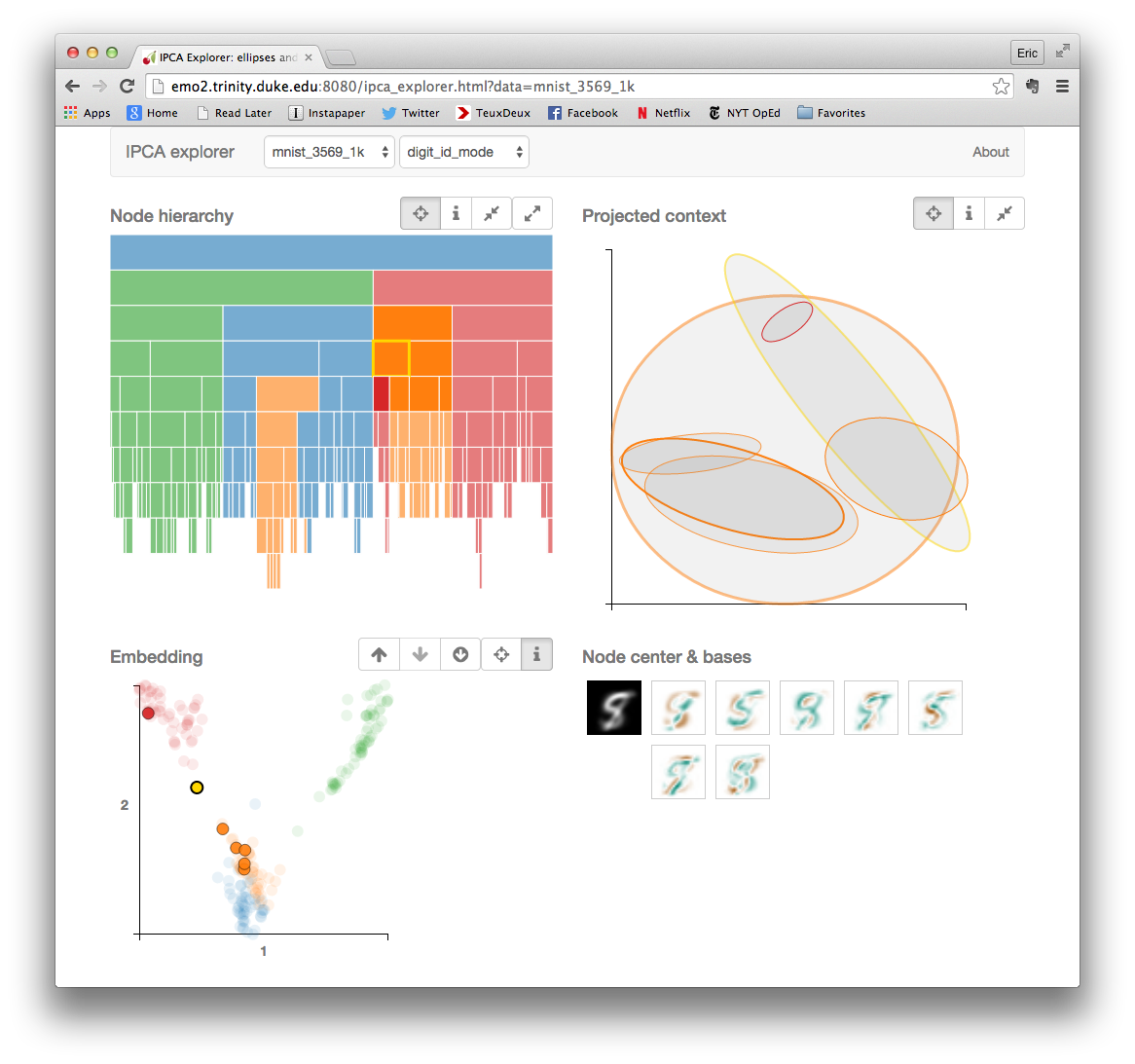
My other initial idea was to show the numbers of patients identified in each of the test overlaps as bubbles in Tableau. Here I continue the shorthand of labeling each test by the letters [a,b,c,d,e], ordered from ALPHA to OMEGA. The number of tests hit are both separated in space and encoded in the color (low to high = light to dark).

Add some (effective?) dimensions

I felt the weakness of this representation was that the bubbles were not spatially associated with their corresponding tests. Inspired by multi-dimensional radial layouts such as those used in the Stanford dissertation browser, I created a chart (in Adobe Illustrator) with five axes for the tests. I wanted each bubble to “feel a pull” from each of the passed tests, so it made sense to place the five-hit “abcde” bubble at the center, and each individual, “_b___”, “__c__”, ____e” bubble right by its letter – making the radius naturally correspond to the number of test hit. Other bubbles were placed (manually) in between their combination of axes / tests.

Five test combinations hits polar bubble plot

The researchers liked this version. It was eye-catching, and the gravitation of bubbles in the b/c quadrant vaguely illustrated the pattern of hits and known test subsets. One criticism, though, was that it was a bit confusing – it wasn’t obvious how the bubbles were placed around the circles, and it might take people too long to figure out how to read the plot. It also, took up a lot of page space.

Give these sets a hand

One of the collaborators, after seeing this representation, suggested trying to use it as the basis for an Euler diagram. Like a Venn diagram, it’s a visualization used to show set inclusion and overlap, but unlike in a Venn, an Euler is drawn using arbitrary shapes surrounding existing labels or images representing the set members. I thought it was an interesting idea, but I initially dismissed the idea as too difficult. I had already put more time than I typically spend on a consult into this visualization (our service model is to help people learn how to make their own visualizations, not produce visualizations for them). Also, I had never made an Euler diagram. While I had seen some good talks about them, I didn’t have any software on hand which would automate the process. So, I responded that the researchers should feel free to try creating curves around the sets themselves, but I wasn’t interested in pursuing it further.

Five tests polar bubbles with hand-drawn set boundaries About two minutes after I sent the email, I began looking at the diagram and wondering if I could draw the sets! I printed out a black and white copy and started drawing lines with colored pencils, making one enclosing shape for each test [a-e]. It turned out that my manual layout resulted in fairly compact curves, except for “_bc_e”, which had ambiguous positioning, anyway. Five tests first draft Euler diagram The curve drawing was so easy that I started an Illustrator version. I kept the circles’ area the same (corresponding to their quantitative value) but pushed them around to make the set shapes more compact.

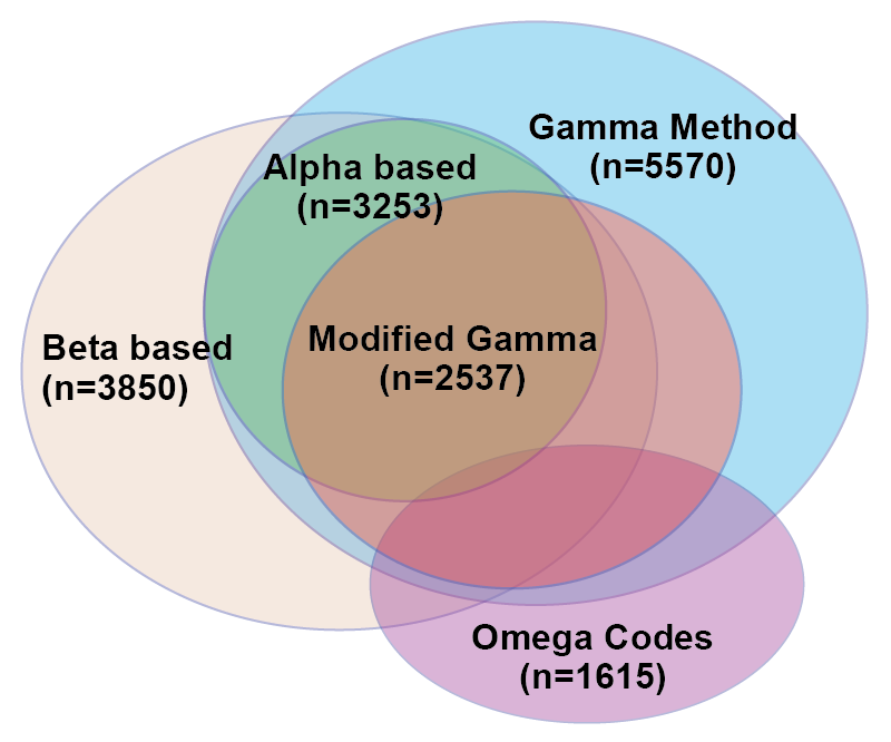
Ironically, I had come back almost exactly to the researchers’ original idea! The important distinction is that the bubbles keep it quantitative, with the regions only representing set overlap.

We’ve come full ellipsoid

Angela Zoss constructively pointed out that there were now too many colors, and the shades encoding number of hits wasn’t necessary. She also felt the region labels weren’t clear. Those fixes, plus some curve smoothing (Path -> Simplify in Illustrator) led me to a final version we were all very happy with!

It’s still not a super simple visualization, but both the quantitative and set overlap patterns are reasonably clear. This results was only possible, though, through trying multiple representations and getting feedback on each!

Five tests final quantitative bubble Euler diagram

If you’re interested in learning how to create visualizations like this yourself, sign up for the DVS announcements listserve, or keep an eye on our upcoming workshops list. We also have videos of many past workshops, including Angela’s Intro to Effective Data Visualization, and my Intro to Tableau, Illustrator for Charts, and Illustrator for Diagrams.

Fall Data and Visualization Workshops

2017 Data and Visualization Workshops

Visualize, manage, and map your data in our Fall 2017 Workshop Series.  Our workshops are designed for researchers who are new to data driven research as well as those looking to expand skills with new methods and tools. With workshops exploring data visualization, digital mapping, data management, R, and Stata, the series offers a wide range of different data tools and techniques. This fall, we are extending our partnership with the Graduate School and offering several workshops in our data management series for RCR credit (please see course descriptions for further details).

Everyone is welcome at Duke Libraries workshops.  We hope to see you this fall!

Workshop Series by Theme

Data Management

09-13-2017 – Data Management Fundamentals
09-18-2017 – Reproducibility: Data Management, Git, & RStudio 
09-26-2017 – Writing a Data Management Plan
10-03-2017 – Increasing Openness and Reproducibility in Quantitative Research
10-18-2017 – Finding a Home for Your Data: An Introduction to Archives & Repositories
10-24-2017 – Consent, Data Sharing, and Data Reuse 
11-07-2017 – Research Collaboration Strategies & Tools 
11-09-2017 – Tidy Data Visualization with Python

Data Visualization

09-12-2017 – Introduction to Effective Data Visualization 
09-14-2017 – Easy Interactive Charts and Maps with Tableau 
09-20-2017 – Data Visualization with Excel
09-25-2017 – Visualization in R using ggplot2 
09-29-2017 – Adobe Illustrator to Enhance Charts and Graphs
10-13-2017 – Visualizing Qualitative Data
10-17-2017 – Designing Infographics in PowerPoint
11-09-2017 – Tidy Data Visualization with Python

Digital Mapping

09-12-2017 – Intro to ArcGIS Desktop
09-27-2017 – Intro to QGIS 
10-02-2017 – Mapping with R 
10-16-2017 – Cloud Mapping Applications 
10-24-2017 – Intro to ArcGIS Pro

Python

11-09-2017 – Tidy Data Visualization with Python

R Workshops

09-11-2017 – Intro to R: Data Transformations, Analysis, and Data Structures  
09-18-2017 – Reproducibility: Data Management, Git, & RStudio 
09-25-2017 – Visualization in R using ggplot2 
10-02-2017 – Mapping with R 
10-17-2017 – Intro to R: Data Transformations, Analysis, and Data Structures
10-19-2017 – Developing Interactive Websites with R and Shiny 

Stata

09-20-2017 – Introduction to Stata
10-19-2017 – Introduction to Stata 


Fall 2016 DVS Workshop Series

GenericWorkshops-01Data and Visualization Services is happy to announce its Fall 2016 Workshop Series. Learn new ways of enhancing your research with a wide range of data driven research methods, data tools, and data sources.

Can’t attend a session?  We record and share most of our workshops online.  We are also happy to consult on any of the topics above in person.  We look forward to seeing you in the workshops, in the library, or online!

Data Sources
 
Data Cleaning and Analysis
 
Data Analysis
Introduction to Stata (Two sessions: Sep 21, Oct 18)
 
Mapping and GIS
Introduction to ArcGIS (Two sessions: Sep 14, Oct 13)
ArcGIS Online (Oct 17)
 
Data Visualization

Visualizing Qualitative Data (Oct 19)
Visualizing Basic Survey Data in Tableau – Likert Scales (Nov 10)

2016 Student Data Visualization Contest Winners

Thanks to an earlier fall deadline, we are already ready to announce the winners of our fourth year of the Duke Student Data Visualization Contest.  The 14 visualizations submitted highlighted some very exciting visualization work being done by students of all ages here at Duke. The winners and other submissions to the contest will soon be featured on the Duke Data Visualization Flickr Gallery.

As in the past, the submissions were judged on the basis of five criteria: insightfulness, broad appeal, aesthetics, technical merit, and novelty.  The three winning submissions this year exemplify all of these and tell rich stories about three very different types of research projects. The winning submissions will be converted to larger poster versions and hung in the Brandaleone Lab for Data and Visualization Services (in the Edge).  Be on the look out later this semester for a reception to celebrate their hard work!  The winners will also receive Amazon gift cards.  We are very grateful to Duke University Libraries for their continuing support of the contest.

First place:

Global Flows of Agriculture and Forestry Feedstocks
Brandon Morrison, Ph.D. Candidate (Division of Earth & Ocean Sciences, NSOE)

2016 Data Visualization Contest-Morrison&Golden

Second place:

Feature Interpretations from Ground Penetrating Radar at Vulci, Italy
Katherine McCusker, Ph.D. Student (Art History)

McCusker_DataVisualization_Vulci_sm

Third place:

Simulated Sediment Deposition at Continental Margins
Candise Henry, Ph.D. Student (Division of Earth & Ocean Sciences, NSOE

henryc_figure

Please join us in celebrating the outstanding work of these students!

Duke welcomes artist/illustrator Jennifer McCormick

McCormick_PortraitOn the last day of classes, December 4, the Duke community will have a very special treat: a visit from artist and certified medical illustrator Jennifer McCormick.  Jennifer has been actively exhibiting and speaking about her work for several years, including a recent TEDx talk at Wake Forest University and an exhibit at the Durham Arts Council.

knee_combinedIn Jennifer’s work as a medical illustrator, she partners with attorneys to create visualizations that explain complex injuries and medical procedures to jury members.  In her fine art, however, she builds on the histories and x-rays of patients to explore “an opportunity for healing, hope, and acceptance.”  Her unique pieces transform the original clinical imagery of the injury into gorgeous, natural, holistic scenes.  In her artist talks, she speaks of “the power of intention” and “our forgotten superpowers” to raise awareness of the importance of art and spirituality for healing.

McCormick-6WEBJennifer will join us for the final Visualization Friday Forum of the semester.  It will be an opportunity for visualization enthusiasts, clinicians, medical imaging specialists, legal scholars, and those interested in the intersection between health and art to gather together for a presentation and conversation.  The talk will occur in the standard time slot for the Visualization Friday Forum — noon on Friday, December 4 — but the location is changing to accommodate a larger audience.  For one week only, we will meet in Duke Hospital Lecture Hall 2003.

The Visualization Friday Forum is sponsored by the Duke University Libraries (Data and Visualization Services), Duke Information Science + Studies (ISS), and the DiVE group. Jennifer’s visit will also be sponsored by the Trent Center for Bioethics, Humanities & History of Medicine and Duke Law – Academic Technologies.

We are so excited Jennifer has agreed to travel to Duke for a visit.  Please mark your calendars for this event.  If you would like to speak with Jennifer about medical illustrations or the intersection between medicine and spirituality, please contact Angela Zoss.

Enter the 2016 Student Data Visualization Contest

2016 Student Data Visualization ContestCalling all Duke undergrad and grad students! Have you worked on a course or research project that included some kind of visualization? Maybe you made a map for a history class paper. Maybe you invented a new type of chart to summarize the results of your experiment. Maybe you played around with an infographic builder just for fun.

Now is the time to start thinking about submitting those visualizations to the Duke Student Data Visualization Contest. It’s easy — just grab a screenshot or export an image of your visualization, write up a short description explaining how you made it, and submit it using our Sakai project site (search for “2016 DataVis Contest”). The deadline is right after finals this fall, so just block in a little extra time at the end of the semester once you’re done with your final assignments and projects.

Not sure what would work as a good submission? Check out our Flickr gallery with examples from the past two years.

Not sure if you’re eligible? If were a Duke student (that is, enrolled in a degree-granting program, so no post-docs) any time during 2015, and you did the work while you were a student, you’re golden!

Want to know more about the technical details and submission instructions? Check out the full contest instructions.

Welcoming our new Data Visualization Analyst — Eric Monson

EMonson2Data and Visualization Services is proud and excited to welcome Eric Monson, Ph.D., our newest staff member. Eric joins the team as our Data Visualization Analyst, working with Angela Zoss to provide support for data visualization across Duke’s campus and community.

Eric worked for several years under the supervision of Rachael Brady, who was the head of the Visualization Technology Group (now the Visualization and Interactive Systems group), the founder of the DiVE, and a hub for the visualization community at Duke. Though transitioning from work in applied physics, Eric quickly became an active member of the broader visualization research community, sharing his experiences developing interactive visualization applications through online forums and professional organizations. His natural design sense contributes to an elegant portfolio of past work, and his work on projects in both the sciences and the humanities gives him an extremely wide range of experience with different datasets, tools, and techniques.

ipca_webSince DVS began offering visualization services in 2012, Eric has been an active supporter and collaborator. While continuing to work as a Research Scientist, Eric has co-organized the Visualization Friday Forum speaker series, teamed up with Angela on instructional sessions, and been an active supporter of visualization events and initiatives. He is an experienced and patient instructor and will bring many years of consulting experience to bear in this new role.

Over the past three years, demand for visualization support has steadily increased at Duke. With an active workshop series, guest lectures in a variety of courses, individual and small-group consultations, and programming such as the Student Data Visualization Contest, DVS is very happy to be able to boast two staff members with visualization expertise. In the near future, we hope to increase our visualization workshop offerings and continue to identify powerful but easy-to-use tools and techniques that will meet the needs of Duke visualizers. Taking advantage of Eric’s background in sciences and humanities, DVS looks forward to being able to answer a broader range of questions and offer a more diverse set of solutions.

Please join us in welcoming Eric to the team!  As always, feel free to contact askdata@duke.edu with any questions or data-driven research needs.

DVS Fall Workshops

GenericWorkshops-01Data and Visualization Services is happy to announce its Fall 2015 Workshop Series.  With a range of workshops covering basic data skills to data visualization, we have a wide range of courses for different interests and skill levels..  New (and redesigned) workshops include:

  • OpenRefine: Data Mining and Transformations, Text Normalization
  • Historical GIS
  • Advanced Excel for Data Projects
  • Analysis with R
  • Webscraping and Gathering Data from Websites

Workshop descriptions and registration information are available at:

library.duke.edu/data/news


Workshop
 

Date

OpenRefine: Data Mining and Transformations, Text Normalization
Sep 9
Basic Data Cleaning and Analysis for Data Tables
Sep 15
Introduction to ArcGIS
Sep 16
Easy Interactive Charts and Maps with Tableau
Sep 18
Introduction to Stata
Sep 22
Historical GIS
Sep 23
Advanced Excel for Data Projects
Sep 28
Easy Interactive Charts and Maps with Tableau
Sep 29
Analysis with R
Sep 30
ArcGIS Online
Oct 1
Web Scraping and Gathering Data from Websites
Oct 2
Advanced Excel for Data Projects
Oct 6
Basic Data Cleaning and Analysis for Data Tables
Oct 7
Introduction to Stata
Oct 14
Introduction to ArcGIS
Oct 15
OpenRefine: Data Mining and Transformations, Text Normalization
Oct 20
Analysis with R
Oct 20


2015 Student Data Visualization Contest Winners

Our third year of the Duke Student Data Visualization Contest has come and gone, and we had another amazing group of submissions this year.  The 19 visualizations submitted covered a very broad range of subject matter and visualization styles. Especially notable this year was the increase in use of graphic design software like Illustrator, Photoshop, and Inkscape to customize the design of the submissions.  The winners and other submissions to the contest will soon be featured on the Duke Data Visualization Flickr Gallery.

As in the past, the submissions were judged on the basis of five criteria: insightfulness, broad appeal, aesthetics, technical merit, and novelty.  The three winning submissions this year exemplify all of these and tell rich stories about three very different types of research projects. The winners will be honored at a public reception on Friday, April 10, from 2:00 p.m. to 3:00 p.m, in the Brandaleone Lab for Data and Visualization Services (in the Edge).  They will each receive an Amazon gift card, and a poster version of the projects will be displayed in the lab.  We are very grateful to Duke University Libraries and the Sanford School of Public Policy for sponsoring this year’s contest.

First place:

Social Circles of Primary Caregivers / Tina Chen

Presentation2

Second place:

Crystal Structure of Human Proliferating Cell Nuclear Antigen (PCNA) for in silico Drug Screen / Yuqian Shi

DVC

Third place:

Deep and Extensive Impacts to Watershed Shape and Structure from Mountaintop Mining in West Virginia / Matthew Ross

DukeViz_MR

Please join us in celebrating the outstanding work of these students, as well as the closing of the Places & Spaces: Mapping Science exhibit, on April 10 in the Edge.

DataFest 2015 @ the Edge

DataFest 2015Duke Libraries are happy to host the American Statistical Association’s Data Fest Competition the weekend of March 20-22nd.  In its fourth year at Duke, DataFest brings teams of students from across the Research Triangle to compete in a weekend long competition that stresses data cleaning, analytics, and visualization skills.   The Edge provides a central location for the competition with facilities designed for collaborative, data driven research.

While the deadline for forming DataFest teams has past, Data and Visualization Services and Duke’s Department of Statistical Sciences are happy to offer another opportunity to participate in DataFest.  Starting Monday, March 16th we are offering four workshops on data analytics and visualization in the four days leading up to the DataFest event.  All workshops are open to the public, but we strongly encourage early registration to ensure a seat. Please come join us as we get ready to celebrate ASA DataFest 2015.

DataFest Workshop Series

Monday, March 16th, 6:00-8:00 PM – Introduction to R

Tuesday, March 17th, 1:30-3:00 PM – Easy Interactive Charts and Maps with Tableau

Wednesday, March 18th,  6:00-8:00 PM – Data Munging with R and dplyr

Thursday, March 19th, 7:00-9:00 PM – Visualization in d3