You’re probably aware that voting in the United States is managed in a very decentralized manner compared to most other countries. There are limited sources that comprehensively compile local-level results or geographic data showing local voting precincts. We’ll discuss several selected projects have come about to try to pull all this data together to provide one-stop repositories, as well as state and local sources for election data. Some of these are free resources, and some are licensed by us for the use of Duke affiliates.
Election Returns
 The Princeton University Library has an excellent guide to elections returns and related data in their Elections and Voting Data Guide: United States (U.S.) and International, compiled by their Politics Librarian, Jeremy Darrington. This is a good first place to look for repositories of voting data, both U.S. and international. We’ll discuss a few of the most useful of these sources that the Duke community has access to.
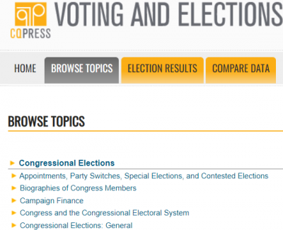 The CQ Voting and Elections Collection (Duke users only) has results data on Presidential, Congressional, and gubernatorial elections, some back to the 19th century. Results are generally given down to the county level of detail.
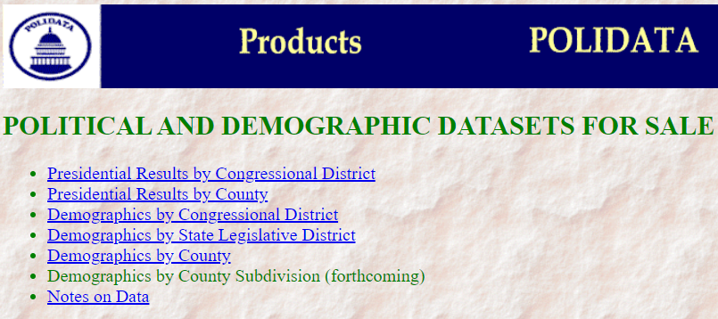 Polidata presents presidential election result data by congressional district and county in STATA, Excel, or CSV format, with data dictionaries as text files and documentation in PDF format. The Duke Libraries has obtained some of their data, curating the 1992-2008 District-level Polidata.
Geographic Data (GIS Layers)
 Geographies that relate specifically to election data are Congressional or Legislative Districts, as well as voting precincts. The Census Bureau’s Voting Tabulation District (VTD) boundaries closely parallel precincts but are based on the Census Block geographies. They may not exactly match all locally created precincts, but may be all you can get electronically.
NHGIS (National Historical GIS) has the most election-related GIS boundary files, back to 1990 for VTDs, to 2000 for state legislative districts, and into the late 1980s for U.S. Congressional Districts. The Census Bureau has a scattered collection of these as well, at least for more recent years, usually on a state-by-state- or county-by-county (for the VTDs) basis. See either their web interface or their FTP site.
Election Results and GIS layers Together
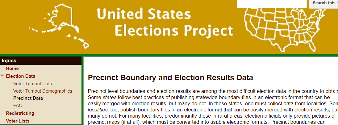 A good all-in-one source is The United States Elections Project, with lead contributors from the Voting and Election Science Team at the University of Florida and Wichita State University. It includes both election results and GIS shapefiles down to the precinct level, mostly from the last decade (as recently as some 2021 elections). For those interested in redistricting issues and gerrymandering, precinct-level data is essential.
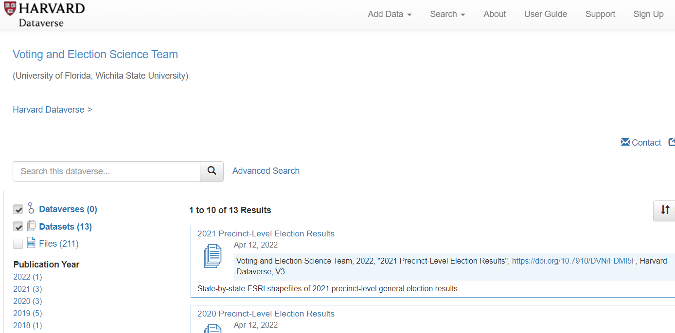 Their data is stored in the Harvard Dataverse, a data publishing platform that includes several election-related projects (election results and sometimes GIS files). It is a rich, if somewhat scattershot, repository with a lot of hidden gems. You can use the Advanced Search interface to find some of these datasets.
State and Local Sources
 Sometimes, you need to find state, county, and city sources for election data, either for local elections or for geographically granular data results, like voting precincts. The National Association of Secretaries of State (NASS) website indexes the Secretaries of State websites, which may or may not have actual election results data.
 The state elections offices may only have information on registration and on voting locations, but sometimes may include results data. For instance, the North Carolina State Board of Elections has some pretty thorough data at the precinct level for recent years, with good documentation.
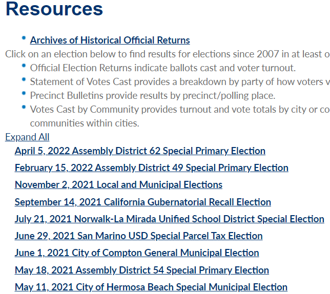
 Some local governments are good about releasing election data at the precinct level. They may include data for such elections as municipal offices, school districts, and bond initiatives that you’d probably never find compiled at a national site. This example is from Los Angeles County.
Tools
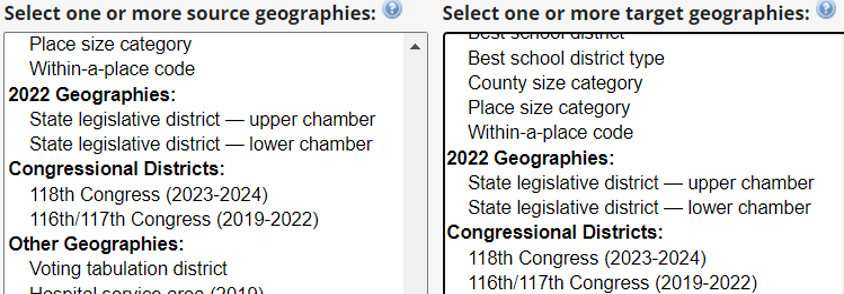 If you need statistical or GIS tools to analyze the data, be sure to contact us at askdata@duke.edu for advice. Here, I’ll mention the Geocorr utility at the Missouri Census Data Center, which you can use to reaggregate data into different geographic areas. You can create correspondence tables between geographies such as voting tabulation districts or legislative districts and Census geographies, say, if you need to analyze demographics and socioeconomic factors. The correspondence tables include weighting factors indicating the percent of one area within another.