As students and classes moved online in the spring of 2020, the Center for Data and Visualization Sciences realized that it was time to expand our existing email (askdata@duke.edu) and lab based consultation services to meet the data demands of online learning and remote projects. Six months and hundreds of online consultations later, we have developed a new appreciation for the online tools that allow us to partner with Duke researchers around the world. Whether you prefer to chat, zoom, or email, we hope to work with you on your next data question!
Chat
Ever had a quick question about how to visualize or manage your data, but weren’t sure where to get help? Having trouble figuring out how to get the data software to do what you need for class/research? CDVS offers roughly thirty hours of chat support each week. Data questions on chat cover our full range of data support. If we cannot resolve a question in the chat session, we will make a referral for a more extended consultation.
Zoom
We’re going to be honest… we miss meeting Duke students and faculty in the Brandaleone Lab in the Edge and consulting on data problems! However, virtual data consultations over zoom have some advantages over an in-person data consultations at the library. With zoom features such as screen sharing, multiple participants, and chat, we can reach both individuals and project teams in a format where everyone can see the screen and sharing resource links is simple. As of October 1st, we have used zoom to consult on questions from creating figures in the R programming languages to advising Bass Connection teams on the best way to visualize their research. We are happy to schedule zoom consultations via email at: askdata@duke.edu.
Just askdata@duke.edu
Even with our new data chat service and video chat services, we are still delighted to advise on questions over email at askdata@duke.edu. As the days grow shorter this fall and project deadlines loom, we look forward to working with you to resolve your data challenges!
John Little is the Data Science Librarian in Duke Libraries Center for Data and Visualizations Sciences. Contact him at askdata@duke.edu.
The Center for Data and Visualization Sciences is and has been open since March! We never closed. We’re answering questions, teaching workshops, have remote virtual machines available, and business is booming.
What’s changed? Due to COVID-19, the CDVS staff are working remotely. While we love meeting with people face-to-face in our lab, that is not currently possible. Meanwhile, digital data wants to be analyzed and our patrons still want to learn. By late spring I began planning to flip my workshops for fall 2020. My main goal was to transform a workshop into something more rewarding than watching the video of a lecture, something that lets the learner engage at their pace, on their terms.
How to flip
Flipping the workshop is a strategy to merge student engagement and active learning. In traditional instruction, a teacher presents a topic and assigns work aimed at reinforcing the lesson.
Background: I offer discrete two-hour workshops that are open to the entire university. There are very few prerequisites and people come with their own level of experience. Since the workshops attract a broad audience, I focus on skills and techniques using general examples that reliably convey information to all learners. In this environment, discipline specific examples risk losing large portions of the audience. As an instructor I must try to leave my expectations of students’ skills and background knowledge — at the door.
In a flipped classroom, materials are assigned and made available in advance. In this way, group Zoom-time can be used for questions and examples. This instruction model allows students to learn at their own pace, pause and rewind videos, practice exercises, or speed up lectures. During the workshop, students can bring questions relevant to their particular point of confusion.
The main instructor goal is to facilitate a topic for student engagement that puts the students in control. This approach has a democratizing effect that allows students to become more active and familiar with the materials. With flipped workshops, student questions appear to be more thoughtful and relevant. When the student is invited to take charge of their learning, the process of investigation becomes their self-driven passion.
For my flipped workshops materials, I offer basic videos to introduce and reinforce particular techniques. I try to keep each video short, less than 25 minutes. At the same time I offer plenty of additional videos on different topical details. More in-depth videos can cover important details that may feel ancillary or even demotivating, even if those details improve task efficiency. Sometimes the details are easier to digest when the student is engaged. This means students start at their own level and gain background when they’re ready. Students may not return to the background material for weeks, but the materials will be ready when they are.
Flipping a consultation?
The Center for Data & Visualization Sciences provides open workshops and Zoom-based consulting. The flipped workshop model aligns perfectly with our consulting services since students can engage with the flipped workshop materials (recordings, code, exercises) at any time. When the student is ready for more information, whether a general question or a specific research question, I can refer to targeted background materials during my consultations. With the background resources, I can keep my consultations relevant and brief while also reducing the risk of under-informing.
For my flipped workshop on R, or other CDVS workshops, please see our workshop page.
Felipe Álvarez de Toledo López-Herrera is a Ph.D. candidate in the Art, Art History, and Visual Studies Department at Duke University and a Digital Humanities Graduate Assistant for Humanities Unbounded, 2019-2020. Contact him at askdata@duke.edu.
[This blogpost introduces a GitHub Repository that provides resources for developing NER projects in historical languages. Please do not hesitate to use the code and ideas made available there, or contact me if there are any issues we could discuss .]
Understanding Historical Art Markets: an Automated Approach
When the Sevillian painters’ guild archive was lost in the 19th century, with it vanished lists of master painters, journeymen, apprentices and possibly dealers recorded in the guilds’ registration books. Nevertheless, researchers working for over a century in other Sevillian archives have published almost twenty volumes of archival documents. These transcriptions, excerpts and summaries reflect the activities of local painters, sculptors, and architects, among other artisans. I use this evidence as a source of data on early modern Seville’s art market in my dissertation research. For this, I have to extract information from many documents in order to query and discern larger patterns.
Left. Some of the volumes used in this research, in my home library. I have managed to acquire these second-hand; others I have borrowed from libraries. Right. A scan of one of the pages of these books, showing some of the documents from which we extracted data.
Instead of manually keying this information into a spreadsheet or other form of data storage, I chose to scan my sources and test an automated approach using Natural Language Processing. Last semester, within the context of the Humanities Unbounded Digital Humanities Graduate Assistantship, I worked with Named-Entity Recognition (NER), a technique in which computers can be taught to identify named real-world objects in texts. NER models underperform on historical texts because they are trained on modern documents such as news or Wikipedia articles. Furthermore, NLP developers have focused most of their efforts on English language models, resulting in underdeveloped models for other languages. For these reasons, I had to retrain a model to be useful for my purposes. In this blogpost, I give an overview of the process of adapting NER tools for use on non-English historical sources.
Defining Named-Entity Recognition
Named-Entity Recognition (NER) is a set of processes in which a computer program is trained to identify and categorize real-world objects with proper names in a corpus of texts. It can be used to tag names in documents without a standardized structure and label them as people, locations or organizations, among other categories.
Named-entity recognition is the automated tagging of real-world objects with names, such as people, locations, organizations, or monetary amounts, within texts.
Code libraries such as Spacy, NLTK or Stanford CoreNLP provide widely-tested toolkits for NER. I decided that Spacy would be the best choice for my purposes. Though its Spanish model included less label categories, they performed better out-of-the-box. Importantly, the model worked better for certain basic language structures such as recognizing compound names (last names with several components, such as my own). The Spacy library also proved user-friendly for those of us with little coding knowledge. Its pre-programmed data processing pipeline is easy to modify, given that you have a basic understanding of Python. In my case, I had the time and motivation to acquire this literacy.
I sought to improve the model’s performance in two ways. First, I retrained it on a subset of my own data. This improved performance and allowed me to add new label categories such as dates, monetary amounts and objects. Additionally, I added a component that modernized my texts’ spelling to make them more conducive to proper tagging.
Training NER on Historical Spanish Text: Process and Results
To improve the model, I needed training data – a “gold standard” of perfectly-tagged text. First, I ran the model on a set of 400 documents, which resulted in a set of preliminary tags. Then, I corrected these tags with a tool called Dataturks and reformatted the output to work with Spacy. Once this data was ready, I split it 80-20, which means running a training loop on 80% of correctly-tagged texts to adjust the performance of the model, and reserving 20% for testing or evaluating the model on data it had not yet seen.
Final output as stored in my database for one particular document with ID=5.
Finally, I evaluated whether all these changes actually improved the model’s performance, saved the updated model, and exported the output in a format that worked for my own database. For my texts, the model initially worked at around 36% recall (the percentage of true entities that were identified by the model), compared to an 89% recall with modern texts as evaluated by Spacy. After training, recall has increased to 64%. Some tags, such as person or location, perform especially well (85% and 81%, respectively). Though the numbers are not perfect, they show a marked improvement, generated with little training data.
For the 8,607 documents processed, the process has resulted in 59,191 tags referring to people, locations, organizations, dates, objects and money. Next steps include finding descriptors of entities within the text, and modeling relationships between entities appearing in the same document. For now, a look at the detected tags underscores the potential of NER for automating data collection in data-driven humanities research.
The Center for Data and Visualization Sciences is glad to welcome you back to a new academic year! We’re excited to have friends and colleagues returning to the Triangle and happy to connect with Duke community members who will not be on campus this fall.
This fall, CDVS will expand its existing online consultations with a new chat service and new online workshops for all members of the Duke community. Since mid-March, CDVS staff have redesigned instructional sessions, constructed new workflows for accessing research data, and built new platforms for accessing data tools virtually. We look forward to connecting with you online and working with you to achieve your research goals.
In addition to our expanded online tools and instruction, we have redesigned our CDVS-Announce data newsletter to provide a monthly update of data news, events, and workshops at Duke. We hope you will consider subscribing.
Upcoming Virtual CDVS Workshops
CDVS continues to offer a full workshops series for the latest strategies and tools for data focused research. Upcoming workshops for early September include:
R for data science: getting started, EDA, data wrangling
Thursday, Sep 1, 2020 10am – 12pm
This workshop is part of the Rfun series. R and the Tidyverse are a data-first coding language that enables reproducible workflows. In this two-part workshop, you’ll learn the fundamentals of R, everything you need to know to quickly get started. You’ll learn how to access and install RStudio, how to wrangle data for analysis, gain a brief introduction to visualization, practice Exploratory Data Analysis (EDA), and how to generate reports.
Register: https://duke.libcal.com/event/6867861
Research Data Management 101
Wednesday, Sep 9, 2020 10am – 12pm
This workshop will introduce data management practices for researchers to consider and apply throughout the research lifecycle. Good data management practices pertaining to planning, organization, documentation, storage and backup, sharing, citation, and preservation will be presented using examples that span disciplines. During the workshop, participants will also engage in discussions with their peers on data management concepts as well as learn about how to assess data management tools.
Register: https://duke.libcal.com/event/6874814
R for Data Science: Visualization, Pivot, Join, Regression
Wednesday, Sep 9, 2020 1pm – 3pm
This workshop will introduce data management practices for researchers to consider and apply throughout the research lifecycle. Good data management practices pertaining to planning, organization, documentation, storage and backup, sharing, citation, and preservation will be presented using examples that span disciplines. During the workshop, participants will also engage in discussions with their peers on data management concepts as well as learn about how to assess data management tools.
Register: https://duke.libcal.com/event/6867914
ArcGIS StoryMaps
Thursday, September 10, 2020 1pm – 2:30pm
This workshop will help you get started telling stories with maps on the ArcGIS StoryMaps platform. This easy-to-use web application integrates maps with narrative text, images, and videos to provide a powerful communication tool for any project with a geographic component. We will explore the capabilities of StoryMaps, share best practices for designing effective stories, and guide participants step-by-step through the process of creating their own application.
Register: https://duke.libcal.com/event/6878545
Assignment Tableau: Intro to Tableau work-together
Friday, September 11, 2020 10am – 11:30am
Work together over Zoom on an Intro to Tableau assignment. Tableau Public (available for both Windows and Mac) is incredibly useful free software that allows individuals to quickly and easily explore their data with a wide variety of visual representations, as well as create interactive web-based visualization dashboards. Attendees are expected to watch Intro to Tableau Fall 2019 online first, or have some experience with Tableau. This will be an opportunity to work together on the assignment from the end of that workshop, plus have questions answered live.
Register: https://duke.libcal.com/event/6878629
While the library may be physically closed, the Duke Research Data Repository (RDR) is open and accepting data deposits. If you have a data sharing requirement you need to meet for a journal publisher or funding agency we’ve got you covered. If you have COVID-19 data that can be openly shared, we can help make these vital research materials available to the public and the research community today. Or if you have data that needs to be under access restrictions, we can connect you to partner disciplinary repositories that support clinical trials data, social science data, or qualitative data.
Speaking of the RDR, we just completed a refresh on the platform and added several features!
Image files can now be previewed via a built in Image Viewer
In-line with data sharing standards, we also assign a digital object identifier (DOI) to all datasets, provide structured metadata for discovery, curate data to further enhance datasets for reuse and reproducibility, provide safe archival storage, and a standardized citation for proper acknowledgement.
Openness supports the acceleration of science and the generation of knowledge. Within the libraries we look forward to partnering with Duke researchers to disseminate their research data! Visit https://research.repository.duke.edu/ to learn more or contact datamanagement@duke.edu with any questions.
One of the attractive features of Tableau for visualization is that it can produce maps in addition to standard charts and graphs. While Tableau is far from being a full-fledged GIS application, it continues to expand its mapping capabilities, making it a useful option to show where something is located or to show how indicators are spatially distributed.
Here, we’re going to go over a few of the Tableau’s mapping capabilities. We’ve recorded a workshop with examples relating to this blog post’s discussion:
Tableau is a visualization tool: Tableau can quickly and effectively visualize your data, but it will not do specialized statistical or spatial analysis.
Tableau makes it easy to import data: A big advantage of Tableau is the simplicity of tasks such as changing variable definitions between numeric, string, and date, or filtering out unneeded columns. You can easily do this at the time you connect to the data (“connect” is Tableau’s term for importing data into the program).
Tableau is quite limited for displaying multiple data layers: Tableau wants to display one layer, so you need to use join techniques to connect multiple tables or layers together. You can join data tables based on common attribute values, but to overlay two geographic layers (stack them), you must spatially join one layer to one other layer based on their common location.
Tableau uses a concept that it calls a “dual-axis” map to allow two indicators to display on the same map or to overlay two spatial layers. If, however, you do need to overlay a lot of data on the same map, consider using proper GIS software.
Overlay spatial files using dual-axis maps
Displaying paths on a map requires a special data structure: In order for tabular data with coordinate values (latitude/longitude) to display as lines on a map, you need to include a field that indicates drawing order. Tableau constructs the lines like connect-the-dots, each row of data being a dot, and the drawing order indicating how the dots are connected.
Using drawing order to create lines from points
You might use this, for instance, with hurricane tracking data, each row representing measurements and location collected sequentially at different times. The illustration above shows Paris metro lines with the station symbol diameter indicating passenger volume. See how to do this in Tableau’s tutorial.
You can take advantage of Tableau’s built-in geographies: Tableau has many built-in geographies (e.g., counties, states, countries), making it easy to plot tabular data that has an attribute with values for these geographic locations, even if you don’t have latitude/longitude coordinates or geographic files — Tableau will look up the places for you! (It won’t, however, look up addresses.)
Tableau also has several built-in base maps available for your background.
Tableau uses the “Web Mercator” projection: This is the same as Google Earth/Maps. Small-scale maps (i.e., large area of coverage) may look stretched out in an unattractive way since it greatly exaggerates the size of areas near the poles.
Useful Mapping Capabilities
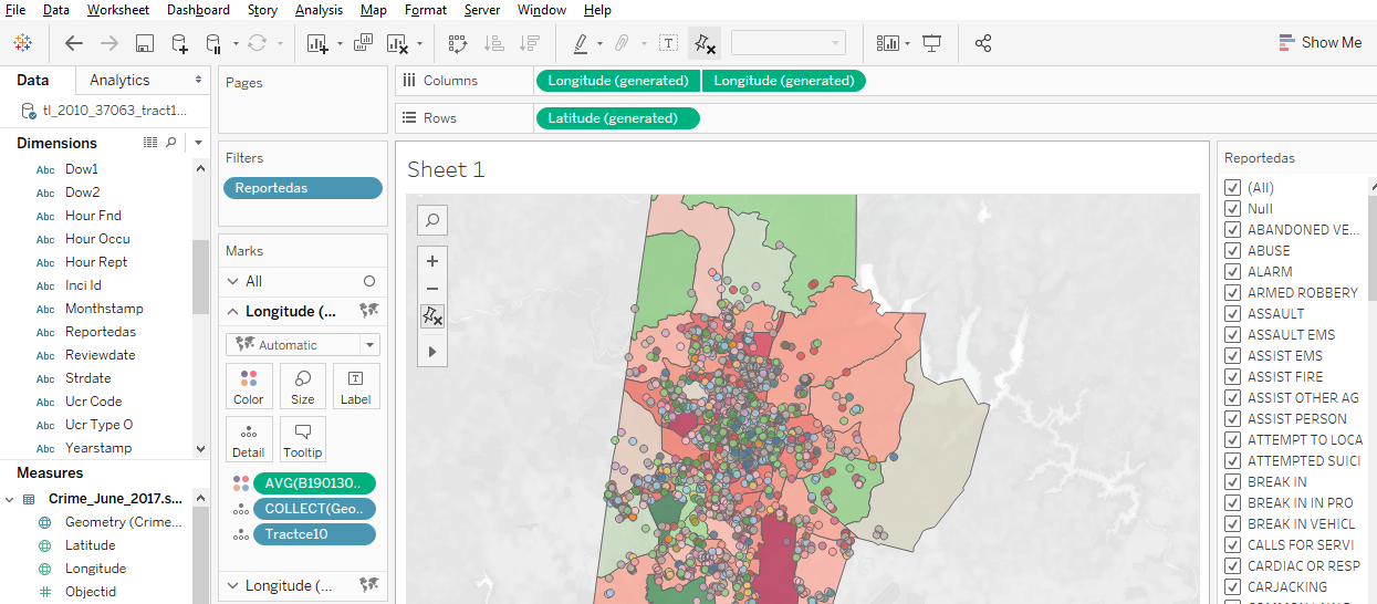
Plot points: Tableau works really well for plotting coordinate data (Longitude (X) and Latitude (Y) values) as points. The coordinates must have values in decimal degrees with negative longitudes being east of Greenwich and negative latitudes being south of the equator.
Point data with time slider
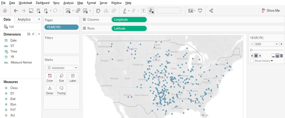
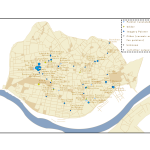
Time slider: If you move a categorical “Dimension” variable onto Tableau’s Pages Card, you can get a value-based slider to filter your data by that variable’s values (date, for instance, as in Google Earth). This is shown in the image above.
Heatmap of point distribution: You can choose Tableau’s “Density” option on its Marks card to create a heatmap, which may display the concentration of your data locations in a smoother manner.
Filter a map’s features: Tableau’s Filter card is akin to ArcGIS’s Definition Query, to allow you to look at just a subset of the features in a data table.
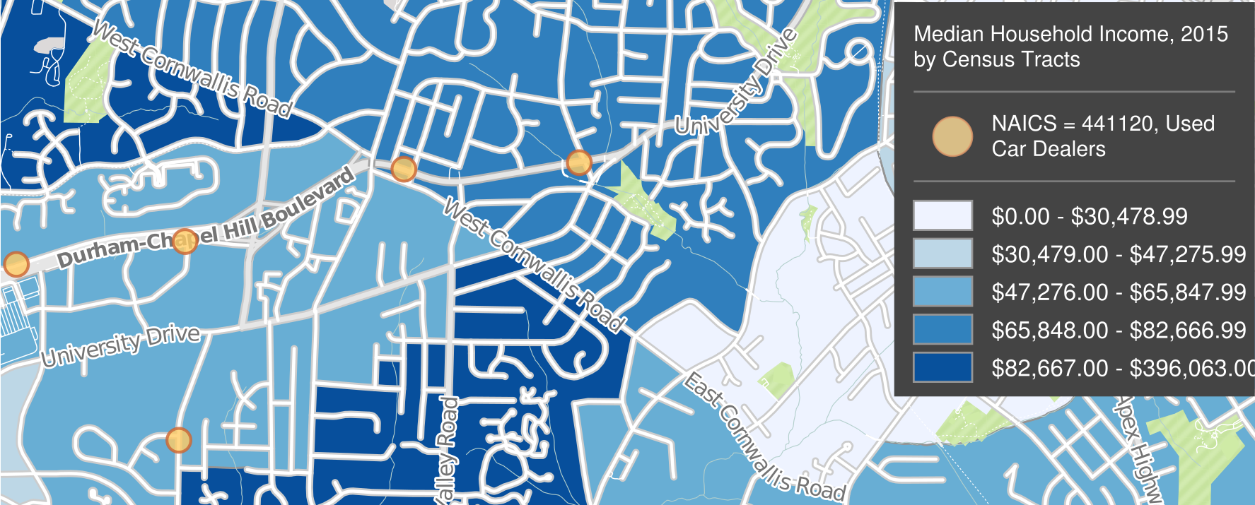
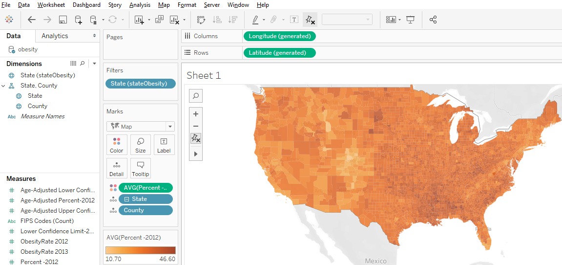
Shade polygons to reflect attribute values: Choropleth maps (polygons shaded to represent values of a variable) are easy to make in Tableau. Generally, you’ll have a field with values that match a built-in geography, like countries of the world or US counties. But you can also connect to spatial files (e.g., Esri shapefiles or GeoJSON files), which is especially helpful if the geography isn’t built into Tableau (US Census Tracts are an example).
Filled map using color to indicate values
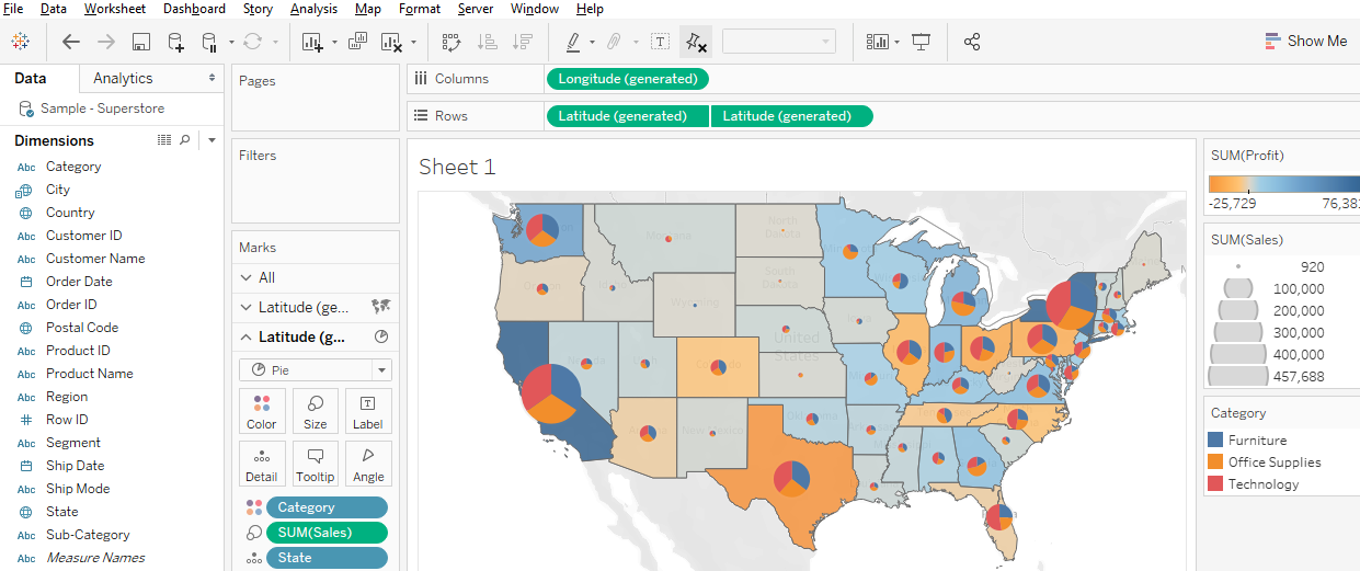
Display multiple indicators: Visualizing two variables on the same map is always problematic because the data patterns often get hidden in the confusion, but it is possible in Tableau. Use the “dual-axis” map concept mentioned above. An example might be pies for one categorical variable (with slices representing the categories) on top of choropleth polygons that visualize a continuous numeric variable.
Two variables using filled polygons and pies
Draw lines from tabular data: Tableau can display lines if your data is structured right, as discussed and illustrated previously, with a field for drawing order. You could also connect to a spatial line file, such as a shapefile or a GeoJSON file.
Help Resources
We’ve just given an overview of some of Tableau’s capabilities regarding spatial data. The developers are adding features in this area all the time, so stay tuned!
Interested in attending the 2020 RStudio Conference, but unable to travel to San Francisco? With the generous support of RStudio and the Department of Statistical Science, Duke Libraries will host a livestream of the annual RStudio conference starting on Wednesday, January 29th at 11AM. See the latest in machine learning, data science, data visualization, and R. Registration links and information about sessions follow. Registration is required for the first session and keynote presentations. Please see the links in the agenda that follows.
Education Track (registration is not required) Meet you where you R – Lauren Chadwick, R Studio.
Data Science Education in 2022 (Karl Howe and Greg Wilson, R Studio)
Data science education as an economic and public health intervention in East Baltimore (Jeff Leek, Johns Hopkins)
Of Teacups, Giraffes, & R Markdown (Desiree Deleon, Emory)
Location: Edge Workshop Room – Bostock 127
5:15 – 6:45
All About Shiny (registration is not required)
Production-grade Shiny Apps with golem (Colin Fay, ThinkR)
Making the Shiny Contest (Duke’s own Mine Cetinkaya-Rundel)
Styling Shiny Apps with Sass and Bootstrap 4(Joe Cheng, RStudio)
Reproducible Shiny Apps with shinymeta (Carson Stewart, RStudio)
7:00 – 8:30
Learning and Using R (registration is not required)
Learning and using R: Flipbooks (Evangeline Reynolds, U Denver)
Learning R with Humorous Side Projects (Ryan Timpe, Lego Group)
Toward a grammar of psychological Experiments (Danielle, Navaro, University of New South Wales)
R for Graphical Clinical Trial Reporting(Frank Harrell, Vanderbilt)
Data Visualization Track (registration is not required) The Glamour of Graphics (William Chase, University of Pennsylvania)
3D ggplots with rayshader (Dr. Tyler Morgan-Wall, Institute for Defense Analyses)
Designing Effective Visualizations (Miriah Meyer, University of Utah)
Tidyverse 2019-2020 (Hadley Wickham, RStudio)
3:00 – 4:00
Livestream of Rstudio Conference Sessions (registration is not required)
4:00 – 5:30
Data Visualization Track 2 (registration is not required)
Spruce up your ggplot2 visualizations with formatted text (Claus Wilke, UT Austin)
The little package that could: taking visualizations to the next level with the scales package (Dana Seidel, Plenty Unlimited)
Extending your ability to extend ggplot2 (Thomas Lin Pedersen, RStudio)
5:45 – 6:30
Career Advice for Data Scientists Panel Discussion (registration is not required)
Duke University Libraries has partnered with the Qualitative Data Repository (QDR) as an institutional member to provide qualitative data sharing, curation, and preservation services to the Duke community. QDR is located at Syracuse University and has staff and infrastructure in place to specifically address some of the unique needs of qualitative data including curating data for future reuse, providing mediated access, and assisting with Data Use Agreements.
Duke University Libraries has long been committed to helping our scholars make their research openly accessible and stewarding these materials for the future. Over the past few years, this has included launching a new data repository and curation program, which accepts data from any discipline as well as joining the Data Curation Network. Now through our partnership with QDR we can further enhance our support for sharing and archiving qualitative data.
Qualitative data come in a variety of forms including interviews, focus groups, archival materials, textual documents, observational data, and some surveys. QDR can help Duke researchers have a broader impact through making these unique data more widely accessible.
“Founded and directed by qualitative researchers, QDR is dedicated to helping researchers share their qualitative data,” says Sebastian Karcher, QDR’s associate director. “Informed by our deep understanding of qualitative research, we help researchers share their data in ways that reflect both their ethical commitments and do justice to the richness and diversity of qualitative research. We couldn’t be more excited to continue our already fruitful partnership with Duke University Libraries”
Through this partnership, Duke University Libraries will have representation on the governance board of QDR and be involved in the latest developments in managing and sharing qualitative data. The libraries will also be partnering with QDR to provide virtual workshops in the spring semester at Duke to enhance understanding around the sharing and management of qualitative research data.
If you are interested in learning more about this partnership, contact datamanagement@duke.edu.
Felipe Álvarez de Toledo López-Herrera is a Ph.D. candidate at the Art, Art History, and Visual Studies Department at Duke University and a Digital Humanities Graduate Assistant for Humanities Unbounded, 2019-2020. Contact him at askdata@duke.edu.
Over the 2019-2020 academic year, I am serving as a Humanities Unbounded graduate assistant in Duke Libraries’ Center for Data and Visualization Sciences. As one of the three Humanities Unbounded graduate assistants, I will partner on Humanities Unbounded projects and focus on developing skills that are broadly applicable to support humanities projects at Duke. In this blog post, I would like to introduce myself and give readers a sense of my skills and interests. If you think my profile could address some of the needs of your group, please reach out to me through the email above!
My own dissertation project began with a data dilemma. 400 years ago, paintings were shipped across the Atlantic by the thousands. They were sent by painters and dealers in places like Antwerp or Seville, for sale in the Spanish colonies. But most of these paintings were not made to last. Cheap supports and shifting fashions guaranteed a constant renewal of demand, and thus more work for painters, in a sort of proto-industrial planned obsolescence.[1]As a consequence, the canvas, the traditional data point of art history, was not a viable starting point for my own research, rendering powerless many of the tools that art history has developed for studying painting. I was interested in examining the market for paintings as it developed in Seville, Spain from 1500-1700; it was a major productive center which held the idiosyncratic role of controlling all trade to the Spanish colonies for more than 200 years. But what could I do when most of the work produced within it no longer exists?
This problem drives my research here at Duke, where I apply an interdisciplinary, data-driven approach. My own background is the product of two fields: I obtained a bachelor’s degree in Economics in my hometown of Barcelona, Spain in 2015 from the Universitat Pompeu Fabra, and simultaneously attended art history classes in the University of Barcelona. This combination found a natural mid-way point in the study of art markets. I came to Duke to be a part of DALMI, the Duke, Art, Law and Markets Initiative, led by Professor Hans J. Van Miegroet, where I was introduced to the methodologies of data-driven art historical research.
Documents in Seville’s archives reveal a stunning diversity of production that encompasses the religious art for which the city is known, but also includes still lives, landscapes and genre scenes whose importance has been understated and of which few examples remain [Figures 1 & 2]. But analysis of individual documents, or small groups of them, yields limited information. Aggregation, with an awareness of the biases and limitations in the existing corpus of documents, seems to me a way to open up alternative avenues for research. I am creating a database of painters in the city of Seville from 1500-1699, where I pool known archival documentation relating to painters and painting in this city and extract biographical, spatial and productive data to analyze the industry. I explore issues such as the industry’s size and productive capacity, its organization within the city, reactions to historical change and, of course, its participation in transatlantic trade.
This approach has obliged me to become familiar with a wide range of digital tools. I use OpenRefine for cleaning data, R and Stata for statistical analysis, Tableau for creating visualizations and ArcGIS for visualizing and generating spatial data (see examples of my own work below [Figures 3-4]). I have also learned the theory behind relational databases and am learning to use MySQL for my own project; similarly, for the data-gathering process I am interested in learning data-mining techniques through machine learning. I have been using a user-friendly software called RapidMiner to simplify some of my own data gathering.
A rare example of a Sevillian landscape. Ignacio de Iriarte, Landscape with Shepherds (1665)
Another example of Sevillian genre production. Francisco de Zurbarán, Still Life with Lemons, Oranges and a Rose (1633)
Map of painter addresses, 1676. Size represents the number of apprentices they held in that year.
Number of apprentices in Seville by place of origin, 1650-1699. Based on documents in Duncan T. Kinkead, Pintores y Doradores en Sevilla, 1650-1699: Documentos (2007).
Thus, I am happy to help any groups that have a data set and want to learn how to visualize it graphically, whether through graphs, charts or maps. I am also happy to help groups think about their data gathering and storage. I like to consider data in the broadest terms: almost anything can be data, if we correctly conceptualize how to gather and utilize it realistically within the limits of a project. I would like to point out that this does not necessarily need to result in visualization; this is also applicable if a group has a corpus of documents that they want to store digitally. If any groups have an interest in text mining and relational databases, we can learn simultaneously—I am very interested in developing these skills myself because they apply to my own project.
I can:
Help you consider potential data sources and the best way to extract the information they contain
Help you make them usable: teach you to structure, store and clean your data
And of course, help you analyze and visualize them
With Tableau: for graphs and infographics that can be interactive and can easily be embedded into dashboards on websites.
With ArcGIS: for maps that can also be interactive and embedded onto websites or in their Stories function.
Help you plan your project through these steps, from gathering to visualization.
Once again, if you think any of these areas are useful to you and your project, please do not hesitate to contact me. I look forward to collaborating with you!
With the launch of the Duke University Energy Intiative (EI) several years ago, the Center for Data and Visualization Sciences (CDVS) has seen an increased demand for all sorts of data and information related to energy generation, distribution, and pricing. The EI is a university-wide, interdisciplinary hub that advances an accessible, affordable, reliable, and clean energy system. It involves researchers and students from the Pratt School of Engineering, the Nicholas School of the Environment, the Sanford School of Public Policy, the Duke School of Law, the Fuqua School of Business, and departments in the Trinity College of Arts & Sciences.
The EI website provides links to energy-related data sources, particularly datasets that have proven useful in Duke energy research projects. We will discuss below some more key sources for finding energy-related data.
Energy resources and potentials
The sources for locating energy data will vary depending on the type of energy and the spot on the source-to-consumption continuum that interests you.
The US Department of Energy’s (DoE’s) Energy Information Administration (EIA) has a nice outline of energy sources, with explanations of each, in their Energy Explainedweb pages. These include nonrenewable sources such as petroleum, gas, gas liquids, coal, and nuclear. The EIA also discusses a number of renewable sources such as hydropower (e.g., dams, tidal, or wave action), biomass (e.g., waste or wood), biofuels (e.g., ethanol or biodiesel), wind, geothermal, and solar. Hydrogen is another fuel source discussed on these pages.
Besides renewability, a you might be interested in a source’s carbon footprint. Note that some of the sources the EIA lists as renewables may be carbon creating (such as biomass or biofuels), and some non-renewables may be carbon neutral (such as nuclear). Any type of energy source clearly has environmental implications, and the Union of Concerned Scientists has a discussion of the Environmental Impacts of Renewable Energy Technologies.
The US Geological Survey’s Energy Resources Program measures resource potentials for all types of energy sources. The Survey is a great place to find data relating to their traditional focus of fossil fuel reserves, but also for some renewables such as geothermal. The EIA provides access to GIS layers relating to energy, not only reserves and renewable potentials, but also infrastructure layers.
The DOE’s Office of Scientific and Technical Information (OSTI) is well known as a repository of technical reports, but it also hosts the DOE Data Explorer. This includes hidden gems like the REPLICA database (Rooftop Energy Potential of Low Income Communities in America), which has geographic granularity down to the Census Tract level.
For more on renewables, check out the NREL (National Renewable Energy Laboratory), which disseminates GIS data relating to renewable energy in the US (e.g., wind speeds, wave energy, solar potential), along with some international data. The DoE’s Open Data Catalog is also particularly strong on datasets (tabular and GIS) relating to renewables. The data ranges from very specific studies to US nationwide data.
REexplorer, showing wind speed in Kenya
For visualizing energy-related map layers from selected non-US countries, the Renewable Energy Data Explorer (REexplorer) provides an online mapping tool. Most layers can be downloaded as GIS files. The International Renewable Energy Agency (IRENA) also has statistics on renewables. Besides downloadable data, summary visualizations can be viewed online using Tableau Dashboards.
Price and production data
The US DOE “Energy Economy” web pages will introduce you to all things relating to the economics of energy, and their EIA (mentioned above) is the main US source for fossil fuel pricing, from both the production and the retail standpoint.
Internationally, the OECD’s International Energy Agency (IEA) collects supply, demand, trade, production and consumption data, including price and tax data, relating to oil, gas, and coal, as well as renewables. In the OECD iLibrary go to Statistics tab to find many detailed IEA databases as well as PDF book series such as World Energy Balances, World Energy Outlook, and World Energy Statistics. For more international data (particularly in the developing world), you might want to try Energydata.info. This includes geospatial data and a lot on renewables, especially solar potential.
Finally, a good place to locate tabular data of all sorts is the database ProQuest Statistical Insight. It indexes publications from government agencies at all levels, IGOs and NGOs, and trade associations, usually providing the data tables or links to the data.
Infrastructure (Generation, Transportation/Distribution, and Storage)
ArcGIS Pro using EPA’s eGRID data
Besides the EIA’s GIS layers relating to energy, mentioned above, another excellent source for US energy infrastructure data is the Homeland Infrastructure Foundation-Level Data (HIFLD), which includes datasets on energy infrastructure from many government agencies. These include geospatial data layers (GIS data) for pipelines, power plants, electrical transmission and more. For US power generation, the Environmental Protection Agency has their Emissions & Generation Resource Integrated Database (eGRID). eGRID data includes the locations of all types of US electrical power generating facilities, including fuel used, generation capacity, and detailed effluent data. For international power plant data, the World Resources Institute’s (WRI’s) Global Power Plant Database includes data on around 30,000 plants, and some of WRI’s other datasets also relate to energy topics.
Energy storage can include the obvious battery technologies, but also pumped hydroelectric systems and even more novel schemes. The US DoE has a Global Energy Storage Database with information on “grid-connected energy storage projects and relevant state and federal policies.”
Businesses
For data or information relating to individual companies in the energy sector, as well as for more qualitative assessments of industry segments, you can begin with the library’s Company and Industry Research Guide. This leads to some of the key business sources that the Duke Libraries provide access to.
Trade Associations
Trade associations that promote the interests of companies in particular industries can provide effective leads to data, particularly when you’re having trouble locating it from government agencies and IGOs/NGOs. If they don’t provide data or much other information on their websites, be sure to contact them to see what they might be willing to share with academic researchers. Most of the associations below focus on the United States, but some are global in scope.
These are just a few of the sources and strategies for locating data on energy. For more assistance, please contact the Center for Data and Visualization Sciences: askdata@duke.edu