Time series data is easy to display as a line chart, but drawing an interesting story out of the data may be difficult without additional description or clever labeling. One option, however, is to add regions to your time series charts to indicate historical periods or visualization binary data.
Here is an example where a chart of annual U.S. national economic indicators has been enhanced with regions that also indicate contractions in the U.S. business cycle – roughly speaking, economic recessions.
To create this chart, all of the indicators were averaged by year and, where necessary, adjusted for inflation using a conversion factor. Download the time series data Excel file for the data and the chart to follow along.
First, to set up the basic line chart, hold Ctrl (PC) or Cmd (Mac) while you select the following columns:
- D (stock price index over CF…)
- E (avg. annual unemployment…)
- G (GDP over CF…)
- I (debt over CF…)
- K (interest rate * 10)
- L (years economy is in decline)
Youll notice that the columns are color coded. Some colors apply to multiple columns; this is because the values that appear on the chart have been calculated by transforming the raw data in some way. Each line on the final chart thus corresponds to one or more columns of data used to produce the values. Transforming the values helps us by normalizing the values (i.e., adjusting for inflation) or scaling the data series itself (making it possible to see the relationships between many different indicators on a single graph, despite wide variations in the ranges of values).
When we select the six columns above and insert a line chart, we get a rather ugly line chart.
We’ll make several changes to improve this:
- Change the “years… in decline” series to an area chart
- Select and adjust the x axis labels and ticks
- Adjust the y axis range
- Customize the color, label, and order of the data series
The basic mechanism of the colored regions on the chart is to use Excel’s “area chart” to create rectangular areas. The area chart essentially takes a line chart and fills the area under the line with a color. If we have a continuous horizontal line as a data series, we will create a large colored rectangle on the chart. To have breaks in the rectangle, we simply need to leave some of the years blank (without values in the cells). To select the appropriate values for column L, we first found the maximum value for the other data series and determined that a value of 20 would create bars starting above the other data series.
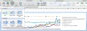
To produce the colored regions that indicate contractions in the business cycle, we take the series that was created from column L and turn it into an area chart.
- Right-click on any data point in the series or on the legend entry
- Select “Change Series Chart Type…”

- Select the standard Area chart from the ribbon

The chart now fills in the area under the original lines with a default fill color.
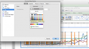
At this point, you can right click on the series again, select “Format Data Series…”, and change the Fill color to a light gray.
Next, we tell the x axis what the correct labels are (the “Year” column) and have the labels show up every 4 years. (Our data series start on an election year, so the labels will always appear on election years.)
- Right click inside the chart somewhere and select “Select Data…”
- Select any of the data series in the “Series” list, then go over to the “Category (X) axis labels” box and select the “Year” column. Click “OK”.

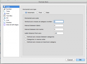
- Right-click on the x axis and select “Format Axis…”.
- Under “Scale”:
- Under “Text Box”, select the text direction of “Rotate to 90 deg Counterclockwise”. Click “OK”.

The x axis should have appropriate year labels now. The y axis can similarly be adjusted to show just the range of values we’re most interested in.
The rest of the changes are simply formatting changes. Right-click on the individual data series to change the colors, line widths, etc. Use the formatting options or the Chart tools on the Excel ribbon to change the font of any text, adjust the grid lines, add labels and titles, etc. The data series names in the legend can be adjusted by using the “Select Data…” option and typing in custom text in the “Name” field.
The final product should have colored regions and look something like the chart below.
In another post, we will show how to spice this chart up even more using Adobe Illustrator.


This is very useful. Do you have any idea on how to do this on the Y-axis? (E.g.. in you example, to produce a horizontal bar between y=4 and y=6). I tried to by going up to the “area chart” option to get a vertical highlight like the ones here, then I would have wanted to swap the axes, but Excel seems to eliminate the X-axis values in the process, even in X-Y scatter charts. All I could do was add a semi-transparent rectangle as a drawing object.
Hello Philip,
Good question! I went ahead and played around with creating horizontal bars, and I ended up using stacked area charts. First, you want a series that represents the bottom of the lowest bar (perhaps “2” on the above chart). To prepare the data for that series, just add a new column and put a “2” in every row. The next new column should be the height of the horizontal bar – so, if you want the top of the bar at “3”, you would put “1” in every row instead of “3”. You could do this again for another horizontal bar – say, add a column of “2”s to skip up to “5” for the bottom of the new bar, and another column of “1”s to make that bar 1 unit tall.
After you add these columns to the chart, you should start out with a bunch of horizontal lines in the wrong places. You have to select those lines and change the chart type to Stacked Area. You might have to play with the order of the series, but once the tops and bottoms of the bars are in the right places, you can select the bottom-most horizontal bar (the one going from 0 to 3, the one you *don’t* want to have on the chart) and change the fill to “no fill”. It should turn transparent but not get deleted. You can do this again for the bar between 3 and 5.
Hope that helps!
Best,
Angela
This was incredibly helpful, thank you!
Hi Angela,
This is very useful but I noticed that any periods with only one year of recession don’t show in the chart (2001, 1970, 1945). What do you need to do to make sure that these shows as well?
Thanks so much for the great question, Arie. You’re absolutely right, the single years aren’t showing up here. In fact, all of the bars are basically showing one fewer year than they should. This technique is specifying a start date for the bars (the top-left corner of the bar), but not an end date (the top right corner), and for contraction cycles that oscillate quickly, the data structure here just isn’t going to be able to capture that.
I wish I had a quick answer, but it looks like the best way to produce the true width of these bands is to follow the instructions for a stepped chart on the Peltier Tech Blog – basically, make a copy of the data and then offset that copy by deleting the earliest year and the latest data value. I did this with the sample data – including all years, either those with a value 20 or those with no value – and was able to produce an area chart that showed the single years as well.
The problem with this method is all of the other line series that go on top of the area chart. I haven’t been able to achieve the combination chart yet, but my guess is that it would be easiest to duplicate the full data table when preparing the area chart, instead of just the contractions data. The problem I ran into is that now that there are duplicate dates in the contractions data, I’m having trouble getting the x-axes to match up between the line series and the area chart.
Another thing to note is that right now I’m playing with this on a Mac using Excel 2011. The new Excel 2013 for Windows seems to have good functionality for multiple axes, perhaps even multiple horizontal axes.
Thanks for the great question, again! I hope this hints at a possible solution for a significant flaw in the proposed method.
I was wandering if there is a way to change color for just some up-down bars in stock open-close chart?
I have done a chart that I need, but all the bars are the same color and I need for just some of them to be different…
Thanks
Thanks for your question! I think you would need to create two separate series, one for each color. The gray bars in the post are created by changing one series from a line chart to an area chart; you would just need to use another column, add the values for the tops of the bars into that column, and add that to the chart as a second area chart.
Another option would be to open this chart in a graphic design program like Inkscape or Adobe Illustrator and just draw the regions by hand.
Hi,
Great information. I just want to ask further that how i can shade or color the area. lets say i want to plot supply and demand curve and i want to calculate consumer and producer surplus. how can i find it out and mark on graph.
Thanks
If you want to change the color of the tall shaded areas, you need to create a separate series for each color. That is, the data for each color would have to be placed in a separate column in the spreadsheet, and you would have to add each column to the chart separately and then change the color manually.
Another way would be to copy the chart into a graphic design program like Adobe Illustrator or Inkscape. You could just edit the color manually.
Finally, if it’s too complicated to try to get Excel to do this for you, you could just skip Excel entirely and add the color regions manually. You could use Illustrator or Inkscape, or maybe even just PowerPoint, to draw rectangles and place them behind the chart in the correct position and with the correct width. It is not as easy to be precise, but it might save time.
Is it possible to get access to the source data (or sources) for your chart?
Thanks…
Sure, the source data is available from: http://blogs.library.duke.edu/data/files/2012/11/indicator_time_series.xlsx
Awesome!
Thank you very much for the help.
Thanks a lot, this is really great
Hey just wanted to point out that the “Area” chart did not work for me, but I followed the same general steps and used a “Bar graph” chart instead. Using the “Area” chart made pointy areas instead of rectangles like I wanted. The bar graph worked perfectly though, and I was able to add borders to the bars to make them show up a little better since the areas I were trying to highlight were only an hour out of an entire business week of data.
I was looking for different ways to do this, or maybe something better I regularly do here.
Another way to make this is using error bars.
You can add vertical and horizontal big error bars to go down to lower axis value and upper than higher axis value, so it fills the whole plot.
With the error bars you can do both horizontal and vertical shading using color transparency.
You can also set individual colors to individual data the same way you can change individual points colors.
HI, just saw this chat and it solved my problem i had been working on for ages! Many thanks! One more question, how do i remove the ‘legend’ for the added columns (for the horixontal lines). They appear with the axis legends as coloured boxes.
I cannot get rid of them.
Thanks again
Michal
Hi Michal! Usually you can selectively delete one or more entries from the legend in Excel. If you click once on the legend and then click once on the specific entry for the lines, it should highlight just that one entry in the legend. Then you can usually just use the “delete” or “backspace” key to delete that without deleting the rest of the legend.