Duke Libraries are happy to welcome the 2016 ASA DataFest to the Edge on April 1-3rd. As part of DataFest 2016, the Edge is hosting five Data Fest related workshops designed to help teams and others interested in data driven research expand their skills. All workshops will meet in the Edge Workshop Room (1st Floor Bostock Library). Laptops are required for all workshops.
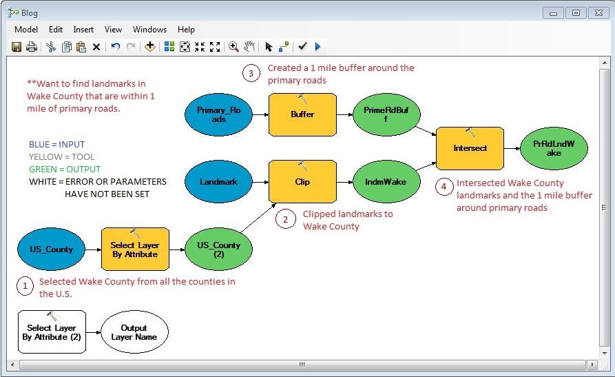
We wish all the teams success in the competition and hope to see you in the next few weeks!
DataFest Workshop Series
Data Analysis with Python
Tuesday, March 22
6:00-9:00 PM
This will be a hands-on class focused on performing data analysis with Python. We’ll help participants set-up their Jupyter Notebook development environment, cover the basic functions for reading and manipulating data, show examples of common statistical models and useful packages and show some of the python visualization tools.
Introduction to R
Wednesday March 23
6:00-8:00 PM
Introduction to R as a statistical programming language. This session will introduce the basics of R syntax, getting data into R, various data types and classes, etc. The session assumes no or little background in R.
Data Munging with R and dplyr
Monday, March 28
6:00-8:00 PM
This session will demonstrate tools for data manipulation and cleaning of data in R. Majority of the session will use the dplyr and tidyr packages. Some background in R is recommended. If you are not familiar with R, make sure to first attend the first R workshop in the series.
Data visualization with R, ggplot2, and shiny
Wednesday, March 30
6:00-8:00 PM
This session will demonstrate tools for static and interactive data visualization in R using ggplot2 and shiny packages. Some background in R is recommended. If you are not familiar with R, make sure to first attend the first R workshop in the series.
EDA and Interactive Predictive Modeling with JMP
Thursday, March 31
4:00-6:00 PM
JMP® Statistical Discovery Software is dynamic, visual and interactive desktop software for Windows and Mac. In this hands-on workshop we see tools for exploring, visualizing and preparing data in JMP. We’ll also learn how to fit a variety of predictive models, including multiple regression, logistic regression, classification and regression trees, and neural networks. A six month license of JMP will be provided.