Header Image: Collection of extinct and extant turtle skull microCT scans in MorphoSource: bit.ly/3DFossilTurtles
MorphoSource (www.morphosource.org) is a publicly accessible repository for 3D research data, especially data that represents biological specimens. Developers in Evolutionary Anthropology and the Library’s Software Services department have been working to rebuild the application, improving upon the current site’s technology and features. An important part of this rebuild is implementing a more robust data model that will let our users efficiently discover, curate, disseminate, and preserve their data.
A typical deposit in MorphoSource is a file or files that represent a scan of all or part of an organism – such as a bone, tooth, or entire animal. The files may be a mesh or series of images produced through a CT scan. In order to collect all the information necessary to understand the files, the specimen that the files represent, and the processes that created the data, the improved site will guide the researcher in providing additional context for their deposit at the same time that they upload their files. The following describes what kind of metadata the depositor can expect to provide as part of the submission process.
The first step is to determine whether the researcher’s current deposit is derived in some way from data that is already in MorphoSource, or if the depositor would like to also submit those files and metadata. For example, they may be depositing a mesh file that was created from original photographs that are already available through the site. By including links to the raw data in the repository, users can reprocess the files if needed, or run different processes in the future.
MorphoSource collects metadata to provide context for 3D data in the repository
Next, the researcher is asked to identify or describe the biological specimen that was imaged to create their data, either by entering the information themselves or importing it from another site like iDigBio. Metadata entered at this stage includes the information about the institution that owns the specimen, a taxonomy for the specimen, and additional identifying information such as the institution’s collection or catalog number. When the depositor fills in these fields, other users will be able to search for and compare data sets for the same specimen or species.
Moving on from the description of the organism, the depositor then provides information about the device that was used to image the specimen, either by selecting a device that is already in the repository’s database, or by creating a new record, including the manufacturer, model, and modality (MRI, photography, laser scan, etc.) of the device.
Once they have described the specimen and device used for imaging, the depositor then enters metadata about the imaging event itself, such as the technician who did the imaging, the date, and the software used.
With the imaging of the specimen described, the depositor then enters data about any processing that was done to create the files being deposited, including who was responsible, what software was used, and what the process was – for example, creating a mesh or point cloud from photographs. This metadata is important in case there is a need to reprocess the data in the future.
Finally, the researcher completes their deposit by uploading the files themselves. While some technical metadata is extracted automatically, MorphoSource will rely on data depositors to provide other information that is helpful for display, such as the orientation of the scan, or to identify the files, like an external id number. This technical metadata is important for long term preservation of the data sets.
Screen capture of example media page in MorphoSource
While the submission process asks the researcher to enter quite a bit of metadata, when users view the data on MorphoSource they have an understanding of what the data represents, how it was created, and how it relates to other data in the repository. It becomes easy to discover other media files representing the same specimen, or the same species, or to explore other items from the institution or researcher’s collections.
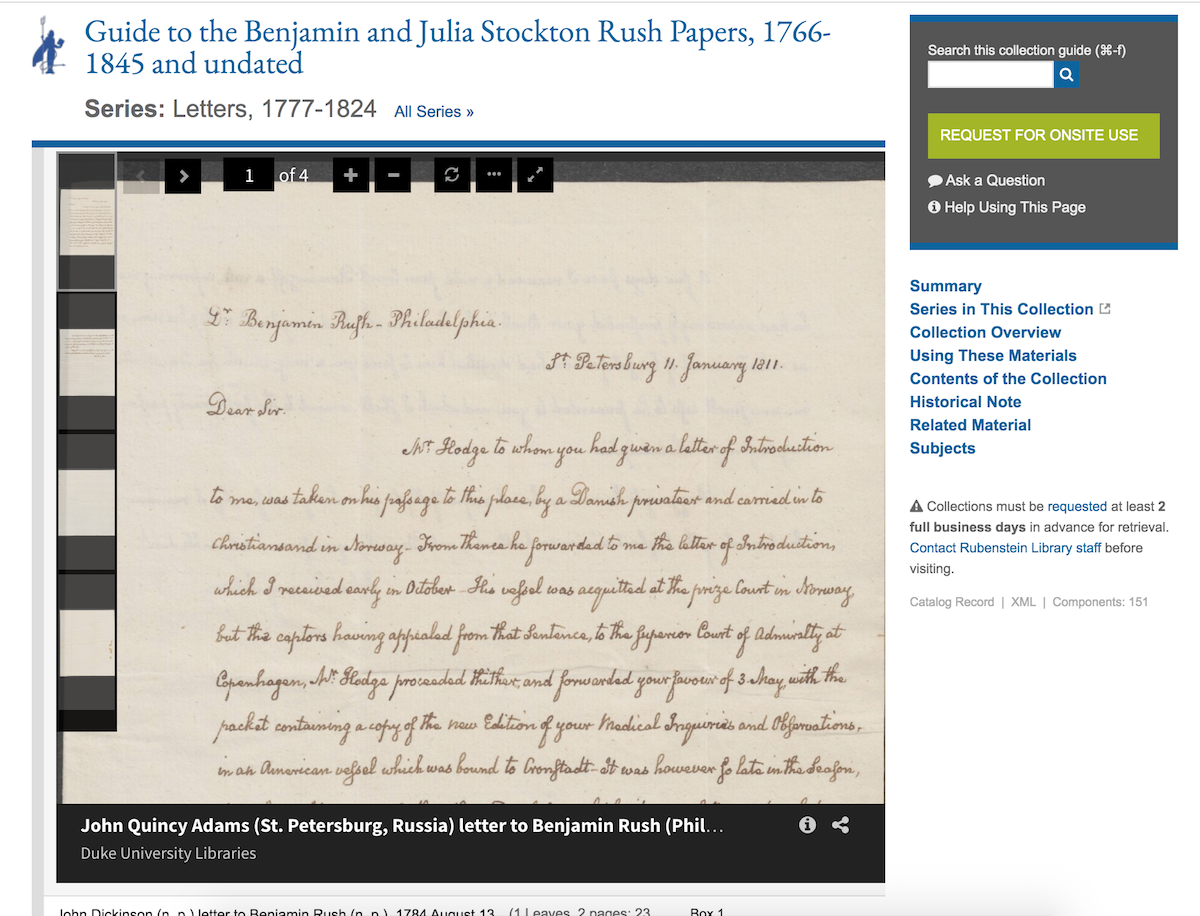
Archival collection guides—also known as finding aids—are a critical part of the researcher experience when finding and accessing materials from the David M. Rubenstein Rare Book & Manuscript Library and the Duke University Archives. At present, we have guides for nearly 4,000 collections with upwards of one million components that have some level of description. Our collection guides site is visited by researchers about 400 times per day.
An example collection guide.
In 2020, we’ll be making significant changes to our systems supporting archival discovery and access. The main impetus for this shift is that our current platform has grown outdated and is no longer sustainable going forward. We intend to replace our platform with ArcLight, open source software backed by a community of peer institutions.
Finding Aids at Duke: Innovations Past
At Duke, we’re no strangers to pushing the boundaries of archival discovery through advances in technology. Way back in the mid 1990s, Duke was among pioneers rendering SGML-encoded finding aids into HTML. For most of the 90s and aughts we used a commercial platform, but we decided to develop our own homegrown finding aids front-end in 2007 (using the Apache Cocoon framework). We then replaced it in 2012 with another in-house platform built on the Django web framework.
Since going home-grown in 2007, we have been able to find some key opportunities to innovate within our platforms. Here are a few examples:
2013. Added inline digital object viewing, as part of a consortium-wide collaborative foray into large-scale manuscript digitization.
2014. Crosswalked metadata using Schema.org markup and used different Google APIs to power rich snippet search results (since deprecated).
Example archival component with inline embedded digital object and sticky navigation.
So, Why Migrate Now?
Our current platform was pretty good for its time, but a lot has changed in eight years. The way we build web applications today is much different than it used to be. And beyond desiring a modern toolset, there are major concerns going forward around size, search/indexing, and support.
Size
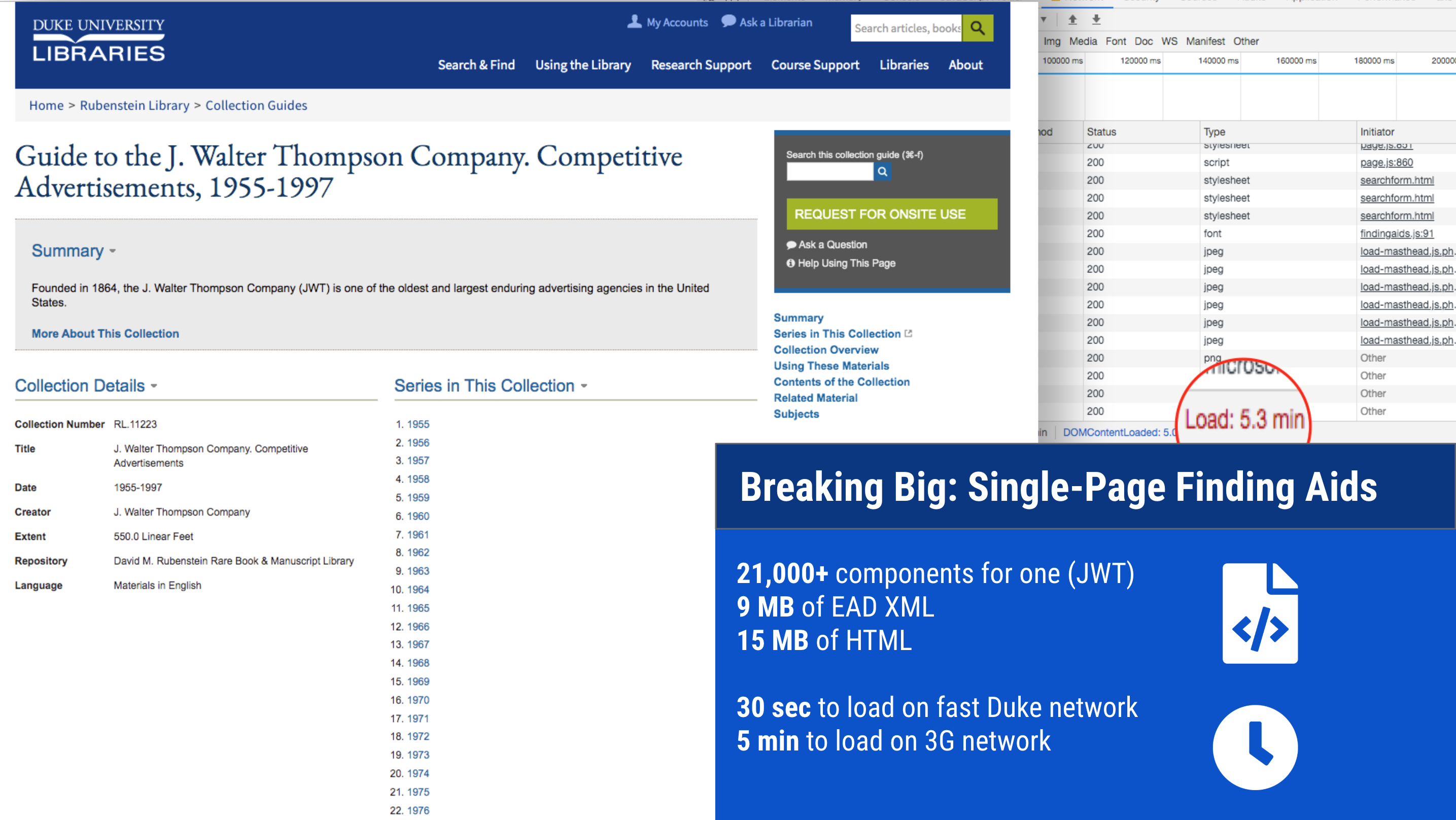
We have some enormous finding aids. And we have added more big ones over the years. This causes problems of scale, particularly with an interface like ours that renders each collection as a single web page with all of the text of its contents written in the markup. One of our finding aids contains over 21,000 components; all told it is 9MB of raw EAD transformed into 15MB of HTML.
A large finding aid — 15MB of HTML in a single page.
No amount of caching or server wizardry can change the fact that this is simply too much data to be delivered and rendered in a single webpage, especially for researchers in lower-bandwidth conditions. We need a solution that divides the data for any given finding aid into smaller payloads.
Search
Google Custom Search does a pretty nice job of relevance ranking and highlighting where in a finding aid a term matches (after all, that’s Google’s bread-and-butter). However, when used to power search in an application like this, it has some serious limitations. It only returns a maximum of one hundred results per query. Google doesn’t index 100% of the text, especially for our larger finding aids. And some finding aids are just mysteriously omitted despite our best efforts optimizing our markup for SEO and providing a sitemap.
Search Results powered by Google Custom Search
We need search functionality where we have complete control of what gets indexed, when, and how. And we need assurance that the entirety of the materials described will be discoverable.
Support
This is a familiar story. Homegrown applications used for several years by organizations with a small number of developers and a large number of projects to support become difficult to sustain over time. We have only one developer remaining who can fix our finding aids platform when it breaks, or prevent it from breaking when the systems around it change. Many of the software components powering the system are at or nearing end-of-life and they can’t be easily upgraded.
Where to Go From Here?
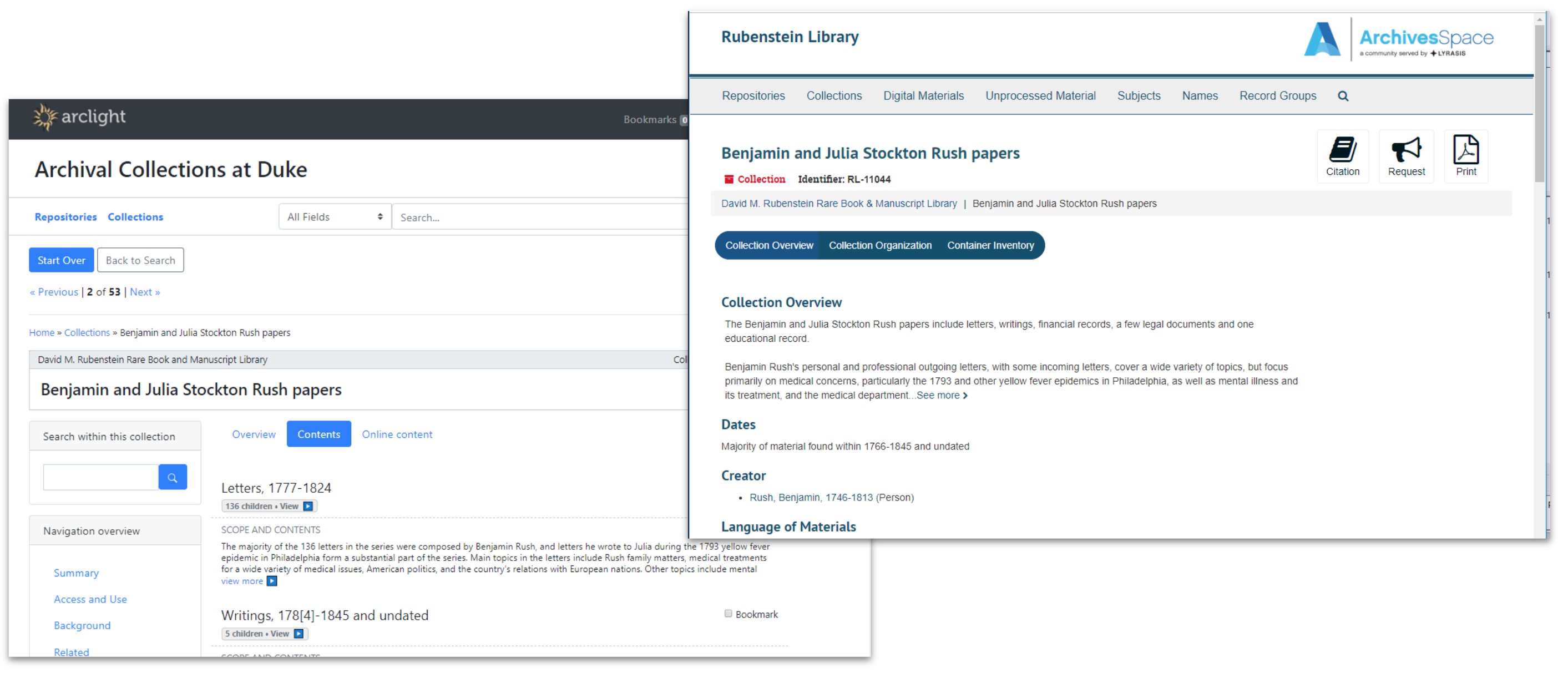
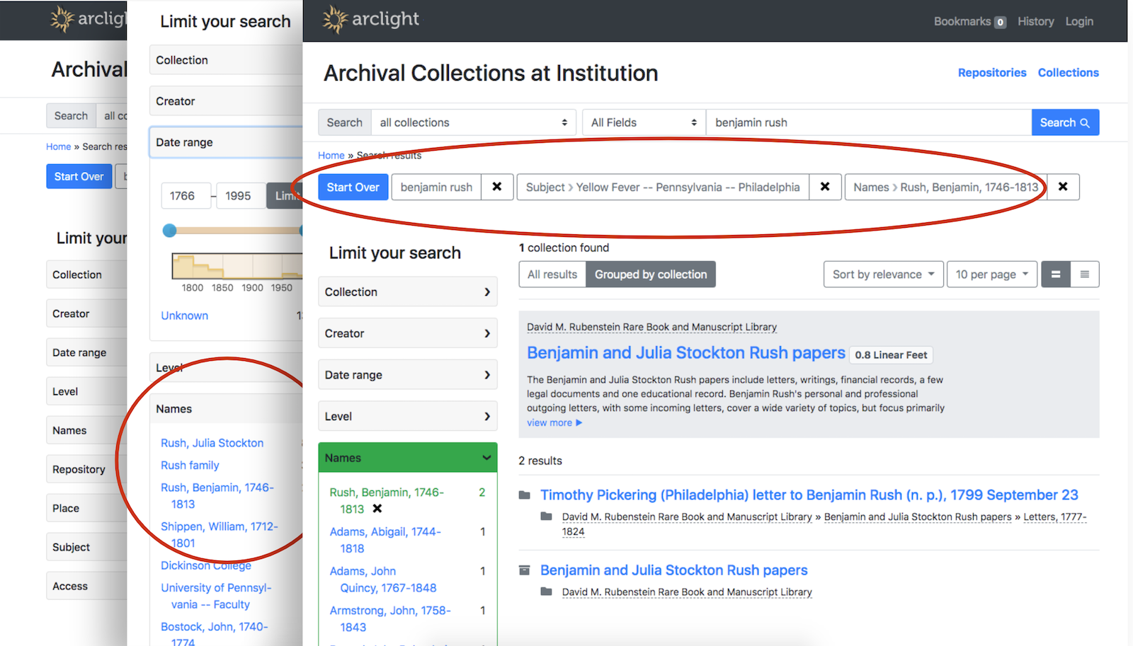
It has been clear for awhile that we would soon need a new platform for finding aids, but not as clear what platform we should pursue. We had been eyeing the progress of two promising open source community-built solutions emerging from our peer institutions: the ArchivesSpace Public UI (PUI), and ArcLight.
Over 2018-19, my colleague Noah Huffman and I co-led a project to install pilot instances of the ASpace PUI and ArcLight, index all of our finding aids in them, and then evaluate the platforms for their suitability to meet Duke’s needs going forward. The project involved gathering feedback from Duke archivists, curators, research services staff, and our digital collections implementation team. We looked at six criteria: 1) features; 2) ease of migration/customization; 3) integration with other systems; 4) data cleanup considerations; 5) impact on existing workflows; 6) sustainability/maintenance.
Comparison of the ASpace PUI and ArcLight, out-of-the-box UI.
There’s a lot to like about both the ASpace PUI and ArcLight. Feature-wise, they’re fairly comparable. Both are backed by a community of talented, respected peers, and either would be a suitable foundation for a usable, accessible interface to archives. In the end, we recommended that Duke pursue ArcLight, in large part due to its similarity to so much of the other software in our IT portfolio.
Duke is certainly not alone in our desire to replace an outdated, unsustainable homegrown finding aids platform, and intention to use ArcLight as a replacement.
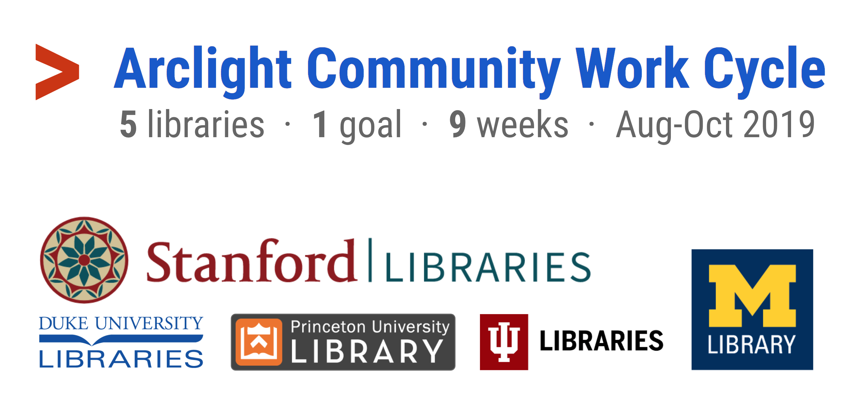
This fall, with tremendous leadership from Stanford University Libraries, five universities collaborated on developing the ArcLight software further to address shared needs. Over a nine week work cycle from August to October, we had the good fortune of working alongside Stanford, Princeton, Michigan, and Indiana. The team addressed needs on several fronts, especially: usability, accessibility, indexing, context/navigation, and integrations.
Duke joined Stanford, Princeton, Michigan, and Indiana for Arclight Community Work Cycle II in fall 2019.
Three Duke staff members participated: I was a member of the Development Team, Noah Huffman a member of the Product Owners Team, and Will Sexton on the Steering Group.
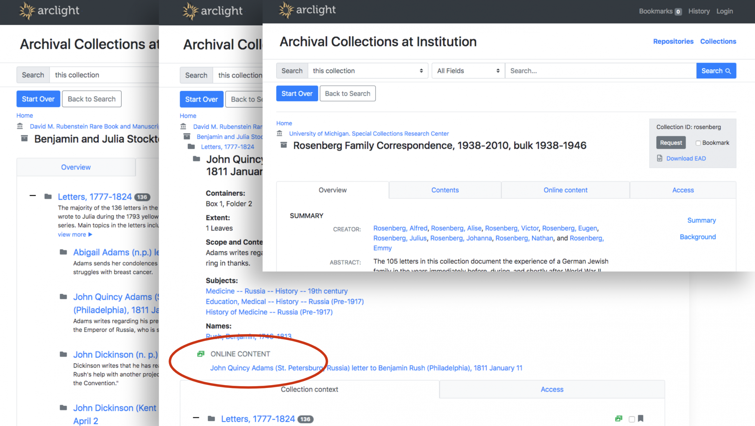
The work cycle is complete and you can try out the current state of the core ArcLight demo application. It includes several finding aids from each of the participating partner institutions. Here are just a few highlights that have us excited about bringing ArcLight to Duke:
Search results can be grouped by collection. Faceted navigation helps pinpoint items of interest from deep within a finding aid.
Components are individually discoverable and have their own pages. Integrations with online content viewers and request systems such as Aeon are possible.
Here’s a final demo video (37 min) that nicely summarizes the work completed in the fall 2019 work cycle.
Lighting the Way
With some serious momentum from the fall ArcLight work cycle and plans taking shape to implement the software in 2020, the Duke Libraries intend to participate in the Stanford-led, IMLS grant-funded Lighting the Way project, a platform-agnostic National Forum on Archival Discovery and Delivery. Per the project website:
Lighting the Way is a year-long project led by Stanford University Libraries running from September 2019-August 2020 focused on convening a series of meetings focused on improving discovery and delivery for archives and special collections.
Coming in 2020: ArcLight Implementation at Duke
There’ll be much more share about this in the new year, but we are gearing up now for a 2020 ArcLight launch at Duke. As good as the platform is now out-of-the-box, we’ll have to do additional development to address some local needs, including:
Duke branding
An efficient preview/publication workflow
Digital object viewing / repository integration
Sitemap generation
Some data cleanup
Building these local customizations will be time well-spent. We’ll also look for more opportunities to collaborate with peers and contribute code back to the community. The future looks bright for Duke with ArcLight lighting the way.
Last week, I went to go see the movie IT: Chapter 2. One thing I really appreciated about the movie was how it used a scene’s lighting to full effect. Some scenes are brightly lit to signify the friendship among the main characters. Conversely, there are dark scenes that signify the evil Pennywise the Clown. For the movie crew, no doubt it took a lot of time and manpower to light an individual scene – especially when the movie is nearly 3 hours long.
We do the same type of light setup and management inside the Digital Production Center (DPC) when we take photos of objects like books, letters, or manuscripts. Today, I will talk specifically about how we light the bound material that comes our way, like books or booklets. Generally, this type of material is always going to be shot on our PhaseOne camera, so I will particularly highlight that lighting setup today.
Before We Begin
It’s not enough to just turn the lights on in our camera room to do the trick. In order to properly light all the things that need to be shot on the PhaseOne, we have specific tools and products we use that you can see in the photo below.
We have 4 high-powered lights (two sets of two Buhl SoftCube SC-150 models) pointed directly in the camera’s field of view. There are two on the right and two on the left. These are stationed approximately 3.5 feet off the ground and approximately 2.5 feet away from the objects themselves. These lights are supported by Avenger A630B light stands. They allow for a wide range of movement, extension, and support if we need them.
But if bright, hot lights were pointed directly at sensitive documents for hours, it would damage them. So light diffusers are necessary. For both sets of lights, we have 3 layers of material to diffuse the light and prevent material from warping or text from fading. The first layer, directly attached to the light box itself, is an inexpensive sheet of diffusion fabric. This type of material is often made from nylon or silk, and are usually inexpensive.
The second diffusion layer is an FJ Westcott Scrim Jim, a similar thin fabric that is attached to a lightweight stand-up frame, the Manfrotto 156BLB. This frame can also be moved or extended if need be. The last layer is another sheet of diffusion fabric, attached to a makeshift “cube” held up by lightweight wooden rods. This cube can be picked up or carried, making it very convenient if we need to eventually move our lights.
So in total, we have 4 lights, 4 layers of diffusion fabric attached to the light boxes, two Scrim Jims, and the cube featuring 2 sides of additional diffusion fabric. After having all these items stationed, surely we can start taking pictures, right? Not yet.
Around the Room
There are still more things to be aware of – this time in the camera room itself. We gently place the materials themselves on a cradle lined with a black felt, similar to velvet. This cradle is visible in the bottom right part of the photo above. It is placed on top of a table, also coated in black felt. This is done so no background colors bounce back or reflect onto the object and change what it looks like in the final image itself. The walls of the camera room are also painted a neutral grey color for the same reason, as you can see in the background of the above photo. Finally, any tiny reflective segments between the ceiling tiles have been blacked out with gaffer tape. Having the room this muted and intentionally dark also helps us when we have to shoot multi-spectral images. No expense has been spared to make sure our colors and photos are correct.
Camera Settings
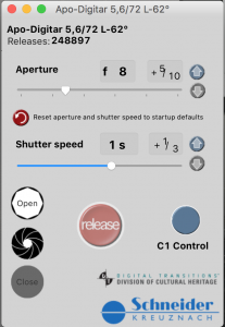
With all these precautions in place, can we finally take photos of our materials? Almost. Before we can start photographing, we have to run some tests to make sure everything looks correct to our computers. After making sure our objects are sharp and in focus, we use a program called DTDCH (see the photo to the right) to adjust the aperture and exposure of the PhaseOne so that nothing appears either way too dim or too bright. In our camera room, we use a PhaseOne IQ180 with a Schneider Kreuznach Apo-Digitar lens (visible in the top-right corner of the photo above). We also use the program CaptureOne to capture, save, and export our photos.
Once the shot is in focus and appropriately bright, we will check our colors against an X-Rite ColorChecker Classic card (see the photo on the left) to verify that our camera has a correct white balance. When we take a photo of the ColorChecker, CaptureOne displays a series of numbers, known as RGB values, found in the photo’s colors. We will check these numbers against what they should be, so we know that our photo looks accurate. If these numbers match up, we can continue. You could check our work by saving the photo on the left and opening it in a program like Adobe Photoshop.
Finally, we have specific color profiles that the DPC uses to ensure that all our colors appear accurate as well. For more information on how we consistently calibrate the color in our images, please check out this previous blog post.
After all this setup, now we can finally shoot photos! Lighting our materials for the PhaseOne is a lot of hard work and preparation. But it is well worth it to fulfill our mission of digitizing images for preservation.
(Header image: Illustration by Jørgen Stamp digitalbevaring.dk CC BY 2.5 Denmark)
Here at Duke University Libraries, we often talk about digital preservation as though everyone is familiar with the various corners and implications of the phrase, but “digital preservation” is, in fact, a large and occasionally mystifying topic. What does it mean to “preserve” a digital resource for the long term? What does “the long term” even mean with regard to digital objects? How are libraries engaging in preserving our digital resources? And what are some of the best ways to ensure that your personal documents will be reusable in the future? While the answers to some of these questions are still emerging, the library can help you begin to think about good strategies for keeping your content available to other users over time by highlighting agreed-upon best practices, as well as some of the services we are able to provide to the Duke community.
File formats
Not all file formats have proven to be equally robust over time! Have you ever tried to open a document created using a Microsoft Office product from several years ago, only to be greeted with a page full of strangely encoded gibberish? Proprietary software like the products in the Office suite can be convenient and produce polished contemporary documents. But software changes, and there is often no guarantee that the beautifully formatted paper you’ve written using Word will be legible without the appropriate software 5 years down the line. One solution to this problem is to always have a version of that software available to you to use. Libraries are beginning to investigate this strategy (often using a technique called emulation) as an important piece of the digital preservation puzzle. The Emulation as a Service (EaaS) architecture is an emerging tool designed to simplify access to preserved digital assets by allowing end users to interact with the original environments running on different emulators.
An alternative to emulation as a solution is to save your files in a format that can be consumed by different, changing versions of software. Experts at cultural heritage institutions like the Library of Congress and the US National Archives and Records Administration have identified an array of file formats about which they feel some degree of confidence that the software of the future will be able to consume. Formats like plain text or PDFs for textual data, value separated files (like comma-separated values, or CSVs), MP3s and MP4s for audio and video data respectively, and JPEGs for still images have all proven to have some measure of durability as formats. What’s more, they will help to make your content or your data more easily accessible to folks who do not have access to particular kinds of software. It can be helpful to keep these format recommendations in mind when working with your own materials.
File format migration
The formats recommended by the LIbrary of Congress and others have been selected not only because they are interoperable with a wide variety of software applications, but also because they have proven to be relatively stable over time, resisting format obsolescence. The process of moving data from an obsolete format to one that is usable in the present day is known as file format migration or format conversion. Libraries generally have yet to establish scalable strategies for extensive migration of obsolete file formats, though it is generally a subject of some concern.
Here at DUL, we encourage the use of one of these recommended formats for content that is submitted to us for preservation, and will even go so far as to convert your files prior to preservation in one of our repository platforms where possible and when appropriate to do so. This helps us ensure that your data will be usable in the future. What we can’t necessarily promise is that, should you give us content in a file format that isn’t one we recommend, a user who is interested in your materials will be able to read or otherwise use your files ten years from now. For some widely used formats, like MP3 and MP4, staff at the Libraries anticipate developing a strategy for migrating our data from this format, in the event that the format becomes superseded. However, the Libraries do not currently have the staff to monitor and convert rarer, and especially proprietary formats to one that is immediately consumable by contemporary software. The best we can promise is that we are able to deliver to the end users of the future the same digital bits you initially gave to us.
Bit-level preservation
Which brings me to a final component of digital preservation: bit-level preservation. At DUL, we calculate a checksum for each of the files we ingest into any of our preservation repositories. Briefly, a checksum is an algorithmically derived alphanumeric hash that is intended to surface errors that may have been introduced to the file during its transmission or storage. A checksum acts somewhat like a digital fingerprint, and is periodically recalculated for each file in the repository environment by the repository software to ensure that nothing has disrupted the bits that compose each individual file. In the event that the re-calculated checksum does not match the one supplied when the file has been ingested into the repository, we can conclude with some level of certainty that something has gone wrong with the file, and it may be necessary to revert to an earlier version of the data. THe process of generating, regenerating, and cross-checking these checksums is a way to ensure the file fixity, or file integrity, of the digital assets that DUL stewards.
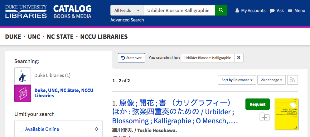
How many times each day to you type something into a search box on the web and click “Search?” Have you ever wondered what happens behind the scenes to make this possible? In this post I’ll show how search works on the Duke University Libraries Catalog. I’ll trace the journey of how search works from metadata in a MARC record (where our bibliographic data is stored), to transforming that data into something we can index for searching, to how the words you type into the search box are transformed, and then finally how the indexed records and your search interact to produce a relevance ranked list of search results. Let’s get into the weeds!
A MARC record stores bibliographic data that we purchase from vendors or are created by metadata specialists who work at Duke Libraries. These records look something like this:
In an attempt to keep this simple, let’s just focus on the main title of the record. This is information recorded in the MARC record’s 245 field in subfields a, b, f, g, h, k, n, p, and s. I’m not going to explain what each of the subfields is for but the Library of Congress maintains extensive documentation about MARC field specifications (see 245 – Title Statement (NR)). Here is an example of a MARC 245 field with a linked 880 field that contains the equivalent title in an alternate script (just to keep things interesting).
The first thing that has to happen is we need to get the data out of the MARC record into a more computer friendly data format — an array of hashes, which is just a fancy way of saying a list of key value pairs. The software reads the metadata from the MARC 245 field, joins all the subfields together, and cleans up some punctuation. The software also checks to see if the title field contains Arabic, Chinese, Japanese, Korean, or Cyrillic characters, which have to be handled separately from Roman character languages. From the MARC 245 field and its linked 880 field we end up with the following data structure.
"title_main": [

  {

    "value": "Urbilder ; Blossoming ; Kalligraphie ; O Mensch, bewein' dein' Sünde gross (Arrangement) : for string quartet"

  },

  {

    "value": "原像 ; 開花 ; 書 (カリグラフィー) ほか : 弦楽四重奏のための",

    "lang": "cjk"

  }

]
We send this data off to an ingest service that prepares the metadata for indexing.
The data is first expanded to multiple fields.
{"title_main_indexed": "Urbilder ; Blossoming ; Kalligraphie ; O Mensch, bewein' dein' Sünde gross (Arrangement) : for string quartet",
title_main_indexed will be indexed for searching. title_main_vernacular_value holds the non Roman version of the title to be indexed for searching. title_main_vernacular_lang holds information about the character set stored in title_main_vernacular_value. title_main_value holds the data that will be stored for display purposes in the catalog user interface.
We take this flattened, expanded set of fields and apply a set of rules to prepare the data for the indexer (Solr). These rules append suffixes to each field and combine the two vernacular fields to produce the following field value pairs. The suffixes provide instructions to the indexer about what should be done with each field.
{"title_main_indexed_tsearchtp": "Urbilder ; Blossoming ; Kalligraphie ; O Mensch, bewein' dein' Sünde gross (Arrangement) : for string quartet",
These are all index time transformations. They occur when we send records into the index.
The query you enter into the search box also gets transformed in different ways and then compared to the indexed fields above. These are query time transformations. As an example, if I search for the terms “Urbilder Blossom Kalligraphie,” the following transformations and comparisons take place:
The values stored in the records for title_main_indexed_t are evaluated against my search string transformed to urbild blossom kalligraphi.
The values stored in the records for title_main_indexed_tp are evaluated against my search string transformed to urbilder blossom kalligraphie.
The values stored in the records for title_main_cjk_v are evaluated against my search string transformed to urbilder blossom kalligraphie.
Then Solr does some calculations based on relevance rules we configure to determine which documents are matches and how closely they match (signified by the relevance score calculated by Solr). The field value comparisons end up looking like this under the hood in Solr:
The ^nnnn indicates the relevance weight given to any matches it finds, while the ~n.n indicates the number of matches that are required from each clause to consider the document a match. Matches in fields with higher boosts count more than fields with lower boosts. You might notice another thing, that full phrase matches are boosted the most, two consecutive term matches are boosted slightly less, and then individual term matches are given the least boost. Furthermore unstemmed field matches (those that have been modified the least by the indexer, such as in the field title_main_indexed_tp) get more boost than stemmed field matches. This provides the best of both worlds — you still get a match if you search for “blossom” instead of “blossoming,” but if you had searched for “blossoming” the exact term match would boost the score of the document in results. Solr also considers how common the term is among all documents in the index so that very common words like “the” don’t boost the relevance score as much as less common words like “kalligraphie.”
I hope this provides some insight into what happens when you clicks search. Happy searching.
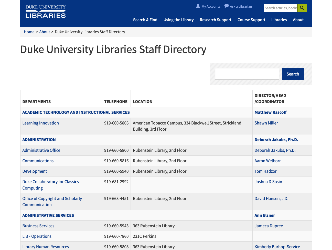
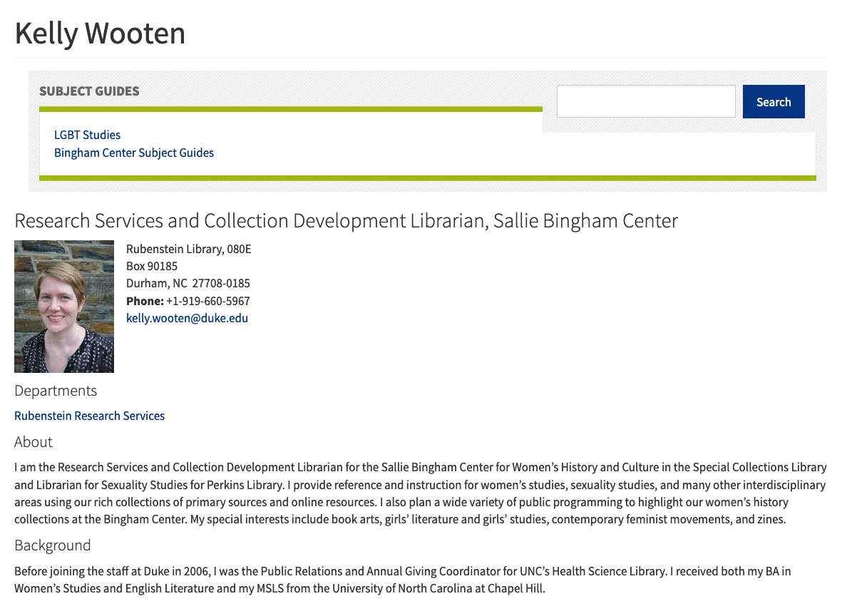
The staff directory on the Library’s website was last overhauled in late 2014, which is to say that it has gotten a bit long in the tooth! For the past few months I’ve been working along with my colleagues Sean Aery, Tom Crichlow, and Derrek Croney on revamping the staff application to make it more functional, easier to use, and more visually compelling.
View of the legacy staff directory interface
Our work was to be centered around three major components — an admin interface for HR staff, an edit form for staff members, and the public display for browsing people and departments. We spent a considerable amount of time discussing the best ways to approach the infrastructure for the project. In the end we settled on a hybrid approach in which the HR tool would be built as a Ruby-on-Rails application, and we would update our existing custom Drupal module for staff editing and public UI display.
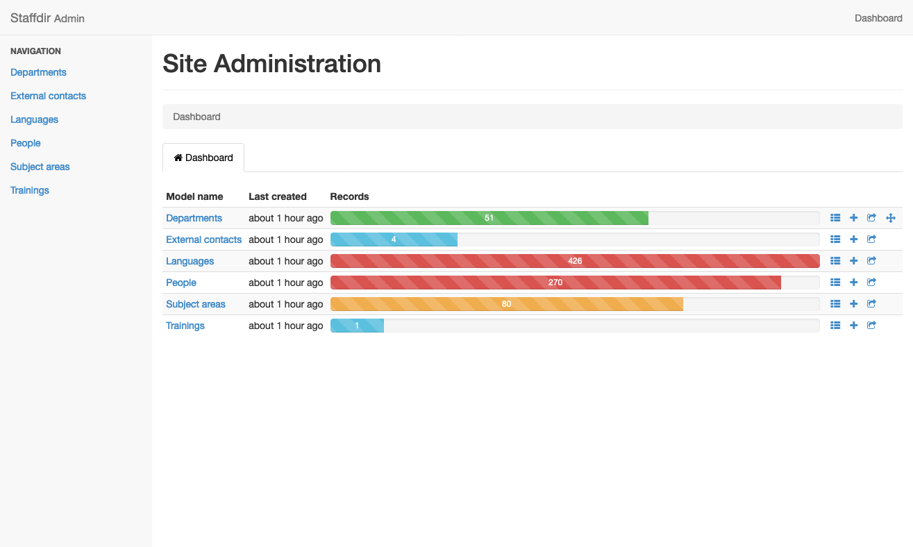
We created a seed file for our Rails app based on the legacy data from the old application and then got to work building the HR interface. We decided to rely on the Rails Admin gem as it met most of our use cases and had worked well on some other internal projects. As we continued to add features, our database models became more and more complex, but working in Rails makes these kind of changes very straightforward. We ended up with two main tables (People and Departments) and four auxiliary tables to store extra attributes (External Contacts, Languages, Subject Areas, and Trainings).
View of the Rails Admin dashboard
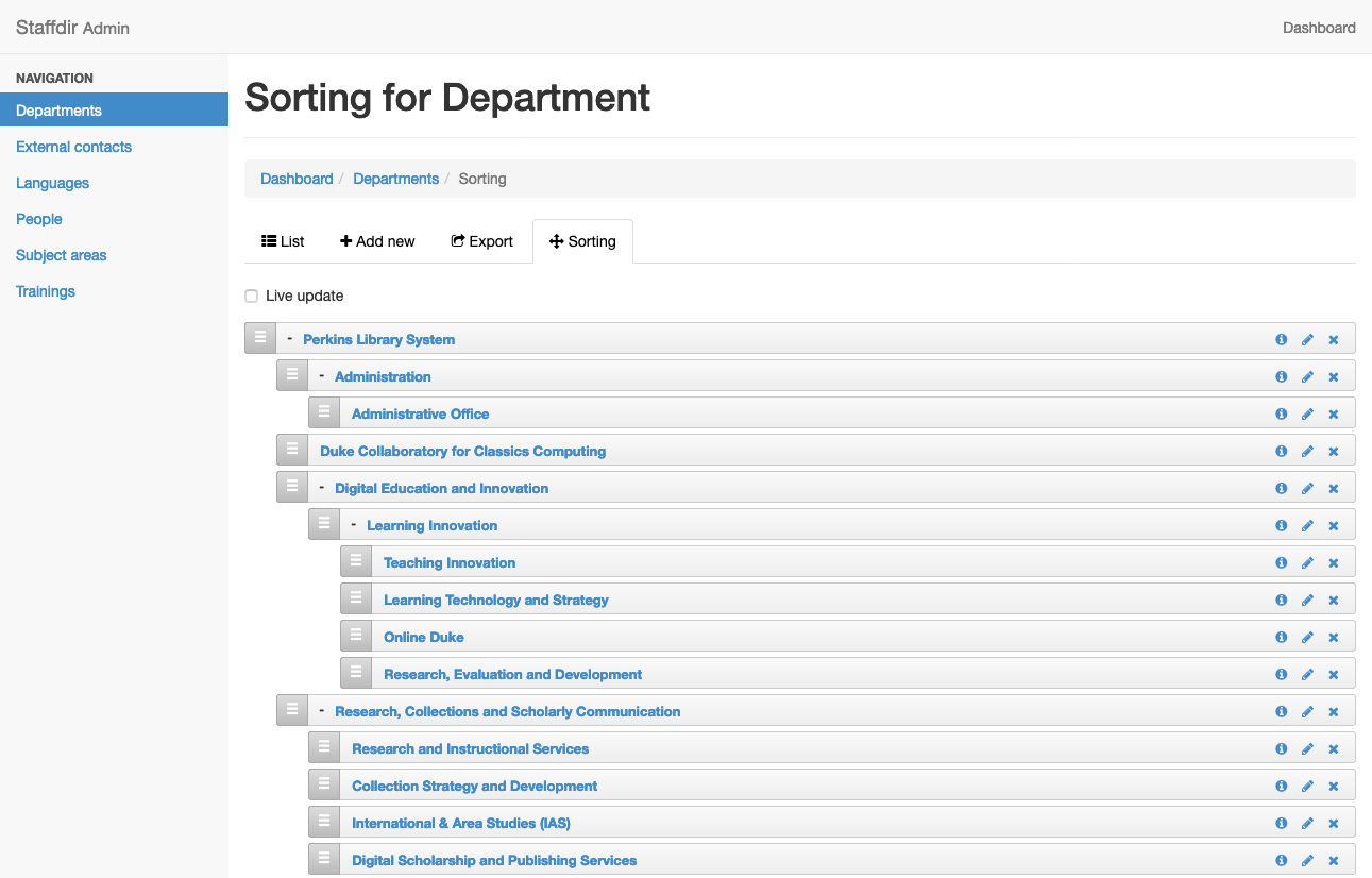
We also made use of the Ancestry gem and the Nestable gem to allow HR staff to visually sort department hierarchy. This makes it very easy to move departments around quickly and using a visual approach, so the next time we have a large department reorganization it will be very easy to represent the changes using this tool.
Nestable gem allows for easy sorting of departments
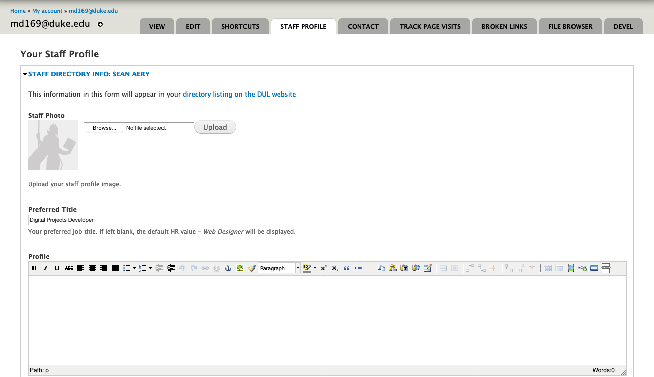
After the HR interface was working well, we concentrated our efforts on the staff edit form in Drupal. We’d previously augmented the default Drupal profile editor with our extra data fields, but wanted to create a new form to make things cleaner and easier for staff to use. We created a new ‘Staff Profile’ tab and also included a link on the old ‘Edit’ tab that points to the new form. We’re enabling staff to include their subject areas, preferred personal pronouns, language expertise, and to tie into external services like ORCID and Libguides.
Edit form for Staff Profile
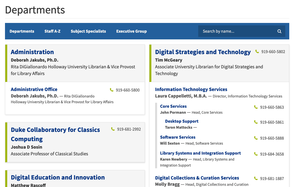
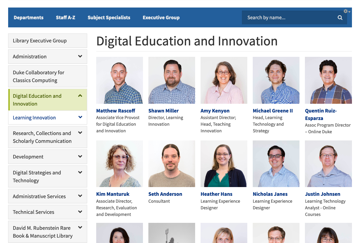
The public UI in Drupal is where most of our work has gone. We’ve created four approaches to browsing; Departments, A–Z, Subject Specialists, and Executive Group. There is also a name search that incorporates typeahead for helping users find staff more efficiently.
The Department view displays a nested view of our complicated organizational structure which helps users to understand how a given department relates to another one. You can also drill down through departments when you’ve landed on a department page.
View of departments
Department pages display all staff members therein and positions managers at the top of the display. We also display the contact information for the department and link to the department website if it exists.
Example of a department page
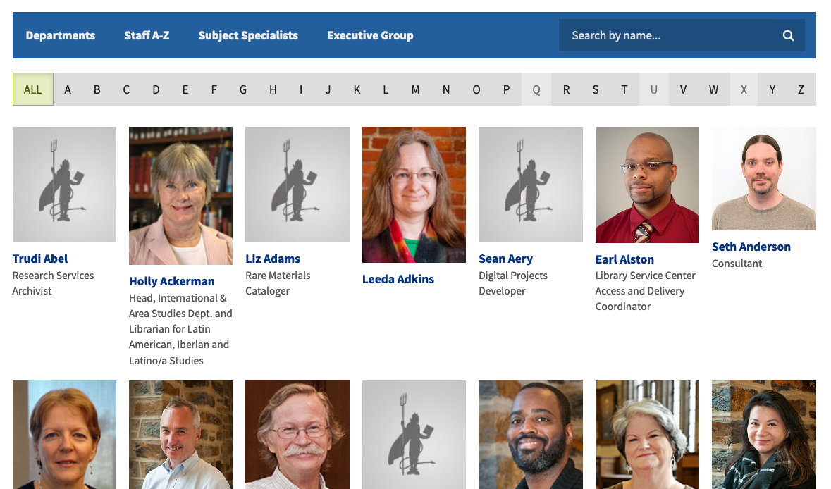
The Staff A–Z list allows users to browse through an alphabetized list of all staff in the library. One challenge we’re still working through is staff photos. We are lacking photos for many of our staff, and many of the photos we do have are out of date and inconsistently formatted. We’ve included a default avatar for staff without photos to help with consistency, but they also serve the purpose of highlighting the number of staff without a photo. Stay tuned for improvements on this front!
A-to-Z browse
The Subject Specialists view helps in finding specific subject librarians. We include links to relevant research guides and appointment scheduling. We also have a text filter at the top of the display that can help quickly narrow the results to whatever area you are looking for.
Subject Specialists view
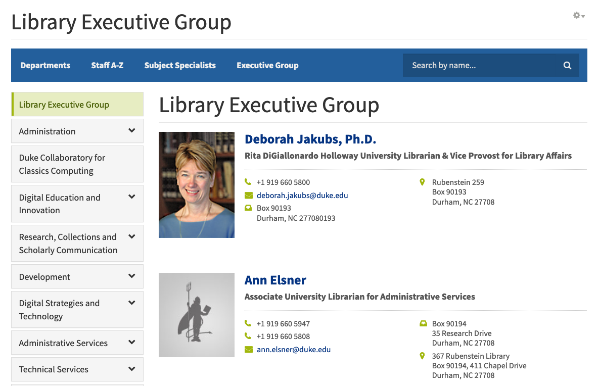
The Executive Group display is a quick way to view the leadership of the library.
Executive Group display
One last thing to highlight is the staff display view. We spent considerable effort refining this, and I think our work has really paid off. The display is clean and modern and a great improvement from what we had before.
View of staff profile in legacy applicationView of the same profile in the new application
In addition to standard information like name, title, contact info, and department, we’re displaying:
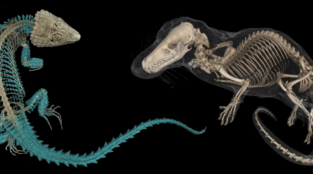
For the past year, developers in the Library’s Software Services department have been working to rebuild Duke’s MorphoSource repository for 3D research data. The current repository, available at www.morphosource.org, provides a place for researchers and curators to make scans of biological specimens available to other researchers and to the general public.
MorphoSource, first launched in 2013, has become the most popular website for virtual fossils in the world. The site currently contains sixty thousand data sets representing twenty thousand specimens from seven thousand different species. In 2017, led by Doug Boyer in Duke Evolutionary Anthropology, the project received a National Science Foundation grant. Under this grant, the technical infrastructure for the repository will be moved to the Library’s management, and the user interface is being rebuilt using Hyrax, an open-source digital repository application widely implemented by libraries that manage research data. The scope of the repository is being expanded to include data for cultural heritage objects, such as museum artifacts, architecture, and archaeological sites. Most importantly, MorphoSource is being improved with better performance, a more intuitive user experience, and expanded functionality for users to view and interact with the data within the site.
Viewing and manipulating CT scans and the derived 3D model of a platypus in the MorphoSource viewer
Management of 3D data is in itself complicated. It becomes even more so when striving towards long-term preservation of the digital representation of a unique biological specimen. In many cases, these specimens no longer exist, and the 3D data becomes the only record of their particular morphology. It’s necessary to collect not only the actual digital files, but extensive metadata describing both the data’s creation and the specimen that was scanned to create the data. This can make the process of contributing data daunting for researchers. To improve the user experience and assist users with entering metadata about their files, MorphoSource 2.0 will guide them through the process. Users will be asked questions about their data, what it represents, when and how it was created, and if it is a derivative of data already in MorphoSource. As they progress through making their deposit, the answers they provide will direct them through linking their deposit to records already in the repository, or help them with entering new metadata about the specimen that was scanned, the facility and equipment used to scan the specimen, and any automated processes that were run to create the files.
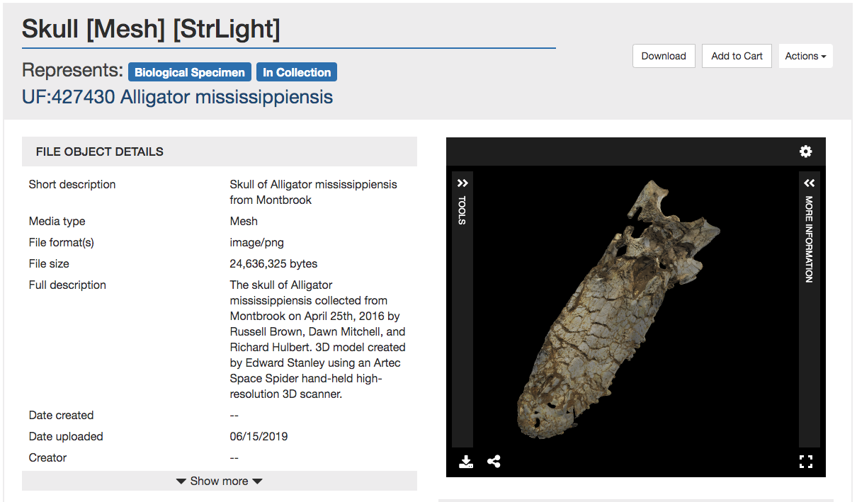
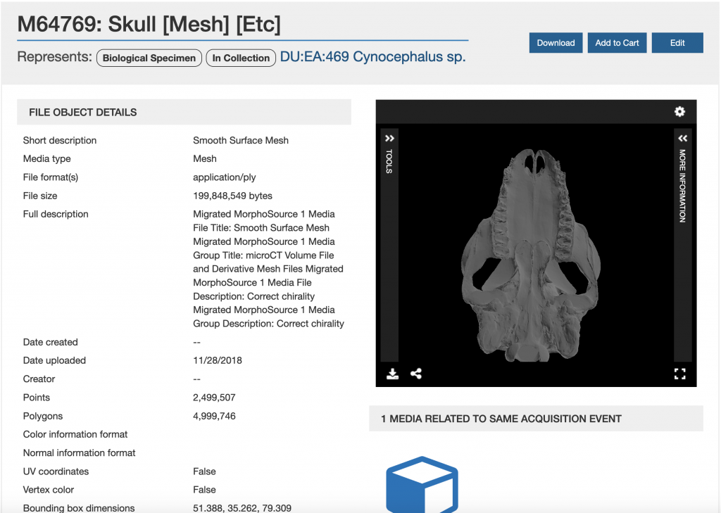
Screenshot of a MorphoSource media page showing an alligator skull.
The new repository will also improve the experience for users exploring metadata about contributed resources and viewing the accompanying 3D files. All of the data describing technical information, acquisition and processing information, ownership and permissions, and related files will be gathered in one page, and give users the option to expand or collapse different metadata sections as their interests dictate. A file viewer will also be embedded in the page, which also allows for full-screen viewing and provides several new tools for users analyzing the media. Besides being able to move and spin the model within the viewer, users can also adjust lighting and other factors to focus on different areas of the model, and take custom measurements of different points on the specimen. Most exciting, for CT image series, users can scroll through the images along three axes, or convert the images to a 3D model. For some data, users will also be able to share models by embedding the file viewer in a webpage.
The MorphoSource team is very excited about our planned improvements, and plans to launch MorphoSource 2.0 in 2020. Stay tuned for the launch date, and in the meantime please visit the current site: www.morphosource.org.
It takes a lot to build and publish digital collections as you can see from the variety and scope of the blog posts here on Bitstreams. We all have our internal workflows and tools we use to make our jobs easier and more efficient. The number and scale of activities going on behind the scenes is mind-boggling and we would never be able to do as much as we do if we didn’t continually refine our workflows and create tools and systems that help manage our data and work. Some of these tools are big, like the Duke Digital Repository (DDR), with its public, staff and backend interface used to preserve, secure, and provide access to digital resources, while others are small, like scripts built to transform ArchiveSpace output into a starter digitization guides. In the Digital Production Center (DPC) we use a homegrown tool that not only tracks production statistics but is also used to do project projections and to help isolate problems that occur during the digitization process. This tool is a relational database that is affectionately named the Daily Work Report and has collected over 9 years of data on nearly every project in that time.
A long time ago, in a newly minted DPC, supervisors and other Library staff often asked me, “How long will that take?”, “How many students will we need to digitize this collection?”, “What will the data foot print of this project be?”, “How fast does this scanner go?”, “How many scans did we do last year?”, “How many items is that?”. While I used to provide general information and anecdotal evidence to answer all of these questions, along with some manual hunting down of this information, it became more and more difficult to answer these questions as the number of projects multiplied, our services grew, the number of capture devices multiplied and the types of projects grew to include preservation projects, donor requests, patron request and exhibits. Answering these seemingly simple questions became more complicated and time consuming as the department grew. I thought to myself, I need a simple way to track the work being done on these projects that would help me answer these recurring common questions.
We were already using a FileMaker Pro database with a GUI interface as a checkout system to assign students batches of material to scan, but it was only tracking what student worked on what material. I decided I could build out this concept to include all of the data points needed to answer the questions above. I decided to use Microsoft Access because it was a common tool installed on every workstation in the department, I had used it before, and classes and instructional videos abound if I wanted to do anything fancy.
Enter the Daily Work Report (DWR). I created a number of discrete tables to hold various types of data: project names, digitization tasks, employee names and so on. These fields are connected to a datasheet represented as a form, which allowed for dropdown lists and auto filling for rapid and consistent entry of information.
At the end of each shift students and professionals alike fill out the DWR for each task they performed on each project and how long they worked on each task. These range from the obvious tasks of scanning and quality control to more minute tasks of derivative creation, equipment cleaning, calibration, documentation, material transfer, file movement, file renaming, ingest prep, and ingest.
Some of these tasks may seem minor and possibly too insignificant to record but they add up. They add up to ~30% of the time it takes to complete a project. When projecting the time it will take to complete a project we collect Scanning and Quality Control data from a similar project, calculate the time and add 30%.
Common Digitization Tasks
Task
Hours
Overall % of project
Scanning
406.5
57.9
Quality Control 1
133
19
Running Scripts
24.5
3.5
Collection Analysis
21
3
Derivative Creation
20.5
2.9
File Renaming
15.5
2.2
Material Transfer
14
2
Testing
12.5
1.8
Documentation
10
1.4
File Movement
9.75
1.4
Digitization Guide
7
1
Quality Control 2
6.75
1
Training
6
0.9
Quality Control 3
5.5
0.9
Stitching
3
0.4
Rescanning
1.5
0.2
Finalize
1.5
0.2
Troubleshooting
1.5
0.2
Conservation Consultation
1
0.1
Total
701
100
New Project Estimates
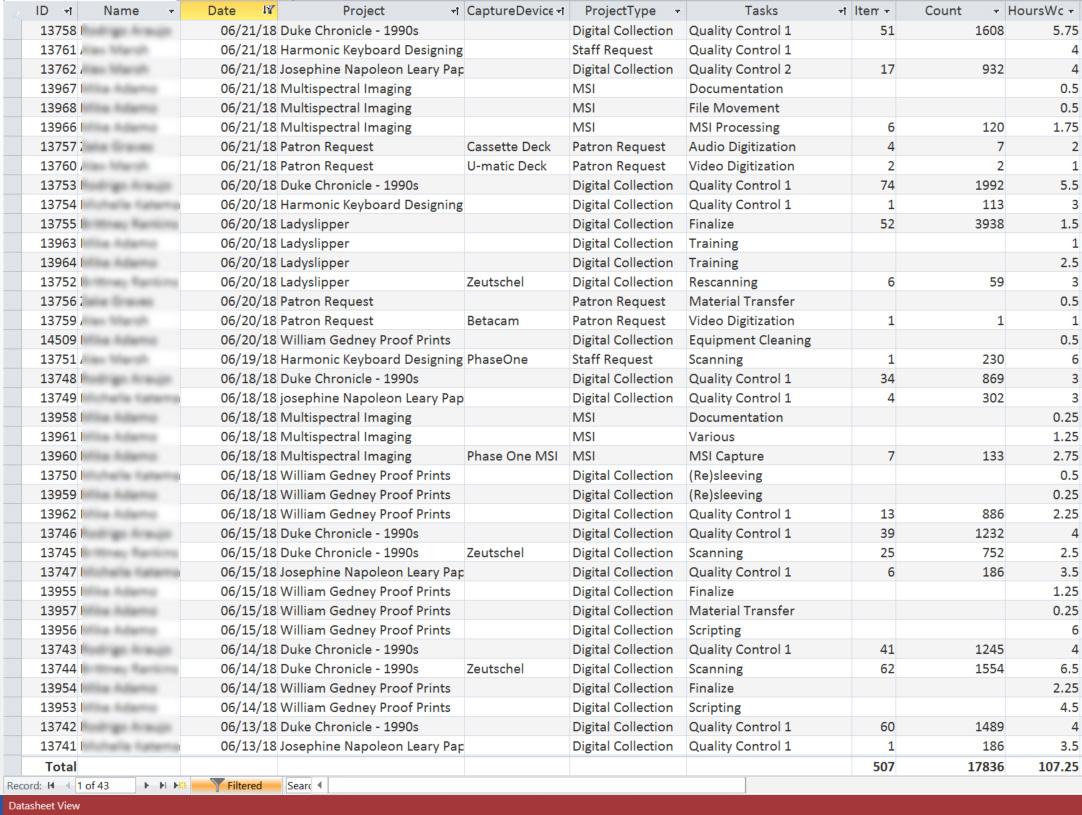
Using the Daily Work Report’s Datasheet View, the database can be filtered by project, then by the “Scanning” task to get the total number of scans and the hours worked to complete those scans. The same can be done for the Quality Control task. With this information the average number of scans per hour can be calculated for the project and applied to the new project estimate.
Gather information from an existing project that is most similar to the project you are creating the estimate for. For example, if you need to develop an estimate for a collection of bound volumes that will be captured on the Zeutschel you should find a similar collection in the DWR to run your numbers.
Gather data from an existing project:
Scanning
Number of scans = 3,473
Number of hours = 78.5
3,473/78.5 = 2/hr
Quality Control
Number of scans = 3,473
Number of hours = 52.75
3,473/52.75 = 8/hr
Apply the per hour rates to the new project:
Estimated number of scans: 7,800
Scanning: 7,800 / 44.2/hr = 176.5 hrs
QC: 7,800 / 68.8/hr = 113.4 hrs
Total: 290 hrs
+ 30%: 87 hrs
Grand Total: 377 hrs
Rolling Production Rate
When an update is required for an ongoing project the Daily Work Report can be used to see how much has been done and calculate how much longer it will take. The number of images scanned in a collection can be found by filtering by project then by the “Scanning” Task. That number can then be subtracted from the total number of scans in the project. Then, using a similar project to the one above you can calculate the production rate for the project and estimate the number of hours it will take to complete the project.
Scanning
Number of scans in the project = 7,800
Number of scans completed = 4,951
Number of scans left to do = 7,800 – 4,951 = 2,849
Scanning time to completion
Number of scans left = 2,849
2,849/42.4/hr = 2 hrs
Quality Control
Number of files to QC in the project = 7,800
Number of files completed = 3,712
Number of files left to do = 7,800 – 3,712 = 4,088
QC hours to completion
Number of scans left to scan = 4,088
4,088/68.8 = 4 hrs
The amount of time left to complete the project
Scanning – 67.2 hrs
Quality Control – 59.4 hrs
Total = 126.2 hrs
+ 30% = 38
Grand Total = 164.2 hrs
Isolate an error
Errors inevitably occur during most digitization projects. The DWR can be used to identify how widespread the error is by using a combination of filtering, the digitization guide (which is an inventory of images captured along with other metadata about the capture process), and inspecting the images. As an example, a set of files may be found to have no color profile. The digitization guide can be used to identify the day the erroneous images were created and who created them. The DWR can be used to filter by the scanner operator and date to see if the error is isolated to a particular person, a particular machine or a particular day. This information can then be used to filter by the same variables across collections to see if the error exists elsewhere. The result of this search can facilitate retraining, recalibrating of capture devices and also identify groups of images that need to be rescanned without having to comb through an entire collection.
While I’ve only touched on the uses of the Daily Work Report, we have used this database in many different ways over the years. It has continued to answer those recurring questions that come up year after year. How many scans did we do last year? How many students worked on that multiyear project? How many patron requests did we complete last quarter? This database has helped us do our estimates, isolate problems and provide accurate updates over the years. For such a simple tool it sure does come in handy.
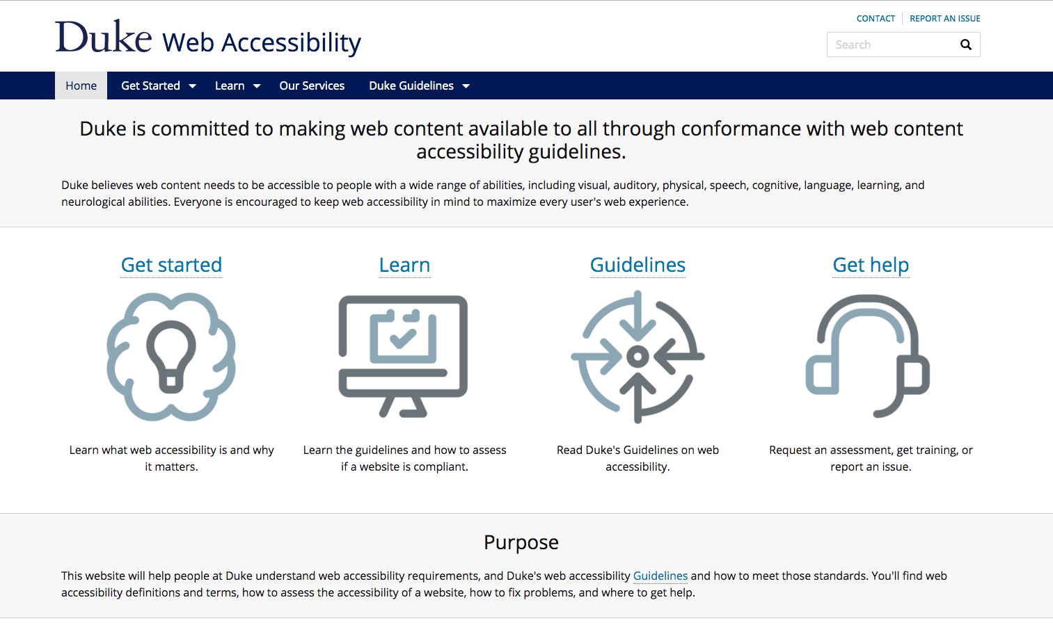
One of the biggest and most important barriers for us to tackle is the accessibility of our web content. Duke University’s Web Accessibility site sums it up well:
Duke believes web content needs to be accessible to people with a wide range of abilities, including visual, auditory, physical, speech, cognitive, language, learning, and neurological abilities.
The Duke Web Accessibility website is a tremendous resource for the Duke community.
As one of the largest research libraries in the U.S., we have a whole lot of content on the web to consider.
Our website alone comprises over a thousand pages with more than fifty staff contributors. The library catalog interface displays records for over 13 million items at Duke and partner libraries. Our various digital repositories and digital exhibits platforms host hundreds of thousands of interactive digital objects of different types, including images, A/V, documents, datasets, and more. The list goes on.
Any attempt to take a full inventory of the library’s digital content reveals potentially several million web pages under the library’s purview, and all that content is managed and rendered via a dizzying array of technology platforms. We have upwards of a hundred web applications with public-facing interfaces. We built some of these ourselves, some are community-developed (with local customizations), and others we have licensed from vendors. Some interfaces are new, some are old. And some are really old, dating all the way back to the mid-90s.
Ensuring that this content is equally accessible to everyone is important, and it is indeed a significant undertaking. We must also be vigilant to ensure that it stays accessible over time.
With that as our context, I’d like to highlight a few recent efforts in the library to improve the accessibility of our digital resources.
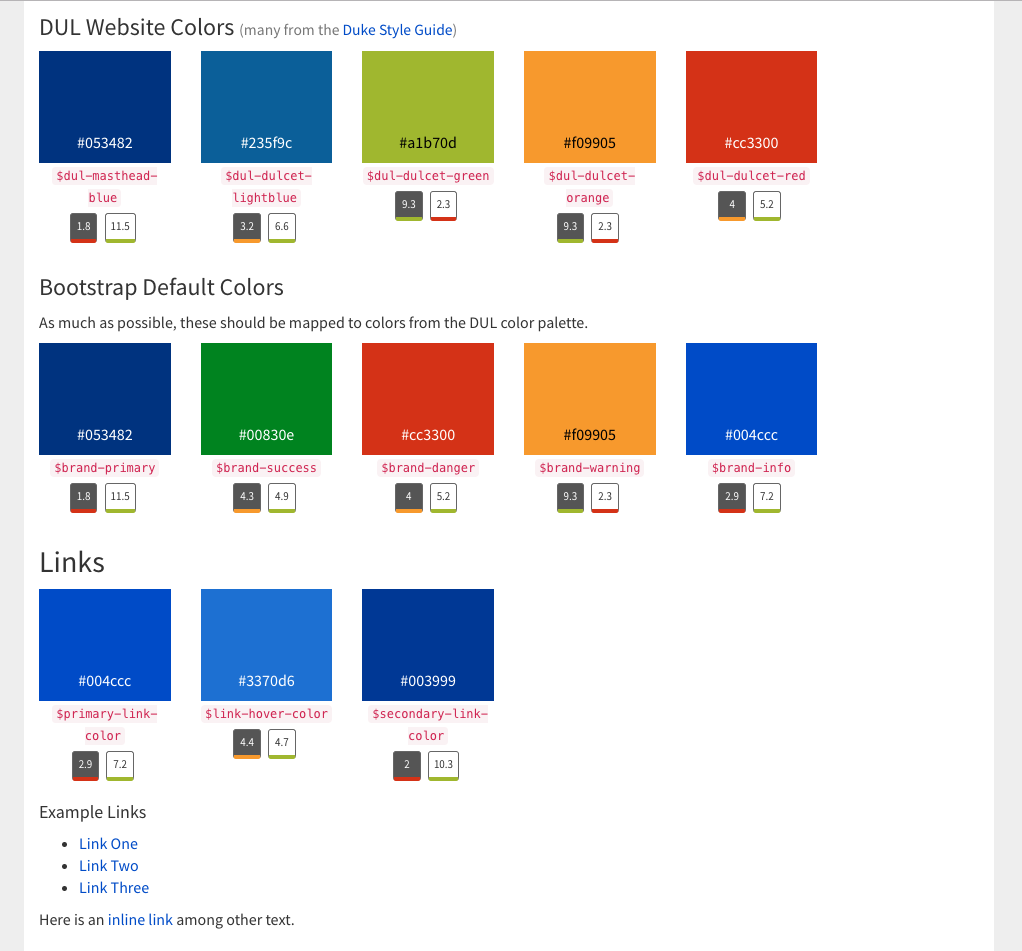
Style Guide With Color Contrast Checks
In January 2019, we launched a new catalog, replacing a decade-old platform and its outdated interface. As we began developing the front-end, we knew we wanted to be consistent, constrained, and intentional in how we styled elements of the interface. We were especially focused on ensuring that any text in the UI had sufficient contrast with its background to be accessible to users with low vision or color-blindness.
We tried out a few existing “living style guide” frameworks. But none of them proved to be a good fit, particularly for color contrast management. So we ended up taking a DIY approach and developed our own living style guide using Javascript and Ruby.
The library catalog’s living style guide dynamically checks for color contrast accessibility.
Here’s how it works. In our templates we specify the array of color variable names for each category. Then we use client-side Javascript to dynamically measure the hex & RGB values and the luminance of each color in the guide. From those figures, we return score labels for black and white contrast ratios, color-coded for WCAG 2.0 compliance.
This style guide is “living” in that it’s a real-time up-to-date reflection of how elements of the UI will appear when using particular color variable names and CSS classes. It helps to guide developers and other project team members to make good decisions about colors from our palette to stay in compliance with accessibility guidelines.
Audiovisual Captions & Interactive Transcripts
In fall 2017, I wrote about an innovative, custom-developed feature in our Digital Repository that renders interactive caption text for A/V within and below our media player. At that time, however, none of our A/V items making use of that feature were available to the public. In the months since then, we have debuted several captioned items for public access.
We extended these features in 2018, including: 1) exporting captions on-the-fly as Text, PDF, or original WebVTT files, and 2) accommodating transcript files that originated as documents (PDF, Word)
WebVTT caption files for A/V are rendered as interactive HTML transcripts and can be exported into text or PDF.
In the course of this assessment, we were able to identify (and then fix!) several accessibility issues in DukeSpace. I’ll share two strategies in particular from the guide that proved to be really effective. I highly recommend using them frequently.
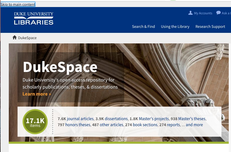
The Keyboard Test
How easy is it to navigate your site using only your keyboard? Can you get where you want to go using TAB, ENTER, SPACE, UP, and DOWN? Is it clear which element of the page current has the focus?
A “Skip to main content” feature in DukeSpace improves navigation via keyboard or assistive devices.
This test illuminated several problems. But with a few modest tweaks to our UI markup, we were able to add semantic markers to designate page sections and a skip to main content link, making the content much more navigable for users with keyboards and assistive devices alike.
A Browser Extension
If you’re a developer like me, chances are you already spend a lot of time using your browser’s Developer Tools pane to look under the hood of web pages, reverse-engineer UIs, mess with styles and markup, or troubleshoot problems.
The Deque Systems aXe Chrome Extension (also available for Firefox) integrates seamlessly into existing Dev Tools. It’s a remarkably useful tool to have in your toolset to help quickly find and fix accessibility issues. Its interface is clear and easy to understand. It finds and succinctly describes accessibility problems, and even tells you how to fix them in your code.
An image from the Deque aXe Chrome extension site showing the tool in action.
With aXe testing, we quickly learned we had some major issues to fix. The biggest problems revealed were missing form labels and page landmarks, and low contrast on color pairings. Again, these were not hard to fix since the tool explained what to do, and where.
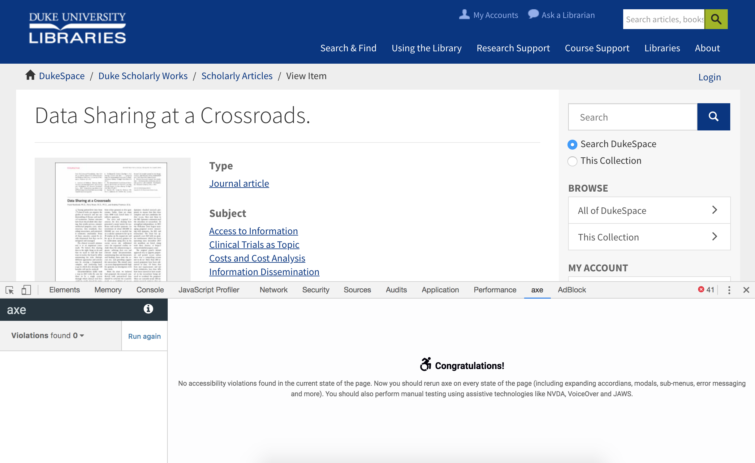
Turning away from DSpace for a moment, see this example article published on a popular academic journal’s website. Note how it fares with an automated aXe accessibility test (197 violations of various types found). And if you were using a keyboard, you’d have to press Tab over 100 times in order to download a PDF of the article.
UI for a published journal article in a publisher’s website after running the aXe accessibility test. Violations found: 197.
Open access copy of an article in DukeSpace: No accessibility violations found.
Here’s another example of an open access article in DukeSpace vs. its published counterpart in the website of a popular journal (PNAS). While the publisher’s site markup addresses many common accessibility issues, it still shows seven violations in aXe. And perhaps most concerning is that it’s completely unnavigable via a keyboard: the stylesheets have removed all focus styles from displaying.
Concluding Thoughts
Libraries are increasingly becoming champions for open access to scholarly research. The overlap in aims between the open access movement and web accessibility in general is quite striking. It all boils down to removing barriers and making access to information as inclusive as possible.
Our open access repository UIs may never be able to match all the feature-rich bells and whistles present in many academic journal websites. But accessibility, well, that’s right up our alley. We can and should do better. It’s all about being true to our values, collaborating with our community of peers, and being vigilant in prioritizing the work.
Look for many more accessibility improvements throughout many of the library’s digital resources as the year progresses.
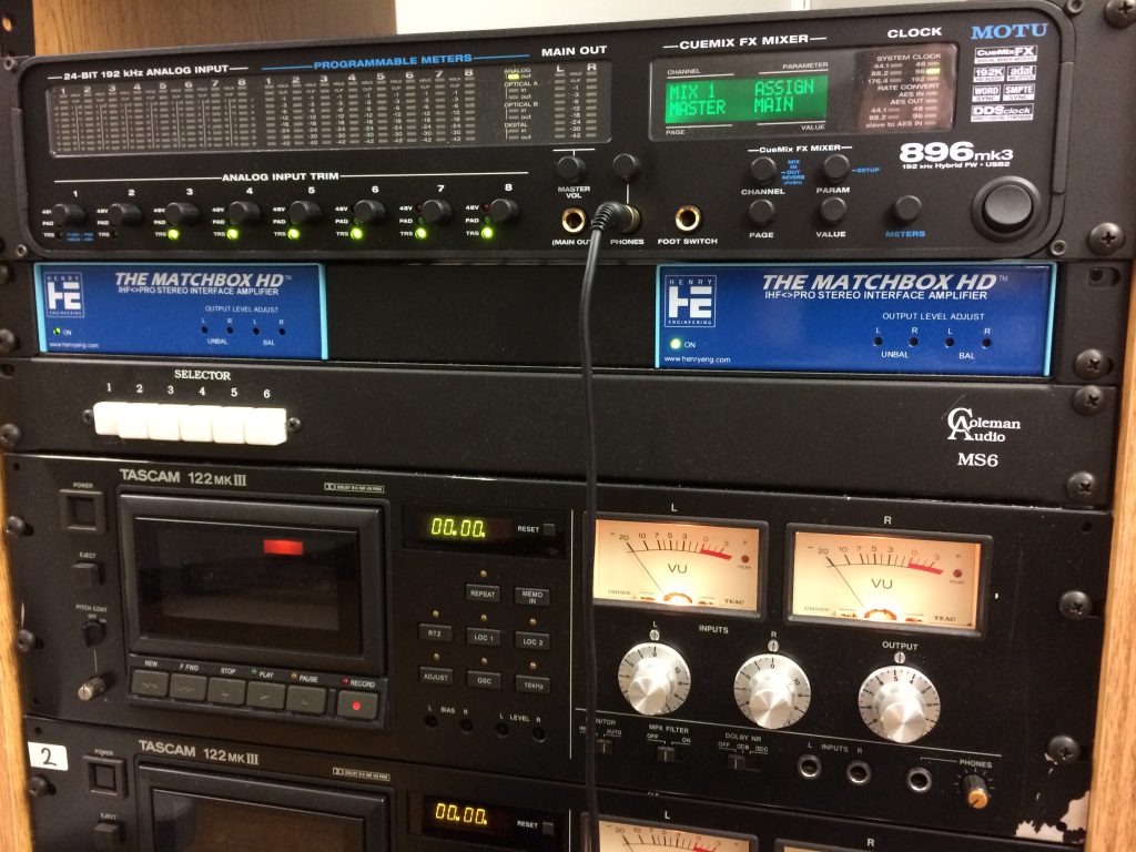
In the audio world, we take our tools seriously, sometimes to an unhealthy and obsessive degree. We give them pet names, endow them with human qualities, and imbue them with magical powers. In this context, it’s not really strange that a manufacturer of professional audio interfaces would call themselves “Mark of the Unicorn.”
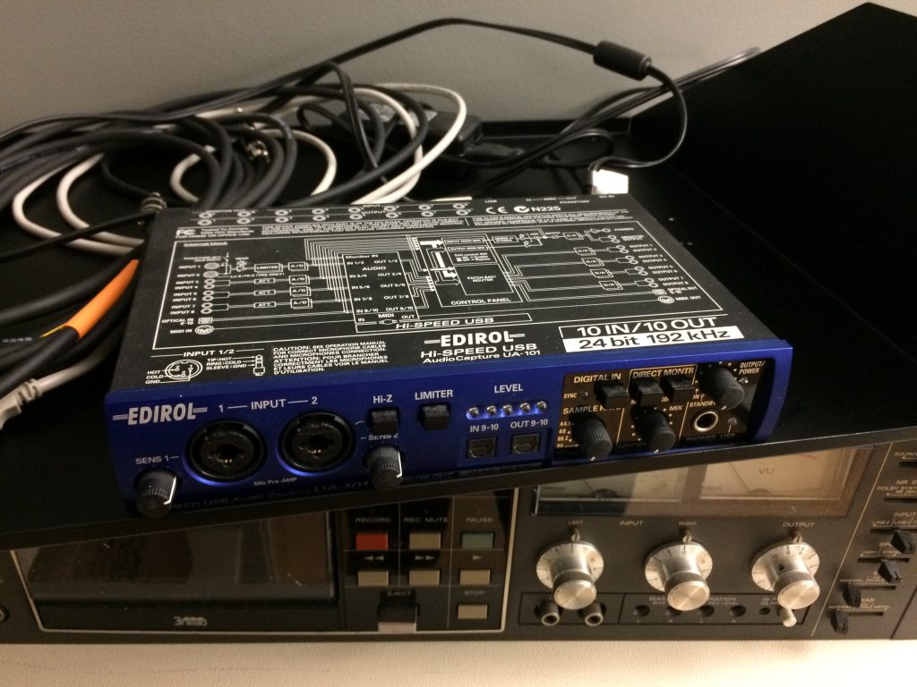
Here at the Digital Production Center, we recently upgraded our audio interface to a MOTU 896 mk3 from an ancient (in tech years) Edirol UA-101. The audio interface, which converts analog signals to digital and vice-versa, is the heart of any computer-based audio system. It controls all of the routing from the analog sources (mostly cassette and open reel tape decks in our case) to the computer workstation and the audio recording/editing software. If the audio interface isn’t seamlessly performing analog to digital conversion at archival standards, we have no hope of fulfilling our mission of creating high-quality digital surrogates of library A/V materials.
The Edirol enjoying its retirement with some other pieces of kit
While the Edirol served us well from the very beginning of the Library’s forays into audio digitization, it had recently begun to cause issues resulting in crashes, restarts, and lost work. Given that the Edirol is over 10 years old and has been discontinued, it is expected that it would eventually fail to keep up with continued OS and software updates. After re-assessing our needs and doing a bit of research, we settled on the MOTU 896 mk3 as its replacement. The 896 had the input, output, and sync options we needed along with plenty of other bells and whistles.
I’ve been using the MOTU for several weeks now, and here are some things that I’m liking about it:
Easy installation of drivers
Designed to fit into standard audio rack
Choice of USB or Firewire connection to PC workstation
Good visual feedback on audio levels, sample rate, etc. via LED meters on front panel
Clarity and definition of sound
The MOTU sitting atop the audio tower
I haven’t had a chance to explore all of the additional features of the MOTU yet, but so far it has lived up to expectations and improved our digitization workflow. However, in a production environment such as ours, each piece of equipment needs to be a workhorse that can perform its function day in and day out as we work our way through the vaults. Only time can tell if the Mark of the Unicorn will be elevated to the pantheon of gear that its whimsical name suggests!
Notes from the Duke University Libraries Digital Projects Team


 Header Image: Collection of extinct and extant turtle skull microCT scans in MorphoSource: bit.ly/3DFossilTurtles


 Once the shot is in focus and appropriately bright, we will check our colors against an X-Rite ColorChecker Classic card (see the photo on the left) to verify that our camera has a correct white balance.
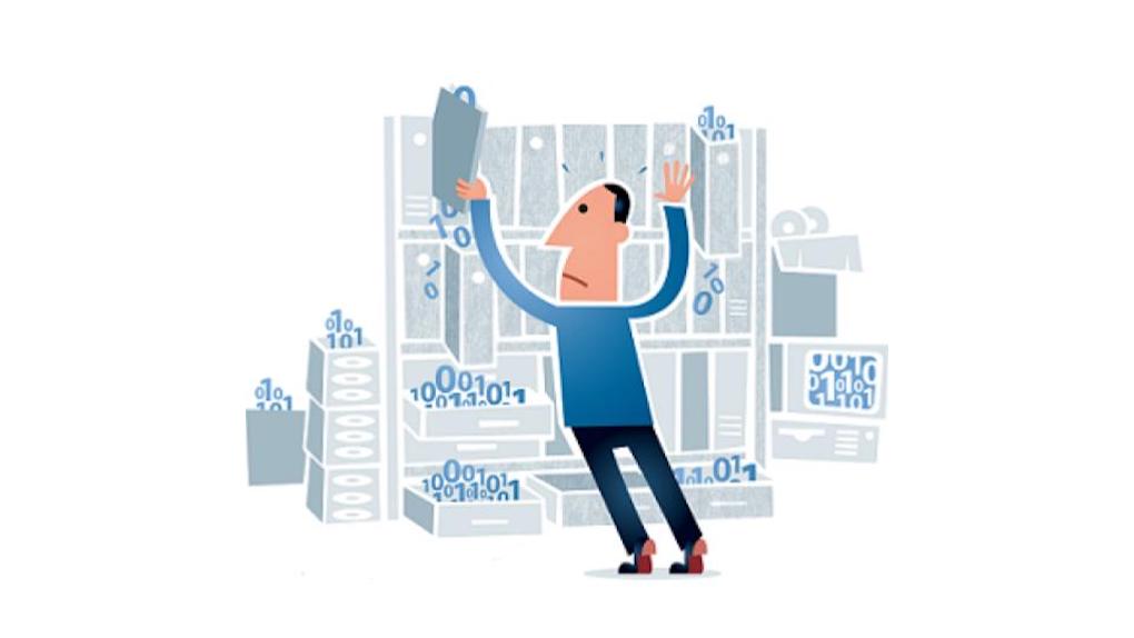


 For the past year, developers in the Library’s Software Services department have been working to rebuild Duke’s