Coming on board as the new Web Experience Developer in the Assessment and User Experience Services (AUXS) Department in early 2022, one of my first priorities was to get up to speed on Web Accessibility guidelines and testing. I wanted to learn how these standards had been applied to Library websites to date and establish my own processes and habits for ongoing evaluation and improvement. Flash-forward one year, and I’m looking back at the steps that I took and reflecting on lessons learned and projects completed. I thought it might be helpful to myself and others in a similar situation (e.g. new web developers, designers, or content creators) to organize these experiences and reflections into a sort of manual or “Quick Start Guide”. I hope that these 5 steps will be useful to others who need a crash course in this potentially confusing or intimidating–but ultimately crucial and rewarding–territory.
Learn from your colleagues
Fortunately, I quickly discovered that Duke Libraries already had a well-established culture and practice around web accessibility, including a number of resources I could consult.
Two Bitstreams posts from our longtime web developer/designer Sean Aery gave me a quick snapshot of the current state of things, recent initiatives, and ongoing efforts:
Repositories of the Library’s open source software projects proved valuable in connecting broader concepts with specific examples and seeing how other developers had solved problems. For instance, I was able to look at the code for DUL’s “theme” (basically visual styling, color, typography, and other design elements) to better understand how it builds on the ubiquitous Bootstrap CSS framework and implements specific accessibility standards around semantic markup, color contrast, and ARIA roles/attributes:
Equipped with some background and context, I found I was much better prepared to formulate questions for team meetings or the project Slack channel.
Look for guidelines from your institution
Duke’s Web Accessibility Initiative establishes clear web accessibility standards for the University and offers practical information on how to understand and implement them:
The site also offers guides geared towards the needs of different stakeholders (content creators, designers, developers) as well as a step-by-step overview of how to do an accessibility assessment.
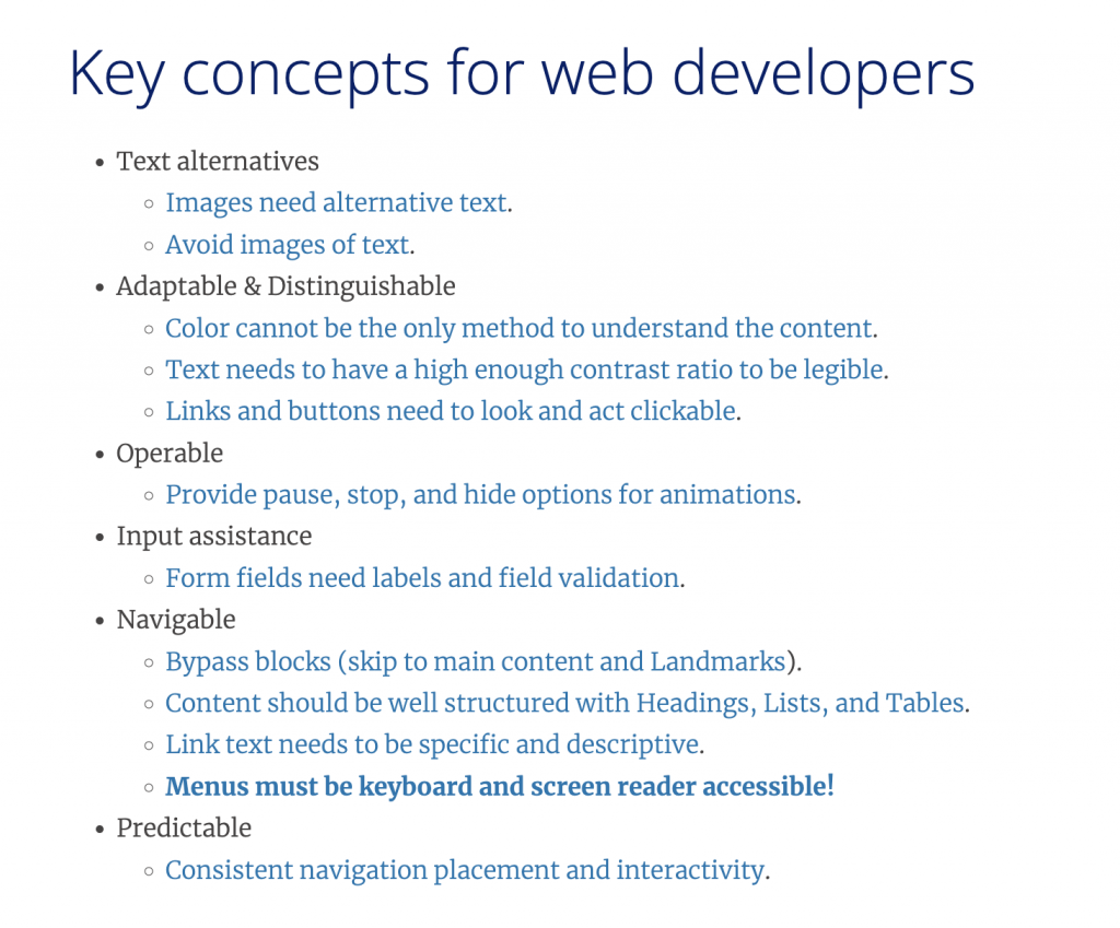
Know your standards
Duke University has specified the Worldwide Web Consortium Web Content Accessibility Guidelines version 2.0, Level AA Conformance (WCAG 2.0 Level AA) as its preferred accessibility standard for websites. While it was initially daunting to digest and parse these technical documents, at least I had a known, widely-adopted target that I was aiming for–in other words, an achievable goal. Feeling bolstered by that knowledge, I was able to use the other resources mentioned here to fill in the gaps and get hands-on experience and practice solving web accessibility issues.
RTFM, ok?
Find a playground
As I settled into the workflow within our Scrum team (based on Agile software development principles), I found a number of projects that gave me opportunities to test and experiment with how different markup and design decisions affect accessibility. I particularly enjoyed working with updating the Style Guide for our Catalog as part of a Bootstrap 3–>4 migration, updating our DUL Theme across various applications — Library Catalog, Quicksearch, Staff Directory — built on the Ruby on Rails framework, and getting scrappy and creative trying to improve branding and accessibility of some of our vendor-hosted web apps with the limited tools available (essentially jQuery scripts and applying CSS to existing markup).
Build your toolkit
A few well-chosen tools can get you far in assessing and correcting web accessibility issues on your websites.
Browser Tools
The built-in developer tools in your browser are essential for viewing and testing changes to markup and understanding how CSS rules are applied to the Document Object Model. The Deque Systems aXe Chrome Extension (also available for Firefox) adds additional tools for accessibility testing with a slick interface that performs a scan, gives a breakdown of accessibility violations ranked by severity, and tells you how to fix them.
Color Contrast Checkers
I frequently turned to these two web-based tools for quick tests of different color combinations. It was educational to see what did and didn’t work in various situations and think more about how aesthetic and design concerns interact with accessibility concerns.
While this color combo technically passes WCAG 2.0 AA and uses colors from the Duke Brand Guide, I probably won’t be using it any time soon
Style Guides
These style guides provided a handy reference for default and variant typography, color, and page design elements. I found the color palettes particular helpful as I tried to find creative solutions to color contrast problems while maintaining Duke branding and consistency across various Library pages.
Attempting to navigate our websites using only the TAB, ENTER, SPACE, UP, and DOWN keys on a standard computer keyboard gave me a better understanding of the significance of semantic markup, skip links, and landmarks. This test is essential for getting another “view” of your pages that isn’t as dependent on visual cues to convey meaning and structure and can help surface issues that automated accessibility scanners might miss.
Quick—when was the last time you went a full day without using a Google product or service? How many years ago was that day?
We all know Google has permeated so many facets of our personal and professional lives. A lot of times, using a Google something-or-other is your organization’s best option to get a job done, given your available resources. If you ever searched the Duke Libraries website at any point over the past seventeen years, you were using Google.
It’s really no secret that when you have a website with a lot of pages, you need to provide a search box so people can actually find things. Even the earliest version of the library website known to the Wayback Machine–from “way back” in 1997–had a search box. Those days, search was powered by the in-house supported Texis Webinator. Google was yet to exist.
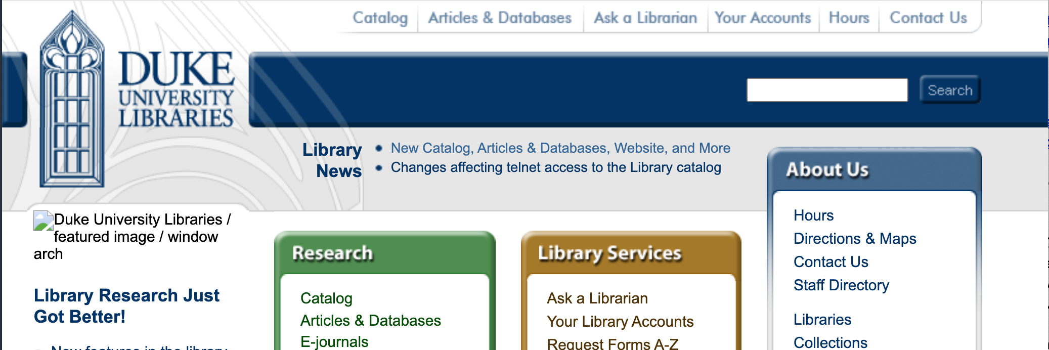
July 24, 2004 was an eventful day for the library IT staff. We went live with a shiny new Integrated Library System from Ex Libris called Aleph (that we are still to this day working to replace). On that very same day, we launched a new library website, and in the top-right corner of the masthead on that site was–for the very first time–a Google search box.
2004 version of the library website, with a Google search box in the masthead.
Years went by. We redesigned the website several times. Interface trends came and went. But one thing remained constant: there was a search box on the site, and if you used it, somewhere on the next page you were going to get search results from a Google index.
That all changed in summer 2021, when we implemented Nutch…
Why Not Google?
Google Programmable Search Engine (recently rebranded from “Google Custom Search Engine”), is easy to use. It’s “free.” It’s fast, familiar, and being a Google thing, it’s unbeatable at search relevancy. So why ditch it now? Well…
The results are capped at 100 per query. Google prioritizes speed and page 1 relevancy, but it won’t give you a precise hit count nor an exhaustive list of results.
It’s a black box. You don’t really get to see why pages get ranked higher or lower than others.
There’s a search API you could potentially build around, but if you exceed 100 searches/day, you have to start paying to use it.
What’s Nutch?
Apache Nutch is open source web crawler software written in Java. It’s been around for nearly 20 years–almost as long as Google. It supports out-of-the-box integration with Apache Solr for indexing.
Solr. Our IT staff have grown quite accustomed to the Solr search platform over the past decade; we already support around ten different applications that use it under the hood.
Self-Hosted. You run it yourself, so you’re in complete control of the data being crawled, collected, and indexed. User search data is not being collected by a third party like Google.
Configurable. You have a lot of control over how it works. All our configs are in a public code repository so we have record of what we have changed and why.
What are the Drawbacks to Using Nutch?
Maintenance. Using open source software requires a commitment of IT staff resources to build and maintain over time. It’s free, but it’s not really free.
Interface. Nutch doesn’t come with a user interface to actually use the indexed data from the crawls; you have to build a web application. Here’s ours.
Relevancy. Though Google considers such factors as page popularity and in-link counts to deem pages as more relevant than others for a particular query, Nutch can’t. Or, at least, its optional features that attempt to do so are flawed enough that not using them gets us better results. So we rely on other factors for our relevancy algorithm, like the segment of the site that a page resides, URL slugs, page titles, subheading text, inlink text, and more.
Documentation. Some open source platforms have really clear, easy to understand instruction manuals online to help you understand how to use them. Nutch is not one of those platforms.
How Does Nutch Work at Duke?
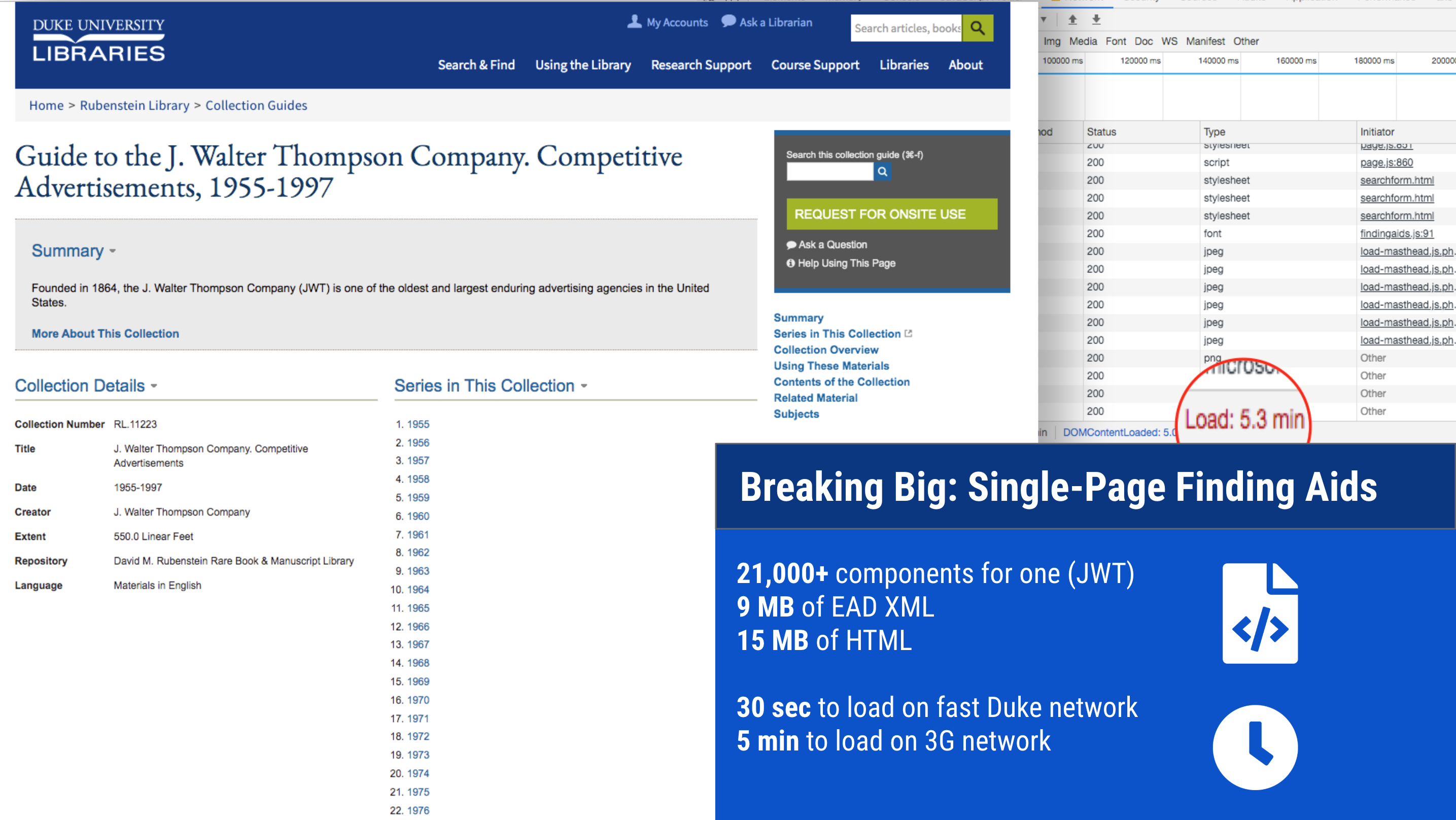
The main Duke University Libraries website is hosted in Drupal, where we manage around 1,500 webpages. But the full scope of what we crawl for library website searching is more than ten times that size. This includes pages from our blogs, LibGuides, exhibits, staff directory, and more. All told: 16,000 pages of content.
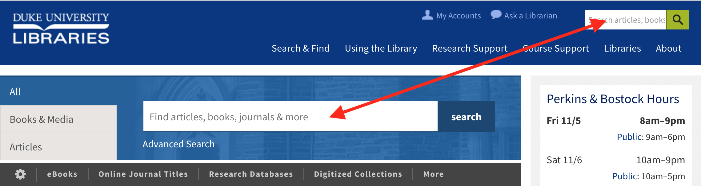
Searching from the website masthead or the default “All” box in the tabbed section on our homepage brings you to QuickSearch results page.
Use either of these search boxes to search QuickSearch.
You’ll see a search results page rendered by our QuickSearch app. It includes sections of results from various places, like articles, books & media, and more. One of the sections is “Our Website” — it shows the relevant pages that we’ve crawled with Nutch.
QuickSearch results page includes a section of results from “Our Website”
You can just search the website specifically if you’re not interested in all those other resources.
An example website-only search.
Three pieces work in concert to enable searching the website: Nutch, Solr, and QuickSearch. Here’s what they do:
Nutch
Crawls web pages that we want to include in the website search.
Parses HTML content; writes it to Solr fields.
Includes configuration for what pages to include/exclude, crawler settings, field mappings
Solr
Index & document store for crawled website content.
Includes configuration for determining relevancy; see parameters in website_searcher.rb
Crawls happen every night to pick up new pages and changes to existing ones. We use an “adaptive fetch schedule” so by default each page gets recrawled every 30 days. If a page changes frequently, it’ll get re-crawled sooner automatically.
Summary
Overall, we’re satisfied with how the switch to Nutch has been working out for us. The initial setup was challenging, but it has been running reliably without needing much in the way of developer intervention. Here’s hoping that continues!
Many thanks to Derrek Croney and Cory Lown for their help implementing Nutch at Duke, and to Kevin Beswick (NC State University Libraries) for consulting with our team.
One of our favorite accessibility checking tools in our toolbox is the axe DevTools Browser Extension by Deque Systems. It’s easy to use, whether on a live site, or in our own local development environments while we’re working on building new features for our applications. Simply open your browser’s Developer Tools (F12), click the Scan button, and get an instant report of any violations, complete with recommendations about how to fix them.
An axe DevTools test result for our archival finding aids homepage.
Keeping a website compliant is a continuous effort. Websites are living things. Content changes, features are added. When a site becomes compliant it does not stay compliant.
One of the goals we set out to accomplish in 2021 was to figure out how to add automated, continuous accessibility testing for our ArcLight software, which powers our archival finding aids search and discovery application. We got it implemented successfully a few months ago and we’re pleased with how it has been working so far.
Let me back up a bit and give some background on the concepts and tools upon which this solution depends. Namely: Continuous Integration, RSpec, Capybara, Selenium, and Docker.
Continuous Integration
For any given software project, we may have several developers making multiple changes to a shared codebase in the same day. Continuous Integration is the practice of ensuring that these code changes 1) don’t break any existing functionality, and 2) comply with established guidelines for code quality.
Evidence of a GitLab CI pipeline that has run — and passed all stages — for a code change.
For accessibility testing, we knew we needed to add something to our existing CI pipeline that would check for compliance and flag any issues.
RSpec Testing Framework
Many of our applications are built using Ruby on Rails. We write tests for our code using RSpec, a popular testing framework for Rails applications. Developers write tests (using the framework’s DSL / domain-specific language) to accompany their code changes. Those tests all execute as part of our CI pipeline (see above). Any failing tests will prevent code from being merged or getting deployed to production.
There are many different types of tests. On one end of the spectrum, there are “unit tests,” which verify that one small piece of code (e.g., one method) returns what we expect it to when it is given different inputs. On the other, there are “feature tests,” which typically verify that several pieces of code are working together as intended in different conditions. This often simulates the use of a feature by a person (e.g., when a user clicks this button, test that they get to this page and verify this link gets rendered, etc.). Feature tests might alternatively be called “integration tests,” “acceptance tests,” or even “system tests” — the terminology is both squishy and evolving.
At any rate, accessibility testing is a specific kind of feature test.
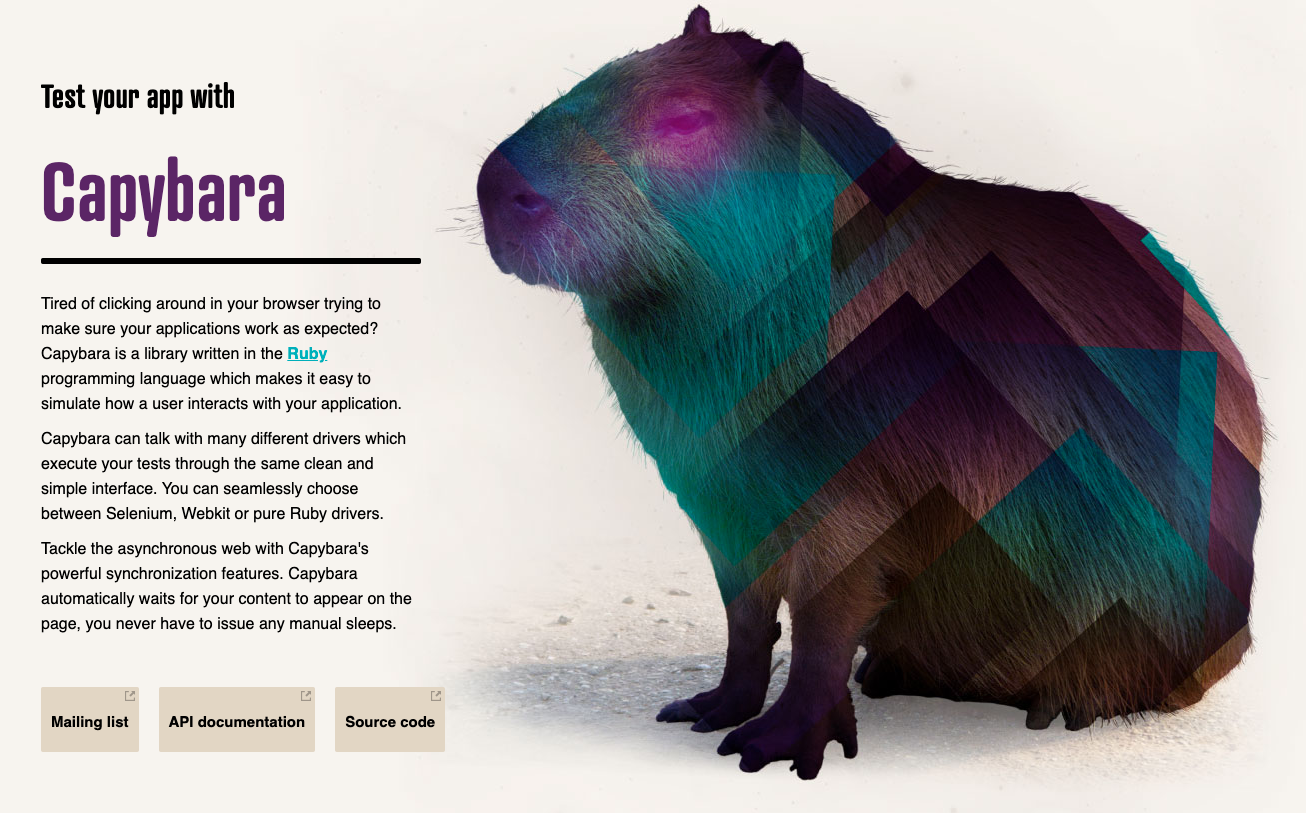
Capybara
On its own, RSpec unfortunately doesn’t natively support feature tests. It requires a companion piece of software called Capybara, which can simulate a user interacting with a web interface. Capybara brings with it a DSL to visit pages, fill out forms, or click on elements within RSpec tests, and special matchers to check that the page is behaving as intended.
Homepage for Capybara, featuring an actual capybara.
When configuring Capybara, you set up the driver you want it to use when running different kinds of tests. Its default driver is RackTest, which is fast but it can’t execute JavaScript like a real web browser can. Our ArcLight UI, for instance, uses a bunch of JavaScript. So we knew that any accessibility tests would have to be performed using a driver for an actual browser; the default Capybara alone wouldn’t cut it.
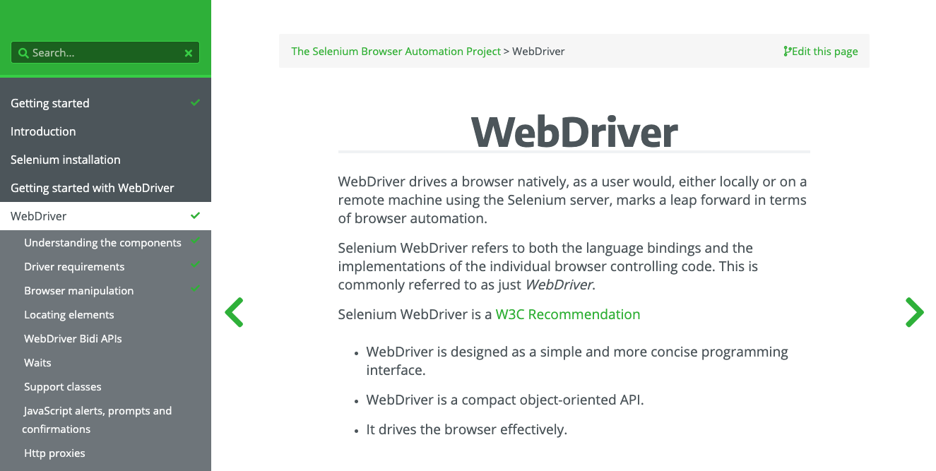
Documentation for Selenium WebDriver for browser automation
The best way we could find to get Capybara to control a real browser in an RSpec test was to add the selenium-webdriver gem to our project’s Gemfile.
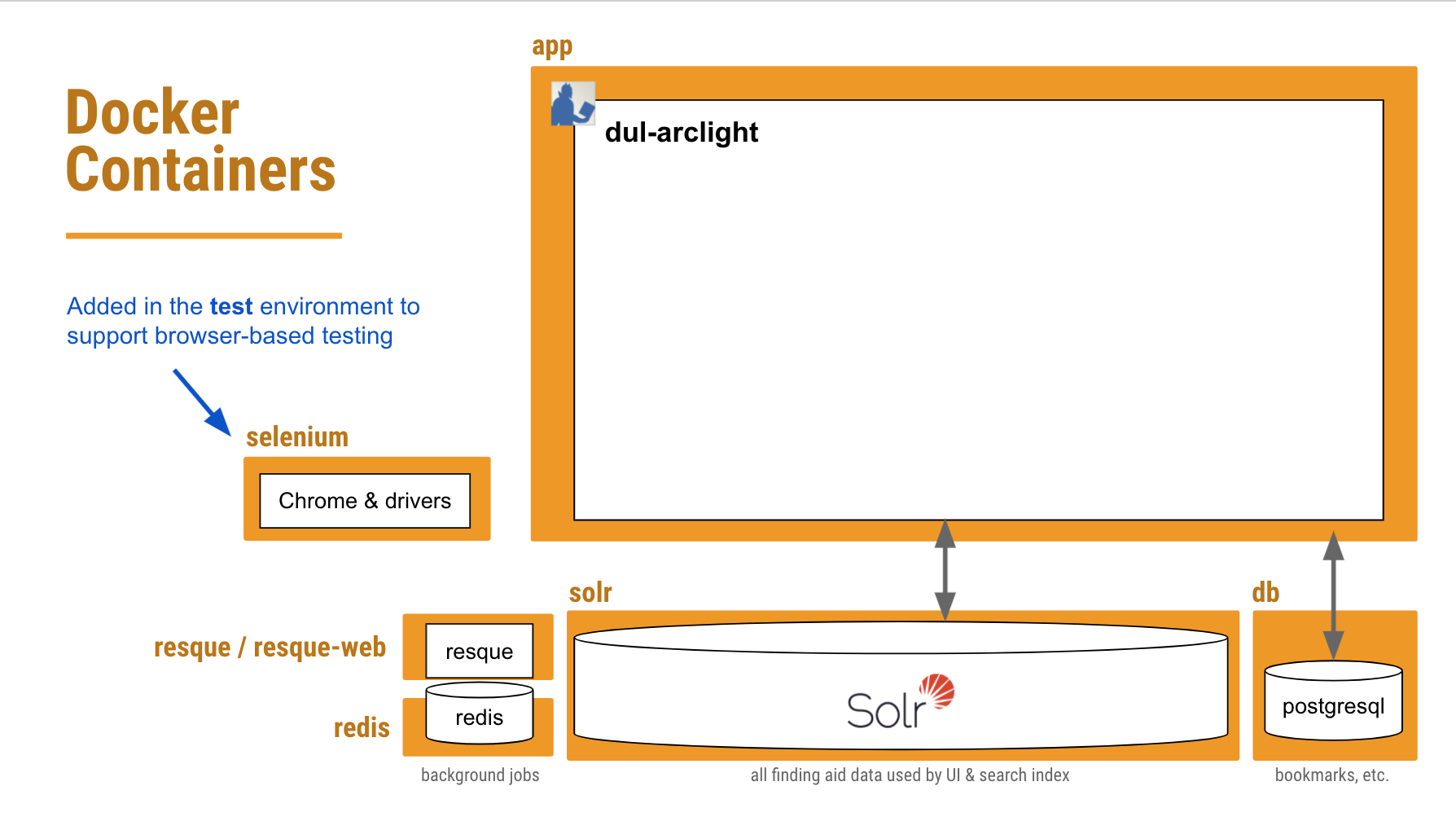
Docker
Over the past few years, we have evolved our DevOps practice and embraced containerizing our applications using Docker. Complex applications that have a lot of interwoven infrastructure dependencies used to be quite onerous to build, run, and share. Getting one’s local development environment into shape to successfully run an application used be a whole-day affair. Worse still, the infrastructure on the production server used to bear little resemblance to what developers were working with on their local machines.
A systems diagram depicting the various services that run to support our ArcLight app.
Docker helps a dev team configure in their codebase all of these system dependencies in a way that that’s easily reproducible in any environment. It builds a network of “containers” on a single host, each running a service that’s crucial to the application. Now a developer can simply check out the code, run a couple commands, wait a few minutes, and they’re good to go.
The same basic setup also applies in a production environment (with a few easily-configurable differences). And that simplicity also carries over to the CI environment where the test suite will run.
Orange boxes depict each service / container we have defined in our Docker configuration.
So what we needed to do was add another container to our existing Docker configuration that would be dedicated to running any JavaScript-dependent feature tests — including accessibility tests — in a browser controlled by Selenium WebDriver.
Keeping this part containerized would hopefully ensure that when a developer runs the tests in their local environment, the exact same browser version and drivers get used in the CI pipeline. We can steer clear of any “well, it worked on my machine” issues.
Putting it All Together
Phew. OK, with all of that background out of the way, let’s look closer at how we put all of these puzzle pieces together.
The folks at Selenium HQ host “standalone” browser Docker images in Docker Hub, complete with the browser software and accompanying drivers. We found a tagged version of their Standalone Chrome image that worked well, and pull that into our newly-defined “selenium” container for our test environments.
Since this is new territory for us, and already fairly complex, we’re starting with just one browser: Chrome. We may be able to add more in the future.
Capybara Driver Configuration
Next thing we needed to do was tell Capybara that whenever it encounters any javascript-dependent feature tests, it should run them in our standalone Chrome container (using a “remote” driver). The Selenium WebDriver gem lets us set some options for how we want Chrome to run.
The key setting here is “headless” — that is, run Chrome, but more efficiently, without all the fancy GUI stuff that a real user might see.
That last URL http://selenium:4444/wd/hub is the location of our Chrome driver within our selenium container.
There are a few other important Capybara settings configured in spec_helper.rbthat are needed in order to get our app and seleniumcontainers to play nicely together.
Capybara.server=:puma,{Threads:'1:1'}Capybara.server_port='3002'Capybara.server_host='0.0.0.0'Capybara.app_host="http://app:#{Capybara.server_port}"Capybara.always_include_port=trueCapybara.default_max_wait_time=30# our ajax responses are sometimes slowCapybara.enable_aria_label=true
[...]
The server_port, server_host and app_host variables are the keys here. Basically, we’re saying:
Capybara (which runs in our app container) should start up Puma to run the test app, listening on http://0.0.0.0:3002 for requests beyond the current host during a test.
The selenium container (where the Chrome browser resides) should access the application under test at http://app:3002 (since it’s in the app container).
Some Actual RSpec Accessibility Tests
Here’s the fun part, where we actually get to write the accessibility tests. The axe-core-rspec gem makes it a breeze. The be_axe_clean matcher ensures that if we have a WCAG 2.0 AA or Section 508 violation, it’ll trip the wire and report a failing test.
require'spec_helper'require'axe-rspec'RSpec.describe'Accessibility (WCAG, 508, Best Practices)',type: :feature,js: true,accessibility: truedodescribe'homepage'doit'is accessible'dovisit'/'expect(page).tobe_axe_cleanendend
[...]
end
With type: :feature and js: true we signal to RSpec that this block of tests should be handled by Capybara and must be run in our headless Chrome Selenium container.
The example above is the simplest case: 1) visit the homepage and 2) do an Axe check. We also make sure to test several different kinds of pages, and with some different variations on UI interactions. E.g., test after clicking to open the Advanced Search modal.
The CI Pipeline
We started out having accessibility tests run along with all our other RSpec tests during the test stage in our GitLab CI pipeline. But we eventually determined it was better to keep accessibility tests isolated in a separate job, one that would not block a code merge or deployment in the event of a failure. We use the accessibility: true tag in our RSpec accessibility test blocks (see the above example) to distinguish them from other feature tests.
No, we don’t condone pushing inaccessible code to production! It’s just that we sometimes get false positives — violations are reported where there are none — particularly in Javascript-heavy pages. There are likely some timing issues there that we’ll work to refine with more configuration.
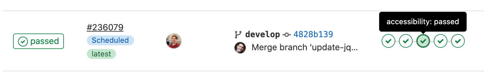
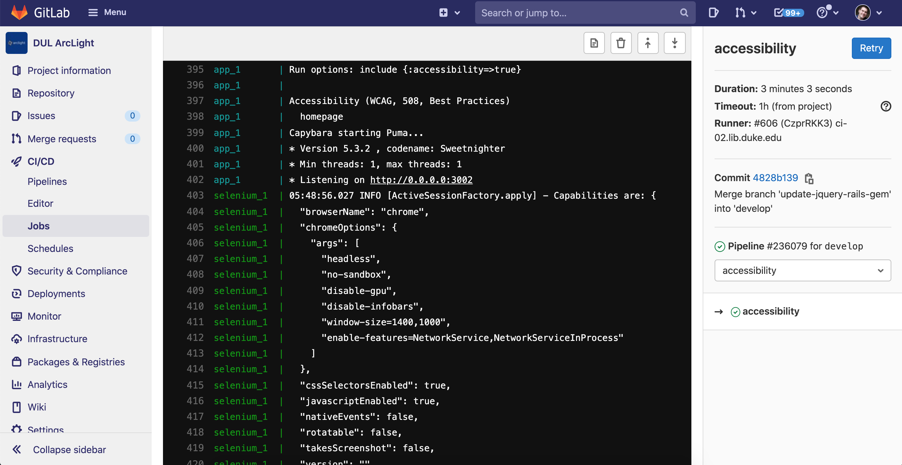
A Successful Accessibility Test
Here’s a completed job in our CI pipeline logs where the accessibility tests all passed:
Output from a successful automated accessibility test job run in a GitLab CI pipeline.
Our GitLab CI logs are not publicly available, so here’s a brief snippet from a successful test.
An Accessibility Test With Failures
Here’s a CI pipeline for a code branch that adds two buttons to the homepage with color contrast and aria-label violations. The axe tests flag the issues as FAILED and recommend revisions (see snippet from the logs).
Concluding Thoughts
Automation and accessibility testing are both rapidly evolving areas, and the setup that’s working for our ArcLight app today might look considerably different within the next several months. Still, I thought it’d be useful to pause and reflect on the steps we took to get automated accessibility testing up and running. This strategy would be reasonably reproducible for many other applications we support.
A lot of what I have outlined could also be accomplished with variations in tooling. Don’t use GitLab CI? No problem — just substitute your own CI platform. The five most important takeaways here are:
Accessibility testing is important to do, continually
Use continuous integration to automate testing that used to be manual
Containerizing helps streamline continuous integration, including testing
You can run automated browser-based tests in a ready-made container
Deque’s open source Axe testing tools are easy to use and pluggable into your existing test framework
Many thanks to David Chandek-Stark (Duke) for architecting a large portion of this work. Thanks also to Simon Choy (Duke), Dann Bohn (Penn St.), and Adam Wead (Penn St.) for their assistance helping us troubleshoot and understand how these pieces fit together.
REVISION 7/29/21: This post was updated, adding links to snippets from CI logs that demonstrate successful accessibility tests vs. those that reveal violations.
In fall 2020, the Libraries quickly developed several new COVID-safe services as we reopened our facilities to students and faculty in the midst of the pandemic. Two such services were Library Takeout, which allows Duke affiliates to pick up reserved books with minimal contact, and an online reservation system for seats and equipment in library study spaces.
Libraries staff spent significant time over the summer of 2020 developing these new services. Once they were put in operation in the fall of 2020, Assessment & User Experience staff knew we needed to gather feedback from users and analyze data to better understand how the services were working and what could be improved. We developed brief, anonymous feedback surveys to be sent during two-week periods to each person who reserved equipment or a study seat or made an appointment to pick up books.
What did we learn?
The vast majority of the 111 patrons who responded to the Library Takeout survey were extremely satisfied with both wait time and safety precautions, as shown in the figure below.
Patrons were also asked what worked well about the process, what did not work well, and whether they had any additional comments or suggestions. There were 69 comments about things that worked well. The most prevalent themes in these compliments were clear instructions, very short wait times, friendly security and staff, access to parking, and adequate safety precautions.
The directions were clear, the parking pass for the Upper Allen lot made arriving on campus for pick up easy, the security staff were helpful and efficient, and the library staff was cheerful and helpful as I’ve come to expect.
Very rigorous about precautions. Keep it that way.
There were 34 comments about things that did not work well, many of which also make suggestions for improvements. For example:
There was interest in the Libraries offering weekend hours for materials pick-up
Several students found the check-in requirements at the library entrance confusing
There were complaints about having to make appointments at all to pick up materials
Several students reported issues with their parking passes not opening the gates
Interest in having the confirmation email for a scheduled pick-up be sent earlier
Several felt that the security presence at the doors was uncomfortable
The survey for seat and equipment reservations received 114 responses in the two-week period in which this survey was distributed at the beginning of the fall semester. Users were asked how easy five activities were: using the online system to book, checking in, finding the seat/equipment, using it, and cleaning up/checking out. An overwhelming percent of users found it “extremely easy” to use their seat/equipment (89%). In general, close to two-thirds of users found each of the other activities “extremely easy.” When “Somewhat easy” and “extremely easy” responses are combined, between 85-97% of respondents found each activity easy. The activity with the lowest “easy” score (85%) was “cleaning up and checking out after your reservation.”
When asked what worked well about reserving and using a seat or equipment, many praised the booking website for its clarity, simplicity, and ease of use, and also praised the entire process. Students were happy to be assured of a seat when they came to the library, and many commented on how clean, quiet, and nicely socially distanced the library was. Compliments were offered for the signage as well as for the security staff’s assistance in finding seats.
It was easy from start to finish. The security guard at the front was very helpful in explaining how to find my seat.
Was happy to see cleaning supplies to wipe down the desk area. felt safe. good social distancing precautions!
When asked what did not work well about reserving and using a study seat or equipment, reported issues included the following:
Some respondents hadn’t realized they were supposed to check out online or clean their seating area when they were finished. The Libraries should add visuals next to the seats instructing on these procedures.
When reserving, patrons can’t tell which seats are close to electrical outlets or windows. They requested a floorplan, map, or photos of the spaces so they can see where the seats are in relation to other things.
Multiple people asked for the ability to easily extend one’s study time in the same seat if no one had booked it after them by the time their session was up.
For the website, several people complained about the inability to edit reservation times without canceling and rebooking the whole thing, and a few other clunky visual things about the tool used for reservations.
Several people requested weekend hours for the service.
Changes we were able to make based on feedback
By gathering student feedback when we first began offering these services, we were able to quickly make changes so that the services better met our users’ needs. Below is a list of some of the key changes we made in response to survey feedback.
Revised and expanded opening hours in both Lilly and Perkins & Bostock Libraries in response to student requests and an analysis of usage patterns based on reservation system data.
Removed the “check in” requirement for study seat users early in the fall semester, once we realized this was posing problems
Added more physical signage in the buildings to help students find their seats
Developed a guide to study seats, including pictures, descriptions, and amenities of seats in Lilly, Music, Perkins, Bostock, and Rubenstein
Added online information so that students can easily see which seats do not have access to electrical outlets when deciding which seat to reserve (see this example)
Added an Interview Room for students to book for 90-minute periods. Students can use this space to participate in virtual interviews.
Increased outreach and marketing about reservable Study Seats through email blasts, social media, and blog posts. Library Takeout got plenty of buzz through this catchy video that went viral this past fall (870,000 views and counting)!
Now that we have been live for awhile, I thought it’d be worthwhile to summarize what we accomplished, and reflect a bit on how it’s going.
Working Among Peers
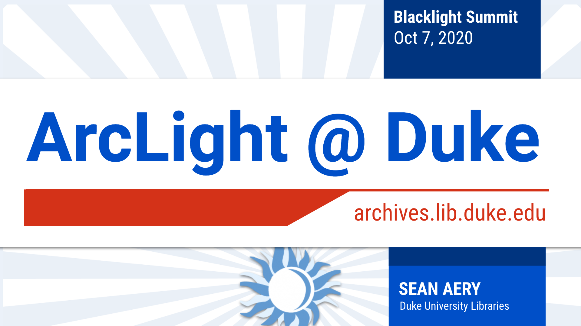
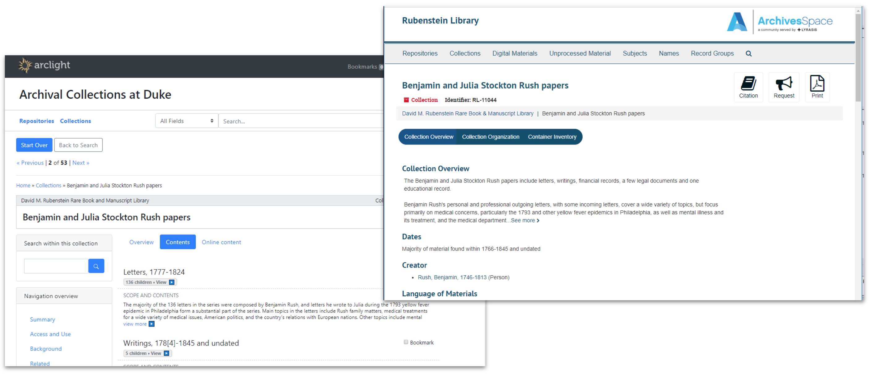
I had the pleasure of presenting about ArcLight at the Oct 2020 Blacklight Summit alongside Julie Hardesty (Indiana University) and Trey Pendragon (Princeton University). The three of us shared our experiences implementing ArcLight at our institutions. Though we have the same core ArcLight software underpinning our apps, we have each taken different strategies to build on top of it. Nevertheless, we’re all emerging with solutions that look polished and fill in various gaps to meet our unique local needs. It’s exciting to see how well the software holds up in different contexts, and to be able to glean inspiration from our peers’ platforms.
Slides from ArcLight@Duke presentation, 10/7/2020
A lot of content in this post will reiterate what I shared in the presentation.
This is one of the hardest things to get right in a finding aids UI, so our solution has evolved through many iterations. We created a context sidebar with lightly-animated loading indicators matching the number of items currently loading. The nav sticks with you as you scroll down the page and the Request button stays visible. We also decided to present a list of direct child components in the main page body for any parent component.
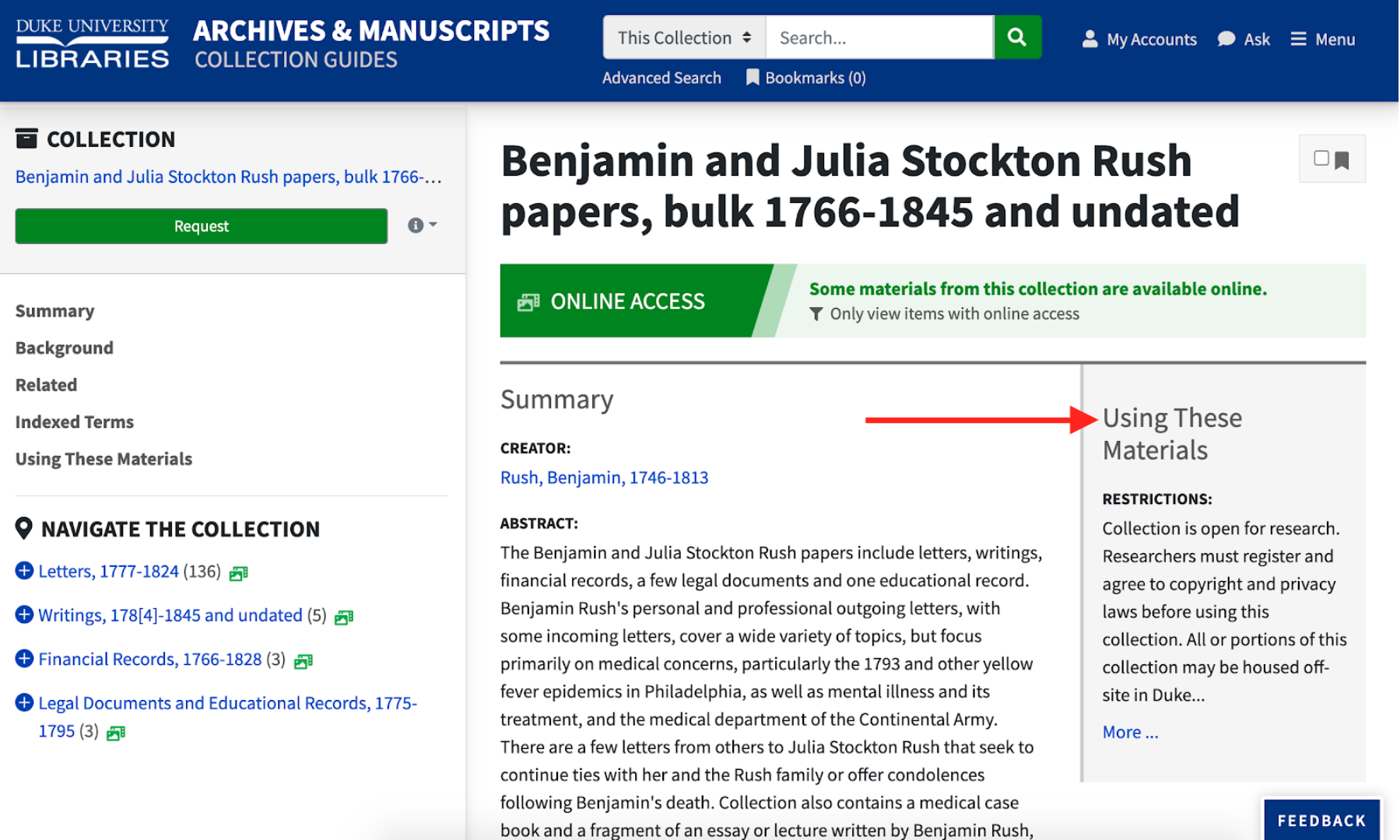
Restrictions
At the collection level, we wanted to ensure that users didn’t miss any restrictions info, so we presented a taste of it at the top-right of the page that jumps you to the full description when clicking “More.”
We changed how access and use restriction indexing so components can inherit their restrictions from any ancestor component. Then we made bright yellow banners and icons in the UI to signify that a component has restrictions.
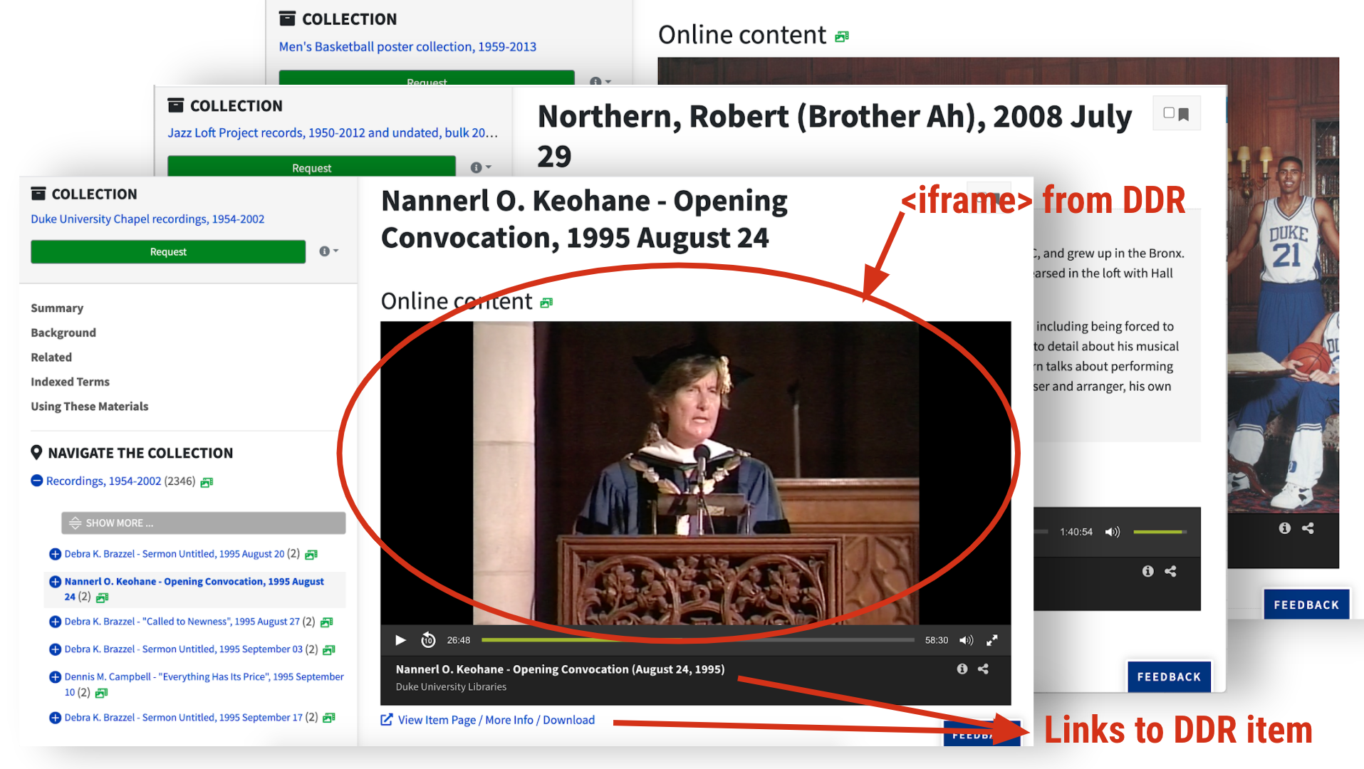
ArcLight exists among a wide constellation of other applications supporting and promoting discovery in the library, so integrating with these other pieces was an important part of our implementation. In April, I showed the interaction between ArcLight and our Requests app, as well as rendering digital object viewers/players inline via the Duke Digital Repository (DDR).
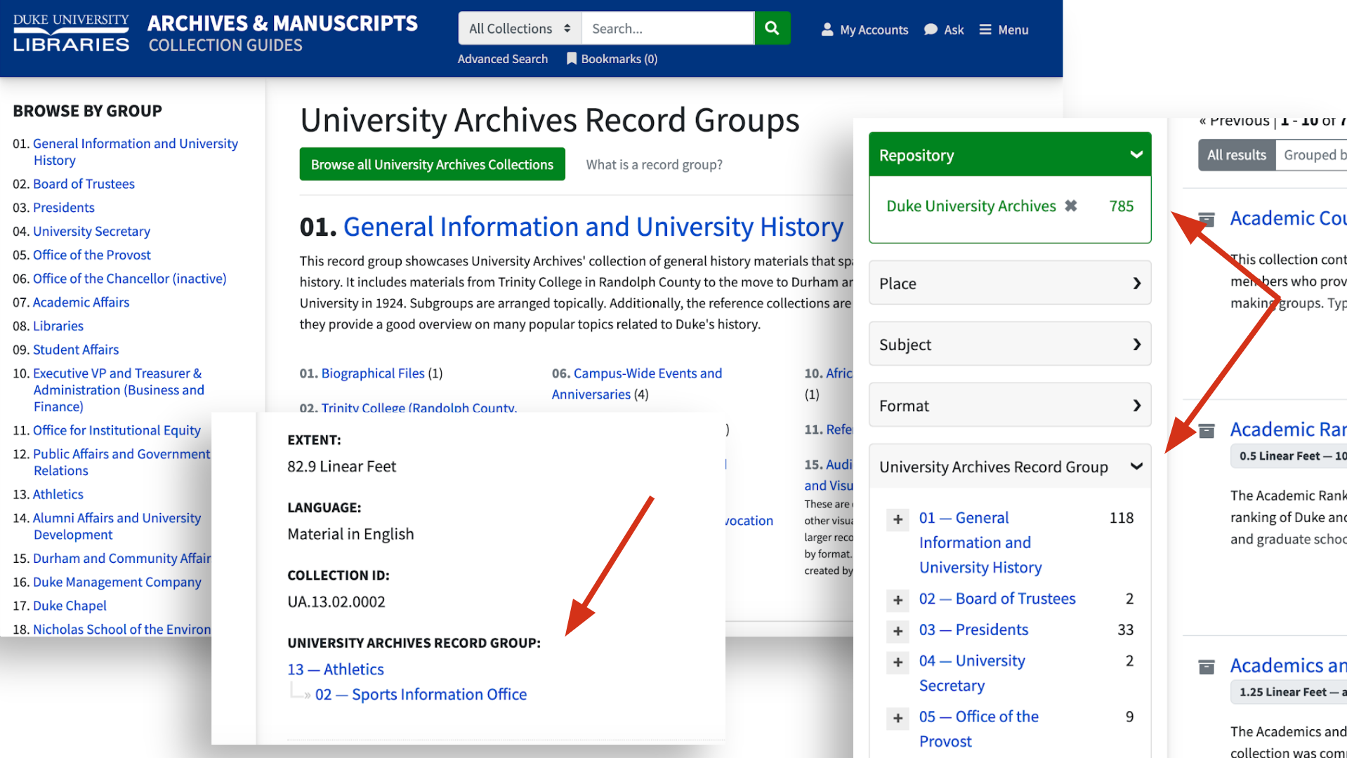
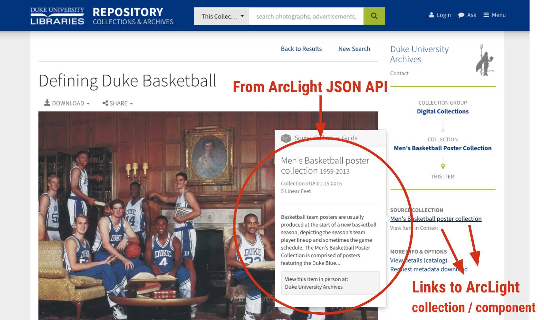
Two other locations external to our application now use ArcLight’s APIs to retrieve archival information. The first is the Duke Digital Repository (DDR). When viewing a digital collection or digital object that has a physical counterpart in the archives, we pull archival information for the item into the DDR interface from ArcLight’s JSON API.
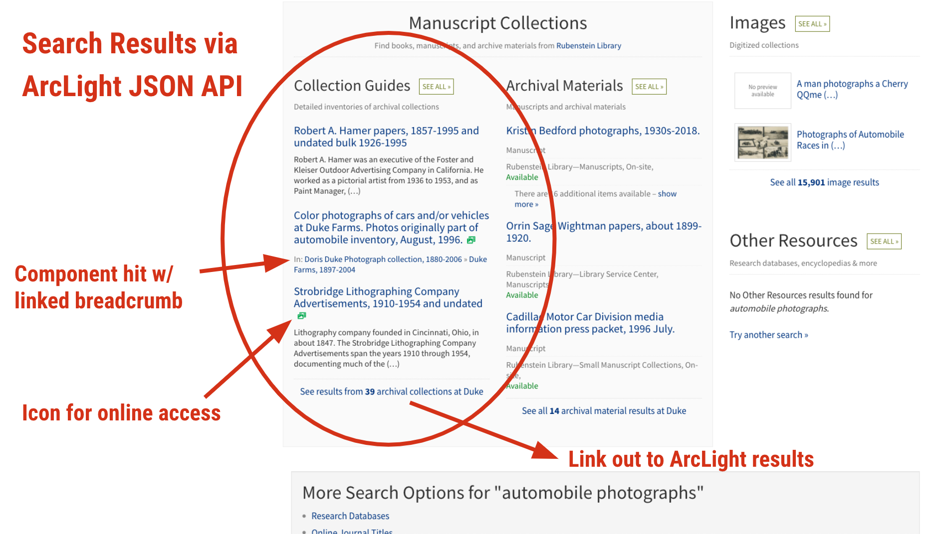
The other is our “Bento” search application powering the default All search available from the library website. Now when your query finds matches in ArcLight, you’ll see component-level results under a Collection Guides bento box. Components are contextualized with a linked breadcrumb trail.
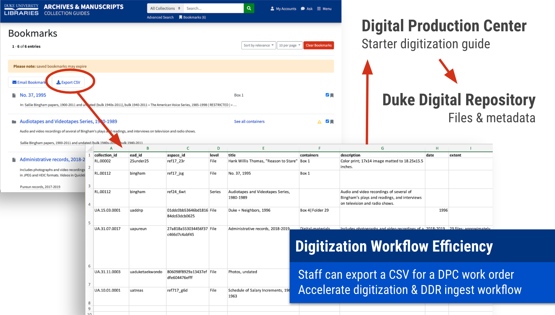
Bookmarks Export CSV
COVID-19 brought about many changes to how staff at Duke Libraries retrieve materials for faculty and student research. You may have heard Duke’s Library Takeout song (819K YouTube views & counting!), and if you have, you probably can’t ever un-hear it.
But with archival materials, we’re talking about items that could never be taken out of the building. Materials may only be accessed in a controlled environment in the Rubenstein Reading Room, which remains highly restricted. With so much Duke instruction moving online during COVID, we urgently needed to come up with a better workflow to field an explosion of requests for digitizing archival materials for use in remote instruction.
ArcLight’s Bookmarks feature (which comes via Blacklight) proved to be highly valuable here. We extended the feature to add a CSV export. The CSV is constructed in a way that makes it function as a digitization work order that our Digital Collections & Curation Services staff use to shepherd a request through digitization, metadata creation, and repository ingest. Over 26,000 images have now been digitized for patron instruction requests using this new workflow.
More Features
Here’s a list of several other custom features we completed after the April midway point.
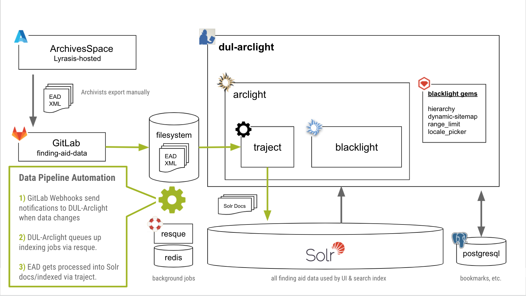
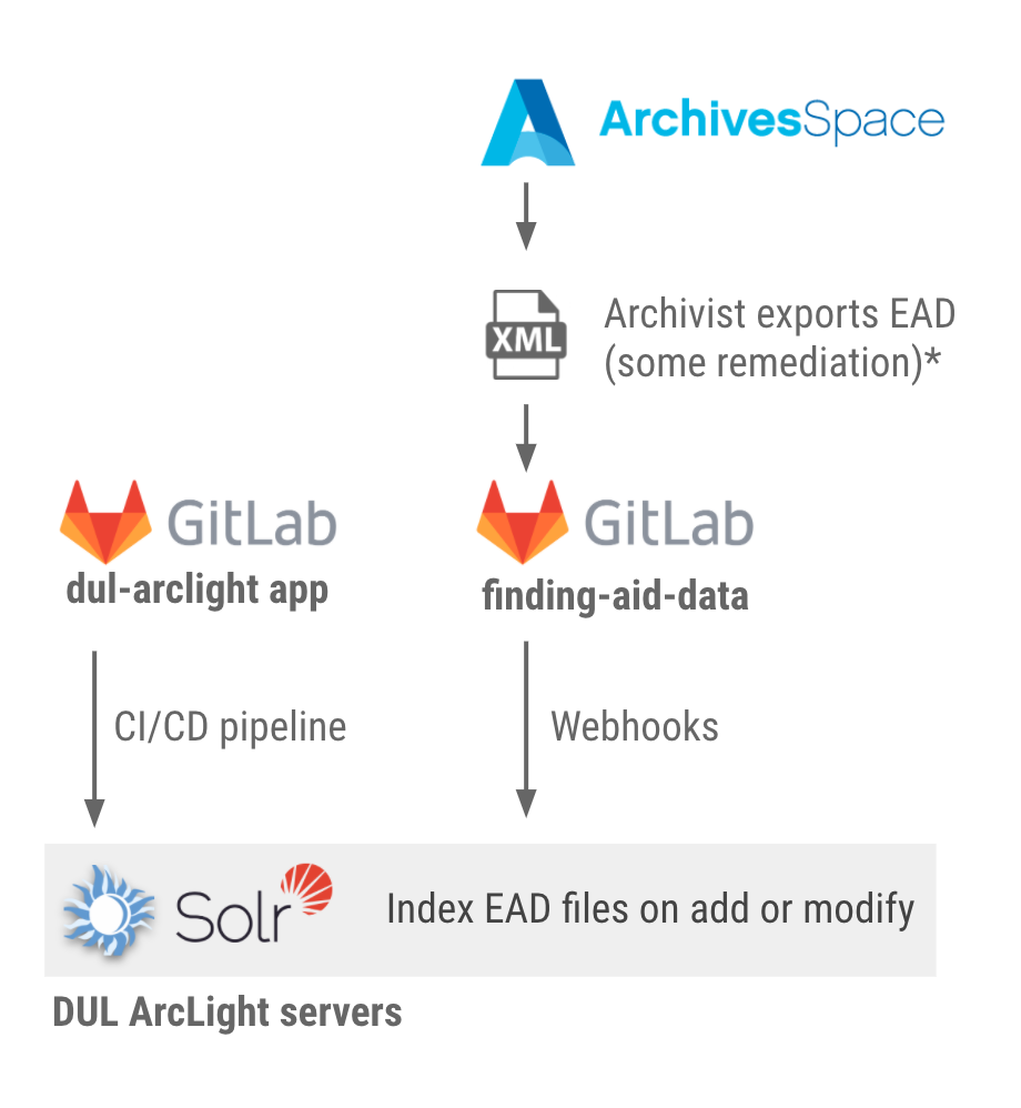
Bringing ArcLight online required some major rearchitecting of our pipeline to preview and publish archival data. Our archivists have been using ArchivesSpace for several years to manage the source data, and exporting EAD2002 XML files when ready to be read by the public UI. Those parts remain the same for now, however, everything else is new and improved.
Our new process involves two GitLab repositories: one for the EAD data, and another for the ArcLight-based application. The data repo uses GitLab Webhooks to send POST requests to the app to queue up reindexing jobs automatically whenever the data changes. We have a test/preview branch for the data that updates our dev and test servers for the application, so archivists can easily see what any revised or new finding aids will look like before they go live in production.
We use GitLab CI/CD to easily and automatically deploy changes to the application code to the various servers. Each code change gets systematically checked for passing unit and feature tests, security, and code style before being integrated. We also aim to add automated accessibility testing to our pipeline within the next couple months.
A lot of data gets crunched while indexing EAD documents through Traject into Solr. Our app uses Resque-based background job processing to handle the transactions. With about 4,000 finding aids, this creates around 900,000 Solr documents; the index is currently a little over 1GB. Changes to data get reindexed and reflected in the UI near-instantaneously. If we ever need to reindex every finding aid, it takes only about one hour to complete.
What We Have Learned
We have been live for just over four months, and we’re really ecstatic with how everything is going.
Usability
In September 2020, our Assessment & User Experience staff conducted ten usability tests using our ArcLight UI, with five experienced archival researchers and five novice users. Kudos to Joyce Chapman, Candice Wang, and Anh Nguyen for their excellent work. Their report is available here. The tests were conducted remotely over Zoom due to COVID restrictions. This was our first foray into remote usability testing.
Novice and advanced participants alike navigated the site fairly easily and understood the contextual elements in the UI. We’re quite pleased with how well our custom features performed (especially the context sidebar, contents lists, and redesigned breadcrumb trail). The Advanced Search modal got more use than we had anticipated, and it too was effective. We were also somewhat surprised to find that users were not confused by the All Collections vs. This Collection search scope selector when searching the site.
“The interface design does a pretty good job of funneling me to what I need to see… Most of the things I was looking for were in the first place or two I’d suspect they’d be.” — Representative quote from a test participant
A few improvements were recommended as a result of the testing:
make container information clearer, especially within the requesting workflow
improve visibility of the online access facet
make the Show More links in the sidebar context nav clearer
better delineate between collections and series in the breadcrumb
replace jargon with clearer labels, especially “Indexed Terms“
We recently implemented changes to address 2, 3, and 5. We’re still considering options for 1 and 4. Usability testing has been invaluable part of our development process. It’s a joy (and often a humbling experience!) to see your design work put through the paces with actual users in a usability test. It always helps us understand what we’re doing so we can make things better.
Usage
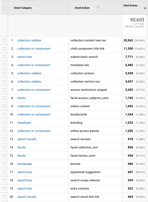
We want to learn more about how often different parts of the UI are used, so we implemented Google Analytics event tracking to anonymously log interactions. We use the Anonymize IP feature to help protect patron privacy.
Top Google Analytics event categories & actions, Jul 1 – Nov 20, 2020.
Some observations so far:
The context nav sidebar is by far the most interacted-with part of the UI.
Browsing the Contents section of a component page (list of direct child components) is the second-most frequent interaction.
Subject, Collection, & Names are the most-used facets, in that order. That does not correlate with the order they appear in the sidebar.
Links presented in the Online Access banners were clicked 5x more often than the limiter in the Online Access facet (which matches what we found in usability testing)
Basic keyword searches happen 32x more frequently than advanced searches
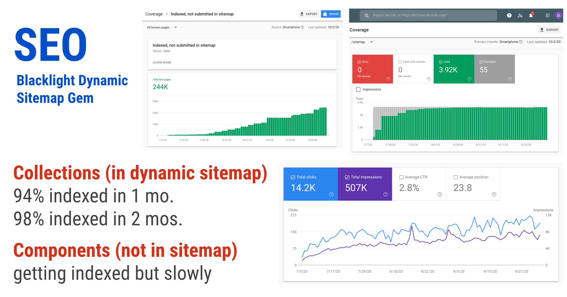
Search Engine Optimization (SEO)
We want to be sure that when people search Google for terms that appear in our finding aids, they discover our resources. So when several Blacklight community members combined forces to create a Blacklight Dynamic Sitemaps gem this past year, it caught our eye. We found it super easy to set up, and it got the vast majority of our collection records Google-indexed within a month or so. We are interested in exploring ways to get it to include the component records in the sitemap as well.
Launching ArcLight: Retrospective
We’re pretty proud of how this all turned out. We have accomplished a lot in a relatively short amount of time. And the core software will only improve as the community grows.
At Duke, we already use Blacklight to power a bunch of different discovery applications in our portfolio. And given that the responsibility of supporting ArcLight falls to the same staff who support all of those other apps, it has been unquestionably beneficial for us to be able to work with familiar tooling.
We did encounter a few hurdles along the way, mostly because the software is so new and not yet widely adopted. There are still some rough edges that need to be smoothed out in the core software. Documentation is pretty sparse. We found indexing errors and had to adjust some rules. Relevancy ranking needed a lot of work. Not all of the EAD elements and attributes are accounted for; some things aren’t indexed or displayed in an optimal way.
Still, the pros outweigh the cons by far. With ArcLight, you get an extensible Blacklight-based core, only catered specifically to archival data. All the things Blacklight shines at (facets, keyword highlighting, autosuggest, bookmarks, APIs, etc.) are right at your fingertips. We have had a very good experience finding and using Blacklight plugins to add desired features.
Finally, while the ArcLight community is currently small, the larger Blacklight community is not. There is so much amazing work happening out in the Blacklight community–so much positive energy! You can bet it will eventually pay dividends toward making ArcLight an even better solution for archival discovery down the road.
Acknowledgments
Many thanks go out to our Duke staff members who contributed to getting this project completed successfully. Especially:
Product Owner: Noah Huffman
Developers/DevOps: Sean Aery, David Chandek-Stark, Michael Daul, Cory Lown (scrum master)
Project Sponsors: Will Sexton & Meghan Lyon
Redesign Team: Noah Huffman (chair), Joyce Chapman, Maggie Dickson, Val Gillispie, Brooke Guthrie, Tracy Jackson, Meghan Lyon, Sara Seten Berghausen
And thank you as well to the Stanford University Libraries staff for spearheading the ArcLight project.
This post was updated on 1/7/21, adding the embedded video recording of the Oct 2020 Blacklight Summit ArcLight presentation.
How can the Duke Libraries better support the needs of Black students at Duke? A team of library staff conducted qualitative research with Black students over the past two years in order to answer this question. This research was part of a multi-year effort at the Libraries to better understand the experiences and needs of various populations at Duke, beginning with first generation college students and continuing this year with a focus on international students.
Our final report discusses the full research process and our findings in more detail than that provided below, including a full list of recommendations resulting from the study.
We began by reading existing research on university and academic libraries’ support of Black students and speaking with key stakeholders on campus, such as Chandra Guinn, the director of the Mary Lou Williams Center for Black Culture. We researched past studies at Duke that had information on the Black student experience, and learned about the history of faculty diversity initiatives and racist incidents that had taken place on campus. We then held two discussion groups and three PhotoVoice sessions with Black graduate and undergraduate students, in addition to analyzing thousands of responses from the Libraries’ 2020 student satisfaction survey broken out by race. Photovoice is a community-based, participatory research method that originated in global health research. Participants take photos in response to prompts and submit them along with captions. This is followed by a group discussion led by participants as they discuss each set of images and captions.
We sought to understand students’ experiences in the Libraries and on campus to improve how all students interact with library services, facilities, and materials. We did not limit our discussions to library services and spaces, as it was important to explore Black students’ experience and use of the Libraries holistically. The research team pursued eight research questions:
To what extent are the Libraries viewed as an inclusive space by Black students?
To what extent is the University viewed as an inclusive space by Black students?
To what extent do students experience microaggressions or bias because of their race in the Libraries, on campus, in Durham, or in North Carolina?
What changes can the Libraries make to ensure Black students feel supported and included? How can the Libraries improve spaces, services, and programs to ensure Black students feel supported and included?
What changes can the University make to ensure Black students feel supported and included? How can the University improve spaces, services, and programs to ensure Black students feel supported and included?
What campus and community services, spaces, and programs do Black students use and find helpful?
What library services, spaces, instruction sessions, and programs do Black students use and find helpful?
What campus and library services, spaces, and programs help Black students feel welcome or supported?
To what extent is Duke University viewed as an inclusive space?
Participants praised many services, programs, and spaces at Duke that contribute to a welcoming environment. At the same time, participants agreed that Duke provides a less inclusive space for Black students than White students. Black students contend with campus culture, curricula, and physical spaces that still largely reflect and center White experiences, history, and values. Academia is a space where Black students do not see themselves valued or accurately represented. From the arts and sciences to statistics and economics, participants reported systemic bias in instructors’ behavior and the scholarship assigned and discussed in class. They experience microaggressions in almost every area of life at Duke. These instances of bias reinforce the idea that their belonging at Duke is qualified.
We found that many Black graduate students have a level of support via their academic programs, beyond what is available to Duke undergraduate students. Participants praised many of their graduate programs for creating inclusive and supportive environments. Elements contributing to such environments include peer and faculty mentors, programs and events, policies, committees, opportunities to be part of decision-making, communication from faculty and administrators, and efforts to increase diversity. Black undergraduate students may be further removed from decision-makers than graduate students, functioning in an anonymous sea of students receiving the same general services. Thus, compared to graduate students, undergraduates may feel less self-efficacy to effect change in campus-wide inclusion efforts.
To what extent are the Libraries viewed as an inclusive space?
Black students largely view the Libraries as inclusive spaces in the sense that they meet their diverse learning needs as underrepresented students at a predominantly White institution (PWI). When asked whether they see the Libraries as inclusive spaces and whether they feel safe, welcome, and supported at the Libraries, both undergraduate and graduate students listed numerous services and resources offered by the Libraries that they value. These include online journals, the variety of study spaces, the textbook lending program, technology support and resources, events and training opportunities, and research support. Respondents reported positive experiences with the Libraries overall.
However, students also reported some negative interactions with staff and with peers in the Libraries. They also perceive aspects of library spaces to be unwelcoming, specifically to Black students because they center White history. Responses to the 2020 student satisfaction survey showed that while around 88% of both Black and White students agreed that the Libraries are a welcoming place for them, only 60% of Black respondents and 66% of White respondents strongly agreed with the statement. Other aspects of the library experience were perceived as unwelcoming for reasons unrelated to race. Though students reported negative experiences in the Libraries, none reported experiencing bias or microaggressions because of their race in DUL.
Students reported a general feeling that both Duke and Duke Libraries, while not actively hostile or racist, are complicit in their silence. Students do not see enough visible actions and signs supporting diversity and inclusion, efforts to limit White western European cultural dominance, or attempts to educate White students about minority experiences. Participants are not convinced that Duke cares about racist incidents, and believe that Duke and Duke Libraries will not take meaningful action if they complain about or report instances of prejudice or microaggression.
What does it mean to be Black at Duke?
“It’s like I have to prove something to somebody: I’m here for the same reason that you are.”
To walk invisible, to speak for all
Students described the contradiction and contrast of seeing oneself almost universally absent – from the scholarship assigned in class and portraits on the walls, to the faces of faculty reflected from the front of class rooms – while simultaneously representing the entire race to others. This is the reality that many experience at Duke, an elite PWI.
Participants discussed being treated as invisible. One undergraduate male shared that even on campus “people usually avoid me with eye contact, crossing to the other side of the street.” It also takes a toll on Black students not to see their backgrounds and experiences represented in the Duke faculty. Currently, Duke’s faculty is significantly less diverse than the study body. Many Black students know the exact number of Black faculty and administrators in their academic programs, and the numbers matter. At the same time, Black students are often unable to fade into a crowd and are forced to be perennially conscious of their race identity in a way that White students at Duke, at PWIs, and in the United States in general, are not. White students and instructors sometimes treat Black students as monoliths, expecting their views and actions to exemplify those of all Black people. Students discussed pressure “to uphold a good image and to go the extra mile…to actively disprove stereotypes.”
One graduate student said:
I feel like I have to speak for everyone…Black people in America don’t have the privilege of individuality.
The validity of Black students’ presence at Duke is challenged both by fellow students and by Durham community members. Black students are hyper-aware that most Black people on campus are staff, not students, and some discussed unease wondering if people mistake them for staff as well. A student explains the need to prove that they belong, not just academically or intellectually, but even physically on campus:
Every time I walk around campus, I’m like, ‘I need to have my book bag on so people know I’m a student, so people don’t think I’m an employee.’… It’s a focus: I have to look like I’m a student. It’s like I have to prove something to somebody: I’m here for the same reason that you are.
A Black undergraduate recounted a story of how she and her friends were aggressively confronted by a group of White male students one night on their way to an event in a campus building who asked, “Do you even go here?” Many participants discussed how demoralizing it is when White people make the frequent assumption that they were admitted to Duke as part of an athletic program, or tell them that they were accepted to Duke as part of a racial quota instead of on the same academic merits as other students.
Graduate students discussed how Duke seems best able to accommodate two specific kinds of Black student, with room for improvement in how it accommodates others:
Duke makes it accommodating for Black students, but only a specific kind of Black student: Black athletes from America, or very rich African kids. I’m African American but not an athlete, or rich. I’m academically curious, and I just feel like I’m alone.
Participants acknowledge and appreciate the diversity of the Black student experience and wish others would do the same. Black students at Duke are rich and poor. They come from countries spanning the globe and from different religions and cultural backgrounds. While some are athletes, most are not.
Being Black at a predominantly White institution
PWIs such as Duke were not originally intended for Black students. Despite the time that has passed and the number of students of color who have been admitted, Duke remains a historically White space, and this history continues to permeate and shape the culture of the campus. The students in our study were fiercely aware of this history.
Undergraduates expressed concerns that many White students have little comprehension of or interest in understanding the experiences of “the Other” and are surrounded by White peers who are often ignorant of and oblivious to American racial dynamics and the realities of racism. Undergraduate participants perceive that Duke’s curriculum does not prioritize ensuring that all students will be exposed to diverse points of view and experiences through required courses or activities, and interdisciplinary courses tend to be racially segregated.
Duke Libraries and Duke as complacent and complicit
There was a general feeling that Duke Libraries and Duke, while not actively hostile or racist, are complicit in their silence. Students do not see enough explicit signals supporting diversity and inclusion, efforts to limit White western European cultural dominance, or to educate elite White students about minority experiences.
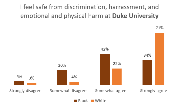
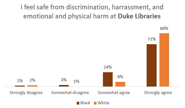
The 2020 Libraries student survey asked students whether they feel safe from discrimination, harassment, and emotional and physical harm at Duke Libraries and at Duke University. There are stark differences by race among the 2,600 students who responded. Black students do not feel as safe from discrimination, harassment, and emotional and physical harm as White students either on campus or in the Libraries.
Figure 1. 2020 DUL student satisfaction survey: “I feel safe” at the LibrariesFigure 2. 2020 DUL student satisfaction survey: “I feel safe” at Duke University
Fewer (34%) of Black students “strongly agree” that they feel safe at Duke University, versus 71% of White students. A quarter of all Black students do not feel safe to some extent, versus only 7% of White students. More Black and White students feel safe in the Libraries than on campus in general, but fewer Black students “strongly agree” with the statement than White students – 71% versus 89%.
Discussion group participants believe that if campus spaces want to make minorities feel welcome, they need more visible signs or statements about inclusion and diversity, particularly because the default in Duke spaces is overwhelming visible representations of White people and Western art and architecture. In reference to the Perkins & Bostock Libraries, one graduate student said:
I don’t see an active attempt to make it welcoming per se. Depending on…what your experience has been like as a Black student on campus, I think there would need to be a purposeful and very explicit attempt to make it welcoming. Not to say there’s a malicious attempt to make it unwelcoming.
Systemic injustice perpetuated through the curriculum
“We were absent in the scholarship. Not just black people – any people of color. And when it was there, it was highly problematized…Every time people of color are mentioned, it’s in some kind of negative context. We’re deficient in some sort of way.”
Academics at Duke are often a space where Black students do not see themselves highly represented or valued. From the arts and sciences to statistics and economics, participants report systemic bias in a variety of areas ranging from instructors’ behavior to the scholarship assigned in class. A student in a business class reported the glaring lack of a single case study involving a Black-owned business or a business run by Black people. Another graduate student in the sciences explained:
All of the people you study are dead White men. And if you never did any outside scholarship yourself, you might be convinced that those are the only people who have ever done [redacted] science in the world.
In addition to racial biases in scholarship assigned, participants discussed the behavior of faculty and instructors as it contributed to systemic injustice in the classroom:
Particularly in statistics classes, almost all data that were racialized normalized Whites and problematized Blacks and other minorities, relatively. There was one assignment where we were supposed to look at and interpret the data, and White people were clearly worse off. The professor did gymnastics to interpret it in such a way where Black people would still be worse off. Come on! They couldn’t even see a way for White people to ever be worse off. And this happens all the time. Whether it’s a guest lecture or whatever…They just focus on the disparities, they interpret it very narrowly, and then there’s no discussion of the origins of those disparities or any solutions to them.
Black students often expect to face racial bias in their daily lives outside academia or from other students on campus. But faculty are both mentors and authority figures who represent the face of Duke to their students. Their silence can speak as loudly as their words in molding students’ perceptions of the extent to which Duke, as well as academic fields more broadly, value them.
On White and Western dominance of physical spaces
Physical spaces communicate priorities, expectations, and cultural values both implicitly and explicitly. They do this via architecture, materials in the spaces such as art, signs, and decorations, and social groupings within spaces. There are parts of Duke that Black students find welcoming and inclusive, but overall, participants do not consider the physical spaces of campus to be as inclusive for Black students as they are for White students.
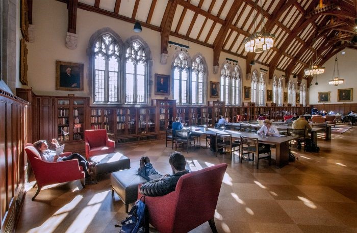
Students across discussion groups listed example after example of spaces at Duke – including a number of libraries – where art and architecture caused physical spaces to feel exclusionary. Duke’s campus and libraries are filled with photography, statues, and portraits depicting mostly White males. This theme was raised by both undergraduates and graduates as a way that campus spaces make Black students (and likely other groups) feel unwelcome and excluded:
In the library at the [professional] school, there’s this room…A bunch of huge paintings of old White guys…It means something, right? Because there’s no other part of that library where you’ll see a big portrait painting of someone who isn’t a White male. It’s more White supremacy in itself: the absence of other people being represented in this school says a lot. If they wanted to do something about it they could. They could put in more paintings. There have been people of color who’ve been through Duke and have gone on to do great things.
Photograph of the Gothic Reading Room filled with portraits of White men
A number of the discussion groups touched on a related topic, which is the lack of a library or a room within the main campus library dedicated to Black studies. Many students came from undergraduate schools that did have such spaces and were surprised to find them lacking at Duke, especially given the presence of the Nicholas Family Reading Room for International Studies (referred to by students as the “Asian reading room”), which houses reference collections for many non-English languages – though not all Asian. One of the more common recommendations across discussion groups was to create such a space within Perkins & Bostock Libraries, similar to the Nicholas Family Reading Room. Such a space would display books and journals related to Black studies or Black history and feature art, photographs, or exhibits related to Black culture or the history of Black people at Duke or in Durham.
Study spaces as social territories
Another aspect of Perkins & Bostock Libraries that feels exclusionary to participants is the territorial dominance of in different parts of the Libraries. This issue was also raised by students in numerous free-text comments of the 2020 student satisfaction survey, focused on Greek Life members laying an unofficial claim to library study spaces. Participants explained that these groups’ behavior often causes students unaffiliated with those fraternities to feel unwelcome in these public, highly-valued study spaces. Both discussion group participants and survey respondents also complained about the groups disturbing other students by not following posted noise norms for quiet study zones and even using library study rooms for fraternity business. One survey respondent said:
The library is divided (perhaps unofficially) into study areas based on Greek and SLG membership. I consider this to be a disgusting practice and it also leaves me (a graduate student) unsure where I can comfortably sit. I just wish the library was not yet another place where the caste system that is the Duke social scene gets reinforced.
Several students discussed how fraternities sometimes reserve bookable library study rooms and use these spaces for business purposes, to bestow access to social resources (in this case, access to parties) that are highly exclusive and closed to the majority of the campus, which further perpetuates exclusivity on campus. The language the students use to describe these interactions (“ostracized,” “uncomfortable,” “not welcomed”) shows the extent to which the presence of these groups in library spaces that are supposed to be inclusive actually makes students feel excluded, as if they cannot use those spaces due to their lack of membership in those groups.
Features of a space matter
The Libraries’ 2020 student survey asked whether respondents enjoy working in a campus library more than other campus spaces. A third of White students “strongly agree” with this statement, versus one-fourth of Black students. Participants in our discussion groups highlighted three features that greatly contribute to study spaces feeling welcoming and supportive, which are likely true for students from all backgrounds: natural light, green spaces and greenery, and vibrant colors.
Library staff have long been aware that students can study and de-stress better in library spaces with natural light. Increasing natural light is only possible when planning and constructing new facilities, but we can review the current spaces to ensure that all areas with natural light have seating options around them. Participants discussed how greenery, even fake plants, contribute to mental well-being and create study spaces that are less stressful. This also includes views of nature out of windows. Vibrant colors and artwork were mentioned time and again as factors that create positive energy and support well-being. Both the Link on the first floor of Bostock Library and the Bryan Center were held up as examples of well-designed spaces at Duke with brightly colored walls and furniture, or artwork.
In comparison, the Perkins & Bostock Libraries were seen as having much room to improve, with the exception of the following spaces: the Link, The Edge, the large reading rooms, light-filled breezeways, and the newly renovated Rubenstein Library. Participants requested that the Perkins & Bostock Libraries modernize its decor and add vibrant colors via paint, carpets, furniture and art. The students feel that the drab colors in study rooms and general open study areas exacerbate the sense of stress that already pervades the library. Students had unapologetically negative views of the atmosphere produced by color and decor choices:
I think Perkins is so uninviting…At a basic level, it’s just not a comfortable, inviting space to me. I hate the lighting. Part of it is that there is very little natural light throughout the library but then I just don’t like the colors that are chosen… It’s depressing. It just seems very outdated.
Campus and library wayfinding came up in multiple discussion groups as an area that needs improvement and contributes to students feeling unwelcome and stressed. Duke’s policy to not have visible external building signage and to use the same architecture for most buildings on West Campus leads newcomers to feel excluded and lost. Participants were critical of the fact that the main campus library has no identifying external feature or sign. Participants also discussed the need for better internal directional and informational signage within the Libraries. Improved signage is necessary both to assist with finding materials, and for guidance on use of study rooms and computer look-up stations. Students like the noise norms and zones designated by signage within the Libraries and want this signage to be larger and more prominent.
Affinity spaces are critical and signal what Duke values
Spaces noted by participants as welcoming and supportive included the Mary Lou Williams Center for Black Culture, the Wellness Center, the West Campus Oasis, the Duke Chapel, the Women’s Center, the Bryan Center, gardens and green spaces, and the Center for Multicultural Affairs. Students also spoke enthusiastically about a number of campus services, including the on-campus dentist; Wellness Center activities like a weekly group therapy session for Black women and free physical assessments; movie nights at the Bryan Center; campus buses; the entrepreneurship program; CAPS; the Writing Studio; and state-of-the-art gym facilities.
Many Photovoice participants submitted photographs and captions about the Mary Lou Williams Center, its programming, and its staff. For participants, the fact that Duke University funds and supports programming for such a large, beautiful space highlights Duke’s commitment to Black students and Black culture. However, not everyone feels welcome on the campus as a whole. One student said they go to the Mary Lou to “escape the white gaze” of the broader campus. These spaces should not be seen as spaces one has to go to escape the general campus experience, but rather as spaces that contribute to their campus experience.
Graduate students talked about the robust support networks in their academic programs. Students reported feeling supported in many ways, from professors who learn students’ names and Deans attending welcome lunches with new students, to orientation activities, peer and professor mentor programs, support for healthy work-life balances, and committees on diversity and inclusion.
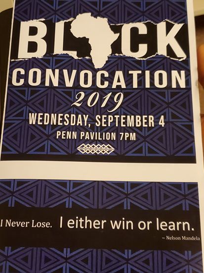
Participants felt welcomed by events hosted solely for Black students, such as Black Convocation and parties held by Black Greek organizations, as well as outreach from the Mary Lou Williams Center to all incoming Black students.
Photovoice image submission of the program for Black Convocation
Library services support students
Library services that were praised included library materials and online resources; the library website; textbook lending; device lending; technology such as scanners, 3D printers, and DVD players in Lilly; events such as snacks and coffee in the library and Puppies in Perkins during finals week; orientation sessions; reservable study rooms; designated noise norms and zones; ePrint; personal assistance from librarians; and Oasis Perkins.[1] Students are surprised by how many services the Libraries offer and want more marketing and information about these services. Library staff should continue to develop outreach strategies for marketing services to students at various points in their programs and majors, both online and within library spaces.
The Libraries textbook lending program came up in every undergraduate discussion group. Students were enthusiastic about the program and the financial burden that it alleviates.
I think [library] rental textbooks are really nice…Knowing that if I change a class I don’t need to buy this book the first week and resell it for only 30%. If you’re paying for your own books, that’s not feasible. It’s…another stress coming into your freshman year of college. Thinking, ‘oh no I have to buy this $200 math book online – no, you can rent it from the library until you know whether you’re even supposed to be in that math class.’ Knowing that I can get through the first part of the semester without having to worry about textbooks is big.
According to results from the Libraries’ 2020 student survey, about one-fourth of all undergraduate students (regardless of race) said that textbook lending is important to them. At the same time, only 48.5% of both Black and White students said that the current program completely meets their needs, and 8% of those who said textbook lending is important to them reported being unaware of the Libraries textbook lending program. The survey also provided the following open-ended prompt to students: “In a perfect world, with unlimited time and resources, the Libraries would…” Eight percent of responses (127 out of 1,535) included a request for the Libraries to provide free textbooks.
Person-to-person interactions make a difference
Interactions with other people can be critical contributors to whether students at Duke feel welcome and supported. Participants discussed many positive interactions on campus and in the Libraries, with library service desk staff, librarians assisting with research, friendly security guards, housekeeping staff, academic program office staff, Mary Lou Williams Center staff, and financial aid officers. Black staff at Duke also provide important social support for students, whether assigned as mentors or simply lending a sympathetic ear. One student immediately thought of a staff member when asked about the most helpful programs and services on campus:
It’s not a program, it’s [an office administrator]. Since she’s a sister, we can just talk about anything. She looks out for me in a way that I know only a Black person would look out.
Library security guards stand out as a group that can help students feel safe and supported with just a friendly word or wave (though as previously noted, security guards can also easily make Black students feel unwelcome):
First semester sophomore year when I was [at the library] really late, there was this one security guard who I saw just going around and around, and each time he would wave. Then I was studying there just two nights ago, I just saw him again and he waved, and it just felt really good.
Affinity groups are important to all students, and especially important to minorities at PWIs. Students mentioned feeling welcomed by the existence of campus student groups such as the Black Student Alliance and Black Graduate & Professional Student Association, Black Greek Life, and spaces for affinity groups to gather (such as the Mary Lou and Black Student Alliance office).
Participants discussed many positive interactions with library staff. Participants value friendliness and good customer service, as well as subject expertise. However, discussions highlighted the fact that initial impressions and experiences are critical, and if students’ initial interaction is negative, they are likely not to come back. In particular, library staff must be mindful of the delicate balance between their roles as teachers and as service providers. While many library staff are trained to teach research skills, students often approach the service desk expecting staff to help them complete their task as quickly and efficiently as possible. Efforts to teach them how to complete the action by themselves instead of just assisting them can be interpreted as patronizing, a rebuke for having “bothered” staff, or poor customer service.
Overall, participants have a positive view of the Libraries. They recommended improvements, especially for physical spaces, and underscored the importance of marketing services such as textbook lending and relaxation events. Participants shared valuable insights that can help library staff understand what it means to be Black at Duke and in Durham, and ways that library staff can make spaces more welcoming and help ease the burden that Black students feel on a daily basis.
What’s next?
These findings became the basis of 34 recommendations outlined in the research team’s full report. One of the top recommendations from participants is that the Libraries dedicate a study space to Black scholarship. Such a space was envisioned to include art, photographs, or exhibits related to Black culture and history and highlight library resources from Black scholars.
The research team has presented and discussed this study at all staff meetings at the Libraries, as well as to various groups and units on Duke’s campus over the summer of 2020. The report was shared widely within the library community to encourage other libraries to consider these questions and undertake similar work.
In August 2020, the Libraries formed a Black Student Study Next Steps Coordinating Team charged with prioritizing and coordinating the implementation of recommendations from the study, as well as additional recommendations that came out of a staff workshop delving into the Libraries’ 2020 student satisfaction survey. For more information on this study or the Coordinating Team, contact Joyce Chapman joyce.chapman@duke.edu.
On January 20, 2020, we kicked off our first development sprint for implementing ArcLight at Duke as our new finding aids / collection guides platform. We thought our project charter was solid: thorough, well-vetted, with a reasonable set of goals. In the plan was a roadmap identifying a July 1, 2020 launch date and a list of nineteen high-level requirements. There was nary a hint of an impending global pandemic that could upend absolutely everything.
The work wasn’t supposed to look like this, carried out by zooming virtually into each other’s living rooms every day. Code sessions and meetings now require navigating around child supervision shifts and schooling-from-home responsibilities. Our new young office-mates occasionally dance into view or within earshot during our calls. Still, we acknowledge and are grateful for the privilege afforded by this profession to continue to do our work remotely from safe distance.
So, a major shoutout is due to my colleagues in the trenches of this work overcoming the new unforeseen constraints around it, especially Noah Huffman, David Chandek-Stark, and Michael Daul. Our progress to date has only been possible through resilience, collaboration, and willingness to keep pushing ahead together.
Three months after we started the project, we remain on track for a summer 2020 launch.
As a reminder, we began with the core open-source ArcLight platform (demo available) and have been building extensions and modifications in our local application in order to accommodate Duke needs and preferences. With the caveat that there’ll be more changes coming over the next couple months before launch, I want to provide a summary of what we have been able to accomplish so far and some issues we have encountered along the way. Duke staff may access our demo app (IP-restricted) for an up-to-date look at our work in progress.
Homepage
Homepage design for Duke’s ArcLight finding aids site.
Duke Branding. Aimed to make an inviting front door to the finding aids consistent with other modern Duke interfaces, similar to–yet distinguished enough from–other resources like the catalog, digital collections, or Rubenstein Library website.
Featured Items. Built a configurable set of featured items from the collections (with captions), to be displayed randomly (actual selections still in progress).
Dynamic Content. Provided a live count of collections; we might add more indicators for types/counts of materials represented.
Layout
A collection homepage with a sidebar for context navigation.
Sidebar. Replaced the single-column tabbed layout with a sidebar + main content area.
Persistent Collection Info. Made collection & component views more consistent; kept collection links (Summary, Background, etc.) visible/available from component pages.
Width. Widened the largest breakpoint. We wanted to make full use of the screen real estate, especially to make room for potentially lengthy sidebar text.
Navigation
Component pages contextualized through a sidebar navigator and breadcrumb above the main title.
Hierarchical Navigation. Restyled & moved the hierarchical tree navigation into the sidebar. This worked well functionally in ArcLight core, but we felt it would be more effective as a navigational aid when presented beside rather than below the content.
Tooltips & Popovers. Provided some additional context on mouseovers for some navigational elements.
Mouseover context in navigation.
List Child Components. Added a direct-child list in the main content for any series or other component. This makes for a clear navigable table of what’s in the current series / folder / etc. Paginating it helps with performance in cases where we might have 1,000+ sibling components to load.
Breadcrumb Refactor. Emphasized the collection title. Kept some indentation, but aimed for page alignment/legibility plus a balance of emphasis between current component title and collection title.
Breadcrumb trail to show the current component’s nesting.
Search Results
Search results grouped by collection, with keyword highlighting.
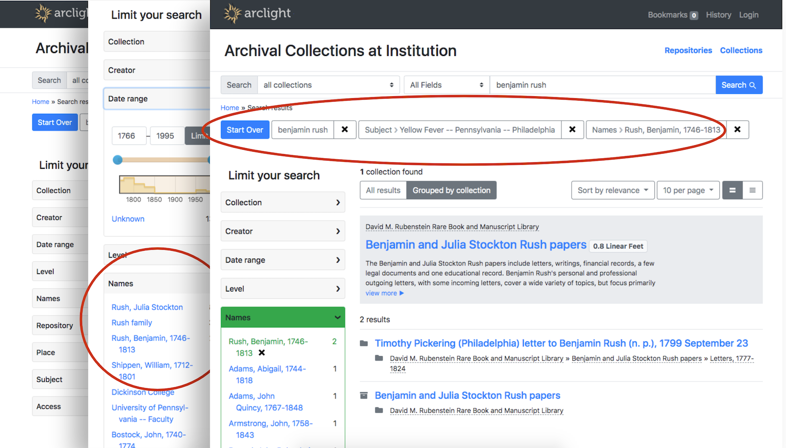
“Group by Collection” as the default. Our stakeholders were confused by atomized components as search results outside of the context of their collections, so we tried to emphasize that context in the default search.
Revised search result display. Added keyword highlighting within result titles in Grouped or All view. Made Grouped results display checkboxes for bookmarking & digitized content indicators.
Advanced Search. Kept the global search box simple but added a modal Advanced search option that adds fielded search and some additional filters.
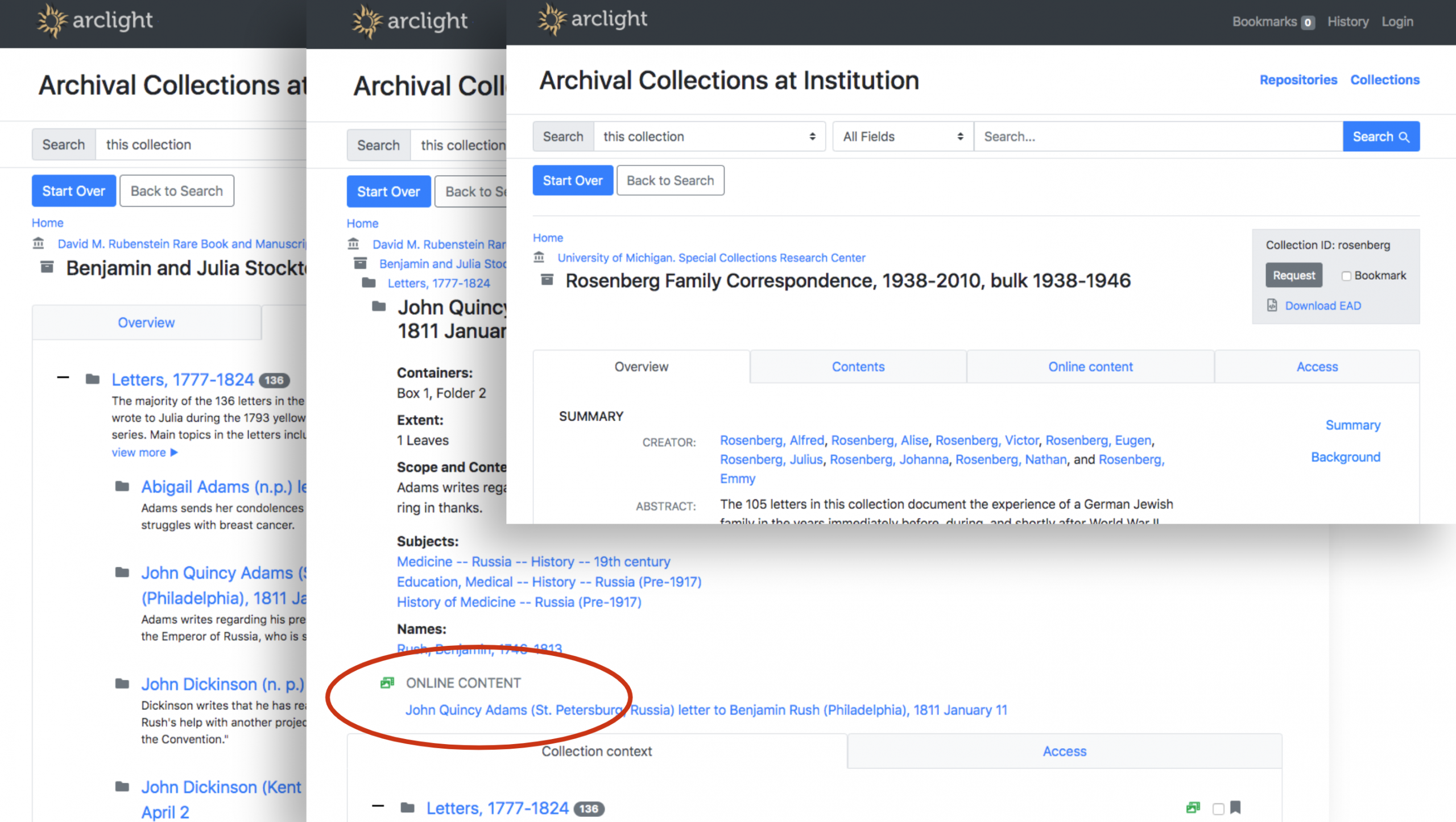
Digital Objects Integration
Digital objects from the Duke Digital Repository are presented inline in the finding aid component page.
DAO Roles. Indexed the @role attribute for <dao> elements; we used that to call templates for different kinds of digital content
Embedded Object Viewers. Used the Duke Digital Repository’s embed feature, which renders <iframe>s for images and AV.
Indexing
Whitespace compression. Added a step to the pipeline to remove extra whitespace before indexing. This seems to have slightly accelerated our time-to-index rather than slow it down.
More text, fewer strings. We encountered cases where note-like fields indexed as strings by ArcLight core (e.g., <scopecontent>) needed to be converted to text because we had more than 32,766 bytes of data (limit for strings) to put in them. In those cases, finding aids were failing to index.
Underscores. For the IDs that end up in a URL for a component, we added an underscore between the finding aid slug and the component ID. We felt these URLs would look cleaner and be better for SEO (our slugs often contain names).
Dates. Changed the date normalization rules (some dates were being omitted from indexing/display)
Bibliographic ID. We succeeded in indexing our bibliographic IDs from our EADs to power a collection-level Request button that leads a user to our homegrown requests system.
Formatting
EAD -> HTML. We extended the EAD-to-HTML transformation rules for formatted elements to cover more cases (e.g., links like <extptr> & <extref> or other elements like <archref> & <indexentry>)
Additional formatting and link render rules applied.
Formatting in Titles. We preserved bold or italic formatting in component titles.
ArcLight Core Contributions
We have been able to contribute some of our code back to the ArcLight core project to help out other adopters.
Setting the Stage
The behind-the-scenes foundational work deserves mention here — it represents some of the most complex and challenging aspects of the project. It makes the application development driving the changes I’ve shared above possible.
Gathered a diverse set of 40 representative sample EADs for testing
Dockerized our Duke ArcLight app to simplify developer environment setup
Provisioned a development/demo server for sharing progress with stakeholders
Automated continuous integration and deployment to servers using GitLabCI
Performed targeted data cleanup
Successfully got all 4,000 of our finding aids indexed in Solr on our demo server
Our team has accomplished a lot in three months, in large part due to the solid foundation the ArcLight core software provides. We’re benefiting from some amazing work done by many, many developers who have contributed their expertise and their code to the Blacklight and ArcLight codebases over the years. It has been a real pleasure to be able to build upon an open source engine– a notable contrast to our previous practice of developing everything in-house for finding aids discovery and access.
Still, much remains to be addressed before we can launch this summer.
The Road Ahead
Here’s a list of big things we still plan to tackle by July (other minor revisions/bugfixes will continue as well)…
ASpace -> ArcLight. We need a smoother publication pipeline to regularly get data from ArchivesSpace indexed into ArcLight.
Access & Use Statements. We need to revise the existing inheritance rules and make sure these statements are presented clearly. It’s especially important when materials are indeed restricted.
Relevance Ranking. We know we need to improve the ranking algorithm to ensure the most relevant results for a query appear first.
Analytics. We’ll set up some anonymized tracking to help monitor usage patterns and guide future design decisions.
Sitemap/SEO. It remains important that Google and other crawlers index the finding aids so they are discoverable via the open web.
Accessibility Testing / Optimization. We aim to comply with WCAG2.0 AA guidelines.
Single-Page View. Many of our stakeholders are accustomed to a single-page view of finding aids. There’s no such functionality baked into ArcLight, as its component-by-component views prioritize performance. We might end up providing a downloadable PDF document to meet this need.
More Data Cleanup. ArcLight’s feature set (especially around search/browse) reveals more places where we have suboptimal or inconsistent data lurking in our EADs.
More Community Contributions. We plan to submit more of our enhancements and bugfixes for consideration to be merged into the core ArcLight software.
If you’re a member of the Duke community, we encourage you toexplore our demo and provide feedback. To our fellow future ArcLight adopters, we would love to hear how your implementations or plans are shaping up, and identify any ways we might work together toward common goals.
After nearly a year of work, the libraries recently launched an updated version of the software stack that powers parts the Duke Digital Repository. This work primarily centered around migrating the underlying software in our Samvera implementation — which we use to power the DDR — from ActiveFedora to Valkyrie. Moving to Valkyrie gives us the benefits of improved stability along with the flexibility to use different storage solutions, which in turn provides us with options and some degree of future-proofing. Considerable effort was also spent on updating the public and administrative interfaces to use more recent versions of blacklight and supporting software.
Administrative interface for the DDR
We also used this opportunity to revise the repository landing page at repository.duke.edu and I was involved in building a new version of the home page. Our main goals were to make use of a header implementation that mirrored our design work in other recent library projects and that integrated our ‘unified’ navigation, while also maintaining the functionality required by the Samvera software.
DDR home page before the redesign
We also spent a lot of time thinking about how best to illustrate the components of the Duke Digital Repository while trying to keep the content simple and streamlined. In the end we went with a design that emphasizes the two branches of the repository; Library Collections and Duke Scholarship. Each branch in turn links to two destinations — Digitized Collections / Acquired Materials and the Research Data Repository / DukeSpace. The overall design is more compact than before and hopefully an improvement aesthetically as well.
Redesigned DDR home page
We also incorporated a feedback form that is persistent across the interface so that users can more readily report any difficulties they encounter while using the platform. And finally, we updated the content in the footer to help direct users to the content they are more than likely looking for.
Future plans include incorporating our header and footer content more consistently across the repository platforms along with bringing a more unified look and feel to interface components.
Check out the new design and let us know what you think!
Archival collection guides—also known as finding aids—are a critical part of the researcher experience when finding and accessing materials from the David M. Rubenstein Rare Book & Manuscript Library and the Duke University Archives. At present, we have guides for nearly 4,000 collections with upwards of one million components that have some level of description. Our collection guides site is visited by researchers about 400 times per day.
An example collection guide.
In 2020, we’ll be making significant changes to our systems supporting archival discovery and access. The main impetus for this shift is that our current platform has grown outdated and is no longer sustainable going forward. We intend to replace our platform with ArcLight, open source software backed by a community of peer institutions.
Finding Aids at Duke: Innovations Past
At Duke, we’re no strangers to pushing the boundaries of archival discovery through advances in technology. Way back in the mid 1990s, Duke was among pioneers rendering SGML-encoded finding aids into HTML. For most of the 90s and aughts we used a commercial platform, but we decided to develop our own homegrown finding aids front-end in 2007 (using the Apache Cocoon framework). We then replaced it in 2012 with another in-house platform built on the Django web framework.
Since going home-grown in 2007, we have been able to find some key opportunities to innovate within our platforms. Here are a few examples:
2013. Added inline digital object viewing, as part of a consortium-wide collaborative foray into large-scale manuscript digitization.
2014. Crosswalked metadata using Schema.org markup and used different Google APIs to power rich snippet search results (since deprecated).
Example archival component with inline embedded digital object and sticky navigation.
So, Why Migrate Now?
Our current platform was pretty good for its time, but a lot has changed in eight years. The way we build web applications today is much different than it used to be. And beyond desiring a modern toolset, there are major concerns going forward around size, search/indexing, and support.
Size
We have some enormous finding aids. And we have added more big ones over the years. This causes problems of scale, particularly with an interface like ours that renders each collection as a single web page with all of the text of its contents written in the markup. One of our finding aids contains over 21,000 components; all told it is 9MB of raw EAD transformed into 15MB of HTML.
A large finding aid — 15MB of HTML in a single page.
No amount of caching or server wizardry can change the fact that this is simply too much data to be delivered and rendered in a single webpage, especially for researchers in lower-bandwidth conditions. We need a solution that divides the data for any given finding aid into smaller payloads.
Search
Google Custom Search does a pretty nice job of relevance ranking and highlighting where in a finding aid a term matches (after all, that’s Google’s bread-and-butter). However, when used to power search in an application like this, it has some serious limitations. It only returns a maximum of one hundred results per query. Google doesn’t index 100% of the text, especially for our larger finding aids. And some finding aids are just mysteriously omitted despite our best efforts optimizing our markup for SEO and providing a sitemap.
Search Results powered by Google Custom Search
We need search functionality where we have complete control of what gets indexed, when, and how. And we need assurance that the entirety of the materials described will be discoverable.
Support
This is a familiar story. Homegrown applications used for several years by organizations with a small number of developers and a large number of projects to support become difficult to sustain over time. We have only one developer remaining who can fix our finding aids platform when it breaks, or prevent it from breaking when the systems around it change. Many of the software components powering the system are at or nearing end-of-life and they can’t be easily upgraded.
Where to Go From Here?
It has been clear for awhile that we would soon need a new platform for finding aids, but not as clear what platform we should pursue. We had been eyeing the progress of two promising open source community-built solutions emerging from our peer institutions: the ArchivesSpace Public UI (PUI), and ArcLight.
Over 2018-19, my colleague Noah Huffman and I co-led a project to install pilot instances of the ASpace PUI and ArcLight, index all of our finding aids in them, and then evaluate the platforms for their suitability to meet Duke’s needs going forward. The project involved gathering feedback from Duke archivists, curators, research services staff, and our digital collections implementation team. We looked at six criteria: 1) features; 2) ease of migration/customization; 3) integration with other systems; 4) data cleanup considerations; 5) impact on existing workflows; 6) sustainability/maintenance.
Comparison of the ASpace PUI and ArcLight, out-of-the-box UI.
There’s a lot to like about both the ASpace PUI and ArcLight. Feature-wise, they’re fairly comparable. Both are backed by a community of talented, respected peers, and either would be a suitable foundation for a usable, accessible interface to archives. In the end, we recommended that Duke pursue ArcLight, in large part due to its similarity to so much of the other software in our IT portfolio.
Duke is certainly not alone in our desire to replace an outdated, unsustainable homegrown finding aids platform, and intention to use ArcLight as a replacement.
This fall, with tremendous leadership from Stanford University Libraries, five universities collaborated on developing the ArcLight software further to address shared needs. Over a nine week work cycle from August to October, we had the good fortune of working alongside Stanford, Princeton, Michigan, and Indiana. The team addressed needs on several fronts, especially: usability, accessibility, indexing, context/navigation, and integrations.
Duke joined Stanford, Princeton, Michigan, and Indiana for Arclight Community Work Cycle II in fall 2019.
Three Duke staff members participated: I was a member of the Development Team, Noah Huffman a member of the Product Owners Team, and Will Sexton on the Steering Group.
The work cycle is complete and you can try out the current state of the core ArcLight demo application. It includes several finding aids from each of the participating partner institutions. Here are just a few highlights that have us excited about bringing ArcLight to Duke:
Search results can be grouped by collection. Faceted navigation helps pinpoint items of interest from deep within a finding aid.
Components are individually discoverable and have their own pages. Integrations with online content viewers and request systems such as Aeon are possible.
Here’s a final demo video (37 min) that nicely summarizes the work completed in the fall 2019 work cycle.
Lighting the Way
With some serious momentum from the fall ArcLight work cycle and plans taking shape to implement the software in 2020, the Duke Libraries intend to participate in the Stanford-led, IMLS grant-funded Lighting the Way project, a platform-agnostic National Forum on Archival Discovery and Delivery. Per the project website:
Lighting the Way is a year-long project led by Stanford University Libraries running from September 2019-August 2020 focused on convening a series of meetings focused on improving discovery and delivery for archives and special collections.
Coming in 2020: ArcLight Implementation at Duke
There’ll be much more share about this in the new year, but we are gearing up now for a 2020 ArcLight launch at Duke. As good as the platform is now out-of-the-box, we’ll have to do additional development to address some local needs, including:
Duke branding
An efficient preview/publication workflow
Digital object viewing / repository integration
Sitemap generation
Some data cleanup
Building these local customizations will be time well-spent. We’ll also look for more opportunities to collaborate with peers and contribute code back to the community. The future looks bright for Duke with ArcLight lighting the way.
The staff directory on the Library’s website was last overhauled in late 2014, which is to say that it has gotten a bit long in the tooth! For the past few months I’ve been working along with my colleagues Sean Aery, Tom Crichlow, and Derrek Croney on revamping the staff application to make it more functional, easier to use, and more visually compelling.
View of the legacy staff directory interface
Our work was to be centered around three major components — an admin interface for HR staff, an edit form for staff members, and the public display for browsing people and departments. We spent a considerable amount of time discussing the best ways to approach the infrastructure for the project. In the end we settled on a hybrid approach in which the HR tool would be built as a Ruby-on-Rails application, and we would update our existing custom Drupal module for staff editing and public UI display.
We created a seed file for our Rails app based on the legacy data from the old application and then got to work building the HR interface. We decided to rely on the Rails Admin gem as it met most of our use cases and had worked well on some other internal projects. As we continued to add features, our database models became more and more complex, but working in Rails makes these kind of changes very straightforward. We ended up with two main tables (People and Departments) and four auxiliary tables to store extra attributes (External Contacts, Languages, Subject Areas, and Trainings).
View of the Rails Admin dashboard
We also made use of the Ancestry gem and the Nestable gem to allow HR staff to visually sort department hierarchy. This makes it very easy to move departments around quickly and using a visual approach, so the next time we have a large department reorganization it will be very easy to represent the changes using this tool.
Nestable gem allows for easy sorting of departments
After the HR interface was working well, we concentrated our efforts on the staff edit form in Drupal. We’d previously augmented the default Drupal profile editor with our extra data fields, but wanted to create a new form to make things cleaner and easier for staff to use. We created a new ‘Staff Profile’ tab and also included a link on the old ‘Edit’ tab that points to the new form. We’re enabling staff to include their subject areas, preferred personal pronouns, language expertise, and to tie into external services like ORCID and Libguides.
Edit form for Staff Profile
The public UI in Drupal is where most of our work has gone. We’ve created four approaches to browsing; Departments, A–Z, Subject Specialists, and Executive Group. There is also a name search that incorporates typeahead for helping users find staff more efficiently.
The Department view displays a nested view of our complicated organizational structure which helps users to understand how a given department relates to another one. You can also drill down through departments when you’ve landed on a department page.
View of departments
Department pages display all staff members therein and positions managers at the top of the display. We also display the contact information for the department and link to the department website if it exists.
Example of a department page
The Staff A–Z list allows users to browse through an alphabetized list of all staff in the library. One challenge we’re still working through is staff photos. We are lacking photos for many of our staff, and many of the photos we do have are out of date and inconsistently formatted. We’ve included a default avatar for staff without photos to help with consistency, but they also serve the purpose of highlighting the number of staff without a photo. Stay tuned for improvements on this front!
A-to-Z browse
The Subject Specialists view helps in finding specific subject librarians. We include links to relevant research guides and appointment scheduling. We also have a text filter at the top of the display that can help quickly narrow the results to whatever area you are looking for.
Subject Specialists view
The Executive Group display is a quick way to view the leadership of the library.
Executive Group display
One last thing to highlight is the staff display view. We spent considerable effort refining this, and I think our work has really paid off. The display is clean and modern and a great improvement from what we had before.
View of staff profile in legacy applicationView of the same profile in the new application
In addition to standard information like name, title, contact info, and department, we’re displaying: