In anticipation of next Tuesday’s midterm elections, here is a photo gallery of voting-related images from Duke Digital Collections. Click on a photo to view more images from our collections dealing with political movements, voting rights, propaganda, activism, and more!
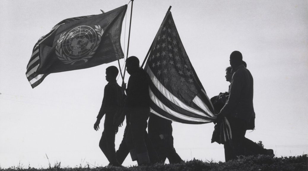
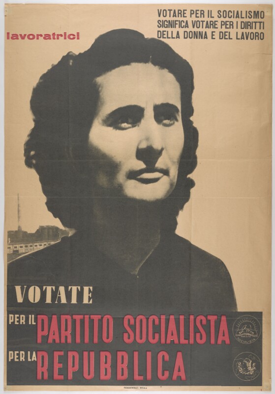
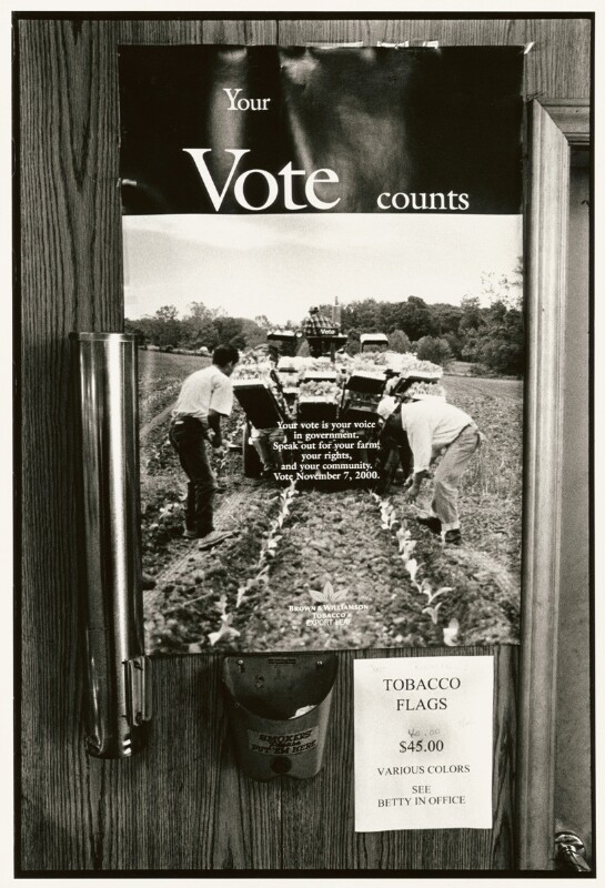
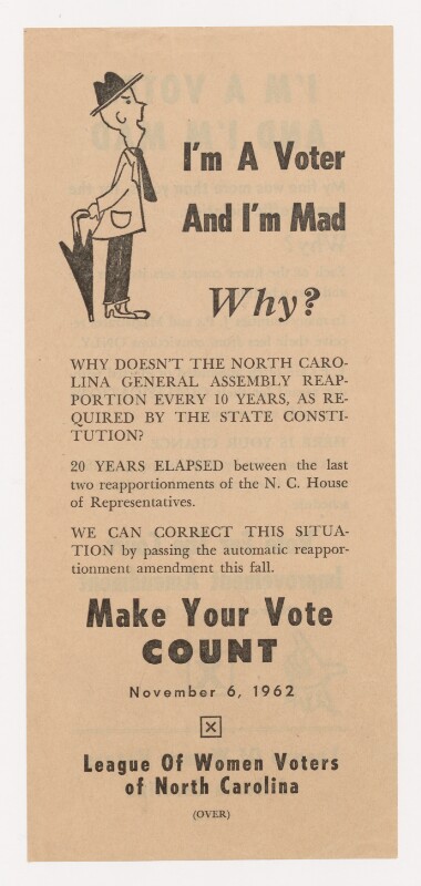
This image is part of a series of photographs taken by James Karales on assignment for Look Magazine during the voting rights march from Selma to Montgomery, Alabama in March 1965.Propaganda poster of the Italian Socialist Party. It reads: “Workers, vote for socialism means voting for women’s rights and labor.”Image is part of “Thirteen-Month Crop: One Year in the Life of a Piedmont Virginia Tobacco Farm,” which documents the Moore family farm in Pittsylvania County, Virginia.Poster with depiction of large PCI flag with the Italian flag behind it.Leaflet created by the League of Women Voters of North Carolina.Socialist Party literature, explaining their views.
If you haven’t already taken advantage of early voting, we at Bitstreams encourage you to exercise your right on November 6!
A broadside is a single-sheet notice or advertisement, often textual rather than pictorial. The historical type of broadsides called ephemera (the Latin word, inherited from Greek, referred to things that do not last long) are temporary documents created for a specific purpose and intended to be thrown away.
The Broadsides and Ephemera Collection (David M. Rubenstein Rare Book & Manuscript Library, Duke University) captures written and printed materials of widespread and short-lived use; items, such as event announcements, letters, tickets, posters, social notices, or printouts on current political affairs whose impact was not meant to sustain the test of time. These are the materials that I want to bring to your attention.
The collection includes items from more than 28 countries. The material is quite heterogeneous in terms of content and historical periods. From the Viceroyalty of Peru, to the tensions between Japanese and American soldiers in the early 1940s in the Philippines, one feels a bit like a time traveler without much of a compass, navigating across a sea of material of daunting complexity. After the first scroll through the many rows and tabs in the collection’s Excel sheet, I began questioning, amidst gallons of coffee, the romantic view of the cataloging librarian as a detective of knowledge long lost. Voltaire’s words at the beginning of The Age of Louis XIV regained strength: “Not everything that is done deserves recording”.
Feria de Abril 1932. Sevilla ( Spring Festival 1932)
Yet, as I delved deeper into the collection, I quickly discovered that Ephemera provides a unique window to understand much about the working of human communities all over the world. In fact, the range of common themes emerging is sort of striking given its geographical and temporal scope. It is actually fun. Let me focus on three themes that consistently emerge across the different sections of the international broadsides.
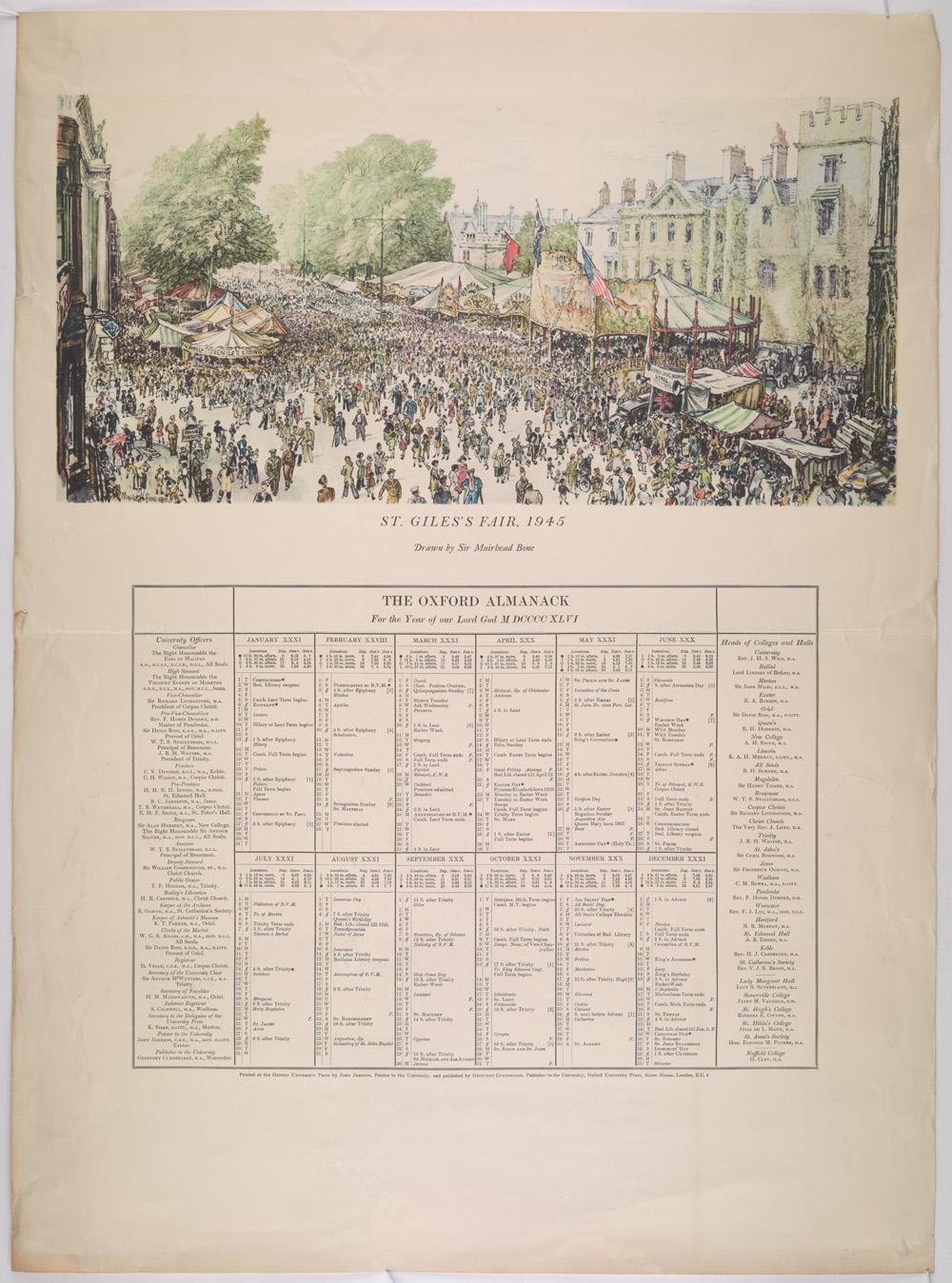
Ephemera work first as a record of the basic organization of social communities. In these instances art becomes a tool to highlight key moments in the everyday life of very diverse communities. The contrast between the 1932 poster for the “Feria de Abril” in Seville, Spain and the 1946 University of Oxford’s Almanac is very telling in this regard. The former serves to mark the most important week in any given year in Seville’s life: around Easter, the city turns into a mixture of art, devotion, and excess in a perfectly balanced and stratified way (different sectors, businesses and social classes get together to party at night after taking part in the parades or processions thanking and honoring the patrons/matrons of the different churches in the city).
The Oxford Almanac, for the year of our Lord God MDCCCCXLVI.
The Almanac provides a list of the head of colleges and the university calendar, making public the key milestones in the life of the university. While the purpose and activities highlighted by these two items could not be more different, their basic function is the same. Both convey useful knowledge about the life of two cities driven by very different pursuits. I know where I would rather study, but it is also quite clear where one ought to go to have some real fun.
Order for taking off the Chimney-Money. In this document is addressed the suppression by the king of the hearth tax in England, and the reaction of the citizens, very grateful of have being liberated from this onerous duty.
A second function of the sort of items included in the international broadsides is to offer a glimpse of political and social relations in many different places. The records on England, for instance, include a letter from subjects to the new King, William of Orange, thanking him for the removal of a the “hearth tax” in 1689, or a piece capturing neatly the scope and goals of the chartist movement in their quest for universal male suffrage, the secret ballot, and annual Parliament elections among other things.
Birmingham Reform petition, part of a working-class movement for political reform in Britain, called Chartism.
The contrast between these two documents (William of Orange order for taking off the Chimney-Money, and the Birmingham Reform Petition) captures nicely the road traveled in England from the Glorious Revolution at the end of the 17th century, to the forefront of economic and political modernization in the 19th century, when the Chartism took place.
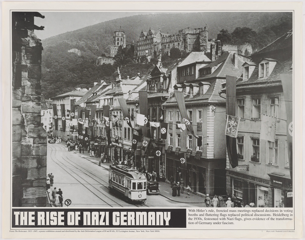
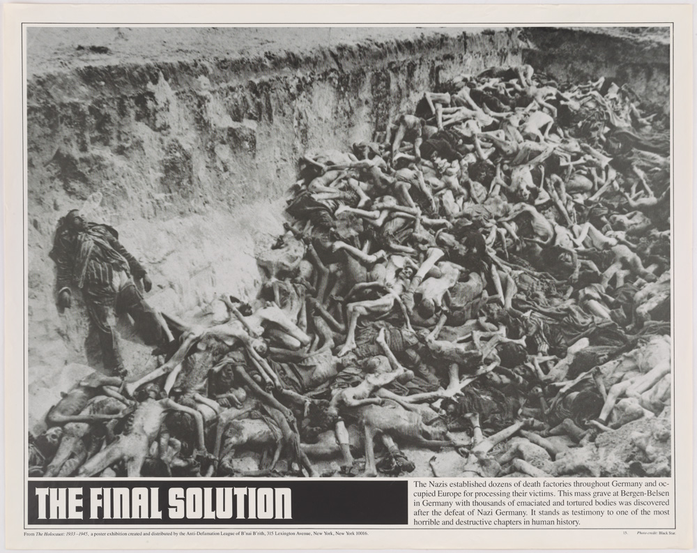
On a grimmer note, the records on Germany capture effectively the rise of the National Socialist German Workers’ Party (commonly referred to in English as the Nazi Party) in the interwar period in cities like Heidelberg, and the consequences that ensued in terms of mass casualties for ones or exile for others.
Heidelberg in 1930, festooned with Nazi flags, giving evidence of the transformation of Germany under fascism.
Photograph of a mass grave at Bergen-Belsen concentration camp in Germany with thousand of emanciated and tortured bodies.
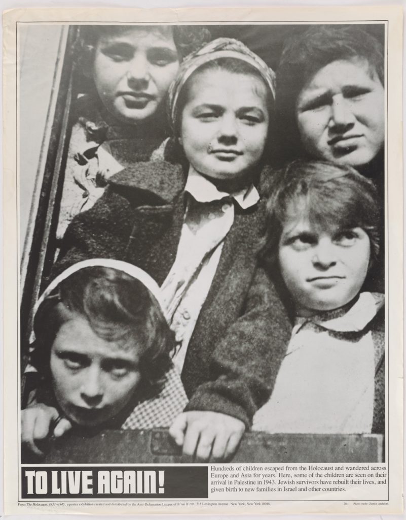
To live again! Photograph of Jewish children, survivors, arriving to Palestine.
But the richest and most comprehensive theme that gives coherence to the records across different countries is the one of war and political persuasion/propaganda. Persuasion comes in very different forms. It can be intellectually driven and directed to small circles: the English records feature letters from American activists to English political philosophers such as John Stuart Mill in a quest for support for the anti-slavery movement. Or it can be emotionally driven and directed to broad populations. It is in this particular variety of ephemera where Duke’s International Broadsides Collection really shines.
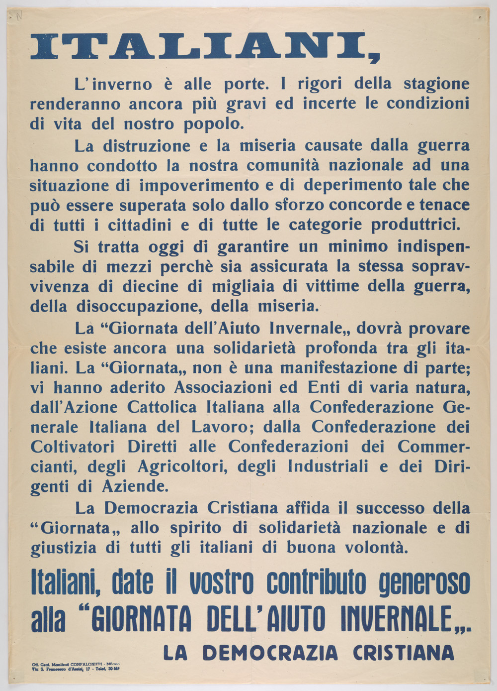
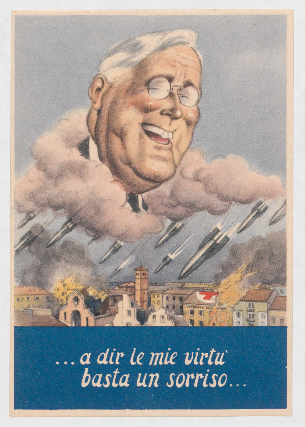
Italiani, l’inverno è alle porte (Italians, winter is coming.)… a dir le mie virtu basta un sorriso…. (…a smile is enough to show my virtues…)Difendilo! (Defend it!) Fascist propaganda poster, alludes at the need to protect the Italian children from the dangers of Communism, Judaism and Freemasonry.
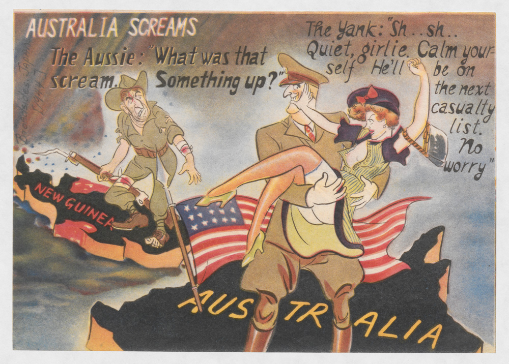
The records contain dozens of art manifestations from pro-Axis actors in Italy, Germany, and Japan, as well as efforts from the British and U.S. armies to undermine the morale and support of Japanese troops in the Philippines after 1945. Among the former, who knew that the motto of House Stark in Game of Thrones (Winter is coming) was to be found in a piece of political propaganda from Italian fascists against the Allies? Or that Franklin Delano Roosevelt’s virtuous smile was wider the more missiles fell on the Italian cities? Or that the good children of Italy were at risk of being pulled apart by the three evils of Communism, Judaism and Freemasonry? Or that the Australian soldiers would do better to return home to protect their women from the American soldiers’ predatory behavior? Australia screams. Japanese anti-American leaflet trying to persuade the Australians to go home because the American soldiers staged in Australia were seducing their wives.
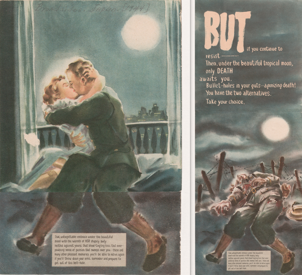
Finally, another good example is this tricky Japanese leaflet. At first, it appears to show just an soldier and his wife embracing under the beautiful moon, but when it is unfolded, although we can still see the soldier’s undamaged legs, we see that he is dead on the battlefield near a barbed wire.
This Japanese war propaganda leaflet shows a soldier and his wife embracing under the beautiful moon… ….but when the leaflet is unfolded, you still see the soldier’s undamaged legs, however he is dead on the battlefield near a barbed wire.
Regardless of their goals, values, and motives, and our views about them, it is remarkable to observe how all parties involved use popular forms of art and imagery to appeal to their constituencies’ worst fears and prejudices about the other and to present themselves as the more humane side.
As you can see there is much to learn and enjoy by delving in collections such as the international broadsides. Along the process, the metadata librarian confronts an important trade-off between efficiency and usefulness, between speed in processing and detail in the amount of information provided for the prospective user. If we want the collection to be useful for students and scholars, it is necessary to provide a minimum of contextual information for them to be able to locate each item and make the best of it. Yet in many instances this proves a challenging task, one that may well require hours, if not days, of digging into every possible angle that may prove helpful. At the extreme, this is bound to pose too much of a burden in terms of processing time. At this point, I do not have a magic formula to balance this trade-off but I tend to lean on the side of providing as much detail as required for a proper understanding of each piece. Otherwise, the digitally processed item will fail to meet Voltaire’s criteria for what deserves to be recorded. A record in a vacuum, whether in bites or ink, hardly allows users to appreciate those “little things” that, as Conan Doyle’s axiom has it, “are infinitely the most important”.
Ever find yourself with a pile of data that you want to plot on a map? You’ve got names of places and lots of other data associated with those places, maybe even images? Well, this happened to me recently. Let me explain.
A few years ago we published the Broadsides and Ephemera digital collection, which consists of over 4,100 items representing almost every U.S. state. When we cataloged the items in the collection, we made sure to identify, if possible, the state, county, and city of each broadside. We put quite a bit of effort into this part of the metadata work, but recently I got to thinking…what do we have to show for all of that work? Sure, we have a browseable list of place terms and someone can easily search for something like “Ninety-Six, South Carolina.” But, wouldn’t it be more interesting (and useful) if we could see all of the places represented in the Broadsides collection on one interactive map? Of course it would.
So, I decided to make a map. It was about 4:30pm on a Friday and I don’t work past 5, especially on a Friday. Here’s what I came up with in 30 minutes, a Map of Broadside Places. Below, I’ll explain how I used some free and easy-to-use tools like Excel, Open Refine, and Google Fusion Tables to put this together before quittin’ time.
Step 1: Get some structured data with geographic information
Mapping only works if your data contain some geographic information. You don’t necessarily need coordinates, just a list of place names, addresses, zip codes, etc. It helps if the geographic information is separated from any other data in your source, like in a separate spreadsheet column or database field. The more precise, structured, and consistent your geographic data, the easier it will be to map accurately. To produce the Broadsides Map, I simply exported all of the metadata records from our metadata management system (CONTENTdm) as a tab delimited text file, opened it in Excel, and removed some of the columns that I didn’t want to display on the map.
Step 2: Clean up any messy data..
For the best results, you’ll want to clean your data. After opening my tabbed file in Excel, I noticed that the place name column contained values for country, state, county, and city all strung together in the same cell but separated with semicolons (e.g. United States; North Carolina; Durham County (N.C.); Durham (N.C.)). Because I was only really interested in plotting the cities on the map, I decided to split the place name column into several columns in order to isolate the city values.
To do this, you have a couple of options. You can use Excel’s “text to columns” feature, instructing it to split the column into new columns based on the semicolon delimiter or you can load your tabbed file into Open Refine and use its “split columns into several columns” feature. Both tools work well for this task, but I prefer OpenRefine because it includes several more advanced data cleaning features. If you’ve never used OpenRefine before, I highly recommend it. It’s “cluster and edit” feature will blow your mind (if you’re a metadata librarian).
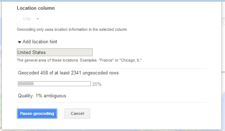
Step 3: Load the cleaned data into Google Fusion Tables Google Fusion Tables is a great tool for merging two or more data sets and for mapping geographic data. You can access Fusion Tables from your Google Drive (formerly Google Docs) account. Just upload your spreadsheet to Fusion Tables and typically the application will automatically detect if one of your columns contains geographic or location data. If so, it will create a map view in a separate tab, and then begin geocoding the location data.
If Fusion Tables doesn’t automatically detect the geographic data in your source file, you can explicitly change a column’s data type in Fusion Tables to “Location” to trigger the geocoding process. Once the geocoding process begins, Fusion Tables will process every place name in your spreadsheet through the Google Maps API and attempt to plot that place on the map. In essence, it’s as if you were searching for each one of those terms in Google Maps and putting the results of all of those searches on the same map.
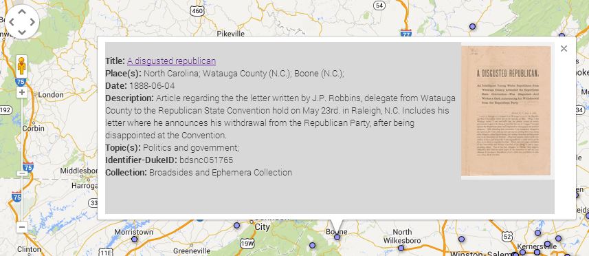
Once the geocoding process is complete, you’re left with a map that features a placemark for every place term the service was able to geocode. If you click on any of the placemarks, you’ll see a pop-up information window that, by default, lists all of the other metadata elements and values associated with that record. You’ll notice that the field labels in the info window match the column headers in your spreadsheet. You’ll probably want to tweak some settings to make this info window a little more user-friendly.
Step 4: Make some simple tweaks to add images and clickable links to your map
To change the appearance of the information window, select the “change” option under the map tab then choose “change info window.” From here, you can add or remove fields from the info window display, change the data labels, or add some custom HTML code to turn the titles into clickable links or add thumbnail images. If your spreadsheet contains any sort of URL, or identifier that you can use to reliably construct a URL, adding these links and images is quite simple. You can call any value in your spreadsheet by referencing the column name in braces (e.g. {Identifier-DukeID}). Below is the custom HTML code I used to style the info window for my Broadsides map. Notice how the data in the {Identifier-DukeID} column is used to construct the links for the titles and image thumbnails in the info window.
Step 5: Publish your map
Once you’re satisfied with you map, you can share a link to it or embed the map in your own web page or blog…like this one. Just choose tools->publish to grab the link or copy and paste the HTML code into your web page or blog.
To learn more about creating maps in Google Fusion Tables, see this Tutorial or contact the Duke Library’s Data and GIS Services.
Yes, it is here; exams and graduation. It can be a time of stress, a time to recognize your hard work, even a time of celebration. But first, take a moment for diversion.
On Exams
Feeling stressed?
Learn how to deal with stressful exams through vintage advertising such as this ad for Lifebuoy soap: Whew! This Exam Is A Tough One! At least you won’t lose any dates if you follow their directions.
Tough questions?
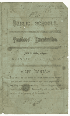
Could you pass this 1892 teacher’s examination found in our Broadsides collection? Answers to the math questions have already been filled in. But alas, they didn’t show their work. Shouldn’t that lead to partial credit?
Who had an exam?
We even hear from Thomas Long about “Jesus’ Final Exam.” Can’t anyone get a break from exams? Long’s sermon begins at 32 minutes into the audio recording of this 1986 worship service from the Duke Chapel recordings collection.
Commencement
Once you’ve passed all of your exams, thoughts turn to time-honored traditions of graduation.
52 years ago at Duke
A four-page issue of The Duke Chronicle notes what the Duke community could expect during the four days of commencement activities in June, 1962. But when you still have exams and papers due, graduation can still seem so far away.
Drama at commencement?
This commencement program from June, 1905 for the Memminger High and Normal School Academy of Music highlights not only a valedictory speech, but also the presentation of two essays, five musical performances, and two dramatic plays. Now, what drama would exemplify your academic experience?
Ahhh…
Once you work is done, whether you are graduating or simply completing another year of rigorous study at Duke, it’s time to unwind.
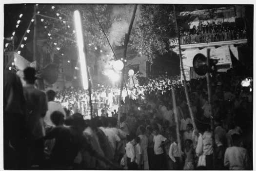
Taking to the streets
This photo from the William Gedney collection shows people celebrating in the streets of Benares, India. Gedney had just told them that you would ace your exams this year and so they started partying. Now that you know how they’ve celebrated your success, how do you plan to celebrate?
Definitely time for cake
Will this vintage Pillsbury commercial from our AdViews collection tempt you into including their Deluxe Chocolate Cake in your party plans? Or, will you resist the cake and simply use the commercial as inspiration for your wardrobe choices for your end-of-year soirées?
May all of your papers, projects and exams go well. Good luck and best wishes from Duke University Libraries.
Notes from the Duke University Libraries Digital Projects Team