Category Archives: Technology

Mapping the Broadsides Collection, or, how to make an interactive map in 30 minutes or less

Ever find yourself with a pile of data that you want to plot on a map? You’ve got names of places and lots of other data associated with those places, maybe even images? Well, this happened to me recently. Let me explain.

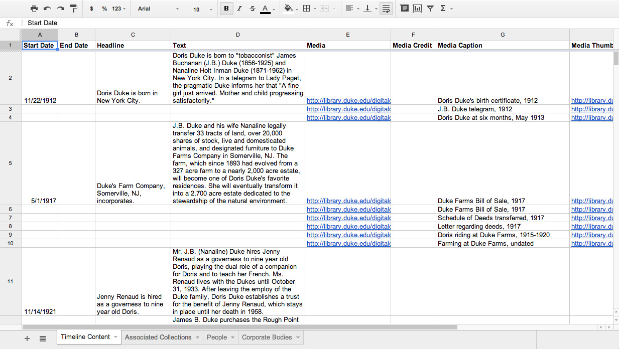
A few years ago we published the Broadsides and Ephemera digital collection, which consists of over 4,100 items representing almost every U.S. state. When we cataloged the items in the collection, we made sure to identify, if possible, the state, county, and city of each broadside. We put quite a bit of effort into this part of the metadata work, but recently I got to thinking…what do we have to show for all of that work? Sure, we have a browseable list of place terms and someone can easily search for something like “Ninety-Six, South Carolina.” But, wouldn’t it be more interesting (and useful) if we could see all of the places represented in the Broadsides collection on one interactive map? Of course it would.

So, I decided to make a map. It was about 4:30pm on a Friday and I don’t work past 5, especially on a Friday. Here’s what I came up with in 30 minutes, a Map of Broadside Places. Below, I’ll explain how I used some free and easy-to-use tools like Excel, Open Refine, and Google Fusion Tables to put this together before quittin’ time.

Step 1: Get some structured data with geographic information
Mapping only works if your data contain some geographic information. You don’t necessarily need coordinates, just a list of place names, addresses, zip codes, etc. It helps if the geographic information is separated from any other data in your source, like in a separate spreadsheet column or database field. The more precise, structured, and consistent your geographic data, the easier it will be to map accurately. To produce the Broadsides Map, I simply exported all of the metadata records from our metadata management system (CONTENTdm) as a tab delimited text file, opened it in Excel, and removed some of the columns that I didn’t want to display on the map.

Step 2: Clean up any messy data..
For the best results, you’ll want to clean your data. After opening my tabbed file in Excel, I noticed that the place name column contained values for country, state, county, and city all strung together in the same cell but separated with semicolons (e.g. United States; North Carolina; Durham County (N.C.); Durham (N.C.)). Because I was only really interested in plotting the cities on the map, I decided to split the place name column into several columns in order to isolate the city values.

To do this, you have a couple of options. You can use Excel’s “text to columns” feature, instructing it to split the column into new columns based on the semicolon delimiter or you can load your tabbed file into Open Refine and use its “split columns into several columns” feature. Both tools work well for this task, but I prefer OpenRefine because it includes several more advanced data cleaning features. If you’ve never used OpenRefine before, I highly recommend it. It’s “cluster and edit” feature will blow your mind (if you’re a metadata librarian).

Step 3: Load the cleaned data into Google Fusion Tables
Google Fusion Tables is a great tool for merging two or more data sets and for mapping geographic data. You can access Fusion Tables from your Google Drive (formerly Google Docs) account. Just upload your spreadsheet to Fusion Tables and typically the application will automatically detect if one of your columns contains geographic or location data. If so, it will create a map view in a separate tab, and then begin geocoding the location data.

geocoding_fusion_tables

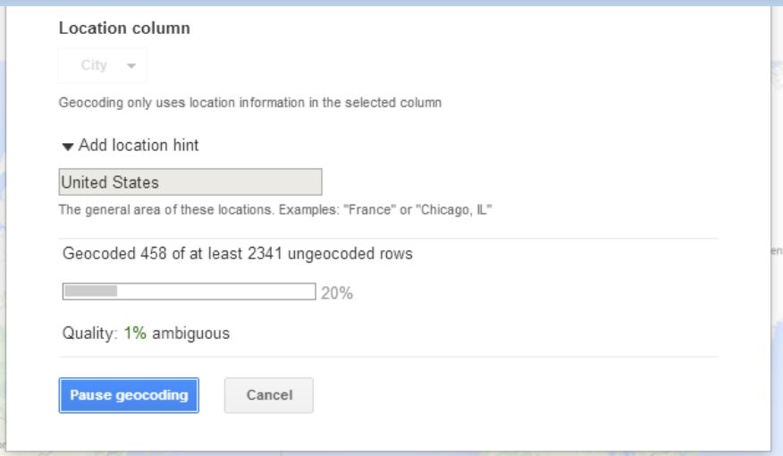
If Fusion Tables doesn’t automatically detect the geographic data in your source file, you can explicitly change a column’s data type in Fusion Tables to “Location” to trigger the geocoding process. Once the geocoding process begins, Fusion Tables will process every place name in your spreadsheet through the Google Maps API and attempt to plot that place on the map. In essence, it’s as if you were searching for each one of those terms in Google Maps and putting the results of all of those searches on the same map.

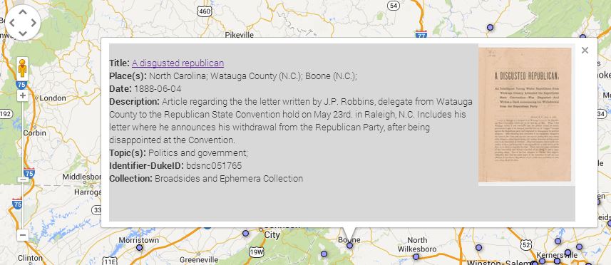
Once the geocoding process is complete, you’re left with a map that features a placemark for every place term the service was able to geocode. If you click on any of the placemarks, you’ll see a pop-up information window that, by default, lists all of the other metadata elements and values associated with that record. You’ll notice that the field labels in the info window match the column headers in your spreadsheet. You’ll probably want to tweak some settings to make this info window a little more user-friendly.

info_window_styled

Step 4: Make some simple tweaks to add images and clickable links to your map
To change the appearance of the information window, select the “change” option under the map tab then choose “change info window.” From here, you can add or remove fields from the info window display, change the data labels, or add some custom HTML code to turn the titles into clickable links or add thumbnail images. If your spreadsheet contains any sort of URL, or identifier that you can use to reliably construct a URL, adding these links and images is quite simple. You can call any value in your spreadsheet by referencing the column name in braces (e.g. {Identifier-DukeID}). Below is the custom HTML code I used to style the info window for my Broadsides map. Notice how the data in the {Identifier-DukeID} column is used to construct the links for the titles and image thumbnails in the info window.

info_window_screen

Step 5: Publish your map
Once you’re satisfied with you map, you can share a link to it or embed the map in your own web page or blog…like this one. Just choose tools->publish to grab the link or copy and paste the HTML code into your web page or blog.

To learn more about creating maps in Google Fusion Tables, see this Tutorial or contact the Duke Library’s Data and GIS Services.

Can You (Virtually) Dig It?

A group from Duke Libraries recently visited Dr. Maurizio Forte’s Digital Archaeology Initiative (a.k.a. “Dig@Lab”) to learn more about digital imaging of three-dimensional objects and to explore opportunities for collaboration between the lab and the library.

2014-04-29 15.37.39
These glasses and stylus allow you to disassemble the layers of a virtual site and rearrange and resize each part.

Dr. Forte (a Professor of Classical Studies, Art, and Visual Studies) and his colleagues were kind enough to demonstrate how they are using 3D imaging technology to “dig for information” in simulated archaeological sites and objects.  Their lab is a fascinating blend of cutting-edge software and display interfaces, such as the Unity 3D software being used in the photo above, and consumer video gaming equipment (recognize that joystick?).

Zeke tries not to laugh as Noah dons the virtual reality goggles.

Using the goggles and joystick above, we took turns exploring the streets and buildings of the ancient city of Regium Lepedi in Northern Italy.  The experience was extremely immersive and somewhat disorienting, from getting lost in narrow alleys to climbing winding staircases for an overhead view of the entire landscape.  The feeling of vertigo from the roof was visceral.  None of us took the challenge to jump off of the roof, which apparently you can do (and which is also very scary according to the lab researchers).  After taking the goggles off, I felt a heaviness and solidity return to my body as I readjusted to the “real world” around me, similar to the sensation of gravity after stepping off a trampoline.

Alex--can you hear me?
Alex–can you hear me?

The Libraries and Digital Projects team look forward to working more with Dr. Forte and bringing 3D imaging into our digital collections.

More information about the lab’s work can be found at:

http://sites.duke.edu/digatlab/


Mike views a mathematically modeled 3D rendering of a tile mosaic.

(Photos by Molly Bragg and Beth Doyle)

A Sketch for Digital Projects at DUL

What happens when an IT manager suffering from administrivia-induced ennui gets ahold of dia and starts browsing The Noun Project.
The inevitable result, when an IT manager suffering from Acute Administrivia-Induced Ennui gets ahold of dia and starts browsing The Noun Project.

We have all these plans and do all this work with the digital collections and the projects and what have you. Plan-plan-plan, work-work-work, and plan and work some more. Some things get done, others don’t, as we journey for that distant horizon, just on the other side of which lies, “Hooray, we finally got it!”

I started to draw a map for the next phases of that journey a few days ago, and it was going to be really serious. All these plans – repository migration, exhibit platform, workflow management, ArchivesSpace – would be represented in this exacting diagram of our content types and platforms and their interrelations. It might even have multiple sheets, which would layer atop one another like transparencies, to show the evolution of our stuff over time. UML books more than ten years old would be dusted off in the production of this diagram.

Almanac-Detail1Then my brain started to hurt, and I found myself doodling in response. I started having fun with it. You might even say I completely dorked out on it. Thus you have the “Sketch for an almanac of digital projects at Duke University Libraries” above.

Placing whimsical sea monster icons on a field of faux design elements took a lot of my time this week, so I’m afraid I’m not able to write any more about the diagram right now. However, provided it doesn’t prove a source of embarrassment and regret, I might revisit it in the near future.

Using Google Spreadsheets with Timelines

Doris Duke timeline
Doris Duke timeline

We’ve been making use of the fabulous Timeline.js library for a while now. The first timeline we published, compiled by Mary Samouelian about the life of Doris Duke, uses Timeline.js to display text and images in an elegant interactive format. Back then the library was called Verite Timeline and our implementation involved parsing XML files using Python to render out the content on the page. And in general, this approach worked great. However, managing and updating the XML files isn’t all that easy. Things also get complicated when more than one person wants to work on them — especially at the same time.

Enter Google Spreadsheets! Timeline.js is now designed to easily grab data from a publicly-published Google spreadsheet and create great looking output out of the box. Managing the timeline data in the spreadsheet is a huge step up from XML files in terms of ease of use for our researchers and for maintainability. And it helps that librarians love spreadsheets. If someone errantly enters some bad data, it’s simple to undo that particular edit as all changes are tracked by default. If a researcher wants to add a new timeline event, they can easily go into the spreadsheet and enter a new row. Changes are reflected on the live page almost immediately.

Spreadsheet data

Timeline.js provides a very helpful template for getting started with entering your data. They require that you include certain key columns and that the columns be named following their data schema. You are free to add additional columns, however, and we’ve played around with doing so in order to include categorical descriptions and the like.

Here is a sample of some data from our Doris Duke timeline.

Data for Doris Duke Timeline

For entries with more than one image, we don’t include a ‘Start Date’ which means Timeline.js will skip over them. We then render these out as smaller thumbnails on our timeline page.

Images on Doris Duke timeline page

Going all-in with spreadsheets

We’ve published our subsequent timelines using a combination of the Google spreadsheet data to generate the Timeline.js output while also using the XML files to load in and display relational data (using the EAC-CPF standard) while using Python to generate the pages. However, for our latest timeline on the J. Walter Thompson Company (preview the dev version), we’ve decided to house all of the data (including the CPF relations) in a Google Spreadsheet and use PHP to parse everything. This approach will mean that we no longer need to rely on the XML files, so our researchers can quickly make updates to the timeline pages. We can easily convert the spreadsheet data back into an XML file if the need arises.

J. Walter Thompson Company Timeline

Code snippets

Note: there’s an updated syntax for newly created spreadsheets.

We’re taking advantage of the Google spreadsheet data API that allows for the data to easily be parsed as JSON. Querying the spreadsheet in PHP looks something like this:

$theURL = "http://spreadsheets.google.com/feeds/list/[your-spreadsheet-key]/
od6/public/values?alt=json&callback=displayContent";

$theJSON = file_get_contents($theURL, 0, $ctx); //the $ctx variable sets a timeout limit

$theData = json_decode($theJSON, TRUE);

And then we can loop through and parse out the data using something like this:

foreach ($theData['feed']['entry'] as $item) {

	echo $item['gsx$startdate']['$t'];
	// Note that the column names in the spreadsheet are targeted by adding 'gsx$' 
	   and 'the column name in lc with no spaces'
	   You may also want to use 'strtotime' on the dates so that you can 
	   transform them using 'date'

	echo $item['gsx$enddate']['$t'];

	echo $item['gsx$headline']['$t'];

	echo $item['gsx$text']['$t'];

	... // and so on
}

One important thing to note is that by default, the above query structure only gets data from the primary worksheet in the spreadsheet (which is targeted using the od6 variable). Should you want to target other worksheets, you’ll need to know which ‘od’ variable to use in your query. You can view the full structure of your spreadsheet by using a url like this:

https://spreadsheets.google.com/feeds/worksheets/[your-spreadsheet-key]/public/basic

Then match up the ‘od’ instance to the correct content and query it.

Timelines and Drupal

We’ve also decided to integrate the publishing of timelines into our Drupal CMS, which drives the Duke University Libraries website, by developing a custom module. Implementing the backend code as a module will make it easy to apply custom templates in the future so that we can change the look and feel of a timeline for a given context. The module isn’t quite finished yet, but it should be ready in the next week or two. All in all, this new process will allow timelines to be created, published, and updated quickly and easily.


UPDATE

I recently learned that sometime in early 2014, google changed the syntax for published spreadsheet URLs and they are no longer using spreadsheet key as an identifier. As such, the syntax for retrieving a JSON feed has changed.

The new syntax looks like this:

https://spreadsheets.google.com/feeds/cells/[spreadsheet-ID]/[spreadsheet-index]/public/basic?alt=json&callback=displayContent

‘spreadsheet-ID’ is the string of text that shows up when you publish your spreadsheet:

https://docs.google.com/spreadsheets/d/[spreadsheet-ID]/pubhtml

‘spreadsheet-index’ you can see when editing your spreadsheet – it’s the value that is assigned to ‘gid’ or in the case below, it’s ‘0’:

https://docs.google.com/spreadsheets/d/[spreadsheet-ID]/edit#gid=0

I hope this helps save some frustration of finding documentation on the new syntax.

Post contributed by Michael Daul

Digitization Details: Bringing Duke Living History Into Your Future

Recently, I digitized 123 videotapes from the Duke University Living History Program. Beginning in the early 1970’s, Duke University faculty members conducted interviews with prominent world leaders, politicians and activists. The first interviews were videotaped in Perkins Library at a time when video was groundbreaking technology, almost a decade before consumer-grade VCRs starting showing up in people’s living rooms. Some of the interviews begin with a visionary introduction by Jay Rutherfurd, who championed the program:

“At the W. R. Perkins library, in Duke University, we now commit this exciting experiment in electronic journalism into your future. May it illuminate well, educate wisely, and relate meaningfully, for future generations.”

Clearly, the “future” that Mr. Rutherfurd envisioned has arrived. Thanks to modern technology, we can now create digital surrogates of these videotaped interviews for long-term preservation and access. The subjects featured in this collection span a variety of generations, nationalities, occupations and political leanings. Interviewees include Les Aspin, Ellsworth Bunker, Dr. Samuel DuBois Cook, Joseph Banks Rhine, Jesse Jackson, Robert McNamara, Dean Rusk, King Mihai of Romania, Terry Sanford, Judy Woodruff, Angier Biddle Duke and many more. The collection also includes videotapes of speeches given on the Duke campus by Ronald Reagan, Abbie Hoffman, Bob Dole, Julian Bond and Elie Wiesel.

residue
Residue wiped off the head of a U-matic playback deck, the result of sticky-shed syndrome.

Many of the interviews were recorded on 3/4″ videotape, also called “U-matic.” Invented by Sony in 1969, the U-matic format was the first videotape to be housed inside a plastic cassette for portability, and would soon replace film as the primary television news-gathering format. Unfortunately, most U-matic tapes have not aged well. After decades in storage, many of the videotapes in our collection now have sticky-shed syndrome, a condition in which the oxide that holds the visual content is literally flaking off the polyester tape base, and is gummy in texture. When a videotape has sticky-shed, not only will it not play correctly, the residue can also clog up the tape heads in the U-matic playback deck, then transfer the contaminant to other tapes played afterwards in the same deck. A U-matic videotape player in good working order is now an obsolete collector’s item, and our tapes are fragile, so we came up with a solution: throw those tapes in the oven!

oven2
After baking, the cookies (I mean U-matic videotapes) are ready for digitization!

At first that may sound reckless, but baking audio and videotapes at relatively low temperatures for an extended period of time is a well-tested method for minimizing the effects of sticky-shed syndrome. The Digital Production Center recently acquired a scientific oven, and after initial testing, we baked each Duke Living History U-matic videotape at 52 celsius (125 fahrenheit) for about 10 hours. Baking the videotapes temporarily removed the moisture that had accumulated in the binder, and made them playable for digitization. About 90% of our U-matic tapes played well after baking. Many of them were unplayable beforehand.

videoracks
The Digital Production Center’s video rack and routing system.

After giving the videotapes time to cool down, we digitize each tape, in real time, as an uncompressed  file (.mov) for long-term preservation. Afterwards, we make a smaller, compressed version (.mp4) of the same recording, which is our access copy. Our U-matic decks are housed in an efficiently-designed rack system, which also includes other obsolete videotape formats like VHS, Betacam and Hi8. Centralized audio and video routers allow us to quickly switch between formats while ensuring a clean, balanced and accurate conversion from analog to digital. Combining the art of analog tape baking with modern video digitization, the Digital Production Center is able to rescue the content from the videotapes, before the magnetic tape ages and degrades any further. While the U-matic tapes are nearing the end of their life-span, the digital surrogates will potentially last for centuries to come. We are able to benefit from Mr. Rutherfurd’s exciting experiment into our future, and carry it forward… into your future. May it illuminate well, educate wisely, and relate meaningfully, for future generations.


Post contributed by Alex Marsh


Society of North Carolina Archivists Annual Meeting Slides

On Tuesday April 8, I had the honor of presenting at the annual meeting of the Society of North Carolina Archivists with representatives from Wake Forest University and Davidson College. The focus of our panel was to present alternatives to CONTENTdm, a system for displaying digital collections widely used by libraries. At Duke, we have developed our own Tripod interface to digital collections. Wake Forest and Davidson use a variety of tools most notably DSpace and Islandora (via Lyrasis) respectively. It was great to present with and learn more about the Wake Forest and Davidson programs! I’ve embedded slides from all three speakers below.


A New Dimension for Duke’s Digital Collections

As our long-term readers of Bitstreams will attest, the Duke Digital Collections program has an established and well-earned reputation as a trailblazer when it comes to introducing new technologies, improved user interfaces, high definition imaging, and other features that deliver digital images with a beauty and verisimilitude true to the originals held by the David M. Rubenstein Rare Book & Manuscript Library.  Thus, we are particularly proud to launch today our newest feature, Smell-O-Bit, which adds a whole new dimension to the digital collections experience.

Smell-O-Bit is a cutting-edge technology that utilizes the diffusers built into most recent model computers to emit predefined scents associated with select digital objects within the Duke Digital Collections site.  While still in a test phase, the Digital Collections team has already tagged several images with scents that evoke the mood or content of key images.   To experience the smells, simply select Ctl-Alt-W-Up- while viewing these test images:


A bold scent for a bold product, Pabst-ett cheese!

Made by the Pabst brewing company while beer was off limits due to Prohibition, Pabst-ett cheese was soft, spreadable, and comfort-food delicious.  We’ve selected a bold, tangy scent to highlight these comforts.  The scent may make you happy enough to slap your own cheeks!

The smell of late a night chess match.

The smell of cigarette smoke, margaritas, and salt from around glass rims and chess players’ brows will make you feel as if you have front row seating at this chess match between composer John Cage and a worthy, but anonymous opponent.

A scent strong enough to eat!

You may feel yourself  overwhelmed with the wafting scent of char-broiled deliciousness, but don’t forget to take a deep inhale to detect the pickles, ketchup, and mustard which makes this a savory image all around.

Perhaps you smell garbage? If so, your Garbex isn’t working!  What about flies, cats, or dogs? Or, perhaps you just smell a rat. Alright, you caught us.

Happy April Fool’s Day from Duke Digital Collections!!

Post Contributed by Duke Digital Collections


Schema.org and Google for Local Discovery: Some Key Takeaways

Google CSE & schema.org
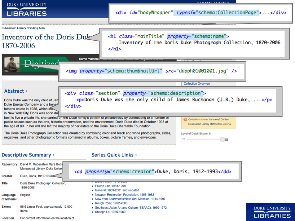
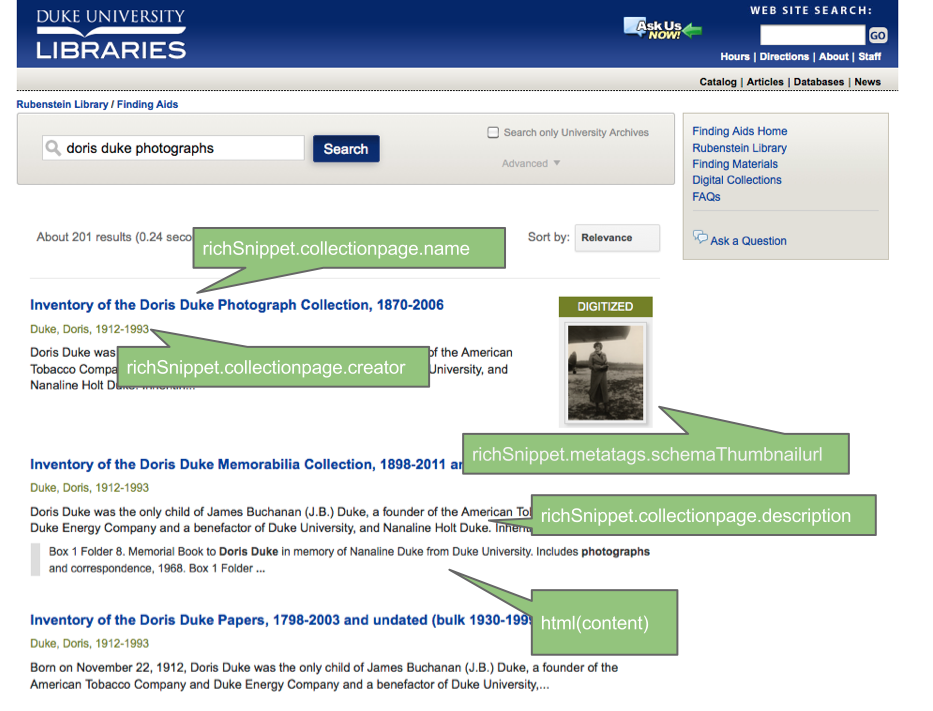
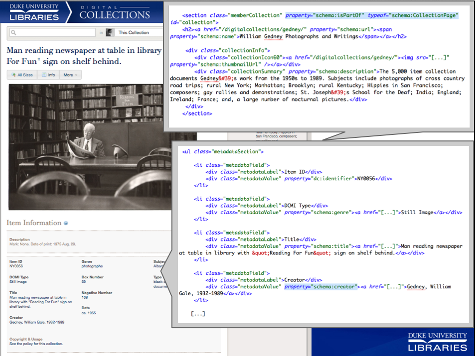
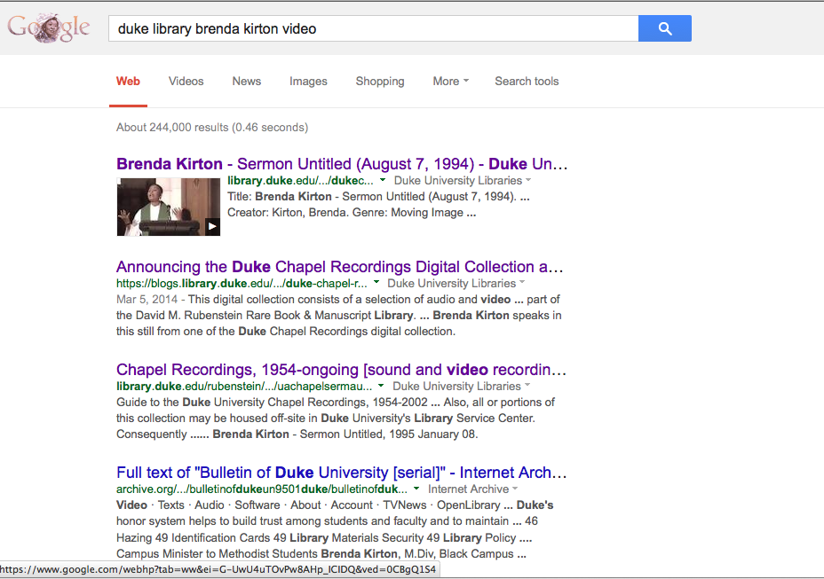
Over the past year and a half, among our many other projects, we have been experimenting with a creative new approach to powering searches within digital collections and finding aids using Google’s index of our structured data. My colleague Will Sexton and I have presented this idea in numerous venues, most recently and thoroughly for a recorded ASERL (Association of Southeastern Research Libraries) webinar on June 6, 2013.

We’re eager to share what we’ve learned to date and hope this new blog will make a good outlet. We’ve had some success, but have also encountered some considerable pitfalls along the way.

What We Set Out to Do

I won’t recap all the fine details of the project here, but in a nutshell, here are the problems we’ve been attempting to address:

  • Maintaining our own Solr index takes a ton of time to do right. We don’t have a ton of time.
  • Staff have noted poor relevance rank and poor support for search using non-Roman characters.
  • Our digital collections search box is actually used sparsely (in only 12% of visits).
  • External discovery (e.g., via Google) is of equal or greater importance vs. our local search for these “inside-out” resources.

Here’s our three-step strategy:

  1. Embed schema.org data in our HTML (using RDFa Lite)
  2. Get Google to index all of our embedded structured data
  3. Use Google’s index of our structured data to power our local search for finding aids & digital collections

Where We Are Today

We mapped several of our metadata fields to schema.org terms, then embedded that schema.org data in all 74,000 digital object pages and all 2,100 finding aids. We’re now using Google’s index of that data to power our default search for:

  1. All of our finding aids (a.k.a. collection guides).  [Example search for “photo”]
  2. One digital collection: Sidney Gamble Photographs. [Example search for “beijing”]

Though the strategy is the same, some of the implementation details are different between our finding aids and digital collections applications. Here are the main differences:

Site Service Google CSE API Max Results per Query
Finding Aids Google Custom Search (free) JS v1.0 100
Digital Collection Google Site Search
(premium version of Custom Search)
XML API 1,000


Finding Aids Search

Embedding the Data. We kept it super simple here. We labeled every finding aid page a ‘CollectionPage’ and tagged only a few properties: name, description, creator, and if present, a thumbnailUrl for a collection with digitized content.

Schema.org tags using RDFa Lite in finding aid HTML

Rendering Search Results Using Google’s Index. 

This worked great. We used a Google Custom Search Element (CSE) and created our own “rich snippets” using the CSE JavaScript API (v1.0) and the handy templating options Google provides. You can simply “View Source” to see the underlying code: it’s all there in the HTML. The HTML5 data- attributes set all the content and the display logic.

Google Javascript objects used in search result snippet presentation.


Digital Collections Search: Sidney D. Gamble Collection

Embedding the Data.

Our digital collections introduce more complexity in the structured data than we see in our finding aids. Naturally, we have a wide range of item types with diverse metadata. We want our markup to represent the relationship of an item to its source collection. The item, the webpage that it’s on, the collection it came from, and the media files associated with it all have properties that can be expressed using schema.org terms. So, we tried it all.[1]

Example Schema.org tags used in item pages

Rendering Search Results Using Google’s Index. 

For the Gamble collection, we succeeded in making queries hit Google’s XML API while sustaining the look of our existing search results. Note that the facets in the left side aren’t powered via Google–we haven’t gotten far enough in our experiment to work with filtering the result set based on the structured data, but that’s possible to do.

Search result rendering using Google's XML API
Search result rendering using Google’s XML API

Outcomes 


The Good

We’ve been pleased with the ability to make our own rich snippets and highly customize the appearance of search results without having to do a ton of development. Getting our structured data back from Google’s index to work with is an awesome service and developing around the schema.org properties that we were already providing has been a nice way to kill two birds with one stone.

For performance, Google CSE is working well in both the finding aids and the Gamble digital collection search for these purposes:

  • getting the most relevant content presented early on in the search result
  • getting results quickly
  • handling non-Roman characters in search terms
  • retrieving a needle in a haystack — an item or handful of items that contain some unique text

The Gotchas

While Google CSE  shows relevant results quickly, we’re finding it’s not a good fit for exploratory searching when either of these aspects is important:

  • getting a stable and precise count of relevant results
  • browsing an exhaustive list of results that match a general query

Be careful: queries max out at 100 results with the JavaScript APIs or 1,000 results when using the XML API.  Those limits aren’t obvious in the documentation, yet they might be a deal-breaker for some potential uses.

For queries with several pages of hits, you may get an estimated result count that’s close, but unfortunately things occasionally and inexplicably go sour as you navigate from from one result page to the next.  E.g., the Gamble digital collection query ‘beijing‘ shows about 2,100 results (which is in the ballpark of what Solr returns), yet browse a few pages in and the result set will get truncated severely: you may only be able to actually browse about 200 of the results without issuing more specific query terms.

Other Considerations

Impact on External Discovery

Traffic to digital collections via external search engines has mostly climbed steadily every quarter for the past few years, from 26% of all visits in Jul-Sep 2011 up to 44% from Jan-Mar 2014 (to date) [2]. We entered schema.org tags in Oct 2012, however we don’t know whether adding that data has contributed at all to this trend. Does schema.org data impact relevance? It’s hard to tell.

Structured Data Syntax + Google APIs

Though RDFa Lite and microdata should be equally acceptable ways to add schema.org tags, Google’s APIs actually work better with microdata if there are nested item types.[3]  And regardless of microdata or RDFa, the Google CSE JavaScript API unfortunately can’t access more than one value for any given property, so that can be problematic [4].

Rich Snippets in Big Google

We’re seeing Google render rich snippets for our videos, because we’ve marked them as schema.org VideoObjects with properties like thumbnailUrl. That’s encouraging! Perhaps someday Google will render better snippets for things like photographs (of which we have a bunch), or maybe even more library domain-specific materials like digitized oral histories, manuscripts, and newspapers.  But at present, none of our other objects seem to trigger nice snippets like this.

A rich snippet triggered by using schema.org videoObject type & thumbnailUrl property.

Footnotes

[1] We represented item pages as schema.org “ItemPage” types using the “ispartOf” property to relate the item page to its corresponding “CollectionPage”. We made the ItemPage “about” a “CreativeWork”. Then we created mappings for many of our metadata fields to CreativeWork properties, e.g., creator, contentLocation, genre, dateCreated.

[2] Digital Collections External Search Traffic by Quarter

Quarter    Visits via Search   % Visits via Search

Jul – Sep 2011   26,621   25.97%
Oct – Dec 2011   32,191   29.59%
Jan – Mar 2012   41,048   32.16%
Apr – Jun 2012   33,872   34.49%
Jul – Sep 2012   28,250   32.40%
Oct – Dec 2012   38,472   36.52% <– entered schema.org tags Oct 19, 2012
Jan – Mar 2013   39,948   35.29%
Apr – Jun 2013   36,641   38.30%
Jul – Sep 2013   35,058   41.88%
Oct – Dec 2013   46,082   43.98%
Jan – Mar 2014   47,123   43.93%

[3] For example, if your RDFa indicates that “an ItemPage is about a CreativeWork whose creator is Sidney Gamble”– the creator of the creative work is not accessible to the API since the CreativeWork is not a top-level item.  To get around that, we had to duplicate all the CreativeWork properties in the HTML <head>, which is unnatural and a bit of a hack.

[4]  Google’s CSE JS APIs also don’t let us retrieve the data when there are multiple values specified for the same field. For a given CreativeWork, we might have six locations that are all important to represent: China; Beijing (China); Huabei xie he nu zi da xue (Beijing, China); 中国; 北京;  华北协和女子大学.  The JSON returned by the API only contains the first value: ‘China’. This, plus the result count limit, made the XML API our only viable choice for digital collections.

Announcing the Duke Chapel Recordings Digital Collection and Video Player!

Duke Digital Collections is excited to announce our newest digital collection: Duke Chapel Recordings!

 dukechapel

This digital collection consists of a selection of audio and video recordings from the extensive collection of Duke University Chapel recordings housed in the Duke University Archives, part of the David M. Rubenstein Rare Book & Manuscript Library.   The digital collection features 168 audio and video recordings from the chapel including sermons from notable African American and female preachers.  This project has been a fruitful collaboration between Duke Chapel, the Divinity School, the Rubenstein Library and of course the digital projects team in Duke University Libraries.  To learn more, visit the Devil’s Tale blog (the blog of the Rubenstein Library).

But wait, there’s more!

sermon video
Brenda Kirton speaks in this still from one of the Duke Chapel Recordings digital collection.

Fifteen of the recordings were digitized from VHS tapes and are available as video playable from within the digital collection.  These are our first digitized videos delivered via our own infrastructure. Our previous efforts have all relied on external platforms like YouTube, iTunes, and the Internet Archive to serve up the videos. While these tools are familiar to users, feature-rich, and built on a strong technological backbone, we have been intending for quite awhile to develop support for delivering digital video in-house.

When you view a video from the Duke Chapel Recordings, you’ll see a “poster frame” image of the featured speaker. Click the play button to begin (of course!) and the video will play within the page. Watching the videos is a “pseudo-streaming” or “progressive download” experience akin to YouTube. That is, you can start watching almost immediately, and you can click ahead to arbitrary points in the middle of the video at any time.  And while you might occasionally have to wait for things to buffer, videos should play smoothly on desktop, tablet, and smartphone devices, and can be easily enlarged to full-screen. Finally, there’s a Download link right below the video if you’d like to take the files with you.

Behind the scenes, we are using the robust JW Player tool, for which the Pro version was recently made available by site-license to the Duke community by our friends in the Office of Information Technology. JW Player is media player software that uses a combination of HTML5 video and Javascript. It can play video from a streaming server, but as in our case, it can also pseudo-stream video over HTTP via a standard web server. Using HTML5 video, the browser requests and receives only the chunks of the video file that it needs as it plays. Almost all of the major modern browsers support HTML5 video delivering H.264/AAC MP4 content (our video encoding of choice), and a peek at our use statistics indicates that more than 80% of our users visit our site with these browsers.  For the rest, JW Player renders a nearly identical media player using Adobe Flash.

We’re looking forward to hearing from our users and learning from our peers who are working with digital media to keep refining our approach.  We hope to make many more videos from our collections available in the near future.

Post authored by Sean Aery and Molly Bragg.