All posts by Joel Herndon, Ph.D.

Duke Libraries and SSRI welcome Mara Sedlins!

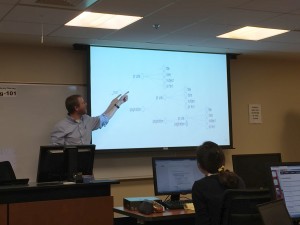
On behalf of Duke Libraries and the Social Science Research Institute, I am happy to welcome Mara Sedlins to Duke.  As the library and SSRI work to develop a rich set of data management, analysis, and archiving strategies for Duke researchers, Mara’s postdoctoral position provides a unique opportunity to work closely with researchers across campus to improve both training and workflows for data curation at Duke.  – Joel Herndon, Head of Data and Visualization Services, Duke Libraries  

2016-08-25 11.06.17 HDRI am excited to join the Data and Visualization Services team this fall as a postdoctoral fellow in data curation for the social sciences (sponsored by CLIR and funded by the Alfred P. Sloan Foundation). For the next two years, I will be working with Duke Libraries and the Social Science Research Institute to develop best practices for managing a variety of research data in the social sciences.

My research background is in social and personality psychology. I received my PhD at the University of Washington, where I worked to develop and validate a new measure of automatic social categorization – to what extent do people, automatically and without conscious awareness, sort faces into socially constructed categories like gender and race? The measure has been used in studies examining beliefs about human genetic variation and the racial labels people assign to multiracial celebrities like President Barack Obama.

While in Seattle, I was also involved in several projects at Microsoft Research assessing computer-supported cooperative work technologies, focusing on people’s preferences for different types of avatar representations, compared to video or audio-only conferencing. I also have experience working with data from a study of risk factors for intimate partner violence, managing a database of donors and volunteers for a historical archive, and organizing thousands of high-resolution images for a large-scale digital comic art restoration project.

I look forward to applying the insights gained from working on a diverse array of data-intensive projects to the problem of developing and promoting best practices for data management throughout the research lifecycle.  I am particularly interested in questions such as:

  • How can researchers write actionable data management plans that improve the quality of their research?
  • What strategies can be used to organize and document data files during a project so that it’s easy to find and understand them later?
  • What steps need to be taken so that data can be discovered and re-used effectively by other researchers?

These are just a few of the questions that are central to the rapidly evolving field of data curation for the sciences and beyond.


Fall 2016 DVS Workshop Series

GenericWorkshops-01Data and Visualization Services is happy to announce its Fall 2016 Workshop Series. Learn new ways of enhancing your research with a wide range of data driven research methods, data tools, and data sources.

Can’t attend a session?  We record and share most of our workshops online.  We are also happy to consult on any of the topics above in person.  We look forward to seeing you in the workshops, in the library, or online!

Data Sources
 
Data Cleaning and Analysis
 
Data Analysis
Introduction to Stata (Two sessions: Sep 21, Oct 18)
 
Mapping and GIS
Introduction to ArcGIS (Two sessions: Sep 14, Oct 13)
ArcGIS Online (Oct 17)
 
Data Visualization

Visualizing Qualitative Data (Oct 19)
Visualizing Basic Survey Data in Tableau – Likert Scales (Nov 10)

Data Fest 2016 Workshop Series

Duke Libraries are happy to welcome the 2016 ASA DataFest to the Edge on April 1-3rd.  As part of  DataFest 2016, the Edge is hosting five DatadataFestFest related workshops designed to help teams and others interested in data driven research expand their skills.   All workshops will meet in the Edge Workshop Room (1st Floor Bostock Library).  Laptops are required for all workshops.

We wish all the teams success in the competition and hope to see you in the next few weeks!


DataFest Workshop Series

Data Analysis with Python
Tuesday, March 22
6:00-9:00 PM
This will be a hands-on class focused on performing data analysis with Python. We’ll help participants set-up their Jupyter Notebook development environment, cover the basic functions for reading and manipulating data, show examples of common statistical models and useful packages and show some of the python visualization tools.

Introduction to R
Wednesday March 23
6:00-8:00 PM
Introduction to R as a statistical programming language. This session will introduce the basics of R syntax, getting data into R, various data types and classes, etc. The session assumes no or little background in R.

Data Munging with R and dplyr
Monday, March 28
6:00-8:00 PM
This session will demonstrate tools for data manipulation and cleaning of data in R. Majority of the session will use the dplyr and tidyr packages. Some background in R is recommended. If you are not familiar with R, make sure to first attend the first R workshop in the series.

Data visualization with R, ggplot2, and shiny
Wednesday, March 30
6:00-8:00 PM
This session will demonstrate tools for static and interactive data visualization in R using ggplot2 and shiny packages. Some background in R is recommended. If you are not familiar with R, make sure to first attend the first R workshop in the series.

EDA and Interactive Predictive Modeling with JMP
Thursday, March 31
4:00-6:00 PM
JMP® Statistical Discovery Software is dynamic, visual and interactive desktop software for Windows and Mac. In this hands-on workshop we see tools for exploring, visualizing and preparing data in JMP. We’ll also learn how to fit a variety of predictive models, including multiple regression, logistic regression, classification and regression trees, and neural networks. A six month license of JMP will be provided.

Data and Visualization Spring 2016 Workshops

Spring 2016 DVS WorkshopsSPRING 2016: Data and Visualization Workshops 

Interested in getting started in data driven research or exploring a new approach to working with research data?  Data and Visualization Services’ spring workshop series features a range of courses designed to showcase the latest data tools and methods.  Begin working with data in our Basic Data Cleaning/Analysis or the new Structuring Humanities Data  workshop.  Explore data visualization in the Making Data Visual class.  Our wide range of workshops offers a variety of approaches for the meeting the challenges of 21st century data driven research.   Please join us!

Workshop by Theme

DATA SOURCES

DATA CLEANING AND ANALYSIS

DATA ANALYSIS

MAPPING AND GIS

DATA VISUALIZATION

* – For these workshops, no prior experience with data projects is necessary!  These workshops are great introductions to basic data practices.

DVS Fall Workshops

GenericWorkshops-01Data and Visualization Services is happy to announce its Fall 2015 Workshop Series.  With a range of workshops covering basic data skills to data visualization, we have a wide range of courses for different interests and skill levels..  New (and redesigned) workshops include:

  • OpenRefine: Data Mining and Transformations, Text Normalization
  • Historical GIS
  • Advanced Excel for Data Projects
  • Analysis with R
  • Webscraping and Gathering Data from Websites

Workshop descriptions and registration information are available at:

library.duke.edu/data/news


Workshop
 

Date

OpenRefine: Data Mining and Transformations, Text Normalization
Sep 9
Basic Data Cleaning and Analysis for Data Tables
Sep 15
Introduction to ArcGIS
Sep 16
Easy Interactive Charts and Maps with Tableau
Sep 18
Introduction to Stata
Sep 22
Historical GIS
Sep 23
Advanced Excel for Data Projects
Sep 28
Easy Interactive Charts and Maps with Tableau
Sep 29
Analysis with R
Sep 30
ArcGIS Online
Oct 1
Web Scraping and Gathering Data from Websites
Oct 2
Advanced Excel for Data Projects
Oct 6
Basic Data Cleaning and Analysis for Data Tables
Oct 7
Introduction to Stata
Oct 14
Introduction to ArcGIS
Oct 15
OpenRefine: Data Mining and Transformations, Text Normalization
Oct 20
Analysis with R
Oct 20


DataFest 2015 @ the Edge

DataFest 2015Duke Libraries are happy to host the American Statistical Association’s Data Fest Competition the weekend of March 20-22nd.  In its fourth year at Duke, DataFest brings teams of students from across the Research Triangle to compete in a weekend long competition that stresses data cleaning, analytics, and visualization skills.   The Edge provides a central location for the competition with facilities designed for collaborative, data driven research.

While the deadline for forming DataFest teams has past, Data and Visualization Services and Duke’s Department of Statistical Sciences are happy to offer another opportunity to participate in DataFest.  Starting Monday, March 16th we are offering four workshops on data analytics and visualization in the four days leading up to the DataFest event.  All workshops are open to the public, but we strongly encourage early registration to ensure a seat. Please come join us as we get ready to celebrate ASA DataFest 2015.

DataFest Workshop Series

Monday, March 16th, 6:00-8:00 PM – Introduction to R

Tuesday, March 17th, 1:30-3:00 PM – Easy Interactive Charts and Maps with Tableau

Wednesday, March 18th,  6:00-8:00 PM – Data Munging with R and dplyr

Thursday, March 19th, 7:00-9:00 PM – Visualization in d3


New Year- New Data and Visualization Lab!

Data and Visualization Services is happy to announce our new Data and Visualization Lab in Duke Libraries new Edge research space.  Located on the first floor of the Bostock Library, the Brandaleone Family Lab for Data and Visualization Services offers a dedicated space for researchers working on data driven projects.

The lab features three distinct areas for supporting data driven research.

Data and Visualization Lab Space

Data and Visualization Lab Computing Zone

Our lab space features twelve high end workstations with dual monitors with the latest software for data visualization, digital mapping, statistics, and qualitative research.  All of the machines have two dedicated displays to encourage collaborative work and data consultations.  Additionally, all twelve machines have a dedicated power port located conveniently under the edge of the table for powering a laptop or usb powered device.

Bloomberg Professional “Bar”

bloom

Since the launch of our Bloomberg terminals, we have seen a steady increase in both individual and team based usage of Bloomberg financial data.  Our three Bloomberg Professional workstations are now located on a dedicated “bar” across from our lab machines.  The  new Bloomberg zone will facilitate collaborate work and provide a base for groups such as the Duke University Investment Club and Duke Financial Economics Center.

Consult and Collaborative SpaceCollaboration Zone

Our third lab space provides a set of four rolling tables for small groups to collaborate or for projects that don’t require a fixed computing space.   An 85″ flat panel display near this zone features data visualizations and other data driven research projects at Duke.

Come See Us!

With ample natural light,  almost 24/7 availability, and a welcoming staff eager to work with you on your next data driven project.  We look forward to working with you in the upcoming year!

Meet Data and Visualization Services

Data and Visualization Services LogoThe fall of 2014 marks the completion of the first five years of the libraries’ Data and GIS Services Department. In 2009, when Mark Thomas and I formed the department, the name accurately reflected our staffing and services as Mark focused on GIS-related issues and I focused on data-related issues. As an increasing number of scholars have embraced data-driven research over the last five years , our services and staff have grown to support an increasingly diverse set of research needs at Duke.

In 2010-2011 academic year, the Libraries launched services around data management and sharing plans in anticipation of new funding rules surrounding research data. In 2012, the library expanded data services in collaboration with OIT’s Research Computing to offer one of the first data visualization consulting positions in the country. In 2013 and 2014, we expanded services and staff to include consultations on research computing and big data.

At this year’s Data and GIS Services annual retreat, we decided that the time has come to change the name of the department to reflect the broader range of staff and consulting services available. While we continue to support our traditional dimensions of data and GIS research, we intend to support a range of data needs across the following five themes:

Data and Visualization Services Themes

Data Sources
Get the data you need. Data and Visualization Services consultants can help you locate and license a diverse range of data sources.  We also provide long term storage for Duke data collections through Duke’s institutional repository.

Data Storage and Management
Need help on a data management plan, want advice on archiving, or struggling with “big data” analytics?  We are happy to consult!

Data Cleaning and Analysis
From Google Refine to the command line, we can help with data cleaning and analysis.

Mapping and GIS
Mapping and spatial analysis remain a core service for the data and visualization program.

Data Visualization
Our data visualization service can help with the most effective way to represent your data for both analysis and communication.


We appreciate the research community’s support as we’ve grown over the last five years.  We look forward to working with you on a larger range of data challenges in the future!

Top 10 List – Data and GIS Edition

As we begin our summer in Data and GIS Services, we spend this post reflecting back on some of the services, software, and tools that made data work this spring more productive and more visible.  We proudly present our top 10 list for the Spring 2014 semster:

10. DMPTool
While we enjoy working directly with researchers crafting data management plans, we realize that some data management needs arise outside of consultation hours.  Fortunately, the Data Management Planning Tool (DMPTool) is there 24/7 to provide targeted guidance on data management plans for a range of granting agencies.

9. Fusion Tables
A database in the cloud that allows you to query and visualize your data, Fusion Tables has proven a powerful tool for researchers who need database functionality but don’t have time for a full featured database.  We’ve worked with many groups to map their data in the cloud; see the Digital Projects blog for an example.  Fusion Tables is a regular workshop in Data and GIS.

8. Open Refine
You could learn the UNIX command line and a scripting language to clean your data, but Open Refine opens data cleaning to a wider audience that is more concerned with simplicity than syntax.  Open Refine is also a regular workshop in Data and GIS.

7. R and RStudio
A programming language that excels at statistics and data visualization, R offers a powerful, open source solution to running statistics and visualizing complex data.  RStudio provides a clean, full-featured development environment for R that greatly enhances the analysis process.

6. Tableau Public
Need a quick, interactive data visualization that you can share with a wide audience?  Tableau Public excels at producing dynamic data visualizations from a range of different datasets and provides intuitive controls for letting your audience explore the data.

5. ArcOnline
ArcGIS has long been a core piece of software for researchers working with digital maps.  ArcOnline extends the rich mapping features of ArcGIS into the cloud, allowing a wider audience to share and build mapping projects.

4. Pandas
A Python library that brings data analysis and modeling to the Python scripting language, Pandas brings the ease and power of Python to a range of data management and analysis challenges.

3. RAW
Paste in your spreadsheet data, choose a layout, drag and drop your variables… and your visualization is ready.  Raw makes it easy to go from data to visualization using an intuitive, minimal interface.

2. Stata 13
Another core piece of software in the Data and GIS Lab (and at Duke), Stata 13 brought new features and flexibility (automatic memory management — “hello big data”) that were greatly appreciated by Duke researchers.

1. R Markdown
While many librarians tell people to “document your work,” R Markdown makes it easy to document your research data, explain results, and embed your data visualizations using a minimal markup language that works in any text editor and ties nicely into the R programming language.   For pulling it all together, R Markdown is number one in our top ten list!

We hope you’ve enjoyed the list!  If you are interested in these or other data tools and techniques, please contact us at askdata@duke.edu!

Scaling Support: Designing Data for a Growing Statistics Program

r_stats101
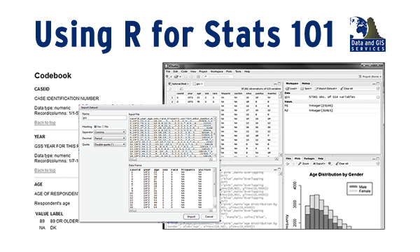
How do you support 57,860 online students learning R and statistics ?  Late last fall, Data and GIS Services shared this challenge with Professor Mine Çetinkaya-Rundel and the staff of CIT as we sought to translate Professor Çetinkaya-Rundel’s successful Statistics 101 course to a Coursera class on Data Analysis and Statistical Inference.  While Data and GIS Services has supported Statistics 101 students for several years identifying appropriate data and using the R statistical language for their assignments, the scale of the Coursera course introduced new challenges of trying to provide engaging data to a very large audience without having the opportunity to provide direct support to everyone in the class.

In our initial meetings with Professor Çetinkaya-Rundel, she requested that Data and GIS create data collections for the course that would provide easy access in R and would include a range of statistical measures that would appeal to the diverse audience in the class.  The first challenge — easy access to R — required some translation work.  While R excels in its flexibility, graphics, and statistical power, it lacks some of the built in data documentation features present in other statistical packages.  This project prompted Data and GIS to reconsider how to provide documentation and pre-formatted R data to an audience that would likely be unfamiliar with R and data documentation.

The second challenge — finding data that covered a wide range of interesting topics — proved much easier.  The General Social Survey with its diverse and engaging questions on a wide range of topics proved to be an easy choice for the class.  The American National Election Studies, also offered a diverse set of measures of public opinion that suited the course well.  With these challenges identified and addressed, we spent the end of 2013 selecting portions of the data for class (subsetting), abridging the data documentation for instructional use, and transforming the data to address its usage in an online setting (processing missing values for R, creating factor variables).

As Professor Çetinkaya-Rundel’s class launches on February 17th, this project has given us a new appreciation of providing data and statistical services in a MOOC while also building course materials that we are using in Statistics 101 at Duke.  While students begin the Coursera course on Data Analysis and Statistical Inference, students in Professor Kari Lock Morgan’s Statistics 101 class will use these data in their on-campus Duke course as well.  We hope that both collections will reduce some of the technological hurdles that often confront courses using R as well as improving statistical literacy at Duke and beyond.