Category Archives: Technology

The Value of Metadata in Digital Collections Projects

Before you let your eyes glaze over at the thought of metadata, let me familiarize you with the term and its invaluable role in the creation of the library’s online Digital Collections.  Yes, metadata is a rather jargony word librarians and archivists find themselves using frequently in the digital age, but it’s not as complex as you may think.  In the most simplistic terms, the Society of American Archivists defines metadata as “data about data.”  Okay, what does that mean?  According to the good ol’ trusty Oxford English Dictionary, it is “data that describes and gives information about other data.”  In other words, if you have a digitized photographic image (data), you will also have words to describe the image (metadata).

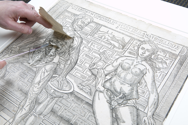
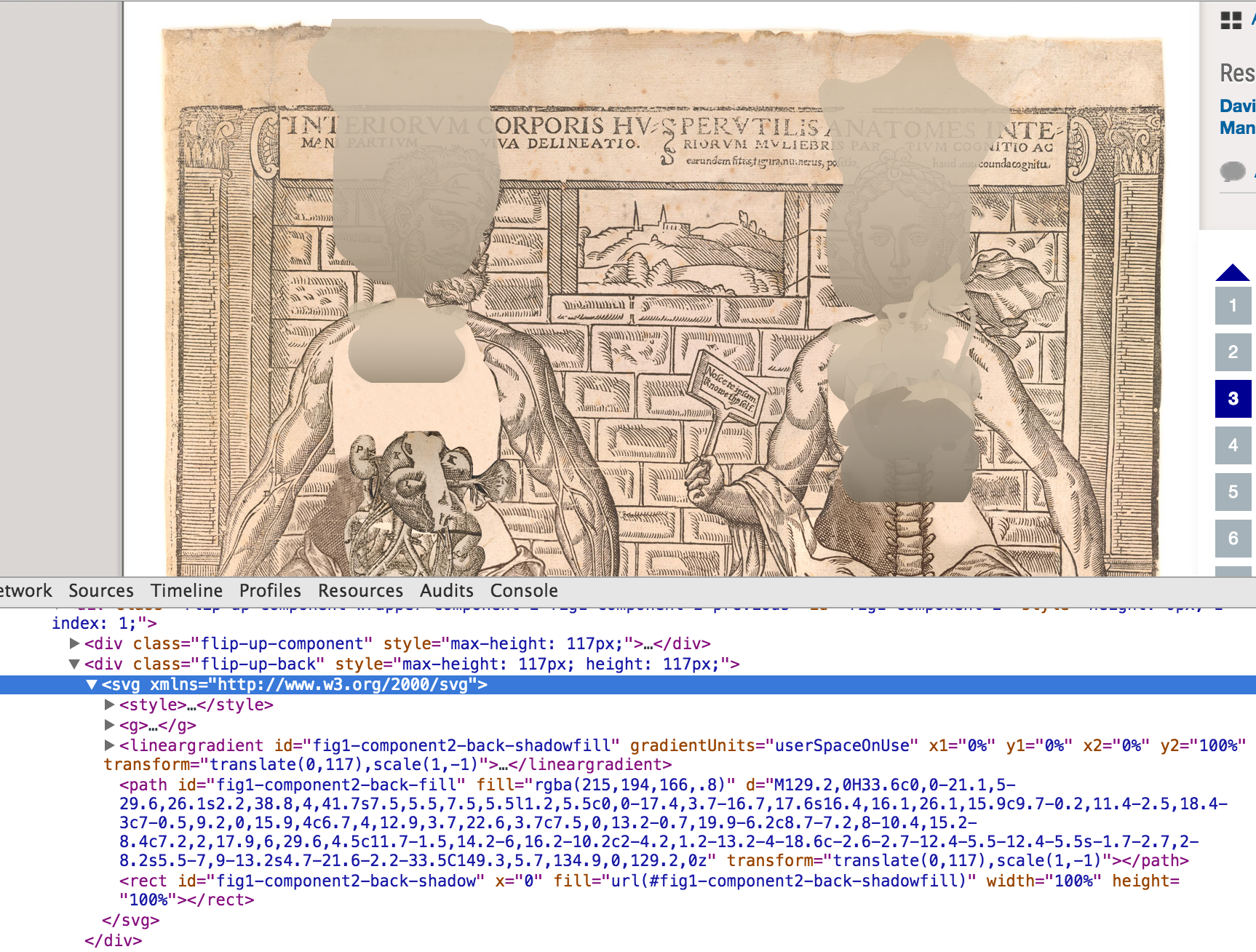
Better yet, think of it this way.  If that image were of a large family gathering and grandma lovingly wrote the date and names of all the people on the backside, that is basic metadata.  Without that information those people and the image would suddenly have less meaning, especially if you have no clue who those faces are in that family photo.  It is the same with digital projects.  Without descriptive metadata, the items we digitize would hold less meaning and prove less valuable for researchers, or at least be less searchable.  The better and more thorough the metadata, the more it promotes discovery in search engines.  (Check out the metadata from this Cornett family photo from the William Gedney collection.)

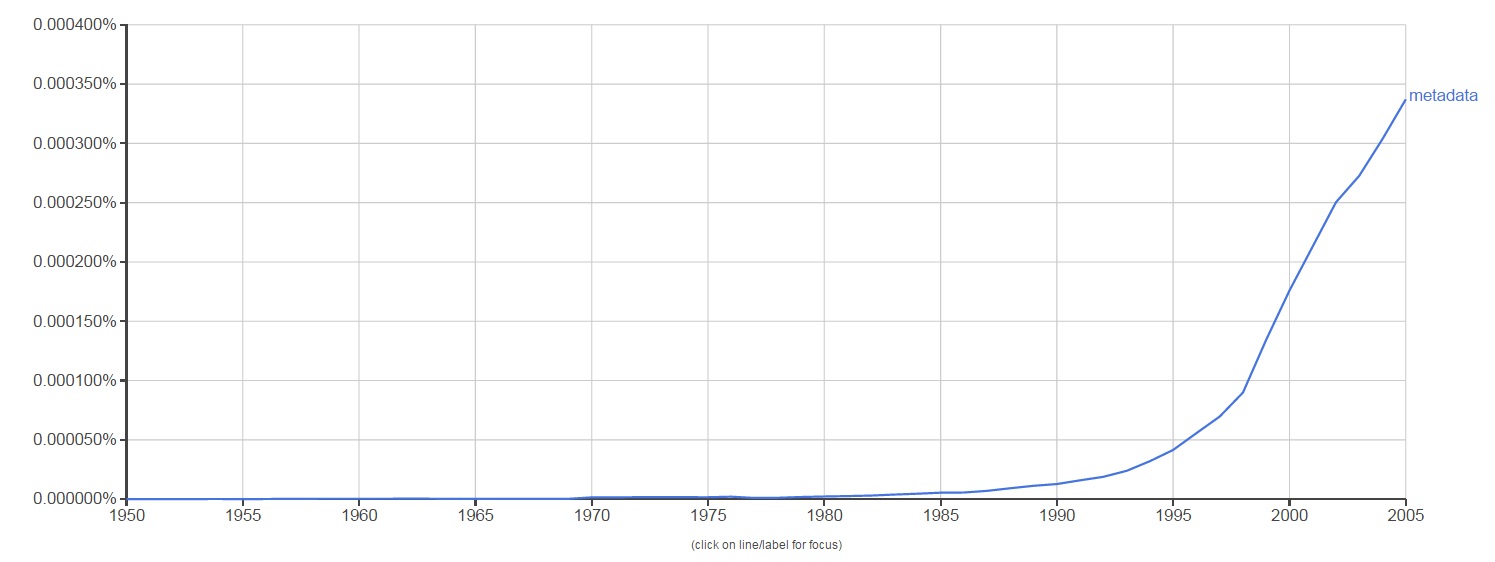
The term metadata was first used in the late 1960s in computer programming language.  With the advent of computing technology and the overabundance of digital data, metadata became a key element to help describe and retrieve information in an automated way.  The use of the word metadata in literature over the last 45 years shows a steeper increase from 1995 to 2005, which makes sense.  The term became used more and more as technology grew more widespread.  This is reflected in the graph below from Google’s Ngram Viewer, which scours over 5 million Google Books to track the usage of words and phrases over time.

metadatangram_blog
Google Ngram Viewer for “metadata”

Because of its link with computer technology, metadata is widely used in a variety of fields that range from computer science to the music industry.  Even your music playlist is full of descriptive metadata that relates to each song, like the artist, album, song title, and length of audio recording.  So, libraries and archives are not alone in their reliance on metadata.  Generating metadata is an invaluable step in the process of preserving and documenting the library’s unique collections.  It is especially important here at the Digital Production Center (DPC) where the digitization of these collections happens.  To better understand exactly how important a role metadata plays in our job, let’s walk through the metadata life cycle of one of our digital projects, the Duke Chapel Recordings.

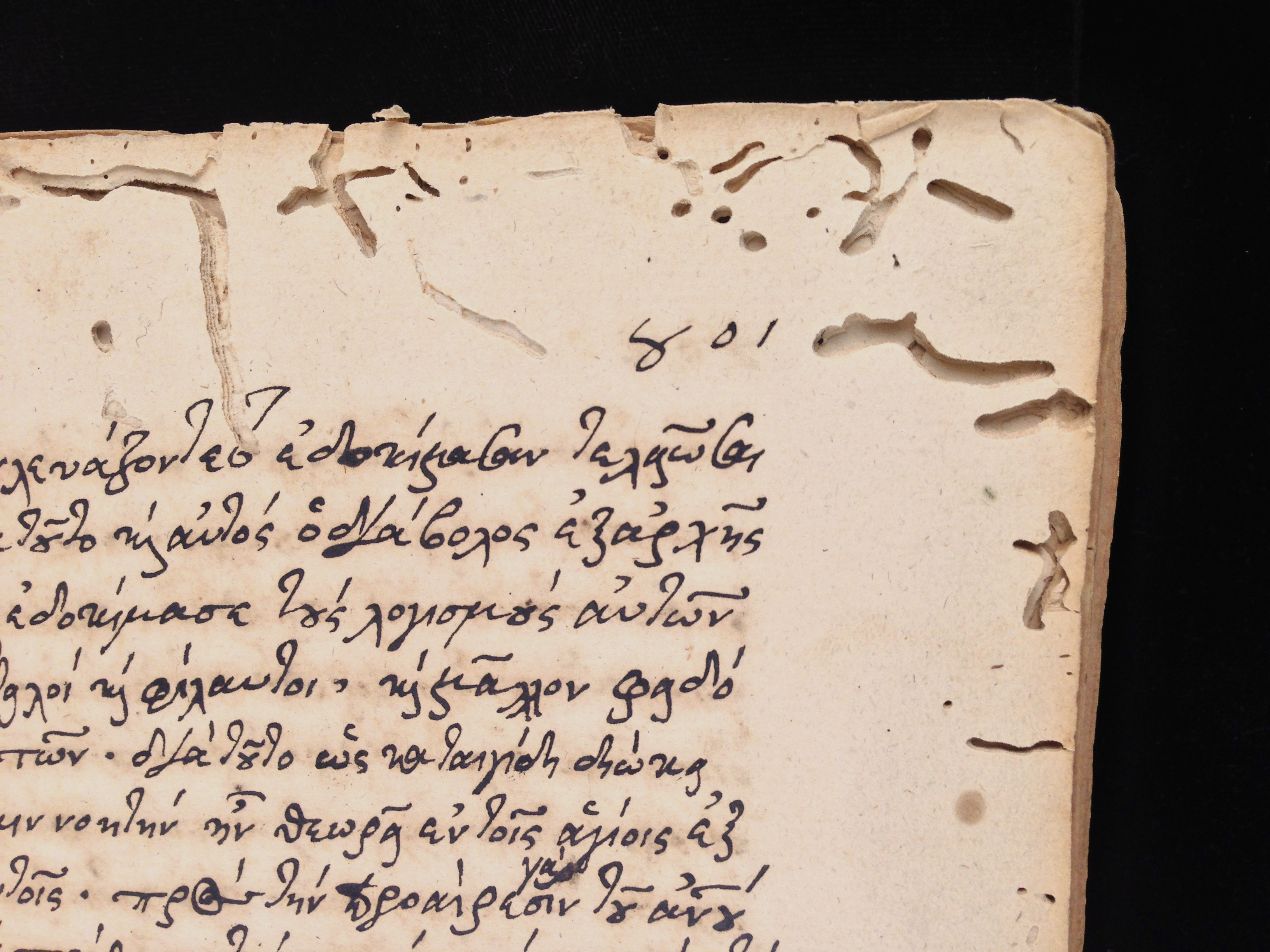
The Chapel Recordings project consists of digitizing over 1,000 cassette and VHS tapes of sermons and over 1,300 written sermons that were given at the Duke Chapel from the 1950s to 2000s.  These recordings and sermons will be added to the existing Duke Chapel Recordings collection online.  Funded by a grant from the Lilly Foundation, this digital collection will be a great asset to Duke’s Divinity School and those interested in hermeneutics worldwide.

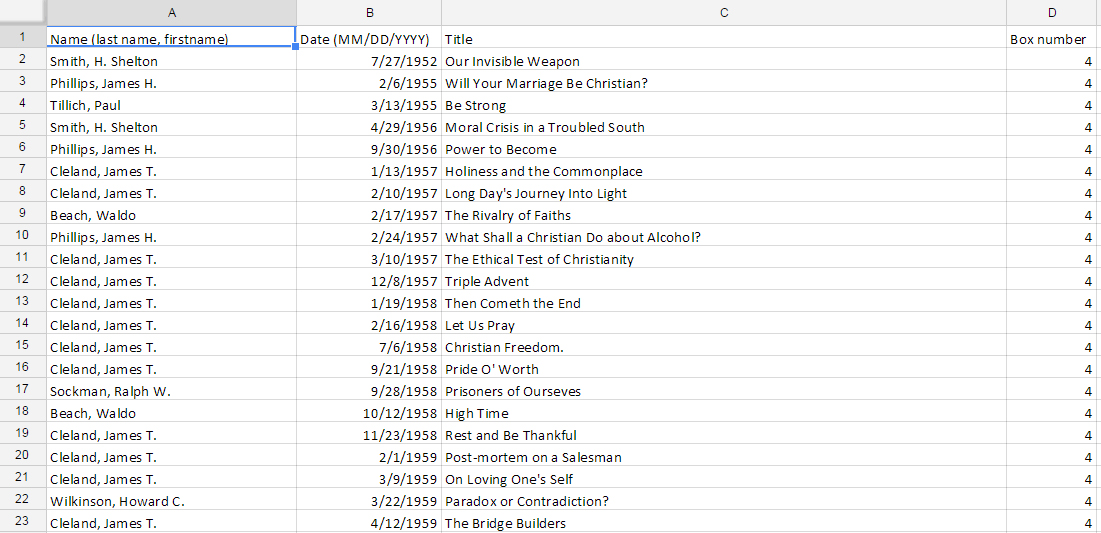
Before the scanners and audio capture devices are even warmed up at the DPC, preliminary metadata is collected from the analog archival material.  Depending on the project, this metadata is created either by an outside collaborator or in-house at the DPC.  For example, the Duke Chronicle metadata is created in-house by pulling data from each issue, like the date, volume, and issue number.  I am currently working on compiling the pre-digitization metadata for the 1950s Chronicle, and the spreadsheet looks like this:

1950sChronicle_blog
1950s Duke Chronicle preliminary metadata

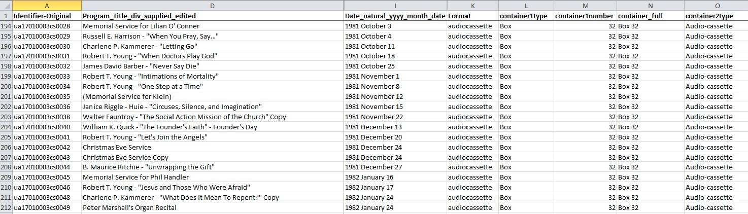
As for the Chapel Recordings project, the DPC received an inventory from the University Archives in the form of an Excel spreadsheet.  This inventory contained the preliminary metadata already generated for the collection, which is also used in Rubenstein Library‘s online collection guide.

inventorymetadata_blog
Chapel Recordings inventory metadata

The University Archives also supplied the DPC with an inventory of the sermon transcripts containing basic metadata compiled by a student.

inventorysermons_blog
Duke Chapel Records sermon metadata

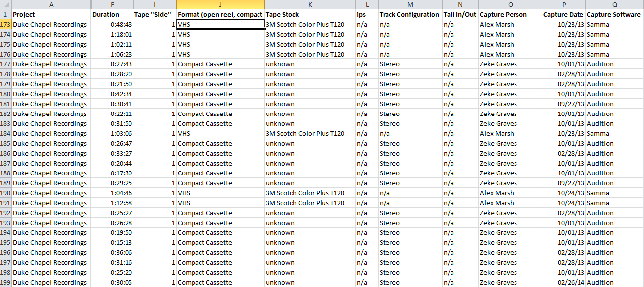
Here at the DPC, we convert this preliminary metadata into a digitization guide, which is a fancy term for yet another Excel spreadsheet.  Each digital project receives its own digitization guide (we like to call them digguides) which keeps all the valuable information for each item in one place.  It acts as a central location for data entry, but also as a reference guide for the digitization process.  Depending on the format of the material being digitized (image, audio, video, etc.), the digitization guide will need different categories.  We then add these new categories as columns in the original inventory spreadsheet and it becomes a working document where we plug in our own metadata generated in the digitization process.   For the Chapel Recordings audio and video, the metadata created looks like this:

digitizationmetadata_blog
Chapel Recordings digitization metadata

Once we have digitized the items, we then run the recordings through several rounds of quality control.  This generates even more metadata which is, again, added to the digitization guide.  As the Chapel Recordings have not gone through quality control yet, here is a look at the quality control data for the 1980s Duke Chronicle:

qcmetadata_blog
1980s Duke Chronicle quality control metadata

Once the digitization and quality control is completed, the DPC then sends the digitization guide filled with metadata to the metadata archivist, Noah Huffman.  Noah then makes further adds, edits, and deletes to match the spreadsheet metadata fields to fields accepted by the management software, CONTENTdm.  During the process of ingesting all the content into the software, CONTENTdm links the digitized items to their corresponding metadata from the Excel spreadsheet.  This is in preparation for placing the material online. For even more metadata adventures, see Noah’s most recent Bitstreams post.

In the final stage of the process, the compiled metadata and digitized items are published online at our Digital Collections website.  You, the researcher, history fanatic, or Sunday browser, see the results of all this work on the page of each digital item online.  This metadata is what makes your search results productive, and if we’ve done our job right, the digitized items will be easily discovered.  The Chapel Recordings metadata looks like this once published online:

onlinemetadata_blog
Chapel Recordings metadata as viewed online

Further down the road, the Duke Divinity School wishes to enhance the current metadata to provide keyword searches within the Chapel Recordings audio and video.  This will allow researchers to jump to specific sections of the recordings and find the exact content they are looking for.  The additional metadata will greatly improve the user experience by making it easier to search within the content of the recordings, and will add value to the digital collection.

On this journey through the metadata life cycle, I hope you have been convinced that metadata is a key element in the digitization process.  From preliminary inventories, to digitization and quality control, to uploading the material online, metadata has a big job to do.  At each step, it forms the link between a digitized item and how we know what that item is.  The life cycle of metadata in our digital projects at the DPC is sometimes long and tiring.  But, each stage of the process  creates and utilizes the metadata in varied and important ways.  Ultimately, all this arduous work pays off when a researcher in our digital collections hits gold.

What’s in my tool chest

I recently, while perhaps inadvisably, updated my workstation to the latest version of OS X (Yosemite) and in doing so ended up needing to rebuild my setup from scratch. As such, I’ve been taking stock of the applications and tools that I use on a daily basis for my work and thought it might be interesting to share them. Keep in mind that most of the tools I use are mac-centric, but there are almost always alternatives for those that aren’t cross-platform compatible.

Communications

Our department uses Jabber for Instant Messaging. The client of choice for OS X is Adium. It works great — it’s light weight, the interface is intelligible, custom statuses are easy to set, and the notifications are readily apparent without being annoying.

My email and calendaring client of choice is Microsoft Outlook. I’m using version 15.9, which is functionally much more similar to Outlook Web Access (OWA) than the previous version (Outlook 2011). It seems to startup much more quickly and it’s notifications are somehow less annoying, even though they are very similar. Perhaps it’s just the change in color scheme. I had some difficulty initially with setting up shared mailboxes, but I eventually got that to work. [go to Tools > Accounts, add a new account using the shared email address, set access type to username and password, and then use your normal login info. The account will then show up under your main mailbox, and you can customize how it’s displayed, etc.]

outlook
Outlook 2015 — now in blue!

Another group that I work with in the library has been testing out Slack, which apparently is quite popular within development teams at lots of cool companies. It seems to me to be a mashup of Google Wave, Newsgroups, and Twitter. Its seems neat, but I worry it might just be another thing to keep up with. Maybe we can eventually use it to replace something else wholesale.

Project Management

We mostly use basecamp for shared planning on projects. I think it’s a great tool, but the UI is starting to feel dated — especially the skeuomorphic text documents. We’ve played around a bit with some other tools (Jira, Trello, Asana, etc) but basecamp has yet to be displaced.

Basecamp text document (I don’t think Steve Jobs would approve)

We also now have access to enterprise-level Box accounts at Duke. We use Box to store project files and assets that don’t make sense to store in something like basecamp or send via email. I think their web interface is great and I also use Box Sync to regularly back up all of my project files. It has built-in versioning which has helped me on a number of occasions with accessing older version of things. I’d been a dropbox user for more than five years, but I really prefer Box now. We also make heavy use of Google Drive. I think everything about it is great.

Another tool we use a lot is Git. We’ve got a library Github account and we also use a Duke-specific private instance of Gitorious. I much prefer Github, fwiw. I’m still learning the best way to use git workflows, but compared to other version management approaches from back in the day (SVN, Mercurial) Git is amazing IMHO.

Design & Production

I almost always start any design work with sketching things out. I tend to grab sheets of 11×17 paper and fold them in half and make little mini booklets. I guess I’m just too cheap to buy real moleskins (or even better, fieldnotes). But yeah, sketching is really important. After that, I tend jump right in to do as much design work in the browser as is possible. However Photoshop, Illustrator, and sometimes Indesign, are still indispensable. Rarely a day goes by that I don’t have at least one of them open.

Still use it everyday...
Photoshop — I still use it a lot!

With regards to media production, I’m a big fan of Sony’s software products. I find that Vegas is both the most flexible NLE platform out there and also the most easy to use. For smaller quicker audio-only tasks, I might fire up Audacity. Handbrake is really handy for quickly transcoding things. And I’ll also give a shout out to Davinci Resolve, which is now free and seems incredibly powerful, but I’ve not had much time to explore it yet.

Development

My code editor of choice right now is Atom — note that it’s mac only. When I work on a windows box, I tend to use notepad++. I’ve also played around a bit with more robust IDEs, like Eclipse and Aptana, but for most of the work I do a simple code editor is plenty.

The UI is easy on the eyes
The Atom UI is easy on the eyes

For local development, I’m a big fan of MAMP. It’s really easy to setup and works great. I’ve also started spinning up dedicated local VMs using Oracle’s Virtual Box. I like the idea of having a separate dedicated environment for a given project that can be moved around from one machine to another. I’m sure there are other better ways to do that though.

I also want to quickly list some Chome browser plugins that I use for dev work: ColorPick Eyedropper, Window Resizer, LiveReload (thanks Cory!), WhatFont, and for fun, Google Art Project.

Testing

I also make use of Virtual Box for doing browser testing. I’ve got several different versions of Windows setup so I can test for all flavors of Internet Explorer along with older incarnations of Firefox, Chrome, and Opera. I’ve yet to find a good way to test for older versions of Safari, aside from using something static like browsershots.

With regards to mobile devices, I think testing on as many real-world variations as possible is ideal. But for quick and dirty tests, I make use of the iOS Simulator and the Android SDK emulator. the iOS simulator comes setup with several different hardware configs while you have to set these up manually with the Android suite. In any case, both tools provide a great way to quickly see how a given project will function across many different mobile devices.

Conclusion

Hopefully this list will be helpful to someone out in the world. I’m also interested in learning about what other developers keep in their tool chest.

Adventures in metadata hygiene: using Open Refine, XSLT, and Excel to dedup and reconcile name and subject headings in EAD

OpenRefine, formerly Google Refine, bills itself as “a free, open source, powerful tool for working with messy data.”  As someone who works with messy data almost every day, I can’t recommend it enough.  While Open Refine is a great tool for cleaning up “grid-shaped data” (spreadsheets), it’s a bit more challenging to use when your source data is in some other format, particularly XML.

Some corporate name terms from an EAD collection guide
Some corporate name terms from an EAD (XML) collection guide

As part of a recent project to migrate data from EAD (Encoded Archival Description) to ArchivesSpace, I needed to clean up about 27,000 name and subject headings spread across over 2,000 EAD records in XML.  Because the majority of these EAD XML files were encoded by hand using a basic text editor (don’t ask why), I knew there were likely to be variants of the same subject and name terms throughout the corpus–terms with extra white space, different punctuation and capitalization, etc.  I needed a quick way to analyze all these terms, dedup them, normalize them, and update the XML before importing it into ArchivesSpace.  I knew Open Refine was the tool for the job, but the process of getting the terms 1) out of the EAD, 2) into OpenRefine for munging, and 3) back into EAD wasn’t something I’d tackled before.

Below is a basic outline of the workflow I devised, combining XSLT, OpenRefine, and, yes, Excel.  I’ve provided links to some source files when available.  As with any major data cleanup project, I’m sure there are 100 better ways to do this, but hopefully somebody will find something useful here.

1. Use XSLT to extract names and subjects from EAD files into a spreadsheet

I’ve said it before, but sooner or later all metadata is a spreadsheet. Here is some XSLT that will extract all the subjects, names, places and genre terms from the <controlaccess> section in a directory full of EAD files and then dump those terms along with some other information into a tab-separated spreadsheet with four columns: original_term, cleaned_term (empty), term_type, and eadid_term_source.

controlaccess_extractor.xsl

 2. Import the spreadsheet into OpenRefine and clean the messy data!

Once you open the resulting tab delimited file in OpenRefine, you’ll see the four columns of data above, with “cleaned_term” column empty. Copy the values from the first column (original_term) to the second column (cleaned_term).  You’ll want to preserve the original terms in the first column and only edit the terms in the second column so you can have a way to match the old values in your EAD with any edited values later on.

OpenRefine offers several amazing tools for viewing and cleaning data.  For my project, I mostly used the “cluster and edit” feature, which applies several different matching algorithms to identify, cluster, and facilitate clean up of term variants. You can read more about clustering in Open Refine here: Clustering in Depth.

In my list of about 27,000 terms, I identified around 1200 term variants in about 2 hours using the “cluster and edit” feature, reducing the total number of unique values from about 18,000 to 16,800 (about 7%). Finding and replacing all 1200 of these variants manually in EAD or even in Excel would have taken days and lots of coffee.

refine_screeshot
Screenshot of “Cluster & Edit” tool in OpenRefine, showing variants that needed to be merged into a single heading.


In addition to “cluster and edit,” OpenRefine provides a really powerful way to reconcile your data against known vocabularies.  So, for example, you can configure OpenRefine to query the Library of Congress Subject Heading database and attempt to find LCSH values that match or come close to matching the subject terms in your spreadsheet.  I experimented with this feature a bit, but found the matching a bit unreliable for my needs.  I’d love to explore this feature again with a different data set.  To learn more about vocabulary reconciliation in OpenRefine, check out freeyourmetadata.org

 3. Export the cleaned spreadsheet from OpenRefine as an Excel file

Simple enough.

4. Open the Excel file and use Excel’s “XML Map” feature to export the spreadsheet as XML.

I admit that this is quite a hack, but one I’ve used several times to convert Excel spreadsheets to XML that I can then process with XSLT.  To get Excel to export your spreadsheet as XML, you’ll first need to create a new template XML file that follows the schema you want to output.  Excel refers to this as an “XML Map.”  For my project, I used this one: controlaccess_cleaner_xmlmap.xml

From the Developer tab, choose Source, and then add the sample XML file as the XML Map in the right hand window.  You can read more about using XML Maps in Excel here.

After loading your XML Map, drag the XML elements from the tree view in the right hand window to the top of the matching columns in the spreadsheet.  This will instruct Excel to map data in your columns to the proper XML elements when exporting the spreadsheet as XML.

Once you’ve mapped all your columns, select Export from the developer tab to export all of the spreadsheet data as XML.

Your XML file should look something like this: controlaccess_cleaner_dataset.xml

control_access_dataset_chunk
Sample chunk of exported XML, showing mappings from original terms to cleaned terms, type of term, and originating EAD identifier.


5. Use XSLT to batch process your source EAD files and find and replace the original terms with the cleaned terms.

For my project, I bundled the term cleanup as part of a larger XSLT “scrubber” script that fixed several other known issues with our EAD data all at once.  I typically use the Oxygen XML Editor to batch process XML with XSLT, but there are free tools available for this.

Below is a link to the entire XSLT scrubber file, with the templates controlling the <controlaccess> term cleanup on lines 412 to 493.  In order to access the XML file  you saved in step 4 that contains the mappings between old values and cleaned values, you’ll need to call that XML from within your XSLT script (see lines 17-19).

AT-import-fixer.xsl

What this script does, essentially, is process all of your source EAD files at once, finding and replacing all of the old name and subject terms with the ones you normalized and deduped in OpenRefine. To be more specific, for each term in EAD, the XSLT script will find the matching term in the <original_term>field of the XML file you produced in step 4 above.  If it finds a match, it will then replace that original term with the value of the <cleaned_term>.  Below is a sample XSLT template that controls the find and replace of <persname> terms.

XSLT template that find and replaces old values with cleaned ones.


Final Thoughts

Admittedly, cobbling together all these steps was quite an undertaking, but once you have the architecture in place, this workflow can be incredibly useful for normalizing, reconciling, and deduping metadata values in any flavor of XML with just a few tweaks to the files provided.  Give it a try and let me know how it goes, or better yet, tell me a better way…please.

More resources for working with OpenRefine:

“Using Google Refine to Clean Messy Data” (Propublica Blog)

freeyourmetadata.org

A Look Under the Hood—and the Flaps—of the Anatomical Fugitive Sheets Collection

We have digitized some fairly complex objects over the years that have challenged our Digital Collections team to push the boundaries of typical digital library solutions for digitization and publication. It happens often: objects we want to digitize are sort of like something we’ve done for a previous project, but not quite, so we can’t simply mimic whatever we did before to get the new project done. We’re frequently flexing our creative muscles.  In many cases, our most successful projects ended up that way because we didn’t concede to the temptation of representing items digitally in an oversimplified manner, or, worse still, as something they are not.

Working with so many rare and unique items from the Rubenstein Library through the years, we’ve become unfazed by these representation challenges and time and again have simply pulled together our team’s brainpower (and willpower) to make something work. Dare I say it, we’ve been unflappable. But this year, we met our match and surely needed some help.

In March, we published ten anatomical fugitive sheets from the 1500s to 1600s. They’re printed illustrations from the Rubenstein Library’s History of Medicine Collections, depicting the human body using layers of paper flaps that can be lifted to reveal internal organs. They’re amazing. They’re distinctive. And they’re really complicated.

Fugitive Sheet
Fugitive Sheet example, accessible online at http://library.duke.edu/digitalcollections/rubenstein_fgsms01003/ (Photo Credit: Les Todd)

The complexity of this project necessitated enlisting help from beyond the library’s walls. Early on, Prof. Mark Olson in Duke’s Art, Art History & Visual Studies department was instrumental in helping us identify modern technical approaches for capturing and modeling such objects. We contracted out development work through local web firm Cuberis, who programmed the bulk of the UI. In-house, we handled digitization, metadata, and integration with our discovery & access application with a lot of collaborative creativity between the digital collections team, the collection curator, conservators, and rare materials cataloger.

In a moment, I’ll discuss what modern technologies make the Fugitive Sheets interface hum. But first, here’s a look at what others have done with flap-based items.

Flaps in the Wind, Er… Wild

There are a few examples of anatomical flap objects represented on the Web, both at Duke and beyond. Common approaches include:

  1. A Sequence of Images. Capture one image of the full item for every state of the flaps possible, then let a user navigate them as if viewing a paginated document or photo sequence.
  2. Video. Either film someone lifting the flaps, or make an auto-playing video of the image sequence above.
  3. Flash. Develop a Flash application and put a SWF file on the web.

The third approach is actually what powers Duke’s Four Seasons project, which remains one of the best interactive historical anatomy interfaces available today. Developed way back in 2000 by Educational Media Services, Four Seasons began as a Java program distributed on CD-ROM (gasp!) and in subsequent years found a home as a Flash application embedded on the library website.

Flash-based flap interface for The Four Seasons, available at http://library.duke.edu/rubenstein/history-of-medicine/four-seasons

Flash has fallen out of favor over the last decade for many reasons, most notably: 1) it won’t work on iOS devices, 2) it’s bad for accessibility, 3) it’s invisible to search engines, and most importantly, 4) most of what Flash used to do exclusively can now be done just as well using HTML5.

Anatomy of a Modern Flap Interface

The Web has made giant leaps forward in the past five years due to advances in HTML, CSS, and Javascript and the evolution of web browsers. Key specs for HTML5 and CSS3 have been supported by all major browsers for several years now.  Below are the vital bits (so to speak) in use by the Anatomical Fugitive Sheets. Many of these things would not have worked (or worked well) on the Web five years ago.

HTML5 Parts

1. SVG (scalable vector graphics). An <svg> element in HTML contains shape data for each flap using a coordinates system. The <path> holds a string with line instructions using shorthand (M, L, c, etc.) for tracing the contour: MoveTo, Lineto, Curveto, Arcto. We duplicate the <path> with a transform attribute to render the shape of the back of the flap.

SVG for flap
SVG coordinates in a <path> element representing the back of a flap.

2. Cross-window messaging API. Each fugitive sheet is rendered within an <iframe> on a page and the clickable layer navigation lives in its parent page, so they’re essentially two separate web pages presented as if one. Having a click in one page do something in another is possible through the Javascript method postMessage, part of the HTML5 spec.

  • From parent page to iframe: frame.contentWindow.postMessage(message, '*');
  • From iframe to parent page: window.top.postMessage(message, '*');

CSS3 Parts

  1. transition Property. Here’s where the flap animation action happens.  The flap elements all have the style declaration transition:1s ease-in-out. That ensures that when a flap property like height changes, it animates over the course of one second, slower at the start and end and quicker in the middle.  Clicking to open a flap calls a Javascript function that simultaneously switches the height of the flap front to zero and the back to its full size.
  2. transform Property. This scales down the figure and all its interactive components for display in the iframe, e.g., body.framed .flip-up-wrapper { transform:scale(.5) }; This scaling doesn’t apply in the full-size and zoomed-in views and thus enables the flaps to work identically at full- or half-resolution.

Capture & Encoding

Capture

Because the fugitive sheets are large and extremely fragile, our Digital Production Center staff and conservators worked carefully together to untangle and prop open each flap to be photographed separately. It often required two or more people to steady and flatten the flaps while being careful not to cast shadows on the layer being shot. I wasn’t there, but in my mind I imagine a game of library Twister.

Staff captured images using an overhead reproduction camera using white paper below each flap to make it easier to later determine and crop the contours. Unlike most images we digitize, the flaps’ derivative images are stored and delivered in PNG format to preserve transparency.

Encoding

As we do for all digital collections, we encode in an XML document the structural, administrative, and descriptive data about the digital objects using accepted library standards so that 1) the data can be preserved and ported between applications, and 2) we can use it to power our discovery & access interface. We use METS, a flexible Library of Congress standard for describing all kinds of digital objects.

METS worked pretty well for representing the flap data (see example), and we tapped into a few parts of the standard that we’ve never or rarely used for other items. Specifically, we:

  • added the LC MIX namespace for technical image metadata
  • used an amdSec to store flap heights & widths
  • used file/@GROUPID to divide flap images between figure 1, figure 2, etc.
  • used fptr/area/@COORDS to hold the SVG path coordinates for each flap

The descriptive metadata for the fugitive sheets posed its own challenges outside the box for our usual projects. All the information about the sheets existed as MARC catalog records, and crosswalking from MARC to anything else is more of an art than a science.

Looking Ahead

We’ll try to build on the accomplishments from the Fugitive Sheets Collection as we tackle new complex digitization projects. The History of Medicine Collections in particular are brimming with items that will be far more challenging than these sheets to model, like paginated flap books with fold-out pages and flaps that open in different directions. Undaunted, we’ll keep flapping our wings to stay aloft.

When MiniDiscs Recorded the Earth

My last several posts have focused on endangered audio formats: open reel tape, compact cassette, and DAT. Each of these media types boasted some advantages over their predecessors, as well as disadvantages that ultimately led to them falling out of favor with most consumers. Whether entirely relegated to our growing tech graveyard or moving into niche and specialty markets, each of the above formats has seen its brightest days and now slowly fades into extinction.

This week, we turn to the MiniDisc, a strange species that arose from Sony Electronics in 1992 and was already well on its way to being no more than a forgotten layer in the technological record by the time its production was discontinued in 2013.

IMG_1783

The MiniDisc was a magneto-optical disc-based system that offered 74 minutes of high-quality digital audio per disc (up to 320 minutes in long-play mode). It utilized a psychoacoustic lossy compression scheme (known as ATRAC) that allowed for significant data compression with little perceptible effect on audio fidelity. This meant you could record near perfect digital copies of CDs, tapes, or records—a revolutionary feat before the rise of writable CDs and hard disc recording. The minidisc platform was also popular in broadcasting and field recording. It was extremely light and portable, had excellent battery life, and possessed a number of sophisticated file editing and naming functions.

Despite these advantages, the format never grabbed a strong foothold in the market for several reasons. The players were expensive, retailing at $750 on launch in December 1992. Even the smaller portable Minidisc “Walkman” never dropped into the low consumer price range.  As a result, relatively few music albums were commercially released on the format. Once affordable CD-Rs and then mp3 players came onto the scene, the Minidisc was all but obsolete without ever truly breaking through to the mainstream.

IMG_1787

I recently unearthed a box containing my first and only Minidisc player, probably purchased used on eBay sometime in the early 2000’s. It filled several needs for me: a field recorder (for capturing ambient sound to be used in audio art and music), a playback device for environmental sounds and backing tracks in performance situations, and a “Walkman” that was smaller, held more music, and skipped less than my clunky portable CD player.

While it was long ago superceded by other electronic tools in my kit, the gaudy metallic yellow still evokes nostalgia. I remember the house I lived in at the time, walks to town with headphones on, excursions into the woods to record birds and creeks and escape the omnipresent hum of traffic and the electrical grid. The handwritten labels on the discs provide clues to personal interests and obsessions of the time: “Circuit Bends,” “Recess – Musique Concrete Master,” “Field Recordings 2/28/04,” “PIL – Second Edition, Keith Hudson – Pick A Dub, Sonic Youth – Sister, Velvet Underground – White Light White Heat.” The sounds and voices of family, friends, and creative collaborators populate these discs as they inhabit the recesses of my memory.

IMG_1780

While some may look at old technology as supplanted and obsolete, I refrain from this kind of Darwinism. The current renaissance of the supposedly extinct vinyl LP has demonstrated that markets and tastes change, and that ancient audio formats can be resurrected and have vital second lives. Opto-magnetic ghosts still walk the earth, and I hear them calling. I’m keeping my Minidisc player.

You’re going to lose: The inherent complexity, and near impossibility, of developing for digital collections


“Nobody likes you. Everybody hates you. You’re going to lose. Smile, you f*#~.”

Joe Hallenbeck, The Last Boy Scout

Screen Shot 2015-04-01 at 12.17.56 PMWhile I’m glad not to be living in a Tony Scott movie, on occasion I feel like Bruce Willis’ character near the beginning of “The Last Boy Scout.” Just look at some of the things they say about us.

Current online interfaces to primary source materials do not fully meet the needs of even experienced researchers. (DeRidder and Matheny)

The criticism, it cuts deep. But at least they were trying to be gentle, unlike this author:

[I]n use, more often than not, digital library users and digital libraries are in an adversarial position. (Saracevic, p. 9)

That’s gonna leave a mark. Still, it’s the little shots they take, the sidelong jabs, that hurt the most:

The anxiety over “missing something” was quite common across interviews, and historians often attributed this to the lack of comprehensive search tools for primary sources. (Rumer and Schonfeld, p. 16)

Screen Shot 2015-04-03 at 10.57.02 AM
Item types in Tripod2.

I’m fond of saying that the youtube developers have it easy. They support one content type – and until recently, it was Flash, for pete’s sake – minimal metadata, and then what? Comments? Links to some other videos? Wow, that’s complicated.

By contrast, we’ve developed for no less than fifteen different item types during the life of Tripod2, the platform that we’ve used to provide discovery and access for Duke Digital Collections since March 2011. You want a challenge? Try building an interface for flippable anatomical fugitive sheets.  It’s one thing to create a feature allowing users to embed videos from a flat web-site structure; it’s quite another to allow it from a site loaded with heterogeneous content types, then extend it to include items nested within multiple levels of description in finding aids (for an example, see the “Southwest Georgia Voters Project” item here).

I think the problem set of developing tools for digitized primary sources is one of the most interesting areas in the field of librarianship, and for the digital collections team, it’s one of our favorite areas of work. However, the quotes that open this post (the ones not delivered by Bruce Willis, anyway) are part of a literature that finds significant disparity between the needs of the researchers who form our primary audience and the tools that we – collectively speaking, in the field of digital libraries – have built.

Our team has just begun work on our next-generation platform for digital collections, which we call Tripod3. It will be built on the Fedora/Hydra framework that our Digital Repository Services team is using to develop the Duke Digital Repository. As the project manager, I’m trying to catch up on the recent literature of assessment for digital collections, and consider how we can improve on what we’ve done in the past. It’s one of the main ways  we can engage with researchers, as I wrote about in a previous post.

One of the issues we need to address is the problem of archival context. It’s something that the users of digitized primary sources cite again and again in the studies I’ve read. It manifests itself in a few ways, and could be the subject of a lengthier piece, but I think Chassanoff gives a good sense of it in her study (pp. 470-1):

Overall, findings suggest that historians seem to feel most comfortable using digitized sources when an online environment replicates essential attributes found in archives. Materials should be obtained from a reputable repository, and the online finding aid should provide detailed description. Historians want to be able to access the entire collection online and obtain any needed information about an item’s provenance. Indeed, the possibility that certain materials are omitted from an online collection appears to be more of a concern than it is in person at an archives.

The idea of archival context poses what I think is the central design problem of digital collections. It’s a particular challenge because, while it’s clear that researchers want and require the ability to see an object in its archival context, they also don’t want it. By which I mean, they also want to be able to find everything in the same flat context that everything assumes with a retrieval service like Google.

Archival context implies hierarchy, using the arrangement of the physical materials to order the digital. We were supposed to have broken away from the tyranny of physical arrangement years ago. David Weinberger’s Everything is Miscellaneous trumpeted this change in 2007, and while we had already internalized what he called the “third order of order” by then, it is the unambiguous way of the world now.

With our Tripod2 platform, we built both a shallow “digital collections miscellany” interface at http://library.duke.edu/digitalcollections/, but later started embedding items directly in finding aids.  Examples of the latter include the Jazz Loft Project Records and the Alexander Stephens Papers. What we never did was integrate these two modes of publication for digitized primary sources. Items from finding aids do not appear in search results for the main digital collections site, and items on the main site do not generally link back to the finding aid for their parent collection, and not to the series in which they’re arranged.

While I might give us a passing grade for the subject of “Providing archival context,” it wouldn’t be high enough to get us into, say, Duke. I expect this problem to be at the center of our work on the next-generation platform.


Sources


Alexandra Chassanoff, “Historians and the Use of Primary Materials in the Digital Age,” The American Archivist 76, no. 2, 458-480.

Jody L. DeRidder and Kathryn G. Matheny, “What Do Researchers Need? Feedback On Use of Online Primary Source Materials,” D-Lib Magazine 20, no. 7/8, available at http://www.dlib.org/dlib/july14/deridder/07deridder.html

Jennifer Rumer and Roger C. Schonfeld, “Supporting the Changing Research Practices of Historians: Final Report from ITHAKA S+R,” (2012), http://www.sr.ithaka.org/sites/default/files /reports/supporting-the-changing-research-practices-of-historians.pdf.

Tefko Saracevic, “How Were Digital Libraries Evaluated?”, paper first presented at the DELOS WP7 Workshop on the Evaluation of Digital Libraries (2004), available at http://www.scils.rutgers. edu/~tefko/DL_evaluation_LIDA.pdf

Small Problems, Little Solutions

I have been thinking lately about tools that make tasks I repeat frequently more efficient. For example, I’m an occasional do-it-yourself home repairer and have an old handsaw that works just fine for cutting a few pieces of wood for small repairs. It’s easy to understand how to use the saw, takes very little planning, and takes just a bit of manual effort.

P1040015

Last summer, however, I faced a larger task of rebuilding a whole section of my deck that had rotted. I began using the handsaw to cut the wood I would need for the repair and quickly realized my usual method was going take a long time and make me very sore and unhappy. I needed a better tool and method. This better tool was an electric circular saw, which is more expensive, harder to understand how to use, and more dangerous than the handsaw, but much more efficient. Since I have a healthy fear of death and dismemberment, I also took some time to learn how to use the dreadful thing in a safe manner. It took an initial investment in time and effort, but with the electric saw I was able to make much faster and less painful progress repairing the deck.

I encounter similar kinds of problems when writing software and making things for the web. It’s perfectly possible to do these things using a basic text editor to write everything out by hand. I got along fine this way for a long time. But there are many ways to make this work more efficient. The rest of this post is mainly a list of techniques and tools I’ve invested time and energy to learn to use to reduce annoying, repetitive tasks.

My favorite time and effort saver is learning how to execute common tasks in a text editor using keyboard shortcuts. Here are a few examples of shortcuts I use many times a day in my favorite editor, Sublime Text 2. The ones I used the most involve moving the cursor or text around without touching the mouse. (These are specific to Macintosh computers, but there are similar shortcuts available in other operating systems.)

  • Hold down the Option key and use the left and right arrow keys to move the cursor a word at a time instead of a space at a time.
  • Hold down the Command key and use the left or right arrow to move to the beginning or end of a line. The up or down arrow will take you to the top or end of the document.
  • Add the shift key to the above shortcuts to select text as the cursor moves.
  • The delete key will also work with these shortcuts.
  • Indent a line of text or a whole block of text using the Command key and the left and right brackets.

There are also more advanced text editor features or plugins that make coding easier by reducing the amount you have to type by hand.

Emmet is a utility that does a few things, but it mainly lets you use abbreviated CSS syntax to generate full HTML markup. For example I can type div.special and when I hit the tab key Emmet automatically turns that into:
Screen Shot 2015-03-13 at 5.17.21 PM
You can string these together to generate multi line nested HTML markup from a single string.

SublimeCodeIntel is another plugin for the text editor I use. It adds an intelligent auto-suggest menu that updates as you type with things that are specific to the programming language you’re working in and the specific program. For example in PHP it if I type “e” it will suggest “echo” and I can hit enter to use that suggestion. It also remembers things like the variable and class names in the project you’re working on. It even seems to learn what terms you use most frequently and suggests those first. It saves much typing.

There are also a couple of utilities I run in a terminal window while I’m working to automate different tasks. Many of these are powered by Guard, which is a Rails Gem that watches for changes to files. This is more useful than it might sound. For example, Guard can run LiveReload. When Guard notices a file has changed that you told it to watch it triggers LiveReload that then refreshes your browser window. With this tool I can make small changes to a project and see the updates in realtime in my browser without having the refresh the page manually. There are also Guard utilities for running tests, compressing JavaScript, and generating browser friendly CSS from easier to write and maintain (coder friendly) SCSS.

687474703a2f2f636c2e6c792f696d6167652f316b336f3172325a3361304a2f67756172642d49636f6e2e706e67

These are just a few of the ways I try to streamline repetitive tasks.

Building a Kiosk for the Edge

Many months ago I learned that a new space, The Ruppert Commons for Research, Technology, and Collaboration, was going to be opening at the start of the calendar year. I was tasked with building an informational kiosk that would be seated in the entry area of the space. The schedule was a bit hectic and we ended up pruning some of the desired features, but in the end I think our first iteration has been working well. So, I wanted to share the steps I took to build it.

Setting Requirements

I first met with the Edge team at the end of August 2014. They had an initial ‘wish list’ of features that they wanted to be included in the kiosk. We went through the list and talked about the feasibility of those items, and tried to rank their importance. Our final features list looked something like this:

Primary Features:

  • Events list (both public and private events in the space)
  • Room reservation system
  • Interactive floor plan map
  • Staff lookup
  • Current Time
  • Contact information (chat, email, phone)

Secondary Features:

  • Display of computer availability
  • Ability to report printing / scanning problems
  • Book locations
  • Scheduleable content on ‘home’ screen

Our deadline was the soft opening date of the space at the start of the new year, but with the approaching holidays (and other projects competing for time) this was going to be a pretty fast turn around. My goal was to have a functional prototype ready for feedback by mid October. I really didn’t start working on the UI side of things until early that month, so I ended up needing to kick that can down the road a few weeks, but that happens some times.

The Hardware

The Library had purchased two Dell 27″ XPS all-in-one touchscreen machines for the purpose of serving as an informational kiosk near the new/temporary main entrance of Perkins/Bostock. For various reasons, that project kept getting postponed. But with the desire to also have a kiosk in the Edge, we decided we could use one of the Dell machines for this purpose. The touch screen display is great —  very bright, reasonably accurate color reproduction, and responsive to touch inputs. It does pickup a lot of finger prints, but that’s sort of unavoidable with a glossy display. The machine seems to run a little bit hot and the fan is far from silent, but in the space you don’t notice it at all. My favorite aspect of this computer is the stand. It’s really fantastic — it’s super easy to adjust, but also very sturdy. You can position it in a variety of ways, depending on the space you’re using it in, and be confident that it won’t slip out of adjustment even under constant use. Various positions of Dell computer 
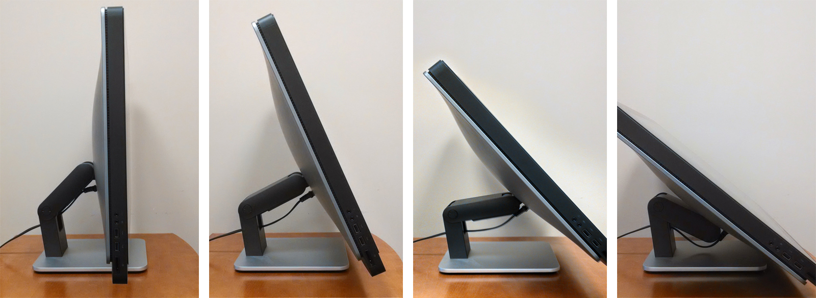
I think in general we’re a little wary of using consumer grade hardware in a 24/7 public environment, but for the 1.5 months it’s been deployed it seems to be holding up well enough.

The OS

The Dell XPS came from the factory with Windows 8. I was really curious about using Assigned Access Mode in the Windows 8.1, but the need to use a local (non-domain) account necessitated a clean install of 8.1, which sounds annoying, but that process is so fast and effortless, at least compared to days of Windows yore, that it wasn’t a huge deal. I eventually configured the system as desired — it auto-boots into the local account on startup and then fires up the assigned Windows app (and limits the machine only to that app).

I spent some time playing around with different approaches for a browser to use with assigned access. The goal was to have a browser that ran in a ‘kiosk’ mode in that there was no ability for the user to interact with anything outside of the intended kiosk UI — meaning, no browser chrome windows, bookmarks, etc. I also planned to use Microsoft’s Family Safety controls to limit access to URLs outside of the range of pages that would comprise the kiosk UI. I tried both Google Chrome and Microsoft IE 11 (which really is a good browser, despite pervasive IE hate), but I ended up having trouble with both of them in different ways. Eventually, I stumbled on to a free Windows Store app called KIOSK SP Browser. It does exactly what I want — it’s a simple, stripped down, full screen browser app. It also has some specific kiosk features (like timeout detection) but I’m only using it to load the kiosk homepage on startup.

The Backend

As several of the requirements necessitated data sources that live in the Drupal system that drives our main library site, I figured the path of least resistance would be to also build the kiosk interface in Drupal. Using the Delta module, I setup a version of our theme that stripped out most of the elements that we wouldn’t be using (header, footer, etc.) for the kiosk. I could then apply the delta to a small range of pages using the Context Module. The pages themselves are quite simple by and large. Screen shots of the pages in the Edge Kiosk

  • Events — I used a View to import an RSS feed from Yahoo Pipes (which combines events from our own Library system and the larger Duke system).
  • Reserve Spaces – this page loads in content from Springshare’s LibCal system using an iFrame.
  • Map — I drew a simplified map in Illustrator based architect’s floor plan , then saved it out as an SVG and added ID tags to the areas I wanted to make interactive.
  • Staff — this page loads in content from a google spreadsheet using a technique I outlined previously on Bitstreams.
  • Help — this page loads our LibraryH3LP Chat Widget and a Qualtrics email form.

The Frontend

When it comes time to design an interface, my first step is almost always to sketch on paper. For this project, I did some playing around and ended up settling on a circular motif for the main navigational interface. I based the color scheme and typography on a branding and style guide that was developed for the Edge. Edge Kiosk home page design 
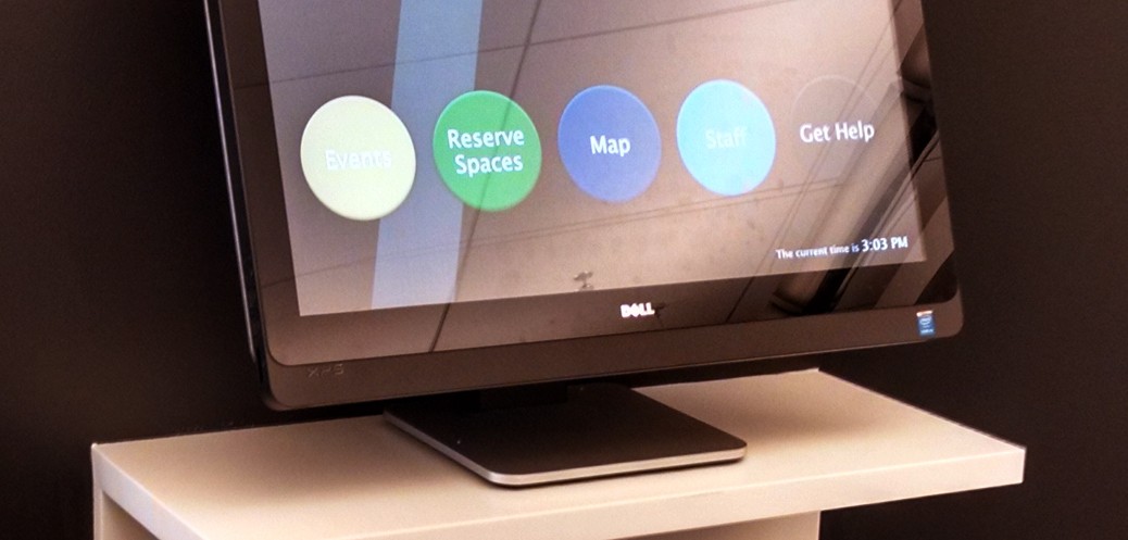
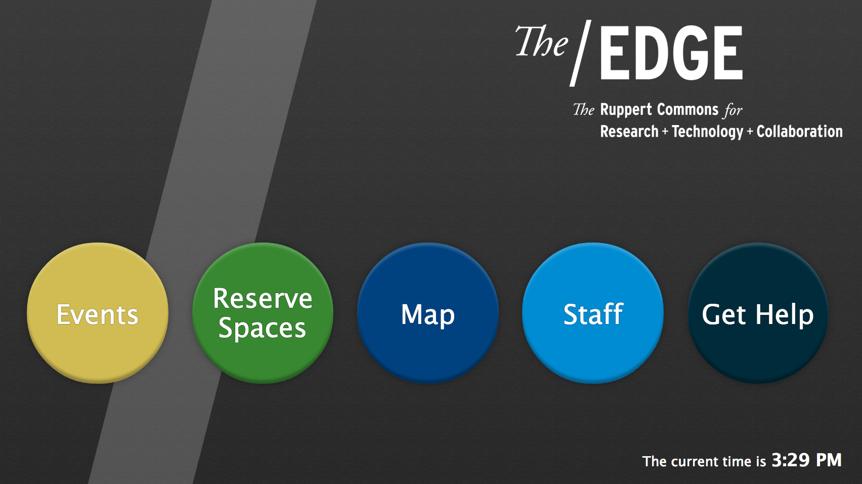
Many years ago I used to turn my sketches into high fidelity mockups in photoshop or illustrator, but for the past couple of years I’ve tended to just dive right in and design on the fly with html/css. I created a special stylesheet just for this kiosk — it’s based on a fixed pixel layout as it is only ever intended to be used on that single Dell computer — and also assigned it to load using Delta. One important aspect of a kiosk is providing some hinting to users that they can indeed interact with it. In my experience, this is usually handled in the form of an attract loop.

I created a very simple motion design using my favorite NLE and rendered out an mp4 to use with the kiosk. I then setup the home page to show the video when it first loads and to hide it when the screen is touched. This helps the actual home page content appear to load very quickly (as it’s actually sitting beneath the video). I also included a script on every page to go to the homepage after a preset period on inactivity. It’s currently set to three minutes, but we may tweak that. Video stills of attract loop All in all I’m pleased with how things turned out. We’re planning to spend some time evaluating the usage of the kiosk over the next couple of months and then make any necessary tweaks to improve user experience. Swing by the Edge some time and try it out!

Challenges of Embedding

One Person, One Vote project room in The/Edge. Countdown shows 17 days until launch

During its first five months, the One Person, One Vote project concentrated on producing content. The forthcoming website (onevotesncc.org) tells the story of how the Student Nonviolent Coordinating Committee’s (SNCC) commitment to community organizing forged a movement for voting rights made up of thousands of local people. When the One Person, One Vote site goes live on March 2nd (only 17 days from today!), it will include over 75 profiles of the sharecroppers and maids, World War II veterans and high school students, SNCC activists and seasoned mentors that are the true heroes in the struggle for voting rights. From September through January, the project team scoured digital collections, archival resources, secondary sources, and internet leads to craft these stories.

At the end of January, the One Person, One Vote WordPress theme was finished and our url was working. The project had just settled into its new space in The/Edge, Duke Libraries new hub for research, technology, and collaboration, making it a great time to start a new phase of the project: populating and embedding.

An example of the layout of a profile on One Person, One Vote with photos embedded in the context and primary source documents in the right sidebar.

Unlike traditional digital collections, the One Person, One Vote site does not host any of the primary source material it uses. Instead, it acts as a digital gateway, embedding and linking to material hosted in different digital collections at institutions across the country. These include the Wisconsin Historical Society’s Freedom Summer Collection, the Civil Rights in Mississippi Digital Archive at the University of Southern Mississippi, Duke’s SNCC 40th Anniversary and Joseph Sinsheimer collections, and the Trinity College’s 1988 SNCC conference tapes to name only a few. Every profile featured on the One Person, One Vote site includes 4 – 8 unique sources, and the entire site has over 400 items embedded in it.

Figuring out how to cleanly and uniformly  embed sources has been a challenge to say the least. Many archival institutions use the archival management system, CONTENTdm, to organize their digital collections. The Veterans of the Civil Rights Movement website hosts their documents as pdf files. The Library of Congress provides an embed code for the oral histories in their Civil Rights Oral History Project, but they also post them on YouTube. Meanwhile, the McComb Legacies Project and Trinity College use Vimeo. The amount of digitized material is staggering but how it’s made available is far from standardized. So by trial and error, One Person, One Vote is slowly coming up with answers to the question: how do we bring diverse sources together to tell a compelling story (both narrative-wise and visually) of the grassroots struggle for voting rights? Right now, these are some of our footnotes.

The One Person, One Vote Project's running footnotes on how to embed primary source material.
A selection of the One Person, One Vote Project’s growing list of footnotes on how to embed primary source material.


Indiana Jones and The Greek Manuscripts

One of my favorite movies as a youngster was Steven Spielberg’s “Raiders of the Lost Ark.” It’s non-stop action as the adventurous Indiana Jones criss-crosses the globe in an exciting yet dangerous race against the Nazis for possession of the Ark of the Covenant. According to the Book of Exodus, the Ark is a golden chest which contains the original stone tablets on which the Ten Commandments are inscribed, the moral foundation for both Judiasm and Christianity. The Ark is so powerful that it single-handedly destroys the Nazis and then turns Steven Spielberg and Harrison Ford into billionaires. Countless sequels, TV shows, theme-park rides and merchandise follow.

emsgk010940010
Greek manuscript 94, binding consists of heavily decorated repoussé silver over leather.

Fast-forward several decades, and I am asked to digitize Duke Libraries’ Kenneth Willis Clark Collection of Greek Manuscripts. Although not quite as old as the Ten Commandments, this is an amazing collection of biblical texts dating all the way back to the 9th century. These are weighty volumes, hand-written using ancient inks, often on animal-skin parchment. The bindings are characterized as Byzantine, and often covered in leathers like goatskin, sometimes with additional metal ornamentation. Although I have not had to run from giant boulders, or navigate a pit of snakes, I do feel a bit like Indiana Jones when holding one of these rare, ancient texts in my hands. I’m sure one of these books must house a secret code that can bestow fame and fortune, in addition to the obvious eternal salvation.

Before digitization, Senior Conservator Erin Hammeke evaluates the condition of each Greek manuscript, and rules out any that are deemed too fragile to digitize. Some are considered sturdy enough, but still need repairs, so Erin makes the necessary fixes. Once a manuscript is given the green light for digitization, I carefully place it in our book cradle so that it cannot be opened beyond a 90-degree angle. This helps protect our fragile bound materials from unnecessary stress on the binding. Next, the aperture, exposure, and focus are carefully adjusted on our Phase One P65+ digital camera so that the numerical values of our X-rite color calibration target, placed on top of the manuscript, match the numerical readings shown on our calibrated monitors.

cradle
Greek manuscript 101, with X-Rite color calibration target, secured in book cradle.

As the photography begins, each page of the manuscript is carefully turned by hand, so that a new image can be made of the following page. This is a tedious process, but requires careful concentration so the pages are consistently captured throughout each volume. Right-hand (recto) pages are captured first, in succession. Then the volume is turned over, so that the left-hand (verso) pages can be captured. I can’t read Greek, but it’s fascinating to see the beauty of the calligraphy, and view the occasional illustrations that appear on some pages. Sometimes, I discover that moths, beetles or termites have bored through the pages over time. It’s interesting to speculate as to which century this invasive destruction may have occurred. Perhaps the Nazis from the Indiana Jones movies traveled back in time, and placed the insects there?

worm2
Greek manuscript 101, showing insect damage.

Once the photography is complete, the recto and verso images are processed and then interleaved to recreate the left-right page order of the original manuscript. Next, the images go through a quality-control process in which any extraneous background area is cropped out, and each page is checked for clarity and consistent color and illumination. After that, another round of quality control insures that no pages are missing, or out of order. Finally, the images are converted to Pyramid TIFF files, which allow our web site users to zoom out and see all the pages at once, or zoom in to see maximum detail of any selected page. 38 Greek manuscripts are ready for online viewing now, and many more are coming soon. Stay tuned for the exciting sequel: “Indiana Jones and Even More Greek Manuscripts.”