
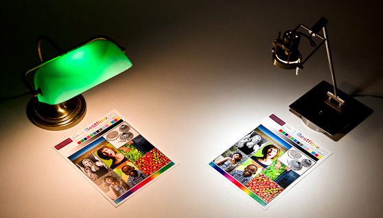
The era in which libraries have digitized their collections and published them on the Internet is less than two decades old. As an observer and participant during this time, I’ve seen some great projects come online. For me, one stands out for its impact and importance – the Farm Security Administration/Office of War Information Black-and-White Negatives, which is Library of Congress’ collection of 175,000 photographs taken by employees of the US government in the 1930s and 40s.
The FSA photographers produced some of the most iconic images of the past century. In the decades following the program, they became known via those who journeyed to D.C. to select, reproduce, and publish in monographs, or display in exhibits. But the entire collection, funded by the federal government, was as public as public domain gets. When the LoC took on the digitization of the collection, it became available in mass. All those years, it had been waiting for the Internet.

The FSA photographers covered the US. This wonderful site built by a team from Yale can help you determine whether they passed through your hometown. Between 1939 and 1940, Dorothea Lange, Marion Post Wolcott, and Jack Delano traveled through the town and the county where I live, and some 73 of their photos are now online. I’ve studied them, and also witnessed the wonderment of my friends and neighbors when they happen upon the pictures. The director of the FSA program, Roy Stryker, was one of the visionaries of the Twentieth Century, but it took the digital collection to make the scope and reach of his vision apparent.
Photography has been an emphasis of our own digital collections program over the years. At the same time that the FSA traveled to rural Chatham County on their mission of “introducing America to Americans,” anonymous photographers employed by the RC Maxwell Company shot their outdoor advertising installations in places like Atlantic City, New Jersey and Richmond, Virginia. Maybe they were merely “introducing advertising to advertisers,” but I like to think of them as our own mini-Langes and mini-Wolcotts, freezing scenes that others cruised past in their Studebakers.
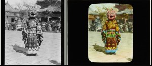
Certainly the most important traveling photographer we’ve published has been Sidney Gamble, an American who visited Asia, particularly China, on four occasions between 1908 and 1932. As with the FSA photos, I’ve spent time studying the scenes of places known to me. I’ve never been to China or Siberia, but I did live in Japan for a while some years ago, and come back to photos of a few places I visited – or maybe didn’t – while I was there.
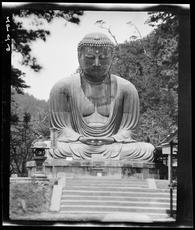
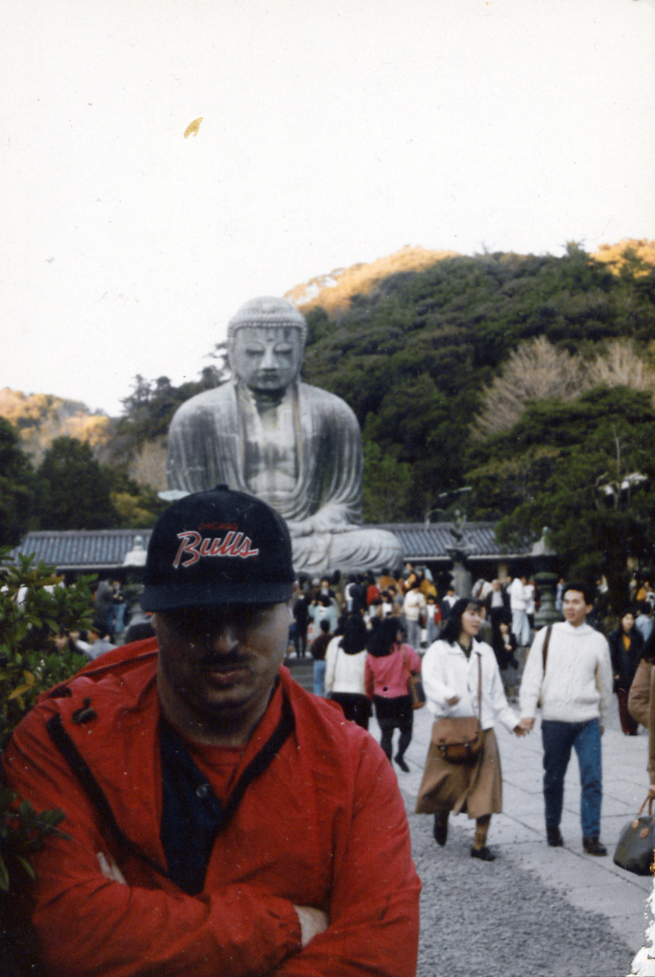
The first place is the Great Buddha at Kamakura. It’s a popular tourist site south of Tokyo; I visited with some friends in 1990. Our collection has four photographs by Gamble of the Daibutsu. I don’t find anything particular of interest in Gamble’s shots, just the unmistakable calm and grandeur of the same scene I saw 60+ years later.
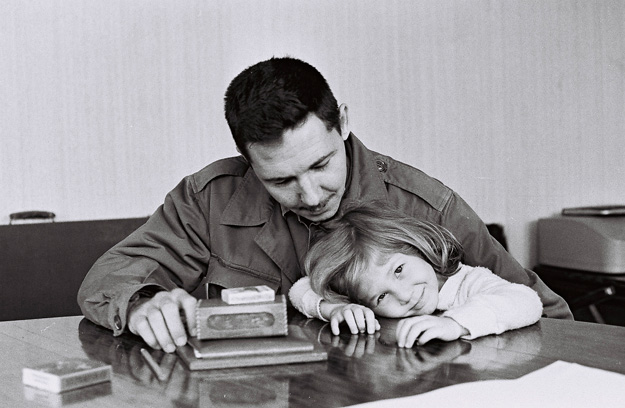
More intriguing for me, however, is the photo that Gamble took of the YMCA* in Yokohama, probably in 1917. For a while during my stay in Japan, I lived a few train stops from Yokohama, and got involved in a weekly game of pickup basketball at the Y there. I don’t remember much about the exterior of the building, but I recall the interior as somewhat funky, with lots of polished wood and a sweet wooden court. It was very distinctive for Tokyo and environs – a city where most of the architecture is best described as transient and flimsy, designed to have minimum impact when flattened by massive forces like earthquakes or bombers. I’ve always wondered if the building in Gamble’s photo was the same that I visited.
* According to his biography on Wikipedia, Gamble was very active in the YMCA both at home and in his travels.

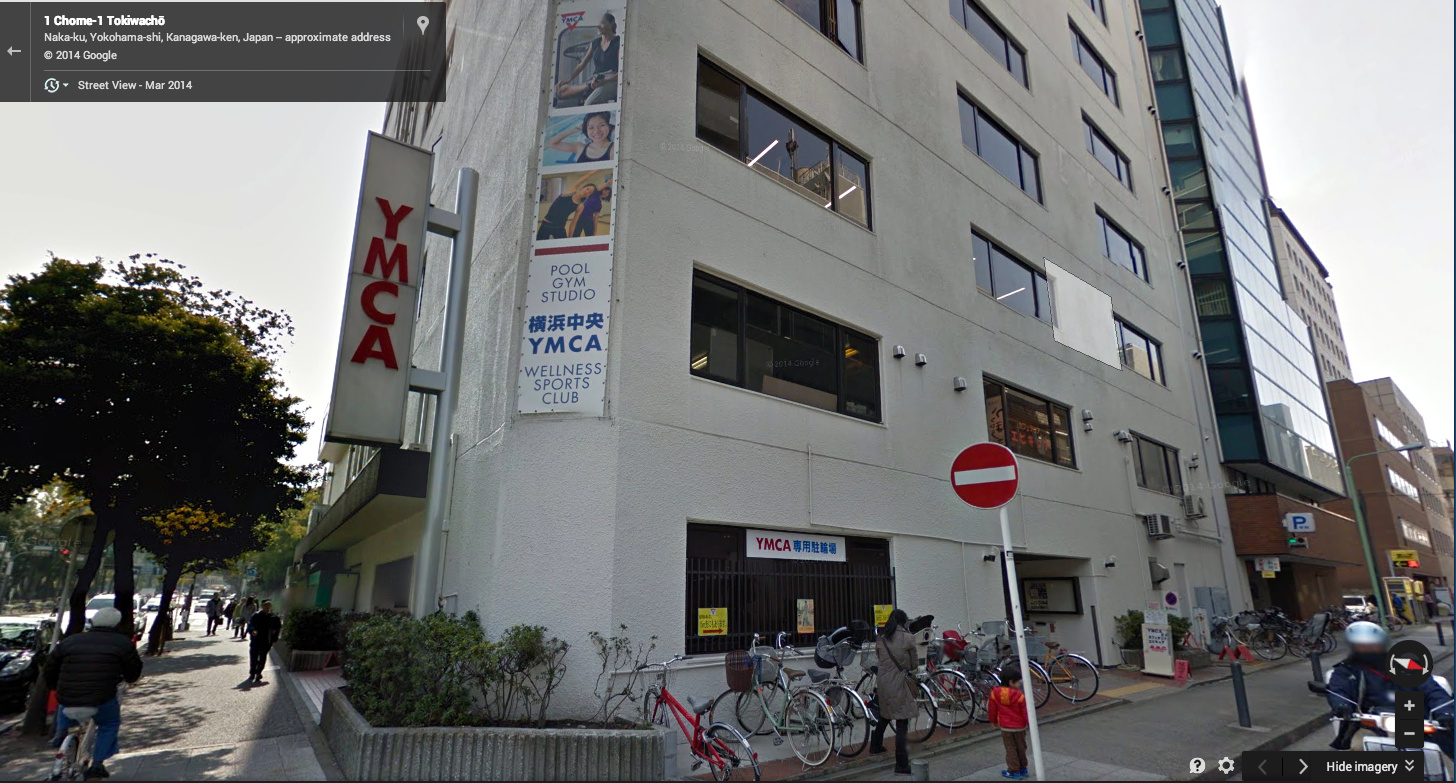
So I began to construct a response to this question based entirely on my own fading memories, some superficial research, and a fractional comprehension of a series of youtube videos on the history of the YMCA in Yokohama. To begin with, a screenshot of Google street view of the Yokohama YMCA in 2011 shows a building quite different from the original.
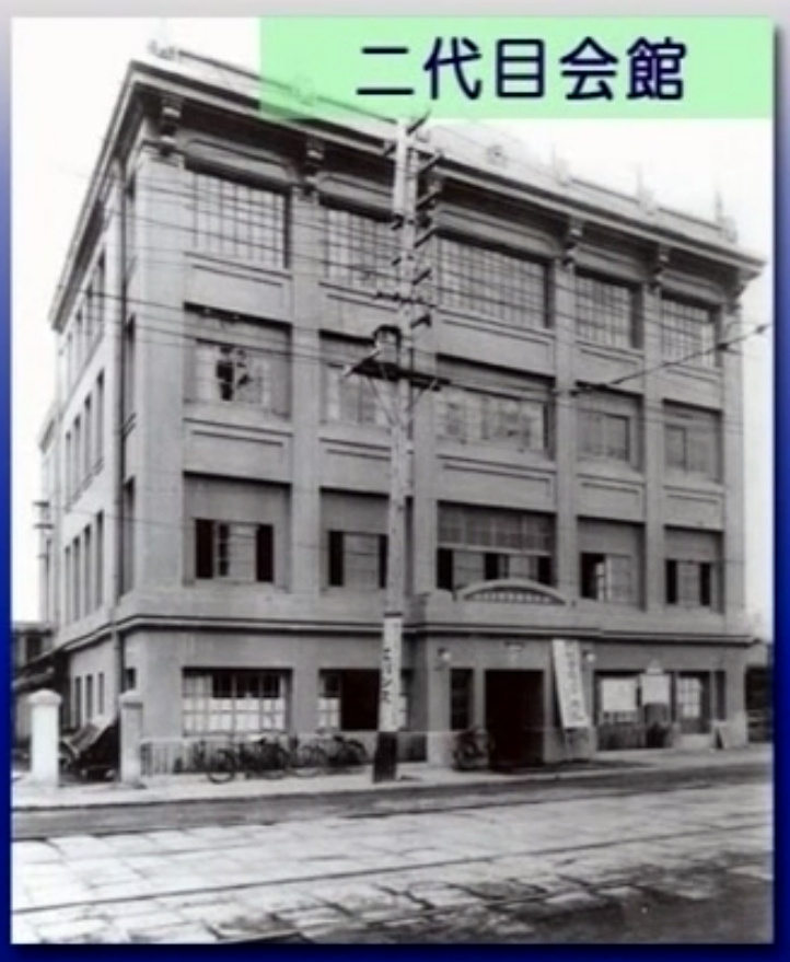
The youtube video includes a photograph of a building, clearly the same as the one in Gamble’s photograph, that was built in 1884. There are shots of people playing basketball and table tennis, and the few details of the interior look a lot like the place I remember. Could it be the same?

But then we see the building damaged from the Great Kanto Earthquake of 1923. That the structure was standing at all would have been remarkable. You can easily search and find images of the astonishing devastation of that event, but I’ll let these harrowing words from a correspondent of The Atlantic convey the scale of it.
Yokohama, the city of almost half a million souls, had become a vast plain of fire, of red, devouring sheets of flame which played and flickered. Here and there a remnant of a building, a few shattered walls, stood up like rocks above the expanse of flame, unrecognizable. There seemed to be nothing left to burn. It was as if the very earth were now burning.
Henry W. Kinney, “Earthquake Days.”The Atlantic, January 1, 1924.
According to my understanding of the video, the YMCA moved into another building in 1926. Based on the photos of the interior, my guess is that it was the same building where I visited in the early 1990s. The shots of basketball and table tennis from earlier might have been taken inside this building, even if the members of the Y engaged in those activities in the original.
Still, I couldn’t help but ask – would the Japanese have played basketball in the original building, between the game’s invention in 1891 and the earthquake in 1923? It seemed anachronistic to me, until I looked into it a little further.
We’ve all heard that the inventor of basketball, James Naismith, was on the faculty at Springfield College in Massachusetts, but the name of the place has changed since 1891, when it was known as the YMCA International Training School .** The 18 men who played in the first game became known in basketball lore as the First Team. Some of them served as apostles for the game, spreading it around the world under the banner of the YMCA. One of them, a man named Genzabaro Ishikawa, took it to Japan.
** The organization proudly claims the game as its own invention.
It’s not hard to imagine Ishikawa making a beeline from the ship when it docked at Yokohama to the YMCA. If so, it makes the building that Gamble shot one of the sanctified sites of the sport, like many shrines since ruined but replaced. Sure it was impressive to gaze up at a Giant Buddha cast in bronze some 800 years prior, but what I really like to think about is how that sweet court I played on in Yokohama bears a direct line of descent from the origins of the game.


