Our Most Popular Item is Probably not What you were Expecting

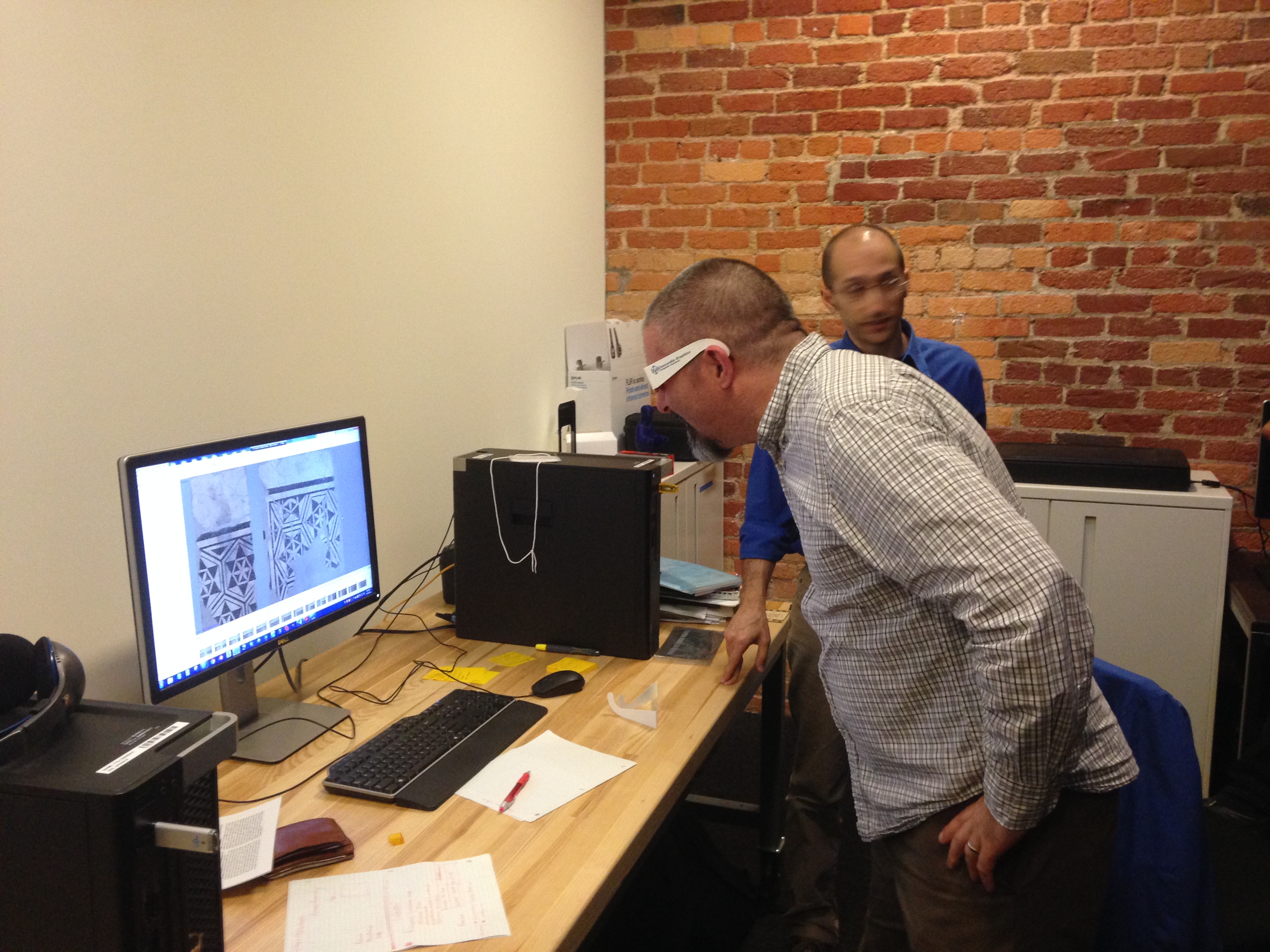
Part of my job is to track our Duke Digital Collections google analytics data.  As a part of this work, I like to keep tabs on the most popular digital collections items each month.  There is generally some variation among the most popular items from month to month. For example in May, a post on the New Yorker blog  pointed to some motherhood oriented ads and our traffic to these items spiked as a result.     

Be-Ro Home Recipes, our most popular item.

However there is one item that persists as one of our most popular items: the Be-Ro Home Recipes: Scones, Cakes, Pastry, Puddings.  Looking back at analytics since 2010 this is the most popular item by about 2000 hits (the book has seen 18,447 pageviews since Jan 1 2010).    In the six months that I’ve been studying our digital collections analytics I consistently wonder, why this item? no really, why?  Sure all the recipes call for lard, but that cannot be the only reason.

“Researching” the cookbook (conducting a few google searches) shows that the Be-Ro company was established in 1875 by the creator of the worlds first self rising flour.  Home Recipes was originally published as a pamphlet to promote use of the flour as early as the 1880s.  Our version includes over 50 recipes, was published in the 1920s, and is the 13th edition of the cookbook.

Duke’s Home Recipes claims that baking at home with Be-Ro is more economical and inspires the a better home, thanks to the woman of the house’s baking: “In ninety-nine cases out of a hundred she has a happy home, because good cooking means good food and good food means good health” (from page 2).  This cookbook has a storied history to be sure, but that still doesn’t explain why our version is so popular.

I kept searching, and found that there is a fervent and passionate following for the Be-Ro Cookbook.  Several UK cooking blog posts swoon over the book, saying they grew up with the recipes and first learned to bake from it.  The community aspect of the cookbook jives with our traffic as most of the users of the item on our website come from the UK.  Another factor driving traffic to our site is that Duke Digital Collections’ version of the cookbook tends to be the 4th hit on Google, when you search for “Be-Ro Cookbook”.

This investigation left me with a  better understanding of why this cookbook is so popular, but I’m still surprised and amused that among all the significant holdings we have digitized and available online, this cookbook is consistently the most visited.  Are there conclusions we can take away from this?  We are not going to start only digitizing cookbooks as a result of this knowledge, I can promise you that. However analytics shows us that in addition to the more traditionally significant items online, items like this cookbook can tap into and find a strong and consistent audience.   And that is data we can use to build better and more resonant digital collections.

Hmmmm…lard.
Hmmm…Fancies!

Mapping the Broadsides Collection, or, how to make an interactive map in 30 minutes or less

Ever find yourself with a pile of data that you want to plot on a map? You’ve got names of places and lots of other data associated with those places, maybe even images? Well, this happened to me recently. Let me explain.

A few years ago we published the Broadsides and Ephemera digital collection, which consists of over 4,100 items representing almost every U.S. state. When we cataloged the items in the collection, we made sure to identify, if possible, the state, county, and city of each broadside. We put quite a bit of effort into this part of the metadata work, but recently I got to thinking…what do we have to show for all of that work? Sure, we have a browseable list of place terms and someone can easily search for something like “Ninety-Six, South Carolina.” But, wouldn’t it be more interesting (and useful) if we could see all of the places represented in the Broadsides collection on one interactive map? Of course it would.

So, I decided to make a map. It was about 4:30pm on a Friday and I don’t work past 5, especially on a Friday. Here’s what I came up with in 30 minutes, a Map of Broadside Places. Below, I’ll explain how I used some free and easy-to-use tools like Excel, Open Refine, and Google Fusion Tables to put this together before quittin’ time.

Step 1: Get some structured data with geographic information
Mapping only works if your data contain some geographic information. You don’t necessarily need coordinates, just a list of place names, addresses, zip codes, etc. It helps if the geographic information is separated from any other data in your source, like in a separate spreadsheet column or database field. The more precise, structured, and consistent your geographic data, the easier it will be to map accurately. To produce the Broadsides Map, I simply exported all of the metadata records from our metadata management system (CONTENTdm) as a tab delimited text file, opened it in Excel, and removed some of the columns that I didn’t want to display on the map.

Step 2: Clean up any messy data..
For the best results, you’ll want to clean your data. After opening my tabbed file in Excel, I noticed that the place name column contained values for country, state, county, and city all strung together in the same cell but separated with semicolons (e.g. United States; North Carolina; Durham County (N.C.); Durham (N.C.)). Because I was only really interested in plotting the cities on the map, I decided to split the place name column into several columns in order to isolate the city values.

To do this, you have a couple of options. You can use Excel’s “text to columns” feature, instructing it to split the column into new columns based on the semicolon delimiter or you can load your tabbed file into Open Refine and use its “split columns into several columns” feature. Both tools work well for this task, but I prefer OpenRefine because it includes several more advanced data cleaning features. If you’ve never used OpenRefine before, I highly recommend it. It’s “cluster and edit” feature will blow your mind (if you’re a metadata librarian).

Step 3: Load the cleaned data into Google Fusion Tables
Google Fusion Tables is a great tool for merging two or more data sets and for mapping geographic data. You can access Fusion Tables from your Google Drive (formerly Google Docs) account. Just upload your spreadsheet to Fusion Tables and typically the application will automatically detect if one of your columns contains geographic or location data. If so, it will create a map view in a separate tab, and then begin geocoding the location data.

geocoding_fusion_tables

If Fusion Tables doesn’t automatically detect the geographic data in your source file, you can explicitly change a column’s data type in Fusion Tables to “Location” to trigger the geocoding process. Once the geocoding process begins, Fusion Tables will process every place name in your spreadsheet through the Google Maps API and attempt to plot that place on the map. In essence, it’s as if you were searching for each one of those terms in Google Maps and putting the results of all of those searches on the same map.

Once the geocoding process is complete, you’re left with a map that features a placemark for every place term the service was able to geocode. If you click on any of the placemarks, you’ll see a pop-up information window that, by default, lists all of the other metadata elements and values associated with that record. You’ll notice that the field labels in the info window match the column headers in your spreadsheet. You’ll probably want to tweak some settings to make this info window a little more user-friendly.

info_window_styled

Step 4: Make some simple tweaks to add images and clickable links to your map
To change the appearance of the information window, select the “change” option under the map tab then choose “change info window.” From here, you can add or remove fields from the info window display, change the data labels, or add some custom HTML code to turn the titles into clickable links or add thumbnail images. If your spreadsheet contains any sort of URL, or identifier that you can use to reliably construct a URL, adding these links and images is quite simple. You can call any value in your spreadsheet by referencing the column name in braces (e.g. {Identifier-DukeID}). Below is the custom HTML code I used to style the info window for my Broadsides map. Notice how the data in the {Identifier-DukeID} column is used to construct the links for the titles and image thumbnails in the info window.

info_window_screen

Step 5: Publish your map
Once you’re satisfied with you map, you can share a link to it or embed the map in your own web page or blog…like this one. Just choose tools->publish to grab the link or copy and paste the HTML code into your web page or blog.

To learn more about creating maps in Google Fusion Tables, see this Tutorial or contact the Duke Library’s Data and GIS Services.

Can You (Virtually) Dig It?

A group from Duke Libraries recently visited Dr. Maurizio Forte’s Digital Archaeology Initiative (a.k.a. “Dig@Lab”) to learn more about digital imaging of three-dimensional objects and to explore opportunities for collaboration between the lab and the library.

2014-04-29 15.37.39
These glasses and stylus allow you to disassemble the layers of a virtual site and rearrange and resize each part.

Dr. Forte (a Professor of Classical Studies, Art, and Visual Studies) and his colleagues were kind enough to demonstrate how they are using 3D imaging technology to “dig for information” in simulated archaeological sites and objects.  Their lab is a fascinating blend of cutting-edge software and display interfaces, such as the Unity 3D software being used in the photo above, and consumer video gaming equipment (recognize that joystick?).

Zeke tries not to laugh as Noah dons the virtual reality goggles.

Using the goggles and joystick above, we took turns exploring the streets and buildings of the ancient city of Regium Lepedi in Northern Italy.  The experience was extremely immersive and somewhat disorienting, from getting lost in narrow alleys to climbing winding staircases for an overhead view of the entire landscape.  The feeling of vertigo from the roof was visceral.  None of us took the challenge to jump off of the roof, which apparently you can do (and which is also very scary according to the lab researchers).  After taking the goggles off, I felt a heaviness and solidity return to my body as I readjusted to the “real world” around me, similar to the sensation of gravity after stepping off a trampoline.

Alex--can you hear me?
Alex–can you hear me?

The Libraries and Digital Projects team look forward to working more with Dr. Forte and bringing 3D imaging into our digital collections.

More information about the lab’s work can be found at:

http://sites.duke.edu/digatlab/


Mike views a mathematically modeled 3D rendering of a tile mosaic.

(Photos by Molly Bragg and Beth Doyle)

The Duke-SLP partnership – seeking design contractors for pilot website

In the 1960s, an unstoppable group of student activists partnered with black southerners to mount an all-out attack on Jim Crow. One person, one vote – that was the idea that drove them when they woke up each morning. In some of the most remote and forgotten areas of the deep South, the Student Nonviolent Coordinating Coordinating Committee (SNCC) and local people risked their lives to secure the right to vote for all Americans. Fifty years later, that struggle is as central as ever.

Fannie Lou Hamer in Hattiesburg.
Voting rights and SNCC activist Fannie Lou Hamer in Hattiesburg, Mississippi in 1964. Image courtesy of the Civil Rights Movement Veterans site.

The SNCC Legacy Project and Duke University are teaming up to chronicle SNCC’s historic campaign for voting rights. The pilot phase of that partnership, a project titled “One Person, One Vote: The Legacy of SNCC and the fight for voting rights,” will reexamine SNCC’s activism in light of current struggles for an inclusive democracy.

The OPOV pilot site will feature documents, photos, and audiovisual materials born out of SNCC’s fight for voting rights. From this material, SNCC veterans will use oral histories, critical curations, and featured exhibits to rethink the impact of their activism.

We’re looking for a talented, Triangle-based design team to help us connect the past to the present. Designers will create a WordPress theme that brings clarity and flow to the overlapping narratives of voting rights activism. See the prospectus for candidate contractors linked below. We’d like to make contact with you now, with a more extensive Call for Proposals to follow in May.


120px-Adobe_PDF_icon

“One Person, One Vote: The Legacy of SNCC and the fight for voting rights” – Prospectus for candidate web contractors, Spring 2014

A Sketch for Digital Projects at DUL

What happens when an IT manager suffering from administrivia-induced ennui gets ahold of dia and starts browsing The Noun Project.
The inevitable result, when an IT manager suffering from Acute Administrivia-Induced Ennui gets ahold of dia and starts browsing The Noun Project.

We have all these plans and do all this work with the digital collections and the projects and what have you. Plan-plan-plan, work-work-work, and plan and work some more. Some things get done, others don’t, as we journey for that distant horizon, just on the other side of which lies, “Hooray, we finally got it!”

I started to draw a map for the next phases of that journey a few days ago, and it was going to be really serious. All these plans – repository migration, exhibit platform, workflow management, ArchivesSpace – would be represented in this exacting diagram of our content types and platforms and their interrelations. It might even have multiple sheets, which would layer atop one another like transparencies, to show the evolution of our stuff over time. UML books more than ten years old would be dusted off in the production of this diagram.

Almanac-Detail1Then my brain started to hurt, and I found myself doodling in response. I started having fun with it. You might even say I completely dorked out on it. Thus you have the “Sketch for an almanac of digital projects at Duke University Libraries” above.

Placing whimsical sea monster icons on a field of faux design elements took a lot of my time this week, so I’m afraid I’m not able to write any more about the diagram right now. However, provided it doesn’t prove a source of embarrassment and regret, I might revisit it in the near future.

Announcing the DukEngineer Digital Collection!

As the Engineering Librarian, and guest blogger for Bitstreams, I’m excited to announce Duke Digital Collections newest digital collection: DukEngineer!

DukEngineer
The DukEngineer magazine is the student run publication of the Pratt School of Engineering.  This collection was compiled from the holdings of Duke University Libraries, Duke University Archives, and Duke’s Pratt School of Engineering and includes nearly every issue published during 1940-2013.  The amazing team in the Digital Projects and Production Services department at the Library digitized 205 DukEngineer issues into images and text searchable pdf’s.  This digital collection was coordinated to be part of the 75th anniversary celebration of Duke’s Pratt School of Engineering in 2014-2015.

As stated in the inaugural issue dedication in May of 1940, DukEngineer has remained, “strictly a student venture” that covers the activities of engineering clubs, societies and departments at Duke.  The publication also includes articles about advancements in engineering at Duke and worldwide, in addition to alumni and faculty profiles. The inclusion of a final page of jokes, puzzles or cartoons has also remained a tradition throughout the run of DukEngineer.

Browsing the collection provides a fascinating overview of how things have changed and remained the same for engineering students since 1940.

DukEngineer Covers

Changing Technology…

For engineering students, the magazine has many examples of the progress of technology for completing calculations, from the trusted slide-rule to (rather large) calculators, and then (even larger) computers.  Eventually things became smaller and smarter, and Duke engineers have been part of that progress.

“The engineer’s most useful servant, be he designer or otherwise, is his slide-rule. Long, complicated calculations can be made with reasonable accuracy in a very short period of time with this instrument.“ -Sept 1945

Other technological advances that are covered include an explanation of the television in Dec 1940 and the many advancements in the space race during the 1960’s – just to name a few.

Changing Styles…

75 years of engineering students and faculty, means 75 years of changing styles, fashions and hairstyles.  The students in the 1940’s frequently wore jackets & ties to class (looking more dressed up than most faculty today), where as in the 1970s and 80’s short shorts and big hair was the way to go.  Of course, throughout the years, there may have been an  examples or two of the stereotypical white shirt, pocket protector, black glasses, engineer style.

DukEngineer Covers

Changing Culture…

Reading through the magazine, written from student’s perspective of the time, it is easy to be surprised at how things have changed in society as a whole and here at Duke.  The cartoons, and joke pages are some of the prime examples of what was considered socially acceptable throughout the years.  One of my favorite jokes (that I can use in this post) is from February 1956.

Mother—”What are you reading, son?”
M.E.—”Playboy.”
Mother—”Oh, all right, dear, I was afraid you had gotten hold of a ‘DukEngineer.’ “

The 1960’s and 1970’s also included a feature “Girl of the Month.”  Some ‘lucky’ co-ed on campus (not an engineering student) was chosen to be highlighted each issue with a photo spread and some details about their likes, major and sometimes even a name.  An issue in Spring of 1986 did a flashback of this and decided to try to even the score with “Men of the 80’s”.

Women of the 60's... Men of the 80's

Changes at Pratt…

Of course, engineering at Duke has changed a lot through the years also.  The College of Engineering at Duke became official in 1939.  It has grown in the number of students, faculty, departments and buildings as it evolved into the Pratt School of Engineering that we know today.  The big move of engineering from East Campus to West is illustrated on the cover of March 1945.  Other highlights of engineering growth include the building of “old red” (aka Hudson Hall), the design and building of the new Teer engineering library building through the more recent Fitzpatrick Center & CIEMAS.

However, some things never seem to change…

Park in Durham? Ha!

We hope you enjoy browsing the issues of the DukEngineer digital collection.  There are many amazing articles about advancements in engineering, fantastic advertisements, pictures of students, profiles of faculty and alumni, etc.

Happy 75th Pratt!

 Post Contributed by Melanie A. Sturgeon

Exams? Graduation? Already?

Yes, it is here; exams and graduation. It can be a time of stress, a time to recognize your hard work, even a time of celebration. But first, take a moment for diversion.

On Exams

Feeling stressed?
Learn how to deal with stressful exams through vintage advertising such as this ad for Lifebuoy soap: Whew! This Exam Is A Tough One! At least you won’t lose any dates if you follow their directions.

Ad for Lifebuoy soap

Tough questions?cover of teacher exam
Could you pass this 1892 teacher’s examination found in our Broadsides collection? Answers to the math questions have already been filled in. But alas, they didn’t show their work. Shouldn’t that lead to partial credit?

Who had an exam?
We even hear from Thomas Long about “Jesus’ Final Exam.” Can’t anyone get a break from exams? Long’s sermon begins at 32 minutes into the audio recording of this 1986 worship service from the Duke Chapel recordings collection.

Commencement

Once you’ve passed all of your exams, thoughts turn to time-honored traditions of graduation.

52 years ago at Duke
four-page issue of The Duke Chronicle notes what the Duke community could expect during the four days of commencement activities in June, 1962. But when you still have exams and papers due, graduation can still seem so far away.

Cover of Duke Chronicle 1962 commencement issue

Drama at commencement?
This commencement program from June, 1905 for the Memminger High and Normal School Academy of Music highlights not only a valedictory speech, but also the presentation of two essays, five musical performances, and two dramatic plays. Now, what drama would exemplify your academic experience?

Ahhh…

Once you work is done, whether you are graduating or simply completing another year of rigorous study at Duke, it’s time to unwind.

Taking to the streets
This photo from the William Gedney collection shows people celebrating in the streets of Benares, India. Gedney had just told them that you would ace your exams this year and so they started partying. Now that you know how they’ve celebrated your success, how do you plan to celebrate?

Image of people celebrating in the streets of Benares, India

Definitely time for cake
Will this vintage Pillsbury commercial from our AdViews collection tempt you into including their Deluxe Chocolate Cake in your party plans? Or, will you resist the cake and simply use the commercial as inspiration for your wardrobe choices for your end-of-year soirées?

May all of your papers, projects and exams go well. Good luck and best wishes from Duke University Libraries.

Using Google Spreadsheets with Timelines

Doris Duke timeline
Doris Duke timeline

We’ve been making use of the fabulous Timeline.js library for a while now. The first timeline we published, compiled by Mary Samouelian about the life of Doris Duke, uses Timeline.js to display text and images in an elegant interactive format. Back then the library was called Verite Timeline and our implementation involved parsing XML files using Python to render out the content on the page. And in general, this approach worked great. However, managing and updating the XML files isn’t all that easy. Things also get complicated when more than one person wants to work on them — especially at the same time.

Enter Google Spreadsheets! Timeline.js is now designed to easily grab data from a publicly-published Google spreadsheet and create great looking output out of the box. Managing the timeline data in the spreadsheet is a huge step up from XML files in terms of ease of use for our researchers and for maintainability. And it helps that librarians love spreadsheets. If someone errantly enters some bad data, it’s simple to undo that particular edit as all changes are tracked by default. If a researcher wants to add a new timeline event, they can easily go into the spreadsheet and enter a new row. Changes are reflected on the live page almost immediately.

Spreadsheet data

Timeline.js provides a very helpful template for getting started with entering your data. They require that you include certain key columns and that the columns be named following their data schema. You are free to add additional columns, however, and we’ve played around with doing so in order to include categorical descriptions and the like.

Here is a sample of some data from our Doris Duke timeline.

Data for Doris Duke Timeline

For entries with more than one image, we don’t include a ‘Start Date’ which means Timeline.js will skip over them. We then render these out as smaller thumbnails on our timeline page.

Images on Doris Duke timeline page

Going all-in with spreadsheets

We’ve published our subsequent timelines using a combination of the Google spreadsheet data to generate the Timeline.js output while also using the XML files to load in and display relational data (using the EAC-CPF standard) while using Python to generate the pages. However, for our latest timeline on the J. Walter Thompson Company (preview the dev version), we’ve decided to house all of the data (including the CPF relations) in a Google Spreadsheet and use PHP to parse everything. This approach will mean that we no longer need to rely on the XML files, so our researchers can quickly make updates to the timeline pages. We can easily convert the spreadsheet data back into an XML file if the need arises.

J. Walter Thompson Company Timeline

Code snippets

Note: there’s an updated syntax for newly created spreadsheets.

We’re taking advantage of the Google spreadsheet data API that allows for the data to easily be parsed as JSON. Querying the spreadsheet in PHP looks something like this:

$theURL = "http://spreadsheets.google.com/feeds/list/[your-spreadsheet-key]/
od6/public/values?alt=json&callback=displayContent";

$theJSON = file_get_contents($theURL, 0, $ctx); //the $ctx variable sets a timeout limit

$theData = json_decode($theJSON, TRUE);

And then we can loop through and parse out the data using something like this:

foreach ($theData['feed']['entry'] as $item) {

	echo $item['gsx$startdate']['$t'];
	// Note that the column names in the spreadsheet are targeted by adding 'gsx$' 
	   and 'the column name in lc with no spaces'
	   You may also want to use 'strtotime' on the dates so that you can 
	   transform them using 'date'

	echo $item['gsx$enddate']['$t'];

	echo $item['gsx$headline']['$t'];

	echo $item['gsx$text']['$t'];

	... // and so on
}

One important thing to note is that by default, the above query structure only gets data from the primary worksheet in the spreadsheet (which is targeted using the od6 variable). Should you want to target other worksheets, you’ll need to know which ‘od’ variable to use in your query. You can view the full structure of your spreadsheet by using a url like this:

https://spreadsheets.google.com/feeds/worksheets/[your-spreadsheet-key]/public/basic

Then match up the ‘od’ instance to the correct content and query it.

Timelines and Drupal

We’ve also decided to integrate the publishing of timelines into our Drupal CMS, which drives the Duke University Libraries website, by developing a custom module. Implementing the backend code as a module will make it easy to apply custom templates in the future so that we can change the look and feel of a timeline for a given context. The module isn’t quite finished yet, but it should be ready in the next week or two. All in all, this new process will allow timelines to be created, published, and updated quickly and easily.


UPDATE

I recently learned that sometime in early 2014, google changed the syntax for published spreadsheet URLs and they are no longer using spreadsheet key as an identifier. As such, the syntax for retrieving a JSON feed has changed.

The new syntax looks like this:

https://spreadsheets.google.com/feeds/cells/[spreadsheet-ID]/[spreadsheet-index]/public/basic?alt=json&callback=displayContent

‘spreadsheet-ID’ is the string of text that shows up when you publish your spreadsheet:

https://docs.google.com/spreadsheets/d/[spreadsheet-ID]/pubhtml

‘spreadsheet-index’ you can see when editing your spreadsheet – it’s the value that is assigned to ‘gid’ or in the case below, it’s ‘0’:

https://docs.google.com/spreadsheets/d/[spreadsheet-ID]/edit#gid=0

I hope this helps save some frustration of finding documentation on the new syntax.

Post contributed by Michael Daul

Digitization Details: Bringing Duke Living History Into Your Future

Recently, I digitized 123 videotapes from the Duke University Living History Program. Beginning in the early 1970’s, Duke University faculty members conducted interviews with prominent world leaders, politicians and activists. The first interviews were videotaped in Perkins Library at a time when video was groundbreaking technology, almost a decade before consumer-grade VCRs starting showing up in people’s living rooms. Some of the interviews begin with a visionary introduction by Jay Rutherfurd, who championed the program:

“At the W. R. Perkins library, in Duke University, we now commit this exciting experiment in electronic journalism into your future. May it illuminate well, educate wisely, and relate meaningfully, for future generations.”

Clearly, the “future” that Mr. Rutherfurd envisioned has arrived. Thanks to modern technology, we can now create digital surrogates of these videotaped interviews for long-term preservation and access. The subjects featured in this collection span a variety of generations, nationalities, occupations and political leanings. Interviewees include Les Aspin, Ellsworth Bunker, Dr. Samuel DuBois Cook, Joseph Banks Rhine, Jesse Jackson, Robert McNamara, Dean Rusk, King Mihai of Romania, Terry Sanford, Judy Woodruff, Angier Biddle Duke and many more. The collection also includes videotapes of speeches given on the Duke campus by Ronald Reagan, Abbie Hoffman, Bob Dole, Julian Bond and Elie Wiesel.

residue
Residue wiped off the head of a U-matic playback deck, the result of sticky-shed syndrome.

Many of the interviews were recorded on 3/4″ videotape, also called “U-matic.” Invented by Sony in 1969, the U-matic format was the first videotape to be housed inside a plastic cassette for portability, and would soon replace film as the primary television news-gathering format. Unfortunately, most U-matic tapes have not aged well. After decades in storage, many of the videotapes in our collection now have sticky-shed syndrome, a condition in which the oxide that holds the visual content is literally flaking off the polyester tape base, and is gummy in texture. When a videotape has sticky-shed, not only will it not play correctly, the residue can also clog up the tape heads in the U-matic playback deck, then transfer the contaminant to other tapes played afterwards in the same deck. A U-matic videotape player in good working order is now an obsolete collector’s item, and our tapes are fragile, so we came up with a solution: throw those tapes in the oven!

oven2
After baking, the cookies (I mean U-matic videotapes) are ready for digitization!

At first that may sound reckless, but baking audio and videotapes at relatively low temperatures for an extended period of time is a well-tested method for minimizing the effects of sticky-shed syndrome. The Digital Production Center recently acquired a scientific oven, and after initial testing, we baked each Duke Living History U-matic videotape at 52 celsius (125 fahrenheit) for about 10 hours. Baking the videotapes temporarily removed the moisture that had accumulated in the binder, and made them playable for digitization. About 90% of our U-matic tapes played well after baking. Many of them were unplayable beforehand.

videoracks
The Digital Production Center’s video rack and routing system.

After giving the videotapes time to cool down, we digitize each tape, in real time, as an uncompressed  file (.mov) for long-term preservation. Afterwards, we make a smaller, compressed version (.mp4) of the same recording, which is our access copy. Our U-matic decks are housed in an efficiently-designed rack system, which also includes other obsolete videotape formats like VHS, Betacam and Hi8. Centralized audio and video routers allow us to quickly switch between formats while ensuring a clean, balanced and accurate conversion from analog to digital. Combining the art of analog tape baking with modern video digitization, the Digital Production Center is able to rescue the content from the videotapes, before the magnetic tape ages and degrades any further. While the U-matic tapes are nearing the end of their life-span, the digital surrogates will potentially last for centuries to come. We are able to benefit from Mr. Rutherfurd’s exciting experiment into our future, and carry it forward… into your future. May it illuminate well, educate wisely, and relate meaningfully, for future generations.


Post contributed by Alex Marsh


Society of North Carolina Archivists Annual Meeting Slides

On Tuesday April 8, I had the honor of presenting at the annual meeting of the Society of North Carolina Archivists with representatives from Wake Forest University and Davidson College. The focus of our panel was to present alternatives to CONTENTdm, a system for displaying digital collections widely used by libraries. At Duke, we have developed our own Tripod interface to digital collections. Wake Forest and Davidson use a variety of tools most notably DSpace and Islandora (via Lyrasis) respectively. It was great to present with and learn more about the Wake Forest and Davidson programs! I’ve embedded slides from all three speakers below.


Notes from the Duke University Libraries Digital Projects Team