Meet staff from Assessment and User Experience

Digital projects at Duke University Libraries are created and maintained by staff from throughout the Libraries. One of the many departments supporting this work is Assessment and User Experience (AUX). We currently have a staff of five.

Emily Daly

Emily Daly

Position: Head of Assessment & User Experience; Librarian for Education

Length of time at Duke: 8 years

What I do at the Library: As Librarian for Education, I help staff the Perkins Help Desk, lead library instruction sessions, teach a half-credit course for the Program in Education, and provide support for students and faculty across the university who are engaging in education-related research. As Head of AUX, I help lead and coordinate DUL staff members’ efforts to assess the effectiveness of our library collections, services and our physical and virtual spaces, and then attempt to improve our services and resources based on our researchers’ feedback. I do this in close collaboration with my talented colleagues Tom, Joyce, Ian and Jeremy. I also serve as a pre-major advisor for 6 first-year students or sophomores.

I think Assessment and User Experience matters in the life of the Duke community because DUL staff provide a range of services and resources to a large group of researchers whose needs are varied and continuously evolving. We work to understand what our users need to conduct their research as effectively and, in many cases, as efficiently as possible. We evolve our services, spaces and resources to meet their changing needs. That, and on a selfish note, it’s really fun and engaging to talk with students and faculty who care deeply about their research.

On the most unexpected trip I ever took I handed in my resume at the public library in Casper, Wyoming. Three weeks later and with virtually no work experience in libraries, I started as Natrona County Public Library’s first full-time Teen Services Librarian (or “Specialist,” since I didn’t yet have an MSLS). I thought I’d be at the library for a year and then return to teaching high school English — I was just waiting for a position to become available. It’s been 11 years since I submitted that resume, and in that time, I’ve worked as a public librarian, school librarian and academic librarian.

If I could take a month to intensively learn one new thing it would be human development with an emphasis on early childhood development, education policy, or web design/development — it’s too hard to pick just one thing to study, which is one reason I became a librarian.

Something memorable that I never expected to see at Duke was college seniors in black graduation gowns walking the quad and stopping periodically to put their hands over the heads and chant. I know now it’s linked to a secret society of some sort, but that’s the extent of my knowledge, and I’m okay with leaving it that way.

What I am currently reading for pleasure: Americanah, by Chimamanda Ngozi Adichie.

Another tidbit about me (related to the pic) is that one of my guilty pleasures is ice cream, and I’m proud to say I’ve passed on my weakness for it to my sons, 5 ½ year-old Philip and 2-year-old Patrick.

Ian Sloat

Ian Sloat

Position: AUX Student Assistant

What I do at Duke and at the Library: I am a graduate student in the MALS program and at the library I have mostly been working on updating signage and usability studies.

How long have you been at Duke? Just over one year as a student and 5 months at Perkins.

I think Assessment and User Experience matters in the life of the Duke community because it provides us with evidence that we can use to better improve the library for all of the members of the Duke community.

On the most unexpected trip I ever took, I was living in Scotland as an exchange student and I decided to take a trip to the highlands. I got off the bus in Loch Ness to go to the hostel I booked before I left. I walked up to the hostel as the bus was pulling away and when I got to the door, they had a sign up saying they were closed for the season. I stood outside (in the rain of course) for 3 hours until I hitched my way 20 miles north to Inverness and found a cheap hotel for the night.

If I could take a month to intensively learn one new thing it would be a second language, I took French for 9 years growing up in Canada, but I can’t speak a lick of it, so maybe something else.

Jeremy Zhang

Position: Undergraduate Assessment and User Experience Assistant

What I do at Duke and at the Library: I am currently an undergraduate student studying Electrical and Computer Engineering and Economics. In the library I help conduct research and produce both qualitative and quantitative data on many facets of the library. I also help develop and edit the main library website.

I think Assessment and User Experience matters in the life of the Duke community because it is important to streamline processes for students and researchers conducting research or working on their daily homework.

If I could take a month to intensively learn one new thing it would be how to produce electronic music.

What I am currently reading for pleasure: Understanding Wall Street, by Jeffrey Little.

Joyce Chapman

Joyce Chapman

Position: Assessment Coordinator

Length of time at Duke: 3 ½ weeks

What I do at the Library: Still figuring it out 🙂 The plan is to collect, analyze, and document data useful for evaluating library operations and understanding user needs; support data management, analysis, and reporting needs across the Libraries; and coordinate and deliver training on evaluation, data, and reporting tools. I’m here to help you, so get in touch!

I think Assessment and User Experience matters in the life of the Duke community because they help us to continuously monitor the Libraries’ impact and effectiveness, provide an ongoing basis to improve resources and services, and support data-informed management and decision making.

On the most unexpected trip I ever took, I was living in Germany as an exchange student in April 2005. A friend and I found cheap tickets to Rome and decided to take a vacation. The day after we bought our tickets Pope John Paul II passed away. We ended up in Rome during the Pope’s funeral, along with tens of thousands of pilgrims from all over the world. It was a really unexpected and interesting experience!

If I could take a month to intensively learn one new thing it would be wilderness survival skills, just in case (zombie apocalypse, etc.).

What I am currently reading for pleasure: The Broken Eye, by Brent Weeks and Our Separate Ways: Women and the Black Freedom Movement in Durham, North Carolina, by Christina Greene.

Thomas Crichlow

Thomas Crichlow

Position: Assessment and User Experience Project Manager

Length of time at Duke: a little over ten years, depending on how you count.

What I do at the Library:

  • I plan and manage projects to create and renovate websites at Duke University Libraries.
  • I lead project teams and also work as a web developer.
  • I participate in assessments of how our community uses our websites, paying special attention to places where our patrons encounter difficulty in using our sites.
  • As a member of our Web Experience Team (WebX), I foster discussions about our vision, strategy and priorities for meeting patron needs through our online presence.

I think Assessment and User Experience matters in the life of the Duke community because we are well positioned to take a collaborative approach in identifying and eliminating pain points that hinder our research community’s ability to use the many tools and services provided through Duke Libraries.

On the most unexpected trip I ever took, I walked a dog from Germany to France, but there and back again only took 45 minutes. I was a high school exchange student in Germany, and the family I stayed with lived near the border with France, which was only two farm fields away from their house. When we got to the border, one of the men staffing the border crossing filled a bowl of water for the dog whom they already seemed to be well acquainted with.

If I could take a month to intensively learn one new thing it would be something hands-on and creative like painting or drawing.

Something memorable that I never expected to see at Duke was a little cabin high-up within the bell tower at Duke Chapel from which Sam Hammond plays the carillon, a manually operated, 50-bell instrument. I worked at the Chapel at that time and had access to parts of it that aren’t normally open to the public. I appreciated Sam’s graciousness in letting me take a peek at this rarely viewed, but oft heard part of our University. A recent Duke Chronicle article provides a further glimpse via an interview with Mr. Hammond and a photo gallery. There is also a recording of “God rest ye merry, gentlemen” played on the carillon.

What I am currently reading for pleasure: Guards! Guards! which is part of the satire-filled Discworld series by Terry Pratchett.

Anatomy of an Exhibit Kiosk

I’ve had the pleasure of working on several exhibit kiosks during my time at the library. Most of them have been simple in their functionality, but we’re hoping to push some boundaries and get more creative in the future. Most recently, I’ve been working on building a kiosk for the Queering Duke History: Understanding the LGBTQ Experience at Duke and Beyond exhibit. It highlights oral history interviews with six former Duke students. This particular kiosk example isn’t very complicated, but I thought it would be fun to outline how it’s put together.

Screen shot of the 'attract' loop
Screen shot of the ‘attract’ loop

Hardware

Most of our exhibits run on one of two late 2009 27″ iMacs that we have at our disposal. The displays are high-res (1920×1080) and vivid, the built-in speakers sound fine, and the processors are strong enough to display multimedia content without any trouble. Sometimes we use the kiosk machines to loop video content, so there’s no user interaction required. With this latest iteration, as users will be able to select audio files for playback, we’ll need to provide a mouse. We do our best to secure them to our kiosk stand, and in my tenure we’ve not had any problems. But I understand in the past that sometimes input devices have been damaged or gone missing. As we migrate to touch-screen machines in the future these sorts of issues won’t be a problem.

Software

We tend to leave our kiosk machines out in the open in public spaces. If the machine isn’t sufficiently locked down, it can lead to it being used for purposes other than what we have in mind. Our approach is to setup a user account that has very narrow privileges and set it as the default login (so when the machine starts up it boots into our ‘kiosk’ account). In OS X you can setup user permissions, startup programs, and other settings via ‘Users and Groups’ in the System Preferences. We also setup power saving settings so that the computer will sleep between midnight and 6:00am using the Energy Saving Scheduler.

My general approach for interactive content is to build web pages, host them externally, and load them on to the kiosk in a web browser. I think the biggest benefits of this approach are that we can make updates without having to take down the kiosk and also track user interactions using Google analytics. However, there are drawbacks as well. We need to ensure that we have reliable network connectivity, which can be a challenge sometimes. By placing the machine online, we also add to the risk that it can be used for purposes other than what we intend. So in order to lock things down even more, we utilize xStand to display our interactive content. It allows for full screen browsing without any GUI chrome, black-listing and/or white-listing sites, and most importantly, it restarts automatically after a crash. In my experience it’s worked very well.

User Interface

This particular exhibit kiosk has only one real mission – to enable users to listen to a series of audio clips. As such, the UI is very simple. The first component is a looping ‘attract’ screen. The attract screen serves the dual purpose of drawing attention to the kiosk and keeping pixels from getting burned in on the display. For this kiosk I’m looping a short mp4 video file. The video container is wrapped in a link and when it’s clicked a javscript hides the video and displays the content div.


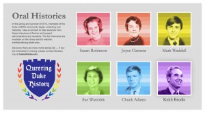
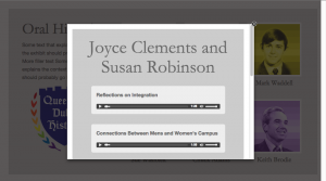
The content area of the page is very simple – there are a group of images that can be clicked on. When they are, a lightbox window (I like Fancy Box) pops up that holds the relevant audio clips. I’m using simple html5 audio playback controls to stream the mp3 files.

Screen shot of the 'home' screen UI
Screen shot of the ‘home’ screen UI
Screen shot of the audio playback UI

Finally, there’s another javascript running in the background that detects and user input. After 10 minutes of inactivity, the page reloads which brings back the attract screen.

The Exhibit

Queering Duke History runs through December 14, 2014 in the Perkins Library Gallery on West Campus. Stop by and check it out!

Comparing Photographic Views of the Civil War in Duke’s Newest Digital Collection

Duke Digital Collections is excited to announce our newest digital offering: The Barnard and Gardner Civil War Photographic Albums.  Rubenstein Library Archive of Documentary Arts Curator, Lisa McCarty contributed the post below to share some further information about these significant and influential volumes.

“In presenting the PHOTOGRAPHIC SKETCH BOOK OF THE WAR to the attention of the public, it is designed that it shall speak for itself. The omission, therefore, of any remarks by way of preface might well be justified; and yet, perhaps a few introductory words may not be amiss.

As mementoes of the fearful struggle through which the country has just passed, it is confidently hoped that the following pages will possess an enduring interest. Localities that would scarcely have been known, and probably never remembered, save in their immediate vicinity, have become celebrated, and will ever be held sacred as memorable fields, where thousands of brave men yielded up their lives a willing sacrifice for the cause they had espoused.”

Verbal representations of such places, or scenes, may or may not have the merit of accuracy; but photographic presentments of them will be accepted by posterity with an undoubting faith. During the four years of the war, almost every point of importance has been photographed, and the collection from which these views have been selected amounts to nearly three thousand.”

-Alexander Gardner

The opening remarks that precede Alexander Gardner’s seminal work, Gardner’s Photographic Sketchbook of the War, operate two-fold. Firstly, these words communicate the subject matter of the book. Secondly, they communicate the artists’ intentions and his beliefs about the enduring power of photography. Undeniably, Gardner’s images have endured along with the images of his contemporary George N. Barnard. Working at the same time, using the same wet collodian process, and on occasion as part of the same studio, Barnard created a work entitled Photographic Views of the Sherman Campaign. Both were published in 1866 and as a pair are considered among the most important pictorial records of the Civil War.

To compare these two epic tomes in their entirety is a rare opportunity, and is now possible to do both in person in the Rubenstein Rare Book and Manuscript Reading Room as well as online in new a digital collection. Whether you prefer to browse paper or virtual pages, there is much that can still be discovered in these 148 year-old books.

Something I noted while revisiting these images is that despite their many commonalities, Gardner’s and Barnard’s approaches as photographers couldn’t have been more different. While both works document the brutality and destruction of the war, Gardner’s images convey this through explicit text and images while Barnard chooses to rely heavily on metaphor and symbolism.

Alexander Gardner, Home of a Rebel Sharpshooter, Gettysburg, Pennslyvania, Plate 41, Gardner’s Photographic Sketchbook of the War
George N. Barnard, The Scene of General McPherson’s Death, Photographic Views of the Sherman Campaign


Evidence of these opposing visions can be seen at their most severe when comparing how the two photographers chose to depict casualties of war. I find that these images are still shocking, but for completely different reasons.

My perception of the image by Gardner is complicated by my knowledge of the circumstances surrounding its production. Gardner’s Photographic Sketchbook is oftennoted as being the first book to show images of slain soldiers. It is also been widely established that in Sharpshooter and other images Gardner and his assistants moved the position of the corpse for greater aesthetic and emotional affect. In this one image, Gardner opened up a variety of debates that have divided documentarians ever since: How should the most inhumane violence be depicted, for what reasons should the documentarian intervene in the scene, and under what circumstances should the public encounter such images?

The image by Barnard answers these questions in a wholly different manner. When examining this image close-up my reaction was immediate and visceral. A thicket marked by an animal skull and a halo of matted grass— the stark absence in this image is haunting. I find the scene of the death and its possible relics to be as distressing as Gardner’s Sharpshooter. For in this case the lack of information provided by Barnard triggers my mind to produce a story that lingers and develops slowly as I search the image for answers to the General’s fate.

Search these images for yourself in all their stark detail in our new digital collection:

http://library.duke.edu/digitalcollections/rubenstein_barnardgardner/

Post Contributed by Lisa McCarty, Curator of the Archive of Documentary Arts

Digital Tools for Civil Rights History

The One Person, One Vote Project is trying to do history a different way. Fifty years ago, young activists in the Student Nonviolent Coordinating Committee broke open the segregationist south with the help of local leaders. Despite rerouting the trajectories of history, historical actors rarely get to have a say in how their stories are told. Duke and the SNCC Legacy Project are changing that. The documentary website we’re building (One Person, One Vote: The Legacy of SNCC and the Struggle for Voting Right) puts SNCC veterans at the center of narrating their history.

SNCC field secretary and Editorial Board member Charlie Cobb.
SNCC field secretary and Editorial Board member Charlie Cobb. Courtesy of www.crmvet.org.

So how does that make the story we tell different? First and foremost, civil rights becomes about grassroots organizing and the hundreds of local individuals who built the movement from the bottom up. Our SNCC partners want to tell a story driven by the whys and hows of history. How did their experiences organizing in southwest Mississippi shape SNCC strategies in southwest Georgia and the Mississippi Delta? Why did SNCC turn to parallel politics in organizing the Mississippi Freedom Democratic Party? How did ideas drive the decisions they made and the actions they took?

For the One Person, One Vote site, we’ve been searching for tools that can help us tell this story of ideas, one focused on why SNCC turned to grassroots mobilization and how they organized. In a world where new tools for data visualization, mapping, and digital humanities appear each month, we’ve had plenty of possibilities to choose from. The tools we’ve gravitated towards have some common traits; they all let us tell multi-layered narratives and bring them to life with video clips, photographs, documents, and music. Here are a couple we’ve found:

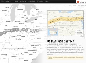
This StoryMap traces how the idea of Manifest Destiny progressed through the years and across the geography of the United States.
This StoryMap traces how the idea of Manifest Destiny progressed through the years and across the geography of the U.S.

StoryMap: Knightlab’s StoryMap tool is great for telling stories. But better yet, StoryMap lets us illustrate how stories unfold over time and space. Each slide in a StoryMap is grounded with a date and a place. Within the slides, creators can embed videos and images and explain the significance of a particular place with text. Unlike other mapping tools, StoryMaps progress linearly; one slide follows another in a sequence, and viewers click through a particular path. In terms of SNCC, StoryMaps give us the opportunity to trace how SNCC formed out of the Greensboro sit-ins, adopted a strategy of jail-no-bail in Rock Hill, SC, picked up the Freedom Rides down to Jackson, Mississippi, and then started organizing its first voter registration campaign in McComb, Mississippi.

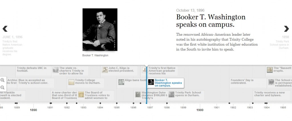
Timeline.JS: We wanted timelines in the One Person, One Vote site to trace significant events in SNCC’s history but also to illustrate how SNCC’s experiences on the ground transformed their thinking, organizing, and acting. Timeline.JS, another Knightlab tool, provides the flexibility to tell overlapping stories in clean, understandable manner. Markers in Timeline.JS let us embed videos, maps, and photos, cite where they come from, and explain their significance. Different tracks on the timeline  give us the option of categorizing events into geographic regions, modes of organizing, or evolving ideas.

The history of Duke University as displayed by Timeline.JS.

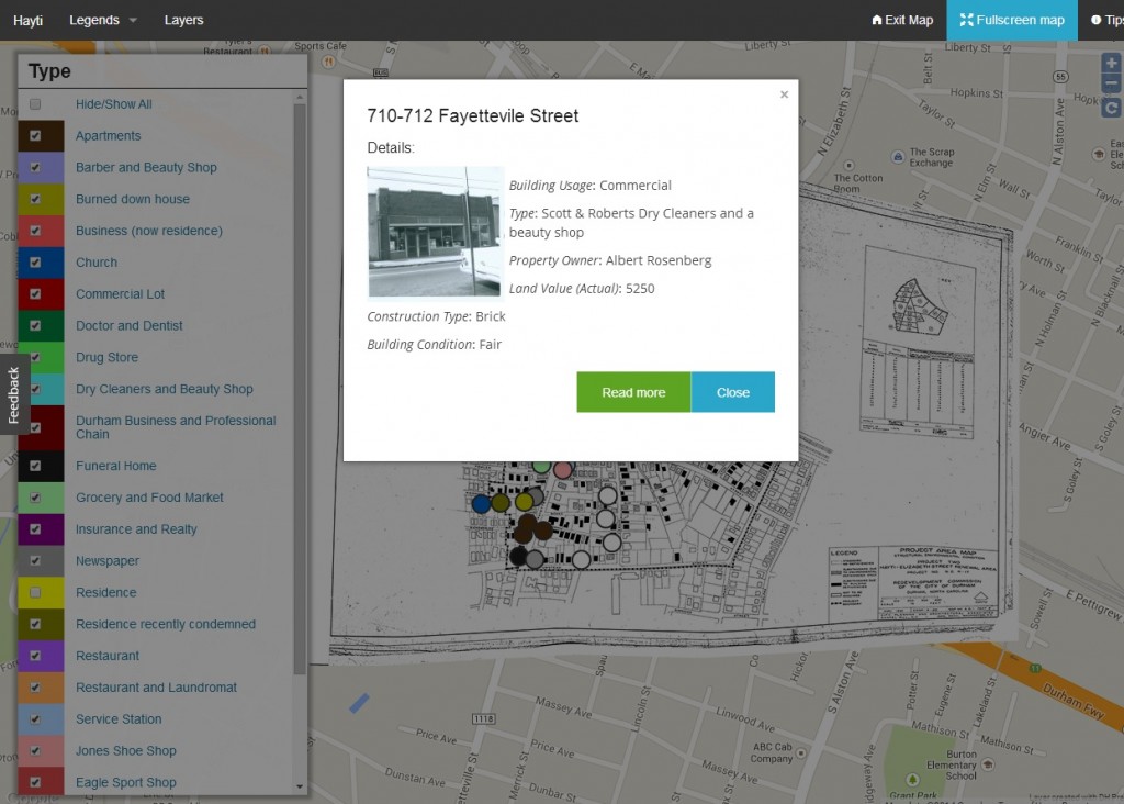
DH Press: Many of the mapping tools we checked out relied on number-heavy data sets, for example those comparing how many robberies took place on the corners of different city blocks. Data sets for One Person, One Vote come mostly in the form of people, places, and stories. We needed a tool that let us bring together events and relevant multimedia material and primary sources and represent them on a map. After checking out a variety of mapping tools, we found that DH Press served many of our needs.

DH Press project representing buildings and uses in Durham's Hayti neighborhood.
DH Press project representing buildings and uses in Durham’s Hayti neighborhood.

Coming out of the University of North Carolina – Chapel Hill’s Digital Innovation Lab, DH Press is a WordPress plugin designed specifically with digital humanities projects in mind. While numerous tools can plot events on a map, DH Press markers provide depth. We can embed the video of an oral history interview and have a transcript running simultaneously as it plays. A marker might include a detailed story about an event, and chronicle all of the people who were there. Additionally, we can customize the map legends to generate different spatial representations of our data.

Example of a marker in DH Press. Markers can be customized to include a range of information about a particular place or event.


These are some of the digital tools we’ve found that let us tell civil rights history through stories and ideas. And the search continues on.

Bodies of Knowledge: Seeking Design Contractors for Innovative Anatomical Digital Collection

The History of Medicine Collections, part of the Rubenstein Rare Book & Manuscript Library at Duke University, would like to create a digital collection of our ten anatomical fugitive sheets.

flap
An Anatomical Fugitive Sheet complete with flap.

Anatomical fugitive sheets are single sheets, very similar to items such as broadsides [early printed advertisements] that date from the sixteenth and seventeenth centuries and are incredibly rare and fragile. Eight of the ten sheets in our collections have overlays or moveable parts adding to the complexity of creating an online presence that allows a user to open or lift the flap digitally.

The primary deliverable for the design contractor of this project will be an online surrogate of the fugitive sheets and any accompanying plugins. Skills needed include JavaScript and CSS.

We’re looking for a talented design team to help us connect the past to the present. See the prospectus for candidate contractors linked below.

Bodies of Knowledge: a prospectus for design contractors to create an innovative anatomical digital collection. 

Analog to Digital to Analog: Impact of digital collections on permission-to-publish requests

We’ve written many posts on this blog that describe (in detail) how we build our digital collections at Duke, how we describe them, and how we make them accessible to researchers.

At a Rubenstein Library staff meeting this morning one of my colleagues–Sarah Carrier–gave an interesting report on how some of our researchers are actually using our digital collections. Sarah’s report focused specifically on permission-to-publish requests, that is, cases where researchers requested permission from the library to publish reproductions of materials in our collection in scholarly monographs, journal articles, exhibits, websites, documentaries, and any number of other creative works. To be clear, Sarah examined all of these requests, not just those involving digital collections. Below is a chart showing the distribution of the types of publication uses.

Types of permission-to-publish requests, FY2013-2014

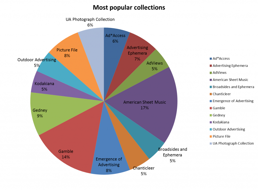
What I found especially interesting about Sarah’s report, though, is that nearly 76% of permission-to-publish requests did involve materials from the Rubenstein that have been digitized and are available in Duke Digital Collections. The chart below shows the Rubenstein collections that generate the highest percentage of requests. Notice that three of these in Duke Digital Collections were responsible for 40% of all permission-to-publish requests:

Collections generating the most permission-to-publish requests, FY2013-2014

So, even though we’ve only digitized a small fraction of the Rubenstein’s holdings (probably less than 1%), it is this 1% that generates the overwhelming majority of permission-to-publish requests.

I find this stat both encouraging and discouraging at the same time. On one hand, it’s great to see that folks are finding our digital collections and using them in their publications or other creative output. On the other hand, it’s frightening to think that the remainder of our amazing but yet-to-be digitized collections are rarely if ever used in publications, exhibits, and websites.

I’m not suggesting that researchers aren’t using un-digitized materials. They certainly are, in record numbers. More patrons are visiting our reading room than ever before. So how do we explain these numbers? Perhaps research and publication are really two separate processes. Imagine you’ve just written a 400 page monograph on the evolution of popular song in America, you probably just want to sit down at your computer, fire up your web browser, and do a Google Image Search for “historic sheet music” to find some cool images to illustrate your book. Maybe I’m wrong, but if I’m not, we’ve got you covered. After it’s published, send us a hard copy. We’ll add it to the collection and maybe we’ll even digitize it someday.

[Data analysis and charts provided by Sarah Carrier – thanks Sarah!]

Tweets and Metadata Unite!: Meet the Twitter Card

Twitter Cards
Source: https://dev.twitter.com/cards

Everyone knows that Twitter limits each post to 140 characters. Early criticism has since cooled and most people agree it’s a helpful constraint, circumvented through clever (some might say better) writing, hyperlinks, and URL-shorteners.  But as a reader of tweets, how do you know what lies at the other end of a shortened link? What entices you to click? The tweet author can rarely spare the characters to attribute the source site or provide a snippet of content, and can’t be expected to attach a representative image or screenshot.

Our webpages are much more than just mystery destinations for shortened URLs. Twitter agrees: its developers want help understanding what the share-worthy content from a webpage actually is in order to present it in a compelling way alongside the 140 characters or less.  Enter two library hallmarks: vocabularies and metadata.

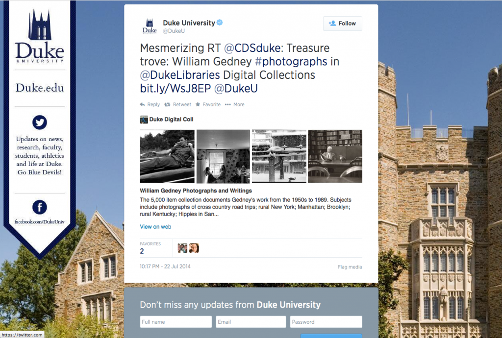
This week, we added Twitter Card metadata in the <head> of all of our digital collections pages and in our library blogs. This data instantly made all tweets and retweets linking to our pages far more interesting. Check it out!

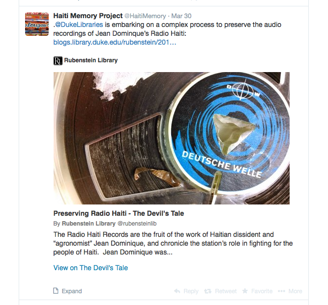
For the blogs, tweets now display the featured image, post title, opening snippet, site attribution, and a link to the original post. Links to items from digital collections now show the image itself (along with some item info), while links to collections, categories, or search results now display a grid of four images with a description underneath. See these examples:


A gallery tweet, linking to the homepage for the William Gedney Photographs collection.
Summary Card With Large Image: tweet linking to a post in The Devil's Tale blog.
Summary Card With Large Image: Tweet linking to a post in The Devil’s Tale blog.
Summary Card With Large Image: tweet linking to a digital collections image.


Why This Matters

In 2013-14, social media platforms accounted for 10.1% of traffic to our blogs (~28,000 visits in 2013-14, 11,300 via Twitter), and 4.3% of visits to our digital collections (~17,000 visits, 1,000 via Twitter). That seems low, but perhaps it’s because of the mystery link phenomenon. These new media-rich tweets have the potential to increase our traffic through these channels by being more interesting to look at and more compelling to click.  We’re looking forward to finding out whether they do.

And regardless of driving clicks, there are two other benefits of Twitter Cards that we really care about in the library: context and attribution. We love it when our collections and blog posts are shared on Twitter. These tweets now automatically give some additional information and helpfully cite the source.

How to Get Your Own Twitter Cards

The Manual Way

If you’re manually adding tags like we’ve done in our Digital Collections templates, you can “View Source” on any of our pages to see what <meta> tags make the magic happen. Moz also has some useful code snippets to copy, with links to validator tools so you can make sure you’re doing it correctly.

Gallery Page
Twitter Card metadata for a Gallery Page (Broadsides & Ephemera Collection)

WordPress

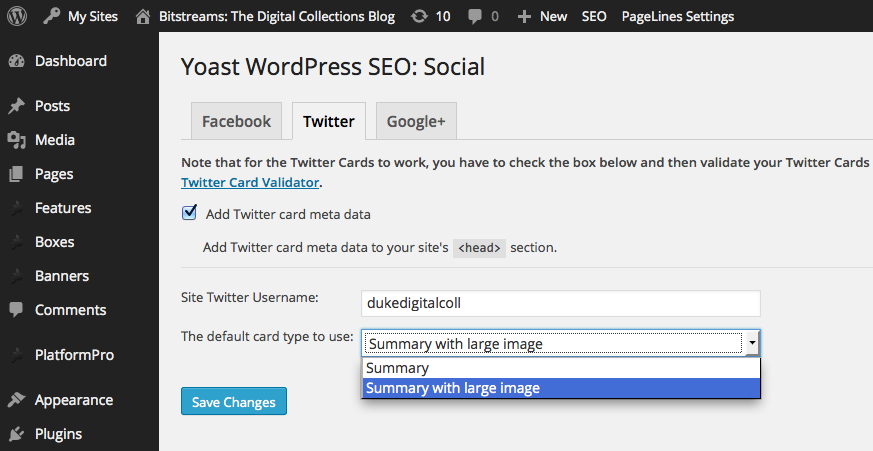
Since our blogs run on WordPress, we were able to use the excellent WordPress SEO plugin by Yoast. It’s helpful for a lot of things related to search engine optimization, and it makes this social media optimization easy, too.

Adding Twitter Card metadata with the WordPress SEO plugin.

Once your tags are in place, you just need to validate an example from your domain using the Twitter Card Validator before Twitter will turn on the media-rich tweets. It doesn’t take long at all: ours began appearing within a couple hours. The cards apply retroactively to previous tweets, too.

Related Work

Our addition of Twitter Card data follows similar work we have done using semantic markup in our Digital Collections site using the Open Graph and Schema.org vocabularies. Open Graph is a standard developed by Facebook. Similar to Twitter Card metadata, OG tags inform Facebook what content to highlight from a linked webpage. Schema.org is a vocabulary for describing the contents of web pages in a way that is helpful for retrieval and representation in Google and other search engines.

All of these tools use RDFa syntax, a key cornerstone of Linked Data on the web that supports the description of resources using whichever vocabularies you choose. Google, Twitter, Facebook, and other major players in our information ecosystem are now actively using this data, providing clear incentive for web authors to provide it. We should keep striving to play along.

Large-Scale Digitization and Lessons from the CCC Project

Back in February 2014, we wrapped up the CCC project, a collaborative three year IMLS-funded digitization initiative with our partners in the Triangle Research Libraries Network (TRLN). The full title of the project is a mouthful, but it captures its essence: “Content, Context, and Capacity: A Collaborative Large-Scale Digitization Project on the Long Civil Rights Movement in North Carolina.”

Together, the four university libraries (Duke, NC State, UNC-Chapel Hill, NC Central) digitized over 360,000 documents from thirty-eight collections of manuscripts relevant to the project theme. About 66,000 were from our David M. Rubenstein Rare Book & Manuscript Library collections.

Large-Scale

So how large is “large-scale”? By comparison, when the project kicked off in summer 2011, we had a grand total of 57,000 digitized objects available online (“published”), collectively accumulated through sixteen years of digitization projects. That number was 69,000 by the time we began publishing CCC manuscripts in June 2012. Putting just as many documents online in three years as we’d been able to do in the previous sixteen naturally requires a much different approach to creating digital collections.

Traditional Digitization Large-Scale Digitization
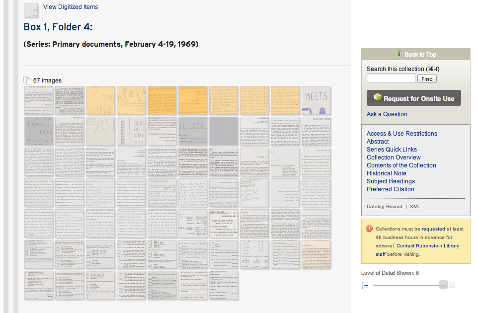
Individual items identified during scanning No item-level identification: entire folders scanned
Descriptive metadata applied to each item Archival description only (e.g., at the folder level)
Robust portals for search & browse Finding aid / collection guide as access point

There are some considerable tradeoffs between document availability vs. discovery and access features, but going at this scale speeds publication considerably. Large-scale digitization was new for all four partners, so we benefited by working together.

Digitized documents accessed through an archival finding aid / collection guide with folder-level description.

Project Evaluation

CCC staff completed qualitative and quantitative evaluations of this large-scale digitization approach during the course of the project, ranging from conducting user focus groups and surveys to analyzing the impact on materials prep time and image quality control. Researcher assessments targeted three distinct user groups: 1) Faculty & History Scholars; 2) Undergraduate Students (in research courses at UNC & NC State); 3) NC Secondary Educators.

Here are some of the more interesting findings (consult the full reports for details):

  • Ease of Use. Faculty and scholars, for the most part, found it easy to use digitized content presented this way. Undergraduates were more ambivalent, and secondary educators had the most difficulty.
  • To Embed or Not to Embed. In 2012, Duke was the only library presenting the image thumbnails embedded directly within finding aids and a lightbox-style image navigator. Undergrads who used Duke’s interface found it easier to use than UNC or NC Central’s, and Duke’s collections had a higher rate of images viewed per folder than the other partners. UNC & NC Central’s interfaces now use a similar convention.
  • Potential for Use. Most users surveyed said they could indeed imagine themselves using digitized collections presented in this way in the course of their research. However, the approach falls short in meeting key needs for secondary educators’ use of primary sources in their classes.
  • Desired Enhancements. The top two most desired features by faculty/scholars and undergrads alike were 1) the ability to search the text of the documents (OCR), and 2) the ability to explore by topic, date, document type (i.e., things enabled by item-level metadata). PDF download was also a popular pick.


Impact on Duke Digitization Projects

Since the moment we began putting our CCC manuscripts online (June 2012), we’ve completed the eight CCC collections using this large-scale strategy, and an additional eight manuscript collections outside of CCC using the same approach. We have now cumulatively put more digital objects online using the large-scale method (96,000) than we have via traditional means (75,000). But in that time, we have also completed eleven digitization projects with traditional item-level identification and description.

We see the large-scale model for digitization as complementary to our existing practices: a technique we can use to meet the publication needs of some projects.

Usage

Do people actually use the collections when presented in this way? Some interesting figures:

  • Views / item in 2013-14 (traditional digital object; item-level description): 13.2
  • Views / item in 2013-14 (digitized image within finding aid; folder-level description): 1.0
  • Views / folder in 2013-14 (digitized folder view in finding aid): 8.5

It’s hard to attribute the usage disparity entirely to the publication method (they’re different collections, for one). But it’s reasonable to deduce (and unsurprising) that bypassing item-level description generally results in less traffic per item.

On the other hand, one of our CCC collections (The Allen Building Takeover Collection) has indeed seen heavy use–so much, in fact, that nearly 90% of TRLN’s CCC items viewed in the final six months of the project were from Duke. Its images averaged over 78 views apiece in the past year; its eighteen folders opened 363 times apiece. Why? The publication of this collection coincided with an on-campus exhibit. And it was incorporated into multiple courses at Duke for assignments to write using primary sources.

The takeaway is, sometimes having interesting, important, and timely content available for use online is more important than the features enabled or the process by which it all gets there.

Looking Ahead

We’ll keep pushing ahead with evolving our practices for putting digitized materials online. We’ve introduced many recent enhancements, like fulltext searching, a document viewer, and embedded HTML5 video. Inspired by the CCC project, we’ll continue to enhance our finding aids to provide access to digitized objects inline for context (e.g., The Jazz Loft Project Records). Our TRLN partners have also made excellent upgrades to the interfaces to their CCC collections (e.g., at UNC, at NC State) and we plan, as usual, to learn from them as we go.

Vacation, all We Ever Wanted

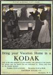
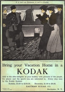
We try to keep our posts pretty focussed on the important work at hand here at Bitstreams central, but sometimes even we get distracted (speaking of, did you know that you can listen to the Go-Gos for hours and hours on Spotify?).   With most of our colleagues in the library leaving for or returning from vacation, it can be difficult to think about anything but exotic locations and what to do with all the time we are not spending in meetings.  So this week, dear reader, we give you a few snapshots of vacation adventures told through Duke Digital Collections.

Artist’s rendering of librarians at the beach.


Many of Duke’s librarians (myself included) head directly East for a few days of R/R at the one of many beautiful North Carolina beaches.  Who can blame them?  It seems like everyone loves the beach including William Gedney, Deena Stryker, Paul Kwilecki and even Sydney Gamble.  Lucky for North Carolina, the beach is only a short trip away, but of course there are essentials that you must not forget even on such a short journey.


K0521


Of course many colleagues have ventured even farther afield to West Virginia, MinnesotaOregon, Maine and even Africa!!  Wherever our colleagues are, we hope they are enjoying some well deserved time-off.  For those of us who have already had our time away or are looking forward to next time, we will just have to live vicariously through our colleagues’ and our collections’ adventures.

On the Reels: Challenges in Digitizing Open Reel Audio Tape

The audio tapes in the recently acquired Radio Haiti collection posed a number of digitization challenges.  Some of these were discussed in this video produced by Duke’s Rubenstein Library:

In this post, I will use a short audio clip from the collection to illustrate some of the issues that we face in working with this particular type of analog media.

First, I present the raw digitized audio, taken from a tape labelled “Tambour Vaudou”:


As you can hear, there are a number of confusing and disorienting things going on there.  I’ll attempt to break these down into a series of discrete issues that we can diagnose and fix if necessary.

Tape Speed

Analog tape machines typically offer more than one speed for recording, meaning that you can change the rate at which the reels turn and the tape moves across the record or playback head.  The faster the speed, the higher the fidelity of the result.  On the other hand, faster speeds use more tape (which is expensive).  Tape speed is measured in “ips” (inches per second).  The tapes we work with were usually recorded at speeds of 3.75 or 7.5 ips, and our playback deck is set up to handle either of these.  We preview each tape before digitizing to determine what the proper setting is.

In the audio example above, you can hear that the tape speed was changed at around 10 seconds into the recording.  This accounts for the “spawn of Satan” voice you hear at the beginning.  Shifting the speed in the opposite direction would have resulted in a “chipmunk voice” effect.  This issue is usually easy to detect by ear.  The solution in this case would be to digitize the first 10 seconds at the faster speed (7.5 ips), and then switch back to the slower playback speed (3.75 ips) for the remainder of the tape.

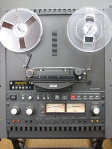
The Otari MX-5050 tape machine

Volume Level and Background Noise

The tapes we work with come from many sources and locations and were recorded on a variety of equipment by people with varying levels of technical knowledge.  As a result, the audio can be all over the place in terms of fidelity and volume.  In the audio example above, the volume jumps dramatically when the drums come in at around 00:10.  Then you hear that the person making the recording gradually brings the level down before raising it again slightly.  There are similar fluctuations in volume level throughout the audio clip.  Because we are digitizing for archival preservation, we don’t attempt to make any changes to smooth out the sometimes jarring volume discrepancies across the course of a tape.  We simply find the loudest part of the content, and use that to set our levels for capture.  The goal is to get as much signal as possible to our audio interface (which converts the analog signal to digital information that can be read by software) without overloading it.  This requires previewing the tape, monitoring the input volume in our audio software, and adjusting accordingly.

This recording happens to be fairly clean in terms of background noise, which is often not the case.  Many of the oral histories that we work with were recorded in noisy public spaces or in homes with appliances running, people talking in the background, or the subject not in close enough proximity to the microphone.  As a result, the content can be obscured by noise.  Unfortunately there is little that can be done about this since the problem is in the recording itself, not the playback.  There are a number of hum, hiss, and noise removal tools for digital audio on the market, but we typically don’t use these on our archival files.  As mentioned above, we try to capture the source material as faithfully as possible, warts and all.  After each transfer, we clean the tape heads and all other surfaces that the tape touches with a Q-tip and denatured alcohol.  This ensures that we’re not introducing additional noise or signal loss on our end.

qtip

Splices

While cleaning the Radio Haiti tapes (as detailed in the video above), we discovered that many of the tapes were comprised of multiple sections of tape spliced together.  A splice is simply a place where two different pieces of audio tape are connected by a piece of sticky tape (much like the familiar Scotch tape that you find in any office).  This may be done to edit together various content into a seamless whole, or to repair damaged tape.  Unfortunately, the sticky tape used for splicing dries out over time, becomes brittle, and loses it’s adhesive qualities.  In the course of cleaning and digitizing the Radio Haiti tapes, many of these splices came undone and had to be repaired before our transfers could be completed.

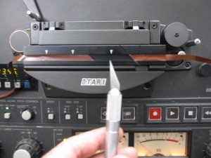
Tape ready for splicing

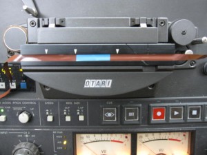
Our playback deck includes a handy splicing block that holds the tape in the correct position for this delicate operation.  First I use a razor blade to clean up any rough edges on both ends of the tape and cut it to the proper 45 degree angle.  The splicing block includes a groove that helps to make a clean and accurate cut.  Then I move the two pieces of tape end to end, so that they are just touching but not overlapping.  Finally I apply the sticky splicing tape (the blue piece in the photo below) and gently press on it to make sure it is evenly and fully attached to the audio tape.  Now the reel is once again ready for playback and digitization.  In the “Tambour Vaudou” audio clip above, you may notice three separate sections of content:  the voice at the beginning, the drums in the middle, and the singing at the end.  These were three pieces of tape that were spliced together on the original reel and that we repaired right here in the library’s Digital Production Center.

A finished splice.  Note that the splice is made on the shiny back of the tape, not on the matte side that audio signal is encoded on.
A finished splice. Note that the splice is made on the shiny back of the tape, not on the matte side that audio is recorded on.


These are just a few of many issues that can arise in the course of digitizing a collection of analog open reel audio tapes.  Fortunately, we can solve or mitigate most of these problems, get a clean transfer, and generate a high-quality archival digital file.  Until next time…keep your heads clean, your splices intact, and your reels spinning!


Notes from the Duke University Libraries Digital Projects Team