Launching One Person, One Vote

Promotional postcard for One Person, One Vote site.

On Monday, March 2nd, the new website, One Person, One Vote: The Legacy of SNCC and the Fight for Voting Rightswent live. The launch represented an unprecedented feat of collaboration between activists, scholars, archivists, digital specialists, and students. In a year and a half, this group went from wanting to tell a grassroots story of SNCC’s voting rights activism to bringing that idea to fruition in a documentary website.

So what did it take to get there? The short answer is a dedicated group of people who believed in a common goal, mobilized resources, put in the work, and trusted each other’s knowledge and expertise enough to bring the project to life. Here’s a brief look at the people behind-the-scenes:

Advisory Board: Made up of representatives of the SNCC Legacy Project, Duke Libraries, and the Center for Documentary Studies, the Advisory Board tackled the monumental task of raising funds, making a way, and ensuring the future of the project.

Editorial Board: One Person, One Vote site has content galore. It features 82 profiles, multimedia stories, an interactive timeline, and map that collectively tell a story of SNCC’s voting rights activism. The enormous task of prioritizing content fell to the Editorial Board. Three historians, three SNCC veterans, and three Duke Libraries staff spent long hours debating the details of who and what to include and how to do it.

OPOVlogo_mediumProject Team: Once the Editorial Board prioritized content, it was the Project Team’s job to carry out the work. Made up of six undergrads, two grad students, and one intern, the Project Team researched and wrote profiles and created the first drafts of the site’s content.

Visiting Activist Scholars: SNCC veterans and Editorial Board members, Charlie Cobb and Judy Richardson, came to Duke during the 2014 – 2015 academic year to advise the Project Team and work with the Project Manager in creating content for One Person, One Vote. As the students worked to write history from the perspective of the activists and local people, the Visiting Activist Scholars guided them, serving as the project’s “SNCC eyes.”

OPOV_logo_textDesign Contractors: The One Person, One Vote Project hired The Splinter Group to design and create a WordPress theme for the site with input from the Editorial Board.

Duke Libraries Digital Specialists: The amazing people in Duke Libraries’ Digital Production Center and Digital Projects turned One Person, One Vote into a reality. They digitized archival material, built new features, problem-solved, and did a thousand other essential tasks that made One Person, One Vote the functional, sleek, and beautiful site that it is.

Of course, this is only the short list. Many more people within the SNCC Legacy Project, the Center for Documentary Studies, and Duke Libraries arranged meetings and travel plans, designed postcards and wrote press releases, and gave their thoughts and ideas throughout the process. One Person, One Vote is unquestionably the work of many and represents a new way for activists, scholars, and librarians to partner in telling a people’s history.

Man to Fight Computers!

1965 Engineers Show Image_DukEngineer
Duke Engineers Show in March 1965, DukEngineers

Fifty years ago this week, Duke students faced off with computers in model car races and tic-tac-toe matches in the annual Engineers’ Show.  In stark contrast to the up-and-coming computers, a Duke Chronicle article dubbed these human competitors as old-fashioned and obsolete.  Five decades later, although we humans haven’t completely lost our foothold to computers, they have become a much bigger part of our daily lives than in 1965.  Yes, there are those of you out there who fear the imminent robot coup is near, but we mostly have found a way to live alongside this technology we have created.  Perhaps we could call it a peaceful coexistence.


Zeutschel Image
Zeutschel Overhead Scanner

At least, that’s how I would describe our relationship to technology here at the Digital Production Center (DPC) where I began my internship six weeks ago.  We may not have the entertaining gadgets of the Engineers’ Show, like a mechanical swimming shark or mechanical monkey climbing a pole, but we do have exciting high-tech scanners like the Zeutschel, which made such instant internet access to articles like “Man To Fight Computers” possible.  The university’s student newspaper has been digitized from fall 1959 to spring 1970, and it is an ongoing project here at the DPC to digitize the rest of the collection spanning from 1905 to 1989.


My first scanning project has been the 1970s Duke Chronicle issues.  While standing at the Zeutschel as it works its digitization magic, it is fascinating to read the news headlines and learn university history through pages written by and for the student population.  The Duke Chronicle has been covering campus activities since 1905 when Duke was still Trinity College.  Over the years it has captured the evolution of student life as well as the world beyond East and West Campus.  The Chronicle is like a time capsule in its own right, each issue freezing and preserving moments in time for future generations to enjoy.  This is a wonderful resource for researchers, history nerds (like me!), and Duke enthusiasts alike, and I invite you to explore the digitized collection to see what interesting articles you may find.  And don’t forget to keep checking back with BitStreams to hear about the latest access to other decades of the Duke Chronicle.


1965 Engineers Show_DukEngineer
DukEngineer, The College of Engineering magazine, covered this particular Engineers’ Show in their April 1965 issue.

The year 1965 doesn’t seem that distant in time, yet in terms of technological advancement it might as well be eons away from where we are now.  Playing tic-tac-toe against a computer seems arcane compared to today’s game consoles and online gaming communities, but it does put things into perspective.  Since that March day in 1965, it is my hope that man and computer both have put down their boxing gloves.

Small Problems, Little Solutions

I have been thinking lately about tools that make tasks I repeat frequently more efficient. For example, I’m an occasional do-it-yourself home repairer and have an old handsaw that works just fine for cutting a few pieces of wood for small repairs. It’s easy to understand how to use the saw, takes very little planning, and takes just a bit of manual effort.

P1040015

Last summer, however, I faced a larger task of rebuilding a whole section of my deck that had rotted. I began using the handsaw to cut the wood I would need for the repair and quickly realized my usual method was going take a long time and make me very sore and unhappy. I needed a better tool and method. This better tool was an electric circular saw, which is more expensive, harder to understand how to use, and more dangerous than the handsaw, but much more efficient. Since I have a healthy fear of death and dismemberment, I also took some time to learn how to use the dreadful thing in a safe manner. It took an initial investment in time and effort, but with the electric saw I was able to make much faster and less painful progress repairing the deck.

I encounter similar kinds of problems when writing software and making things for the web. It’s perfectly possible to do these things using a basic text editor to write everything out by hand. I got along fine this way for a long time. But there are many ways to make this work more efficient. The rest of this post is mainly a list of techniques and tools I’ve invested time and energy to learn to use to reduce annoying, repetitive tasks.

My favorite time and effort saver is learning how to execute common tasks in a text editor using keyboard shortcuts. Here are a few examples of shortcuts I use many times a day in my favorite editor, Sublime Text 2. The ones I used the most involve moving the cursor or text around without touching the mouse. (These are specific to Macintosh computers, but there are similar shortcuts available in other operating systems.)

  • Hold down the Option key and use the left and right arrow keys to move the cursor a word at a time instead of a space at a time.
  • Hold down the Command key and use the left or right arrow to move to the beginning or end of a line. The up or down arrow will take you to the top or end of the document.
  • Add the shift key to the above shortcuts to select text as the cursor moves.
  • The delete key will also work with these shortcuts.
  • Indent a line of text or a whole block of text using the Command key and the left and right brackets.

There are also more advanced text editor features or plugins that make coding easier by reducing the amount you have to type by hand.

Emmet is a utility that does a few things, but it mainly lets you use abbreviated CSS syntax to generate full HTML markup. For example I can type div.special and when I hit the tab key Emmet automatically turns that into:
Screen Shot 2015-03-13 at 5.17.21 PM
You can string these together to generate multi line nested HTML markup from a single string.

SublimeCodeIntel is another plugin for the text editor I use. It adds an intelligent auto-suggest menu that updates as you type with things that are specific to the programming language you’re working in and the specific program. For example in PHP it if I type “e” it will suggest “echo” and I can hit enter to use that suggestion. It also remembers things like the variable and class names in the project you’re working on. It even seems to learn what terms you use most frequently and suggests those first. It saves much typing.

There are also a couple of utilities I run in a terminal window while I’m working to automate different tasks. Many of these are powered by Guard, which is a Rails Gem that watches for changes to files. This is more useful than it might sound. For example, Guard can run LiveReload. When Guard notices a file has changed that you told it to watch it triggers LiveReload that then refreshes your browser window. With this tool I can make small changes to a project and see the updates in realtime in my browser without having the refresh the page manually. There are also Guard utilities for running tests, compressing JavaScript, and generating browser friendly CSS from easier to write and maintain (coder friendly) SCSS.

687474703a2f2f636c2e6c792f696d6167652f316b336f3172325a3361304a2f67756172642d49636f6e2e706e67

These are just a few of the ways I try to streamline repetitive tasks.

The History of Medicine’s Anatomical Fugitive Sheet Digital Collection

As Curator for the History of Medicine Collections in the Rubenstein Rare Book & Manuscript Library, I have the opportunity to work with incredible items, including Renaissance era amputation saws, physician case books from the nineteenth century, and anatomical illustrations with moveable parts, just to name a few.

HOM1
One of the Anatomical Fugitive Sheets with flap down.
HOM2
Same image as the previous one, but with top flap up.

In my opinion, our holdings of anatomical fugitive sheets are some of the most remarkable and rare items one can find in historical medical collections. Our collection includes ten of these sheets, and each one is fascinating for its own reasons.

These anatomical fugitive sheets, which date from the early sixteenth to the mid-seventeenth centuries, are single sheets, similar to broadsides, that are unique in that they contain overlays or flaps that lift to reveal the inside of the human body.

I have read arguments that such items would have been used by barber surgeons or medical students, but others say these were hung in apothecary shops or purchased and kept by individuals with an interest in knowing what was inside their body. After almost 500 years, it is amazing that these anatomical fugitive sheets still exist. While we do have a few sheets that have lost some or all of their flaps, I think it’s fascinating to examine where flaps are broken. Somehow these broken and missing parts make these sheets more real to me – a reminder that each one has a story to tell. How and when did the flap get torn? How would this have really been used in 1539?

After the success of our Animated Anatomies exhibit, many of my colleagues and I have been discussing how to make our materials that contain flaps available online. I can tell you, it’s no easy task, but I am thrilled that we now have a digital version of our collection of anatomical fugitive sheets. With funding from the Elon Clark Endowment, a local custom web design firm, Cuberis, was outsourced to create the code, making these items interactive. Our own amazing Digital Collections Team not only photographed each overlay, but also took the code and applied it to DUL’s digital collection site, making it all work freely to a public audience.

There are so many people involved in making something like this happen. Thanks to Mark Olson, Cordelia and William Laverack Family Assistant Professor of Art, Art History & Visual Studies here at Duke University, for his role in getting this project started. And here in the DUL – a huge thanks to Erin Hammeke (Conservation), Mike Adamo and Molly Bragg (Digital Production Center), Noah Huffman and Lauren Reno (Rubenstein Library Technical Services), Will Sexton, Cory Lown, and especially Sean Aery (Digital Projects Department). They are an incredible team that makes beautiful things happen. Obviously.

Post contributed by Rachel Ingold

Taken near doorways

We’re continually walking through doorways or passing them by, but how often do we linger to witness the life that unfolds nearby? Let the photographs below be your doorway, connecting you with lives lived in other places and times.

Man holding small boy in the air while a woman looks on from doorway.
Man holding small boy in the air while a woman looks on from doorway, from William Gedney Photographs and Writings

Man in doorway. Woman walking down sidewalk
New York City: Greenwich Village, from Ronald Reis Photographs

Man sitting on chair holding a small child.
Man sitting on chair holding a small child, from William Gedney Photographs and Writings

Woman, boy and man near entrance to store.
Outside entrance to Wynn’s Department Store, 1968 Dec., from Paul Kwilecki Photographs

Woman with cat in doorway
Woman with cat in doorway, Pear Orchard, 1961, from Paul Kwilecki Photographs

family portrait taken in front of doorway.
N479, from Hugh Mangum Photographs

Man eating, with child in background
Man Eating, with Child in Background, from Sidney D. Gamble Photographs

Be adventurous. Explore more images taken by these photographers as displayed within Duke University Libraries’ digitized collections.

Getting to Know Us Even Better

Last Fall, this blog featured brief profiles of all your favorite Duke Library Information Technology Services staff, including our digitization specialists.   This week on the blog we thought we would shine the spotlight even closer on our still image digitization expert, Mike and learn more about his unique contribution to Duke University Libraries.

Mike Adamo, Still Image Digitization Specialist


Favorite thing about your job:

While there are a number of things I enjoy about my job I would have to say that working on the Digital Collections Implementation Team consistently rises to the top.  We are a small agile group that is tasked with publishing a wide variety of digital content created within the library and without for publication on the Library’s Digital Collections website.  Each member of the team has a different vantage point when working with digital collections but we have the same goal in mind.  We all strive to publish high quality digital collections in an efficient, consistent and innovative way.  Everyone on the team is constantly trying to expand our capabilities whether it be an enhancement to the interface, normalization of metadata, adding new digitization equipment, streamlining the proposal process or the overarching goal to fold all of our workflows and systems together.  It is rewarding to be on such an innovative, hardworking team.

What is the most noteworthy/most exciting/biggest change in your 10 years at Duke:

I would say that the Digital Production Center is always changing.  The DPC has been in 4 different locations. I think we have had over 10 department heads all with different priorities, communication styles and approaches to the work.  Our department has been under Conservation and IT (twice).  We have a steady flow of students to keep us on our toes.

Favorite collection/project you have worked on:

I’ve had a few favorite collections over the years but the one that rise to the top is the Jane Goodall Archive.  The Goodall Research papers was an interesting project to work on because it is such a large collection and it spanned many years.  The logistics of pulling this off were pretty complex with a lot of moving parts.  The highlight was that I (along with other members of the team) got to meet Jane Goodall.  She has an open, quiet strength and was very friendly.  Who knows if I’ll ever meet another legend in my lifetime?

Most challenging aspect of your work:

Just like many of us in the Library, the demands on my time are spread across many areas.  Our main focus in the DPC is to “create(s) digital captures of unique, valuable, or compelling primary resources for the purpose of preservation, access, and publication.”  This involves analyzing collections for digitization, developing project plans, consulting Conservation, providing supporting documentation for each project, training and monitoring students, color calibrating and profiling the environment, digitization of collections, quality control of collections, moving and posting of thousands upon thousands of images.  To make it more fun, we always have multiple projects going at one time.

 But just like most of us in the Library, in addition to my main job I have where many hats.  Some of them are: Normalization and ingest of legacy collections into the repository; test and make recommendations for new technology for use in the DPC and elsewhere in the Library; maintain existing technology; troubleshoot our own equipment and work with our vendors to resolve mechanical, software and enterprise issues; consult with faculty and staff in the Library and across campus on their digitization projects; train Library staff on digital imaging standards and equipment; monitor and maintain 7 servers used for production and storage of archival digital images; and field all manner of random questions related to still image capture.  So, balancing all of these things is probably the most challenging thing about my job.  I think many, if not all of us, in the Library deal with this and do a pretty good job of keeping up with everything.

Favorite image:

This is not on Duke Digital Collections, but we digitized it and it was displayed at the Nasher Museum.  For me, this picture personifies the severity of the struggle and sacrifice that is the Civil Rights Movement.

James Karales, Passive resistance training, Student Nonviolent Coordinating Committee (SNCC), 1960. Atlanta, Georgia. Gelatin silver print, 8.5 x 13 inches. The Duke University Special Collections Library.
James Karales, Passive resistance training, Student Nonviolent Coordinating Committee (SNCC), 1960. Atlanta, Georgia. Gelatin silver print, 8.5 x 13 inches. The Duke University Special Collections Library. Screenshot from Nasher Museum of Art webpage.

Building a Kiosk for the Edge

Many months ago I learned that a new space, The Ruppert Commons for Research, Technology, and Collaboration, was going to be opening at the start of the calendar year. I was tasked with building an informational kiosk that would be seated in the entry area of the space. The schedule was a bit hectic and we ended up pruning some of the desired features, but in the end I think our first iteration has been working well. So, I wanted to share the steps I took to build it.

Setting Requirements

I first met with the Edge team at the end of August 2014. They had an initial ‘wish list’ of features that they wanted to be included in the kiosk. We went through the list and talked about the feasibility of those items, and tried to rank their importance. Our final features list looked something like this:

Primary Features:

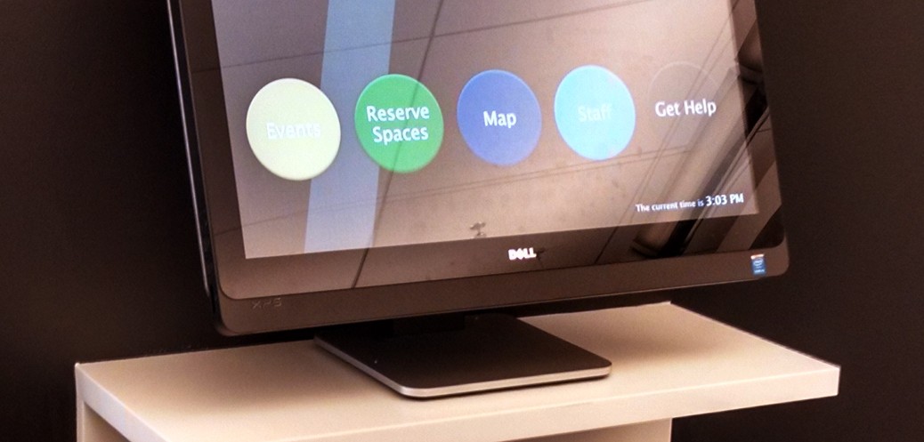
  • Events list (both public and private events in the space)
  • Room reservation system
  • Interactive floor plan map
  • Staff lookup
  • Current Time
  • Contact information (chat, email, phone)

Secondary Features:

  • Display of computer availability
  • Ability to report printing / scanning problems
  • Book locations
  • Scheduleable content on ‘home’ screen

Our deadline was the soft opening date of the space at the start of the new year, but with the approaching holidays (and other projects competing for time) this was going to be a pretty fast turn around. My goal was to have a functional prototype ready for feedback by mid October. I really didn’t start working on the UI side of things until early that month, so I ended up needing to kick that can down the road a few weeks, but that happens some times.

The Hardware

The Library had purchased two Dell 27″ XPS all-in-one touchscreen machines for the purpose of serving as an informational kiosk near the new/temporary main entrance of Perkins/Bostock. For various reasons, that project kept getting postponed. But with the desire to also have a kiosk in the Edge, we decided we could use one of the Dell machines for this purpose. The touch screen display is great —  very bright, reasonably accurate color reproduction, and responsive to touch inputs. It does pickup a lot of finger prints, but that’s sort of unavoidable with a glossy display. The machine seems to run a little bit hot and the fan is far from silent, but in the space you don’t notice it at all. My favorite aspect of this computer is the stand. It’s really fantastic — it’s super easy to adjust, but also very sturdy. You can position it in a variety of ways, depending on the space you’re using it in, and be confident that it won’t slip out of adjustment even under constant use. Various positions of Dell computer 
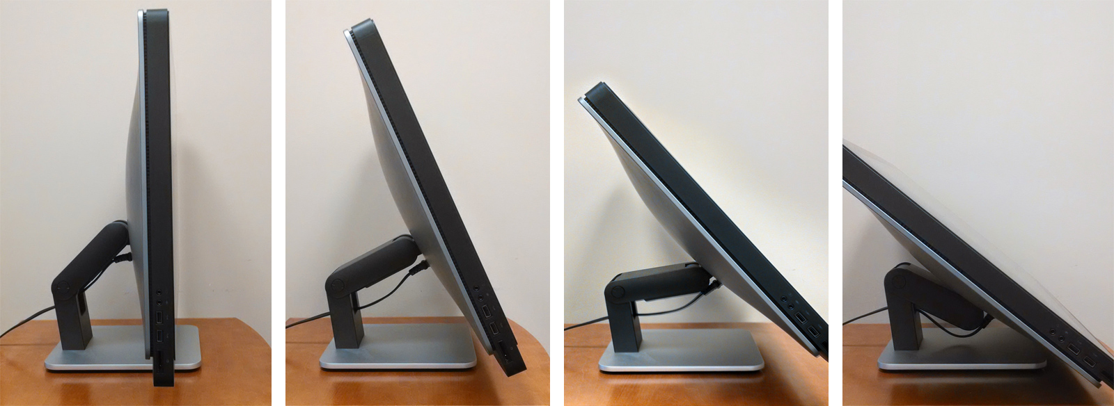
I think in general we’re a little wary of using consumer grade hardware in a 24/7 public environment, but for the 1.5 months it’s been deployed it seems to be holding up well enough.

The OS

The Dell XPS came from the factory with Windows 8. I was really curious about using Assigned Access Mode in the Windows 8.1, but the need to use a local (non-domain) account necessitated a clean install of 8.1, which sounds annoying, but that process is so fast and effortless, at least compared to days of Windows yore, that it wasn’t a huge deal. I eventually configured the system as desired — it auto-boots into the local account on startup and then fires up the assigned Windows app (and limits the machine only to that app).

I spent some time playing around with different approaches for a browser to use with assigned access. The goal was to have a browser that ran in a ‘kiosk’ mode in that there was no ability for the user to interact with anything outside of the intended kiosk UI — meaning, no browser chrome windows, bookmarks, etc. I also planned to use Microsoft’s Family Safety controls to limit access to URLs outside of the range of pages that would comprise the kiosk UI. I tried both Google Chrome and Microsoft IE 11 (which really is a good browser, despite pervasive IE hate), but I ended up having trouble with both of them in different ways. Eventually, I stumbled on to a free Windows Store app called KIOSK SP Browser. It does exactly what I want — it’s a simple, stripped down, full screen browser app. It also has some specific kiosk features (like timeout detection) but I’m only using it to load the kiosk homepage on startup.

The Backend

As several of the requirements necessitated data sources that live in the Drupal system that drives our main library site, I figured the path of least resistance would be to also build the kiosk interface in Drupal. Using the Delta module, I setup a version of our theme that stripped out most of the elements that we wouldn’t be using (header, footer, etc.) for the kiosk. I could then apply the delta to a small range of pages using the Context Module. The pages themselves are quite simple by and large. Screen shots of the pages in the Edge Kiosk

  • Events — I used a View to import an RSS feed from Yahoo Pipes (which combines events from our own Library system and the larger Duke system).
  • Reserve Spaces – this page loads in content from Springshare’s LibCal system using an iFrame.
  • Map — I drew a simplified map in Illustrator based architect’s floor plan , then saved it out as an SVG and added ID tags to the areas I wanted to make interactive.
  • Staff — this page loads in content from a google spreadsheet using a technique I outlined previously on Bitstreams.
  • Help — this page loads our LibraryH3LP Chat Widget and a Qualtrics email form.

The Frontend

When it comes time to design an interface, my first step is almost always to sketch on paper. For this project, I did some playing around and ended up settling on a circular motif for the main navigational interface. I based the color scheme and typography on a branding and style guide that was developed for the Edge. Edge Kiosk home page design 
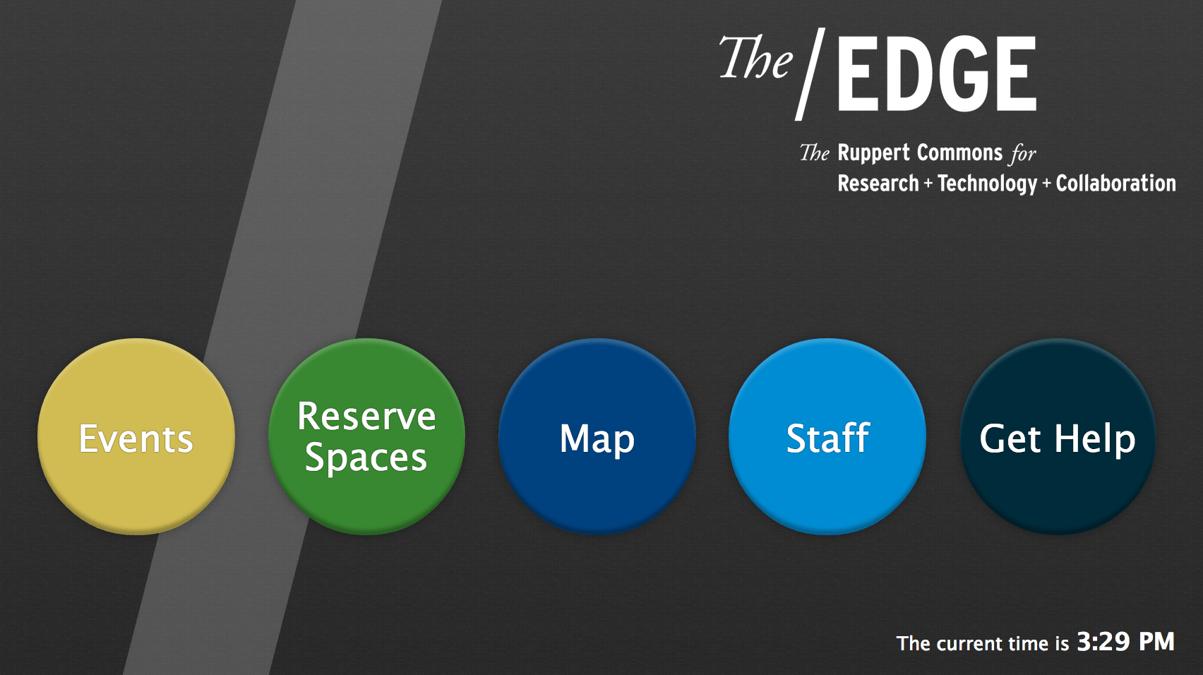
Many years ago I used to turn my sketches into high fidelity mockups in photoshop or illustrator, but for the past couple of years I’ve tended to just dive right in and design on the fly with html/css. I created a special stylesheet just for this kiosk — it’s based on a fixed pixel layout as it is only ever intended to be used on that single Dell computer — and also assigned it to load using Delta. One important aspect of a kiosk is providing some hinting to users that they can indeed interact with it. In my experience, this is usually handled in the form of an attract loop.

I created a very simple motion design using my favorite NLE and rendered out an mp4 to use with the kiosk. I then setup the home page to show the video when it first loads and to hide it when the screen is touched. This helps the actual home page content appear to load very quickly (as it’s actually sitting beneath the video). I also included a script on every page to go to the homepage after a preset period on inactivity. It’s currently set to three minutes, but we may tweak that. Video stills of attract loop All in all I’m pleased with how things turned out. We’re planning to spend some time evaluating the usage of the kiosk over the next couple of months and then make any necessary tweaks to improve user experience. Swing by the Edge some time and try it out!

Challenges of Embedding

One Person, One Vote project room in The/Edge. Countdown shows 17 days until launch

During its first five months, the One Person, One Vote project concentrated on producing content. The forthcoming website (onevotesncc.org) tells the story of how the Student Nonviolent Coordinating Committee’s (SNCC) commitment to community organizing forged a movement for voting rights made up of thousands of local people. When the One Person, One Vote site goes live on March 2nd (only 17 days from today!), it will include over 75 profiles of the sharecroppers and maids, World War II veterans and high school students, SNCC activists and seasoned mentors that are the true heroes in the struggle for voting rights. From September through January, the project team scoured digital collections, archival resources, secondary sources, and internet leads to craft these stories.

At the end of January, the One Person, One Vote WordPress theme was finished and our url was working. The project had just settled into its new space in The/Edge, Duke Libraries new hub for research, technology, and collaboration, making it a great time to start a new phase of the project: populating and embedding.

An example of the layout of a profile on One Person, One Vote with photos embedded in the context and primary source documents in the right sidebar.

Unlike traditional digital collections, the One Person, One Vote site does not host any of the primary source material it uses. Instead, it acts as a digital gateway, embedding and linking to material hosted in different digital collections at institutions across the country. These include the Wisconsin Historical Society’s Freedom Summer Collection, the Civil Rights in Mississippi Digital Archive at the University of Southern Mississippi, Duke’s SNCC 40th Anniversary and Joseph Sinsheimer collections, and the Trinity College’s 1988 SNCC conference tapes to name only a few. Every profile featured on the One Person, One Vote site includes 4 – 8 unique sources, and the entire site has over 400 items embedded in it.

Figuring out how to cleanly and uniformly  embed sources has been a challenge to say the least. Many archival institutions use the archival management system, CONTENTdm, to organize their digital collections. The Veterans of the Civil Rights Movement website hosts their documents as pdf files. The Library of Congress provides an embed code for the oral histories in their Civil Rights Oral History Project, but they also post them on YouTube. Meanwhile, the McComb Legacies Project and Trinity College use Vimeo. The amount of digitized material is staggering but how it’s made available is far from standardized. So by trial and error, One Person, One Vote is slowly coming up with answers to the question: how do we bring diverse sources together to tell a compelling story (both narrative-wise and visually) of the grassroots struggle for voting rights? Right now, these are some of our footnotes.

The One Person, One Vote Project's running footnotes on how to embed primary source material.
A selection of the One Person, One Vote Project’s growing list of footnotes on how to embed primary source material.


Indiana Jones and The Greek Manuscripts

One of my favorite movies as a youngster was Steven Spielberg’s “Raiders of the Lost Ark.” It’s non-stop action as the adventurous Indiana Jones criss-crosses the globe in an exciting yet dangerous race against the Nazis for possession of the Ark of the Covenant. According to the Book of Exodus, the Ark is a golden chest which contains the original stone tablets on which the Ten Commandments are inscribed, the moral foundation for both Judiasm and Christianity. The Ark is so powerful that it single-handedly destroys the Nazis and then turns Steven Spielberg and Harrison Ford into billionaires. Countless sequels, TV shows, theme-park rides and merchandise follow.

emsgk010940010
Greek manuscript 94, binding consists of heavily decorated repoussé silver over leather.

Fast-forward several decades, and I am asked to digitize Duke Libraries’ Kenneth Willis Clark Collection of Greek Manuscripts. Although not quite as old as the Ten Commandments, this is an amazing collection of biblical texts dating all the way back to the 9th century. These are weighty volumes, hand-written using ancient inks, often on animal-skin parchment. The bindings are characterized as Byzantine, and often covered in leathers like goatskin, sometimes with additional metal ornamentation. Although I have not had to run from giant boulders, or navigate a pit of snakes, I do feel a bit like Indiana Jones when holding one of these rare, ancient texts in my hands. I’m sure one of these books must house a secret code that can bestow fame and fortune, in addition to the obvious eternal salvation.

Before digitization, Senior Conservator Erin Hammeke evaluates the condition of each Greek manuscript, and rules out any that are deemed too fragile to digitize. Some are considered sturdy enough, but still need repairs, so Erin makes the necessary fixes. Once a manuscript is given the green light for digitization, I carefully place it in our book cradle so that it cannot be opened beyond a 90-degree angle. This helps protect our fragile bound materials from unnecessary stress on the binding. Next, the aperture, exposure, and focus are carefully adjusted on our Phase One P65+ digital camera so that the numerical values of our X-rite color calibration target, placed on top of the manuscript, match the numerical readings shown on our calibrated monitors.

cradle
Greek manuscript 101, with X-Rite color calibration target, secured in book cradle.

As the photography begins, each page of the manuscript is carefully turned by hand, so that a new image can be made of the following page. This is a tedious process, but requires careful concentration so the pages are consistently captured throughout each volume. Right-hand (recto) pages are captured first, in succession. Then the volume is turned over, so that the left-hand (verso) pages can be captured. I can’t read Greek, but it’s fascinating to see the beauty of the calligraphy, and view the occasional illustrations that appear on some pages. Sometimes, I discover that moths, beetles or termites have bored through the pages over time. It’s interesting to speculate as to which century this invasive destruction may have occurred. Perhaps the Nazis from the Indiana Jones movies traveled back in time, and placed the insects there?

worm2
Greek manuscript 101, showing insect damage.

Once the photography is complete, the recto and verso images are processed and then interleaved to recreate the left-right page order of the original manuscript. Next, the images go through a quality-control process in which any extraneous background area is cropped out, and each page is checked for clarity and consistent color and illumination. After that, another round of quality control insures that no pages are missing, or out of order. Finally, the images are converted to Pyramid TIFF files, which allow our web site users to zoom out and see all the pages at once, or zoom in to see maximum detail of any selected page. 38 Greek manuscripts are ready for online viewing now, and many more are coming soon. Stay tuned for the exciting sequel: “Indiana Jones and Even More Greek Manuscripts.”

On Tour with H. Lee Waters: Visualizing a Logbook with TimeMapper

The H. Lee Waters Film Collection we published earlier this month has generated quite a buzz. In the last few weeks, we’ve seen a tremendous uptick in visits to Duke Digital Collections and received comments, mail, and phone calls from Waters fans, film buffs, and from residents of the small towns he visited and filmed over 70 years ago. It’s clear that Waters’ “Movies of Local People” have wide appeal.

The 92 films in the collection are clearly the highlight, but as an archivist and metadata librarian I’m just as fascinated by the logbooks Waters kept as he toured across the Carolinas, Virginia, and Tennessee screening his films in small town theaters between 1936 and 1942. In the logbooks, Waters typically recorded the theater name and location where he screened each film, what movie-goers were charged, his percentage of the profits, his revenue from advertising, and sometimes the amount and type of footage shown.

As images in the digital collection, the logbooks aren’t that interesting (at least visually), but the data they contain tell a compelling story. To bring the logbooks to life, I decided to give structure to some of the data (yes, a spreadsheet) and used a new visualization tool I recently discovered called TimeMapper to plot Waters’ itinerary on a synchronized timeline and map–call it a timemap! You can interact with the embedded timemap below, or see a full-screen version here. Currently, the Waters timemap only includes data from the first 15 pages of the logbook (more to come!). Already, though, we can start to visualize Waters’ route and the frequency of film screenings.  We can also interact with the digital collection in new ways:

  • Click on a town in the map view to see when Waters’ visited and then view the logbook entry or any available films for that town.
  • Slide the timeline and click through the entries to trace Waters’ route
  • Toggle forward or backwards through the logbook entries to travel along with Waters

For me, the Waters timemap demonstrates the potential for making use of the data in our collections, not just the digitized images or artifacts. With so many simple and freely available tools like TimeMapper and Google Fusion Tables (see my previous post), it has never been so easy to create interactive visualizations quickly and with limited technical skills.

I’d love to see someone explore the financial data in Waters’ logbooks to see what we might learn about his accounting practices or even about the economic conditions in each town. The logbook data has the potential to support any number of research questions. So start your own spreadsheet and have at it!

[Thanks to the folks at Open Knowledge Labs for developing TimeMapper]

Notes from the Duke University Libraries Digital Projects Team