MATLAB is an integrated technical computing environment that combines numeric computation, advanced graphics and visualization, and a high-level programming language. Duke’s license agreement offers MATLAB licenses to faculty and staff for work or personal computers, as well as students through on-campus use. The Duke Office of Information Technology (OIT) maintains instructions on installing MATLAB at Duke. MATLAB is used by many communities at Duke, including Engineering, Econometrics, Medical Sciences, Computational Biology, and Business.
On Tuesday, June 18, OIT in partnership with Duke University Libraries will host a one-day course on MATLAB that focuses on using this software for Data Processing and Visualization. The course will cover importing data, organizing data, and visualizing data in a hands-on format (detailed outline). Seats are limited to 20; please register soon to reserve your spot.
MATLAB for Data Processing and Visualization
(outline)
Laura Proctor, Academic Training Engineer at MathWorks
Tuesday, June 18
8:30 a.m. to 4:30 p.m. (lunch break from 12:00 p.m. to 1:00 p.m., lunch not provided)
Library Computer Classroom, Bostock 023 Registration (seats limited to 20)
The course assumes some existing familiarity with MATLAB. New potential MATLAB users may want to attend an overview seminar on the software that will be held on Thursday, May 30. This overview will not be hands on, but it will include live demonstrations and examples of both MATLAB and Simulink, an environment for multi-domain simulation and model-based design.
Introduction to Data Analysis and Visualization with MATLAB & Simulink
(details and registration)
Mehernaz Savai, Applications Engineer at MathWorks
Thursday, May 30
1:00 p.m. to 4:00 p.m. FCIEMAS Building, Schiciano Auditorium – side A
The finalists winners of the 2013 Data Visualization Contest were announced at our recent Data & GIS Services open house. The judging panel selected the top five submissions as finalists, each of which was then converted into a poster for display in the Brandaleone Family Center for Data and GIS Services (Perkins 226). Of the five finalists, the panel also selected two grand prize winners, each of whom was awarded $250 in Amazon Gift Cards.
Data and GIS Services would like to congratulate the finalists and winners and thank all of the student submitters for their impressive work! The full set of submissions to the contest is available on our growing Flickr gallery.
Tableau is a data visualization software application that allows you to easily create and share interactive charts, graphs, and maps. While the free version of this tool, Tableau Public, has offered wonderful opportunities for generating and publishing data visualizations, there are file size and format limits that make it difficult for some researchers to use the public tool.
For some time, the company has had a program to offer temporary licenses to teachers and students who use Tableau in the classroom (Tableau for Teaching). Now, the company is giving full-time students free access to Tableau Desktop for one year.
With the recent release of Tableau 8 and its many new features, this is a wonderful time to start visualizing your data!
Dr. Collins engages in interdisciplinary research, combining information visualization and human-computer interaction with natural language processing to address the challenges of information management and the problems of information overload. His publications, including the DocuBurst document content visualization system, have helped to open a new and thriving area of research in “Linguistic Visualization”. Dr. Collins has been awarded a Discovery Grant from NSERC, providing 5 years of funding for research on “Text and Multimedia Document Visualization”. His research interests include: visualization of natural language data, interaction techniques for information visualization (including multi-touch interaction), scientific visual analytics, and social implications of computing / ethics & philosophy of computing.
Dr. Collins will give the following public presentations:
Humanizing Data:
Enabling Linguistic Insight with Information Visualization
Thursday, April 4, 2013
12:00p.m. to 1:00p.m. (lunch provided) Smith Warehouse, Bay 4, in the FHI Garage
While linguistic skill is a hallmark of humanity, the increasing volume of linguistic data each of us faces is causing individual and societal problems – ‘information overload’ is a commonly discussed condition. Big data has enabled new tasks, such as finding the most appropriate information online, engaging in historical study using language data on the level of millions of documents, and tracking trends in sentiment and opinion in real time. These tasks need not cause stress and feelings of overload: the human intellectual capacity is not the problem. Rather, the current technological supports are inappropriate for these tasks. Linguistic information overload is not a new phenomenon: throughout history, the pace of information creation and storage has exceeded the pace of development of management strategies.
Drawing on a variety of qualitative and quantitative methods, my research aims to bring new, richly interactive interfaces to the forefront of information management, in order to keep up with the current challenges of ‘big data’ and the growing power of linguistic computing algorithms. In this talk I will present the results of several design studies spanning investigations of patterns in millions of real passwords to using visualization to analyze the written history of the court system. Each project aims to bridge what I call the ‘linguistic visualization divide’ – the practical disconnect between the sophistication of natural language processing and the power of interactive visualization. In conclusion, I will present some general challenges and opportunities for the future of text and language visualization.
Designing Multiple Relation Visualizations:
Case Studies from Text Analytics
Friday, April 5, 2013
12:00p.m. to 1:00p.m. (lunch provided) Levine Science Research Center, Room D106 (near the Research Drive entrance), in conjunction with the Visualization Friday Forum
Datasets often have both explicit relations (e.g. citations between papers in a data set, links in a parse tree), and implicit relations (e.g. papers by the same author, words that start with the same letter). Drawing on grounding research into the real-world problems faced by computational linguists, in this talk I will explore several examples of visualizations designed to support simultaneous exploration of both explicit and implicit relations in data. I will suggest the concept of ‘spatial rights’ – the primacy of the spatial visual encoding, and present several methods for enhancing visualizations through adding implicit relation information without disrupting the spatialization of the explicit relation. The techniques have been generalized by others beyond the linguistic domain to be used in bioinformatics, finance, and general statistical charts.
There are also blocks of time in his schedule available for individual and group meetings. If you would like to meet with Dr. Collins, please contact Angela Zoss (angela.zoss@duke.edu) or Eric Monson (emonson@cs.duke.edu).
Visualizing spatial data can be challenging. Specialized software tools like ArcGIS produce excellent results, but often seem complex for relatively simple tasks. Several online tools have emerged recently that provide relatively easy alternatives for the display of spatial data. In this post, we examine Google Fusion Tables, which combines visualizations, including spatial visualizations, with a database back end. The key advantages to Fusion Tables are easy display of latitude/longitude data or data that is included with address information. In addition, Fusion Tables provides a one-stop location for producing visualizations other than maps, such as line charts or tables.
Uploaded to Fusion Tables is easy through Google Docs. Simply log in if you have an account, create a new Table, and on the next screen, point to the file you wish to upload. Excel and CSV files are the two most commonly used, and KML files allow for upload of maps that contain spatial information, such as locations or polygon definitions.
One thing to note about Google products is that they are often in a state of flux. Limits and restrictions noted below may change in the future. For further information regarding Google Fusion Tables, please consult this Libguide authored by Mark Thomas.
Geocoding Addresses
A complete list of geographic data types can be found at the Google support site. In this post, two of the more common geocoding types will be addressed, address data and data that applies to states, counties, and similar objects.
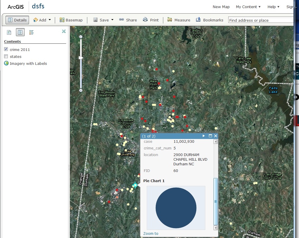
Address data is pretty easy to work with. Addresses should contain as much information as possible with items separated by spaces only, no commas. For example, 134 Chapel Drive Durham NC 27708 should produce a pretty good geocoding result. In the following example, Durham gun crimes for 2011 were downloaded from the Durham Police Department. The data only came with address information, so city and state data were subsequently added and combined in Excel (location field). In Figure 1, highlighted fields indicate spatial information.
To geocode the addresses, select “Map” under the “Visualize” tab. The program will automatically begin geocoding based on the left-most field containing spatial information, which is city in this case. Changing the field to “location,” which contains the full address information, will correctly geocode these addresses (Figure 2).
Once complete, the geocoded points are plotted on a map (Figure 3). As with other mapping applications, you may apply a symbology to the points in order to visualize your data.
This particular dataset contains a numeric field that identifies 5 general types of crime (crime_cat_num). Under the “Configure styles” link at the top, navigate to “Buckets” and divided the data into five buckets (Figure 4).
Once saved, each color will represent a different type of crime and shown in Figure 5 (red indicates robbery, yellow, assault and so on).
Note that only numeric fields can be used to categorize data, so you may wish to create these fields prior to upload.
Geocoding Polygons
Working with polygon data can be a bit trickier because the polygons must be spatially defined. Fusion Tables does this by using kml, which is basically a large piece of text containing all of the coordinates, in order, that define a boundary. For example, in this table, each boundary is defined in the geometry field. Google provides a variety of boundary types, which are available here. If your data match one of these existing boundary types, you may upload data and merge it with the correct table, which will basically import the boundary definitions into your dataset. Otherwise, you will have to locate suitable boundaries in a kml file and import those boundaries before merging.
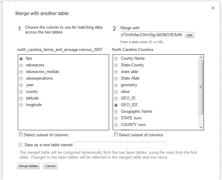
This dataset displays acreage and farms for each county in North Carolina and originally came from the Census of Agriculture. Note that there must be a field in common between your data and the data containing boundary definitions in order to merge. In addition, merge fields can only be text fields. FIPS codes uniquely identify counties and are contained in both tables. Unfortunately, Google didn’t set up their FIPS fields correctly, so a cleaned up North Carolina county file is located here.
Next, click the merge tab. Copy and paste the URL for the boundaries table and click the “Get” button. In Figure 6, I merged my data to the boundary file using the fips field, which is called “fips” in table 1 and “GEO_ID2” in table 2. A merge will produce a new table, so be sure to name that new table at the bottom.Once complete, styling the map is comparable to point data. First, select “Map” under the “Visualize” tab, and be sure to point the location field at the top left to “geometry” where the boundary definitions are stored. Next, click the configure styles link. Then, select Fill color under the Polygons section.
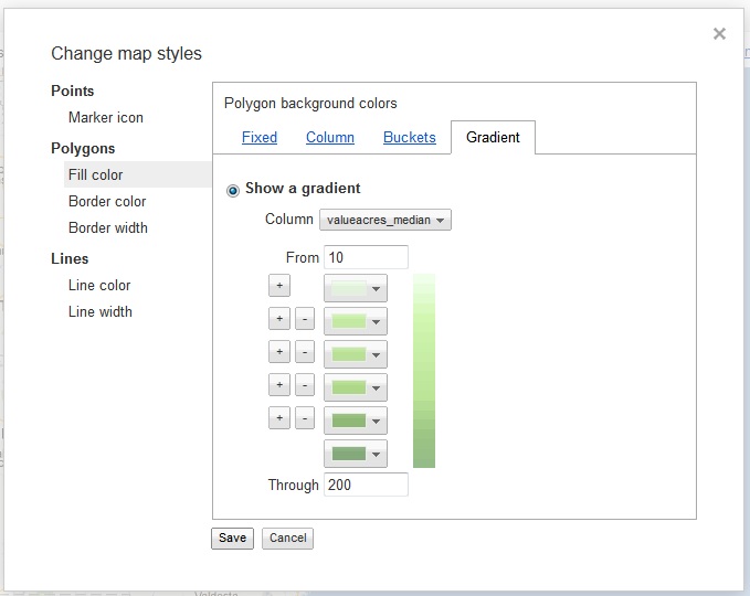
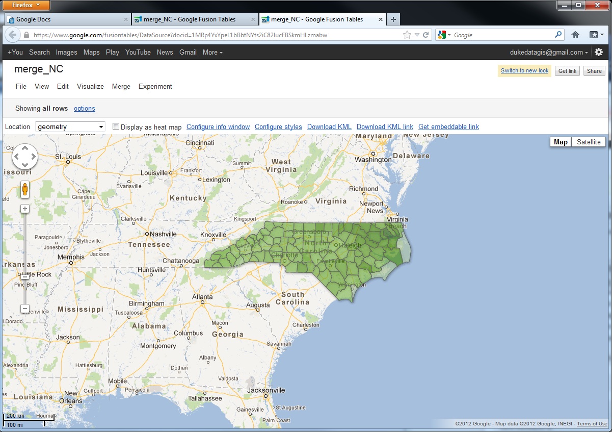
In Figure 7, I am showing median farm size (in acres) along a gradient. It’s important to note the lower and upper limits to your data in advance as the program will not automatically sense this. In this case, median farm size ranges from 10 to 191. Figure 8 shows the output.
Sharing Maps
As withsimilar online programs, Fusion Tables allows sharing of data and maps through a variety of avenues, from links to embeddable script to email. The links below point to the two maps produced in this posting.
This overview provides only a brief introduction to the mapping capabilities of Fusion Tables. A broad gallery of applications is located at this site, and it contains a variety of geography types. Some of these use the Fusion Tables API, which is a nice feature that allows for application development with some programming experience. As with the other tools reviewed by this blog, non-standard boundaries are generally absent and can be difficult to locate. For example, a researcher with country-level data from the 1700s may have difficulty finding a country border map from that time. However, maps are available on Fusion Tables for counties, states, countries, and congressional districts, and additional maps can be found on the Internet.
On March 20, from 3:30pm to 5:30pm, Data and GIS Services will be hosting an Open House to celebrate recent upgrades to our computer lab and to announce the finalists and winners of the recent Data Visualization Contest.
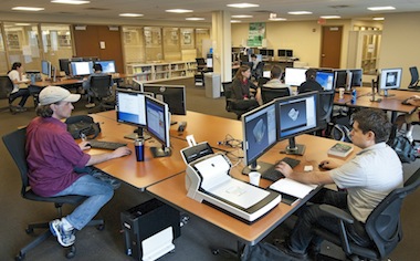
Since the end of the summer, Data and GIS Services has enjoyed periodic upgrades to the computer lab, starting with a refresh of all of the machines and an expansion from 8 machines to 12. Each machine now boasts two 24″ monitors, a 4-core 3.5 GHz processor, 16GB RAM, 1TB of open storage for projects in progress, and an extensive list of GIS, statistical, and visualization software packages.
In addition to the new machines, the lab space has just been enhanced with a 50″ display and conference table to support small group instructional sessions. For advanced topics and sessions using software packages that can be installed on individuals’ laptops, the new display will allow Data and GIS Services staff to expand instructional opportunities and meet additional needs of the Duke community.
The finalists and winners of the recent data visualization contest are developing poster versions of their submissions. These posters will hang in the Data and GIS Services lab and will be unveiled at the open house.
Data and GIS and Perkins Libraries are happy to sponsor DataFest 2013 (March 22-24, 2013). In its second year, DataFest “is a data analysis competition where teams of up to five undergraduates have a weekend to attack a large and complex dataset.” See the DataFest 2012 page for examples of projects and tools.
Apply your data skills and represent Duke in this year’s competition!
ArcGIS Online is a service that allows for storage and sharing of spatial data and maps. In contrast to many other web based GIS services, ArcGIS Online accepts geocoded text-based data and shapefiles, which allows users to share and present work built in ArcGIS Desktop.
Members of the Duke community can register for two different version of ArcOnline. Public access to the service grants access that allows basic file storage and digital mapping. Duke-sponsored access facilitates sharing files within the Duke community and provides a higher threshold for storing and processing ArcGIS files online. Access to the Duke version is available on request for Duke affiliates with a valid Duke email at askdata@duke.edu.
Loading and Processing Data
Duke-sponsored access allows users to import and work with text-based data sets containing more than 250 features or shapefiles containing more than 1,000 features online. Data sets that exceed these thresholds must be published as Feature Services, which can done at the time of upload or any point thereafter. A Feature Service is basically an object that can be brought into a map and differs from a file, which can be uploaded for storage, but cannot be imported into a map.
Figure 1: Geolocation in ArcGIS Online
In addition, Duke sponsored access will allow you to use data shared by other members of the Duke community, which expands the data available beyond those data sources shared with the public and by members of groups to which you belong, both available in either version. Users with modest data needs and users that prefer use ArcGIS Desktop to create maps will find the public version suitable in most cases. Users with larger datasets and those that will collaborate and present maps online will find Duke-sponsored access much more helpful.ArcGIS Online provide two entry points for the uploading of data and the production of maps. The first is entered when “My Content” is clicked. This section lists all of the items that have been uploaded and produced by the user. There are two key types of items listed, files and data sources. Files, including text files and shapefiles, are items that can be stored and shared, but are not accessible by the mapping interfaces. By contrast, data sources, the most common of which are Feature Services and Web Maps, can be seen by the mapping interfaces and incorporated into new maps.
Duke sponsored access provides the ability to convert geocoded text files and shapefiles into data sources at the time of upload or any point thereafter. By contrast, the public version does not allow users to create Feature Services, but does allow for the creation of Web Maps data sources from text files containing fewer than 250 features or shapefiles containing fewer than 1,000 features. Data sets exceeding these thresholds will require Duke sponsored access to visualize online.
Mapping
The second section of ArcGIS Online is the “Map” section, which opens the map viewer, one of the two mapping tools available in ArcGIS Online. The map viewer allows for the creation of Web Maps, which can be shared online and saved as data sources for new maps. Both versions of ArcGIS Online will allow for the upload of data sources directly into the viewer, the inclusion of public and group data to which the user has access, and the inclusion of data sources previously created by the user.
Figure 2: Customized styling in Map Viewer
Once saved, the map can be accessed in the “My Content” section and opened in either map viewer or Explorer, the second mapping tool available.Map viewer allows you to add data from files, web services, and allows for the creation of editable layers. Many styling modifications like color classification of features and customization of the attribute popup window are possible. This map displays a customized popup with an added pie chart based on, in this case, a single feature.
Explorer contains the same basic set of features, but it also contains a presentation mode, where slide stills can be taken and arranged for presentation. Again, this map displays a styled popup as well as customized county-level styling based on an attribute.
Sharing Data and Maps
Saved maps can be shared by embeddable script or by link. The map as a data source can also be shared with the public, with members of any groups to which the user belongs, and with the Duke community as a whole (“Duke University and Medical Center –NSOE”).
Figure 3: Presentation mode in Explorer
Conclusion
Online sharing of data and collaboration is a relatively new need that multiple tools are working to fulfill. ArcGIS Online is an excellent option, particularly when online viewing is an important goal. If your online visualization needs are modest, and if you generally prefer to produce maps and edit shapefiles on ArcGIS Desktop, the public version may fulfill your needs. But if the feature restrictions noted above prove prohibitive, Duke sponsored access will provide the flexibility needed for most applications.
Clean your data with Google Refine. Use digital maps to explore the present and past. Analyze data with R or Stata. Visualize your research with one of our data visualization courses. The Data and GIS Workshops offer a range of research strategies for data based questions. Register online for our courses or schedule a session for your course by emailing askdata@duke.edu
Are you a current Duke University undergraduate or graduate student? Have you used data visualization in a past or current research project to help solve a problem, tell a story, or highlight an interesting trend? Write up a short description and you’ll have a submission for the contest and a chance to win a $500 technology prize.
As mentioned in the fall – with 12 workstations with dual 24″ monitors and 16 gigs of memory, the new Data and GIS lab is ready to take on the most challenging statistical, mapping, and visualization research projects. The new lab also features a flatbed scanner for projects moving from print to digital data. Lab hours are the same hours as Perkins Library (almost 24/7).
Puzzled by data management planning? Not sure what to include in your grants data management plan? Data and GIS has launched a guide that supports researchers looking for advice on data management plans now required by several granting agencies. The guide provides examples of sample plans, key concepts involved in writing a plan, and contact information for groups on campus providing data management advice.
Come visit us in Perkins 226 for a consultation or contact us online (email: askdata@duke.edu or twitter: duke_data OR duke_vis). Our consultants are available weekdays 8-5 by appointment or offer drop in hours as well We look forward to working with you on your next data driven project.
The Data & GIS Services department is hosting a data visualization contest this winter!
Are you a current Duke University undergraduate or graduate student? Have you used data visualization in a past or current research project to help solve a problem, tell a story, or highlight an interesting trend? Write up a short description and you’ll have a submission for the contest and a chance to win a $500 technology prize!
The final deadline for submissions is January 20, 2013. For more details, see the full contest site.


 On Thursday, April 4 and Friday, April 5, Duke University will host a visit from
  Exploring Text Entities
 Visualizing Semantics in Passwords
 Bubble Sets: Revealing Set Relations with Isocontours over Existing Visualizations

 DocuBurst: Visualizing Document Content using Language Structure