ACS Mapping Extension for ArcGIS

The Census Bureau’s American Community Survey provides a continuous measure of the community demographics in the US.   A  new extension provided by the Department of Geography and Geoinformation Science at Geroge Mason University enhances the mapping of ACS by data by allowing researchers to visualize both survey estimates while revealing the level of uncertainty in the estimates.  ACS Mapping Extensions is an ArcGIS addon available for both ArcGIS 9.3 and 10.  This post provides a brief overview of installation, setup, and use.  Detailed technical assistance is provided by the extension.


Installation
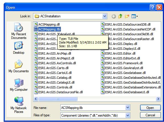
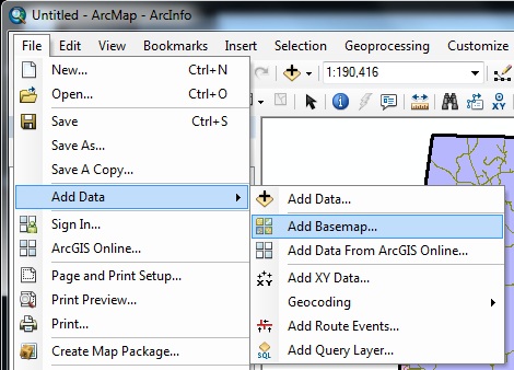
1) Once you download the program, you will want to install and note the installation directory.  In ArcGIS, select Customize from the menu bar, and click Customize Mode….  Then select “Add from file…” and navigate to the installation directory.  Once in this directory, select the “ACSMapping.tlb” file.


2) Before you leave the Customize window, be sure to check the “ACS Mapping Tools” toolbar.  You will have a new “ACS Mapping” toolbar added to your window.


Setup
1) The “Documentation” option in the “ACS Mapping” toolbar provides detailed instructions for downloading ACS data and boundary files.  Follow these instructions to the letter and to their entirety.  With respect to boundary files, the TIGER 2008 county boundaries were used for this example.


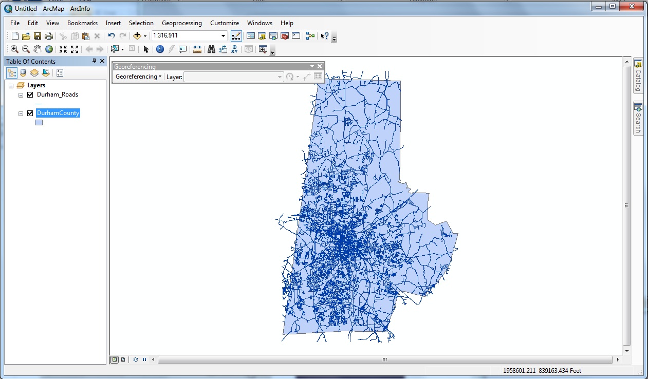
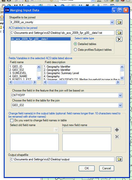
2) Add the boundary layer to a blank map and select “Join ACS Table(s) with Shapefiles” option in the “ACS Mapping” toolbar.  In this example, I have downloaded county boundaries and county-level median income data from the 2005-09 ACS.  In this figure, the first two fields indicate the items to be joined, one table to one shapefile.   “CNTYIDFP” represents the FIPS code in the boundary file, and “GEO_ID2” is the corresponding code in the ACS table.  Once you’ve set an output location, select “OK.”


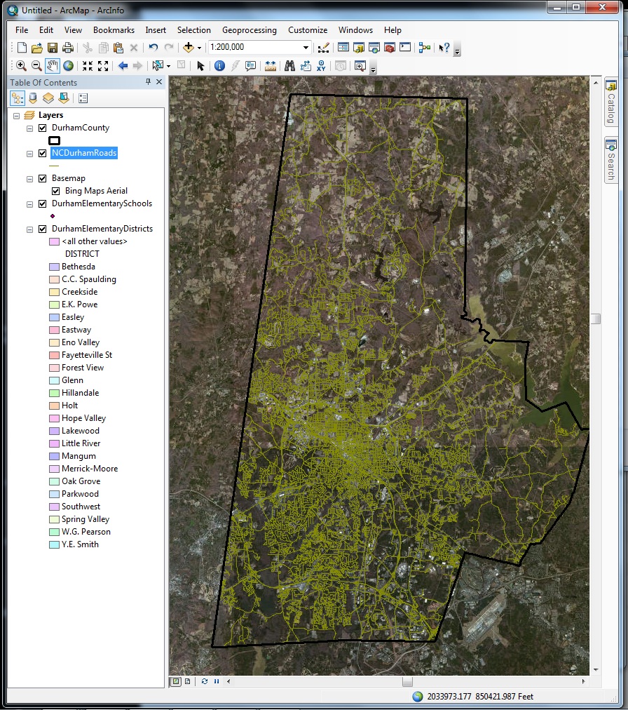
3) Finally, you will want to apply a symbology to the layer.  In this case, I chose the median income estimate and 5 total categories.  The following figure shows what my map looks like at this point.


Mapping ACS Estimates with Coefficients of Variation

1) The tools are located under the “Mapping Data Uncertainty” option in the ACS Mapping toolbar.  The first option, “Overlay CVs with Estimates,” will allow you to visualize the uncertainty of estimates at the same time as the estimates themselves.    As noted by the documetation provided by the ACS Mapping Extension web site, ACS provides a margin of error that produces a confidence level of 90%.  This tool will convert these data into coefficients of variation that will allow you to assess the quality of the estimates.


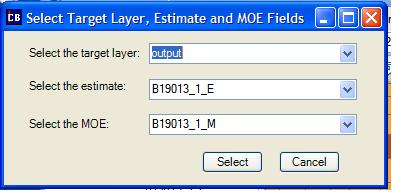
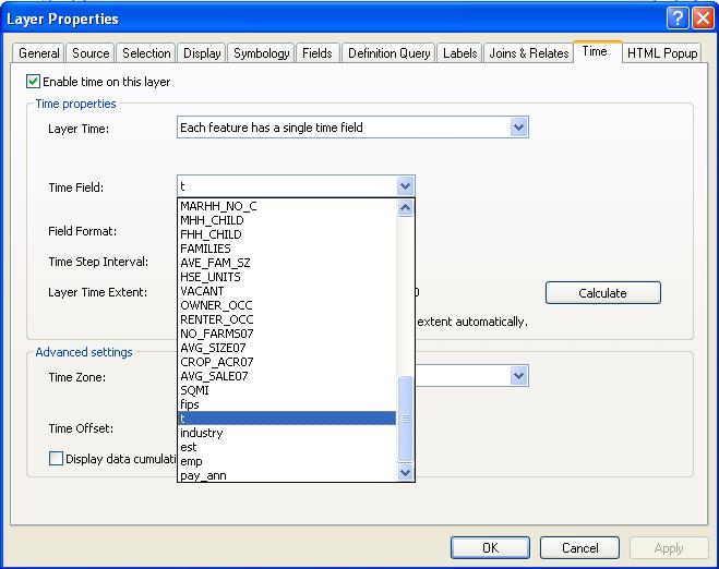
2) Select the target layer to whcih you added symbology, select the variable that stores the estimate to be calculated, and finally, select the variable that stores the margin of error (suffix = “_M”).


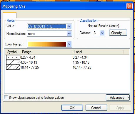
3) After you click the “Select” button, you will be presented with the new Symbology options for the new coefficients of variation layer to be generated.  In this case, I retained the automatic selections and hit “OK.”


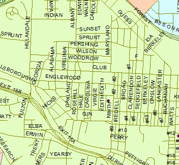
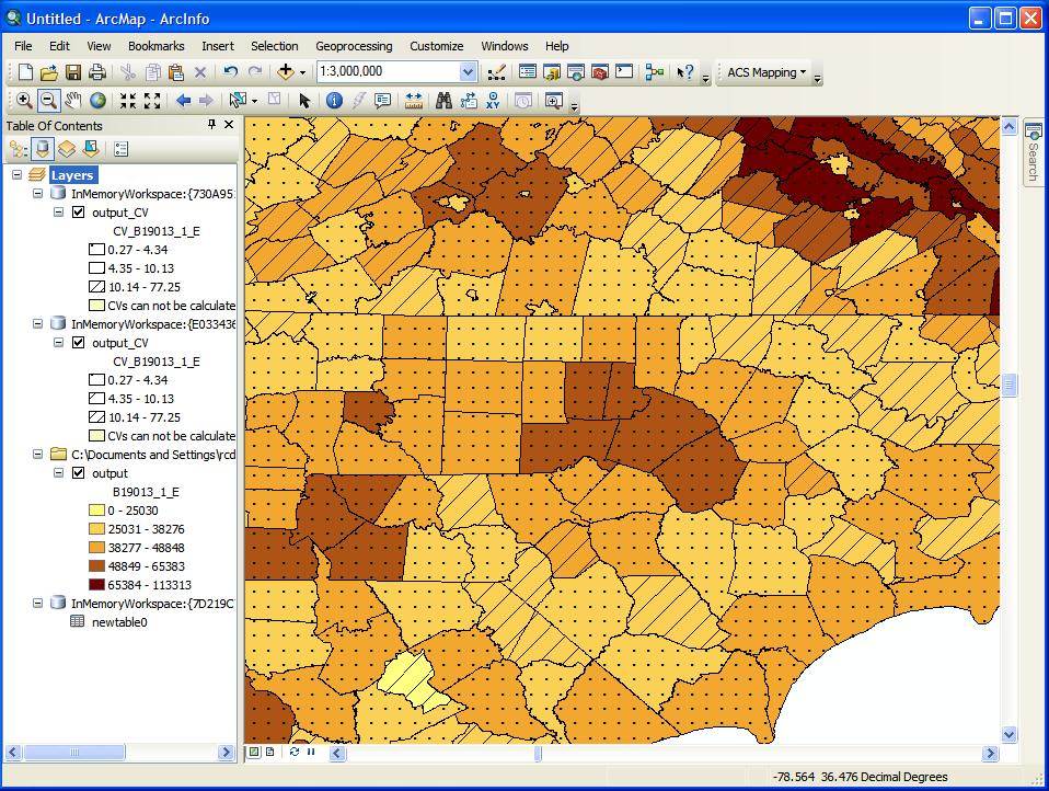
4) Zooming in to central North Carolina, one can see not only that the Research Triangle Area has relatively high incomes compared with much of North Carolina, but that coefficients of variation are lower than thay are for parts of northern North Carolina and southern Virginia.


Measuring Singificant Differences in Income
1) The second option, “Identify Areas of Significant Differences,” allows you to assess whether there is a significant difference between one spatial unit and all other spatial units for a given variable.  In order for this option to work, you must select one specific spatial unit.  In this example, I selected Durham County and will assess whether there are significant differences in median household income in the region.


2) First, select the target layer for which you selected a single feature.  You want to verify the estimates and margin of error variables, and you can adjust the confidence level from the default 90%.  Select OK.


3) The output is represented by four different symbologies.  First, your chosen county is filled with dots.  All counties that are significantly different are striped, while all those that are not are empty.  Finally, when significance cannot be determined, the original color fill is replaced with a new color.  In this case, median household income is not significantly different between Durham and Chatham counties.  However, this could be due to small differences or large margins of error in one or both counties.


Data and GIS Winter Newsletter 2012

Data driven teaching and research at Duke keeps growing and Perkins Data and GIS continues to increase support for researchers and classes employing data, GIS, and data visualization tools.  Whether your discipline is in the Humanities, Sciences, or Social Sciences, Perkins Data and GIS seeks to support researchers and students using numeric and geospatial data across the disciplines.

New Website for 2012
http://library.duke.edu/data/

You can find:

  • Online data or digital maps that you need for your project
  • A workshop on the latest software packages and digital tools

New workshops for 2012
http://library.duke.edu/data/news/index.html
Clean your data with Google Refine. Learn about data management planning. Visualize your data with Tableau Public, or map your results using ArcGIS or Google Earth Pro.  A new series of workshops connects traditional statistical, geospatial, and visualization tools with web based options.  Register online for our courses or schedule a session for your course by emailing askdata@duke.edu

  • StataReview                               (Statistics/Data Management)
  • Introduction to ArcGIS           (Geographic Information Systems / Data Visualization)
  • Data Management Planning  (Data Management/Grants)
  • Geocommons                            (Geographic Information Systems / Data Visualization)
  • Google Earth (Pro)                   (Geographic Information Systems / Data Visualization)
  • Google Refine                           (Data Management/Descriptive Statistics)
  • Tableau Public                          (Data Visualization)

Bloomberg (terminals) have arrived
http://blogs.library.duke.edu/data/2011/08/29/bloomberg-has-arrived/

Duke Libraries in pleased to announce the installation of three Bloomberg financial terminals in the Data and GIS Lab in 226 Perkins.  The terminals provide the latest news and financial data and include an application that makes it easy to export data to Excel.  Access is restricted to all current Duke affiliates.

Get help with Data Management Planning
http://library.duke.edu/data/guides/data-management/index.html

Data and GIS has launched a new guide that provides guidance for researchers looking for advice on data management plans now required by several granting agencies.  The guide provides examples of sample plans, key concepts involved in writing a plan, and contact information for groups on campus providing data management advice.

New Collections
http://library.duke.edu/data/collections/new.html
Explore the Indonesian Village Potential Statistics (PODES), look at household economic behavior in the Indian National Sample Survey, or explore historical digital maps of Europe- the Data and GIS collection collects research data sets and maps of interest to the Duke community covering a wide range of topics.

Support for Restricted Data Contracts and Restricted Data Licensing
Perkins Library has partnered with the Social Science Research Institute (SSRI) to support restricted data licensing with Paul Pooley as a restricted data specialist.  Paul is available  to work with researchers licensing restricted data and negotiating restricted data management plans.  Please contact Paul paul.pooley@duke.edu or askdata@duke.edu for more details.

Contact Us!askdata@duke.edu – twitter: duke_datahttp://library.duke.edu/data/hours.html

Joel Herndon
Head, Data and GIS Services
919-660-5946
Location: Room 227 Perkins
joel.herndon@duke.edu
Mark Thomas
Economics/GIS Librarian
919-660-5853
Location: Room 233 Perkins
mark.thomas@duke.edu
Teddy Gray
Biological Sciences Librarian
919-660-5971
Location: Room 233 Perkins
teddy.gray@duke.edu

ArcGIS Tutorial – Georeferencing Imagery

One of the limitations of computer mapping technology is that it is new. There is little historical imagery and data available as a result, although this has started to change. The integration of paper and imaged maps into computer mapping technology is possible, and this tutorial will walk through the process of georeferencing.

Georeferencing is the process of placing an image into two dimensional space. In essence, georeferencing pins a scanned map to particular geographical coordinates.

This tutorial will georeference a map of Durham County from 1955. In addition to the scanned map, we will use two current layers as referents: the Durham roads layer, and the Durham county boundary. Note that because the layers are more recent than the historical map, many roads will not exist in the image. Georeferencing historical imagery requires familiarity with geographic characteristics and changes.


Step 1: Enable Georeferencing

First, under the “Customize” Menu Bar option, navigate to “Toolbar” and select Georeferencing. The figure to the right displays the Georeferencing toolbar.


Step 2: Add Data and Image Layers

Next, add the shapefiles that you will use as referents for the image.

Once this is done, add the image to be georeferenced.  Note that you will almost certainly not see that image, as it lacks spatial coordinates. However, the image will appear in the Table of Contents.

In this example, I have added Durham County (blue polygon) and the Durham roads layer (blue lines).


Step 3: Fitting the Image to the Layers

The next step will relocate the image to the center of your current window and will expand the image only to the point where the entire image is visible. In this case, Durham County is taller than it is wide, so vertical space will be maximized.

First, it is a good idea to zoom, if necessary, so that your current view roughly matches where the image will be place. In this case, zooming to the full extent of the Durham county boundary will accomplish this.

Second, under the Georeferencing toolbar, click “Georeferencing” and select “Fit to Display.” The image should be roughly aligned to the data layers, though if not, this is not problematic.

As you can see from the image to the right, there is some distance between the county boundaries of today (red lines) to the hand-drawn county boundaries located in the image (white lines).


Step 4: Adjusting the Map

ArcGIS georeferences images through the addition of control points. The control points tool (to the right) operates through two mouse clicks: the first mouse click selects a point on the image, and the second mouse click pins that point to a location within a data layer.

For example, in the image to the right, I have selected a major intersection that likely has not changed in the last 60 years. After my first click, where I’ve selected a point near the top of the intersection, a green crosshair is placed. As I move the mouse, ArcGIS will pin my current crosshair to a proximate layer, in this case, the Durham roads layer.

Once you click a second time, the map will move to conform to the new control points. Control points work in combination, so as you add new control points, your image will (ideally) match more closely to your referents.

There is a limit to how much each subsequent control point will improve fit as more points are added. Generally, it’s a good idea to zoom in to improve accuracy and to create control points across the extent of the image.

After about 15 control points, we can compare the image to the included shapefiles. As you can see, if we assume that major roads have not changed, the green lines correspond well to the image, while the county boundary does to a lesser extent.


Step 5: Statistics and Transformations

Before saving the results, it is also a good idea to evaluate the results. Open the Table of Points to see each of your control points and the root mean squared error of all control points.

The Root Mean Square error (RMS) provides a rough guide to how consistent your control points are to one another with reference to the map.  Note that a low value does not mean that you’ve necessarily georeferenced the image well, it means you’ve georeferenced consistently.  High RMS errors indicate that your control points are less consistent with one another in comparison with a low RMS error.  One way to address this issue is to identify especially probelmatic control points and either replace or remove these points.  However, always reevaluate how well your image maps to the referent shapefiles.

You may delete control points or add new points at this stage. In addition, you may also try different transformations, although second- or third-order transformations are rarely needed.


Step 6: Saving the Results

Under the Georeferencing tab of the Georeferencing toolbar, select “Update Georeferencing.” Spatial information is saved in two new files that MUST accompany the image, an “.aux” file and a “.thw” file.


General Tips

– Zoom close to the layer resolution in order to improve accuracy

– Use more than 1 referent if possible. In this example, the county boundary provided a rough guide with respect to how far off the image initially is, but was not used to actually georeference the image.

– Georeference to accurate features. In this example, the county boundary was hand-drawn on the image and is not as precise as photographed features, like roads.

What’s new in ArcGIS 10?

Basemaps

Would you like to add aerial photography or a topographic map underneath map layers for visual appeal or context? With ArcGIS 10, you can add a basemap to your map project.

A basemap is a link to an online imagery data source. You must be connected to the Internet in order to see a basemap.

Basemaps contain imagery at different levels of detail. When zooming in or out, new imagery will replace old imagery, which provides an approprate level of detail at any zoom level and improves performance by limiting the amount of information to be downloaded and displayed.


Export Map Packages

Sharing maps and shapefiles with others can be a pain when a map is composed of many shapefiles and layers.  A map package bundles all shapefiles, layers, and map documents into a single file that can be opened by others with ArcGIS 10.


Background Processing

In ArcGIS 10, ArcToolbox tools default to background processing.  This allows you to continue to work while the tool processes your data.

To disable background processing, navigate to the “Geoprocessing Options…” choice under the Geoprocessing Menu Bar, and uncheck the “Enable” box.


Search Toolbox Feature

Got a tool you want to use but can’t remember what toolbox its in?  With the Search feature, you can easily locate what you need. Your search term can be the tool name or a close approximation of what you wish to do.


Easy to Use Time Data

Time series data became easier to use with ArcGIS 10. Version 10 recognizes time series data with the addition of a single time field.

For example, suppose you have annual precipitation for US cities.  Your data will contain an ID field, a point field, a time field containing the year, and a field containing the precipitation amount.

For more information, see this blog post.


How Do I Label Individual Items?

Have you ever wanted to label individudal items on a map, and avoid the cluttered appearance of labels for all features, such as that shown to the right?

ArcGIS 10 hides the tool that you use to label individual items, but it’s easy to get back.

  1. Turn on the “Labeling” toolbar under the Customize Menu Bar.
  2. At the top right corner of the toolbar, click the arrow pointed downward and click “Customize…”
  3. Select the “Commands” tab and select the “Label” category (left panel).
  4. In the right panel, drag the “Label” tool and drop it into any toolbar that you wish.

Converting ArcGIS Layers to Google Earth (KML)

Converting ArcGIS layers to Google Earth allows others to easily see layers without specialized software.  Both ArcGIS and Google Earth Pro contain tools that allow conversion to and saving in KML format.
Note: Be certain you are allowed to share layers if they were not created by you.

Conversion using ArcGIS

  • First, open the layer that you wish to covert.
  • In the ArcToolbox window, expand “Conversion Tools,” then “To KML,” and select “Layer to KML.”
  • When the “Layer to KML” window appears, first select the shapefile or layer for the “Layer” box.
  • Next select a directory for the file to be created and provide a name for the file.
  • Finally, you must enter a number for the “Layer Output Scale.”  If your layer has a scale-dependent renderer, this setting allows you to export the KML at a specific level of resolution.  Otherwise, it has no effect, whatever the number.

For layers with many features, ArcGIS may produce a KML file that does not open in Google Earth due to errors.  There are two ways to solve this problem.

  • First, you can split your shapefile into several smaller shaepfiles.
  • Second, you can (usually) convert the shapefile to KML with Google Earth Pro.

Conversion using Google Earth Pro

  • First, open the shapefile with the Open command.  Be certain to change the file type to “ESRI Shapefile”.
  • When opened, you will receive a warning if your shapefile contains more than 2,500 items.  You will still possess the ability to import the entire file, but it may take some time.
  • You will be asked whether you wish to apply a style template to the document.  If you do so, you will be able to choose the attribute that contains the item name (for example, the address field or the street name field).
    Note: you don’t have to save the style template to select the name field.
  • Finally, right-click the layer added to the Temporary Places folder, and click “Save Place As.”  Provide a location and file name for the file to be created.

Bloomberg Has Arrived

No, it’s not Michael Bloomberg, New York City’s mayor, but the financial data service that he founded back in 1981.

The Data & GIS Services Department of Perkins Library is pleased to announce the installation of three Bloomberg Terminals in the Data/GIS Computer Cluster (Perkins Room 226). The terminals are made possible with the generous assistance of the Duke Financial Economics Center in the Duke Department of Economics.

In the past, West Campus users would need to travel to the Ford Library at the Fuqua School of Business.  This new arrangement allows them to access the Bloomberg service whenever Perkins Library is open.  The service is available only to Duke students, faculty, and staff.

Data and NewsBloomberg Monitors

Bloomberg Professional is an online service providing current and historical financial data on individual equities, stock market indices, fixed-income securities, currencies, commodities, futures, and foreign exchange for both international and domestic markets.

It also provides news on worldwide financial markets and industries as well as economic data for the countries of the world.  Additionally, it provides company profiles, company financial statements and filings, analysts’ forecasts, and audio and video interviews and presentations by key players in business and finance (the Bloomberg Forum).

The Bloomberg Excel Add-in is a tool that delivers Bloomberg data directly into an Excel spreadsheet for custom analysis and calculations.

Bloomberg keyboard

Hardware

The dual monitors at each workstation provide plenty of real estate, enabling multiple windows for your research.

The Bloomberg keyboard is customized and color-coded to allow users to access quickly and easily the information contained in the Bloomberg system and to perform specific functions.

  • The red keys are used to login or logout of the system.
  • The yellow keys represent market sectors.
  • Green keys are action keys, to request the system to do something.

Often when using Bloomberg, your command might look something like this:
[TICKER] < MARKET > [FUNCTION CODE] < GO >

The system also allows standard mouse-clicking on the screens to activate many functions.

Bloomberg Certification

You may wish to become Bloomberg Certified, which requires the successful completion of several online Bloomberg Essential courses: 4 core courses plus 1 market sector found under the BESS command.  Complete these at your own pace, but you only have two chances to pass the test.  Certification will provide documentation that you’ve gained comprehensive knowledge of the Bloomberg Professional service.

Limitations

Bloomberg for Education doesn’t have the full functionality of the commercial version of Bloomberg Professional.  For instance, there is a lag in stock quotes and data that makes it incompatible for real-time analysis or trading, it has more limited downloading capabilities, and of course there’s no online trading.

Login

You need to create your own personal login when you first access the system and will need to be near a cell phone to complete registration.  You will get either a phone call or a text message with a validation code.

Once your personal login is validated and you open the Bloomberg Service, you can open Excel and then install the Excel Add-in (move mouse to lower edge of screen to activate Windows Start button, choose All Programs … Bloomberg … Install Excel Add-in).  Then close and reopen Excel to display the Bloomberg tab for added functionality.

Cheat Sheet to log in to Bloomberg at the Library

Assistance

For help, please contact staff in the Library’s Data & GIS Services Dept.  To tide us over while we gather further documentation, besides the green Help key on the Bloomberg keyboard, the EASY command, and the CHEAT command, please take a look at some of the following help guides that have been compiled at other libraries. (Be aware that some of the instructions regarding access and logging in are specific to these other institutions.)

Time Series Visualizations in ArcGIS – An Introduction

Introduction

ArcGIS 10 makes it easy to manage and visualize time-series data to identify trends and create compelling visualizations.  Creating a visualization of time-series data requires only a few additional steps beyond those needed to produce any map.

Step 1: Data Formatting

Time-series data contains records, each of which is specific to both an individual and to a single point in time.  The following example uses employment data for the textile industry in North Carolina from 2000 through 2009.

In this example, “fips” corresponds to each county’s unique FIPS code, “industry” corresponds to the textile industry’s unique NAICS code representation, “t” denotes the year.  Establishments, employment, and annual pay, our data items, are stored in the fields “est”, “emp”, and “pay_ann”.  All missing values were coded ‘-1’.

Tip: Make sure each record has a value.  Records without values will not be drawn in ArcGIS.

Tip: Do not name the time field “year,” as it is a reserved name in ArcGIS.

We suggest based on experience that the storage of data in a Microsoft Access database provides the greatest degree of reliability.

Step 2: Add Data to Map in ArcGIS

Once the data is formatted, join the data to a geographic layer.  For help in finding a geographic layer, please consult the Perkins Data and GIS Services Department.

Tip: When joining layers, it is good practice to Verify the join selection before approving.  The program will inform you of any errors.

Step 3: Enabling Time

Once the data are joined to a layer, enter the layer properties by right-clicking the layer name in the Table of Contents pane.

Navigate to the Time tab and check the box.  ArcGIS will want to know which field contains time information, as well as the format.  If the join was successful, you will see the fields that represent the data joined to the geographic layer.  In this example, the time field is labeled “t”.

You must also specify the date/time format.  Available time formats are listed to the right.

Finally, you will have to enable time on the data table as well.  To do this, right-click the data table in the Table of Contents pane.  Follow the same steps as presented for the geographic layer.

Step 4: Enable Time Display

Now that ArcGIS understands the data structure, you may enable time visualization.  The “Tools” toolbar, which contains the most commonly used tools, contains the button highlighted below, “Open Time Slider Window”.  Select this button.

The time slider window (left) will appear.  The slider spans the time range of the data, identifies what point in this range is currently displayed on the map, and allows for access to a variety of playback and recording options.  To access these options, click the options button.

This button is the equivalent of “Play.”  It will display the data from the first time point to the last.

Buttons with both arrows and vertical lines are one-step increments.  This particular button moves forward one time increment, the other one moves back.

This button exports the display to video.  This is the final step.

Step 5: Configure Options and Visual Display

Before you export to video, you will want to configure the appearance of the map.  This example will focus on new options that come with time series data.

First, select “Options” in the Time Slider toolbar.  Under the “Time Display” tab, you can alter the format of the displayed date to conform to your data.  In this example, I selected 2011 (yyyy) because we are using annual data.

Second, under the “Playback” tab, you can specify a length of time for playback.  This example contains 10 years of data.  If I specify 5 seconds playback, each data year will be displayed for one-half second.  If I specify 10 second, each year will be visible for 1 second.

Third, I will display the year in order to make clear to the viewer the time point that is visible.  To do this, I will go to “Insert” “Dynamic Text” “Data Frame Time.”

Tip: Alternatively, you can insert the data frame time into the title or other display object by including the following in the text of the object: <dyn type=”dataFrame” name=”Layers” property=”time” emptyStr=”[off]”/>

After some trial and error, I successfully integrated the time currently visible into the title.  The image to the left shows its appearance.

Step 6: Export to Video

Once the appearance of the map is satisfactory, you can export the map to video or to sequential images.  Click the “Export to Video” button on the time slider window.

Tip: maximize the ArcGIS window, switch to Layout View, zoom the layout to 100%, and clear any toolbars that may obstruct the layout view to improve video appearance.

First, you will be asked for a file or folder location and the export format.  Videos are exported as AVI files, while sequential images are exported to a folder either as bitmaps or JPEGS.

Second, if you exported to video, you will be asked to select a codec, which essentially encodes and compresses the outputted video.  The codec selection depends on the individual machine, and some codecs work with ArcGIS better than others.

Finally, you may have to produce a video several times before it comes out as expected.  Be sure to watch for missing time points, as this frequently happens.  Fixing the video length to a specific play duration per time point (one-half second or one second) helps you watch for these missing time points.

The following example is a 5-second video that displays employment in the textiles industry in North Carolina from 2000 through 2009.  Note that declining employment is signified by colors that change from dark to light.

Catching up on computational biology resources

With the arrival of summer, now is great time to catch up on these resources in computation biology and bioinformatics:

BioStar: Have a question on bioinformatics, computational genomics and biological data analysis but not sure who to ask? Try BioStar, which is an online open community of biologists ready to answer questions, even from “newbies”. You are also welcome to answer and comment on the questions. The more you do, the more reputation points you can earn toward your BioStar badge.

OpenHelix: The site provides a searchable collection of tutorials,  training materials, and exercises on the most popular genomic resources. The folks at OpenHelix also contract with resource providers to offer onsite, hands-on workshops at institutions. While most of their tutorials and training materials require a subscription, they do provide a suite of free tutorials, including ones on the UCSC Genome Browser and the RCSB Protein Data Bank.

Database: The Journal of Biological Databases and Data Curation: While maybe not beach reading, Database is a nice complement to the Nucleic Acids Research annual database issue. This open-access journal, launched in 2009, aims to provide a “platform for the presentation of novel ideas in database research and biocuration, and aims to help strengthen the bridge between database developers, curators, and users.”

Have a computation biology resource you would like to recommend? Please leave a comment.

Where There’s Smoke …

A team of Duke undergraduates participating in the Global Health Capstone course was awarded the “Outstanding Capstone Research Project” for their examination of state and congressional district characteristics that might influence the outcome of legislative efforts to raise cigarette excise taxes in North Carolina, South Carolina, and Mississippi.  Sarah Chapin and Gregory Morrison used GIS mapping tools in the Library’s Data & GIS Services Department to illuminate the relationships between county demographics and state legislators’ votes for or against cigarette tax hikes. Brian Clement, Alexa Monroy, and Katherine Roemer were other members of the research group.  Congratulations!

Regional Focus
The recent cigarette excise tax increases Mississippi (2009), North Carolina (2009), and South Carolina (2010) served as case studies from which to draw components of successful strategies to develop a regional legislative toolkit for those wishing to increase cigarette excise taxes in the Southeast.  In all of these states, the tax increase was controversial. The Southeast in general is tax averse, which presents a systemic challenge to those who advocate raising taxes on cigarettes.

Senate Votes & Poverty by CountyThe researchers examined state characteristics which might influence the outcome of efforts to raise excise taxes, such as coalitions for and against proposed increases, the facts each side brought to bear and the nature of the discourse mobilized by different groups, the economic impact in each state of both smoking and the proposed excise taxes, and local political realities. The students restricted the area of interest to the Southeast because this region has a shared history and, consequently, similar challenges when it comes to race, poverty, and rural populations. They are also, broadly speaking, politically similar and have had a similar experience with both tobacco use and government regulation.

This multi-disciplinary analysis provides a reference point for state legislators or interest groups wishing to pass cigarette tax increases.  The deliverable provided a model of past voting trends, suggestions for framing political dimensions of the issue, and strategies to overcome opposition in state legislatures.

Comparing Legislative Districts and County Data
Senate Votes & Party AffiliationThe bulk of the research involved mapping the political landscape surrounding cigarette tax legislation.  In doing so, researchers looked at voting records, interest group politics, campaigns, and state ideology. Broadly, the research entailed charting the electoral geography by overlaying state house and senate districts with county-level data.  Districts were coded based on voting history, party affiliation, smoking rates, and constituent demographics.  State legislature websites were used to find representatives’ voting histories, allowing the researchers to match legislators by county when constructing a GIS dataset.  County party affiliations are available through the state board of elections.  Finally, county demographics came from the 2010 Census data.

Senate Votes & Percent Black by County

Overcoming Ideology
Besides using GIS mapping to illustrate these relationships, the researchers analyzed the involvement of major interest groups, specifically, lobbying expenditures and campaign contributions to map the involvement of both pro- and anti-tobacco interest groups.  Additionally, they examined the impact of state ideology on the framing of political dimensions, looking at editorials, opinion pieces, newspapers, and committee markups, as well as interviews (both previous interviews and ones they conducted) with state legislators and interest groups.  Overcoming state ideology, both political and social, is a major factor in passing cigarette excise tax legislation, especially in a region with such dominant tobacco influence.

Again, the purpose of the research is not merely to understand the political landscapes surrounding the passage of cigarette tax bills, but to apply these findings to the creation of a legislative toolbox for representatives or interests groups concerned with pushing similar legislation.

Swimming in a Sea of Data

This post comes from Erika Kociolek, a second year Master in Environmental Management student at the Nicholas School.  The Data and GIS staff want to congratulate Erika on successfully defending her project!

For about 4 months, I’ve been swimming in a proverbial sea of data related to hypoxia (low dissolved oxygen concentrations) and landings in the Gulf of Mexico brown shrimp fishery.  I’m a second year master of environmental management (MEM) student at the Nicholas School, focusing on Environmental Economics and Policy.  I’ve been working with my advisor, Dr. Lori Bennear, to complete my master’s project (MP), an analysis attempting to estimate the effect of hypoxia  on landings and other economic outcomes of interest.

To do this, we are using data from the Southeast Monitoring and Assessment Program (SEAMAP), NOAA/NMFS, and a database of laws and policies related to brown shrimp that I compiled in Fall 2010.  By running regressions that difference out all variation in catch except for that attributable to hypoxia, we can isolate its effect on economic outcomes of interest.  I’ve found that catch, revenue, catch per unit effort, and revenue per unit effort are all larger in the presence of summer hypoxia.  However, if we look at catch for different sizes of shrimp, we see that in the presence of summer hypoxia, catch of larger shrimp decreases and catch of smaller shrimp increases significantly.

Getting to the point of discussing results has required a bunch of data analysis, cleaning, management, and visualization.  I used R, STATA, ArcGIS, and have even used video editing software to make dynamic graphics representing my results that have improved my own understanding of the raw data.  As an example, the video below, showing the change in hypoxia over time (1997-2004), was created using ArcGIS 10.

http://youtu.be/2YfYBE_Fe7U

Note: The maps in the video above use data from the Southeast Monitoring and Assessment Program (SEAMAP).

Hypoxia is a dynamic and complex phenomenon, varying in severity, over time, and in space; hypoxia in Gulf waters is more severe and widespread in summer.  The model I’m using actually takes advantage of this variation to obtain an estimate of the effect of hypoxia on catch and other economic outcomes.  To show people the source of variation I’m exploiting, I created this video.  These maps are drawing on data of dissolved oxygen concentrations and displaying it spatially.

We have dissolved oxygen measurements for most of the Gulf in the summer (June) and fall (December).  Each subarea-depth zone (see related map) that changes from salmon shading (not hypoxic) to red (hypoxic), or vice-versa, is variation in hypoxia that the models I’m running use to get an estimate of the hypothesized effect.

Many thanks are due to my advisor, Dr. Bennear, as well as to the helpful folks at the Data/GIS lab, who have provided invaluable assistance with the data management and data visualization components of this project!

This research was funded by NOAA’s National Center for Coastal Ocean Science, Award #NA09NOS4780235.