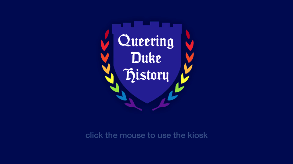
A screen from the Queering Duke History exhibit kiosk, just one of the ways DigEx supports library exhibits.
Just under a year ago Duke University Libraries formed the Digital Exhibits Working Group (DigEx) to provide vision, consulting expertise, and hands-on support to the wide array of projects and initiatives related to gallery exhibits, web exhibits, data visualizations, digital collections, and digital signage. Membership in the group is as cross-departmental as the projects they support. With representatives from Data and Visualization, Digital Projects and Production Services, Digital Scholarship Services, Communications, Exhibits, Core Services and the Rubenstein Library, every meeting is a vibrant mix of people, ideas and agenda items.
The group has taken on a number of ambitious projects; one of which is to identify and understand digital exhibits publishing platforms in the library (we are talking about screens here). Since April, a sub-committee – or “super committee” as we like to call ourselves – of DigEx members have been meeting to curate a digital exhibit for the Link Media Wall. DigEx members have anecdotal evidence that our colleagues want to program content for the wall, but have not been able to successfully do so in the past. DigEx super committee to the rescue!
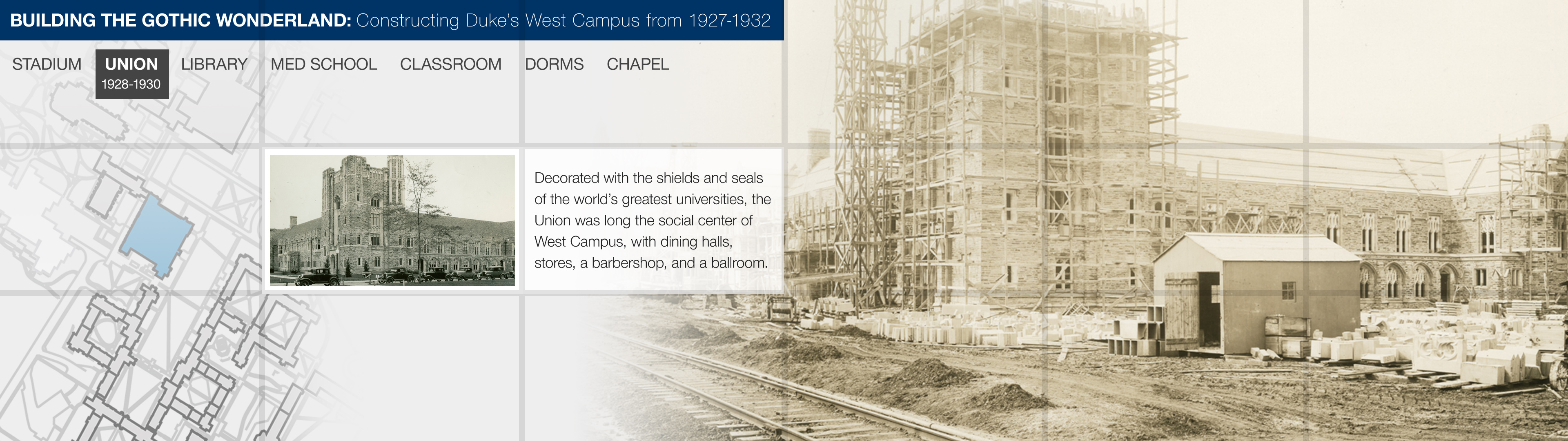
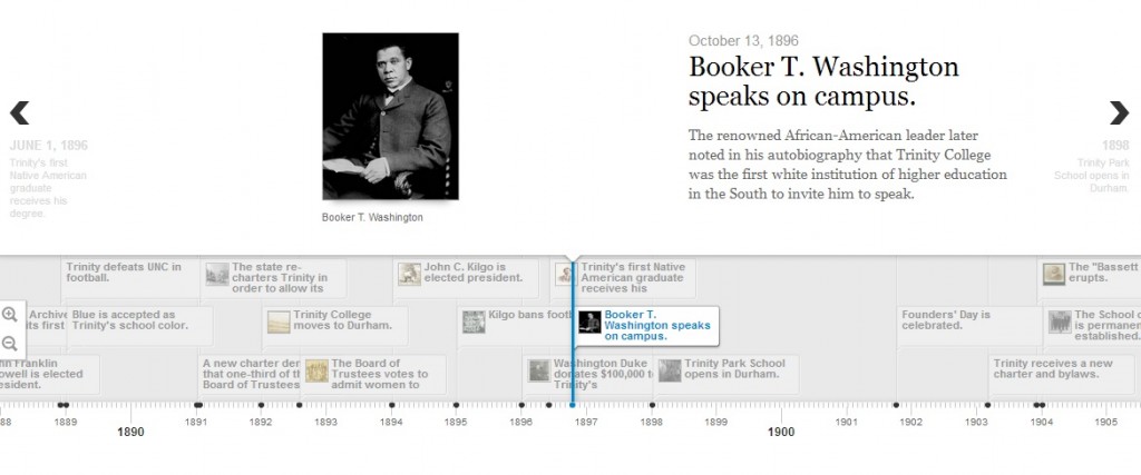
The Link super committee started meeting in April, and at first we thought our goals were simple and clear. In curating an exhibit for the link wall we wanted to create a process and template for other colleagues to follow. We quickly chose an exhibit topic: the construction of West Campus in 1927-1932 told through the University Archive’s construction photography digital collection and Flickr feed. The topic is both relevant given all the West campus construction happening currently, and would allow us to tell a visually compelling story with both digitized historic photographs and opportunities for visualizations (maps, timelines, etc).
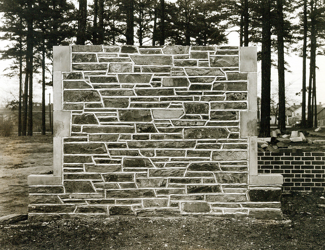
Test stone wall created by University to select the stones for our Gothic campus (1925).
Our first challenge arose with the idea of templating. Talking through ideas and our own experiences, we realized that creating a design template would hinder creative efforts and could potentially lead to an unattractive visual experience for our patrons. Think Microsoft PowerPoint templates; do you really want to see something like that spread across 18 digital panels? So even though we had hoped that our exhibit could scale to other curators, we let go of the idea of a template.
We had logistical challenges too. How do we design for such a large display like the media wall? How do you create an exhibit that is eye catching enough to catch attention, simple enough for someone to understand as they are walking by yet moves through content slowly enough that someone could stop and really study the images? How do we account for the lines between each separate display and avoid breaking up text or images? How do we effectively layout our content on our 13-15” laptops when the final project is going to be 9 FEET long?!! You can imagine that our process became de-railed at times.
Stone was carried from the quarry in Hillsborough to campus by way of a special railroad track.
But we didn’t earn the name super committee for nothing. The Link media wall coordinator met with us early on to help solve some of our challenges. Meeting with him and bringing in our DigEx developer representative really jumpstarted the content creation process. Using a scaled down grid version of the media wall, we started creating simple story boards in Powerpoint. We worked together to pick a consistent layout each team member would follow, and then we divided the work of finding images, and creating visualizations. Our layout includes the exhibit title, a map and a caption on every screen to ground the viewer in what they are seeing no matter where they come into the slideshow. We also came up with guidelines as to how quickly the images would change.
Mockup of DigEx Link Media Wall exhibit showing gridlines representing delineations between each display.
At this point, we have handed our storyboards to our digital projects developer and he is creating the final exhibit using HTML and web socket technology to make it interactive (see design mockup above). We are also finishing up an intro slide for the exhibit. Once the exhibit is finished, we will review our process and put together guidelines for other colleagues in DUL to follow. In this way we hope to meet our goal of making visual technology in the library more available to our innovative staff and exhibits program. We hope to premiere the digital exhibit on the Link Wall before the end of the calendar year. Stay Tuned!!
Special shout out to the Link Media Wall Exhibit Super Committee within the Digital Experiences Working Group (DigEx): Angela Zoss, Data Visualization Coordinator, Meg Brown, The E. Rhodes and Leona B. Carpenter Foundation Exhibits Coordinator, Michael Daul, Digital Projects Developer, Molly Bragg, Digital Collections Program Manager and Valerie Gillispie, University Archivist.
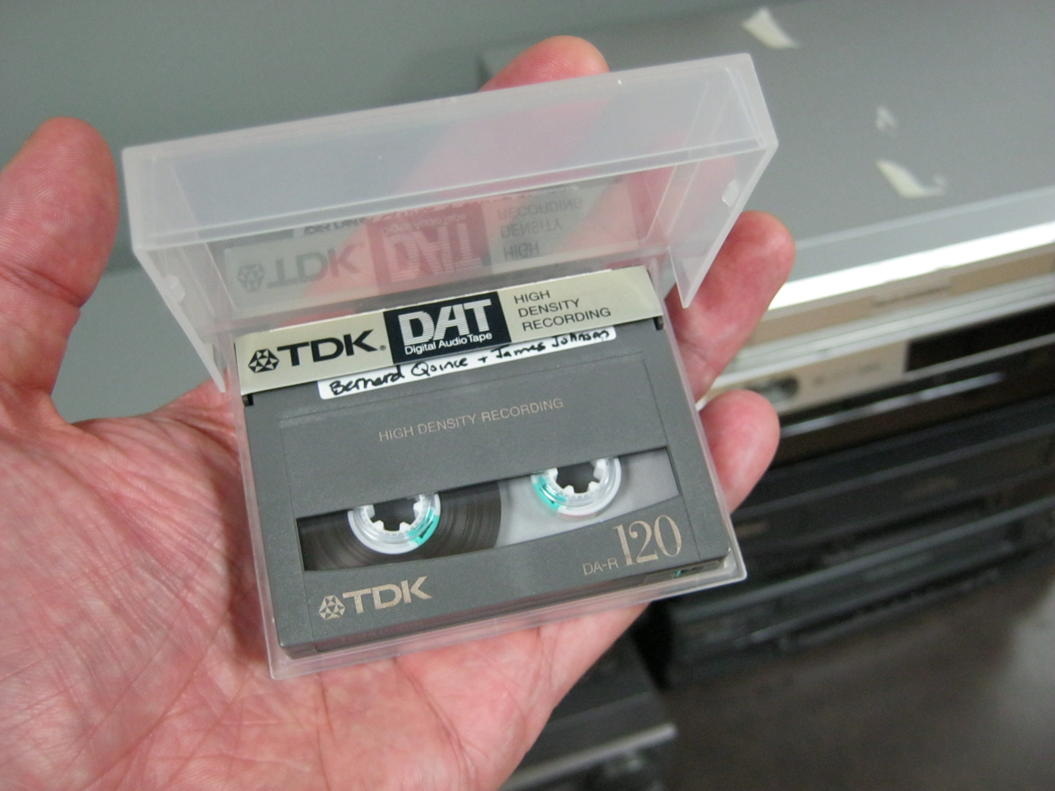
My recent posts have touched on endangered analog audio formats (open reel tape and compact cassette) and the challenges involved in digitizing and preserving them. For this installment, we’ll enter the dawn of the digital and Internet age and take a look at the first widely available consumer digital audio format: the DAT (Digital Audio Tape).
The DAT was developed by consumer electronics juggernaut Sony and introduced to the public in 1987. While similar in appearance to the familiar cassette and also utilizing magnetic tape, the DAT was slightly smaller and only recorded on one “side.” It boasted lossless digital encoding at 16 bits and variable sampling rates maxing out at 48 kHz–better than the 44.1 kHz offered by Compact Discs. During the window of time before affordable hard disk recording (roughly, the 1990s), the DAT ruled the world of digital audio.
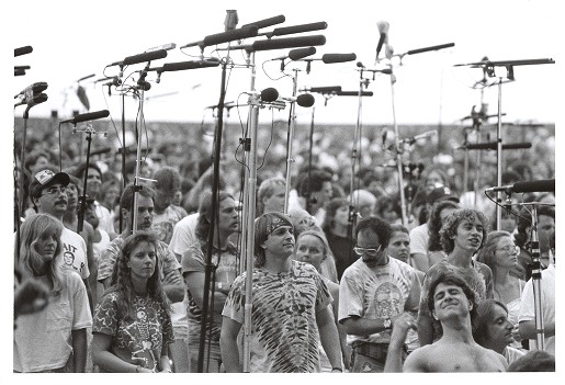
The format was quickly adopted by the music recording industry, allowing for a fully digital signal path through the recording, mixing, and mastering stages of CD production. Due to its portability and sound quality, DAT was also enthusiastically embraced by field recordists, oral historians & interviewers, and live music recordists (AKA “tapers”):
[Conway, Michael A., “Deadheads in the Taper’s section at an outside venue,” Grateful Dead Archive Online, accessed October 10, 2014, http://www.gdao.org/items/show/834556.]
However, the format never caught on with the public at large, partially due to the cost of the players and the fact that few albums of commercial music were issued on DAT [bonus trivia question: what was the first popular music recording to be released on DAT? see below for answer]. In fact, the recording industry actively sought to suppress public availability of the format, believing that the ability to make perfect digital copies of CDs would lead to widespread piracy and bootlegging of their product. The Recording Industry Association of America (RIAA) lobbied against the DAT format and attempted to impose restrictions and copyright detection technology on the players. Once again (much like the earlier brouhaha over cassette tapes and subsequent battle over mp3’s and file sharing) “home taping” was supposedly killing music.
By the turn of the millennium, CD burning technology had become fairly ubiquitous and hard disk recording was becoming more affordable and portable. The DAT format slowly faded into obscurity, and in 2005, Sony discontinued production of DAT players.
In 2014, we are left with a decade’s worth of primary source audio tape (oral histories, interviews, concert and event recordings) that is quickly degrading and may soon be unsalvageable. The playback decks (and parts for them) are no longer produced and there are few technicians with the knowledge or will to repair and maintain them. The short-term answer to these problems is to begin stockpiling working DAT machines and doing the slow work of digitizing and archiving the tapes one by one. For example, the Libraries’ Jazz Loft Project Records collection consisted mainly of DAT tapes, and now exists as digital files accessible through the online finding aid: http://library.duke.edu/rubenstein/findingaids/jazzloftproject/. A long-term approach calls for a survey of library collections to identify the number and condition of DAT tapes, and then for prioritization of these items as it may be logistically impossible to digitize them all.
And now, the answer to our trivia question: in May 1988, post-punk icons Wire released The Ideal Copy on DAT, making it the first popular music recording to be issued on the new format.
I’ve had the pleasure of working on several exhibit kiosks during my time at the library. Most of them have been simple in their functionality, but we’re hoping to push some boundaries and get more creative in the future. Most recently, I’ve been working on building a kiosk for the Queering Duke History: Understanding the LGBTQ Experience at Duke and Beyond exhibit. It highlights oral history interviews with six former Duke students. This particular kiosk example isn’t very complicated, but I thought it would be fun to outline how it’s put together.
Screen shot of the ‘attract’ loop
Hardware
Most of our exhibits run on one of two late 2009 27″ iMacs that we have at our disposal. The displays are high-res (1920×1080) and vivid, the built-in speakers sound fine, and the processors are strong enough to display multimedia content without any trouble. Sometimes we use the kiosk machines to loop video content, so there’s no user interaction required. With this latest iteration, as users will be able to select audio files for playback, we’ll need to provide a mouse. We do our best to secure them to our kiosk stand, and in my tenure we’ve not had any problems. But I understand in the past that sometimes input devices have been damaged or gone missing. As we migrate to touch-screen machines in the future these sorts of issues won’t be a problem.
Software
We tend to leave our kiosk machines out in the open in public spaces. If the machine isn’t sufficiently locked down, it can lead to it being used for purposes other than what we have in mind. Our approach is to setup a user account that has very narrow privileges and set it as the default login (so when the machine starts up it boots into our ‘kiosk’ account). In OS X you can setup user permissions, startup programs, and other settings via ‘Users and Groups’ in the System Preferences. We also setup power saving settings so that the computer will sleep between midnight and 6:00am using the Energy Saving Scheduler.
My general approach for interactive content is to build web pages, host them externally, and load them on to the kiosk in a web browser. I think the biggest benefits of this approach are that we can make updates without having to take down the kiosk and also track user interactions using Google analytics. However, there are drawbacks as well. We need to ensure that we have reliable network connectivity, which can be a challenge sometimes. By placing the machine online, we also add to the risk that it can be used for purposes other than what we intend. So in order to lock things down even more, we utilize xStand to display our interactive content. It allows for full screen browsing without any GUI chrome, black-listing and/or white-listing sites, and most importantly, it restarts automatically after a crash. In my experience it’s worked very well.
User Interface
This particular exhibit kiosk has only one real mission – to enable users to listen to a series of audio clips. As such, the UI is very simple. The first component is a looping ‘attract’ screen. The attract screen serves the dual purpose of drawing attention to the kiosk and keeping pixels from getting burned in on the display. For this kiosk I’m looping a short mp4 video file. The video container is wrapped in a link and when it’s clicked a javscript hides the video and displays the content div.
The content area of the page is very simple – there are a group of images that can be clicked on. When they are, a lightbox window (I like Fancy Box) pops up that holds the relevant audio clips. I’m using simple html5 audio playback controls to stream the mp3 files.
Screen shot of the ‘home’ screen UIScreen shot of the audio playback UI
Finally, there’s another javascript running in the background that detects and user input. After 10 minutes of inactivity, the page reloads which brings back the attract screen.
The Exhibit
Queering Duke History runs through December 14, 2014 in the Perkins Library Gallery on West Campus. Stop by and check it out!
The One Person, One Vote Project is trying to do history a different way. Fifty years ago, young activists in the Student Nonviolent Coordinating Committee broke open the segregationist south with the help of local leaders. Despite rerouting the trajectories of history, historical actors rarely get to have a say in how their stories are told. Duke and the SNCC Legacy Project are changing that. The documentary website we’re building (One Person, One Vote: The Legacy of SNCC and the Struggle for Voting Right) puts SNCC veterans at the center of narrating their history.
SNCC field secretary and Editorial Board member Charlie Cobb. Courtesy of www.crmvet.org.
So how does that make the story we tell different? First and foremost, civil rights becomes about grassroots organizing and the hundreds of local individuals who built the movement from the bottom up. Our SNCC partners want to tell a story driven by the whys and hows of history. How did their experiences organizing in southwest Mississippi shape SNCC strategies in southwest Georgia and the Mississippi Delta? Why did SNCC turn to parallel politics in organizing the Mississippi Freedom Democratic Party? How did ideas drive the decisions they made and the actions they took?
For the One Person, One Vote site, we’ve been searching for tools that can help us tell this story of ideas, one focused on why SNCC turned to grassroots mobilization and how they organized. In a world where new tools for data visualization, mapping, and digital humanities appear each month, we’ve had plenty of possibilities to choose from. The tools we’ve gravitated towards have some common traits; they all let us tell multi-layered narratives and bring them to life with video clips, photographs, documents, and music. Here are a couple we’ve found:
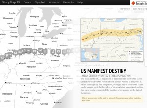
This StoryMap traces how the idea of Manifest Destiny progressed through the years and across the geography of the U.S.
StoryMap: Knightlab’s StoryMap tool is great for telling stories. But better yet, StoryMap lets us illustrate how stories unfold over time and space. Each slide in a StoryMap is grounded with a date and a place. Within the slides, creators can embed videos and images and explain the significance of a particular place with text. Unlike other mapping tools, StoryMaps progress linearly; one slide follows another in a sequence, and viewers click through a particular path. In terms of SNCC, StoryMaps give us the opportunity to trace how SNCC formed out of the Greensboro sit-ins, adopted a strategy of jail-no-bail in Rock Hill, SC, picked up the Freedom Rides down to Jackson, Mississippi, and then started organizing its first voter registration campaign in McComb, Mississippi.
Timeline.JS: We wanted timelines in the One Person, One Vote site to trace significant events in SNCC’s history but also to illustrate how SNCC’s experiences on the ground transformed their thinking, organizing, and acting. Timeline.JS, another Knightlab tool, provides the flexibility to tell overlapping stories in clean, understandable manner. Markers in Timeline.JS let us embed videos, maps, and photos, cite where they come from, and explain their significance. Different tracks on the timeline give us the option of categorizing events into geographic regions, modes of organizing, or evolving ideas.
The history of Duke University as displayed by Timeline.JS.
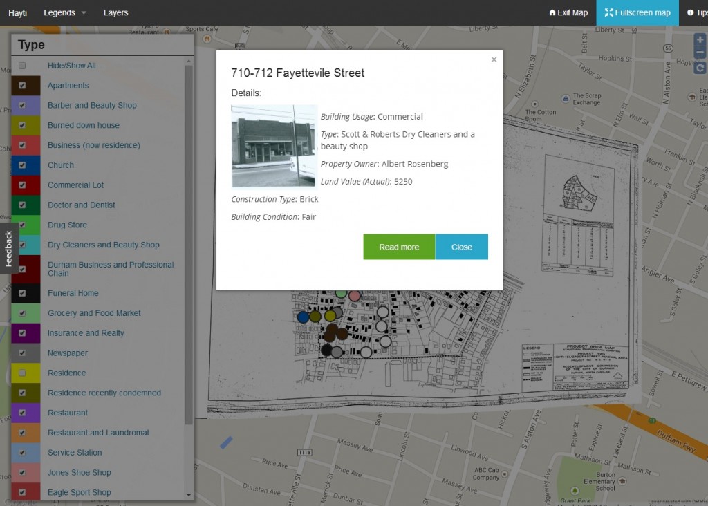
DH Press: Many of the mapping tools we checked out relied on number-heavy data sets, for example those comparing how many robberies took place on the corners of different city blocks. Data sets for One Person, One Vote come mostly in the form of people, places, and stories. We needed a tool that let us bring together events and relevant multimedia material and primary sources and represent them on a map. After checking out a variety of mapping tools, we found that DH Press served many of our needs.
DH Press project representing buildings and uses in Durham’s Hayti neighborhood.
Coming out of the University of North Carolina – Chapel Hill’s Digital Innovation Lab, DH Press is a WordPress plugin designed specifically with digital humanities projects in mind. While numerous tools can plot events on a map, DH Press markers provide depth. We can embed the video of an oral history interview and have a transcript running simultaneously as it plays. A marker might include a detailed story about an event, and chronicle all of the people who were there. Additionally, we can customize the map legends to generate different spatial representations of our data.
Example of a marker in DH Press. Markers can be customized to include a range of information about a particular place or event.
These are some of the digital tools we’ve found that let us tell civil rights history through stories and ideas. And the search continues on.
Anatomical fugitive sheets are single sheets, very similar to items such as broadsides [early printed advertisements] that date from the sixteenth and seventeenth centuries and are incredibly rare and fragile. Eight of the ten sheets in our collections have overlays or moveable parts adding to the complexity of creating an online presence that allows a user to open or lift the flap digitally.
The primary deliverable for the design contractor of this project will be an online surrogate of the fugitive sheets and any accompanying plugins. Skills needed include JavaScript and CSS.
We’re looking for a talented design team to help us connect the past to the present. See the prospectus for candidate contractors linked below.
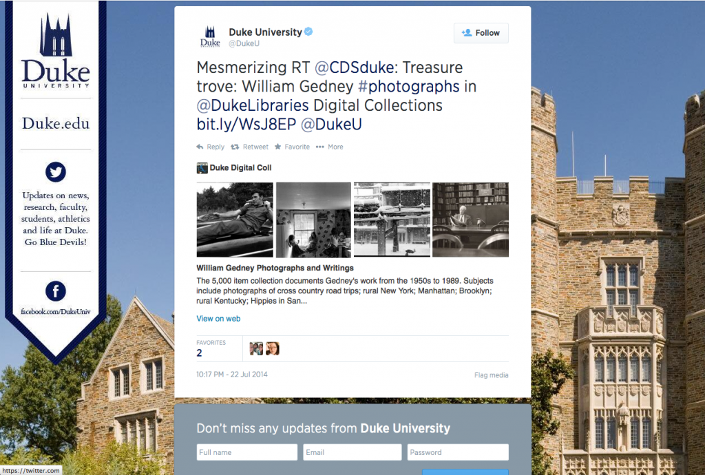
Everyone knows that Twitter limits each post to 140 characters. Early criticism has since cooled and most people agree it’s a helpful constraint, circumvented through clever (some might say better) writing, hyperlinks, and URL-shorteners. But as a reader of tweets, how do you know what lies at the other end of a shortened link? What entices you to click? The tweet author can rarely spare the characters to attribute the source site or provide a snippet of content, and can’t be expected to attach a representative image or screenshot.
Our webpages are much more than just mystery destinations for shortened URLs. Twitter agrees: its developers want help understanding what the share-worthy content from a webpage actually is in order to present it in a compelling way alongside the 140 characters or less. Enter two library hallmarks: vocabularies and metadata.
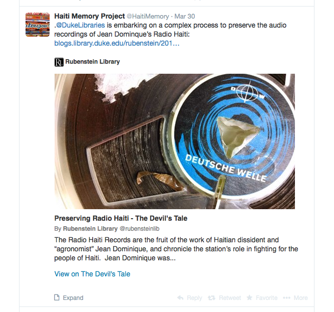
This week, we added Twitter Card metadata in the <head> of all of our digital collections pages and in our library blogs. This data instantly made all tweets and retweets linking to our pages far more interesting. Check it out!
For the blogs, tweets now display the featured image, post title, opening snippet, site attribution, and a link to the original post. Links to items from digital collections now show the image itself (along with some item info), while links to collections, categories, or search results now display a grid of four images with a description underneath. See these examples:
In 2013-14, social media platforms accounted for 10.1% of traffic to our blogs (~28,000 visits in 2013-14, 11,300 via Twitter), and 4.3% of visits to our digital collections (~17,000 visits, 1,000 via Twitter). That seems low, but perhaps it’s because of the mystery link phenomenon. These new media-rich tweets have the potential to increase our traffic through these channels by being more interesting to look at and more compelling to click. We’re looking forward to finding out whether they do.
And regardless of driving clicks, there are two other benefits of Twitter Cards that we really care about in the library: context and attribution. We love it when our collections and blog posts are shared on Twitter. These tweets now automatically give some additional information and helpfully cite the source.
How to Get Your Own Twitter Cards
The Manual Way
If you’re manually adding tags like we’ve done in our Digital Collections templates, you can “View Source” on any of our pages to see what <meta> tags make the magic happen. Moz also has some useful code snippets to copy, with links to validator tools so you can make sure you’re doing it correctly.
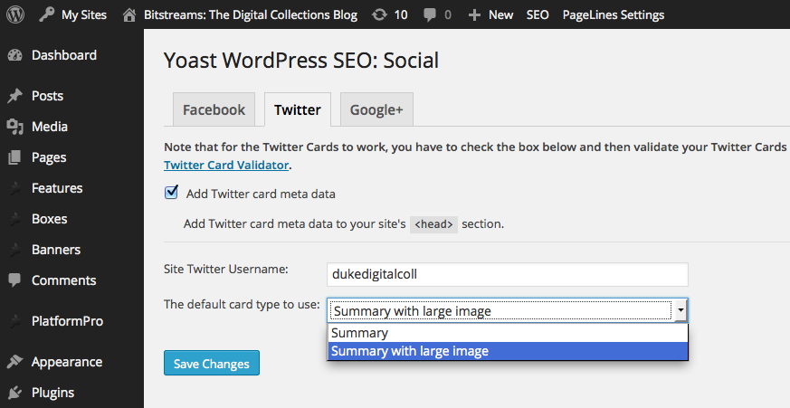
Since our blogs run on WordPress, we were able to use the excellent WordPress SEO plugin by Yoast. It’s helpful for a lot of things related to search engine optimization, and it makes this social media optimization easy, too.
Adding Twitter Card metadata with the WordPress SEO plugin.
Once your tags are in place, you just need to validate an example from your domain using the Twitter Card Validator before Twitter will turn on the media-rich tweets. It doesn’t take long at all: ours began appearing within a couple hours. The cards apply retroactively to previous tweets, too.
Related Work
Our addition of Twitter Card data follows similar work we have done using semantic markup in our Digital Collections site using the Open Graph and Schema.org vocabularies. Open Graph is a standard developed by Facebook. Similar to Twitter Card metadata, OG tags inform Facebook what content to highlight from a linked webpage. Schema.org is a vocabulary for describing the contents of web pages in a way that is helpful for retrieval and representation in Google and other search engines.
All of these tools use RDFa syntax, a key cornerstone of Linked Data on the web that supports the description of resources using whichever vocabularies you choose. Google, Twitter, Facebook, and other major players in our information ecosystem are now actively using this data, providing clear incentive for web authors to provide it. We should keep striving to play along.
The audio tapes in the recently acquired Radio Haiti collection posed a number of digitization challenges. Some of these were discussed in this video produced by Duke’s Rubenstein Library:
In this post, I will use a short audio clip from the collection to illustrate some of the issues that we face in working with this particular type of analog media.
First, I present the raw digitized audio, taken from a tape labelled “Tambour Vaudou”:
As you can hear, there are a number of confusing and disorienting things going on there. I’ll attempt to break these down into a series of discrete issues that we can diagnose and fix if necessary.
Tape Speed
Analog tape machines typically offer more than one speed for recording, meaning that you can change the rate at which the reels turn and the tape moves across the record or playback head. The faster the speed, the higher the fidelity of the result. On the other hand, faster speeds use more tape (which is expensive). Tape speed is measured in “ips” (inches per second). The tapes we work with were usually recorded at speeds of 3.75 or 7.5 ips, and our playback deck is set up to handle either of these. We preview each tape before digitizing to determine what the proper setting is.
In the audio example above, you can hear that the tape speed was changed at around 10 seconds into the recording. This accounts for the “spawn of Satan” voice you hear at the beginning. Shifting the speed in the opposite direction would have resulted in a “chipmunk voice” effect. This issue is usually easy to detect by ear. The solution in this case would be to digitize the first 10 seconds at the faster speed (7.5 ips), and then switch back to the slower playback speed (3.75 ips) for the remainder of the tape.
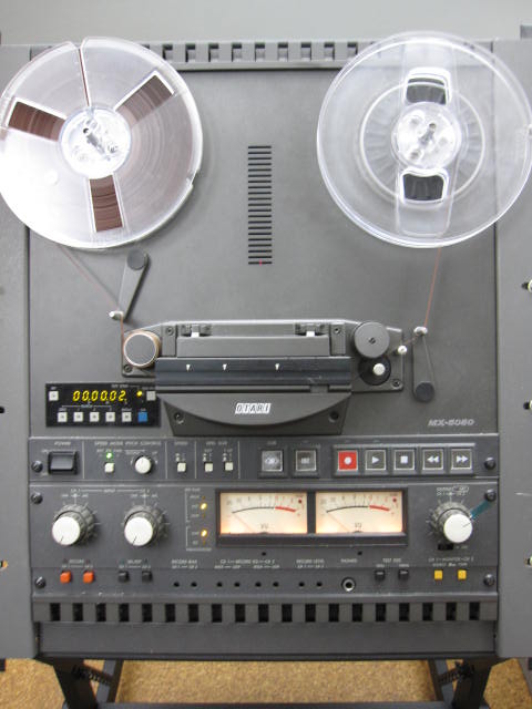
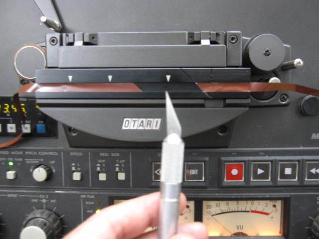
The Otari MX-5050 tape machine
Volume Level and Background Noise
The tapes we work with come from many sources and locations and were recorded on a variety of equipment by people with varying levels of technical knowledge. As a result, the audio can be all over the place in terms of fidelity and volume. In the audio example above, the volume jumps dramatically when the drums come in at around 00:10. Then you hear that the person making the recording gradually brings the level down before raising it again slightly. There are similar fluctuations in volume level throughout the audio clip. Because we are digitizing for archival preservation, we don’t attempt to make any changes to smooth out the sometimes jarring volume discrepancies across the course of a tape. We simply find the loudest part of the content, and use that to set our levels for capture. The goal is to get as much signal as possible to our audio interface (which converts the analog signal to digital information that can be read by software) without overloading it. This requires previewing the tape, monitoring the input volume in our audio software, and adjusting accordingly.
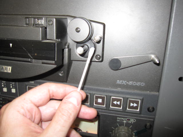
This recording happens to be fairly clean in terms of background noise, which is often not the case. Many of the oral histories that we work with were recorded in noisy public spaces or in homes with appliances running, people talking in the background, or the subject not in close enough proximity to the microphone. As a result, the content can be obscured by noise. Unfortunately there is little that can be done about this since the problem is in the recording itself, not the playback. There are a number of hum, hiss, and noise removal tools for digital audio on the market, but we typically don’t use these on our archival files. As mentioned above, we try to capture the source material as faithfully as possible, warts and all. After each transfer, we clean the tape heads and all other surfaces that the tape touches with a Q-tip and denatured alcohol. This ensures that we’re not introducing additional noise or signal loss on our end.
Splices
While cleaning the Radio Haiti tapes (as detailed in the video above), we discovered that many of the tapes were comprised of multiple sections of tape spliced together. A splice is simply a place where two different pieces of audio tape are connected by a piece of sticky tape (much like the familiar Scotch tape that you find in any office). This may be done to edit together various content into a seamless whole, or to repair damaged tape. Unfortunately, the sticky tape used for splicing dries out over time, becomes brittle, and loses it’s adhesive qualities. In the course of cleaning and digitizing the Radio Haiti tapes, many of these splices came undone and had to be repaired before our transfers could be completed.
Tape ready for splicing
Our playback deck includes a handy splicing block that holds the tape in the correct position for this delicate operation. First I use a razor blade to clean up any rough edges on both ends of the tape and cut it to the proper 45 degree angle. The splicing block includes a groove that helps to make a clean and accurate cut. Then I move the two pieces of tape end to end, so that they are just touching but not overlapping. Finally I apply the sticky splicing tape (the blue piece in the photo below) and gently press on it to make sure it is evenly and fully attached to the audio tape. Now the reel is once again ready for playback and digitization. In the “Tambour Vaudou” audio clip above, you may notice three separate sections of content: the voice at the beginning, the drums in the middle, and the singing at the end. These were three pieces of tape that were spliced together on the original reel and that we repaired right here in the library’s Digital Production Center.
A finished splice. Note that the splice is made on the shiny back of the tape, not on the matte side that audio is recorded on.
These are just a few of many issues that can arise in the course of digitizing a collection of analog open reel audio tapes. Fortunately, we can solve or mitigate most of these problems, get a clean transfer, and generate a high-quality archival digital file. Until next time…keep your heads clean, your splices intact, and your reels spinning!
So much work to do, so little time. But what keeps us focused as we work to make a wealth of resources available via the web? It often comes down to a willingness to collaborate and a commitment to a common vision.
Staying focused through vision and values
When Duke University Libraries embarked on our 2012-2013 website redesign, we created a vision and values statement that became a guidepost during our decision making. It worked so well for that single project, that we later decided to apply it to current and future web projects. You can read the full statement on our website, but here are just a few of the key ideas:
Put users first.
Verify data and information, perpetually remove outdated or inaccurate data and content, & present relevant content at the point of need.
Strengthen our role as essential partners in research, teaching, and scholarly communication: be a center of intellectual life at Duke.
Maintain flexibility in the site to foster experimentation, risk-taking, and future innovation.
As we decide which projects to undertake, what our priorities should be, and how we should implement these projects, we often consider what aligns well with our vision and values. And when something doesn’t fit well, it’s often time to reconsider.
Team work, supporting and balancing one another
Vision counts, but having people who collaborate well is what really enables us to maintain focus and to take a coherent approach to our work.
A number of cross-departmental teams within Duke University Libraries consider which web-based projects we should undertake, who should implement them, when, and how. By ensuring that multiple voices are at the table, each bringing different expertise, we make use of the collective wisdom from within our staff.
WebX
The Web Experience Team (WebX) is responsible for the overall visual consistency and functional integrity of our web interfaces. It not only provides vision for our website, but actively leads or contributes to the implementation of numerous projects. Sample projects include:
The introduction of a new eBook service called Overdrive
The development of a new, Bento-style, version of our search portal to be released in August
Testing the usability of our web interfaces with patrons leading to changes such as the introduction of a selectable default search tab
Members of WebX are Aaron Welborn, Emily Daly, Heidi Madden, Jacquie Samples, Kate Collins, Michael Peper, Sean Aery, and Thomas Crichlow.
ACDC
While we love to see the research community using our collections within our reading rooms, we understand the value in making these collections available online. The Advisory Committee for Digital Collections (ACDC) decides which collections of rare material will be published online. Members of ACDC are Andy Armacost, David Pavelich, Jeff Kosokoff, Kat Stefko, Liz Milewicz, Molly Bragg, Naomi Nelson, Valerie Gillispie, and Will Sexton.
DCIT
The Digital Collections Implementation Team (DCIT) both guides and undertakes much of the work needed to digitize and publish our unique online collections. Popular collections DCIT has published include:
Members of DCIT are Erin Hammeke, Mike Adamo, Molly Bragg, Noah Huffman, Sean Aery, and Will Sexton.
These groups have their individual responsibilities, but they also work well together. The teamwork extends beyond these groups as each relies on individuals and departments throughout Duke Libraries and beyond to ensure the success of our projects.
Most importantly, it helps that we like to work together, we value each other’s viewpoints, and we remain connected to a common vision.
The technology for digitizing analog videotape is continually evolving. Thanks to increases in data transfer-rates and hard drive write-speeds, as well as the availability of more powerful computer processors at cheaper price-points, the Digital Production Center recently decided to upgrade its video digitization system. Funding for the improved technology was procured by Winston Atkins, Duke Libraries Preservation Officer. Of all the materials we work with in the Digital Production Center, analog videotape has one of the shortest lifespans. Thus, it is high on the list of the Library’s priorities for long-term digital preservation. Thanks, Winston!
Thunderbolt is leaving USB in the dust.
Due to innovative design, ease of use, and dominance within the video and filmmaking communities, we decided to go with a combination of products designed by Apple Inc., and Blackmagic Design. A new computer hardware interface recently adopted by Apple and Blackmagic, called Thunderbolt, allows the the two companies’ products to work seamlessly together at an unprecedented data-transfer speed of 10 Gigabits per second, per channel. This is much faster than previously available interfaces such as Firewire and USB. Because video content incorporates an enormous amount of data, the improved data-transfer speed allows the computer to capture the video signal in real time, without interruption or dropped frames.
Blackmagic design converts the analog video signal to SDI (serial digital interface).
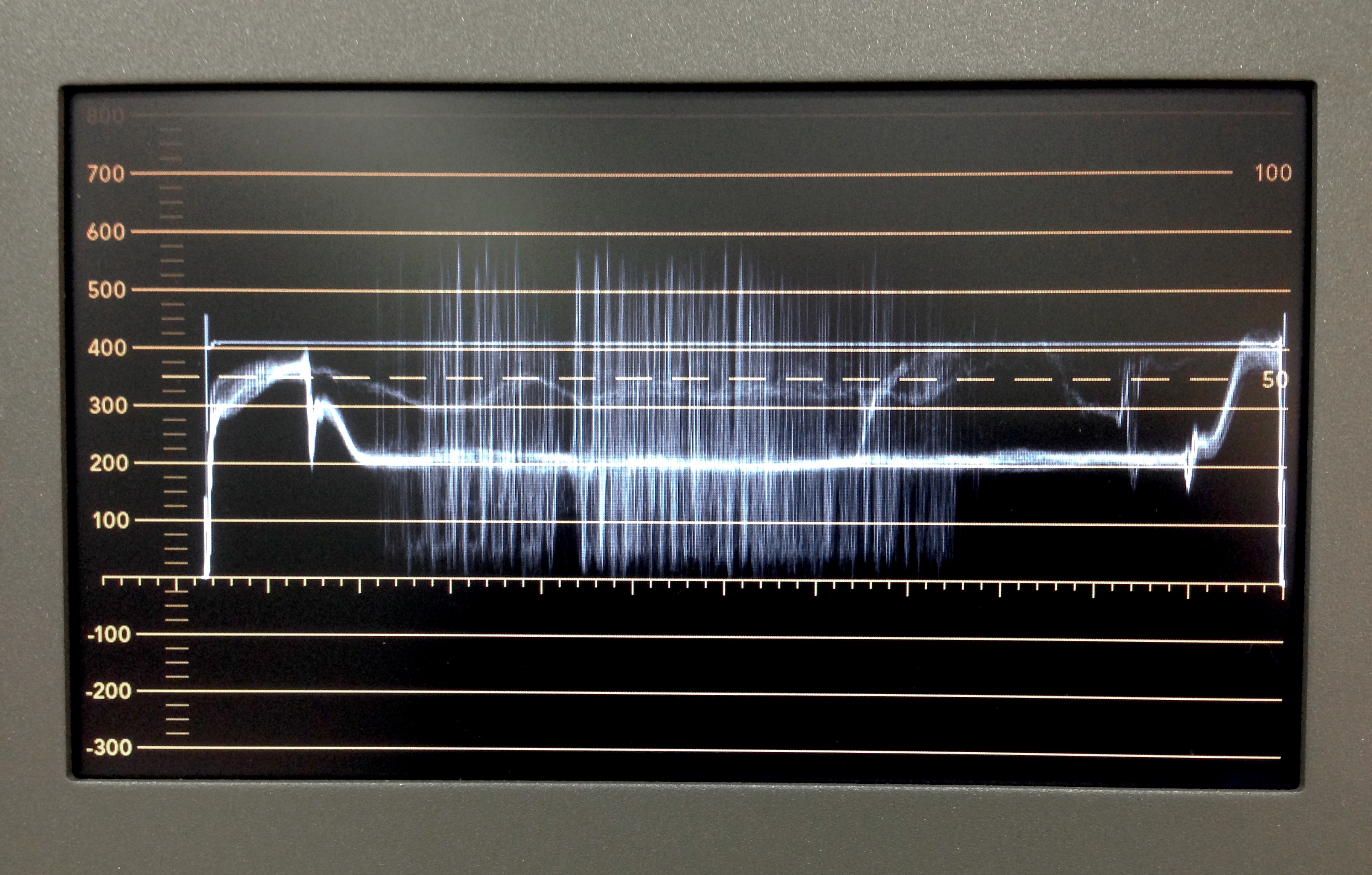
Our new data stream works as follows. Once a tape is playing on an analog videotape deck, the output signal travels through an Analog to SDI (serial digital interface) converter. This converts the content from analog to digital. Next, the digital signal travels via SDI cable through a Blackmagic SmartScope monitor, which allows for monitoring via waveform and vectorscope readouts. A veteran television engineer I know will talk to you for days regarding the physics of this, but, in layperson terms, these readouts let you verify the integrity of the color signal, and make sure your video levels are not too high (blown-out highlights) or too low (crushed shadows). If there is a problem, adjustments can be made via analog video signal processor or time-base corrector to bring the video signal within acceptable limits.
Blackmagic’s SmartScope allows for monitoring of the video’s waveform. The signal must stay between 0 and 700 (left side) or clipping will occur, which means you need to get that videotape to the emergency room, STAT!
Next, the video content travels via SDI cable to a Blackmagic Ultrastudio interface, which converts the signal from SDI to Thunderbolt, so it can now be recognized by a computer. The content then travels via Thunderbolt cable to a 27″ Apple iMac utilizing a 3.5 GHz Quad-core processor and NVIDIA GeForce graphics processor. Blackmagic’s Media Express software writes the data, via Thunderbolt cable, to a G-Drive Pro external storage system as a 10-bit, uncompressed preservation master file. After capture, editing can be done using Apple’s Final Cut Pro or QuickTime Pro. Compressed Mp4 access derivatives are then batch-processed using Apple’s Compressor software, or other utilities such as MPEG-Streamclip. Finally, the preservation master files are uploaded to Duke’s servers for long-term storage. Unless there are copyright restrictions, the access derivatives will be published online.
Video digitization happens in real time. A one-hour tape is digitized in, well, one hour, which is more than enough Bob Hope jokes for anyone.
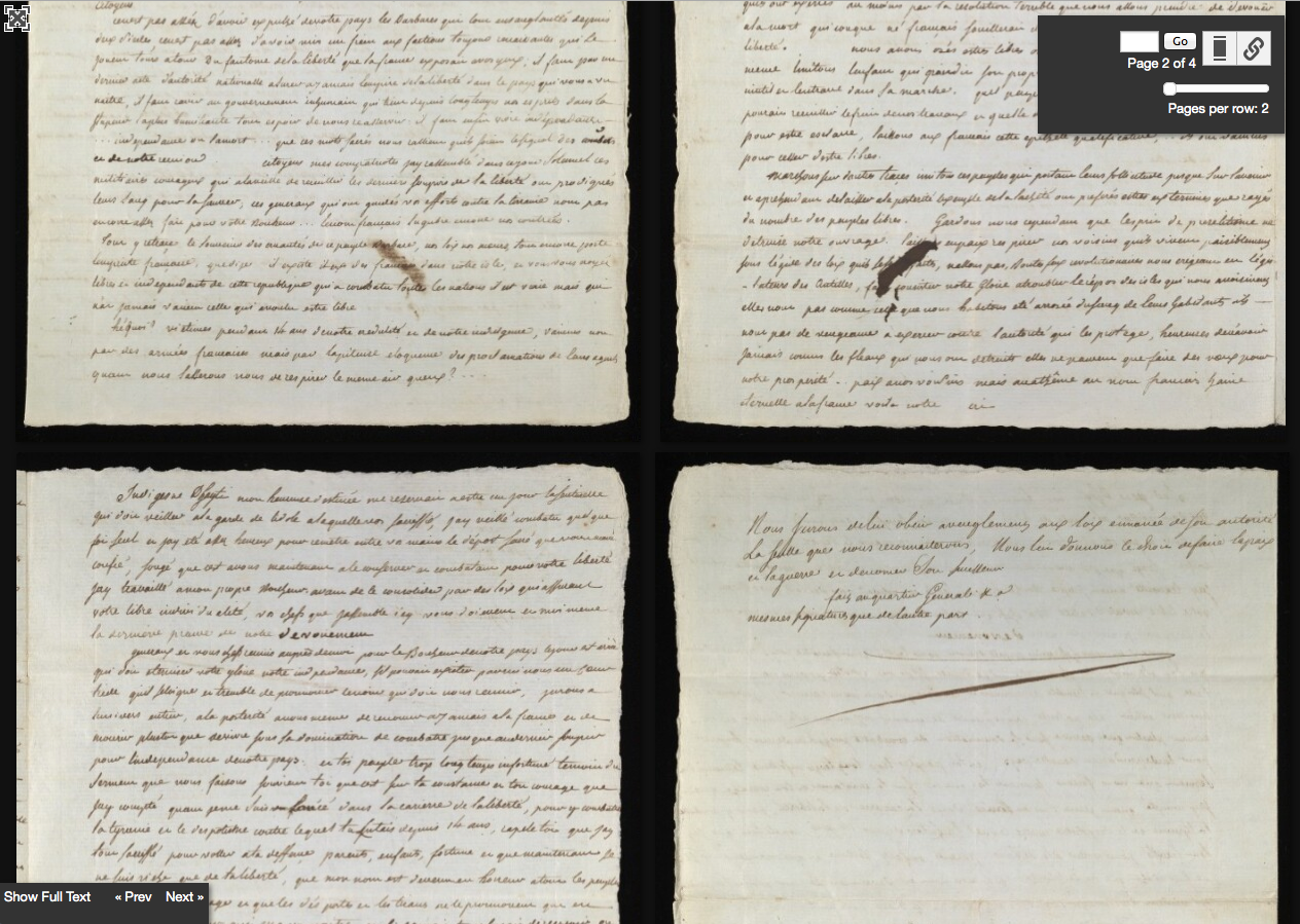
This past week, we were excited to be able to publish a rare 1804 manuscript copy of the Haitian Declaration of Independence in our digital collections website. We used the project as a catalyst for improving our document-viewing user experience, since we knew our existing platforms just wouldn’t cut it for this particular treasure from the Rubenstein Library collection. In order to present the declaration online, we decided to implement the open-source Diva.js viewer. We’re happy with the results so far and look forward to making more strides in our ability to represent documents in our site as the year progresses.
Haitian Declaration of Independence as seen in Diva.js document viewer with full text transcription.
Challenges to Address
We have had two glaring limitations in providing access to digitized collections to date: 1) a less-than-stellar zoom & pan feature for images and 2) a suboptimal experience for navigating documents with multiple pages. For zooming and panning (see example), we use software called OpenLayers, which is primarily a mapping application. And for paginated items we’ve used two plugins designed to showcase image galleries, Galleria (example) and Colorbox (example). These tools are all pretty good at what they do, but we’ve been using them more as stopgap solutions for things they weren’t really created to do in the first place. As the old saying goes, when all you have is a hammer, everything looks like a nail.
Big (OR Zoom-Dependent) Things
A selection from our digitized Italian Cultural Posters. The “large” derivative is 11,000 x 8,000 pixels, a 28MB JPG.
Traditionally as we digitize images, whether freestanding or components of a multi-page object, at the end of the process we generate three JPG derivatives per page. We make a thumbnail (helpful in search results or other item sets), medium image (what you see on an item’s webpage), and large image (same dimensions as the preservation master, viewed via the ‘all sizes’ link). That’s a common approach, but there are several places where that doesn’t always work so well. Some things we’ve digitized are big, as in “shoot them in sections with a camera and stitch the images together” big. And we’ve got several more materials like this waiting in the wings to make available. A medium image doesn’t always do these things justice, but good luck downloading and navigating a giant 28MB JPG when all you want to do is zoom in a little bit.
Likewise, an object doesn’t have to be large to really need easy zooming to be part of the viewing experience. You might want to read the fine print on that newspaper ad, see the surgeon general’s warning on that billboard, or inspect the brushstrokes in that beautiful hand-painted glass lantern slide.
And finally, it’s not easy to anticipate the exact dimensions at which all our images will be useful to a person or program using them. Using our data to power an interactive display for a media wall? A mobile app? A slideshow on the web? You’ll probably want images that are different dimensions than what we’ve stored online. But to date, we haven’t been able to provide ways to specify different parameters (like height, width, and rotation angle) in the image URLs to help people use our images in environments beyond our website.
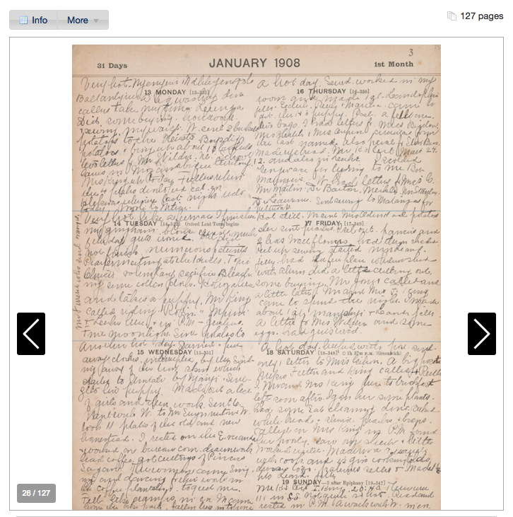
A page from Mary McCornack Thompson’s 1908 travel diary, limited by its presentation via an image gallery.
Paginated Things
We do love our documentary photography collections, but a lot of our digitized objects are represented by more than just a single image. Take an 11-page piece of sheet music or a 127-page diary, for example. Those aren’t just sequences or collections of images. Their paginated orientation is pretty essential to their representation online, but a lot of what characterizes those materials is unfortunately lost in translation when we use gallery tools to display them.
The Intersection of (Big OR Zoom-Dependent) AND Paginated
Here’s where things get interesting and quite a bit more complicated: when zooming, panning, page navigation, and system performance are all essential to interacting with a digital object. There are several tools out there that support these various aspects, but very few that do them all AND do them well. We knew we needed something that did.
Our Solution: Diva.js
We decided to use the open-source Diva.js (Document Image Viewer with AJAX). Developed at the Distributed Digital Music Archives and Libraries Lab (DDMAL) at McGill University, it’s “a Javascript frontend for viewing documents, designed to work with digital libraries to present multi-page documents as a single, continuous item” (see About page). We liked its combination of zooming, panning, and page navigation, as well as its extensibility. This Code4Lib article nicely summarizes how it works and why it was developed.
Setting up Diva.js required us to add a few new pieces to our infrastructure. The most significant was an image server (in our case, IIPImage) that could 1) deliver parts of a digital image upon request, and 2) deliver complete images at whatever size is requested via URL parameters.
Our Interface: How it Works
By default, we present a document in our usual item page template that provides branding, context, and metadata. You can scroll up and down to navigate pages, use Page Up or Page Down keys, or enter a page number to jump to a page directly. There’s a slider to zoom in or out, or alternatively you can double-click to zoom in / Ctrl-double-click to zoom out. You can toggle to a grid view of all pages and adjust how many pages to view at once in the grid. There’s a really handy full-screen option, too.
Fulltext transcription presented in fullscreen mode, thumbnail view.Page 4, zoom level 4, with link to download.
It’s optimized for performance via AJAX-driven “lazy loading”: only the page of the document that you’re currently viewing has to load in your browser, and likewise only the visible part of that page image in the viewer must load (via square tiles). You can also download a complete JPG for a page at the current resolution by clicking the grey arrow.
We extended Diva.js by building a synchronized fulltext pane that displays the transcript of the current page alongside the image (and beneath it in full-screen view). That doesn’t come out-of-the-box, but Diva.js provides some useful hooks into its various functions to enable developing this sort of thing. We also slightly modified the styles.
A tile delivered by IIPImage server
Behind the scenes, we have pyramid TIFF images (one for each page), served up as JPGs by IIPImage server. These files comprise arrays of 256×256 JPG tiles for each available zoom level for the image. Let’s take page 1 of the declaration for example. At zoom level 0 (all the way zoomed out), there’s only one image tile: it’s under 256×256 pixels; level 1 is 4 tiles, level 2 is 12, level 3 is 48, level 4 is 176. The page image at level 5 (all the way zoomed in) includes 682 tiles (example of one), which sounds like a lot, but then again the server only has to deliver the parts that you’re currently viewing.
Every item using Diva.js also needs to load a JSON stream including the dimensions for each page within the document, so we had to generate that data. If there’s a transcript present, we store it as a single HTML file, then use AJAX to dynamically pull in the part of that file that corresponds to the currently-viewed page in the document.
Diva.js & IIPImage Limitations
It’s a good interface, and is the best document representation we’ve been able to provide to date. Yet it’s far from perfect. There are several areas that are limiting or that we want to explore more as we look to make more documents available in the future.
Out of the box, Diva.js doesn’t support page metadata, transcriptions, or search & retrieval within a document. We do display a synchronized transcript, but there’s currently no mapping between the text and the location within each page where each word appears, nor can you perform a search and discover which pages contain a given keyword. Other folks using Diva.js are working on robust applications that handle these kinds of interactions, but the degree to which they must customize the application is high. See for example, the Salzinnes Antiphonal: a 485-page liturgical manuscript w/text and music or a prototype for the Liber Usualis: a 2,000+ page manuscript using optical music recognition to encode melodic fragments.
Diva.js also has discrete zooming, which can feel a little jarring when you jump between zoom levels. It’s not the smooth, continuous zoom experience that is becoming more commonplace in other viewers.
With the IIPImage server, we’ll likely re-evaluate using Pyramid TIFFs vs. JPEG2000s to see which file format works best for our digitization and publication workflow. In either case, there are several compression and caching variables to tinker with to find an ideal balance between image quality, storage space required, and system performance. We also discovered that the IIP server unfortunately strips out the images’ ICC color profiles when it delivers JPGs, so users may not be getting a true-to-form representation of the image colors we captured during digitization.
Next Steps
Launching our first project using Diva.js gives us a solid jumping-off point for expanding our ability to provide useful, compelling representations of our digitized documents online. We’ll assess how well this same approach would scale to other potential projects and in the meantime keep an eye on the landscape to see how things evolve. We’re better equipped now than ever to investigate alternative approaches and complementary tools for doing this work.
We’ll also engage more closely with our esteemed colleagues in the Duke Collaboratory for Classics Computing (DC3), who are at the forefront of building tools and services in support of digital scholarship. Well beyond supporting discovery and access to documents, their work enables a community of scholars to collaboratively transcribe and annotate items (an incredible–and incredibly useful–feat!). There’s a lot we’re eager to learn as we look ahead.
Notes from the Duke University Libraries Digital Projects Team


