Let me tell you something people: Coordinating development of the Duke Digital Repository (DDR) is a crazy logistical affair that involves much ado about… well, everything!
My last post, What is a Repository?, discussed at a high level, what exactly a digital repository is intended to be and the purpose it plays in the Libraries’ digital ecosystem. If we take a step down from that, we can categorize the DDR as two distinct efforts, 1) a massive software development project and 2) a complex service suite. Both require significant project management and leadership, and necessitate tools to help in coordinating the effort.
There are many, many details that require documenting and tracking through the life cycle of a software development project. Initially we start with requirements- meaning what the tools need to do to meet the end-users needs. Requirements must be properly documented and must essentially detail a project management plan that can result in a successful product (the software) and the project (the process, and everything that supports success of the product itself). From this we manage a ‘backlog’ of requirements, and pull from the backlog to structure our work. Requirements evolve into tasks that are handed off to developers. Tasks themselves become conversations as the development team determines the best possible approach to getting the work done. In addition to this, there are bugs to track, changes to document, and new requirements evolving all of the time… you can imagine that managing all of this in a simple ‘To Do’ list could get a bit unwieldy.
We realized that our ability to keep all of these many plates spinning necessitated a really solid project management tool. So we embarked on a mission to find just the right one! I’ll share our approach here, in case you and your team have a similar need and could benefit from our experiences.
STEP 1: Establish your business case: Finding the right tool will take effort, and getting buy-in from your team and organization will take even more! Get started early with justifying to your team and your org why a PM tool is necessary to support the work.
STEP 2: Perform a needs assessment: You and your team should get around a table and brainstorm. Ask yourselves what you need this tool to do, what features are critical, what your budget is, etc. Create a matrix where you fully define all of these characteristics to drive your investigation.
STEP 3: Do an environmental scan: What is out there on the market? Do your research and whittle down a list of tools that have potential. Also build on the skills of your team- if you have existing competencies in a given tool, then fully flesh out its features to see if it fits the bill.
STEP 4: Put them through the paces: Choose a select list of tools and see how they match up to you needs assessment. Task a group of people to test-drive the tools, and report out on the experience.
STEP 5: Share your findings: Discuss the findings with your team. Capture the highs and the lows and present the material in a digestible fashion. If it’s possible to get consensus, make a recommendation.
STEP 6: Get buy-in: This is the MOST critical part! Get buy-in from your team to implement the tool. A PM tool can only benefit the team if it is used thoroughly, consistently, and in a team fashion. You don’t want to deal with adverse reactions to the tool after the fact…
No matter what tool you choose, you’ll need to follow some simple guidelines to ensure successful adoption:
Once again… Get TEAM buy-in!
Define ownership, or an Admin, of the tool (ideally the Project Manager)
Define basic parameters for use and team expectations
PROVIDE TRAINING
Consider your ecosystem of tools and simplify where appropriate
The more robust the tool, the more support and structure will be required
Trust me when I say that this exercise will not let you down, and will likely yield a wealth of information about the tools that you use, the projects that you manage, your team’s preferences for coordinating the work, and much more!
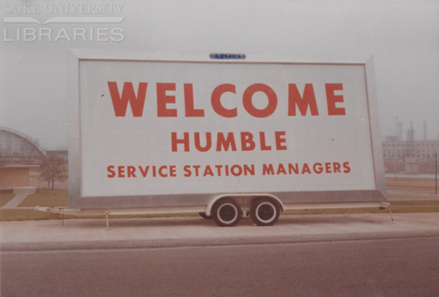
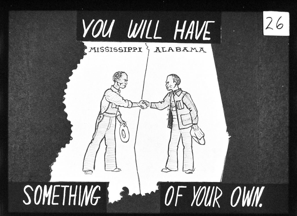
The Student Nonviolent Coordinating Committee worked on the cutting edge. In the fight for Black political and economic power, SNCC employed a wide array of technology and tactics to do the work. SNCC bought its own WATS (Wide Area Telephone Service) lines, allowing staff to make long-distance phone calls for a flat rate. It developed its own research department, communications department, photography department, transportation bureau, and had network of supporters that spanned the globe. SNCC’s publishing arm printed tens of thousands of copies of The Student Voice weekly to hold mass media accountable to the facts and keep the public informed. And so, when SNCC discovered they could create an informational organizing tool at 10¢ a pop that showed how people were empowering themselves, they did just that.
SNCC activist Maria Varela was one of the first to work on this experimental project to develop filmstrips. Varela had come into SNCC’s photography department through her interest in creating adult literacy material that was accessible, making her well-positioned for this type of work. On 35mm split-frame film, Varela and other SNCC photographers pieced together positives that told a story, could be wound up into a small metal canister, stuffed into a cloth drawstring, and attached to an accompanying script. Thousands of these were mailed out all across the South, where communities could feed them into a local school’s projector and have a meeting to learn about something like the Delano Grape Strike or the West Batesville Farmers Cooperative.
Fifty years later, Varela, a SNCC Digital Gateway Visiting Documentarian, is working with us to digitize some of these filmstrips for publication on our website. Figuring out the proper way to digitize these strips took some doing. Some potential options required cutting the film so that it could be mounted. Others wouldn’t capture the slides in their entirety. We had to take into account the limitations of certain equipment, the need to preserve the original filmstrips, and the desire to make these images accessible to a larger public.
Ultimately, we partnered with Skip Elsheimer of A/V Geeks in Raleigh, who has done some exceptional work with the film. Elsheimer, a well-known name in the field, came into his line of work through his interest in collecting old 16mm film reels. As collection, equipment, and network expanded, Elsheimer turned to this work full-time, putting together and A/V archive of over 25,000 films in the back of his former residence.
We’re very excited to incorporate these filmstrips into the SNCC Digital Gateway. The slides really speak for themselves and act as a window into the organizing tools of the day. They educated communities about each other and helped knit a network of solidarity between movements working to bring power to the people. Stay tuned to witness this on snccdigital.org when our site debuts.
Just to remind you, the Chapel Recordings digital collection features recordings of services and sermons given in the chapel dating back to the mid 1950s. The collection also includes a set of written versions of the sermons that were prepared prior to the service dating back to the mid 1940s.
What is Unique about the Duke Chapel Recordings Project?
All of our digital collections projects are unique, but the Chapel Recordings had some special challenges that raised the level of complexity of the project overall. All of our usual digital collections tasks (digitization, metadata, interface development) were turned up to 11 (in the Spinal Tap sense) for all the reasons listed below.
More stakeholders: Usually there is one person in the library who champions a digital collection, but in this case we also had stakeholders from both the Chapel and the Divinity School who applied for the grant to get funding to digitize. The ultimate goal for the collection is to use the recordings of sermons as a homiletics teaching tool. As such they continue to create metadata for the sermons, and use it as a resource for their homiletics communities both at Duke and beyond.
More formats and data: we digitized close to 1000 audio items, around 480 video items and 1300 written sermons. That is a lot of material to digitize! At the end of the project we had created 58 TB of data!! The data was also complex; we had some sermons with just a written version, some with written, audio, and video versions and every possible combination in between. Following digitization we had to match all the recordings and writings together as well as clean up metadata and file identifiers. It was a difficult, time-consuming, and confusing process.
More vendors: given the scope of digitization for this project we outsourced the work to two vendors. We also decided to contract with a vendor for transcription and closed captioning. Although this allowed our Digital Production Center to keep other projects and digitization pipelines moving, it was still a lot of work to ship batches of material, review files, and keep in touch throughout the process.
More changes in direction: during the implementation phase of the project we made 2 key decisions which elevated the complexity of our project. First, we decided to launch the new material in the new Digital Repository platform. This meant we basically started from scratch in terms of A/V interfaces, and representing complex metadata. Sean, one of our digital projects developers, talked about that in a past blog post and our TRLN presentation. Second, in Spring of 2015 colleagues in the library started thinking deeply about how we could make historic A/V like the Chapel Recordings more accessible through closed captions and transcriptions. After many conversations both in the library and with our colleagues in the Chapel and Divinity, we decided that the Chapel Recordings would be a good test case for working with closed captioning tools and vendors. The Divinity School graciously diverted funds from their Lilly Endowment grant to make this possible. This work is still in the early phases, and we hope to share more information about the process in an upcoming blog post.
Duke Chapel Recordings project was made possible by a grant from the Lilly Endowment.
Lessons learned and re-learned
As with any big project that utilizes new methods and technology, the implementation team learned a lot. Below are our key takeaways.
More formal RFP / MOU: we had invoices, simple agreements, and were in constant communication with the digitization vendors, but we could have used a more detailed MOU defining vendor practices at a more detailed level. Not every project requires this kind of documentation, but a project of this scale with so many batches of materials going back and forth would have benefitted from a more detailed agreement.
Interns are the best: University Archives was able to redirect intern funding to digital collections, and we would not have finished this project (or the Chronicle) with any sanity left if not for our intern. We have had field experience students, and student workers, but it was much more effective to have someone dedicated to the project throughout the entire digitization and launch process. From now on, we will include interns in any similar grant funded project.
Review first – digitize 2nd: this is definitely a lesson we re-learned for this project. Prior to digitization, the collection was itemized and processed and we thought we were ready to roll. However there were errors that would have been easier to resolve had we found them prior to digitization. We also could have gotten a head start on normalizing data, and curating the collection had we spent more time with the inventory prior to digitization.
Modeling and prototypes: For the last few years we have been able to roll out new digital collections through an interface that was well known, and very flexible. However we developed Chapel Recordings in our new interface, and it was a difficult and at times confusing process. Next time around, we plan to be more proactive with our modeling and prototyping the interface before we implement it. This would have saved both the team and our project stakeholders time, and would have made for less surprises at the end of the launch process.
Post Launch work
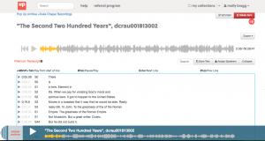
The Pop Up Archive editing interface.
As I mentioned at the top of this blog post, Chapel Recordings work continues. We are working with Pop Up Archive to transcribe the Chapel Recordings, and there is a small group of people at the Divinity School who are currently in the process of cleaning up transcripts specifically for the sermons themselves. Eventually these transcriptions will be made available in the Chapel Recordings collection as closed captions or time synced transcripts or in some other way. We have until December 2019 to plan and implement these features.
The Divinity School is also creating specialized metadata that will help make the the collection a more effective homiletics teaching tool. They are capturing specific information from the sermons (liturgical season, bible chapter and verse quoted), but also applying subject terms from a controlled list they are creating with the help of their stakeholders and our metadata architect. These terms are incredibly diverse and range from LCSH terms, to very specific theological terms (ex, God’s Love), to current events (ex, Black Lives Matter), to demographic-related terms (ex, LGBTQ) and more. Both the transcription and enhanced metadata work is still in the early phases, and both will be integrated into the collection sometime before December 2019.
The team here at Duke has been both challenged and amazed by working with the Duke Chapel Recordings. Working with the Divinity School and the Chapel has been a fantastic partnership, and we look forward to bringing the transcriptions and metadata into the collection. Stay tuned to find out what we learn next!
This summer I’ve been working, or at least thinking about working, on a couple of website design refresh projects. And along those lines, I’ve been thinking a lot about typography. I think it’s fair to say that the overwhelming majority of content that is consumed across the Web is text-based (despite the ever-increasing rise of infographics and multimedia). As such, typography should be considered one of the most important design elements that users will experience when interacting with a website.
An early mockup of the soon-to-be-released CIT design refresh
Early on, Web designers were restricted to using certain ‘stacks’ of web-safe fonts that would hunt through the list of those available on a user’s computer until it found something compatible. Or worst-case, the page would default to using the most basic system ‘sans’ or ‘serif.’ So type design back then wasn’t very flexible and could certainly not be relied upon to render consistently across browsers or platforms. Which essentially resulted in most website text looking more or less the same. In 2004, some very smart people released sIFR which was a flashed-based font replacement technique. It ushered in a bit of a typography renaissance and allowed designers to include almost any typeface they desired into their work with the confidence that the overwhelming majority of users would see the same thing, thanks largely to the prevalence of the (now maligned) Flash plugin.
Right before Steve Jobs fired the initial shot that would ultimately lead to the demise flash, an additional font replacement technique, named Cufon, was released to the world. This approach used Scalable Vector Graphics and Javascript (instead of flash) and was almost universally compatible across browsers. Designers and developers were now very happy as they could use non-standard type faces in their work without relying on Flash.
More or less in parallel with the release of Cufon came the widespread adoption across browsers for the @font-face rule. This allowed developers to load fonts from a web server and have them render on a page, instead of relying on the local fonts a user had installed. In mid to late 2009, services like Typekit, League of Moveable Type, and Font Squirrel began to appear. Instead of outrightly selling licenses to fonts, Typekit worked on a subscription model and made various sets of fonts available for use both locally with design programs and for web publishing, depending on your membership type. [Adobe purchased Typekit in late 2011 and includes access to the service via their Creative Cloud platform.] LoMT and Font Squirrel curate freeware fonts and makes it easy to download the appropriate files and CSS code to integrate them into your site. Google released their font service in 2010 and it continues to get better and better. They launched an updated version a few weeks ago along with this promo video:
There are also many type foundries that make their work available for use on the web. A few of my favorite font retailers are FontShop, Emigre, and Monotype. The fonts available from these ‘premium’ shops typically involve a higher degree of sophistication, more variations of weight, and extra attention to detail — especially with regard to things like kerning, hinting, and ligatures. There are also many interesting features available in OpenType (a more modern file format for fonts) and they can be especially useful for adding diversity to the look of brush/script fonts. The premium typefaces usually incorporate them, whereas free fonts may not.
Modern web conventions are still struggling with some aspects of typography, especially when it comes to responsive design. There are many great arguments about which units we should be using (viewport, rem/em, px) and how they should be applied. There are calculators and libraries for adjusting things like size, line length, ratios, and so on. There are techniques to improve kerning. But I think we have yet to find a standard, all-in-one solution — there always seems to be something new and interesting available to explore, which pretty much underscores the state of Web development in general.
Here are some other excellent resources to check out:
I’ll conclude with one last recommendation — the Introduction to Typography class on Coursera. I took it for fun a few months ago. It seemed to me that the course is aimed at those who may not have much of a design background, so it’s easily digestible. The videos are informative, not overly complex, and concise. The projects were fun to work on and you end up getting to provide feedback on the work of your fellow classmates, which I think is always fun. If you have an hour or two available for four weeks in a row, check it out!
The SNCC Digital Gateway is a collaborative, Mellon-funded project to document the history and legacy of the Student Nonviolent Coordinating Committee on a digital platform. One of the challenges of this undertaking is the physical distance between many of the project partners. From Washington, D.C. to St. Cloud, MN and Durham, NC to Rochester, NY, the SNCC veterans, scholars, librarians, and staff involved in the SNCC Digital Gateway Project are spread across most of the country. We’ve had collaborators call in anywhere from grocery stores in Jacksonville to the streets of Salvador da Bahia. Given these arrangements and the project’s “little d” democracy style of decision-making, communication, transparency, and easy access to project documents are key. The digital age has, thankfully, given us an edge on this, and the SNCC Digital Gateway makes use of a large selection of digital platforms to get the job done.
Say hello to Trello, an easy-to-use project management system that looks like a game of solitaire. By laying cards in different categories, we can customize our to-do list and make sure we have a healthy movement between potential leads, what’s slated to be done, and items marked as complete. We always try to keep our Trello project board up-to-date, making the project’s progress accessible to anyone at anytime.
While we use Trello for as a landing board for much of our internal communication, Basecamp has come in handy for our work with Digital Projects and our communication with the website’s design contractor, Kompleks Creative. Basecamp allows us to have conversations around different pieces of project development, as we provide feedback on design iterations, clarify project requirements, and ask questions about the feasibility of potential options. Keeping this all in one place makes this back-and-forth easy to access, even weeks or months later.
Much of the project’s administrative documents fall into Box, a platform available through Duke that is similar to Dropbox but allows for greater file security. With Duke Toolkits, you can define a project and gain access to a slew of handy features, one of which is a project designation within Box (giving you unlimited space). That’s right, unlimited space. So, apart from allowing us to organize all of the many logistical and administrative documents in a collective space, Box is able to rise to the challenge of large file sharing. We use Box as a temporary landing platform through which we send archival scans, videos, audio recordings, and other primary source material to project partners.
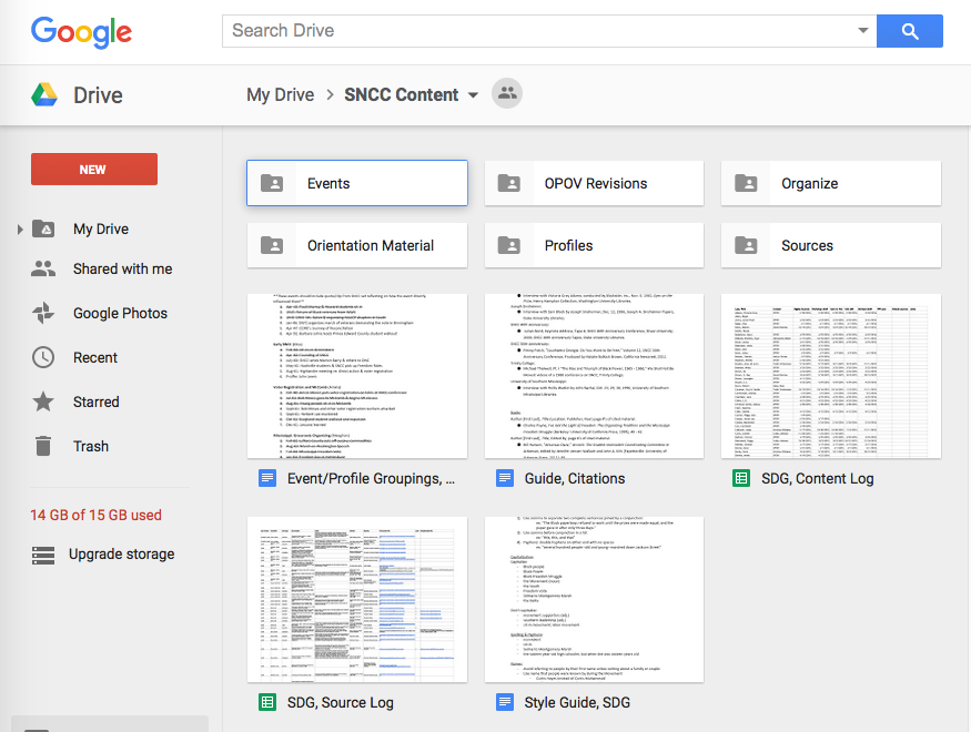
With the student project team, we’re also producing hundreds of pages worth of written content and look to Google Drive as our go-to for organization, access, and collaborative editing. Upon the completion of a set of drafts, we hold a workshop session where other members of the project team comment, critique, and contribute their knowledge. After a round of edits, drafts then go to SNCC veteran and former journalist Charlie Cobb, who puts red pen to paper (figuratively). With one more round of fact-checking and source logging, the final drafts are ready for the website.
And who doesn’t like to see the face of who they’re talking to? We make good use of Skype and Google Hangouts for long distance calls, and Uber Conference when we need to bring a lot of people into the conversation. And finally, an ongoing volley of e-mails, texts, and phone calls between individual project partners helps keep us on the same page.
While non-exhaustive, these are some of the digital platforms that have helped us get to where we are today and maintain communication across continents in this intergenerational and interdisciplinary collaboration.
Last Summer, Sean and I wrote about efforts we were were undertaking with colleagues to assess the research and scholarly impact of Duke Digital Collections. Sean wrote about data analysis approaches we took to detect scholarly use, and I wrote about a survey we launched in Spring 2015. The goal of the survey was to gather information about our patrons and their motivations that were not obvious from Google Analytics and other quantitative data. The survey was live for 7 months, and today I’m here to share the full results.
In a nutshell (my post last Summer included many details about setting up the survey), the survey asked users, “who are you,” “why are you here,” and “what are you going to do with what you find here?” The survey was accessible from every page of our Digital Collections website from April 30 – November 30, 2015. We set up event tracking in Google Analytics, so we know that around 43% of our 208,205 visitors during that time hovered on the survey link. A very small percentage of those clicked through (0.3% or 659 clicks), but 20% of the users that clicked through did answer the survey. This gave us a total of 132 responses, only one of which seems to be 100% spam. Traffic to the survey remained steady throughout the survey period. Now, onto the results!
Question 1: Who are you?
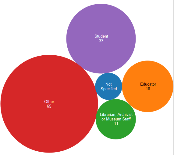
Respondents were asked to identify as one of 2 academically oriented groups (students or educators), librarians, or as “other”. Results are represented in the bubble graphic below. You can see that the majority of respondents identified as “other”. Of those 65 respondents, 30 described themselves, and these labels have been grouped in the pie chart below. It is fascinating to note that other than the handful of self-identified musicians (I grouped vocalists, piano players, anything musical under musicians) and retirees, there is a large variety of self descriptors listed.
Responses to Question 1, “I am a (choose one)” (127 total – click to enlarge)Question 1 fill-in responses (39 total – click to enlarge)
The results breakdown of responses to question 1 remained steady over time when you compare the overall results to those I shared last Summer. Overall 26% of respondents identified as student (compared to 25% in July), 14% identified as educator (compared to 18% earlier), 9% identified as librarian, archivist or museum overall (exactly the same as earlier), and 51% identified as other (47% in the initial results). We thought these results might change when the Fall academic semester started, but as you can see that was not the case.
Question 2: Why are you here?
As I said above, our goal in all of our assessment work this time around was to look for signs of scholarly use so we were very interested in knowing if visitors come to Duke Digital Collections for academic research or for some other reason. Of the 125 total responses to question 2, personal research and casual browsing outweighed academic research ( see in the bar graph below). Respondents were able to check multiple categories. There were 8 instances where the same respondent selected casual browsing and personal research, 4 instances where casual browsing was paired with followed a link, 3 where academic research was tied to casual browsing, and 3 where academic research was tied to other. Several users selected more than 2 categories, but by in large respondents selected 1 category only. To me, this infers that our users are very clear about why they come to Duke Digital Collections.
Question 2 responses (125 total – click to enlarge)
Respondents were prompted to enter their research topic/purpose whether it be academic, personal or other. Every respondent that identified with other filled in a topic, 73% of personal researchers identified their topic, and 63% of academic researchers shared their topics. Many of the topics/purposes were unique, but research around music came up across all 3 categories as did topics related the history of a local region (all different regions). Advertising related topics also came up under academic and personal research. Several of the respondents who chose other entered a topic that suggested that they were in the early phases of a book project or looking for materials to use in classes. To me these seemed like more academically associated activities, and I was surprised they turned up under “other”. If I was able to ask follow up questions to these respondents, I would prompt for more information about their topic and why they defined it as academic or personal. Similarly, if we were designing this survey again, I think we would want to include a category for academic related uses apart from official research.
The results to question 2 also remained mostly consistent since our first view of the results last Summer. Academic research and casual browsing were tied at a 28% response rate each initially, and finished tied at a 30% response rate. The followed a link response rate when down from 17% to an overall 11%, personal research also went down from 44% to 36% overall, and other climbed slightly from 11% to 15% overall.
Question 3: What will you do with the images and/or resources you find on this site?
The third survey question attempts to get at the “now what” part of resource discovery. Following trends with the first two questions, it is not surprising that a majority of the 121 respondences are oriented towards “personal” use (see bar graph below). Like question 2, respondents were able to select multiple choices, however they tended to choose only one response.
Question 3 responses (121 total – click to enlarge)
Everyone who selected “other” did enter a statement, and of these a handful seemed like they could have fit under one of the defined categories. Several of the write-ins mentioned wanting to share items they found with family and friends assumably using methods other than social media. Five “others” responded with potentially academic related pursuits such as “an article”, “a book”, “update a book”, and 2 class related projects. I re-ran some numbers and combined these 5 responses with the academic publication, teaching tool, and homework respondents for a total of 55 possibly academically related answers or 45% of the total response to this question. The new 45% “academicish” grouping, as I like to think of it, is a more substantial total than each academic topic on its own. I propose this as an interesting way to slice and dice the data, and I’m sure there are others.
Observations
My colleagues and I have been very pleased with the results of this survey. First, we couldn’t be more thrilled that we were successfully able to collect necessary data (any data!). At the beginning of this assessment project, we were looking for evidence of research, scholarly and instructional use of Duke Digital Collections. We did find some, but this survey along with other data shows that the majority of our users come to Duke Digital Collections with a more personal agenda. We welcome the opportunity to make this kind of individual impact, and it is powerful. If the respondents of this survey are a representative sample of our user base, then our patrons are actively performing our collections (we have a lot of music), sharing items with family, friends, and community, as well as using the collections to pursue a wide variety of interests.
While this survey data assures us that we are making individual impacts, it also reveals that there is more we can do to cultivate our scholarly and researcher audience. This will be a long term process, but we have made some short term progress. As a result of our work in 2015, my colleagues and I put together a “teaching with digital collections” webpage to collect examples of instructional use and encourage more. In the course of developing a new platform for digital collections, we are also exploring new tools that could serve scholarly researchers more effectively. With a look towards the longer term, all of Duke University Libraries has been engaged in strategic planning for the past year, and Digital Collections is no exception. As we develop our goals around scholarly use, survey data like this is an important asset.
I’m curious to hear from others, what has your experience been with surveys? What have you learned and how have you put that knowledge to use? Feel free to comment or contact me directly! (molly.bragg at duke.edu)
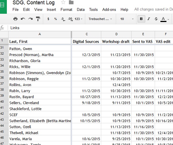
Google Drive content log for SNCC Digital Gateway.
So much content. Gobs of content. Never-ending ideas for more content. Content–how to produce, present, and connect it–it’s a challenge the SNCC Digital Gateway Project faces on a daily basis.
The SNCC Digital Gateway deals in two types of content.
First is the content written by the student Project Team under the direction of our SNCC Visiting Activist Scholar. This includes 600 – 700 word profiles of people, stories of events, audiovisual pieces exploring different perspectives in SNCC, and close-ups of the inner workings of SNCC as an organization. When the SNCC Digital Gateway debuts in December of 2016, it will feature over 150 profiles, 50 events, 9 audiovisual pieces, and 25 organizing SNCC pages.
Arrest record for Willie Ricks Individuals active in civil disturbances, vol. 1, ADAH
The second type of content in the SNCC Digital Gateway is the primary sources embedded within the profiles, events, and organizing SNCC pages. Each piece of written content features 6 – 8 digitized primary sources. These are items like the arrest record of SNCC field secretary Willie Ricks — “Extremely radical, militant individual”–, articles from SNCC’s newsletter, The Student Voice, or SNCC activists recounting their organizing experiences in the 1988 We Shall Not Be Moved conference at Trinity College.
Multiply the amount of written content by the number of embedded sources, and that totals well over 1500 items. And that’s only for the 2016 debut…2017 is devoted to producing more content! By the time the SNCC Digital Gateway is complete, it’s aiming to feature 300 – 400 profiles, 100 plus events, 50 organizing SNCC pages, and over 20 audiovisual pieces.
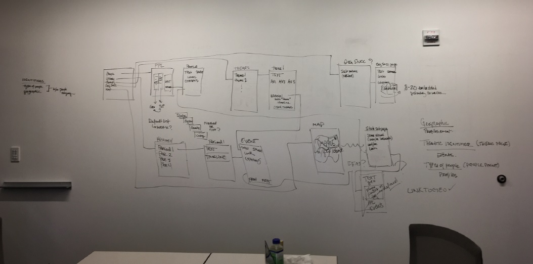
Producing so much content is a challenge in and of itself, and our resources have limits. But the SNCC Digital Gateway also needs to present these vast volumes of content in a user-friendly, intuitive way. One Person, One Vote, the pilot site to SDG, taught us a good deal about what works and doesn’t work in site architecture. We wanted the SNCC Digital Gateway to be more accessible to students and teachers, movement veterans and the general public. That meant providing users ways to explore by people and place, periods, organizations, and ideas. The Editorial Board and project staff have spent months hammering out how best to do that. We ended up with something that looks like this:
Wireframe for the SNCC Digital Gateway sketched on the whiteboard wall of the project room.
In mid-January, we met with Kompleks Creative, the designers of the SNCC Digital Gateway, to see what they thought was possible. Here’s an illustrative recount of the conversation about profiles and how to navigate through them using geography:
SDG:“We want users to be able to sort through profiles by state, region, county, or city, and we’d really like them to be able to get to counties and cities directly.
Kompleks: “How many counties are you talking about?”
SDG: “Probably 100 or more.”
Kompleks: “Wow. That’s not going to work.”
Don’t worry. We came to up with a good solution. But the fact that the SNCC Digital Gateway needs to handle 500 – 600 pieces of content when finished (never mind the thousands of embedded sources) is an ongoing hurdle. The design process is only beginning, so our site architecture questions are far from sorted out. But in the end, the SNCC Digital Gateway needs to bring SNCC’s history to life in a way that both channels how movement activists understood their work and is accessible and compelling for a new generation of young people, teachers, and scholars.
Good thing we’re only half a year into a three-year project.
Duke University Libraries has been sharing its rich resources by creating and publishing digital collections for more than 20 years (remember the Scriptorium?), and to date the digital projects team stewards more than 100 collections consisting of 191,000+ items. Over the years the technologies and practices employed to deliver this content have changed often and drastically. Two weeks ago, we announced the latest iteration of our digital collections interface with the release of the Tripod3. Currently Tripod3 only features one collection – W. Duke, Sons & Co. Advertising Materials, 1880-1910 – but in early 2016 all of the digital collections currently being delivered using Tripod2 (the predecessor to Tripod3) will be migrated to the new system.
And that’s where I come in… Hello! I’m Maggie – DUL’s newly hired Metadata Architect, and I’ve been here for about a month and a half. Now that I’ve got my sea legs, I’m embarking on a project to remediate all of the Tripod2 metadata in advance of its migration to Tripod3. I’m not going it alone, though – we’ve formed a task group to guide this process as well as make recommendations for the ongoing creation and management of metadata associated with all materials in the Duke Digital Repository (and beyond).
Back in the day – metadata in the time of the Scriptorium:
Partying like it was 1999.
Back in 1995, when the first digital collections were being created, the focus was on providing access to those collections in a standalone way, and little thought was given to cross-collection and federated searching and browsing, because the capabilities just hadn’t evolved yet. We were still pretty excited about hypertext. Metadata standards and practices for digital collections were in their nascent stages, as well, and so their application was spotty and inconsistent. This resulted in the ‘silo-ization’ of our digital collections. Now, we have a robust, consolidated preservation and access system and the capability to share our collections much more broadly through aggregators such as the Digital Public Library of America. And LINKED DATA, y’all! But the discovery and access of our resources, even in the most sophisticated of systems, is only as good as the metadata used to describe them.
Just about yesterday – a Tripod2 metadata record:
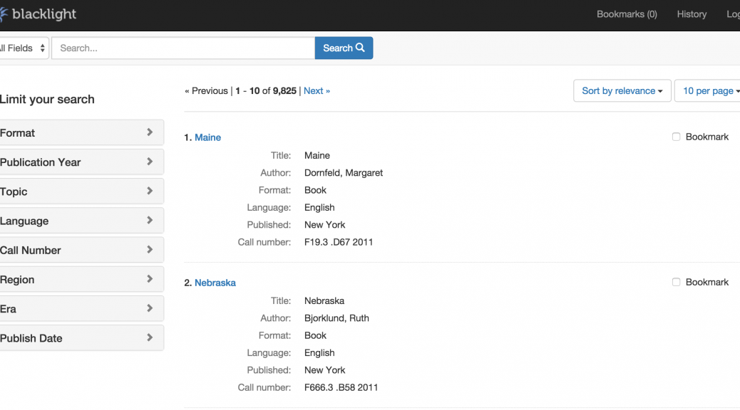
And now, Tripod 3:
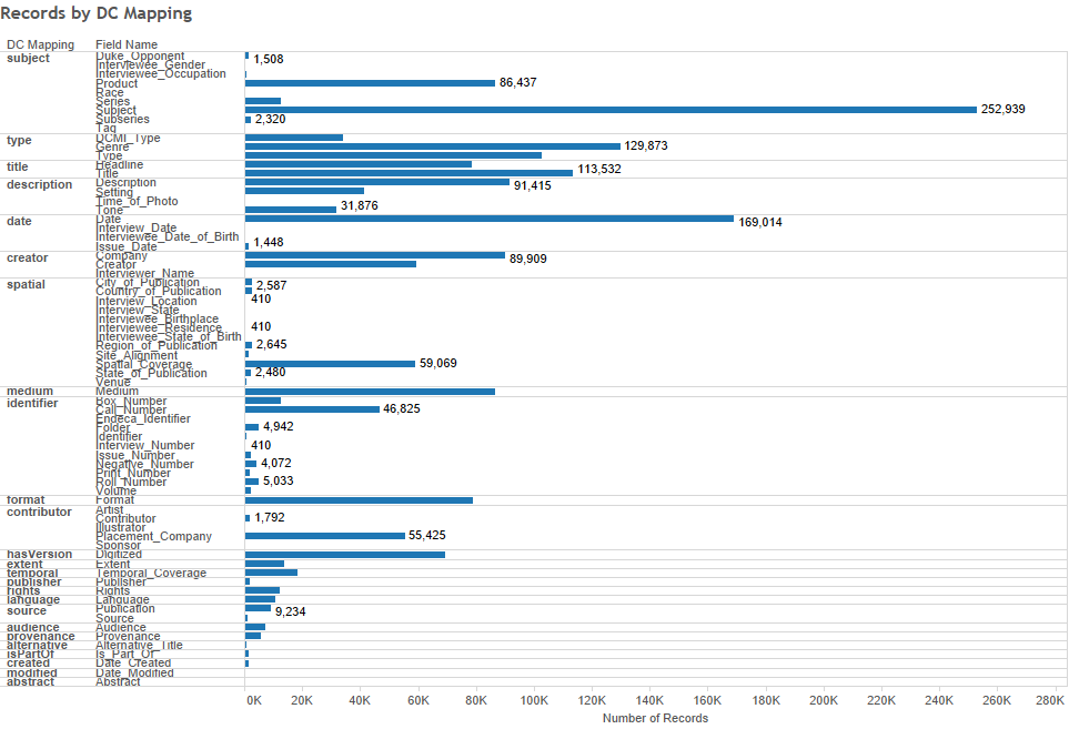
Remediating all of the legacy metadata is a big job – turns out you can create a LOT of metadata over the course of 20 years. Expressed as RDF, we have more than two million statements. And inevitably, as it’s been created over many years, by many people of varying backgrounds and experience, and according to many different practices and standards, it’s a mess. So, in the coming weeks and months, we’ll be tackling each and every one of the 85 (!) fields used in the creation of DUL’s digital collections, assessing usage and mappings and doing a whole heck of a lot of data munging (thank goodness for OpenRefine). And we’ll be diving into the world of linked data and reconciling our metadata against linked open data sets wherever possible.
A visualization of the current state of Tripod2 metadata fields and Dublin Core mappings:
Things are gonna change.
Once we’re finished with this project, our metadata will not only be beautiful, it will lend itself to a much more comprehensible experience for our users, as well as the ability to effectively and efficiently share our materials broadly. We’ve only just begun this work and will report on our progress periodically. Please stay tuned!
Content production is deep underway here at the SNCC Digital Gateway, a continuation of the collaboration between Duke University, the SNCC Legacy Project, and Movement scholars that created the One Person, One Vote website. Our project room is piled high with books about the Movement, our walls covered with information about source documents and citation, and our workshop sessions are rich in conversation about who SNCC was, what SNCC did, and what SNCC’s legacy is today.
Over the past few months, the project has been working to lay the digital groundwork for the website. Before beginning the conversation with design contractors about the vision for the SNCC Digital Gateway, we first had to explore some of the challenges of working with a digital platform ourselves.
Lucky for us, the library has a wealth of knowledge about web development on the third floor of Bostock.
Unlike a book, there is no straight-forward beginning, middle, and end to a website, and there are limits on the amount of text that we can put on a page. So, how do we present this material in a way that keeps the user engaged? How can we have multiple access points to this content while still keeping it grounded in the larger narrative? How will the users want to approach this material, and how do we hope to steer them?
Rather than following a linear exploration of this history, the SNCC Digital Gateway emphasizes the layering of ideas, people, and places. It recognizes the importance of chronology for contextual understanding but is not driven by it. It emphasizes the need to document not only the stories of those involved in the Movement, but also how they organized, the local landscape of where they organized, and the kinds of conversations they were having. It hopes to tie the narrative of SNCC and other Movement veterans to today’s struggles, exploring history to not only understand the roots of systemic oppression but to provide tools for organizing today.
Why, Brinck, we would love to design a website that works!
We asked ourselves, how do you start to organize all of this information? Well, why not pick up an Expo marker and start drawing on the walls (if you’re in The Edge, of course)? This is, at least, what SNCC Digital Gateway team did this past spring.
Wireframe after wireframe, we began to piece together an information architecture for the site content. With a projected scope of hundreds of discrete pages, each with written content, embedded primary source documents, and audio/visual material, it was clear that this would have to be carefully planned so that the user wouldn’t get lost or overwhelmed.
We want users to be able to engage with the site differently each time they visit – following thematic threads through SNCC’s history, understanding the political landscape before SNCC came to the scene, delving into defining moments that spurred ideological shifts in the organization, seeing what the complexity of this narrative and these relationships meant to different people. And we want to do so in a way that even a 5th grader can understand.
Hopefully our site will be a little easier to follow than this affinity model found in _Information Architecture for the World Wide Web_.
Armed with book upon book about site design and navigation, we’ve tried to find a way to break with the typical hierarchical site structure and find one that was more suited to the fluidity of our content’s dimensions. We settled on having two main entry points into the content: chronological and thematic. We will continue to produce profiles that are tied to different geographic areas and have a section that explore SNCC’s internal and external network and relationships. But these will be connected to the thematic/chronological core of the site, so that the user can easily navigate between all different categories and types of content.
Without going into the nitty gritty, we’ve pulled together the skeleton for our site (just in time for Halloween) and have begun to flesh out this conversation with a design contractor. Not only is it important for us to think about how to tell the story of SNCC, it’s important for us to think about how to present it.
The Library’s Digital Projects Services department has been working with Digital Repository Services on a software project that will eventually replace our existing Digital Collections platform. There will be future posts announcing the new way of discovering and accessing Duke’s Digital Collections, but I want to use this post to reflect on the tools and practices we’ve been using to build this new application.
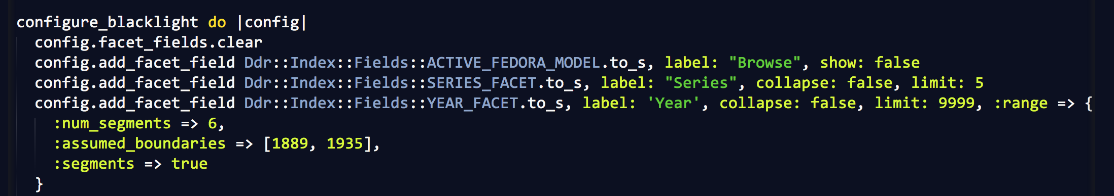
There are a few important differences between this not yet released new application and our current system. One is that Digital Collections will be part of the library’s Digital Repository, which includes a much broader range of digital items and collections. The second is that since the repository is being developed using Project Hydra, we’re using a component of the Hydra stack, Project Blacklight, as the discovery and access layer for Digital Collections.
Blacklight is an open source, Ruby on Rails Engine that provides a basic discovery interface for searching an Apache Solr index, and provides search box, facet constraints, stable document urls, etc., all of which is customizable via Rails (templating) mechanisms.
The Blacklight Development Google Group has posts going back to 2009, and the GitHub repository has commits back to 2009 as well. So, the project’s been actively developed and used for a while. The Project Blacklight website maintains a list of different implementations of the software, where you can see the range of interfaces it has been used to develop.
One of the benefits of using a widely adopted open source platform is access to a community of developers who use the same software. I was able to solve many problems just by searching the Blacklight Development Google Group for answers. Blacklight made it easy to get a basic interface up and running quickly and provided a platform to add local customizations. Because the basics were already in place we were able to spend our time on more specialized features and local requirements. For example, specifying which search filters should appear for a collection and what metadata fields should be included in search were as easy as adding a few lines of configuration code to the application.
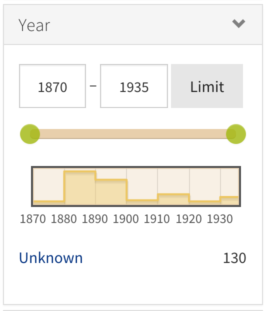
Even for some of the more specialized features, we’ve relied as much as possible on available add-ons and tools to add features to Blacklight. Because of this we’ve been able to add advanced features to the new application that did not require a large amount of development time. For example, we’re using the Blacklight Range Limit Ruby Gem to add a visual date picker with a histogram for searching the collections by year.
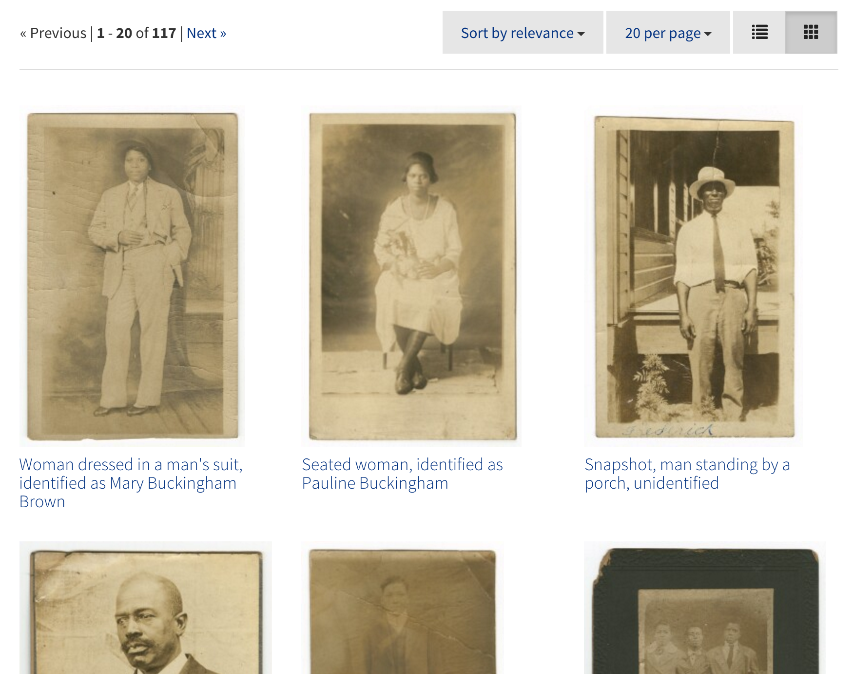
We also used the Blacklight Gallery Ruby Gem to add an option to view search results as a gallery with larger thumbnails.
Both of these features were relatively easy to implement because we were able to make use of plugins shared with the Blacklight community.
Another new (to us) tool we’re using is the IIPImage server for serving images to the application. Because the image server automatically creates and then returns the right size image based on parameters sent in a request, we don’t have to pre-generate thumbnails of various sizes to support different displays in the application. The image server can even crop images. Because the image server stores the images as Pyramid TIFFs, we’re able to provide very smooth and fast in-browser pan and zoom of images, which works similarly to Google maps. To get a better idea of what this means for exploring high resolution images in your browser, you can explore some of the examples on the IIPImage site.
To manage this project we’ve been following Agile project management techniques, which for us meant taking an iterative approach to designing and building features of the application in two week sprints. At the beginning of each sprint we decide what we’re going to work on from a backlog of user stories, and our goal by the end of the two weeks is to have a version of the code that is working and deployed with these features implemented. Each day we have a 15-minute stand-up meeting during which each person reviews what they worked on yesterday, explains what they’re going to work on today, and then notes anything that’s blocking their progress. These quick, daily meetings have helped keep the project moving by increasing communication and helping to focus our work.
We’re still putting some pieces in place, so our new platform for publishing Digital Collections isn’t available yet, but look for it soon along with more information about the project and its first published collection.
Notes from the Duke University Libraries Digital Projects Team