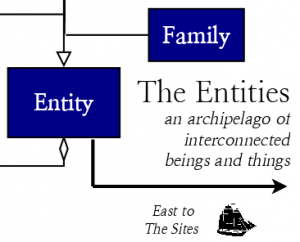
We have all these plans and do all this work with the digital collections and the projects and what have you. Plan-plan-plan, work-work-work, and plan and work some more. Some things get done, others don’t, as we journey for that distant horizon, just on the other side of which lies, “Hooray, we finally got it!”
I started to draw a map for the next phases of that journey a few days ago, and it was going to be really serious. All these plans – repository migration, exhibit platform, workflow management, ArchivesSpace – would be represented in this exacting diagram of our content types and platforms and their interrelations. It might even have multiple sheets, which would layer atop one another like transparencies, to show the evolution of our stuff over time. UML books more than ten years old would be dusted off in the production of this diagram.
 Then my brain started to hurt, and I found myself doodling in response. I started having fun with it. You might even say I completely dorked out on it. Thus you have the “Sketch for an almanac of digital projects at Duke University Libraries” above.
Placing whimsical sea monster icons on a field of faux design elements took a lot of my time this week, so I’m afraid I’m not able to write any more about the diagram right now. However, provided it doesn’t prove a source of embarrassment and regret, I might revisit it in the near future.


How come you didn’t include directions to Mordor on this diagram? Isn’t that some sort of UX faux pas? However, since I smiled when I saw Hensen’s redoubt, I guess I should cut you a little slack.
Love the sketch. At first I thought the flying eels should be shrieking eels… and that’s when I realized you left off the cliffs of insanity!