When I’m teaching effective visualization principles, one of the most instructive processes is critiquing published visualizations and reviewing reworks done by professionals. I’ll often show examples from Cole Nussbaumer Knaflic’s blog, Storytelling with Data, and Jon Schwabish’s blog, The Why Axis. Both brilliant! (Also, check out my new favorite blog Uncharted, by Lisa Charlotte Rost, for wonderful visualization discussions and advice!)
What we don’t usually get to see is the progression of an individual visualization throughout the design process, from data through rough drafts to final product. I thought it might be instructive to walk through an example from one of my recent consults. Some of the details have been changed because the work is unpublished and the jargon doesn’t help the story.
Data full of hits and misses
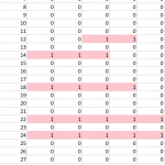
 A researcher came to me for help with an academic paper figure. He and his collaborator were comparing five literature-accepted methods for identifying which patients might have a certain common disease from their medical records. Out of 60,000 patients, about 10% showed a match with at least one of the tests. The resulting data was a spreadsheet with a column of patient IDs, and five columns of tests, with a one if a patient was identified as having the disease by that particular test, and a zero if their records didn’t match for that test. As you can see in the figure, there were many inconsistencies between who seemed to have the disease across the five tests!
So you want to build a snowman
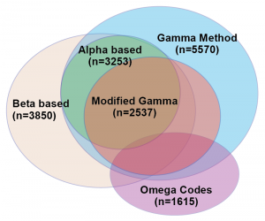
 The researchers wanted a visualization to represent the similarities and differences between the test results. Specifically, they wanted to make a Venn diagram, which consists of ellipsoids representing overlapping sets. They had an example they’d drawn by hand, but wanted help making it into an accurate depiction of their data. I resisted, explaining that I didn’t know of a program that would accomplish what he wanted, and that it is likely to be mathematically impossible to take their five-dimensional data set and represent it quantitatively as a Venn diagram in 2D. Basically, you can’t get the areas of all of the overlapping regions to be properly proportional to the number of patients that had hits on all of the combinations of the five tests. The Venn diagram works fine schematically, as a way to get across an idea of set overlap, but it would never be a data visualization that would reveal quantitative patterns from their findings. At worst, it would be a misleading distortion of their results.
Count me in
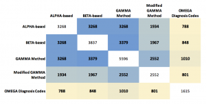
 His other idea was to show the results as a table of numbers in the form of a matrix. Each of the five tests were listed across the top and the side, and the cell contents showed the quantity of patients who matched on that pair of tests. The number matching on a single test was listed on the diagonal. Those patterns can be made more visual by coloring the cells with “conditional formatting” in Excel, but the main problem with the table is that it hides a bunch of interesting data! We don’t see any of the numbers for people who hit on the various combinations of three tests, or four, or the ones that hit on all five.

I suggested we start exploring the hit combinations by creating a heatmap of the original data, but sort the patients (along the horizontal axis) by how many tests tests they hit (listing the tests up the vertical axis). Black circles are overlaid showing the number of tests hit for any given patient.
There are too many patients / lines here to show clearly the combinations of tests, but this visualization already illuminated two things that made sense to the researchers. First, there is a lot of overlap between ALPHA (a) and BETA-based (b) tests, and between GAMMA Method (c) and Modified GAMMA (d), because these test pairs are variations of each other. Second, the overlaps indicate a way the definitions are logically embedded in each other; (a) is a subset of (b), and (b) is for the most part a subset of (c).

My other initial idea was to show the numbers of patients identified in each of the test overlaps as bubbles in Tableau. Here I continue the shorthand of labeling each test by the letters [a,b,c,d,e], ordered from ALPHA to OMEGA. The number of tests hit are both separated in space and encoded in the color (low to high = light to dark).
Add some (effective?) dimensions
I felt the weakness of this representation was that the bubbles were not spatially associated with their corresponding tests. Inspired by multi-dimensional radial layouts such as those used in the Stanford dissertation browser, I created a chart (in Adobe Illustrator) with five axes for the tests. I wanted each bubble to “feel a pull” from each of the passed tests, so it made sense to place the five-hit “abcde” bubble at the center, and each individual, “_b___”, “__c__”, ____e” bubble right by its letter – making the radius naturally correspond to the number of test hit. Other bubbles were placed (manually) in between their combination of axes / tests.

The researchers liked this version. It was eye-catching, and the gravitation of bubbles in the b/c quadrant vaguely illustrated the pattern of hits and known test subsets. One criticism, though, was that it was a bit confusing – it wasn’t obvious how the bubbles were placed around the circles, and it might take people too long to figure out how to read the plot. It also, took up a lot of page space.
Give these sets a hand
One of the collaborators, after seeing this representation, suggested trying to use it as the basis for an Euler diagram. Like a Venn diagram, it’s a visualization used to show set inclusion and overlap, but unlike in a Venn, an Euler is drawn using arbitrary shapes surrounding existing labels or images representing the set members. I thought it was an interesting idea, but I initially dismissed the idea as too difficult. I had already put more time than I typically spend on a consult into this visualization (our service model is to help people learn how to make their own visualizations, not produce visualizations for them). Also, I had never made an Euler diagram. While I had seen some good talks about them, I didn’t have any software on hand which would automate the process. So, I responded that the researchers should feel free to try creating curves around the sets themselves, but I wasn’t interested in pursuing it further.
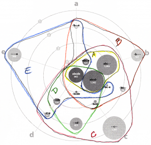
 About two minutes after I sent the email, I began looking at the diagram and wondering if I could draw the sets! I printed out a black and white copy and started drawing lines with colored pencils, making one enclosing shape for each test [a-e]. It turned out that my manual layout resulted in fairly compact curves, except for “_bc_e”, which had ambiguous positioning, anyway.
  The curve drawing was so easy that I started an Illustrator version. I kept the circles’ area the same (corresponding to their quantitative value) but pushed them around to make the set shapes more compact.
Ironically, I had come back almost exactly to the researchers’ original idea! The important distinction is that the bubbles keep it quantitative, with the regions only representing set overlap.
We’ve come full ellipsoid
Angela Zoss constructively pointed out that there were now too many colors, and the shades encoding number of hits wasn’t necessary. She also felt the region labels weren’t clear. Those fixes, plus some curve smoothing (Path -> Simplify in Illustrator) led me to a final version we were all very happy with!
It’s still not a super simple visualization, but both the quantitative and set overlap patterns are reasonably clear. This results was only possible, though, through trying multiple representations and getting feedback on each!

If you’re interested in learning how to create visualizations like this yourself, sign up for the DVS announcements listserve, or keep an eye on our upcoming workshops list. We also have videos of many past workshops, including Angela’s Intro to Effective Data Visualization, and my Intro to Tableau, Illustrator for Charts, and Illustrator for Diagrams.
 McCall Pitcher joined CDVS at the end of October 2024 and is delighted to start her first full semester supporting Duke students, faculty, and staff as they create effective data visualizations. McCall comes to Duke from George Washington University, where she spent two years teaching data visualization to graduate students in the Trachtenberg School of Public Policy and Public Administration. Her course equipped students with core theoretical approaches around graphical communication, data storytelling principles, and foundational R programming techniques to clean and visualize data.
 Passionate about making graphics clean and clear, McCall looks forward to consulting and instructing in a way that prioritizes both aesthetic and story. In her short time in this role, McCall has already been blown away by the Duke community’s talent and subject matter expertise — she can’t wait to continue helping all these brilliant minds visually communicate their exciting findings and ideas.


