Category Archives: Uncategorized

Hydra Connect #2: Cleveland Rocks

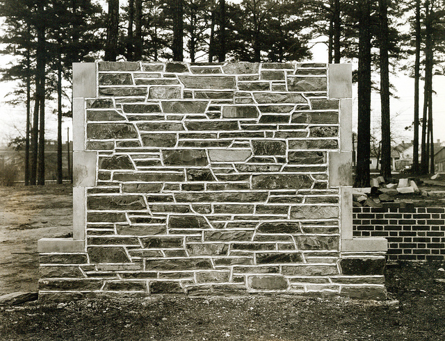
I recently traveled to Cleveland to attend the second-ever Hydra Connect meeting. For some quick background, Hydra is a repository solution that many libraries and other institutions are using to manage large and interesting collections of digital things. At DUL, our amazing Repository Services team has been working on our Hydra-based repository for around two years. Mike Adamo of DPPS and others have been getting lots of content into the system and from what I understand it’s working great so far. David and Jim have also worked on a Digital Asset Management tool that will be used by the Duke CIT to archive video assets from MOOCs.

The Kelvin Smith Library at Case Western Reserve University

DPPS has grand plans to migrate our current digital collections platform to a Hydra-based system, so we’ll be working closely with David and the Jims to utilize their expertise. I attended Hydra Connect as a way to get some exposure to the community and to try and soak up as much knowledge as possible. I’d say the grand takeaway (and I heard this sentiment repeated time and time again) is that Hydra is an amazing open source community. Every single person I met at the meeting was friendly, knowledgeable, and happy to answer questions. It was a fantastic experience. The host institution, Case Western Reserve University, was great and in general Cleveland was excellent – the area we stayed in was very walkable, there were several interesting museums nearby, and by and large the weather was perfect.

Interactive wall at the Cleveland Museum of Art

Hydra Connect #2 nearly doubled the attendance number from Hydra Connect #1 so clearly there is momentum behind the project. But what seems really apparent is that the community is very welcoming. Beginners like me are treated warmly – you are not scoffed at for asking basic questions.

I started off the meeting by attending a half day Dive into Hydra workshop and followed that with an intro to blacklight. The organizers cleverly passed out USB drives with a pre-packaged development environment all ready to go, so everyone in the room was up and running right away. We made it all the way through the program and even completed a few of the bonus tasks. The organizers did a great job of explaining how our simplified examples could be applied to more complex projects and also stressed best practices for making UI tweaks (protip – use the internationalizations). All in all a very empowering experience.

Cleveland street art

Wednesday was filled with lots of knowledge sharing. Between the lightning talks and the poster sessions it was amazing to see how many really interesting Hydra projects are out there! In particular, I was struck by these:

Thursday had  more sessions, more lightning talks, and an ‘unconference.’ I really enjoyed the sessions on UX and Project Management.

Overall I had a great experience at Hydra Connect. I learned a ton, met some great people, and most importantly I’m psyched to get to work on a Hydra project here at DUL.

A Digital Exhibits Epic Saga: Game of Stones

A screen from the Queering Duke History exhibit kiosk, just one of the ways DigEx supports library exhibits.

Just under a year ago Duke University Libraries formed the Digital Exhibits Working Group (DigEx) to provide vision, consulting expertise, and hands-on support to the wide array of projects and initiatives related to gallery exhibits, web exhibits, data visualizations, digital collections, and digital signage.  Membership in the group is as cross-departmental as the projects they support. With representatives from Data and Visualization, Digital Projects and Production Services, Digital Scholarship Services, Communications, Exhibits, Core Services and the Rubenstein Library, every meeting is a vibrant mix of people, ideas and agenda items.

The group has taken on a number of ambitious projects; one of which is to identify and understand digital exhibits publishing platforms in the library (we are talking about screens here).   Since April, a sub-committee – or “super committee” as we like to call ourselves – of DigEx members have been meeting to curate a digital exhibit for the Link Media Wall.  DigEx members have anecdotal evidence that our colleagues want to program content for the wall, but have not been able to successfully do so in the past.  DigEx super committee to the rescue!

The Link super committee started meeting in April, and at first we thought our goals were simple and clear.  In curating an exhibit for the link wall we wanted to create a process and template for other colleagues to follow.  We quickly chose an exhibit topic: the construction of West Campus in 1927-1932 told through the University Archive’s construction photography digital collection and Flickr feed.  The topic is both relevant given all the West campus construction happening currently, and would allow us to tell a visually compelling story with both digitized historic photographs and opportunities for visualizations (maps, timelines, etc).

Test stone wall created by University to select the stones for our Gothic campus.
Test stone wall created by University to select the stones for our Gothic campus (1925).

Our first challenge arose with the idea of templating.  Talking through ideas and our own experiences, we realized that creating a design template would hinder creative efforts and could potentially lead to an unattractive visual experience for our patrons.  Think Microsoft PowerPoint templates; do you really want to see something like that spread across 18 digital panels? So even though we had hoped that our exhibit could scale to other curators, we let go of the idea of a template.


We had logistical challenges too.  How do we design for such a large display like the media wall?  How do you create an exhibit that is eye catching enough to catch attention, simple enough for someone to understand as they are walking by yet moves through content slowly enough that someone could stop and really study the images?  How do we account for the lines between each separate display and avoid breaking up text or images?  How do we effectively layout our content on our 13-15” laptops when the final project is going to be 9 FEET long?!!  You can imagine that our process became de-railed at times.

Stone was carried from the quarry in Hillsborough to campus by way of a special railroad track.

But we didn’t earn the name super committee for nothing.  The Link media wall coordinator met with us early on to help solve some of our challenges. Meeting with him and bringing in our DigEx developer representative really jumpstarted the content creation process.  Using a scaled down grid version of the media wall, we started creating simple story boards in Powerpoint.  We worked together to pick a consistent layout each team member would follow, and then we divided the work of finding images, and creating visualizations.  Our layout includes the exhibit title, a map and a caption on every screen to ground the viewer in what they are seeing no matter where they come into the slideshow. We also came up with guidelines as to how quickly the images would change.


media_wall_grid.draft2-grid
Mockup of DigEx Link Media Wall exhibit showing gridlines representing delineations between each display.

At this point, we have handed our storyboards to our digital projects developer and he is creating the final exhibit using HTML and web socket technology to make it interactive (see design mockup above). We are also finishing up an intro slide for the exhibit.   Once the exhibit is finished, we will review our process and put together guidelines for other colleagues in DUL to follow.  In this way we hope to meet our goal of making visual technology in the library more available to our innovative staff and exhibits program.   We hope to premiere the digital exhibit on the Link Wall before the end of the calendar year.  Stay Tuned!!

Special shout out to the Link Media Wall Exhibit Super Committee within the Digital Experiences Working Group (DigEx):  Angela Zoss, Data Visualization Coordinator, Meg Brown, The E. Rhodes and Leona B. Carpenter Foundation Exhibits Coordinator, Michael Daul, Digital Projects Developer, Molly Bragg, Digital Collections Program Manager and Valerie Gillispie, University Archivist.


Creating, Reading, Learning: Work and Life

Does anyone else find it difficult to blog about work? For me, it’s not for lack of things to write about or lack of interest in what I am working on. It has more to do with the fact that the excitement I feel for the projects I’m working on, the people I work with and the growth I’ve seen in my department doesn’t translate well in writing. At least not for me and my writing style. Maybe I need to take a writing course? Maybe I need to find my voice in blogging? Maybe I just need to get on with it?

As is true for many of us, the things that interest or occupy us at work bleed into our lives at home and vice versa, whether or not we want them to. Personally, I find that some, but not all of the things I am focused on at work have a place in my life at home.

Below is a list of things I am creating, reading, watching, wanting and learning both at work and at home. I hope you enjoy!

Creating:

I recently finished work on a donor request for slides from the Morris and Dorothy Margolin film collection. Right now I am digitizing the Duke Gardens Accession Cards , a planting card catalog from the Sarah P. Duke Gardens records collection. These particular requests are not for public consumption but support curatorial research at Duke.   The Digital Production Center fulfills many requests of this nature that never show up on the Digital Collections website but are none the less interesting and useful.

card
From the planting card catalog at the Sarah P. Duke Gardens. The names and places on the card have been changed to protect the innocent.

At home I create digital content of my own using similar cameras, lights and software. I really enjoy studio shooting because I can control the lighting environment to suit my needs. My training as a photographer has translated well to my work at Duke. I have also applied things I use at work to my photography at home such as managing larger numbers of files and working in a calibrated environment.

Reading:

Technical Guidelines for Digitizing Cultural Heritage Materials: Creation of Raster Image Master Files written by the Federal Agencies Digitization Initiative (FADGI) – Still Image Working Group. This standard outlines digital imaging standards related to DPI, bit depth and color profiles and is an updated version of the NARA Technical Guidelines for Digitizing Archival Materials which the Digital Production Center has been following since its creation. Exciting reading!

At home I’m reading The Luminaries by Eleanor Catton. A complex book about the happenings of the gold rush town of Hokitika, in the southwest of New Zealand circa 1866 where a crime has just been committed. Super long (848 pages) but worth the read.

Watching:

Color Management and Quality Output by Tom Ashe. This webinar is offered by Xrite, a leader in professional grade color profiling hardware and software. As described in a previous blog post, color management is a critical part of the work we do in the Digital Production Center.

Are you color blind? You might be if you have trouble seeing the numbers within these five circles.

At home I just watched Tiny, a documentary on the Tiny   House movement that chronicles the building of a tiny house. These houses range from 60 – 100 square feet and are usually built on trailers to avoid problems with state  ordinances that require an in ground home be no less than 600 square feet. Whoa!

Wanting:

A DT RG3040 Reprographic System by Phase One. This model has a foot operated book cradle with a 90 degree platen and two P65 R-cams that shoot opposing pages simultaneously. This would really speed up and simplify digitization of fragile bound volumes that can only be opened 90 degrees during digitization. I would also take an oversize map scanner.

At home I really I want to setup a traditional wet darkroom, but we do not have the space. I’m thinking about building a single car garage just to accommodate a darkroom but will probably have to settle for setting up in the bathroom.

Learning:

The Python programming language. I have completed a MOOC (Massive Open Online Course) through Coursera and am now in the middle of my second course. While I haven’t built anything (at work) from scratch yet, I have been able to troubleshoot a few broken scripts and get them up and running again. The Digital Production Center is, as the name states, a production environment that lends itself to automation. While taking these classes I have developed many ideas on how to automate parts of our workflow and I am excited to start programming.

At home I continue to learn the Python programming language. The more I learn about Python the more I want to learn. While learning has been frustrating at times it has also been rewarding when I finally develop a solution that works. The IT staff in the Library has also been very supportive which keeps me moving forward when I get stuck on a problem that takes some time to figure out. python

When I started putting this post together I didn’t realize it was about work/life balance but I believe that is what it became. It seems my work/life balance is a very fluid thing. I feel lucky to work at a place where my personal interests dovetail nicely with my work interest.   While this is not always the case, most of the time I enjoy coming to work and I also enjoy going home at the end of the day.

Comparing Photographic Views of the Civil War in Duke’s Newest Digital Collection

Duke Digital Collections is excited to announce our newest digital offering: The Barnard and Gardner Civil War Photographic Albums.  Rubenstein Library Archive of Documentary Arts Curator, Lisa McCarty contributed the post below to share some further information about these significant and influential volumes.

“In presenting the PHOTOGRAPHIC SKETCH BOOK OF THE WAR to the attention of the public, it is designed that it shall speak for itself. The omission, therefore, of any remarks by way of preface might well be justified; and yet, perhaps a few introductory words may not be amiss.

As mementoes of the fearful struggle through which the country has just passed, it is confidently hoped that the following pages will possess an enduring interest. Localities that would scarcely have been known, and probably never remembered, save in their immediate vicinity, have become celebrated, and will ever be held sacred as memorable fields, where thousands of brave men yielded up their lives a willing sacrifice for the cause they had espoused.”

Verbal representations of such places, or scenes, may or may not have the merit of accuracy; but photographic presentments of them will be accepted by posterity with an undoubting faith. During the four years of the war, almost every point of importance has been photographed, and the collection from which these views have been selected amounts to nearly three thousand.”

-Alexander Gardner

The opening remarks that precede Alexander Gardner’s seminal work, Gardner’s Photographic Sketchbook of the War, operate two-fold. Firstly, these words communicate the subject matter of the book. Secondly, they communicate the artists’ intentions and his beliefs about the enduring power of photography. Undeniably, Gardner’s images have endured along with the images of his contemporary George N. Barnard. Working at the same time, using the same wet collodian process, and on occasion as part of the same studio, Barnard created a work entitled Photographic Views of the Sherman Campaign. Both were published in 1866 and as a pair are considered among the most important pictorial records of the Civil War.

To compare these two epic tomes in their entirety is a rare opportunity, and is now possible to do both in person in the Rubenstein Rare Book and Manuscript Reading Room as well as online in new a digital collection. Whether you prefer to browse paper or virtual pages, there is much that can still be discovered in these 148 year-old books.

Something I noted while revisiting these images is that despite their many commonalities, Gardner’s and Barnard’s approaches as photographers couldn’t have been more different. While both works document the brutality and destruction of the war, Gardner’s images convey this through explicit text and images while Barnard chooses to rely heavily on metaphor and symbolism.

Alexander Gardner, Home of a Rebel Sharpshooter, Gettysburg, Pennslyvania, Plate 41, Gardner’s Photographic Sketchbook of the War
George N. Barnard, The Scene of General McPherson’s Death, Photographic Views of the Sherman Campaign


Evidence of these opposing visions can be seen at their most severe when comparing how the two photographers chose to depict casualties of war. I find that these images are still shocking, but for completely different reasons.

My perception of the image by Gardner is complicated by my knowledge of the circumstances surrounding its production. Gardner’s Photographic Sketchbook is oftennoted as being the first book to show images of slain soldiers. It is also been widely established that in Sharpshooter and other images Gardner and his assistants moved the position of the corpse for greater aesthetic and emotional affect. In this one image, Gardner opened up a variety of debates that have divided documentarians ever since: How should the most inhumane violence be depicted, for what reasons should the documentarian intervene in the scene, and under what circumstances should the public encounter such images?

The image by Barnard answers these questions in a wholly different manner. When examining this image close-up my reaction was immediate and visceral. A thicket marked by an animal skull and a halo of matted grass— the stark absence in this image is haunting. I find the scene of the death and its possible relics to be as distressing as Gardner’s Sharpshooter. For in this case the lack of information provided by Barnard triggers my mind to produce a story that lingers and develops slowly as I search the image for answers to the General’s fate.

Search these images for yourself in all their stark detail in our new digital collection:

http://library.duke.edu/digitalcollections/rubenstein_barnardgardner/

Post Contributed by Lisa McCarty, Curator of the Archive of Documentary Arts

Bento is Coming!

A unified search results page, commonly referred to as the “Bento Box” approach, has been an increasingly popular method to display search results on library websites. This method helps users gain quick access to a limited result set across a variety of information scopes while providing links to the various silos for the full results. NCSU’s QuickSearch implementation has been in place since 2005 and has been extremely influential on the approach taken by other institutions.

Way back in December of 2012, the DUL began investigating and planning for implementing a Bento search results layout on our website. Extensive testing revealed that users favor searching from a single box — as is their typical experience conducting web searches via Google and the like. Like many libraries, we’ve been using Summon as a unified discovery layer for articles, books, and other resources for a few years, providing an ‘All’ tab on our homepage as the entry point. Summon aggregates these various sources into a common index, presented in a single stream on search results pages. Our users often find this presentation overwhelming or confusing and prefer other search tools. As such, we’ve demoted the our ‘All’ search on our homepage — although users can set it as the default thanks to the very slick Default Scope search tool built by Sean Aery (with inspiration from the University of Notre Dame’s Hesburgh Libraries website):

Default Search Tool

The library’s Web Experience Team (WebX) proposed the Bento project in September of 2013. Some justifications for the proposal were as follows:

Bento boxing helps solve these problems:

  • We won’t have to choose which silo should be our default search scope (in our homepage or masthead)
  • Synthesizing relevance ranking across very different resources is extremely challenging, e.g., articles get in the way of books if you’re just looking for books (and vice-versa).
  • We need to move from “full collection discovery to full library discovery” – in the same search, users discover expertise, guides/experts, other library provisions alongside items from the collections. 1
  • “A single search box communicates confidence to users that our search tools can meet their information needs from a single point of entry.” 2

Citations:

  1. Thirteen Ways of Looking at Libraries, Discovery, and the Catalog by Lorcan Dempsey.
  2. How Users Search the Library from a Single Search Box by Cory Lown, Tito Sierra, and Josh Boyer

Sean also developed this mockup of what Bento results could look like on our website and we’ve been using it as the model for our project going forward:

Bento Mockup

For the past month our Bento project team has been actively developing our own implementation. We have had the great luxury of building upon work that was already done by brilliant developers at our sister institutions (NCSU and UNC) — and particular thanks goes out to Tim Shearer at UNC Libraries who provided us with the code that they are using on their Bento results page, which in turn was heavily influenced by the work done at NCSU Libraries.

Our approach includes using results from Summon, Endeca, Springshare, and Google. We’re building this as a Drupal module which will make it easy to integrate into our site. We’re also hosting the code on GitHub so others can gain from what we’ve learned — and to help make our future enhancements to the module even easier to implement.

Our plan is to roll out Bento search in August, so stay tuned for the official launch announcement!


PS — as the 4th of July holiday is right around the corner, here are some interesting items from our digital collections related to independence day:


The Duke-SLP partnership – seeking design contractors for pilot website

In the 1960s, an unstoppable group of student activists partnered with black southerners to mount an all-out attack on Jim Crow. One person, one vote – that was the idea that drove them when they woke up each morning. In some of the most remote and forgotten areas of the deep South, the Student Nonviolent Coordinating Coordinating Committee (SNCC) and local people risked their lives to secure the right to vote for all Americans. Fifty years later, that struggle is as central as ever.

Fannie Lou Hamer in Hattiesburg.
Voting rights and SNCC activist Fannie Lou Hamer in Hattiesburg, Mississippi in 1964. Image courtesy of the Civil Rights Movement Veterans site.

The SNCC Legacy Project and Duke University are teaming up to chronicle SNCC’s historic campaign for voting rights. The pilot phase of that partnership, a project titled “One Person, One Vote: The Legacy of SNCC and the fight for voting rights,” will reexamine SNCC’s activism in light of current struggles for an inclusive democracy.

The OPOV pilot site will feature documents, photos, and audiovisual materials born out of SNCC’s fight for voting rights. From this material, SNCC veterans will use oral histories, critical curations, and featured exhibits to rethink the impact of their activism.

We’re looking for a talented, Triangle-based design team to help us connect the past to the present. Designers will create a WordPress theme that brings clarity and flow to the overlapping narratives of voting rights activism. See the prospectus for candidate contractors linked below. We’d like to make contact with you now, with a more extensive Call for Proposals to follow in May.


120px-Adobe_PDF_icon

“One Person, One Vote: The Legacy of SNCC and the fight for voting rights” – Prospectus for candidate web contractors, Spring 2014

About “Digital Collections”

When users see the phrase “Digital Collections” how are they to know it’s where they’ll find these photos of Fidel Castro looking in his fridge for leftovers?
We have a problem with “Digital Collections.” It’s a phrase that’s exclusive to libraries and librarians, mysterious to patrons and web site users, and inadequate for its purpose. It describes what it references with about the same precision that “athletic endeavor” describes a Duke-UNC basketball game.

Yet it seems a given that libraries use the phrase to refer to their online installations of digitized primary sources from unique or rare collections. I remember talking about “digital collections” when I was a graduate student in Information and Library Science in the 1990s; the phrase just seemed to stick in our field, despite having almost no meaning outside of it.

We use it at Duke, and our usability studies show  time and again that it’s one of the least understood things on our web site. People tend to be excited when they find our collections and understand what they are. We just seem to have a problem providing the context they need to get there.

I don’t  have the answer to the problem today, but I’ve begun to do some thinking on how libraries cue web site users on their digitized collections, how we describe the resources, and how we might better convey what we’re doing for our audience. At Duke, we’re preparing to update our design for our “Digital Collections,” and my hope is that when we’ve finished, we’re calling it something entirely different.