Category Archives: Technology

Developing the Duke Digital Repository is Messy Business

Let me tell you something people: Coordinating development of the Duke Digital Repository (DDR) is a crazy logistical affair that involves much ado about… well, everything!

My last post, What is a Repository?, discussed at a high level, what exactly a digital repository is intended to be and the purpose it plays in the Libraries’ digital ecosystem.  If we take a step down from that, we can categorize the DDR as two distinct efforts, 1) a massive software development project and 2) a complex service suite.  Both require significant project management and leadership, and necessitate tools to help in coordinating the effort.

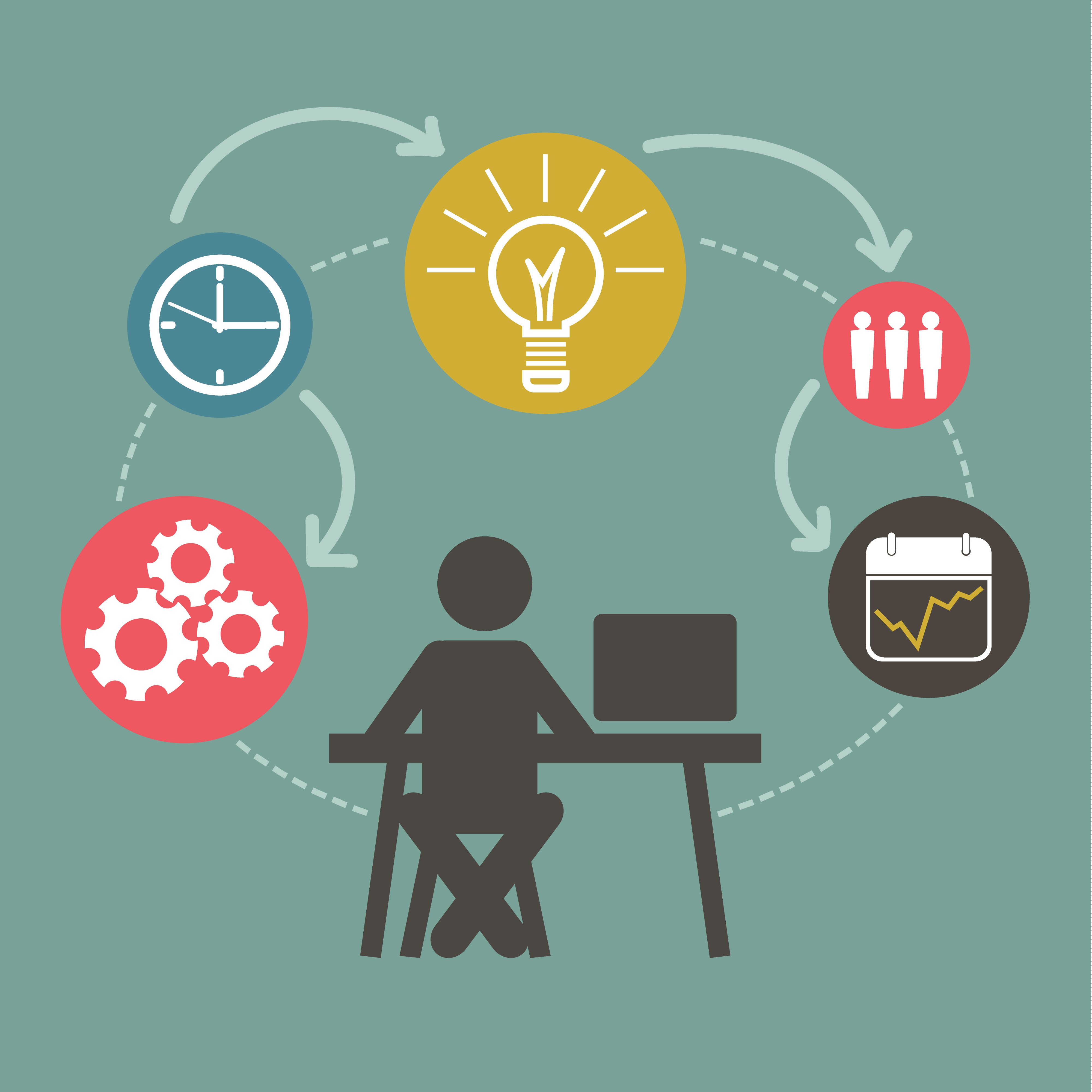
There are many, many details that require documenting and tracking through the life cycle of a software development project.  Initially we start with requirements- meaning what the tools need to do to meet the end-users needs.  Requirements must be properly documented and must essentially detail a project management plan that can result in a successful product (the software) and the project (the process, and everything that supports success of the product itself).  From this we manage a ‘backlog’ of requirements, and pull from the backlog to structure our work.  Requirements evolve into tasks that are handed off to developers.  Tasks themselves become conversations as the development team determines the best possible approach to getting the work done.  In addition to this, there are bugs to track, changes to document, and new requirements evolving all of the time… you can imagine that managing all of this in a simple ‘To Do’ list could get a bit unwieldy.

overwhelmed-stickynotes-manager

We realized that our ability to keep all of these many plates spinning necessitated a really solid project management tool.  So we embarked on a mission to find just the right one!  I’ll share our approach here, in case you and your team have a similar need and could benefit from our experiences.

STEP 1: Establish your business case:  Finding the right tool will take effort, and getting buy-in from your team and organization will take even more!  Get started early with justifying to your team and your org why a PM tool is necessary to support the work.

STEP 2: Perform a needs assessment: You and your team should get around a table and brainstorm.  Ask yourselves what you need this tool to do, what features are critical, what your budget is, etc.  Create a matrix where you fully define all of these characteristics to drive your investigation.

STEP 3: Do an environmental scan: What is out there on the market?  Do your research and whittle down a list of tools that have potential.  Also build on the skills of your team- if you have existing competencies in a given tool, then fully flesh out its features to see if it fits the bill.

STEP 4:  Put them through the paces: Choose a select list of tools and see how they match up to you needs assessment.  Task a group of people to test-drive the tools, and report out on the experience.

STEP 5: Share your findings: Discuss the findings with your team.  Capture the highs and the lows and present the material in a digestible fashion.  If it’s possible to get consensus, make a recommendation.

STEP 6: Get buy-in: This is the MOST critical part!  Get buy-in from your team to implement the tool.  A PM tool can only benefit the team if it is used thoroughly, consistently, and in a team fashion.  You don’t want to deal with adverse reactions to the tool after the fact…

project-management

No matter what tool you choose, you’ll need to follow some simple guidelines to ensure successful adoption:

  • Once again… Get TEAM buy-in!
  • Define ownership, or an Admin, of the tool (ideally the Project Manager)
  • Define basic parameters for use and team expectations
  • PROVIDE TRAINING
  • Consider your ecosystem of tools and simplify where appropriate
  • The more robust the tool, the more support and structure will be required

Trust me when I say that this exercise will not let you down, and will likely yield a wealth of information about the tools that you use, the projects that you manage, your team’s preferences for coordinating the work, and much more!

Nobody Wants a Slow Repository

As we’ve been adding features and refining the public interface to Duke’s Digital Repository, the application has become increasingly slow. Don’t worry, the very slowest versions were never deployed beyond our development servers. This blog post is about how I approached addressing the application’s performance problems before they made their way to our production site.

14729168562_ecc30e44d8_b
A modern web application, like the public interface to Duke’s Digital Repository, is a complex beast, relying on layers of software and services just to deliver a bunch of HTML, CSS, and JavaScript to your web browser. A page like this, the front page to the Alex Harris collection takes a lot to build — code to read configuration files, methods that assemble information needed to build the page, requests to Solr to find the images to display, requests to a separate administrative application service that provides contact information for the collection, another request to fetch related blog posts, and requests to our finding aid application to deliver information about the physical collection. All of these requests take time and all of them have to finish before anything gets delivered to your browser.

My main suspects for the slowness: HTTP requests to external services, such as the ones mentioned above; and repeated calls to slow methods in the application. But identifying precisely which HTTP requests are slow and what code needs to be optimized takes a bit of sleuthing.

The first thing I wanted to know was: how slow is this thing, really? Turns out it was getting getting really slow. Too slow. There’s old research (1960s old) about computer system performance and its impact on user perception and task performance that still applies today. This also old (1993 old) article from the Nielsen Norman Group summarizes the issue nicely.

To determine just how slow things were getting I used Chrome’s developer tools. The “Network” tab in Chrome’s developer tools is where the hard truth comes to light about just how bloated and slow your web application is. Or, as my high school teachers used to say when handing back test results: “read ’em and weep.”

network-panel-dev-tools

By using the Network tab in Browser Tools I was able to see that the browser was having to wait 15 or more seconds for anything to come back from the server. This is too slow.

The next thing I wanted to know was how many HTTP requests were being made to external services and which ones were being made repeatedly or were taking a long time. For this dose of reality I used the httplog gem, which logs useful information about every HTTP request, including how long the application has to wait for a response.

When added to the project’s Gemfile, httplog starts printing out useful information to the log about HTTP requests, such as this set of entries about the request to fetch finding aid information. I can see that the application is waiting over half a second to get a response back from the finding aid service:


D, [2016-08-06T12:51:09.531076 #2529] DEBUG -- : [httplog] Connecting: library.duke.edu:80
D, [2016-08-06T12:51:09.854003 #2529] DEBUG -- : [httplog] Sending: GET http://library.duke.edu:80/rubenstein/findingaids/harrisalex.xml
D, [2016-08-06T12:51:09.855387 #2529] DEBUG -- : [httplog] Data:
D, [2016-08-06T12:51:10.376456 #2529] DEBUG -- : [httplog] Status: 200
D, [2016-08-06T12:51:10.377061 #2529] DEBUG -- : [httplog] Benchmark: 0.520600972 seconds

As I expected, this request and many others were contributing significantly to the application’s slowness.

It was a bit harder to determine which parts of the code and which methods were also making the application slow. For this, I mainly used two approaches. The first was to look at the application logs which tracks how long different views take to assemble. This helped narrow down which parts of the code were especially slow (and also confirmed what I was seeing with httplog). For instance in the log I can see different partials that make up the whole page and how long each of them takes to assemble. From the log:


12:51:09 INFO: Rendered digital_collections/_home_featured_collections.html.erb (0.8ms)
12:51:09 INFO: Rendered digital_collections/_home_highlights.html.erb (1.3ms)
12:51:10 INFO: Rendered catalog/_show_finding_aid_full.html.erb (953.4ms)
12:51:11 INFO: Rendered catalog/_show_blog_post_feature.html.erb (0.9ms)
12:51:11 INFO: Rendered catalog/_show_blog_posts.html.erb (914.5ms)

(The finding aid and blog posts are slow due to the aforementioned HTTP requests.)

widget2

One particular area of concern was extremely slow searches. To identify the problem I turned to yet another tool. Rack-mini-profiler is a gem that when added to your project’s Gemfile adds an expandable tab on every page of the site. When you visit pages of the application in a browser it displays a detailed report of how long it takes to build each section of the page. This made it possible to narrow down areas of the application that were too slow.

search_results

What I found was that the thumbnail section of the page — which can appear up to twenty times or more on a search result page was very slow. And it wasn’t loading the images that was slow but running the code to select the correct thumbnail image took a long time to run. (Thumbnail selection is complicated in the repository because there are various types and sources for thumbnails.)

Having identified several contributors to the site’s poor performance (expensive thumbnail selection, and frequent and costly HTTP requests to various services) I could now work to address each of the issues.

I used three different approaches to improving the application’s performance: fragment caching, memoization, and code optimization.

Caching

finding_aid

I decided to use fragment caching to address the slow loading of finding aid information. The benefit of caching is that it’s really fast. Once Rails has the snippet of HTML cached (either in memory or on disk, depending on how it’s configured) it can use that fragment of cached markup, bypassing a lot of code and, in this case, that slow HTTP request. One downside to caching is that if something in the finding aid changes the application won’t reflect the change until the cache is cleared or expires (after 7 days in this case).


<% cache("finding_aid_brief_#{document.ead_id}", expires_in: 7.days) do %>
<%= source_collection({ :document => document, :placement => 'left' }) %>
<% end %>

Memoization

Memoization is similar to caching in that you’re storing information to be used repeatedly rather then recalculated every time. This can be a useful technique to use with expensive (slow) methods that get called frequently. The parent_collection_count method returns the total number of collections in a portal in the repository (such as the Digital Collections portal). This method is somewhat expensive because it first has to run a query to get information about all of the collections and then count them. Since this gets used more than once, I’m using Ruby’s conditional assignment operator (||=) to tell Ruby not to recalculate the value of @parent_collection_count every time the method is called. With memoization, if the value is already stored Ruby just reuses the previously calculated value. (There are some gotchas with this technique, but it’s very useful in the right circumstances.)


def parent_collections_count
@parent_collections_count ||= response(parent_collections_search).total
end

Code Optimization

One of the reasons thumbnails were slow to load in search results is that some items in the repository have hundreds of images. The method used to find the thumbnail path was loading image path information for all the item’s images rather than just the first one. To address this I wrote a new method that fetches just the item’s first image to use as the item’s thumbnail.

Combined, these changes made a significant improvement to the site’s performance. Overall application speed and performance will remain one of our priorities as we add features to the Duke Digital Repository.

Typography (and the Web)

This summer I’ve been working, or at least thinking about working, on a couple of website design refresh projects. And along those lines, I’ve been thinking a lot about typography. I think it’s fair to say that the overwhelming majority of content that is consumed across the Web is text-based (despite the ever-increasing rise of infographics and multimedia). As such, typography should be considered one of the most important design elements that users will experience when interacting with a website.

CIT Site
An early mockup of the soon-to-be-released CIT design refresh

Early on, Web designers were restricted to using certain ‘stacks’ of web-safe fonts that would hunt through the list of those available on a user’s computer until it found something compatible. Or worst-case, the page would default to using the most basic system ‘sans’ or ‘serif.’ So type design back then wasn’t very flexible and could certainly not be relied upon to render consistently across browsers or platforms. Which essentially resulted in most website text looking more or less the same. In 2004, some very smart people released sIFR which was a flashed-based font replacement technique. It ushered in a bit of a typography renaissance and allowed designers to include almost any typeface they desired into their work with the confidence that the overwhelming majority of users would see the same thing, thanks largely to the prevalence of the (now maligned) Flash plugin.

Right before Steve Jobs fired the initial shot that would ultimately lead to the demise flash, an additional font replacement technique, named Cufon, was released to the world. This approach used Scalable Vector Graphics and Javascript (instead of flash) and was almost universally compatible across browsers. Designers and developers were now very happy as they could use non-standard type faces in their work without relying on Flash.

More or less in parallel with the release of Cufon came the widespread adoption across browsers for the @font-face rule. This allowed developers to load fonts from a web server and have them render on a page, instead of relying on the local fonts a user had installed. In mid to late 2009, services like Typekit, League of Moveable Type, and Font Squirrel began to appear. Instead of outrightly selling licenses to fonts, Typekit worked on a subscription model and made various sets of fonts available for use both locally with design programs and for web publishing, depending on your membership type. [Adobe purchased Typekit in late 2011 and includes access to the service via their Creative Cloud platform.] LoMT and Font Squirrel curate freeware fonts and makes it easy to download the appropriate files and CSS code to integrate them into your site.  Google released their font service in 2010 and it continues to get better and better. They launched an updated version a few weeks ago along with this promo video:

There are also many type foundries that make their work available for use on the web. A few of my favorite font retailers are FontShop, Emigre, and Monotype. The fonts available from these ‘premium’ shops typically involve a higher degree of sophistication, more variations of weight, and extra attention to detail — especially with regard to things like kerning, hinting, and ligatures. There are also many interesting features available in OpenType (a more modern file format for fonts) and they can be especially useful for adding diversity to the look of brush/script fonts. The premium typefaces usually incorporate them, whereas free fonts may not.

Modern web conventions are still struggling with some aspects of typography, especially when it comes to responsive design. There are many great arguments about which units we should be using (viewport, rem/em, px) and how they should be applied. There are calculators and libraries for adjusting things like size, line length, ratios, and so on. There are techniques to improve kerning. But I think we have yet to find a standard, all-in-one solution — there always seems to be something new and interesting available to explore, which pretty much underscores the state of Web development in general.

Here are some other excellent resources to check out:

I’ll conclude with one last recommendation — the Introduction to Typography class on Coursera. I took it for fun a few months ago. It seemed to me that the course is aimed at those who may not have much of a design background, so it’s easily digestible. The videos are informative, not overly complex, and concise. The projects were fun to work on and you end up getting to provide feedback on the work of your fellow classmates, which I think is always fun. If you have an hour or two available for four weeks in a row, check it out!

Repository Mega-Migration Update

We are shouting it from the roof tops: The migration from Fedora 3 to Fedora 4 is complete!  And Digital Repository Services are not the only ones relieved.  We appreciate the understanding that our colleagues and users have shown as they’ve been inconvenienced while we’ve built a more resilient, more durable, more sustainable preservation platform in which to store and share our digital assets.

shouting_from_the_rooftops

We began the migration of data from Fedora 3 on Monday, May 23rd.  In this time we’ve migrated roughly 337,000 objects in the Duke Digital Repository.  The data migration was split into several phases.  In case you’re interested, here are the details:

  1. Collections were identified for migration beginning with unpublished collections, which comprise about 70% of the materials in the repository
  2. Collections to be migrated were locked for editing in the Fedora 3 repository to prevent changes that inadvertently won’t be migrated to the new repository
  3. Collections to be migrated were passed to 10 migration processors for actual ingest into Fedora 4
    • Objects were migrated first.  This includes the collection object, content objects, item objects, color targets for digital imaging, and attachments (objects related to, but not part of, a collection like deposit agreements
    • Then relationships between objects were migrated
    • Last, metadata was migrated
  4. Collections were then validated in Fedora 4
  5. When validation is complete, collections will be unlocked for editing in Fedora 4

Presto!  Voila!  That’s it!

MV5BMTEwNjMwMjc3MDdeQTJeQWpwZ15BbWU4MDg0OTA4MDIx._V1_UX182_CR0,0,182,268_AL_

While our customized version of the Fedora migrate gem does some validation of migrated content, we’ve elected to build an independent process to provide validation.  Some of the validation is straightforward such as comparing checksums of Fedora 3 files against those in Fedora 4.  In other cases, being confident that we’ve migrated everything accurately can be much more difficult. In Fedora 3, we can compare checksums of metadata files while in Fedora 4 object metadata is stored opaquely in a database without checksums that can be compared.  The short of it is that we’re working hard to prove successful migration of all of our content and it’s harder than it looks.  It’s kind of like insurance- protecting us from the risk of lost or improperly migrated data.

We’re in the final phases of spiffing up the Fedora 4 Digital Repository user interface, which is scheduled to be deployed the week of July 11th.  That release will not include any significant design changes, but is simply compatible with the new Fedora 4 code base.  We are planning to release enhancements to our Data & Visualizations collection, and are prioritizing work on the homepage of the Duke Digital Repository… you will likely see an update on that coming up in a subsequent blog post!

Color Bars & Test Patterns

In the Digital Production Center, many of the videotapes we digitize have “bars and tone” at the beginning of the tape. These are officially called “SMPTE color bars.” SMPTE stands for The Society of Motion Picture and Television Engineers, the organization that established the color bars as the North American video standard, beginning in the 1970s. In addition to the color bars presented visually, there is an audio tone that is emitted from the videotape at the same time, thus the phrase “bars and tone.”

color_bars
SMPTE color bars

The purpose of bars and tone is to serve as a reference or target for the calibration of color and audio levels coming from the videotape during transmission. The color bars are presented at 75% intensity. The audio tone is a 1kHz sine wave. In the DPC, we can make adjustments to the incoming signal, in order to bring the target values into specification. This is done by monitoring the vectorscope output, and the audio levels. Below, you can see the color bars are in proper alignment on the DPC’s vectorscope readout, after initial adjustment.

vectorscope
Color bars in proper alignment with the Digital Production Center’s vectorscope readout. Each letter stands for a color: red, magenta, blue, cyan, green and yellow.

We use Blackmagic Design’s SmartView monitors to check the vectorscope, as well as waveform and audio levels. The SmartView is an updated, more compact and lightweight version of the older, analog equipment traditionally used in television studios. The Smartview monitors are integrated into our video rack system, along with other video digitization equipment, and numerous videotape decks.

dpc_video_rack
The Digital Production Center’s videotape digitization system.

If you are old enough to have grown up in the black and white television era, you may recognize this old TV test pattern, commonly referred to as the “Indian-head test pattern.” This often appeared just before a TV station began broadcasting in the morning, and again right after the station signed off at night. The design was introduced in 1939 by RCA. The “Indian-head” image was integrated into a pattern of lines and shapes that television engineers used to calibrate broadcast equipment. Because the illustration of the Native American chief contained identifiable shades of gray, and had fine detail in the feathers of the headdress, it was ideal for adjusting brightness and contrast.

indian_head
The Indian-head test pattern was introduced by RCA in 1939.

When color television debuted in the 1960’s, the “Indian-head test pattern” was replaced with a test card showing color bars, a precursor to the SMPTE color bars. Today, the “Indian-head test pattern” is remembered nostalgically, as a symbol of the advent of television, and as a unique piece of Americana. The master art for the test pattern was discovered in an RCA dumpster in 1970, and has since been sold to a private collector.  In 2009, when all U.S. television stations were required to end their analog signal transmission, many of the stations used the Indian-head test pattern as their final analog broadcast image.

Web Interfaces for our Audiovisual Collections

Audiovisual materials account for a significant portion of Duke’s Digital Collections. All told, we now have over 3,400 hours of A/V content accessible online, spread over 14,000 audio and video files discoverable in various platforms. We’ve made several strides in recent years introducing impactful collections of recordings like H. Lee Waters Films, the Jazz Loft Project Records, and Behind the Veil: Documenting African American Life in the Jim Crow South. This spring, the Duke Chapel Recordings collection (including over 1,400 recordings) became our first A/V collection developed in the emerging Duke Digital Repository platform. Completing this first phase of the collection required some initial development for A/V interfaces, and it’ll keep us on our toes to do more as the project progresses through 2019.

A video recording in the Duke Chapel Recordings collection.
A video interface in the Duke Chapel Recordings collection.

Preparing A/V for Access Online

When digitizing audio or video, our diligent Digital Production Center staff create a master file for digital preservation, and from that, a single derivative copy that’s smaller and appropriately compressed for public consumption on the web. The derivative files we create are compressed enough that they can be reliably pseudo-streamed (a.k.a. “progressive download”) to a user over HTTP in chunks (“byte ranges”) as they watch or listen. We are not currently using a streaming media server.

Here’s what’s typical for these files:

  • Audio. MP3 format, 128kbps bitrate. ~1MB/minute.
  • Video. MPEG4 (.mp4) wrapper files. ~17MB/minute or 1GB/hour.
    The video track is encoded as H.264 at about 2,300 kbps; 640×480 for standard 4:3.
    The audio track is AAC-encoded at 160kbps.

These specs are also consistent with what we request of external vendors in cases where we outsource digitization.

The A/V Player Interface: JWPlayer

Since 2014, we have used a local instance of JWPlayer as our A/V player of choice for digital collections. JWPlayer bills itself as “The Most Popular Video Player & Platform on the Web.” It plays media directly in the browser by using standard HTML5 video specifications (supported for most intents & purposes now by all modern browsers).

We like JWPlayer because it’s well-documented, and easy to customize with a robust Javascript API to hook into it. Its developers do a nice job tracking browser support for all HTML5 video features, and they design their software with smart fallbacks to look and function consistently no matter what combo of browser & OS a user might have.

In the Duke Digital Repository and our archival finding aids, we’re now using the latest version of JWPlayer. It’s got a modern, flat aesthetic and is styled to match our color palette.

JW Player displaying inline video for the Jazz Loft Project Records collection guide.

Playlists

Here’s an area where we extended the new JWPlayer with some local development to enhance the UI. When we have a playlist—that is, a recording that is made up of more than one MP3 or MP4 file—we wanted a clearer way for users to navigate between the files than what comes out of the box. It was fairly easy to create some navigational links under the player that indicate how many files are in the playlist and which is currently playing.

A multi-part audio item from Duke Chapel Recordings.

Captions & Transcripts

Work is now underway (by three students in the Duke Divinity School) to create timed transcripts of all the sermons given within the recorded services included in the Duke Chapel Recordings project.

We contracted through Popup Archive for computer-generated transcripts as a starting point. Those are about 80% accurate, but Popup provides a really nice interface for editing and refining the automated text before exporting it to its ultimate destination.

Caption editing interface provided by Popup Archive

One of the most interesting aspects of HTML5 <video> is the <track> element, wherein you can associate as many files of captions, subtitles, descriptions, or chapter information as needed.  Track files are encoded as WebVTT; so we’ll use WebVTT files for the transcripts once complete. We’ll also likely capture the start of a sermon within a recording as a WebVTT chapter marker to provide easier navigation to the part of the recording that’s the most likely point of interest.

JWPlayer displays WebVTT captions (and chapter markers, too!). The captions will be wonderful for accessibility (especially for people with hearing disabilities); they can be toggled on/off within the media player window. We’ll also be able to use the captions to display an interactive searchable transcript on the page near the player (see this example using Javascript to parse the WebVTT). Our friends at NCSU Libraries have also shared some great work parsing WebVTT (using Ruby) for interactive transcripts.

The Future

We have a few years until the completion of the Duke Chapel Recordings project. Along the way, we expect to:

  • add closed captions to the A/V
  • create an interactive transcript viewer from the captions
  • work those captions back into the index to aid discovery
  • add a still-image extract from each video to use as a thumbnail and “poster frame” image
  • offer up much more A/V content in the Duke Digital Repository

Stay tuned!

Hang in there, the migration is coming

Detail from Hugh Mangum photographs - N318
Wouldn’t you rather read a post featuring pictures of cats from our digital collections than this boring item about a migration project that isn’t even really explained? Detail from Hugh Mangum photographs – N318.

While I would really prefer to cat-blog my merry way into the holiday weekend, I feel duty-bound to follow up on my previous posts about the digital collections migration project that has dominated our 2016.

Since I last wrote, we have launched two more new collections in the Fedora/Hydra platform that comprises the Duke Digital Repository. The larger of the two, and a major accomplishment for our digital collections program, was the Duke Chapel Recordings. We also completed the Alex Harris Photographs.

Meanwhile, we are working closely with our colleagues in Digital Repository Services to facilitate a whole other migration, from Fedora 3 to 4, and onto a new storage platform. It’s the great wheel in which our own wheel is only the wheel inside the wheel. Like the wheel in the sky, it keeps on turning. We don’t know where we’ll be tomorrow, though we expect the platform migration to be completed inside of a month.

hang-in-there-baby-kitten-poster
A poster like this, with the added phrase “Friday’s coming,” used to hang in one of the classrooms in my junior high. I wish we had that poster in our digital collections.

Last time, I wrote hopefully of the needle moving on the migration of digital collections into the new platform, and while behind the scenes the needle is spasming toward the FULL side of the gauge, for the public it still looks stuck just a hair above EMPTY. We have two batches of ten previously published collections ready to re-launch when we roll over to Fedora 4, which we hope will be in June – one is a group of photography collections, and the other a group of manuscripts-based collections.

In the meantime, the work on migrating the digital collections and building a new UI for discovery and access absorbs our team. Much of what we’ve learned and accomplished during this project has related to the migration, and quite a bit has appeared in this blog.

Our Metadata Architect, Maggie Dickson, has undertaken wholesale remediation of twenty years’ worth of digital collections metadata. Dealing with date representation alone has been a critical effort, as evidenced by the series of posts by her and developer Cory Lown on their work with EDTF.

Sean Aery has posted about his work as a developer, including the integration of the OpenSeadragon image viewer into our UI. He also wrote about “View Item in Context,” four words in a hyperlink that represent many hours of analysis, collaboration, and experimentation within our team.

I expect, by the time the wheel has completed another rotation, and it’s my turn again to write for the blog, there will be more to report. Batches will have been launched, features deployed, and metadata remediated. Even more cat pictures will have been posted to the Internet. It’s all one big cycle and the migration is part of it.


Preservation Architecture: Phase 2 – Moving Forward with Duke Digital Repository


DukeSpace circa 2013


In 2013, the average price for a gallon of gas was $3.80, President Obama was inaugurated for a second term, and Duke University Libraries offered DukeSpace as an institutional repository.  Some things haven’t changed much, but the preservation architecture protecting the digital materials curated by the Libraries has changed a lot!

We still provide DukeSpace, but are laying the foundation to migrate collections and processes to the Duke Digital Repository (DDR).  The DDR was conceived of and developed as a digital preservation repository, an environment intended to preserve and sustain the rich digital collections; university scholarship and research data; purchased collections, and history of Duke far into the future.  Only through the grace of our partnership with Digital Projects and Production Services has the DDR recently also become a site that no longer hurts the eyes of our visitors.

The Duke Digital Repository endeavors to protect our assets from a large and diverse threat model. There are threats that are not addressed in the systems model presented here, such as those identified in the SPOT Model for Risk Assessment, of course. We formally consider these baseline threats to include:

  • Natural disasters including accidents at our local nuclear power station, fire, and hurricanes
  • Data degradation also known as bit rot or bit decay
  • External actors or threats posed by people external to the DDR team including those who manage our infrastructure
  • Internal actors including intentional or unintentional security risks and exploits by privileged staff in the libraries and supporting IT organizations

Phase 1 of our ingress into digital preservation established that DSpace, the software powering DukeSpace, was not sufficient for our needs, which led to an environmental scan and pilot project with Fedora and then Fedora and Hydra. This provided us with some of the infrastructure to mitigate the threats we had identified, but not all.  In Phase 1 we were to perform some important preservation tasks including:

  • Prove authenticity by offering checksum fixity validation on ingest and periodically
  • Identify and report on data degradation
  • Capture context in the form of descriptive, administrative, and technical metadata
  • Identify files in need of remediation using file characterization tools

Phase 2 allows us to address a greater range of threats and therefore offer a higher level of security to our collections.  In Phase 2 we’re doing several concurrent migrations including migrating our archival storage to infrastructure that will allow for dynamic resizing, de-duplication, and block-level integrity checking; moving to a horizontally scaled server architecture to allow the repository to grow to meet increasing demands of size (individual file size and size of collection) and traffic; and adopting a cloud replication disaster recovery process using DuraCloud to replace our local-only disk/tape infrastructure.  These changes provide significant protection against our baseline threat model by providing geographic diversity to our replicas, allowing us to constantly monitor the health of our 3 cloud replicas, and providing administrative diversity to the management of our replicas ensuring no single threat may corrupt all 4 copies of our data.

More detail about the repository architecture to come.