Tag Archives: history of advertising

Colonizing Latin America with Pan American World Airways

Post contributed by Leah Tams, Pan Am CLIR Grant Intern.

The United States has long been an empire with colonial holdings, even since its inception. The U.S. has carried out its colonialism in many different ways, depending upon the time period and area being colonized. In the 1930s and 1940s, the “Good Neighbor Policy,” first articulated by President Franklin D. Roosevelt, became an avenue for the United States to commercially influence Latin American nations. In the spirit of the Good Neighbor Policy, the United States didn’t send hundreds of people to colonize Latin America—instead, it sent businesses to establish and extend their economic influences within the region. One of the key businesses sent to Latin America was Pan American World Airways (Pan Am).

This colorful ad for the Pan American Airways System shows a crowd in stereotypical South American clothing, including a man on horseback, watching the arrival of a Pan Am airplane. The tagline reads "The good neighbor who calls every day . . . "
The Good Neighbor Who Calls Every Day…, Pan American Airways System, 1941, AdAccess Digital Collection

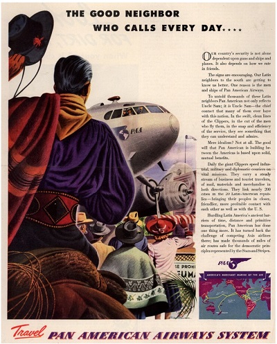
The John W. Hartman Center’s earliest ads from Pan Am illustrate the Good Neighbor Policy in action: “Out of the Muck of the Mazatlán,” Pan Am created airfields in Latin America, which were heralded as “Another ‘Stepping Stone.’” These “stepping stones” would allow the United States to connect with various Latin American cities and civilizations, thus extending U.S. influence southward. Other early advertisements were even more overt in their reference to the policy, proclaiming that Pan Am was indeed “The Good Neighbor Who Calls Every Day” who would create meaningful—and influential—political and economic contact between both regions. As historian Jennifer Van Vleck argues, “the development of commercial aviation did important work to make the U.S. presence in Latin America appear more benign while also bringing the region within closer reach of Washington and Wall Street.”[1]

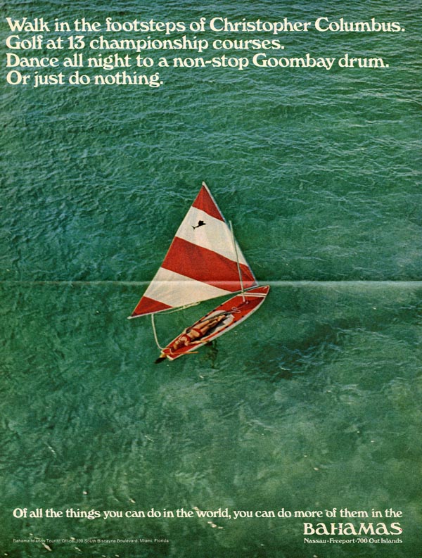
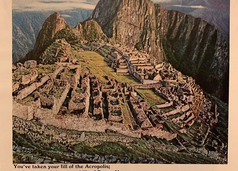
Once Pan Am had an established presence in Latin America, it was fairly simple to begin advertising the wondrous destinations available—particularly because Pan Am (or, more accurately, Panagra, as the joint venture in South America was known) presented the region as an almost-undiscovered land. Ads from the late 1940s assured travelers that they would “travel in the intrepid footsteps of Pizzaro [sic],” in a paradise “spangled with the glories of past centuries.”[2] These intimations of Francisco Pizarro—the Spanish conquistador who invaded Panama and Peru—and other overt references to the colonialist efforts of Pan Am, which injected U.S. influence and culture into South America, would continue for decades.

A black-and-white announcement of JWT's new advertising campaign for Panagra airline. In green text, the announcement proclaims "Greatest campaign since Pizarro!" Images of the ads that will be included in national print publications are included.
Greatest Campaign Since Pizarro, PANAGRA, 1962. J. Walter Thompson Co., Domestic Advertisements Collection

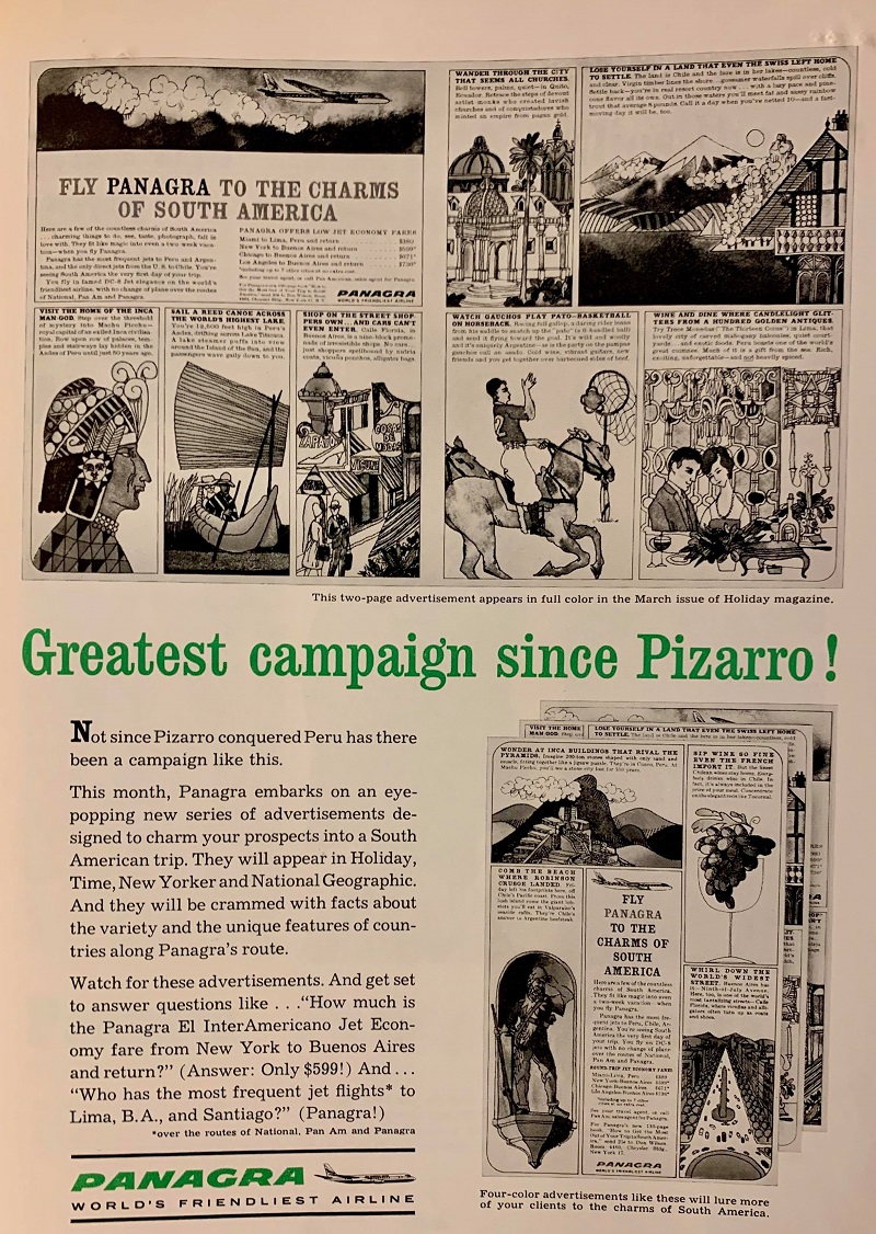
In 1962, the J. Walter Thompson Company (JWT), Pan Am’s principal advertiser, launched a campaign for Panagra that touted the “Charms of South America” to potential travelers. To its travel agents, JWT called this effort the “Greatest Campaign Since Pizarro!” Other Panagra advertisements from the 1960s celebrate Pizarro’s lasting impact upon Lima, Peru, stating that “He laid out the city’s streets, the government buildings, the cathedral, just where you see them today.” With these references to and celebrations of Pizarro, it seems as though Pan Am is encouraging its travelers to once again conquer and colonize Latin America—in fact, Panagra ads from 1965 invite travelers to “Capture the city Pizarro couldn’t!” (referring to Machu Picchu in Peru) and underscore the flippant imperialism of the U.S.

This ad shows a color aerial photo of Machu Picchu with the tagline "You've taken your fill of the Acropolis; you've stormed the seven hills of Rome. Now . . . Capture the city Pizarro couldn't!"
Capture the City Pizarro Couldn’t, PANAGRA, 1965. J. Walter Thompson Co., Domestic Advertisements Collection

To be sure, contemporary advertisements for Pan Am’s flights to Europe portray the continent and its destinations as commodities, most often as dollar amounts. But where European cities and regions are reduced a monetary figure, they are never reduced to places that can be conquered, subdued, or gifted civilization the way that Latin America is. In Latin America, it seems that Pan Am found the perfect candidate for profit and U.S. imperialism, veiled in the thin language of adventure.

[1] Jennifer Van Vleck, Empire of the Air: Aviation and the American Ascendancy (Cambridge, MA: Harvard University Press, 2013), 54.

[2] “Panagra Vacation,” 1947, https://repository.duke.edu/dc/adaccess/T1593.

New Exhibit: “No One Can Suppress Archie Boston”

Post contributed by Kasia Stempniak, John W. Hartman Center intern for 2018-2019 and Ph.D. student in Duke’s Romance Studies department. 

The Hartman Center’s new exhibit, “No One Can Suppress Archie Boston,” on display through October in the Stone Family Gallery, focuses on Archie Boston, a graphic designer whose innovative and socially-conscious designs shed valuable insight into the intersections of race and identity in the advertising world.

Raised in segregated St. Petersburg, Florida in the 1940s, Archie Boston moved to Los Angeles in the 1960s to pursue a career in graphic design. In 1963, Boston and his brother Brad started their own advertising agency, Boston & Boston. As one of the first African-American owned advertising agencies, Boston & Boston faced difficulties securing clients in an almost exclusively white industry. Rather than hide their identity, Boston and his brother confronted the industry with provocative self-promotional ads that made explicit references to slavery and racism. “We wanted our potential clients,” Boston remarked in an interview, “to know that we were a black firm.”

Archie Boston's Pentel ad, featuring an image of him with a display of Pentel pens. The larger text reads: "I told Pentel what to with their pens. And they did it."
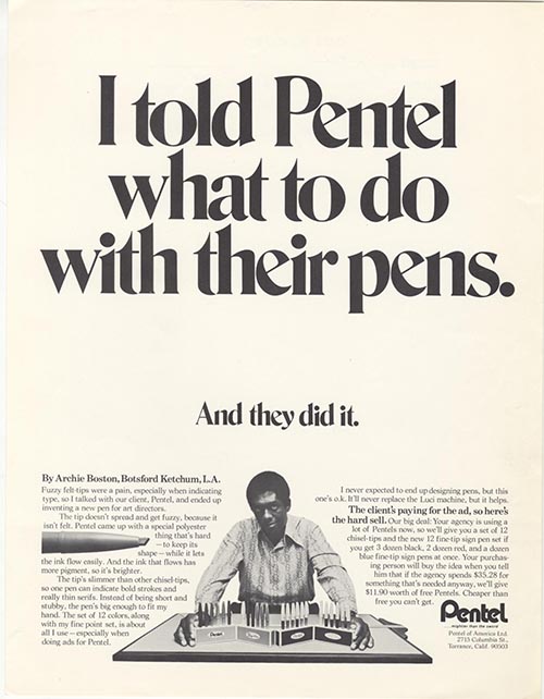
Boston later worked at the ad agency Botsford & Ketchum where he developed one of his most famous ads for Pentel that boasted the caption, “I told Pentel what to do with their pens.” By placing himself at the center of the ad, Boston subverted the usually invisible presence of the advertising executive. At a time when very few African-Americans worked in advertising, the ad also announced a subtle shift in the demographics of the industry.

In the late 1970s, Boston left the agency to pursue a career as a professor at California State University-Long Beach (CSULB) where he developed the design program for the next thirty years all while still operating his own graphic design firm, Archie Boston Graphic Design.

The first African-American recipient of the American Institute of Graphic Arts (AIGA) Fellow Award, Boston served multiple terms as president of the Art Directors Club of Los Angeles where he was the first African-American elected to this position. In his final lecture at CSULB, Boston articulated how design, teaching, and social activism shaped his career: “I want to be remembered as a professor who cared about his students and did what he thought was best for them. I want to be remembered as someone who stood up against criticism and spoke out on controversial issues. And finally I want to be remembered as a designer and educator, someone who documented my experience as an African American.”

Book jacket image from "Fly in the Buttermilk," showing Mr. Boston drinking out of a milk carton through a red-and-white striped straw.
Book jacket image for Fly in the Buttermilk

The Archie Boston Papers offer a comprehensive view of Boston’s wide-ranging career including early student sketches, self-promotional ads for Boston & Boston, corporate ads for Lloyd Bank, Pentel, and Yamaha, awards and university materials related to Boston’s tenure at CSULB as well as Boston’s two published texts, his memoir Fly in the Buttermilk: Memoirs of an African American in Advertising, Design & Design Education (2001) and Lil’ Colored Rascals in the Sunshine City (2009).

Some of Boston’s most important designs, including Boston’s famous Pentel ad, are on display in the exhibit. Other highlights of the exhibit include Boston’s most recent work that engages directly with race and identity, including poetry and designs that Boston created after being inspired by Black Lives Matter, the 2014 events in Ferguson, Missouri, and the 2017 event in Charlottesville, Virginia. These recent works convey a growing sense of urgency and frustration with the treatment of African-American communities in the United States.

The Archie Boston Papers are available for the public research at the Rubenstein Library.

New J. Walter Thompson Co. Digital Database

Post contributed by Josh Larkin Rowley, Reference Archivist for the John W. Hartman Center for Sales, Advertising & Marketing History.

In 2016, a small group of researchers and project managers descended upon the Rubenstein Library reading room.  They were from the company Adam Matthew Digital, a U.K.-based builder of primary source digital databases for use in teaching and research.  Over six weeks and three trips, they were firmly ensconced in research in our reading room from when we opened at 9AM—pausing only for meals—until we closed.

They perused hundreds of boxes from the Hartman Center for Sales, Advertising & Marketing History’s archives of the J. Walter Thompson Co., an advertising agency founded in New York City in 1864.  Considered the most complete record of any existing advertising agency, the archives documents 150 years of the agency’s work with hundreds of business clients, corporate culture, personnel, marketing research, and contributions to the advertising industry.  The goal of Adam Matthew’s research was to build a digital database that captured the essence of the agency and its contributions to American consumer culture.

Homepage for J. Walter Thompson: Advertising America database featuring 1972 Kodak ad from the JWT Advertisements Collection.
Homepage for J. Walter Thompson: Advertising America research database featuring 1972 Kodak ad from the JWT Advertisements Collection.

Thanks to the work of Adam Matthew Digital, Backstage Library Works, our own Digital Collections & Curation Services, and several Duke student assistants, the database is now complete and available to institutions for purchase.  Titled J. Walter Thompson: Advertising America, the database includes print advertisements, writings and speeches by JWT staff, company publications, account materials, company newsletters, market research and reports, meeting minutes and much, much more.  Together, these materials not only document the story of one of America’s oldest and most enduring advertising agencies, but they also reveal many aspects of 20th century history.  Researchers interested in facets of business, social, economic, and cultural history are sure to find the database a rich resource.

"Browse by Collection" page for J. Walter Thompson: Advertising America research database.
“Browse by Collection” page for J. Walter Thompson: Advertising America research database.

If you are interested in purchasing the database for your own institution, inquiries can be sent to Adam Matthew Digital website hereThe database is free to Duke students, faculty, and staff in the Libraries’ collection of resource databases here.

Uncola: Seven-Up, Counterculture and the Making of an American Brand

Post contributed by Claire Payton, John W.  Hartman Center for Sales, Advertising & Marketing History intern and Ph.D. candidate, Duke University Department of History

It was 1967, and people weren’t drinking Seven-Up. Well, a few were: consumers mostly thought of the bubbly beverage as a mixer or a tonic to calm an upset stomach. But executives at the St. Louis-based Seven-Up Company were anxious to tap into a wider market. The company wanted to rebrand its product as a common soft-drink like the more well-known cola beverages, Pepsi or Coca-Cola. It enlisted a marketing team from the Chicago office of the J. Walter Thompson ad agency to help them. Out of this collaboration came one of the most famous advertising campaigns of the 20th century.

The late 1960s were a difficult time in America. The Vietnam War and the fight for civil rights divided the country.  Disillusioned young people were building a robust oppositional counter-culture that rejected war, racial segregation, and violence. The summer of 1967 became known as the “Summer of Love,” a period when hippies gathered in San Francisco and cities around the country in the hopes of igniting “a renaissance of compassion, awareness, and love, and the revelation of unity for all mankind.”

Seizing on this oppositional energy, the JWT team designed a campaign that framed 7-Up as the ultimate oppositional drink: the “Uncola.” Rather than trying to play up the similarities the soda shared with its competitors, the new ads focused on its differences. In the company newsletter, the team explained “Seven-Up advertising tells people that, of the three top-selling soft drink brands, 7-Up, the Uncola, is the only one with distinctly different qualities.”

An early Uncola ad: "A hotdog and . . . The Uncola?"
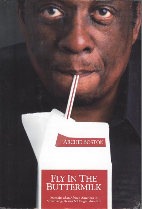
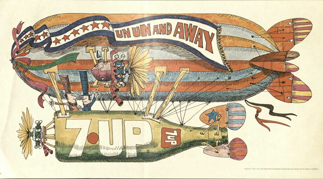
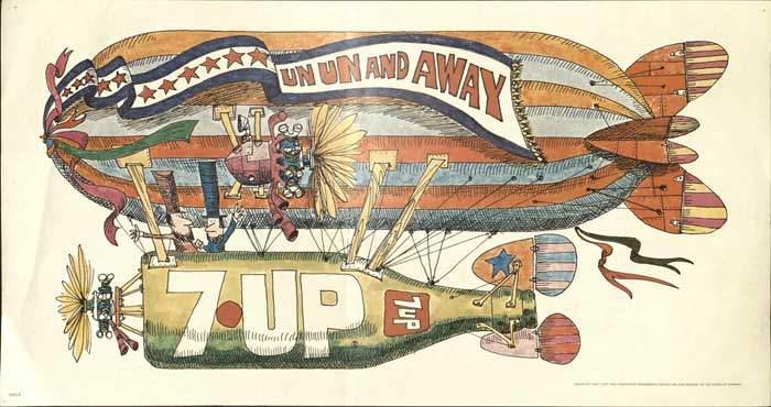
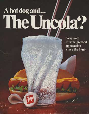
The “Uncola” struck a chord with the younger generation as the first ads appeared in 1968. They focused on puns based around “un” part of the new slogan. By portraying Coke and Pepsi as “the Establishment,” JWT effectively situated 7-Up as an alternative brand for alternative people.

The following year JWT created a contest inviting artists to submit wildly imaginative designs for 7-Up ads. The submissions were presented to the client, who chose the final images. The winner received a $2000 reward and the opportunity to work with JWT to make final versions. From this contest, JWT and the Seven-Up company built a campaign of colorful road-side billboards with psychedelic graphics. Art by young graphic designers including Pat Dypold, Ed Georges, and Milton Glaser dotted highways across the country in 1969.

A 1973 article from Southern Advertising described the success of the billboard campaign: “To zero in on the college and younger age groups, [Seven-Up executive] Roesch has developed a different approach to the use of the outdoor medium. The agency’s media department uses outdoor as a means of zeroing in on a specific target . . . instead of as a mass media that doesn’t discriminate.  The boards are located accordingly, and the art used is slated to the specific likes of the age groups. The result has been demand for Seven-Up posters to be used as room decorations, party decorations, all without any promotion by the company.”

An example of a Seven-Up Uncola billboard

The campaign complemented its print ads and billboards with television spots. The most memorable ads from this campaign featured Trinidadian dancer and actor Geoffrey Holder explaining the difference between ugly, dry, kola nuts and the tangy, juicy lemon and limes that flavor 7-Up. The ad broke racial barriers within the Seven-Up Company, which until then had never used black actors in its television ads.

The Uncola campaign continued into the 1970s. As times changed, the campaign tried to stay in dialog with oppositional culture by incorporating new visual mediums such as grafitti. JWT argued that “In 1968, the rebellious approach of youth was a workable parallel for the rebellious approach of Seven-Up. Today, in the Seventies, the attack remains viable.” However, 7-Up’s hard-won market share declined over the course of the decade, losing ground to the growing popularity of another lemon-lime soda, Sprite.

Brief article about Seven-Up Uncola grafitti posters

Perhaps the soda became a victim of its own success. The Uncola campaign had so effectively linked to the youth of the 1960s that by the 1990s, it was considered ”what old people drink,” in the words of one financial analyst, “and that’s not what you want in a soft drink.” In 1998, the company finally dropped the Uncola slogan and reinvented its formula. Since then the company has since tried several different campaigns to redefine its identity without success. Regardless, the Uncola campaign will remain a mainstay of the consumer culture of 20th century America and a sign of the times in which it was created.


‘We Try Harder’ and Other Famous Ad Campaigns by Paula Green

Post contributed by Cameron Byerly, a rising junior at St. John’s College in Annapolis, Maryland.  He helped process the Paula Green papers through St. John’s Hodson Internship Program during Summer 2017.

Photograph of Paula Green from the Paula Green papers at the Rubenstein Library.

It’s not the size of the budget
It’s the ferocity of the idea
–Paula GRRRRReen

Paula Green’s papers amounted to nearly 100 boxes of print documents, photographs and audiovisual materials, which is intimidating for a first archival processing project.

My relief was immediate when I discovered these boxes contained dozens of awards, fascinating drafts and edits to ads, pleasant correspondence, articles explaining an honest and steadfast worldview, and above all, a character who I came to deeply respect the voice and intents of through a long and successful career.

Union Label song created by Paula Green and Malcolm Dodds in 1975 for the International Ladies Garment Workers Union.

The central theme I would use to describe Paula Green’s work is ‘cause-driven’. Paula’s speeches and correspondence make it clear she chose clients she personally believed in, including the local jobs offered by the International Ladies Garment Workers Union (ILGWU), and the work she did to fight breast cancer with the U.S. government’s Public Health Service and the American Cancer Society. Perhaps her largest success was her part in creating the “Look for the Union Label” song for the ILGWU in the 70’s. The song’s importance became more tangible to me when reading President Jimmy Carter’s quote “Sometimes I have a hard time deciding which I like best, ‘Hail to the Chief’ or ‘Look for the Union Label,’” and the subsequent parodies from newspaper comics, South Park and Saturday Night Live. The song represented an enormous collective effort of the American fight for local jobs. As I pieced together Paula’s insistence on visiting local factories, employing real workers for TV spots, and saying “please buy from us” rather than “don’t buy from foreigners,” I realized that she applied her own moral standard to the work she believed in.

Paula Green created the now famous “We Try Harder” campaign for Avis in 1962.

The second notable theme in Paula Green’s work is intelligence. Her early success at Doyle Dane Bernbach with the ‘We’re No. 2’ advertising campaign for Avis car rental allowed her the economic power to create her own advertising agency in 1975, and demonstrated her intelligence in engaging with the audience. I consider how well her methods would work in today’s more image-driven and crowded advertising landscape. Records of her work include hundreds of edits of reasoned arguments and recipes used to include in her marketing of food products. She often argued against a more deceptive world of associating lifestyles with products, and instead cleanly focused on the merits of her products. Her copywriting involved well-written sentences to back up her buzz-words and intelligent methodology in expressing her ideas.  Continue reading ‘We Try Harder’ and Other Famous Ad Campaigns by Paula Green

Mad Men Monday – Season 8, Episode 12 “Lost Horizon”

The move to McCann is underway and a number of the SC&P staff are finding the transition challenging in their own unique ways.

Don is welcomed with enthusiasm by Jim Hobart, who expects Don to “bring things up a notch around here.” Later Don attends his first meeting in which Conley Research presents its findings on the market for a new Miller “diet beer.” Don seems out of his element in a room full of creative directors all taking notes. He watches a plane fly by high up in the air and walks out.

Joan was welcomed by two women copywriters who have interest in her accounts. They invite her to join them for drinks sometime.  Later she has conference calls with her clients and her ill-prepared colleague Dennis, who interrupts Joan and thinks he has better ways of handling her clients.  When she complains to Ferg about working with Dennis he promises to make it better, which means that she will work directly with him instead. His lecherous intentions quickly become clear.

Peggy’s move is thwarted by the fact that McCann has mistaken her for a secretary and did not reserve an office for her.  She refuses to move her belongings over until she gets an office and so spends a few surreal days in an empty SC&P working on Dow.

Don planned to drive Sally back to school, but found out belatedly from Betty that she got a ride from a friend instead. As he drives back to the city he impulsively takes a detour towards Pennsylvania and keeps driving all the way to Racine, Wisconsin. While his colleagues wonder where he is over the next few days, he tries to find out where Diana is from her ex-husband by posing as someone who has a prize for Diana. Her ex gets irate and sees through Don’s charade. He tells Don that Diana is a tornado who destroys everything.

Peggy and Roger drink too much vermouth and talk at SC&P before they make their official moves over to McCann.  Peggy is later seen walking confidently into the office with her belongings and Bert Cooper’s artwork that Roger gave her.

Joan meets with Jim Hobart and says she’d rather not work with Ferg on her accounts. Jim belittles her and her status at SC&P.  She says she’s willing to take the money she is owed and walk away, but he retorts that he will only give her fifty cents on the dollar. She threatens to contact the Equal Employment Opportunity Commission and the ACLU regarding the sexism at McCann. Later she finds Roger waiting for her and he tells her to take the offer and that he can’t help her. She dejectedly agrees to the deal and walks out with her Rolodex and a photo of her son.

Don keeps on driving and picks up a hitchhiker headed to St. Paul.

Last night’s show featured references to Ladies Home Journal, Tampax, Miller, and Westinghouse, among other things.  Enjoy our selection of highlighted ads that reflect the brands and themes that Mad Men characters interacted with last night.

A gallery of our selected images may also be found on Flickr.

Post contributed by Jacqueline Reid Wachholz, Director of the John W. Hartman Center for Sales, Advertising, and Marketing History.

1 travelers insurance001

2 tampax001

3 contraception001

4 bahamas001

5 cash register001

6 dow overn cleaner001

7 miller high life001

8 truth well told001

9 salem001

10 maxwell coffee001

11 westing house fridge 12 ladies home journal001

13 organ001