All posts by Michael Daul

Using an M1 Mac for development work

Due to a battery issue with my work laptop (an Intel-based MacBook pro), I had an opportunity to try using a newer (ARM-based) M1 Mac to do development work. Since roughly a year had passed since these new machines had been introduced I assumed the kinks would have been generally worked out and I was excited to give my speedy new M1 Mac Mini a test run at some serious work. However, upon trying to do make some updates to a recent project (by the way, we launched our new staff directory!) I ran into many stumbling blocks.

M1 Mac Mini ensconced beneath multitudes of cables in my home office

My first step in starting with a new machine was to get my development environment setup. On my old laptop I’d typically use homebrew for managing packages and RVM (and previously rbenv) for ruby version management in different projects. I tried installing the tools normally and ran into multitudes of weirdness. Some guides suggested setting up a parallel version of homebrew (ibrew) using Rosetta (which is a translation layer for running Intel-native code). So I tried that – and then ran into all kinds of issues with managing Ruby versions. Oh and also apparently RVM / rbenv are no longer cool and you should be using chruby or asdf. So I tried those too, and ran into more problems. In the end, I stumbled on this amazing script by Moncef Belyamani. It was really simple to run and it just worked, plain and simple. Yay – working dev environment!

We’ve been using Docker extensively in our recent library projects over the past few years and the Staff Directory was setup to run inside a container on our local machines. So my next step was to get Docker up and running. The light research I’d done suggested that Docker was more or less working now with M1 macs so I dived in thinking things would go smoothly. I installed Docker Desktop (hopefully not a bad idea) and tried to build the project, but bundle install failed. The staff directory project is built in ruby on rails, and in this instance was using therubyracer gem, which embeds the V8 JS library. However, I learned that the particular version of the V8 library used by therubyracer is not compiled for ARM and breaks the build. And as you tend to do when running into questions like these, I went down a rabbit hole of potential work-arounds. I tried manually installing a different version of the V8 library and getting the bundle process to use that instead, but never quite got it working. I also explored using a different gem (like mini racer) that would correctly compile for ARM, or just using Node instead of V8, but neither was a good option for this project. So I was stuck.

Building the Staff Directory app in Docker

My text attempt at a solution was to try setting up a remote Docker host. I’ve got a file server at home running TrueNAS, so I was able to easily spin up a Ubuntu VM on that machine and setup Docker there. You could do something similar using Duke’s VCM service. I followed various guides, setup user accounts and permissions, generated ssh keys, and with some trial and error I was finally able to get things running correctly. You can setup a context for a Docker remote host and switch to it (something like: docker context use ubuntu), and then your subsequent Docker commands point to that remote making development work entirely seamless. It’s kind of amazing. And it worked great when testing with a hello-world app like whoami. Running docker run --rm -it -p 80:80 containous/whoami worked flawlessly. But anything that was more complicated, like running an app that used two containers as was the case with the Staff Dir app, seemed to break. So stuck again.

After consulting with a few of my brilliant colleagues, another option was suggested and this ended up being the best work around. Take my same ubuntu VM and instead of setting it up as a docker remote host, use it as the development server and setup a tunnel connection (something like: ssh -N -L localhost:8080:localhost:80 docker@ip.of.VM.machine) to it such that I would be able to view running webpages at localhost:8080. This approach requires the extra step of pushing code up to the git repository from the Mac and then pulling it back down on the VM, but that only takes a few extra keystrokes. And having a viable dev environment is well worth the hassle IMHO!

As apple moves away from Intel-based machines – rumors seem to indicate that the new MacBook Pros coming out this fall will be ARM-only – I think these development issues will start to be talked about more widely. And hopefully some smart people will be able to get everything working well with ARM. But in the meantime, running Docker on a Linux VM via a tunnel connection seems like a relatively painless way to ensure that more complicated Docker/Rails projects can be worked on locally using an M1 Mac.

What does it mean to be an actively antiracist developer?

The library has been committed to Diversity, Equity, and Inclusion for the past year extended, specifically through the work of DivE-In and the Anti-Racist Roadmap. And to that end, the Digital Strategies and Technology department, where I work, has also been focusing on these issues. So lately I’ve been thinking a lot about how, as a web developer, I can be actively antiracist in my work.

First, some context. As a cis-gendered white male who is gainfully employed and resides in one of the best places to live in the country, I am soaking in privilege. So take everything I have to say with that large grain of salt. My first job out of college was working at a tech startup that was founded and run by a black person. To my memory, the overall makeup of the staff was something like 40–50% BIPOC, so my introduction to the professional IT world was that it was normal to see people who were different than me. However, in subsequent jobs my coworker pool has been much less diverse and more representative of the industry in general, which is to say very white and very male, which I think is a problem. So how can an industry that lacks diversity actively work on promoting the importance of diversity? How can we push back against systematic racism and oppression when we benefit from those very systems? I don’t think there are any easy answers.

Antiracist Baby Cover
Antiracist Baby by Ibram X. Kendi

I think it’s important to recognize that for organizations driven by top-down decision making, sweeping change needs to come from above. To quote one of my favorite bedtime stories, “Point at policies as the problem, not people. There’s nothing wrong with the people!” But that doesn’t excuse ‘the people’ from doing the hard work that can lead to profound change. I believe an important first step is to acknowledge your own implicit bias (if you are able, attend Duke IT’s Implicit Bias in the Workplace Training). Confronting these issues is an uncomfortable process, but I think ultimately that’s a good thing. And at least for me, I think doing this work is an ongoing process. I don’t think my implicit biases will ever truly go away, so it’s up to me to constantly be on the lookout for them and to broaden my horizons and experiences.

So in addition to working on our internalized biases, I think we can also work on how we communicate with each other as coworkers. In a recent DST-wide meeting concerning racial equity at DUL, the group I was in talked a lot about interpersonal communication. We should recognize that we all have blind spots and patterns that we slip into, like being overly jargony, being terse and/or confrontational, and so on. We have the power to change these patterns. I think we also need to be thoughtful of the language we use and the words that we speak. We need to appreciate diversity of backgrounds and be mindful of the mental taxation of code switching. We can try to help each other feel more comfortable in own skin and feel safe expressing our thoughts and ideas. I think it’s profoundly important to meet people from a place of empathy and mutual respect. And we should not pass up the opportunities to have difficult conversations with each other. If I say something loaded with a microaggression and make a colleague feel uncomfortable or slighted, I want to be called out. I want to learn from my mistakes, and I would think that’s true for all of my coworkers.

aze-con
Axe-con is an open and inclusive digital accessibility conference

We can also incorporate anti-racist practices into the things we create. Throughout my career, I’ve tried to always promote the benefits of building accessible interfaces that follow the practices of universal design. Building things with accessibility in mind is good for everyone, not just those who make use of assistive technologies. And as an aside, axe-con 2021 was packed full of great presentations, and recording are available for free. We can take small steps like removing problematic language from our workflows (“master” branches are now “main”). But I think and hope we can do more. Some areas where I think we have an opportunity to be more proactive would be doing an assessment of our projects and tools to see to what degree (if at all) we seek out feedback and input from BIPOC staff and patrons. How can we make sure their voices are represented in what we create?

I don’t have many good answers, but I will keep listening, and learning, and growing.

Fun with sticky scrolling

For the past several weeks I’ve had the great fortune to help contribute to our new archival finding aid interface, based on the Stanford ArcLight project. My coworker Sean Aery, is a contributor to that project as well as being the lead developer for Duke University Libraries’ implementation.

The new site is set to launch next week (July 1st) and we are all very excited about it. You can read a teaser post about it written by the product owner, Noah Huffman.

Last week we were trying to work out a thorny issue with the overall interface. There was a feature request from the product owner team to make a section of the navigation ‘sticky’ while allowing other parts of the interface to scroll normally. We have a similar setup for viewing results in our catalog, but that was implemented in an ‘older’ way using extra markup and javascript. Support for position:sticky; across the major browsers is now at point that we could try implementing this feature in a much more simple way, so that’s what we did!

Video of scrolling behavior (with scroll bars showing)

Everything was working great with our implementation, except I really wanted to figure out a way to hide the scroll bars when they weren’t being used — but the most reliable way to do so seemed to involve some flavor of third-party javascript library and I didn’t want to go down that road. In chatting with Sean about it over Slack, he wasn’t seeing the scroll bar problems that I was. I was completely flummoxed! Our development environments are more or less identical. He’s running on a newer version of MacOS than me, but our browser versions are the same. I just couldn’t wrap my head around why I was seeing different behavior with the scroll bars.

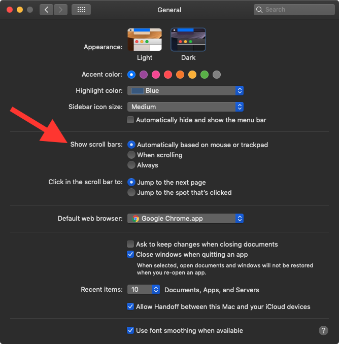
However, some googling revealed that there was a setting in macOS for the scroll bars which I was completely unfamiliar with:

screenshot of scrollbar settings
Screenshot of the scroll bar settings options in macOS

I didn’t recall having ever changed that in the past, so I checked with Sean and his was set the same as mine. This felt like the right track, but I still couldn’t imagine what was going on.

Sean also mentioned he was using a trackpad to browse, whereas I have an external mouse attached to my machine. On a whim I tried unhooking the mouse and restarting my computer — and sure enough, that did the trick!


See the Pen
MWKvmbV
by Michael Daul (@mikedaul)
on CodePen.

Set the zoom level of the embedded view above to 0.5x to play with the scrolling


So the lesson of this story is… if you ever encounter unexpected behavior with scroll bars while doing development work on your Mac, make sure to check your settings and/or account for your use of an external mouse!

Duke Digital Repository Evolution and a new home page

After nearly a year of work, the libraries recently launched an updated version of the software stack that powers parts the Duke Digital Repository. This work primarily centered around migrating the underlying software in our Samvera implementation — which we use to power the DDR — from ActiveFedora to Valkyrie. Moving to Valkyrie gives us the benefits of improved stability along with the flexibility to use different storage solutions, which in turn provides us with options and some degree of future-proofing. Considerable effort was also spent on updating the public and administrative interfaces to use more recent versions of blacklight and supporting software.

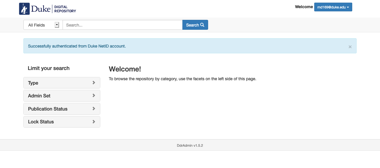
ddr admin interface
Administrative interface for the DDR

We also used this opportunity to revise the repository landing page at repository.duke.edu and I was involved in building a new version of the home page. Our main goals were to make use of a header implementation that mirrored our design work in other recent library projects and that integrated our ‘unified’ navigation, while also maintaining the functionality required by the Samvera software.

Old DDR Homepage
DDR home page before the redesign

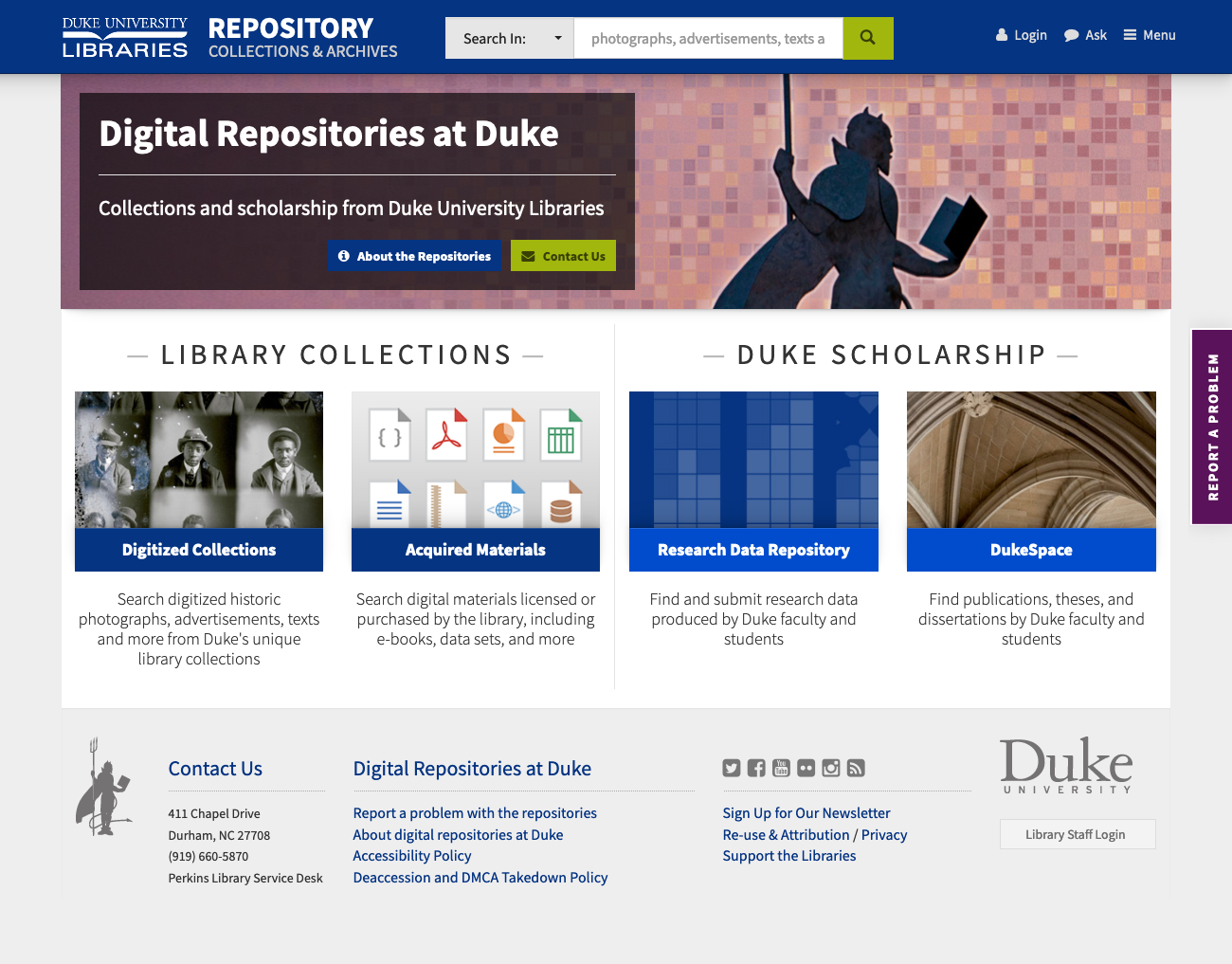
We also spent a lot of time thinking about how best to illustrate the components of the Duke Digital Repository while trying to keep the content simple and streamlined. In the end we went with a design that emphasizes the two branches of the repository; Library Collections and Duke Scholarship. Each branch in turn links to two destinations — Digitized Collections / Acquired Materials and the Research Data Repository / DukeSpace. The overall design is more compact than before and hopefully an improvement aesthetically as well.

new DDR homepage
Redesigned DDR home page

We also incorporated a feedback form that is persistent across the interface so that users can more readily report any difficulties they encounter while using the platform. And finally, we updated the content in the footer to help direct users to the content they are more than likely looking for.

Future plans include incorporating our header and footer content more consistently across the repository platforms along with bringing a more unified look and feel to interface components.

Check out the new design and let us know what you think!

Building a new Staff Directory

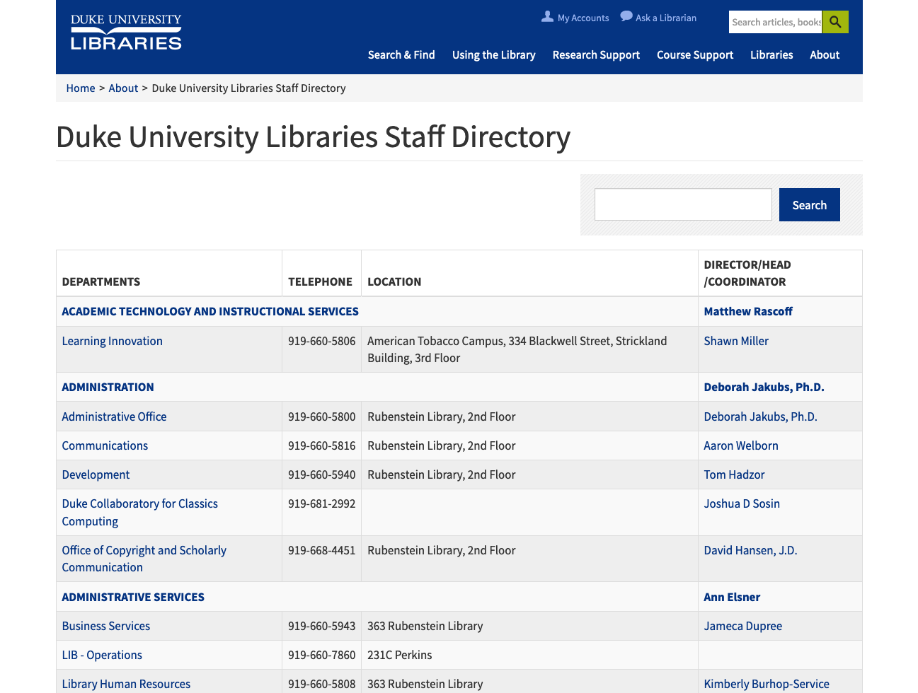
The staff directory on the Library’s website was last overhauled in late 2014, which is to say that it has gotten a bit long in the tooth! For the past few months I’ve been working along with my colleagues Sean Aery, Tom Crichlow, and Derrek Croney on revamping the staff application to make it more functional, easier to use, and more visually compelling.

staff directory interface
View of the legacy staff directory interface


Our work was to be centered around three major components — an admin interface for HR staff, an edit form for staff members, and the public display for browsing people and departments. We spent a considerable amount of time discussing the best ways to approach the infrastructure for the project. In the end we settled on a hybrid approach in which the HR tool would be built as a Ruby-on-Rails application, and we would update our existing custom Drupal module for staff editing and public UI display.

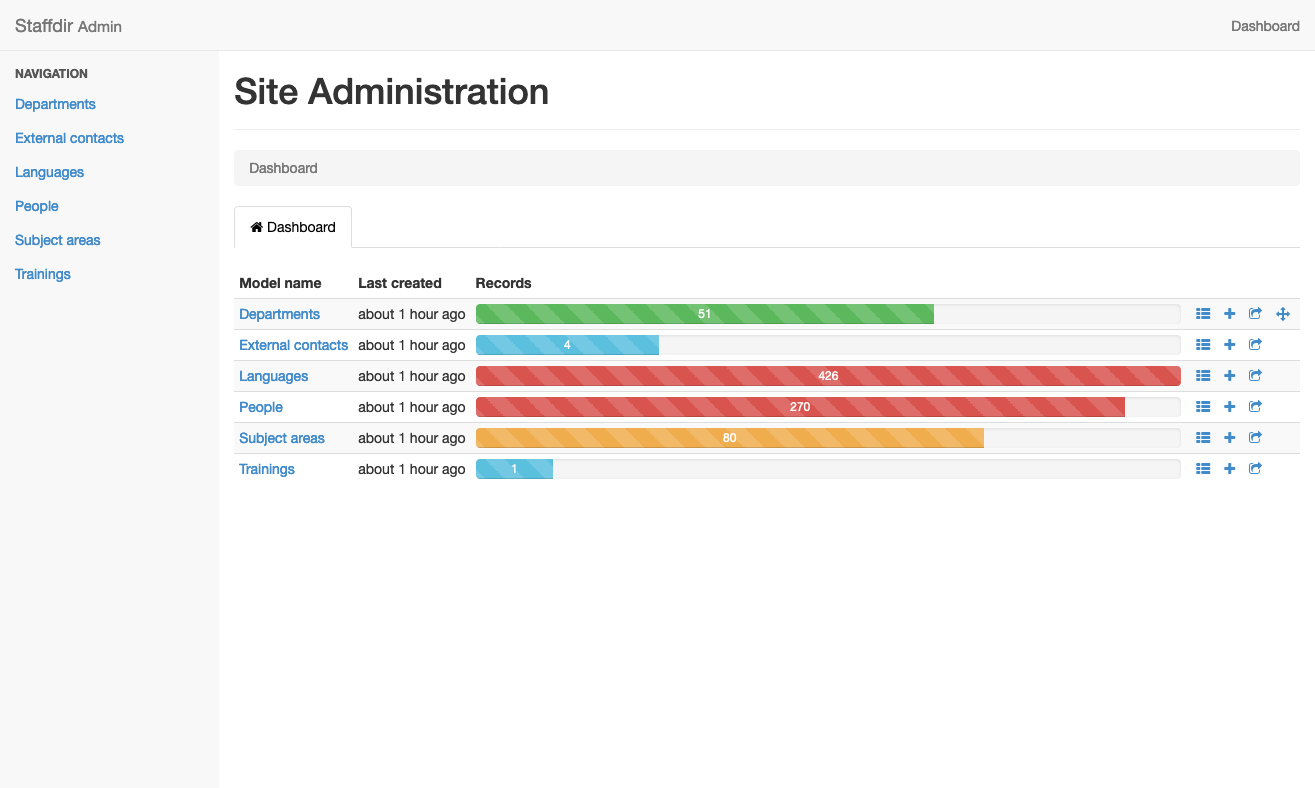
We created a seed file for our Rails app based on the legacy data from the old application and then got to work building the HR interface. We decided to rely on the Rails Admin gem as it met most of our use cases and had worked well on some other internal projects. As we continued to add features, our database models became more and more complex, but working in Rails makes these kind of changes very straightforward. We ended up with two main tables (People and Departments) and four auxiliary tables to store extra attributes (External Contacts, Languages, Subject Areas, and Trainings).

rails admin
View of the Rails Admin dashboard


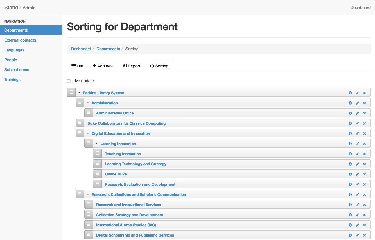
We also made use of the Ancestry gem and the Nestable gem to allow HR staff to visually sort department hierarchy. This makes it very easy to move departments around quickly and using a visual approach, so the next time we have a large department reorganization it will be very easy to represent the changes using this tool.

department sorting
Nestable gem allows for easy sorting of departments


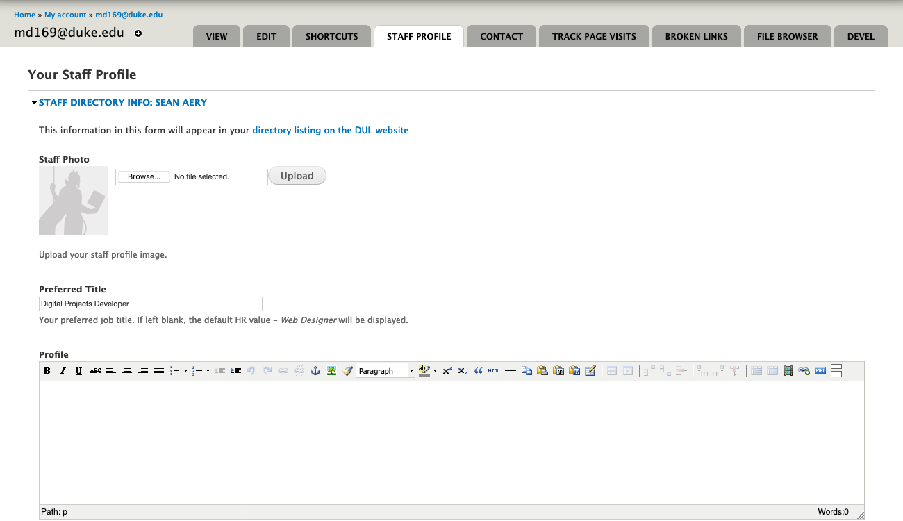
After the HR interface was working well, we concentrated our efforts on the staff edit form in Drupal. We’d previously augmented the default Drupal profile editor with our extra data fields, but wanted to create a new form to make things cleaner and easier for staff to use. We created a new ‘Staff Profile’ tab and also included a link on the old ‘Edit’ tab that points to the new form. We’re enabling staff to include their subject areas, preferred personal pronouns, language expertise, and to tie into external services like ORCID and Libguides.

drupal edit form
Edit form for Staff Profile


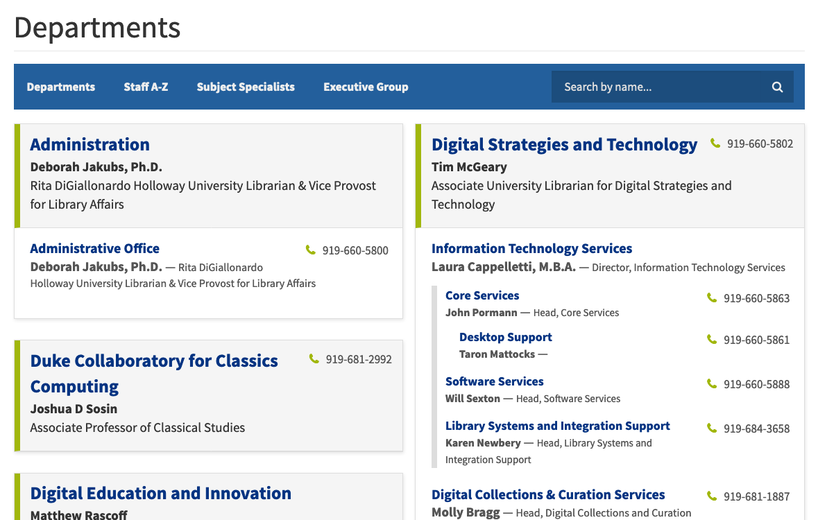
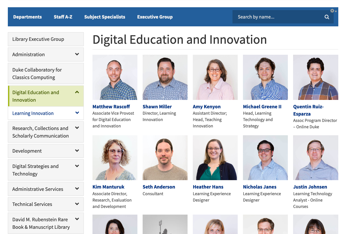
The public UI in Drupal is where most of our work has gone. We’ve created four approaches to browsing; Departments, A–Z, Subject Specialists, and Executive Group. There is also a name search that incorporates typeahead for helping users find staff more efficiently.

The Department view displays a nested view of our complicated organizational structure which helps users to understand how a given department relates to another one. You can also drill down through departments when you’ve landed on a department page.

departments
View of departments


Department pages display all staff members therein and positions managers at the top of the display. We also display the contact information for the department and link to the department website if it exists.

department example
Example of a department page


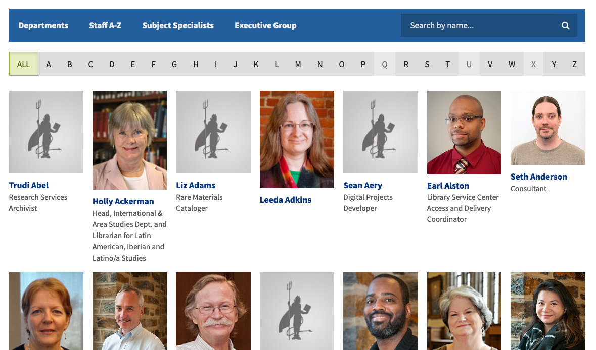
The Staff A–Z list allows users to browse through an alphabetized list of all staff in the library. One challenge we’re still working through is staff photos. We are lacking photos for many of our staff, and many of the photos we do have are out of date and inconsistently formatted. We’ve included a default avatar for staff without photos to help with consistency, but they also serve the purpose of highlighting the number of staff without a photo. Stay tuned for improvements on this front!

a-to-z list
A-to-Z browse


The Subject Specialists view helps in finding specific subject librarians. We include links to relevant research guides and appointment scheduling. We also have a text filter at the top of the display that can help quickly narrow the results to whatever area you are looking for.

subject specialists
Subject Specialists view


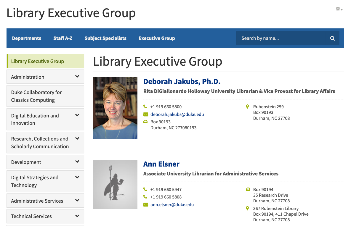
The Executive Group display is a quick way to view the leadership of the library.

executive group
Executive Group display


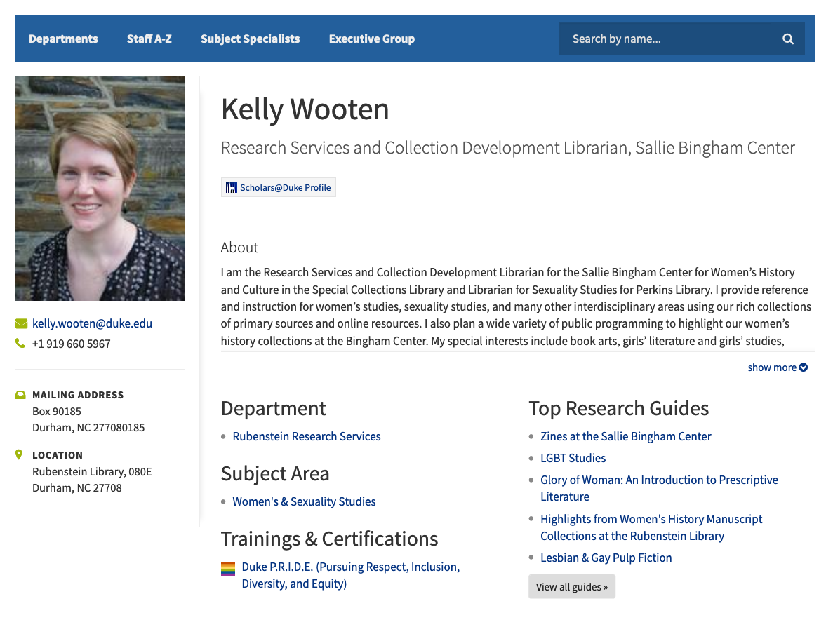
One last thing to highlight is the staff display view. We spent considerable effort refining this, and I think our work has really paid off. The display is clean and modern and a great improvement from what we had before.

old profile
View of staff profile in legacy application
updated profile
View of the same profile in the new application


In addition to standard information like name, title, contact info, and department, we’re displaying:

  • a large photo of the staff person
  • personal pronouns
  • specialized trainings (like Duke’s P.R.I.D.E. program)
  • links our to ORCID, Libguides, and Libcal scheduling
  • customizable bio (with expandable text display)
  • language expertise
  • subject areas

Our plan is to roll out the new system at the end of the month, so you can look forward to a greatly improved staff directory experience soon!

Bringing 500 Years of Women’s Work Online

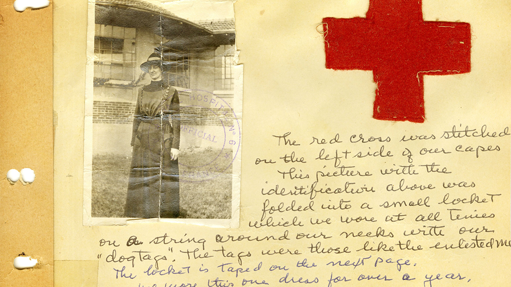
Back in 2015, Lisa Unger Baskin placed her extensive collection of more than 11,000 books, manuscripts, photographs, and artifacts in the Sallie Bingham Center for Women’s History & Culture in the David M. Rubenstein Rare Book & Manuscript Library. In late February of 2019, the Libraries opened the exhibit “Five Hundred Years of Women’s Work: The Lisa Unger Baskin Collection” presenting visitors with a first look at the diversity and depth of the collection, revealing the lives of women both famous and forgotten and recognizing their accomplishments. I was fortunate to work on the online component of the exhibit in which we aimed to offer an alternate way to interact with the materials.

Homepage of the exhibit

Most of the online exhibits I have worked on have not had the benefit of a long planning timeframe, which usually means we have to be somewhat conservative in our vision for the end product. However, with this high-profile exhibit, we did have the luxury of a (relatively) generous schedule and as such we were able to put a lot more thought and care into the planning phase. The goal was to present a wide range and number of items in an intuitive and user-friendly manner. We settled on the idea of arranging items by time period (items in the collection span seven centuries!) and highlighting the creators of those items.

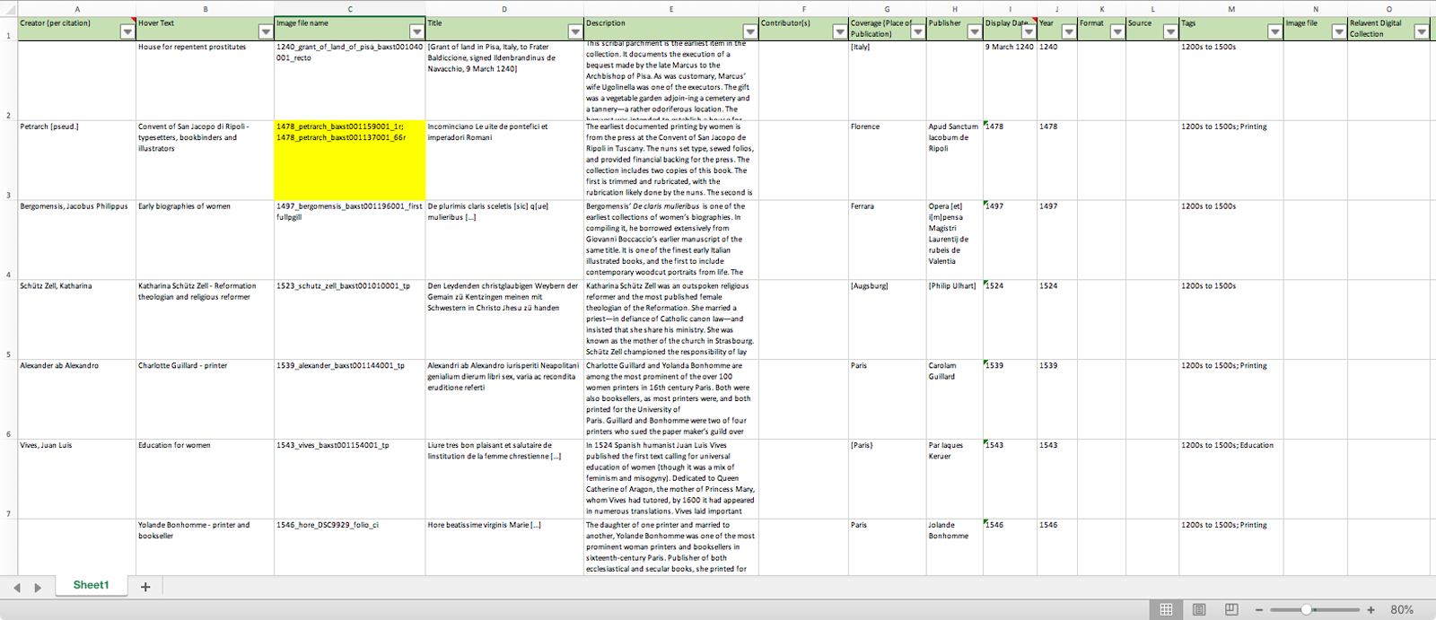
We also decided to use Omeka (classic!) for our content management system as we’ve done with most of our other online exhibits. Usually exhibit curators manually enter the item information for their exhibits, which can get somewhat tedious. In this case, we were dealing with more than 250 items, which seemed like a lot of work to enter one at a time. I was familiar with the CSV Import plugin for Omeka, which allows for batch uploading items and mapping metadata fields. It seemed like the perfect solution to our situation. My favorite feature of the plugin is that it also allows for quickly undoing an ingest in case you discover that you’ve made a mistake with mapping fields or the like, which made me less nervous about applying batch uploads to our production Omeka instance that already contained about 1,100 items.

Metadata used for batch upload

Working with the curators, we came up with a data model that would nest well within Omeka’s default Dublin-core based approach and expanded that with a few extra non-standard fields that we attached to a new custom item type. We then assembled a small sample set of data in spreadsheet form and I worked on spinning up a local instance of Omeka to test and make sure our approach was actually going to work! After some frustrating moments with MAMP and tracking down strange paths to things like imagemagick (thank you eternally, Stack Overflow!) I was able to get things running well and was convinced the batch uploads via spreadsheet was a good approach.

Now that we had a process in place, I began work on a custom theme to use with the exhibit. I’d previously used Omeka Foundation (a grid-based starter theme using the Zurb Foundation CSS framework) and thought it seemed like a good place to start with this project. The curators had a good idea of the site structure that they wanted to use, so I jumped right in on creating some high-fidelity mockups borrowing look-and-feel cues from the beautiful print catalog that was produced for the exhibit. After a few iterations we arrived at a place where everyone was happy and I started to work on functionality. I also worked on incorporating a more recent version of the Foundation framework as the starter theme was out of date.

Print catalog for the exhibit

The core feature of the site would be the ability to browse all of the items we wanted to feature via the Explore menu, which we broke into seven sections — primarily by time period, but also by context. After looking at some other online exhibit examples that I thought were successful, we decided to use a masonry layout approach (popularized by sites like Pinterest) to display the items. Foundation includes a great masonry plugin that was very easy to implement. Another functionality issue had to do with displaying multi-page items. Out of the box, I think Omeka doesn’t do a great job displaying items that contain multiple images. I’ve found combining them into PDFs works much better, so that’s what we did in this case. I also installed the PDF Embed plugin (based on the PDF.js engine) in order to get a consistent experience across browsers and platforms.

Once we got the theme to a point that everyone was happy with it, I batch imported all of the content and proceeded with a great deal of cross-platform testing to make sure things were working as expected. We also spent some time refining the display of metadata fields and making small tweaks to the content. Overall I’m very pleased with how everything turned out. User traffic has been great so far so it’s exciting to know that so many people have been able to experience the wonderful items in the exhibit. Please check out the website and also come visit in person — on display until June 15, 2019.

Examples of 'Explore' and 'Item' pages
Examples of ‘Explore’ and ‘Item’ pages

Bringing ‘Views of the Great War’ to life

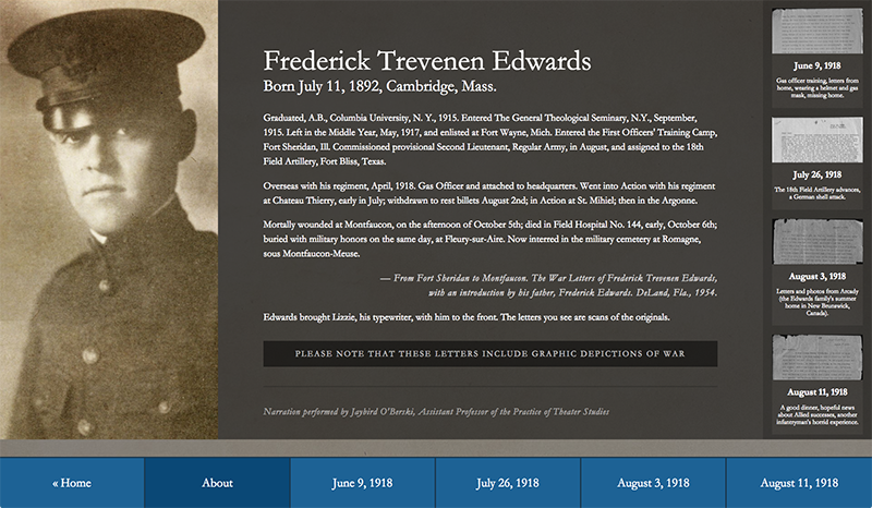
I recently worked on an interactive kiosk for a new exhibit in the library — Views of the Great War: Highlights from the Duke University Libraries. Elizabeth Dunn, the exhibit curator, wanted to highlight a series of letters that shared the experiences of two individuals during the war. She was able to recruit the talents of Jaybird O’Berski and Ahnna Beruk who brought the writings of Frederick Trevenen Edwards and Ann Henshaw Gardiner to life.


letter excerpt
Excerpt from Edwards’ June 9, 1918 Letter


Elizabeth and I booked time for Jay and Ahhna in the Multimedia Production Studio where we recorded their performances. I then edited down multiple takes into more polished versions and created files I could use with the kiosk. I also used youtube’s transcript tool to get timed captions working well and to export VTT files.

Here is an example:


The final interface allows users to both listen to the performances and read timed transcriptions of the letters while also being able to scroll through the original typed versions.


screenshot of interface

screenshot of interface

screenshot of interface
Screenshots of the kiosk interface


The exhibit is housed in the Mary Duke Biddle Room and runs through February 16. Come check it out!

Baby Advice (from Duke Digital Collections)

As a recent first-time parent, I’m constantly soliciting advice from other more experienced people I meet about how best to take care of my baby. I thought it might be fun to peruse the Duke Digital Collections to see what words of wisdom could be gleaned from years past.


This 1930 ad, part of the Medicine and Madison Avenue collection, advises that we should make regular visits to the doctor’s office so our baby can be ‘carefully examined, measured, weighed and recorded.’ Excellent – we’ve been doing that!


This one from 1946 offers the ‘newest facts and findings on baby care and feeding.’ Overall the advice largely seems applicable to today. I found this line to be particularly fun:

Let your child participate in household tasks — play at dusting or cooking or bedmaking. It’s more of a hindrance than a help, but it gives the youngster a feeling of being needed and loved.


Baby strollers seem to have many innovative features these days, but more than 100 years ago the Oriole Go-Basket — a ‘combined Go-Cart, High Chair, Jumper and Bassinet’ — let you take your baby everywhere.


I’m a puzzled father of a rather young child — it’s like this 1933 ad was written just for me…


Of all the digitized materials in the collections I searched through, this 1928 booklet from the Emergence of Advertising in America collection seems to hold the most knowledge. On page 15, they offer ‘New Ways to Interest the Whole Family’ and suggest serving ‘Mapl-Flake’ and ‘Checkr-Corn Flake’ — are these really Web startups from 2005?


And finally, thanks to this 1955 ad, I’m glad to know I can give my baby 7-up, especially when mixed in equal parts with milk. ‘It’s a wholesome combination — and it works!’

Yasak/Banned Kiosk

Recently I worked on a simple kiosk for a new exhibit in the library, Yasak/Banned: Political Cartoons from Late Ottoman and Republican Turkey. The interface presents users with three videos featuring the curators of the exhibit that explain the historical context and significance of the items in the exhibit space. We also included a looping background video that highlights many of the illustrations from the exhibit and plays examples of Turkish music to help envelop visitors into the overall experience.

With some of the things I’ve built in the past, I would setup different section of an interface to view videos, but in this case I wanted to keep things as simple as possible. My plan was to open each video in an overlay using fancybox. However, I didn’t want the looping background audio to interfere with the curator videos. We also needed to include a ‘play/pause’ button to turn off the background music in case there was something going on in the exhibit space. And I wanted all these transitions to be as smooth as possible so that the experience wouldn’t be jarring. What seemed reasonably simple on the surface proved a little more difficult than I thought.

After trying a few different approaches with limited success, as usual stackoverflow revealed a promising direction to go in — the key turned out to be the .animate jQuery method.

The first step was to write functions to ‘play/pause’ – even though in this case we’d let the background video continue to play and only lower the volume to zero. The playVid function sets the volume to 0, then animates it back up to 100% over three seconds. pauseVid does the inverse, but more quickly.

function playVid() {
  vid.volume = 0;
  $('#myVideo').animate({
    volume: 1
  }, 3000); // 3 seconds
  playBtn.style.display = 'none';
  pauseBtn.style.display = 'block';
}

function pauseVid() {
  // really just fading out music
  vid.volume = 1;
  $('#myVideo').animate({
    volume: 0
  }, 750); // .75 seconds

  playBtn.style.display = 'block';
  pauseBtn.style.display = 'none';
}

The play and pause buttons, which are positioned on top of each other using CSS, are set to display or hide in the functions above. The are also set to call the appropriate function using an onclick event. Their markup looks like this:

<button onclick="playVid()" type="button" id="play-btn">Play</button>
<button onclick="pauseVid()" type="button" id="pause-btn">Pause</button>

Next I added an onclick event calling our pause function to the link that opens our fancybox window with the video in it, like so:

<a data-fancybox-type="iframe" href="https://my-video-url" onclick="pauseVid();"><img src="the-video-thumbnail" /></a>

And finally I used the fancybox callback afterClose to ramp up the background video volume over three seconds:

afterClose: function () {
  vid.volume = 0;
  $('#myVideo').animate({
    volume: 1
  }, 3000);
  playBtn.style.display = 'none';
  pauseBtn.style.display = 'block';
},

play/pause demo
play/pause demo

You can view a demo version and download a zip of the assets in case it’s helpful. I think the final product works really well and I’ll likely use a similar implementation in future projects.

SNCC Digital Gateway Homepage Updates

Earlier this summer I worked with the SNCC Digital Gateway team to launch a revised version of their homepage. The SNCC Digital Gateway site originally was launched in the Fall of 2016. Since then much more content has been incorporated into the site. The team and their advisory board wanted to highlight some of this new content on the homepage (by making it scrollable) while also staying true to the original design.

The previous version of the homepage included two main features:

  • a large black and white photograph that would randomly load (based on five different options) every time a user visited the page
  • a ‘fixed’ primary navigation in the footer

Rotating Background Images

In my experience, the ‘go to’ approach for doing any kind of image rotation is to use a Javascript library, probably one that relies on jQuery. My personal favorite for a long time has been jQuery Cycle 2 which I appreciated for it’s lightweight, flexible implementation, and price ($free!). With the new SNCC homepage, I wanted to figure out a way to both crossfade the background images and fade the caption text in and out elegantly. It was also critical that the captions match up perfectly with their associated images. I was worried that doing this with Cycle 2 was going to be overly complicated with respect to syncing the timing, as in some past projects I’d run into trouble keeping discrete carousels locked in sync after several iterations — for example, with leaving the page up and running for several minutes.

I decided to try and build the SNCC background rotation using CSS animations. In the past I’d shied away from using CSS animations for anything that was presented as a primary feature or that was complex as the browser support was spotty. However, the current state of browser support is better, even though it still has a ways to go. In my first attempt I tried crossfading the images as backgrounds in a wrapper div, as this was going to make things work with resizing the page much easier by using background-size: cover property. But I discovered that animating background images isn’t actually supported in the spec, even though it worked perfectly in Chrome and Opera. So instead I went with the approach where you stack the images on top of each other and change the opacity one at a time, like so:

<div class="bg-image-wrapper">
  <img src="image-1.jpg" alt="">
  <img src="image-2.jpg" alt="">
  <img src="image-3.jpg" alt="">
  <img src="image-4.jpg" alt="">
  <img src="image-5.jpg" alt="">
</div>

I setup the structure for the captions in a similar way:

<div id="home-caption">
  <li>caption 1</li>
  <li>caption 2</li>
  <li>caption 3</li>
  <li>caption 4</li>
  <li>caption 5</li>
</div>

I won’t bore you with the details of CSS animation, but in short they are based on keyframes that can be looped and applied to html elements. The one thing that proved to be a little tricky was the timing between the images and the captions, as the keyframes are represented in percentages of the entire animation. This was further complicated by the types of transitions I was using (crossfading the images and linearly fading the captions) and that I wanted to slightly stagger the caption animations so that they would come in after the crossfade completes and transition out just before the next crossfade starts, like so:

Crossfade illustration
As time moves from left to right, the images and captions have independent transitions

The SNCC team and I also discussed a few options for the overall timing of the transitions and settled on eight seconds per image. With five images in our rotation, the total time of the animation would be 40 seconds. The entire animation is applied to each image, and offset with a delay based on their position in the .bg-image-wrapper stack. The CSS for the images looks like this:

.bg-image-wrapper img {
  animation-name: sncc-fader;
  animation-timing-function: ease-in-out;
  animation-iteration-count: infinite;
  animation-duration: 40s;
}


@keyframes sncc-fader {
  0% {
    opacity:1;
  }
  16% {
    opacity:1;
  }
  21% {
    opacity:0;
  }
  95% {
    opacity:0;
  }
  100% {
    opacity:1;
  }
}

.bg-image-wrapper img:nth-of-type(1) {
  animation-delay: 32s;
}
.bg-image-wrapper img:nth-of-type(2) {
  animation-delay: 24s;
}
.bg-image-wrapper img:nth-of-type(3) {
  animation-delay: 16s;
}
.bg-image-wrapper img:nth-of-type(4) {
  animation-delay: 8s;
}
.bg-image-wrapper img:nth-of-type(5) {
  animation-delay: 0;
}

The resulting animation looks something like this:

SNCC example rotation

The other piece of the puzzle was emulating the behavior of background: cover which resizes a background image to fill the entire width of a div and positions the image vertically in a consistent way. In general I really like using this attribute. I struggled to get things working on my own, but eventually came across a great code example of how to get things working. So I copied that implementation and it worked perfectly.

Fixed Nav

I was worried that getting the navigation bar to stay consistently positioned at the bottom of the page and allowing for scrolling — while also working responsively — was going to be a bit of a challenge. But in the end the solution was relatively simple.

The navigation bar is structured in a very typical way — as an unordered list with each menu element represented as a list item, like so:

<div id="navigation">
    <ul>
      <li><a href="url1">menu item 1</a></li>
      <li><a href="url2">menu item 2</a></li>
      <li><a href="url3">menu item 3</a></li>
    </ul>
</div>

To get it to ‘stick’ to the bottom of the page, I just placed it using position: absolute, gave it a fixed height, and set the width to 100%. Surprisingly, worked great just like that, and also allowed the page to be scrolled to reveal the content further down the page.


You can view the updated homepage by visiting snccdigital.org.