Category Archives: Digital Exhibits

Managing impermanence – migration of the Libraries’ digital exhibits

Post contributed by Claire Cahoon, student in the master’s program at the School of Information and Library Science, UNC-Chapel Hill.

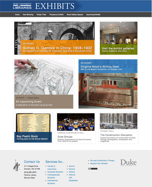
This summer I worked as a field experience student in the Software Services department migrating digital exhibits into Omeka 2, Duke’s most current platform. The ultimate goal was to start and document the process of moving exhibits from legacy platforms into Omeka 2.

The reasoning behind the project became clear as we started creating an index of all of the digital exhibits on display in the exhibits website. Out of 97 total exhibits, there were varying degrees of functionality, from the most recent and up-to-date exhibits, to sites with broken links and pages where only text would display, leaving out crucial images. Centralizing these into a single platform should make it easier to create, support, and maintain all of these exhibits.

Screenshot of the sidebar of an exhibit, showing the link to the previous version of the exhibit in the Internet Archive

I found exhibits in Omeka 1, Cascade, Scriptorium, JAlbum, and even found a few mystery platforms that we never identified. Since it was the largest, we decided to work on the Omeka 1 group over the summer, and this week I finished migrating all 34 exhibits – that means that after a few adjustments to make the new exhibits available, Omeka 1 can be shut off!

We worked with Meg Brown, Exhibits Coordinator for the Libraries, and the exhibits department to figure out how each exhibit needed to be represented. Since we were managing expectations from lots of different stakeholders, we landed on the idea to include a link to the archived version of each exhibit in the WayBack machine, in case the look and feel of the new exhibits is limiting for anyone used to Omeka 1.

Working with the internet archive links and sorting through broken pieces of these exhibits really put into perspective how impermanent the internet is, even for seemingly static information. Without much maintenance, these exhibits lost some of the core content when video links changed, references were lost, and even the most well-written custom code stopped working. I hope that my work this summer will help keep these exhibit materials in working order while also eliminating the need to continue supporting for Omeka 1.

While migrating, I came across a few favorite exhibits and items that combined interesting content and some updated features in Omeka 2:

Cover of “Anxious homes: cursory-cleaning for the imminent arrival of visitors or how to give the impression of a clean house in under 20 minutes” by Jackie Batey.
Cover of “Anxious homes: cursory-cleaning for the imminent arrival of visitors or how to give the impression of a clean house in under 20 minutes” by Jackie Batey. Available in the Rubenstein Library: N7433.4.B38 A59 2006

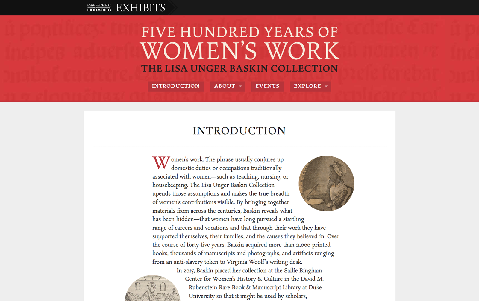
Book + Art: Artists’ books from the Sallie Bingham Center for Women’s History and Culture (and the old version of Book + Art)

John Hope Franklin: Imprint of an American Scholar (and the old version of the John Hope Franklin exhibit)

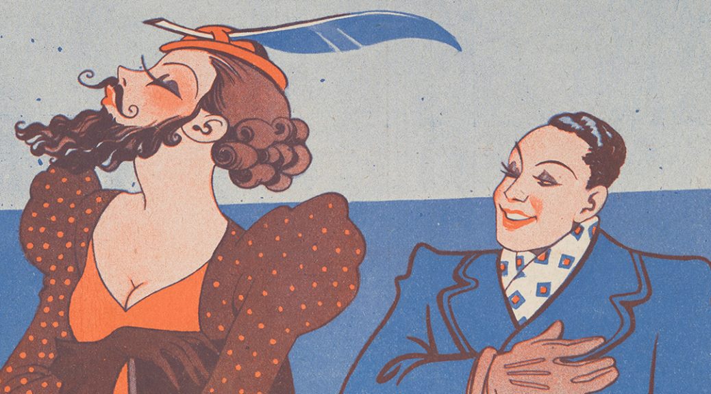
Cheap Thrills: The Highs and Lows of Paris’s Cabaret Culture (and the old version of Cheap Thrills)

Medicology, or, Home encyclopedia of health: a complete family guide... Vol. I, by Joseph Gibbons Richardson (1904).
Medicology, or, Home encyclopedia of health: a complete family guide… Vol. I, by Joseph Gibbons Richardson (1904). Available in the Rubenstein Library: RC81 .R52 1904

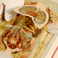
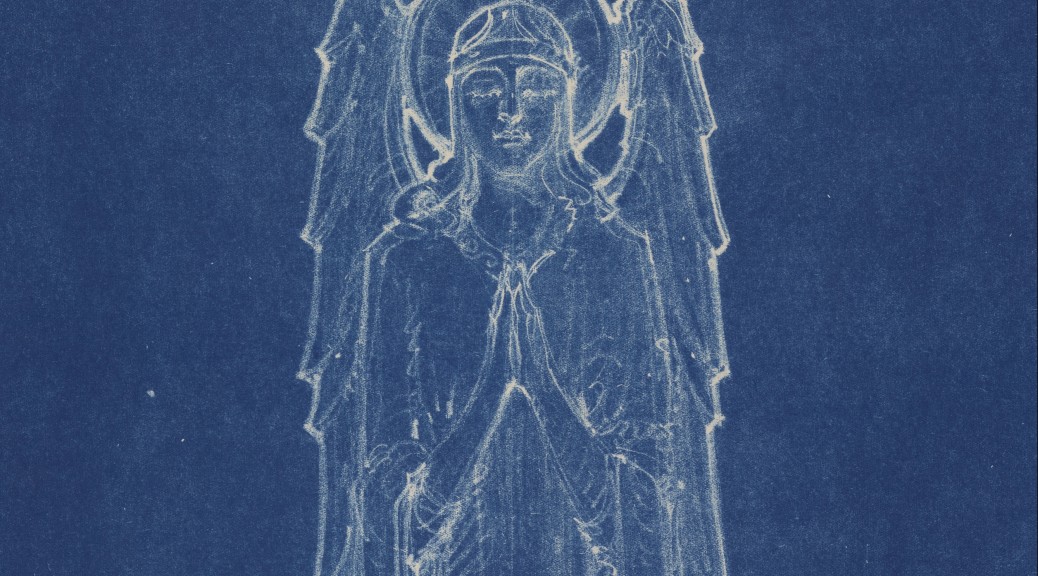
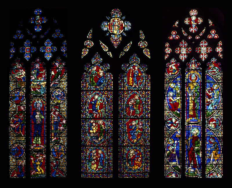
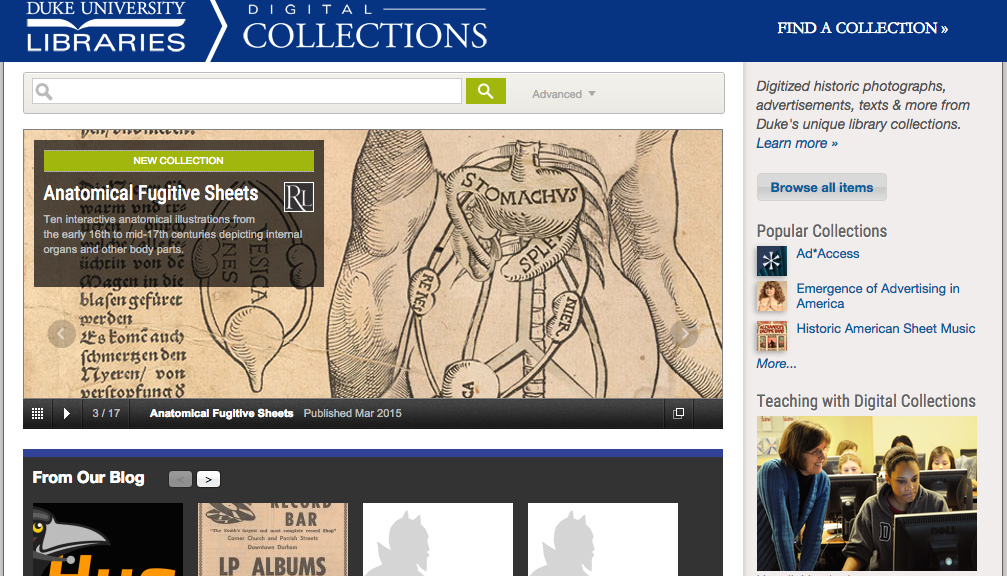
Animated Anatomies: The Human Body in Anatomical Texts from the 16th to 21st Centuries (and the old version of Animated Anatomies)

Omeka still has some quirks to work out, and the accessibility of the pages and the metadata display are still in the works. However, migrating these exhibits into Omeka 2 will make them much easier to support and change for improvements. Thanks to the team that worked with me and taught me so much this summer: Will Sexton, Michael Daul, and Meg Brown!

Bringing 500 Years of Women’s Work Online

Back in 2015, Lisa Unger Baskin placed her extensive collection of more than 11,000 books, manuscripts, photographs, and artifacts in the Sallie Bingham Center for Women’s History & Culture in the David M. Rubenstein Rare Book & Manuscript Library. In late February of 2019, the Libraries opened the exhibit “Five Hundred Years of Women’s Work: The Lisa Unger Baskin Collection” presenting visitors with a first look at the diversity and depth of the collection, revealing the lives of women both famous and forgotten and recognizing their accomplishments. I was fortunate to work on the online component of the exhibit in which we aimed to offer an alternate way to interact with the materials.

Homepage of the exhibit

Most of the online exhibits I have worked on have not had the benefit of a long planning timeframe, which usually means we have to be somewhat conservative in our vision for the end product. However, with this high-profile exhibit, we did have the luxury of a (relatively) generous schedule and as such we were able to put a lot more thought and care into the planning phase. The goal was to present a wide range and number of items in an intuitive and user-friendly manner. We settled on the idea of arranging items by time period (items in the collection span seven centuries!) and highlighting the creators of those items.

We also decided to use Omeka (classic!) for our content management system as we’ve done with most of our other online exhibits. Usually exhibit curators manually enter the item information for their exhibits, which can get somewhat tedious. In this case, we were dealing with more than 250 items, which seemed like a lot of work to enter one at a time. I was familiar with the CSV Import plugin for Omeka, which allows for batch uploading items and mapping metadata fields. It seemed like the perfect solution to our situation. My favorite feature of the plugin is that it also allows for quickly undoing an ingest in case you discover that you’ve made a mistake with mapping fields or the like, which made me less nervous about applying batch uploads to our production Omeka instance that already contained about 1,100 items.

Metadata used for batch upload

Working with the curators, we came up with a data model that would nest well within Omeka’s default Dublin-core based approach and expanded that with a few extra non-standard fields that we attached to a new custom item type. We then assembled a small sample set of data in spreadsheet form and I worked on spinning up a local instance of Omeka to test and make sure our approach was actually going to work! After some frustrating moments with MAMP and tracking down strange paths to things like imagemagick (thank you eternally, Stack Overflow!) I was able to get things running well and was convinced the batch uploads via spreadsheet was a good approach.

Now that we had a process in place, I began work on a custom theme to use with the exhibit. I’d previously used Omeka Foundation (a grid-based starter theme using the Zurb Foundation CSS framework) and thought it seemed like a good place to start with this project. The curators had a good idea of the site structure that they wanted to use, so I jumped right in on creating some high-fidelity mockups borrowing look-and-feel cues from the beautiful print catalog that was produced for the exhibit. After a few iterations we arrived at a place where everyone was happy and I started to work on functionality. I also worked on incorporating a more recent version of the Foundation framework as the starter theme was out of date.

Print catalog for the exhibit

The core feature of the site would be the ability to browse all of the items we wanted to feature via the Explore menu, which we broke into seven sections — primarily by time period, but also by context. After looking at some other online exhibit examples that I thought were successful, we decided to use a masonry layout approach (popularized by sites like Pinterest) to display the items. Foundation includes a great masonry plugin that was very easy to implement. Another functionality issue had to do with displaying multi-page items. Out of the box, I think Omeka doesn’t do a great job displaying items that contain multiple images. I’ve found combining them into PDFs works much better, so that’s what we did in this case. I also installed the PDF Embed plugin (based on the PDF.js engine) in order to get a consistent experience across browsers and platforms.

Once we got the theme to a point that everyone was happy with it, I batch imported all of the content and proceeded with a great deal of cross-platform testing to make sure things were working as expected. We also spent some time refining the display of metadata fields and making small tweaks to the content. Overall I’m very pleased with how everything turned out. User traffic has been great so far so it’s exciting to know that so many people have been able to experience the wonderful items in the exhibit. Please check out the website and also come visit in person — on display until June 15, 2019.

Examples of 'Explore' and 'Item' pages
Examples of ‘Explore’ and ‘Item’ pages

Bringing ‘Views of the Great War’ to life

I recently worked on an interactive kiosk for a new exhibit in the library — Views of the Great War: Highlights from the Duke University Libraries. Elizabeth Dunn, the exhibit curator, wanted to highlight a series of letters that shared the experiences of two individuals during the war. She was able to recruit the talents of Jaybird O’Berski and Ahnna Beruk who brought the writings of Frederick Trevenen Edwards and Ann Henshaw Gardiner to life.


letter excerpt
Excerpt from Edwards’ June 9, 1918 Letter


Elizabeth and I booked time for Jay and Ahhna in the Multimedia Production Studio where we recorded their performances. I then edited down multiple takes into more polished versions and created files I could use with the kiosk. I also used youtube’s transcript tool to get timed captions working well and to export VTT files.

Here is an example:


The final interface allows users to both listen to the performances and read timed transcriptions of the letters while also being able to scroll through the original typed versions.


screenshot of interface

screenshot of interface

screenshot of interface
Screenshots of the kiosk interface


The exhibit is housed in the Mary Duke Biddle Room and runs through February 16. Come check it out!

Woman: The World Over

An amazing collection of lantern slides depicting women from nations around the world. At first glance, the women in these portraits seem like other portraits of the time, generally nondescript portraits of people at some random moment in time.  But upon closer inspection, and with the use of an accompanying lecture booklet, a much deeper picture is painted of the lives of these women.

Women: The World Over is a commercially-produced set of slides created by the European firm Riley Brothers in Bradford, England in 1901 that boasts a catalogue of 1,500 slide sets for sale or hire with lecture-format captions. These slides include women of different classes, working in agricultural, service, and industrial settings with lecture notes that refer to problematic social conditions for women, particularly regarding marriage, and changing social norms as the 20th century begins.

These lantern slides are part of the Lisa Unger Baskin Collection, a large collection with a common thread of revealing the often hidden role of women working and being productive throughout history.  The slides  will be a part of the exhibition, 500 Years of Women’s Work: the Lisa Unger Baskin Collection on display from March 5-June 15, 2019 in the Biddle Rare Book Room, Stone Family Gallery, and History of Medicine Room.

Included with the images below are transcriptions from the lecture booklet that accompanies this set of slides and contain views of the time and the author’s opinion.

“Arab women. Here we have some city Arab women coming from the well. These women are always veiled in public, the long black veil extending from their eyes down to their waist, and sometimes to their feet. Between their eyes, and stretching upwards to their foreheads, is a curious brass ornament resembling three stout thimbles, one on top of another. This serves a double purpose­ to act as an ornament, and to still further conceal the features. The rest of the figure is enveloped in a long gown with very wide sleeves. No one can fail to be struck with the upright walk of the women in Egypt, and some say it is due to their habit of carrying heavy weights on their heads, which renders it necessary to walk very erect and firmly.”
“Market Women, Madeira. We are now in sunny Madeira, where a group of market women await our notice. The streets of Funchal are always bright and busy. Sledges laden with sugar cane, barrels of wine or luggage, and drawn by oxen, dispute the road with hammock bearers and porters of all descriptions. But the gaily dressed women and girls who hasten about with heavy loads upon their backs, and with bright coloured handkerchiefs upon their heads, are the most interesting sight. Baskets of fruit and vegetables are their commonest burdens, and very picturesque the groups look, whether they are standing at the street corner discussing the rise and fall in prices, or seated upon the ground as in the present instance, or walking slowly homewards in the cool of the day. They are a pleasant folk, and live a life of comparative freedom and pleasure.”
“Hulling Rice in the Philippines. Here we have come across some Philippine women engaged in hulling rice. There are immense rice fields in all parts of the island which give employment to thousands of people. Rice is their staple food and the home product is not yet sufficient for the home consumption. A family of five persons will consume about 250 lbs. of rice per month. No rice husking or winnowing machines are in use, save small ones for domestic purposes The grain is usually husked in a large hard-wood mortar, where it is beaten with a pestle, several women, and sometimes men working over one mortar.”
“Haymaking in Russian. Then we all know that woman from the earliest recorded times has been employed in harvest operations, and has been at home in the field of peace. This seems fitting work for women, and work which she seems always willing to undertake.
The picture introduces us to a Russian haymaker, whose garment is of the most striking colours, and whose frame is built for hard work. The Russian peasantry of her class are a cheerful and contented folk, courteous to strangers, but not too friendly to soap the water.”

All 48 slides and the accompanying booklet will be published on the Digital Collections website later this year, included in the exhibit mentioned above and will also be traveling to the Grolier Club in New York city in December of 2019.  Keep an eye out for them!


Catalog Record: https://search.library.duke.edu/search?id=DUKE008113723

Finding Aid: https://library.duke.edu/rubenstein/findingaids/womantheworldover/

Yasak/Banned Kiosk

Recently I worked on a simple kiosk for a new exhibit in the library, Yasak/Banned: Political Cartoons from Late Ottoman and Republican Turkey. The interface presents users with three videos featuring the curators of the exhibit that explain the historical context and significance of the items in the exhibit space. We also included a looping background video that highlights many of the illustrations from the exhibit and plays examples of Turkish music to help envelop visitors into the overall experience.

With some of the things I’ve built in the past, I would setup different section of an interface to view videos, but in this case I wanted to keep things as simple as possible. My plan was to open each video in an overlay using fancybox. However, I didn’t want the looping background audio to interfere with the curator videos. We also needed to include a ‘play/pause’ button to turn off the background music in case there was something going on in the exhibit space. And I wanted all these transitions to be as smooth as possible so that the experience wouldn’t be jarring. What seemed reasonably simple on the surface proved a little more difficult than I thought.

After trying a few different approaches with limited success, as usual stackoverflow revealed a promising direction to go in — the key turned out to be the .animate jQuery method.

The first step was to write functions to ‘play/pause’ – even though in this case we’d let the background video continue to play and only lower the volume to zero. The playVid function sets the volume to 0, then animates it back up to 100% over three seconds. pauseVid does the inverse, but more quickly.

function playVid() {
  vid.volume = 0;
  $('#myVideo').animate({
    volume: 1
  }, 3000); // 3 seconds
  playBtn.style.display = 'none';
  pauseBtn.style.display = 'block';
}

function pauseVid() {
  // really just fading out music
  vid.volume = 1;
  $('#myVideo').animate({
    volume: 0
  }, 750); // .75 seconds

  playBtn.style.display = 'block';
  pauseBtn.style.display = 'none';
}

The play and pause buttons, which are positioned on top of each other using CSS, are set to display or hide in the functions above. The are also set to call the appropriate function using an onclick event. Their markup looks like this:

<button onclick="playVid()" type="button" id="play-btn">Play</button>
<button onclick="pauseVid()" type="button" id="pause-btn">Pause</button>

Next I added an onclick event calling our pause function to the link that opens our fancybox window with the video in it, like so:

<a data-fancybox-type="iframe" href="https://my-video-url" onclick="pauseVid();"><img src="the-video-thumbnail" /></a>

And finally I used the fancybox callback afterClose to ramp up the background video volume over three seconds:

afterClose: function () {
  vid.volume = 0;
  $('#myVideo').animate({
    volume: 1
  }, 3000);
  playBtn.style.display = 'none';
  pauseBtn.style.display = 'block';
},

play/pause demo
play/pause demo

You can view a demo version and download a zip of the assets in case it’s helpful. I think the final product works really well and I’ll likely use a similar implementation in future projects.

Digitizing for Exhibits

While most of my Bitstreams posts have focused on my work preserving and archiving audio collections, my job responsibilities also include digitizing materials for display in Duke University Libraries Exhibits.  The recent renovation and expansion of the Perkins Library entrance and the Rubenstein Library have opened up significantly more gallery space, meaning more exhibits being rotated through at a faster pace.

gallery2

Just in the past year, I’ve created digital images for exhibits on Vesalius’s study of human anatomy, William Gedney’s photographs, Duke Chapel’s stained glass windows, and the 1793 Yellow Fever epidemic.  I also worked with a wide range of materials spanning “books, manuscripts, photographs, recordings and artifacts that document human aspirations” for the Dreamers and Dissenters exhibit celebrating the reopening of the newly renovated David M. Rubenstein Rare Book & Manuscript Library.  The digital images are used to create enlargements and facsimiles for the physical exhibits and are also used in the online “virtual exhibits.”


Working with such a variety of media spanning different library collections presents a number of challenges and necessitates working closely with our Exhibits and Conservation departments.  First, we have to make sure that we have all of the items listed in the inventory provided by the exhibit curator.  Secondly, we have to make sure we have all of the relevant information about how each item should be digitally captured (e.g. What image resolution and file specifications?  Which pages from a larger volume?  What section of a larger map or print?)  Next we have to consider handling for items that are in fragile condition and need special attention.  Finally, we use all of this information to determine which scanner, camera, or A/V deck is appropriate for each item and what the most efficient order to capture them in is.

All of this planning and preliminary work helps to ensure that the digitization process goes smoothly and that most questions and irregularities have already been addressed.  Even so, there are always issues that come up forcing us to improvise creative solutions.  For instance:  how to level and stabilize a large, fragile folded map that is tipped into a volume with tight binding?  How to assemble a seamless composite image of an extremely large poster that has to be photographed in multiple sections?  How to minimize glare and reflection from glossy photos that are cupped from age?  I won’t give away all of our secrets here, but I’ll provide a couple examples from the Duke Chapel exhibit that is currently on display in the Jerry and Bruce Chappell Family gallery.

angel

This facsimile of a drawing for one of the Chapel’s carved angels was reproduced from an original architectural blueprint.  It came to us as a large and tightly rolled blueprint–so large, in fact, that we had to add a piece of plywood to our usual camera work surface to accommodate it.  We then strategically placed weights around the blueprint to keep it flattened while not obscuring the section with the drawing.  The paper was still slightly wrinkled and buckled in places (which can lead to uneven color and lighting in the resulting digital image) but fortunately the already mottled complexion of the blueprint material made it impossible to notice these imperfections.

projection

These projected images of the Chapel’s stained glass were reproduced from slides taken by a student in 1983 and currently housed in the University Archives.  After the first run through our slide scanner, the digital images looked okay on screen, but were noticeably blurry when enlarged.  Further investigation of the slides revealed an additional clear plastic protective housing which we were able to carefully remove.  Without this extra refractive layer, the digital images were noticeably sharper and more vibrant.

Despite the digitization challenges, it is satisfying to see these otherwise hidden treasures being displayed and enjoyed in places that students, staff, and visitors pass through everyday–and knowing that we played a small part in contributing to the finished product!


Chapel Exhibit

Over the past few weeks I’ve been working on content for a new exhibit in the library; An Iconic Identity: Stories and Voices of Duke University Chapel. I’d like to share what we created and how they were built.

Chapel Kiosk

The exhibit is installed in the Jerry and Bruce Chappell Family Gallery near the main entrance to the library. There are many exhibit cases filled with interesting items relating to the history of Duke Chapel. A touchscreen lenovo all-in-one computer is installed in the corner and runs a fullscreen version of Chrome containing an interface built in HTML. The interface encourages users to view six different videos and also listen to recordings of sermons given by some famous people over the years (including Desmond Tutu, Dr. Martin Luther King Sr., and Billy Graham) – these clips were pulled from our Duke Chapel Recordings digital collection. Here are some screenshots of the interface:

chapel-kiosk-1
Home screen
Detail of audio files interface
Playing audio clips
Video player interface
Playing a video

Carillon Video

One of the videos featured in the kiosk captures the University Carillonneur playing a short introduction, striking the bells to mark the time, and then another short piece. I was very fortunate to be able to go up into the bell tower and record J. Samuel Hammond  playing this unique instrument.  I had no idea as to the physicality involved and listening to the bells so close was really interesting. Here’s the final version of the video:

Chapel Windows

Another space in the physical exhibit features a projection of ten different stained glass windows from the chapel. Each window scrolls slowly up and down, then cycles to the next one. This was accomplished using CSS keyframes and my favorite image transition plugin, jquery cycle2. Here’s a general idea of how it looks, only sped up for web consumption:

looping_window

Here’s a grouping of three of my favorite windows from the bunch:
windows

The exhibit will be on display until June 19 – please swing by and check it out!

FY15: A Year in Digital Projects

We experience a number of different cycles in the Digital Projects and Production Services Department (DPPS). There is of course the project lifecycle, that mysterious abstraction by which we try to find commonalities in work processes that can seem unique for every case. We follow the academic calendar, learn our fate through the annual budget cycle, and attend weekly, monthly, and quarterly meetings.

The annual reporting cycle at Duke University Libraries usually falls to departments in August, with those reports informing a master library report completed later. Because of the activities and commitments around the opening of the Rubenstein Library, the departments were let off the hook for their individual reports this year. Nevertheless, I thought I would use my turn in the Bitstreams rotation to review some highlights from our 2014-15 cycle.

Loads of accomplishments after the jump …

Continue reading FY15: A Year in Digital Projects

Inspiration from Italy

One project we’ve been working on recently in the Digital Projects Department is a revamped Library Exhibits website that will launch in concert with the opening of the newly renovated Rubenstein Library in August. The interface is going to focus on highlighting the exhibit spaces, items, and related events. Here’s a mockup of where we hope to be shortly:

Exhibits Teaser

On a somewhat related note, I recently traveled to Italy and was able to spend an afternoon at the Venice Biennale, which is an international contemporary art show that takes place every other year. Participating artists install their work across nearly 90 pavilions and there’s also a central gallery space for countries that don’t have their own buildings. It’s really an impressive amount of work to wander through in a single day and I wasn’t able to see everything, but many of the works I did see was amazing. Three exhibits in particular were striking to me.

Garden of Eden

The first I’ll highlight is the work of Joana Vasconcelos, titled Il Giardino dell’Eden, which was housed in a silver tent of a building from one of the event sponsors, Swatch (the watch company). As I entered I was immediately met with a dark and cool space, which was fantastic on this particularly hot and humid day. The room was filled with an installation of glowing fiber optic flowers that pulsated with different patterns of color. It was beautiful and super engaging. I spent a long time wandering through the pathway trying to take it all in.

Garden of Eden

Garden of Eden

Garden of Eden

Autonomous Trees

Another engrossing installation was housed in the French Pavilion; Revolutions by Celeste Boursier-Mougenot. I walked into a large white room where a tree with a large exposed rootball was sitting off to the side. There were deep meditative tones being projected from somewhere close by. I noticed people were lounging in the wings of the space, so I wandered over to check it out for myself. What looked like a wooden bleacher of sorts actually turned out to be made of some sort of painted foam. So as I stumbled and laughed when I tried to first walk on it, like many others who came into the space later, I plopped down to soak in the exhibit. I noticed the deep tones were subtly rhythmic and they definitely gave off a meditative vibe, so it was nice to relax a bit after a long day of walking. But then I noticed the large tree was not where it had been when I first entered the room. It was moving, but very slowly. Utterly interesting. It almost seemed to levitate. I’d really like to know how it worked (there were also two more trees outside the pavilion that moved in the same way). Overall it was a fantastic experience.

Red Sea of Keys

My favorite installation was in the Japanese Pavilion; The Key in the Hand by Chiharu Shiota. The space was filled with an almost incomprehensible number of keys dangling from entangled red yarn suspended from the ceiling of the room. There were also a few small boats positioned around the space. My first instinct was that I was standing underneath a red sea. It’s really hard to describe just how much ‘red’ there actually is in the space. The intricacy of the threads and the uniqueness of almost every key I looked at was simply mind blowing. I think my favorite part of the exhibit was nestled in a corner of the room where an iPad sat looping a time compressed video of the installation of the work. It was uniquely satisfying to watch it play out and come together over and over. I’m not sure how to tap into that experience for exhibits in the library, but it’s something we can certainly aim for!

The Key in the Hand

The Key in the Hand

The Key in the Hand

The Key in the Hand

Assembling the Game of Stones

Back in October, Molly detailed DigEx’s work on creating an exhibit for the Link Media Wall. We’ve finally finalized our content and hope to have the new exhibit published to the large display in the next week or two. I’d like to detail how this thing is actually put together.

HTML Code

In our planning meetings the super group talked about a few different approaches for how to start. We considered using a CMS like WordPress or Drupal, Four Winds (our institutional digital signage software), or potentially rolling our own system. In the end though, I decided to build using super basic HTML / CSS / Javascript. After the group was happy with the design, I built a simple page page framework to match our desired output of 3840 x 1080 pixels. And when I mean simple, I mean simple.

got_assembly

I broke the content chunks into five main sections: the masthead (which holds the branding), the navigation (which highlights the current section and construction period), the map (which shows the location of the buildings), the thumbnail (which shows the completed building and adds some descriptive text), and the images (which houses a set of cross-fading historic photos illustrating the progression of construction). Working with a fixed-pixel layout feels strange in the modern world of web development, but it’s quick and satisfying to crank out. I’m using the jQuery Cycle plugin to transition the images, which is lightweight and offers lots of configurable options. I also created a transparent PNG file containing a gradient that fades to the background color which overlays the rotating images.

Another part of the puzzle I wrestled with was how to transition from one section of the exhibit to another. I thought about housing all of the content on a single page and using some JS to move from one to the next, but I was a little worried about performance so I again opted for the super simple solution. Each page has a meta refresh in the header set to the number of seconds that it takes to cycle through the corresponding set of images and with a destination of the next section of the exhibit. It’s a little clunky in execution and I would probably try something more elegant next time, but it’s solid and it works.

Here’s a preview of the exhibit cycling through all of the content. It’s been time compressed – the actual exhibit will take about ten minutes to play through.

In a lot of ways this exhibit is an experiment in both process and form, and I’m looking forward to seeing how our vision translates to the Media Wall space. Using such simple code means that if there are any problems, we can quickly make changes. I’m also looking forward to working on future exhibits and helping to highlight the amazing items in our collections.