Category Archives: Projects

Getting to the Finish Line: Wrapping Up Digital Collections Projects

Part of my job as Digital Collections Program Manager is to manage our various projects from idea to proposal to implementation and finally to publication. It can be a long and complicated process with many different people taking part along the way.  When we (we being the Digital Collections Implementation Team or DCIT) launch a project online, there are special blog posts, announcements and media attention.  Everyone feels great about a successful project implementation, however as the excitement of the launch subsides the project team is not quite done. The last step in a digital collections project at Duke is the post project review.

Project post-mortems keeps the team from feeling like the men in this image!

Post project reviews are part of project management best practices for effectively closing and assessing the outcomes of projects.  There are a lot of resources for project management available online, but as usual Wikipedia provides a good summary of project post-mortems as well as the different types and phases of project management in general.   Also if you Google “project post-mortem,” you will get more links then you know what to do with.

Process

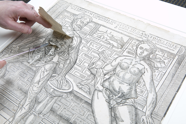
 As we finish up projects we conduct what we call a “post-mortem,” and it is essentially a post project review.   The name evokes autopsies, and what we do is not dissimilar but thankfully there are no bodies involved (except when we closed up the recent Anatomical Fugitive Sheets digital collection – eh? see what I did there? wink wink).  The goals of our post mortem process are for the project team to do the following:

  • Reflect on the project’s outcomes both positive and negative
  • Document any unique decisions or methods employed during the project
  • Document resources put into the project.

In practice, this means that I ask the project team to send me comments about what they thought went well and what was challenging about the project in question.   Sometimes we meet in person to do this, but often we send comments through email or our project management tool.  I also meet in person with each project champion as a project wraps up.  Project champions are the people that propose and conceive a project.  I ask everyone the same general questions: what worked about the project and what was challenging. With champions, this conversation is also an opportunity to discuss any future plans for promotion as well as think of any related projects that may come up in the future.

DCIT's Post-Mortem Template
DCIT’s Post-Mortem Template

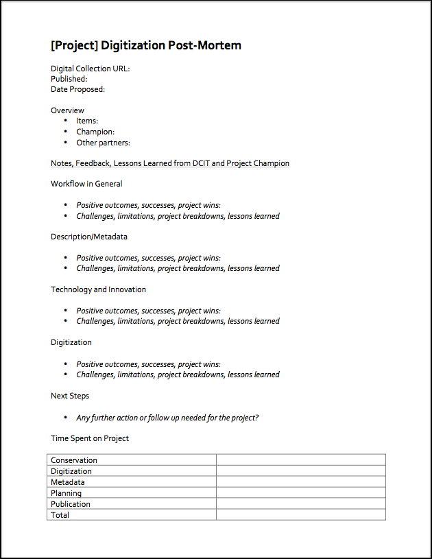
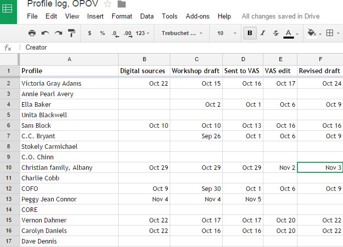
Once I have all the comments from the team and champion I put these into my post-mortem template (see right – click to expand).  I also pull together project stats such as the number of items published, and the hours spent on the project.  Everyone in the core project team is asked to track and submit the hours they spend on projects, which makes pulling stats an easy process.  I designed the template I use as a word document.  Its structured enough to be organized but unstructured enough for me to add new categories on the fly as needed (for example, we worked with a design contractor on a recent project so I added a “working with contractor” section).

 Seems like a simple enough process right?  It is, assuming you can have two ingredients.  First, you need to have a high degree of trust in your core team and good relationships with project stakeholders.  The ability to speak honestly (really really honestly) about a project is a necessity for the information you gather to be useful.  Secondly, you do actually have to conduct the review.  My team gets pulled so quickly from project to project, its really easy to NOT make time for this process.  What helps my team, is that post mortems are a formal part of our project checklists.  Also, I worked with my team to set up our information gathering process, so we all own it and its relevant and easy for them.

DCIT is never to busy for project reviews!

Impacts

The impacts these documents have on our work are very positive. First there is short term benefit just by having the core team communicate what they thought worked and didn’t work. Since we instituted this in the last year, we have used these lessons learns to make small but important changes to our process.

This process also gives the project team direct feedback from our project champions.  This is something I get a lot through my informal interactions with various stakeholders in my role as project manager, however the core team doesn’t always get exposed to direct feedback both positive and negative.

The long term benefit is using the data in these reports to make predictions about resources needed for future projects, track project outcomes at a program level, and for other uses we haven’t considered yet.

Further Resources

 All in all, I cannot recommend a post project review process to anyone and everyone who is managing projects enough.  If you are not convinced by my template (which is very simple), there are lots of examples out there.  Google “project post-mortem templates” (or similar terminology) to see a huge variety.

There are also a few library and digital collections project related resources you may find useful as well:

Here is a blog post from California Digital Library on project post-mortems that was published in 2010, but remains relevant. 

UCLA’s Library recently published a “Library Special Collections Digital Project Toolkit” that includes an “Assessment and Evaluation” section and a “Closeout Questionnaire”


A Look Under the Hood—and the Flaps—of the Anatomical Fugitive Sheets Collection

We have digitized some fairly complex objects over the years that have challenged our Digital Collections team to push the boundaries of typical digital library solutions for digitization and publication. It happens often: objects we want to digitize are sort of like something we’ve done for a previous project, but not quite, so we can’t simply mimic whatever we did before to get the new project done. We’re frequently flexing our creative muscles.  In many cases, our most successful projects ended up that way because we didn’t concede to the temptation of representing items digitally in an oversimplified manner, or, worse still, as something they are not.

Working with so many rare and unique items from the Rubenstein Library through the years, we’ve become unfazed by these representation challenges and time and again have simply pulled together our team’s brainpower (and willpower) to make something work. Dare I say it, we’ve been unflappable. But this year, we met our match and surely needed some help.

In March, we published ten anatomical fugitive sheets from the 1500s to 1600s. They’re printed illustrations from the Rubenstein Library’s History of Medicine Collections, depicting the human body using layers of paper flaps that can be lifted to reveal internal organs. They’re amazing. They’re distinctive. And they’re really complicated.

Fugitive Sheet
Fugitive Sheet example, accessible online at http://library.duke.edu/digitalcollections/rubenstein_fgsms01003/ (Photo Credit: Les Todd)

The complexity of this project necessitated enlisting help from beyond the library’s walls. Early on, Prof. Mark Olson in Duke’s Art, Art History & Visual Studies department was instrumental in helping us identify modern technical approaches for capturing and modeling such objects. We contracted out development work through local web firm Cuberis, who programmed the bulk of the UI. In-house, we handled digitization, metadata, and integration with our discovery & access application with a lot of collaborative creativity between the digital collections team, the collection curator, conservators, and rare materials cataloger.

In a moment, I’ll discuss what modern technologies make the Fugitive Sheets interface hum. But first, here’s a look at what others have done with flap-based items.

Flaps in the Wind, Er… Wild

There are a few examples of anatomical flap objects represented on the Web, both at Duke and beyond. Common approaches include:

  1. A Sequence of Images. Capture one image of the full item for every state of the flaps possible, then let a user navigate them as if viewing a paginated document or photo sequence.
  2. Video. Either film someone lifting the flaps, or make an auto-playing video of the image sequence above.
  3. Flash. Develop a Flash application and put a SWF file on the web.

The third approach is actually what powers Duke’s Four Seasons project, which remains one of the best interactive historical anatomy interfaces available today. Developed way back in 2000 by Educational Media Services, Four Seasons began as a Java program distributed on CD-ROM (gasp!) and in subsequent years found a home as a Flash application embedded on the library website.

Flash-based flap interface for The Four Seasons, available at http://library.duke.edu/rubenstein/history-of-medicine/four-seasons

Flash has fallen out of favor over the last decade for many reasons, most notably: 1) it won’t work on iOS devices, 2) it’s bad for accessibility, 3) it’s invisible to search engines, and most importantly, 4) most of what Flash used to do exclusively can now be done just as well using HTML5.

Anatomy of a Modern Flap Interface

The Web has made giant leaps forward in the past five years due to advances in HTML, CSS, and Javascript and the evolution of web browsers. Key specs for HTML5 and CSS3 have been supported by all major browsers for several years now.  Below are the vital bits (so to speak) in use by the Anatomical Fugitive Sheets. Many of these things would not have worked (or worked well) on the Web five years ago.

HTML5 Parts

1. SVG (scalable vector graphics). An <svg> element in HTML contains shape data for each flap using a coordinates system. The <path> holds a string with line instructions using shorthand (M, L, c, etc.) for tracing the contour: MoveTo, Lineto, Curveto, Arcto. We duplicate the <path> with a transform attribute to render the shape of the back of the flap.

SVG for flap
SVG coordinates in a <path> element representing the back of a flap.

2. Cross-window messaging API. Each fugitive sheet is rendered within an <iframe> on a page and the clickable layer navigation lives in its parent page, so they’re essentially two separate web pages presented as if one. Having a click in one page do something in another is possible through the Javascript method postMessage, part of the HTML5 spec.

  • From parent page to iframe: frame.contentWindow.postMessage(message, '*');
  • From iframe to parent page: window.top.postMessage(message, '*');

CSS3 Parts

  1. transition Property. Here’s where the flap animation action happens.  The flap elements all have the style declaration transition:1s ease-in-out. That ensures that when a flap property like height changes, it animates over the course of one second, slower at the start and end and quicker in the middle.  Clicking to open a flap calls a Javascript function that simultaneously switches the height of the flap front to zero and the back to its full size.
  2. transform Property. This scales down the figure and all its interactive components for display in the iframe, e.g., body.framed .flip-up-wrapper { transform:scale(.5) }; This scaling doesn’t apply in the full-size and zoomed-in views and thus enables the flaps to work identically at full- or half-resolution.

Capture & Encoding

Capture

Because the fugitive sheets are large and extremely fragile, our Digital Production Center staff and conservators worked carefully together to untangle and prop open each flap to be photographed separately. It often required two or more people to steady and flatten the flaps while being careful not to cast shadows on the layer being shot. I wasn’t there, but in my mind I imagine a game of library Twister.

Staff captured images using an overhead reproduction camera using white paper below each flap to make it easier to later determine and crop the contours. Unlike most images we digitize, the flaps’ derivative images are stored and delivered in PNG format to preserve transparency.

Encoding

As we do for all digital collections, we encode in an XML document the structural, administrative, and descriptive data about the digital objects using accepted library standards so that 1) the data can be preserved and ported between applications, and 2) we can use it to power our discovery & access interface. We use METS, a flexible Library of Congress standard for describing all kinds of digital objects.

METS worked pretty well for representing the flap data (see example), and we tapped into a few parts of the standard that we’ve never or rarely used for other items. Specifically, we:

  • added the LC MIX namespace for technical image metadata
  • used an amdSec to store flap heights & widths
  • used file/@GROUPID to divide flap images between figure 1, figure 2, etc.
  • used fptr/area/@COORDS to hold the SVG path coordinates for each flap

The descriptive metadata for the fugitive sheets posed its own challenges outside the box for our usual projects. All the information about the sheets existed as MARC catalog records, and crosswalking from MARC to anything else is more of an art than a science.

Looking Ahead

We’ll try to build on the accomplishments from the Fugitive Sheets Collection as we tackle new complex digitization projects. The History of Medicine Collections in particular are brimming with items that will be far more challenging than these sheets to model, like paginated flap books with fold-out pages and flaps that open in different directions. Undaunted, we’ll keep flapping our wings to stay aloft.

Embeds, Math & Beyond

This week, in conjunction with our H. Lee Waters Film Collection unveiling, we rolled out a handy new Embed feature for digital collections items.  The idea is to make it as easy as possible for someone to share their discoveries from our collections, with proper attribution, on other websites or blogs.

How To

It’s simple, really, and mimics the experience you’re likely to encounter getting embed code from other popular sites with videos, images, and the like. We modeled our approach loosely on the Internet Archive‘s video embed service (e.g., visit this video and click the Share icon, but only if you are unafraid of clowns).

Embed Link

Click the “Embed” link under an item from Duke Digital Collections, and copy the snippet of code that pops up. Paste it in your website, and you’re done!

Examples

I’ll paste a few examples below using different kinds of items. The embed code is short and nearly identical for all of these:

A Single Image

Paginated Item

A Video

Single-Track Audio

Multi-Track Audio

Document with Document Viewer

Technical Considerations

Building this feature required a little bit of math, some trial & error, and a few tricks. The steps were to:

  • Set up a service to return customized item pages at the path http://library.duke.edu/digitalcollections/embed/<itemid>/
  • Use CSS & JS to make the media as fluid as possible to fill whatever space it ends up in
  • Use a fixed height and overflow: auto on the attribution box so longer content will scroll
  • Use link rel=”canonical” to ensure the item’s embed page is associated with the real item page (especially to improve links / ranking signals for search engines).
  • Present the user a copyable HTML <iframe> element in the regular item page that has the correct height & width attributes to accommodate the item(s) to be embedded

This last point is where the math comes in. Take a single image item, for example. With a landscape-orientation image we need to give the user a different <iframe> height to copy than we would for a portrait. It gets even more complicated when we have to account for multiple tracks of audio or video, or combinations of the two.

Coming Soon

We’ll refine this feature a bit in the coming weeks, and work out any embed-bugs we discover. We’ll also be developing a similar feature for embedding digitized content found in our archival collection guides.

Assembling the Game of Stones

Back in October, Molly detailed DigEx’s work on creating an exhibit for the Link Media Wall. We’ve finally finalized our content and hope to have the new exhibit published to the large display in the next week or two. I’d like to detail how this thing is actually put together.

HTML Code

In our planning meetings the super group talked about a few different approaches for how to start. We considered using a CMS like WordPress or Drupal, Four Winds (our institutional digital signage software), or potentially rolling our own system. In the end though, I decided to build using super basic HTML / CSS / Javascript. After the group was happy with the design, I built a simple page page framework to match our desired output of 3840 x 1080 pixels. And when I mean simple, I mean simple.

got_assembly

I broke the content chunks into five main sections: the masthead (which holds the branding), the navigation (which highlights the current section and construction period), the map (which shows the location of the buildings), the thumbnail (which shows the completed building and adds some descriptive text), and the images (which houses a set of cross-fading historic photos illustrating the progression of construction). Working with a fixed-pixel layout feels strange in the modern world of web development, but it’s quick and satisfying to crank out. I’m using the jQuery Cycle plugin to transition the images, which is lightweight and offers lots of configurable options. I also created a transparent PNG file containing a gradient that fades to the background color which overlays the rotating images.

Another part of the puzzle I wrestled with was how to transition from one section of the exhibit to another. I thought about housing all of the content on a single page and using some JS to move from one to the next, but I was a little worried about performance so I again opted for the super simple solution. Each page has a meta refresh in the header set to the number of seconds that it takes to cycle through the corresponding set of images and with a destination of the next section of the exhibit. It’s a little clunky in execution and I would probably try something more elegant next time, but it’s solid and it works.

Here’s a preview of the exhibit cycling through all of the content. It’s been time compressed – the actual exhibit will take about ten minutes to play through.

In a lot of ways this exhibit is an experiment in both process and form, and I’m looking forward to seeing how our vision translates to the Media Wall space. Using such simple code means that if there are any problems, we can quickly make changes. I’m also looking forward to working on future exhibits and helping to highlight the amazing items in our collections.

New Angles & Avenues for Bitstreams

This week, we added a display of our most recent Bitstreams blog posts to our Digital Collections homepage (example), and likewise, a view of posts relevant to a given collection on the respective collection’s homepage (example).

Screen Shot 2014-11-12 at 1.19.56 PM

Background

Our Digital Projects & Production team has been writing in Bitstreams at least weekly since February 2014. We’ve had some excellent guest contributors, too. Some posts share updates about new digital collections or additions, while others share insights, lessons learned, and behind-the-scenes looks at the projects we’re currently tackling.

Many of our posts have been featured on our library homepage and library news site. But until now, we haven’t been able to display any of them—not even the ones about new digital collections—alongside the collections themselves. So, if you visited the DukEngineer collection in the past, you likely missed out on Melanie’s excellent overview, which puts the magazine in context and highlights the best of what’s inside.

Past Solutions

Syndicating tagged blog posts for display elsewhere is a pretty common use case, and we’ve used a bunch of different solutions as our platforms have evolved. Each solution has naturally been painstakingly tailored to accommodate the inner workings of both the source and the destination. Seven years ago, we were writing custom XSLT to create and then consume our own RSS feeds in Cascade Server CMS. We have since hopped over to Wordpress for managing news and blogs (whew!). An older version of our digital collections app used WordPress’ XML-RPC API to get tagged posts and parsed them with Python.

These days, our library website does blog syndication by using a combo of WordPress RSS, Drupal’s feed aggregator module, and occasionally Yahoo! Pipes for data mashing and munging. It works well in Drupal, but other platforms require other approaches.

Under the Hood: Angular.js and Wordpress JSON API

Bret Davidson’s Code4Lib 2014 presentation, Towards Pasta Code Nirvana: Using JavaScript MVC to Fill Your Programming Ravioli  (slides) made me hungry. Hungry for pasta, yes, but also for knowledge. I wanted to:

  1. Experiment with one of the Javascript MVC frameworks to learn how they work, and in the process…
  2. Build something potentially useful for digital collections that could be ported over to a new application framework in the future (e.g., from our current Django app to a future Ruby on Rails app).

From the many possibilities, I chose AngularJS. It seemed well-documented, increasingly popular, and with Google’s backing, it seems like it’ll be around for awhile.

WordPress JSON API

Among Angular’s virtues is that it really simplifies the process of getting and using JSON data from an API. I found Wordpress’ JSON API plugin, which was interestingly developed by staff at MoMA so they could use WordPress as a back-end to a site with a Rails front-end. So we first had to enable that for our Bitstreams blog.

AngularJS

angularjsAngularJS definitely helps keep code clean, especially by abstracting the model (the blogposts & associated characteristics, as well as the page state) from the view (indicates how to display the data) from the controller (gets and refines the data into the model, updates the model upon interactions with the view). I’ve done several projects in the past using jQuery and DOM manipulation to retrieve and display data. It usually works, but in the process I create a veritable rat’s nest of spaghetti code wherein /* no amount of commenting */ can truly help disentangle what’s happening.

Angular also supercharges HTML with more useful attributes to control a display. I’ve only just scratched the surface, but it’s clear that built-in directives like ng-repeat and filters like limitTo spare me from writing a ton of Javascript, e.g., <li ng-repeat="post in blogposts | limitTo:pageSize">. After the initial learning curve, the markup is visually intuitive. And it’s nice that directives and filters are extensible so you can make your own.

Source code: controller js, HTML (view source)

Initial Lessons Learned

  • AngularJS has a steeper learning curve than I’d expected; I assumed I could do this mini-project in a few hours, but it took a couple days to really get a handle on the basic pieces I needed for this project.
  • Writing an Angular app within a Django app is tricky. Both use {{ variable }} template tags so I had to change Angular to use [[ variable ]] instead.

Looking Ahead

I consider this an encouraging proof of concept. While our own blog posts can be interesting, there are many other sources of valuable data out in the world that are relevant to our collections that would add value for our researchers if we were able to easily get and display them. AngularJS won’t be the answer to all of these needs, but it’s nice to have in the toolset.

Profiling Movement Activists in 7 Steps

SNCC workers prepare to go to Belzoni in the Fall of 1963 to organize for the Freedom Vote. Courtesy of www.crmvet.org.

On the surface, writing a 500-word profile about a SNCC (Student Nonviolent Coordinating Committee) field secretary or a Mississippi-beautician-turned-grassroots-organizer doesn’t seem like a formidable task. Five hundred words hardly takes ten minutes to type. But the One Person, One Vote project is aiming for more than short biographies; it’s trying to capture why each individual was important to the movement and show that using stories. So this is how we craft a profile in 7 steps:

Step 1: Choose a person

Back in June, the Editorial Board generated a list of people that the One Person, One Vote site needed to profile in order to understand SNCC’s voting rights activism. In less than an hour, we had a list of over a hundred names that included SNCC field secretaries, local people, movement elders, and everyone in between. And those were only the first names that came to mind! We narrowed that list down to 65 people, and that’s what the project team has been working from.

Step 2: Find out everything you can about the person

The first step in profile writing is research. We have a library of twenty books for instant referencing of secondary sources. Next comes surveying available primary sources. Our profiles include documents, photographs, audio clips, news stories, and other items created during the movement to make historical actors come to life. Some of our go-to places to find these sources include: Wisconsin Historical Society’s Freedom Summer Digital Collection, the Civil Rights History Project at the Library of Congress, the Joseph Sinsheimer interviews and SNCC 40th Anniversary Conference tapes at Duke University, the Civil Rights in Mississippi Digital Archive at the University of Southern Mississippi, the University of Georgia’s Civil Rights Digital Library. There are more, of course, but that’s the start.

Step 3: Figure out why the person you’re profiling was important to the movement

The central question behind every profile the project team writes is: who was _______ to the movement? Once you start filling in the blank, the answers vary to an incredible degree. Movement elders like Ella Baker and Myles Horton contributed to the movement in different, yet equally important ways as  Mississippi-born field secretaries like Charles McLaurin, Sam Block, and Willie Peacock. Trying to figure out how and why is no small undertaking. This is where the guidance of our Visiting Activist Scholar helps focus the One Person, One Vote site on the themes that were at the heart of the movement: grassroots activism, community organizing, and individual empowerment.

Step 4: Use stories to express that in 500 words

Next, spend hours trying to express who the person you’re profiling was to the movement in only five hundred words. The profiles on the One Person, One Vote site aren’t mini academic biographies. Instead, we try to tell stories that illustrate who the people were and how their lives and work influenced SNCC’s voting rights activism in the 1960s. Finding the right story to highlight these central themes is key, and telling it well takes time and (lots of) revision.

The OPOV project does all content production in Google Drive. Here is the OPOV Profile Log to keep tract of profiles through the steps towards completion.

Step 5: Workshop profile draft with project team

The first draft of every profile is workshopped with the One Person, One Vote project team (made up of 4 undergrads, 2 graduate students, and the project manager). As a group, we suggest how profiles can better convey their central theme, make sure that the person’s story is readable and compelling, line edit for clunky writing, and go through the primary sources.

Step 6: Send to Visiting Activist Scholar for editing

All of the revised profile drafts go the Visiting Activist Scholar for a final round of editing. Charlie Cobb, a journalist and former SNCC field secretary, is our first Visiting Activist Scholar. He helps bring the profiles to life in ways that only someone who was a part of the movement can. Charlie adds details about events, mannerisms of people, and behind-the-scene stories that never made it into history books. While the project team relies on available primary and secondary sources, the Visiting Activist Scholars adds something extra to the profiles on the One Person, One Vote site.

Step 7:  Voila!

Profiles goes through one last proofreading and polishing. Then come 2015, the will be posted on the One Person, One Vote site and the primary sources will be embedded and linked to from the Resources section of the profile pages. Voila!


Preview of the W. Duke, Sons & Co. Digital Collection

T206_Piedmont_cards
When I almost found the T206 Honus Wagner

It was September 6, 2011 (thanks Exif metadata!) and I thought I had found one–a T206 Honus Wagner card, the “Holy Grail” of baseball cards.  I was in the bowels of the Rubenstein Library stacks skimming through several boxes of a large collection of trading cards that form part of the W. Duke, Sons & Co. adverting materials collection when I noticed a small envelope labeled “Piedmont.”  For some reason, I remembered that the Honus Wagner card was issued as part of a larger set of cards advertising the Piedmont brand of cigarettes in 1909.  Yeah, I got pretty excited.

I carefully opened the envelope, removed a small stack of cards, and laid them out side by side, but, sadly, there was no Honus Wagner to be found.  A bit deflated, I took a quick snapshot of some of the cards with my phone, put them back in the envelope, and went about my day.  A few days later, I noticed the photo again in my camera roll and, after a bit of research, confirmed that these cards were indeed part of the same T206 set as the famed Honus Wagner card but not nearly as rare.

Fast forward three years and we’re now in the midst of a project to digitize, describe, and publish almost the entirety of the W. Duke, Sons & Co. collection including the handful of T206 series cards I found.  The scanning is complete (thanks DPC!) and we’re now in the process of developing guidelines for describing the digitized cards.  Over the last few days, I’ve learned quite a bit about the history of cigarette cards, the Duke family’s role in producing them, and the various resources available for identifying them.

T206 Harry Lumley
1909 Series T206 Harry Lumley card (front), from the W. Duke, Sons & Co. collection in the Rubenstein Library
T206 Harry Lumley card (back)
1909 Series T206 Harry Lumley card (back)


Brief History of Cigarette Cards

A Bad Decision by the Umpire
“A Bad Decision by the Umpire,” from series N86 Scenes of Perilous Occupations, W. Duke, Sons & Co. collection, Rubenstein Library.
  • Beginning in the 1870s, cigarette manufacturers like Allen and Ginter and Goodwin & Co. began the practice of inserting a trade card into cigarette packages as a stiffener. These cards were usually issued in sets of between 25 and 100 to encourage repeat purchases and to promote brand loyalty.
  • In the late 1880s, the W. Duke, Sons, & Co. (founded by Washington Duke in 1881), began inserting cards into Duke brand cigarette packages.  The earliest Duke-issued cards covered a wide array of subject matter with series titled Actors and Actresses, Fishers and Fish, Jokes, Ocean and River Steamers, and even Scenes of Perilous Occupations.
  • In 1890, the W. Duke & Sons Co., headed by James B. Duke (founder of Duke University), merged with several other cigarette manufacturers to form the American Tobacco Company.
  • In 1909, the American Tobacco Company (ATC) first began inserting baseball cards into their cigarettes packages with the introduction of the now famous T206 “White Border” set, which included a Honus Wagner card that, in 2007, sold for a record $2.8 million.
The American Card Catalog
Title page from library’s copy of The American Card Catalog by Jefferson R. Burdick.

Identifying Cigarette Cards

  • The T206 designation assigned to the ATC’s “white border” set was not assigned by the company itself, but by Jefferson R. Burdick in his 1953 publication The American Card Catalog (ACC), the first comprehensive catalog of trade cards ever published.
  • In the ACC, Burdick devised a numbering scheme for tobacco cards based on manufacturer and time period, with the two primary designations being the N-series (19th century tobacco cards) and the T-series (20th century tobacco cards).  Burdick’s numbering scheme is still used by collectors today.
  • Burdick was also a prolific card collector and his personal collection of roughly 300,000 trade cards now resides at the Metropolitan Museum of Art in New York.


Preview of the W. Duke, Sons & Co. Digital Collection [coming soon]

Dressed Beef (Series N81 Jokes)
“Dressed Beef” from Series N81 Jokes, W. Duke, Sons & Co. collection, Rubenstein Library
  •  When published, the W. Duke, Sons & Co. digital collection will feature approximately 2000 individual cigarette cards from the late 19th and early 20th centuries as well as two large scrapbooks that contain several hundred additional cards.
  • The collection will also include images of other tobacco advertising ephemera such as pins, buttons, tobacco tags, and even examples of early cigarette packs.
  • Researchers will be able to search and browse the digitized cards and ephemera by manufacturer, cigarette brand, and the subjects they depict.
  • In the meantime, researchers are welcome to visit the Rubenstein Library in person to view the originals in our reading room.


A Digital Exhibits Epic Saga: Game of Stones

A screen from the Queering Duke History exhibit kiosk, just one of the ways DigEx supports library exhibits.

Just under a year ago Duke University Libraries formed the Digital Exhibits Working Group (DigEx) to provide vision, consulting expertise, and hands-on support to the wide array of projects and initiatives related to gallery exhibits, web exhibits, data visualizations, digital collections, and digital signage.  Membership in the group is as cross-departmental as the projects they support. With representatives from Data and Visualization, Digital Projects and Production Services, Digital Scholarship Services, Communications, Exhibits, Core Services and the Rubenstein Library, every meeting is a vibrant mix of people, ideas and agenda items.

The group has taken on a number of ambitious projects; one of which is to identify and understand digital exhibits publishing platforms in the library (we are talking about screens here).   Since April, a sub-committee – or “super committee” as we like to call ourselves – of DigEx members have been meeting to curate a digital exhibit for the Link Media Wall.  DigEx members have anecdotal evidence that our colleagues want to program content for the wall, but have not been able to successfully do so in the past.  DigEx super committee to the rescue!

The Link super committee started meeting in April, and at first we thought our goals were simple and clear.  In curating an exhibit for the link wall we wanted to create a process and template for other colleagues to follow.  We quickly chose an exhibit topic: the construction of West Campus in 1927-1932 told through the University Archive’s construction photography digital collection and Flickr feed.  The topic is both relevant given all the West campus construction happening currently, and would allow us to tell a visually compelling story with both digitized historic photographs and opportunities for visualizations (maps, timelines, etc).

Test stone wall created by University to select the stones for our Gothic campus.
Test stone wall created by University to select the stones for our Gothic campus (1925).

Our first challenge arose with the idea of templating.  Talking through ideas and our own experiences, we realized that creating a design template would hinder creative efforts and could potentially lead to an unattractive visual experience for our patrons.  Think Microsoft PowerPoint templates; do you really want to see something like that spread across 18 digital panels? So even though we had hoped that our exhibit could scale to other curators, we let go of the idea of a template.


We had logistical challenges too.  How do we design for such a large display like the media wall?  How do you create an exhibit that is eye catching enough to catch attention, simple enough for someone to understand as they are walking by yet moves through content slowly enough that someone could stop and really study the images?  How do we account for the lines between each separate display and avoid breaking up text or images?  How do we effectively layout our content on our 13-15” laptops when the final project is going to be 9 FEET long?!!  You can imagine that our process became de-railed at times.

Stone was carried from the quarry in Hillsborough to campus by way of a special railroad track.

But we didn’t earn the name super committee for nothing.  The Link media wall coordinator met with us early on to help solve some of our challenges. Meeting with him and bringing in our DigEx developer representative really jumpstarted the content creation process.  Using a scaled down grid version of the media wall, we started creating simple story boards in Powerpoint.  We worked together to pick a consistent layout each team member would follow, and then we divided the work of finding images, and creating visualizations.  Our layout includes the exhibit title, a map and a caption on every screen to ground the viewer in what they are seeing no matter where they come into the slideshow. We also came up with guidelines as to how quickly the images would change.


media_wall_grid.draft2-grid
Mockup of DigEx Link Media Wall exhibit showing gridlines representing delineations between each display.

At this point, we have handed our storyboards to our digital projects developer and he is creating the final exhibit using HTML and web socket technology to make it interactive (see design mockup above). We are also finishing up an intro slide for the exhibit.   Once the exhibit is finished, we will review our process and put together guidelines for other colleagues in DUL to follow.  In this way we hope to meet our goal of making visual technology in the library more available to our innovative staff and exhibits program.   We hope to premiere the digital exhibit on the Link Wall before the end of the calendar year.  Stay Tuned!!

Special shout out to the Link Media Wall Exhibit Super Committee within the Digital Experiences Working Group (DigEx):  Angela Zoss, Data Visualization Coordinator, Meg Brown, The E. Rhodes and Leona B. Carpenter Foundation Exhibits Coordinator, Michael Daul, Digital Projects Developer, Molly Bragg, Digital Collections Program Manager and Valerie Gillispie, University Archivist.


Digital Tools for Civil Rights History

The One Person, One Vote Project is trying to do history a different way. Fifty years ago, young activists in the Student Nonviolent Coordinating Committee broke open the segregationist south with the help of local leaders. Despite rerouting the trajectories of history, historical actors rarely get to have a say in how their stories are told. Duke and the SNCC Legacy Project are changing that. The documentary website we’re building (One Person, One Vote: The Legacy of SNCC and the Struggle for Voting Right) puts SNCC veterans at the center of narrating their history.

SNCC field secretary and Editorial Board member Charlie Cobb.
SNCC field secretary and Editorial Board member Charlie Cobb. Courtesy of www.crmvet.org.

So how does that make the story we tell different? First and foremost, civil rights becomes about grassroots organizing and the hundreds of local individuals who built the movement from the bottom up. Our SNCC partners want to tell a story driven by the whys and hows of history. How did their experiences organizing in southwest Mississippi shape SNCC strategies in southwest Georgia and the Mississippi Delta? Why did SNCC turn to parallel politics in organizing the Mississippi Freedom Democratic Party? How did ideas drive the decisions they made and the actions they took?

For the One Person, One Vote site, we’ve been searching for tools that can help us tell this story of ideas, one focused on why SNCC turned to grassroots mobilization and how they organized. In a world where new tools for data visualization, mapping, and digital humanities appear each month, we’ve had plenty of possibilities to choose from. The tools we’ve gravitated towards have some common traits; they all let us tell multi-layered narratives and bring them to life with video clips, photographs, documents, and music. Here are a couple we’ve found:

This StoryMap traces how the idea of Manifest Destiny progressed through the years and across the geography of the United States.
This StoryMap traces how the idea of Manifest Destiny progressed through the years and across the geography of the U.S.

StoryMap: Knightlab’s StoryMap tool is great for telling stories. But better yet, StoryMap lets us illustrate how stories unfold over time and space. Each slide in a StoryMap is grounded with a date and a place. Within the slides, creators can embed videos and images and explain the significance of a particular place with text. Unlike other mapping tools, StoryMaps progress linearly; one slide follows another in a sequence, and viewers click through a particular path. In terms of SNCC, StoryMaps give us the opportunity to trace how SNCC formed out of the Greensboro sit-ins, adopted a strategy of jail-no-bail in Rock Hill, SC, picked up the Freedom Rides down to Jackson, Mississippi, and then started organizing its first voter registration campaign in McComb, Mississippi.

Timeline.JS: We wanted timelines in the One Person, One Vote site to trace significant events in SNCC’s history but also to illustrate how SNCC’s experiences on the ground transformed their thinking, organizing, and acting. Timeline.JS, another Knightlab tool, provides the flexibility to tell overlapping stories in clean, understandable manner. Markers in Timeline.JS let us embed videos, maps, and photos, cite where they come from, and explain their significance. Different tracks on the timeline  give us the option of categorizing events into geographic regions, modes of organizing, or evolving ideas.

The history of Duke University as displayed by Timeline.JS.

DH Press: Many of the mapping tools we checked out relied on number-heavy data sets, for example those comparing how many robberies took place on the corners of different city blocks. Data sets for One Person, One Vote come mostly in the form of people, places, and stories. We needed a tool that let us bring together events and relevant multimedia material and primary sources and represent them on a map. After checking out a variety of mapping tools, we found that DH Press served many of our needs.

DH Press project representing buildings and uses in Durham's Hayti neighborhood.
DH Press project representing buildings and uses in Durham’s Hayti neighborhood.

Coming out of the University of North Carolina – Chapel Hill’s Digital Innovation Lab, DH Press is a WordPress plugin designed specifically with digital humanities projects in mind. While numerous tools can plot events on a map, DH Press markers provide depth. We can embed the video of an oral history interview and have a transcript running simultaneously as it plays. A marker might include a detailed story about an event, and chronicle all of the people who were there. Additionally, we can customize the map legends to generate different spatial representations of our data.

Example of a marker in DH Press. Markers can be customized to include a range of information about a particular place or event.


These are some of the digital tools we’ve found that let us tell civil rights history through stories and ideas. And the search continues on.

Bodies of Knowledge: Seeking Design Contractors for Innovative Anatomical Digital Collection

The History of Medicine Collections, part of the Rubenstein Rare Book & Manuscript Library at Duke University, would like to create a digital collection of our ten anatomical fugitive sheets.

flap
An Anatomical Fugitive Sheet complete with flap.

Anatomical fugitive sheets are single sheets, very similar to items such as broadsides [early printed advertisements] that date from the sixteenth and seventeenth centuries and are incredibly rare and fragile. Eight of the ten sheets in our collections have overlays or moveable parts adding to the complexity of creating an online presence that allows a user to open or lift the flap digitally.

The primary deliverable for the design contractor of this project will be an online surrogate of the fugitive sheets and any accompanying plugins. Skills needed include JavaScript and CSS.

We’re looking for a talented design team to help us connect the past to the present. See the prospectus for candidate contractors linked below.

Bodies of Knowledge: a prospectus for design contractors to create an innovative anatomical digital collection.