All Made Up

Every once in a while we come across a book composed of parts from multiple copies of the same edition, commonly referred to as a made-up copy (Carter, 2004). It can be very difficult to tell if a book is made-up, depending upon how the different pieces were assembled and treated.  An item that recently came into the lab provides a fairly obvious example.

Made-up book
Visibly smaller section on the right.

This incunable in a 19th century binding contains two gathering (one at the front and another towards the center of the textblock) that are noticeably shorter at the tail and fore-edge. Shorter leaves can indicate a number of things about the production of a binding, including proof (Roberts & Etherington, 1982) that the leaves were not overly trimmed by the binder. In this case, though, other evidence suggests the section came from another binding. It may be difficult to tell in the image above, but the paper of the section on the right is significantly brighter than the sections before and after.

Different edge treatment
Red and blue edge decoration

Additionally, the edges of the shorter section have been treated differently. The image above shows that the edges of the smaller section (left) are colored red, while the rest of the texblock (right) has been sprinkled with blue pigment.

In-filled tail edge
In-filled tail edge

It appears that the binder infilled the smaller section at the front to match the size of the surrounding leaves. Similarly toned and textured laid paper has been adhered to the tail edge and at the gutter of each leaf to make them larger. Since the red edge decoration is still visible on these leaves, this was probably done to reduce the risk of handling damage, rather than an attempt to disguise the added gathering.

While the added sections appear somewhat out of place in this binding, I appreciate that the binder did not attempt to hide them by over-trimming the entire textblock or obscuring their red edge decoration. The clear diffirences between paper size, color, and edge treatment provides additional information about the life and use of this object.


Carter, J. (2004). ABC for book collectors (8th ed.). New Castle, DE: Oak Knoll.

Roberts, M. & Etherington, D. (1982). Bookbinding and the conservation of books : a dictionary of descriptive terminology. Washington, D.C.: Library of Congress

Persistent Picture Props

By Rachel Penniman, Senior Conservation Technician

Philena McKeen
Philena McKeen

Recently part of the McKeen-Duren Family papers was brought to the lab. Two boxes of approximately 40 daguerreotypes and ambrotypes were in need of better housing. Most of the photographs are of the close family of Silas McKeen. Silas was born in Corinth, Vermont in 1831 and was a Congregational Minister in Bradford, Vermont for much of his life. At some time, a family member had attached slips of paper inside each of the cases with a description of who was depicted in each photograph. Inside the case of a photograph of Silas’ daughter Philena was a longer caption:

Label

“Philena McKeen-
1st photo ever taken in
our family – taken by
Southworth of Boston
when Philena was there
taking music lessons.”

The name Southworth jogged my memory. Back in May we were treating True Flag, a newspaper published in Boston from 1851-1908. While encapsulating an issue from Saturday July 15, 1854, I had noticed an advertisement for daguerreotypes and taken a photograph of it.

True Flag Quote

Southworth & Hawes was a prominent photography business active in Boston in the mid-1800’s and well known for their portraits of notable people of the day, including Henry Wadsworth Longfellow, Ralph Waldo Emerson, and Harriet Beecher Stowe. The daguerreotypes of Albert Sands Southworth and Josiah Johnson Hawes are held today in the collections of The George Eastman House, The Metropolitan Museum of Art, and the Museum of Fine Arts Boston.

Curious to learn more about Messrs. Southworth & Hawes, I requested a couple of books from Duke Libraries and noticed something repeated in their images:

3updaguerreotypes01

3updaguerreotypes02
(All images above from Young America: The Daguerreotypes of Southworth & Hawes by Romer and Wallis)

Like the backdrop on class picture day, it looks like certain props and settings were used repeatedly in the studio of Southworth & Hawes; A table with a floral patterned cloth, a potted plant, and a book seem to have been an especially popular combination of props. The specific fern-patterned cloth draped on the table beside Philena even makes an appearance in a number of other photographs. A daguerreotype of Harriet Beecher Stowe at The Met looks especially similar.

harriet-beecher-stowe10
Harriet Beecher Stowe (Metropolitan Museum of Art)

Along with celebrities, Southworth and Hawes took a number of photographs of their own family members. Although not the best example of their work, in this photograph of Nancy Southworth Hawes (wife of Josiah Hawes and sister of Albert Southworth) at the MFA in Boston, she appears to be holding the same highly decorated book as Philena.

Nancy Southworth Hawes
Nancy Southworth Hawes (MFA Boston)

Unlike the fern-patterned cloth and potted plant that popped up again and again, the photo of Philena and the photo of Nancy are the only two I found where this specific book was identifiable. I wonder if the book was just another prop sitting around the studio for patrons to use, or if it held some greater significance. Interestingly, Albert and Nancy Southworth grew up on their parent’s farm in Fairlee, Vermont; less than 10 miles from Philena’s childhood home in Bradford. Is it possible these two families knew each other before meeting again in the Boston photographer’s studio?

Got Something Big To Move? Grab the U-boat!

We realized we needed some sort of large cart to better move folders from the stacks to the reading room when we expanded our flat file storage to include super-oversized file drawers. After some investigation we settled on the “U-boat.” This custom cart was first introduced to me by Michele Hamill, Paper and Photograph Conservator in the Digitization and Conservation Services Department at Cornell University Library.

Cornell’s U-boat in action. (image courtesy Michele Hamill)

The cool thing about its design is the three-tiered storage system. The base is tall enough for a standard archival records box, the middle has a concave section to transport large folders, and the top is a large flat space to place oversize flat boxes. The best part? The top is removable! Once I saw it, I wanted it.

Today was the first opportunity for Conservation to really put the U-boat to use in moving oversize materials. We had to move three super-oversized folders from the lab to the third floor stacks. These folders are about 75 inches long and 50 inches wide, so we  brought down the U-boat to transport them.

img_3324
The U-boat ready to roll.

Once the folders were on the cart, we placed a large tube in the middle to stabilize the contents and keep the folders from slipping or folding over. Three of us escorted the cart upstairs to the stacks. Two people steered while one cleared the way and opened doors.

img_3325
The collections in their new super-sized home.
img_3327
The U-boat with its top shelf back in place.

The U-boat was custom made for us by G.S. Manufacturing . It arrived fully assembled and ready to go. While this is the first time I’ve used the U-boat, I often see it in use in the stacks for oversized flat boxes. Is it wrong to fall in love with a cart? Because I believe I have.

Saving Horace Trumbauer From 91 Inches of Tape

In 2014 we implemented our Adopt-a-Book Program. To date over 44 items have been adopted by 22 donors. We started this program as a way to raise money for the conservation of materials from across our collections, especially those that we might need to send out for conservation because of an object’s size or special needs.

One such project was adopted by Mrs. Georgeann C Corey in memory of George Nassif Corey (T’69). This architectural blueprint of Duke’s East Campus by Horace Trumbauer was created in 1924. At some point in its lifetime it was the recipient of a DIY repair with self adhesive tape and the adhesive caused a lot of staining and damage.

Duke University
Duke University East Campus as designed by Horace Trumbauer (1924) [recto; Image courtesy of NEDCC]
Duke University
91 linear inches of tape adorned this blueprint before treatment. That is just over 7-1/2 feet of tape! [verso; image courtesy of NEDCC]

This was a perfect item to put up for adoption due to its size, the amount of tape removal needed, and its need to be lined. This blueprint is 52-1/8″ by 40-1/8″. It is too large to fit comfortably in our washing sink, and we have no suction table or karibari board to facilitate the lining. We also wanted a digital image and facsimile reproduction made so that the original could be safely housed while the facsimile could be displayed.

Thanks to the generosity of Mrs. Corey, we were able to send this drawing to the Northeast Document Conservation Center for treatment. You can see from the images below that the treatment was truly transformative. NEDCC conservators removed 91 linear inches of tape, reduced the staining from the adhesive, washed it and repaired the tears and losses, and finally lined it with Japanese tissue. NEDCC digitally captured the drawings and made a 1:1 physical print of the file for us to use as our use copy.

Duke University
Trumbauer blueprint after treatment. [recto; image courtesy of NEDCC]
Duke University
Trumbauer blueprint after treatment. [verso; image courtesy of NEDCC]

This is one of many success stories from our Adopt-a-Book Program. We look forward to sharing others with you in the future.

Letter Spacing on Labels

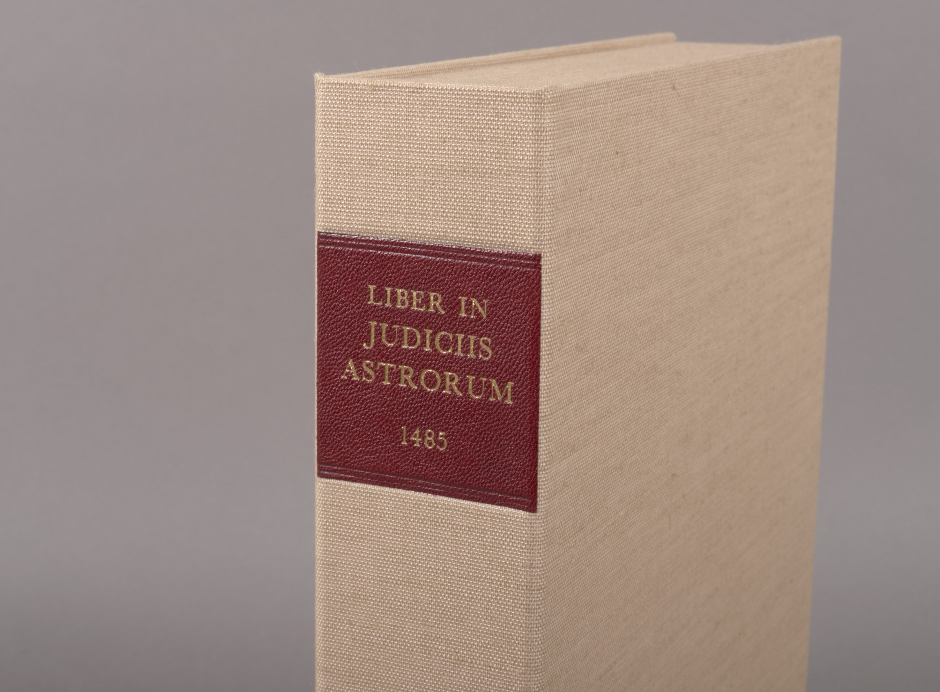
One can really go down a rabbit hole when it comes to making labels for book enclosures. In addition to considering the layout and typeface, there are a number of materials and printing or gilding techniques that can be used to create one. Stamped leather labels are certainly a nicer option, but require special equipment and are very time consuming to produce.

Judiciis Astrorum Label

Paper labels are very quick to make, especially in large quantities, and everyone has the necessary equipment. With a little effort in setup, paper labels can look surprisingly good on a box.

5 Volumes of Aldine Galen

One of the major problems I have had with setting up paper labels digitally is the lack of spacing control between lines or between letters that one has with a hot stamp or handle letters. Common word processing software doesn’t make this type of layout work easy; however, I have recently discovered some simple tricks in Microsoft Word that can be employed to achieve a more pleasing arrangement of text.

When setting up a label in Word, I will often start with a simple text box. Before typing any titling text, I set the dimensions of the text box based on measurements from the spine of the enclosure. I will also set the box to have a compound line (thick and thin) to look more like traditional tooling. There is a lot of literature about choosing typefaces and laying out book titling, so I won’t get into any of that here. Let’s just focus on spacing.

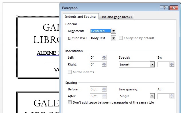
With the text generally arranged  and sized to fit, I will start adjusting the spacing between lines, commonly referred to as “leading“. Word seems to default to multiple spacing between lines, so I remove all of that first. With all the text selected, right click and select Paragraph. After setting the line spacing to Single, you can then customize the point spacing after each line to achieve the leading you want.

leading

Next you may need to adjust the spacing between letters, also known as kerning. The example below uses Centaur as the typeface and, on the left, you will see some bigger variation between letter spacing. Compare the “IB” to the “RO” spacing in “LIBRORUM”.

Labels_BeforeAfter

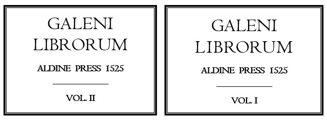
On the right, I have adjusted the letters to have a more uniform appearance. I find this spacing more subtle on a screen, but much more obvious on a printed label for some reason. The kerning is adjusted in a similar way to the leading: with a letter highlighted, right click and select Font. Under the Advanced tab, you can choose Expanded or Condensed spacing and modify it with a number. In this example, I expanded the spacing of the I and B and reduced the spacing for the R. Font Dialogue Box

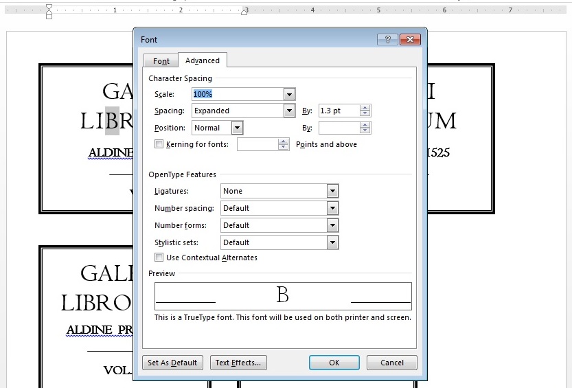
I find that a little consideration to spacing makes a huge difference in the look of my book titling and labels. Hopefully these simple modifications can come in handy for other folks, too.

Quick Pic: Penny Magazine

Rope Illustration, Penny Magazine (1842)

A few weeks ago, I wrote about a method for making your own custom cord.  I had included an illustration of fiber to rope by Jane Dalrymple-Hollo, which mirrored a diagram from Tom Conroy’s 1987 article. A few days later, Jeff Peachey sent me a much earlier example of that same diagram from an 1842 issue of The Penny Magazine. This was quite serendipitous, as I am currently treating four volumes of that serial from our collection and I had already posted images of one in my post on book edge treatments. The illustrations  in this magazine are just fantastic and the whole run is available through Hathi Trust. You can find the 1842 article about a rope and sail-cloth factory here.

Never, Ever Tempt Fate

Remember a couple weeks ago when I mused that we might stack two folding tables on top of each other to dry twice the amount of books in the same footprint? I can report that it works really well.

Photo Aug 16, 3 48 10 PMWe found some additional damp books  from the disaster we had a couple weeks ago. Since the tables were still set up I decided to test my hypothesis. It worked really well. As you can see below I made sure there were plenty of fans to circulate the air around the top layer. The books are drying nicely and we can still move around this small space with relative ease.

Photo Aug 16, 3 47 41 PMThat said, I’m going to keep quiet the next time I mutter, “I wonder if this would work in the next disaster?”

Custom Cord

I have been trying to catch up on some reading lately and just finished a wonderful collection of essays titled Roger Powell, the Compleat Binder.  If you are interested in early manuscripts, I would definitely recommend that you give it a read – but one article in particular provided an excuse for some fun experimentation with broader book binding and book conservation application.

Robert Espinosa published a paper on a rigid board, laced structure for potential use as a conservation rebinding in the early 1980s, and a heavily revised version of this article appears in Roger Powell. In this second version, Espinosa expands upon his discussion of hand spun sewing supports.

Fiber to Cable
(Illustration by Jane Dalrymple-Hollo)

Sewing supports are just one of many components in a sewn binding that can influence the action of a book, as illustrated in Tom Conroy’s excellent article The Movement of the Book Spine. Choosing the right combination of sewing supports, sewing structure, and spine linings can make a big difference in the resulting binding. We keep a selection of commercially-made linen cord on hand, but sometimes, when creating a new binding or replacing a damaged sewing support, they don’t quite meet the needs of the book. I decided to give Espinosa’s method a try.

The process starts off with a length of 18/3 Coats Barbour linen thread, tied together at the ends and doubled to create a length of four threads. I have stretched that piece over two needles in the image below to hopefully illustrate the starting configuration.

Pre-Cord Thread

I dampened the thread a bit to soften some of the sizing and make it more flexible. I needed something to hold one end firmly while the other was twisted, so I just looped one end over a wall-mounted cabinet door handle. Next I tightened a small screw hook into the chuck of a cordless drill. Drill with HookNow I just needed to figure out which direction to twist. Since the thread I was using has an “S” twist, the cord (or hawser-laid rope) would need have a “Z” twist. With one loop of the threads over the cabinet handle and the other over the hook of the drill, that meant it the drill should turn counter-clockwise (or in the “reverse” setting). Even going pretty slowly, I was able to wind approximately 3 feet of cord in about 10 seconds.

Cord Comparison

The result is about half the diameter of the smallest 4-ply cord we have on hand and frays out nicely. Using this method, one could create a custom cord to any specification simply by adjusting the thickness or number of strands of the starting thread.

Quick Pic: Double Decker Drying

File under, “Why didn’t I think of that before?”

Photo Aug 05, 9 15 56 AM
Pro-tip: Use folding tables stacked two-high for drying wet books with a more compact footprint.

This morning I stacked two of our folding tables on top of each other to allow the tops to dry before putting them away. It occurred to me we could have created this two-tiered drying table to dry the wet books we got this week. We could dry the same number of books using half the floor space. Alternatively, we can dry twice as many books on the same footprint if we had four tables, in two stacks of two. I need to remember this for next time. I think it would work as long as you were sure there was enough air flow around all the tables. Am I the last person to come up with this?

Duke University Libraries Preservation