We’re very excited to announce that a new batch of conservation records has just been made publicly available in the CDA! With the addition of this batch, we have a total of 1,788 records preserved in the collection to date. The latest group of records date from 2017 through 2020. To view them, you can browse the CDA collection and then sort by date (New to Old).
It really takes a team of people to ensure these records are ingested, described, and displaying correctly. Thank you so much to the staff from Conservation Services, Repository Services, Rubenstein Library Collection Development, Technical Services, and Digital Collections for their skillful work on and dedication to this ongoing project.
In the first blogpost of our series introducing the Conservation Documentation Archive (CDA), I wrote at length about the needs for creating documentation during our work and the various forms in which it takes. Unfortunately, ingesting those materials into the Duke Digital Repository was not as simple as migrating digital files from one platform to another. A lot of work went into preparing each record, and today I’d like to share some more of the details and considerations that went into that process.
Our “hard copy” documentation has always been stored in a filing cabinet, organized by fiscal year, with the files of each treatment contained in a paper folder. As record keeping practices and technology changed over the years, we began producing our reports and images digitally and saving them to shared network storage provided by the university. The digital files are similarly organized in folders by fiscal year and treatment number.
Preservation of our born-digital records has long been on our minds: it’s imperative that conservation treatment documentation persists for use by future custodians of the item (see AIC Guidelines for Practice #28 and commentary). Electronic records require regular, proactive maintenance in order to remain usable over long periods of time. The shared network drives are regularly backed up, but the integrity of the files are not checked as part of that process. If files were to become corrupted or deleted, we might not know for some time and our records could be lost.
Documents that are stored in a human-readable format, on the other hand, have advantages for long-term preservation. Their storage requirements are pretty minimal (a cool, dry place), and they require no active maintenance or special equipment to access them. AIC’s Guidelines for Practice state that if the maintenance of electronic documentation records cannot be ensured, the conservation professional must create and maintain hard copies of that documentation using the most permanent materials available (see Guideline #28, Commentary B). The adage often used in libraries and archives is “Lots of Copies Keep Stuff Safe”, abbreviated LOCKSS.
American Photocopy Equipment Company (1963)
Since we already have a method for storing hard copy records, we’ve been printing representative copies of our digital records and storing them in the filing cabinet. The reports are black and white electrostatic prints from our office copier (see Batterham, 2008). We also select a small number of representative before and after images, arrange them four to a page and then print them with pigment-based inks on Epson glossy photo paper using an Epson SureColor P800 inkjet printer.
The 35 mm slides in our legacy documentation are a bit of an exception. While they can be viewed with just a light source and magnification, special equipment is required in order to work with them easily. The colors of those slides have also shifted over time – and will continue to do so (Weidner 2012). “Benign neglect” isn’t a viable preservation strategy for this media.
Kodak slide and film viewer
The Duke Digital Repository offers a number of advantages over our past record storage strategies. Many of these are outlined in the Digital Preservation Policy, including regular monitoring of records for fixity and version control, maintenance of multiple copies in different locations, and control over who can edit, move, or delete materials and metadata. In addition to providing a better preservation environment, the digital repository also offers an improved mechanism for access by scholars using the collection. Rather than requesting a copy of paper records from our filing cabinet, library users can just view the records themselves online. In order to make that kind of access possible, however, we needed to get all of our documentation in order.
Our records underwent several phases of work to prepare them for ingest into the repository. Thanks to support from the Lyrasis Catalyst Fund, we were able to outsource the digitization of all of our legacy hard copy documentation, as well as hire a student worker and intern to assist with the large volume of file prep and metadata creation.
With digital records for all of our treatments in one place, we were able to perform a comprehensive review to ensure the files were correctly ordered and labeled. Reports were checked to ensure they were complete, images were rotated to the correct orientation, and a file naming convention was established. Some file formats are better for long-term preservation than others, so the raw DNG files and compressed JPEG derivatives were separated into subfolders; only the uncompressed TIFF images are ingested. Written reports were migrated to PDF format. If the report was born digital (rather than a scanned page), the documents were converted to accessible PDF and saved in the PDF/A format for better long-term preservation.
Once ingested, each treatment is organized as a single item in the digital collection, with the associated reports and digital images grouped together. We created metadata for each treatment to better identify and organize the records, and allow users additional access points. A title was created for each treatment, which includes the year the treatment was completed, a brief description of the work done, the workflow through which it came to the lab (if known), and the title of the item being treated (for example, “2016 board reattachment and tissue reback for instructional use of Athanasii Kircheri”). We also produced metadata to describe the culture or geography of the item’s origin, its condition, and the treatment techniques used. Whenever possible we adopted controlled vocabulary terms from theArt & Architecture Thesaurus (AAT) or Ligatus for all of these fields. Description for Duke’s other digital collections already rely on terms from the AAT. A unique identifier (either the BibSys number or archives collection identifier) was verified for each treatment in order to link the digital collection of documentation to the catalog record or finding aid for the item.
It’s important to note that some information or records are not represented in the CDA due to privacy or copyright issues. In all of our digitized reports, the signatures of employees have been redacted. While the email communication between conservators and curators that provides additional context for treatment decisions has been preserved, those files are suppressed from public view. Closed collections and items not owned by Duke University Libraries that we have documented (typically for exhibit loans) are also suppressed.
There was a lot of discussion in the media at the start of 2024 about copyright protections due to a certain culturally significant character entering the public domain. Shout-out to Jennifer Jenkins at Duke Law School for compiling a yearly roundup of works entering the public domain – it’s a really great read. Many of the items that we have treated are still under copyright protection, but there is a good fair use argument for making our treatment images of them available. The images are only used for scholarship, only small portions of copyrighted text are represented, etc. We ultimately decided to suppress certain treatment images of photographic collections, though, as they are fairly high resolution reproductions of the entire work. In those cases our reports are still available. See, for example, this condition assessment for an exhibit loan of a print from the Tom Rankin collection.
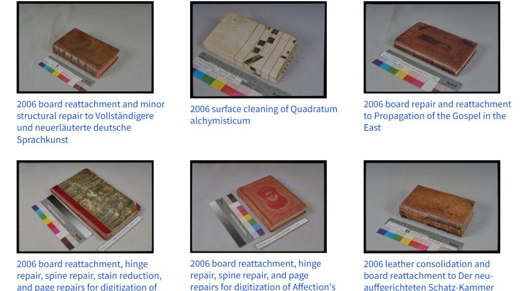
To date we have ingested around 1,400 records into the repository, which covers up to the 2016/17 fiscal year. At the moment we are hard at work preparing records from the next 3 fiscal years for ingest. Our eventual goal, once we are caught up, is to have a regular, annual release of records from the previous year.
We have heard that some of our colleagues are already using the CDA for research and instruction. In the next episode of this series, we will dive into the interface and look at some of the ways this collection can be used for research.
Batterham, I., & National Archives of Australia,. (2008). The office copying revolution: History, identification and preservation : a manual for conservators, archivists, librarians and forensic document examiners.
Today we are excited to publicly announce the launch of The Conservation Documentation Archive (CDA). This is the culmination of several years of work to digitize and make available all of the conservation documentation that has been produced as part of caring for Duke’s collections for the last 26 years. Over 1400 records have been ingested into the Duke Digital Repository at this point, with smaller batches of records expected to be added annually. This work was generously supported by a 2021 Lyrasis Catalyst Fund grant and was awarded the inaugural Sandy Nyberg Award. We hope that this archive will become a valuable resource, not only for researchers to access additional information about objects in the collection, but in documenting the standard preservation practices of our institution and the profession at large. A great deal of thought and effort went into building the CDA, so over the coming months we will publish a series of blog posts discussing in greater detail some of our motivations and processes for creating this repository collection.
In the first installment, we will travel back to February 2020, when staff from Conservation Services began discussing this project, to examine the scope of records that needed to be digitized and problems that the CDA is attempting to address.
Readers who are unfamiliar with the details of our work may be asking, “What is all this documentation and why do we need to save it?” The rationale for creating and maintaining documentation is laid out in The American Institute for Conservation’s Guidelines for Practice (see numbers 24-28), one of the core guiding documents for our profession. The purpose of this documentation is to be an accurate and permanent record of our examination, testing, and treatment for any of the objects that come under our care. This could be when an item will be altered as part of conservation treatment, but documentation is often created for condition assessments, like collection surveys or prior to an exhibit loan. Our records attempt to describe the collection material, establish its condition at the time of examination, and help future custodians in their work with the item. When possible, the records we create include both written reports and images.
The format and detail of the treatment reports has varied considerably over the years, depending on the type of object or collection, circumstances, and who produced it. Most of our records were produced by department staff over the years, but some of the records come from vendors or conservators in private practice. Reports typically start with a number of basic fields with identifying information from the catalog or finding aid and name of the examiner and a date for the report. The item’s dimensions are measured and recorded on the form. The report might also include a statement about the justification or goals for treatment.
Next we try to thoroughly describe the object (and accompanying items), including the format, structure, style, and decoration. The report includes what materials are used and if there are any distinguishing characteristics or marks. We also try to capture any condition issues that are observed, including damage or degradation, evidence of past treatment, and risks of additional damage or loss from use. We will note the methods of examination, including any testing and their results. This information informs our proposal for treatment.
Condition section of an Object Treatment form
The proposal for treatment is often a list of potential options, ranging from minimal intervention to very extensive treatment. We typically list the materials we will use, any alternative approaches that might be possible, and the potential risks. The proposal will include an estimate for the treatment time to help with setting priorities and workload. At this stage in the process, we will hold a meeting with the collection curator and other stakeholders to discuss the various treatment options and arrive at the best course of action for the item. This section of the report includes space to document the date of the meeting, the names of staff in attendance, and signatures of the conservator and curator or collection manager.
The remainder of the report describes the treatment itself, such as procedures or techniques and the location and extent of all alterations. If the treatment carried out is in any way different from the proposal, we will note why. This section documents any material that may have been added or removed, including the manufacturer or source for added materials. We list any adhesives or other substances (cleaning agents, solvents, poultices, etc) used in the treatment, including their chemical name and manufacturing source. This information will be most helpful if the item needs treatment again in the future or if any of the alterations need to be reversed for some reason. The date the treatment was completed and the time spent are also recorded here.
Before and after treatment photos
We produce photographs of the item before any alterations are made and after treatment is complete. In some cases we will photograph the object during treatment, too. We follow the AIC Guide to Digital Photography and Conservation Documentation for our photography workflow. The photographs typically show the item positioned on a neutral gray backdrop and include a target or photo checker card and printed label. The target or color checker provides a standard of comparison to help capture scale, direction of illumination, and true color of the item. These targets help us to create consistent before and after images, so that one can more easily compare the changes that occurred during treatment. The label in the photo includes a unique identifier for the item (the lab log number) and date of the photograph. This practice ensures we can always identify the item in the photograph, even if the file names or image metadata are altered or erased.
Conservation Services has been storing legacy documentation produced over the last 26 years in a large filing cabinet. The records for each treatment reside in their own paper file folder. The formats and media of those records have changed with the available technology. In addition to paper reports, our archive of physical media contains 35mm color slides, and inkjet photographic prints. The born-digital documentation is saved in a variety of file formats on networked storage. Reports tend to be saved in Microsoft Word or PDF format, while the images are saved in an archival raw format (DNG), as well as derivative TIFF and JPG versions. The TIFF acts as a preservation-friendly file format, while the JPG is a compressed format that is much easier to scroll through or post on the web. We have been printing paper copies of the forms and representative images as a backup for several years. Some of the older treatment folders hold very small fragments (like remnants of original sewing thread) that could not be reincorporated into the object during treatment. Our current practice is to encapsulate small fragments and store them in the enclosure with the item.
The conservation documentation that we produce has enduring value for both collections research and the history of the library. One of the key principles of the Duke University Libraries Strategic Plan is support and advocacy for openness. Our department has always made our records available to anyone who asked (assuming that access respects donor agreements for restricted collections and confidentiality), but previously there hasn’t been a good mechanism for researchers to know that an item has been treated or that these records exist. Library staff in other departments may not even be aware that we have a cabinet full of reports sitting in our lab.
Survey data from McCann (2012)
This is a fairly common situation across our peer institutions. A 2012 survey by Laura McCann at NYU Libraries indicated that a majority of conservators at research libraries are producing documentation for special collections treatments, but fewer than half are depositing those records into the institution’s archives. Maintaining records of previous treatments is important for making decisions about the item’s care in the future. It also becomes an important record if an item is lost, destroyed in an accident, or becomes inaccessible for other reasons. Improved access to our documentation might help us to evaluate different treatment methods or materials. It might also aid future scholarship into the history of the conservation profession, providing a record of accepted practices for different time periods, and giving more context to our thought processes and rationales for certain treatment decisions.
With this summary of what we are trying to preserve and why out of the way, next we will look at some of the work that went into digitizing the legacy records and creating the necessary metadata for ingesting everything into the Duke Digital Repository. We’ll be taking a break from blogging in December, so look for our next installment in January 2024.
Frey, F. S., Warda, J., & Digital Photographic Documentation Task Force. (2011). The AIC guide to digital photography and conservation documentation. American Institute for Conservation of Historic and Artistic Works.
Everywhere you turn lately it seems like tech companies are adding some kind of AI feature to their software. Sometimes these updates are incredibly useful. Other times… not so much.
We discovered that Microsoft Word will now automatically generate Alt Text (alternative text) descriptions of the images you insert into your documents after it described an Ethiopic scroll as a roll of toilet paper. Clearly the robots have some training to do on cultural heritage materials.
Alternative text is important for making documents more accessible and we make every effort to add it when we can. I’m sure this automatically generated text is accurate enough for stock images and maybe will improve over time, but for the treatment and handling documentation we create it’s really only good for a laugh. We have turned it off rather than risk some ridiculous description being saved in our work. Just open the Options menu and look for either Accessibility or Ease of Access (depending on your version) to silence the machines.
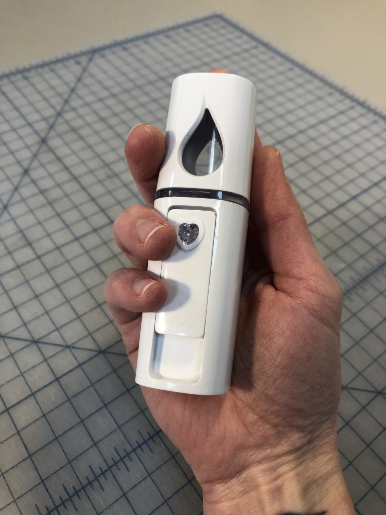
This tip is shamelessly stolen from a blog post by Satomi Sasaki Verhagen on The Book & Paper Gathering and I cannot thank them enough for writing about this wonderful tool.
It’s a mini, handheld humidifier that creates a very fine mist (click here for a short video) perfect for localized humidification. It looked so useful in their blog post I ordered one right away and had fun playing around with it when it arrived.
Now over a year later I’ve finally had a chance to use it on a treatment project. I blame working from home for not finding a use for it earlier.
We recently got a large vellum binding with many creased and torn fold outs that needed flattening and mending. The binding was stiff and allowed for only a very small opening angle. Mini-humidifier to the rescue. I was able to very lightly humidify just the localized areas of creasing to flatten and realign them before mending. It worked beautifully. Because the little humidifier doesn’t create a very large spray of mist it was easy to direct and keep only in the areas I wanted. Also, it creates such a small amount of moisture that it worked very slowly so it was easy to control how humid each area got.
It wasn’t perfect though. If left running it could build up condensation around the nozzle especially when held at an angle. I found I had to hold a paper towel around the base to prevent any of these drops of condensation from falling on the page I was humidifying. Regularly turning the humidifier off and blotting drops of water off from around the nozzle helped manage condensation build up. The battery didn’t last very long but it is rechargeable and charged very quickly while I was at lunch.
Overall I was so happy with how this tool works and will definitely be using it again.
On this day in 2009 our blog was born! Looking back, we have accomplished quite a lot here over those 11 years. We are rapidly approaching our 500th post. It seemed fitting to celebrate by highlighting our eleven most popular stories or “quick pics” from the lab:
I was a bit surprised to see that three of the top posts are from this calendar year. With the disruption to everyone’s work over the last 9 months, it has been a little more challenging to keep to our usual publishing schedule. But with everyone spending more time at home these days, I guess that also means more folks are looking for something to read. Welcome to our new readers and a huge ‘thank you’ to long-time followers who have stuck with us! Here’s to another 11 years of preservation stories, coming to you from the library basement. Have a safe and restful holiday.
One of the silver linings of business travel being suspended for the foreseeable future is that so many conferences have gone virtual this year. This has provided a number of opportunities to experience the meetings of professional groups outside my usual repertoire. This week I’ve been really enjoying the International Mountmakers Forum. The organization has been very generous to record and upload the talks to Youtube.
Mounting objects for exhibition can be very challenging, and I have learned about new materials and techniques this week that could be used in the gallery spaces in our library.
The success of virtual conferencing during that pandemic gives me hope that this kind of programming will remain available, even when the world has returned to normal. Conferences are an essential fundraising opportunity for many professional organizations, and there can be financial disincentives for the organization in making content too freely available. At the same time, there are many professionals working in cultural heritage institutions or in private practice who do not have access to funding for professional development and are cut off from the debates and interactions that happen at these meetings. I’ve been very impressed with the way our professional organizations have adapted in the last year and I look forward to continued innovation and greater inclusion using these same systems in years to come.
We get pretty excited about labels in the Conservation Services department, as evidenced by this post, and this one. Apart from spine labels, we frequently add signage to our enclosures to provide information about what’s inside and how it should be handled.
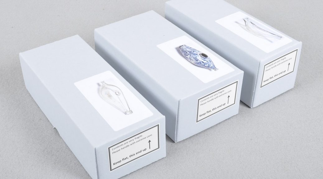
We often add picture labels to the outsides of our enclosures, particularly those containing fragile objects. We find these labels cut down on browsing and give and idea of what’s inside.
Picture labels can be created fairly quickly by capturing at relatively low resolution and under normal lighting conditions. We photograph items on a white background in our digital photographic documentation studio. Using the levels adjustments in Photoshop, select the white eyedropper and then select the white background. This usually causes the background to disappear and makes for a cleaner looking label.
We add in handling information specific to the item, such as HANDLE WITH GLOVES or CAUTION: SHARP!
We also print of sheets of small labels with common handling concerns, such as CONTAINS GLASS, FRAGILE, HEAVY. This makes for quick and easy labeling of boxes that otherwise wouldn’t get a special photo label.
We’ve even had luck playing with clip art to make some useful handling labels.
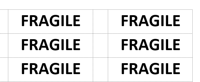
Infographics
Sometimes you need a simple and specific way of demonstrating how to handle an item, and narrative text or clip art just won’t cut it. We’ve had some luck creating infographic style labels using this process:
Take a high resolution photo of the action/item you’d like to have pictured in your infographic label.
In Photoshop, open your image and create a new layer on top of the image.
On the new layer you’ve created, trace the elements with a drawing tool. Working at 100% or higher, and using the smoothing settings will help to improve any jagged or rough-looking lines in your drawing.
Copy the layer with the drawing and paste it onto a new blank canvas with a white background. Make any final adjustments to your drawing, keeping in mind that it doesn’t have to be perfect.
Reduce the size of your drawing without reducing the file quality. Most of these images will not be printed out very large, so pick a label size, such as 2 x 4” and resize the drawing so it fits on that label. You will find that most imperfections in the drawing will not be noticeable when the drawing is resized.
It’s a hard to believe, but over a year ago now I posted about our new method for documenting collection material going on loan. I’ve learned a lot about the technology in that time and would like to share some of those lessons, in case others are considering adopting the method. While the system I described back then did work well to document the necessary information on a compressed schedule, ultimately some of the tools present problems for reformatting and long-term digital storage of the reports.
In my previous post, I outlined some of the benefits of using Microsoft OneNote for generating reports:
Full access to the software is included in our institution’s Office 365 license.
It seamlessly works with other Microsoft products, like Excel, which we often use to manage collection metadata for projects.
Annotation of images can be done right inside the application. When off-site, it was very quick to photograph objects using the Surface Book’s camera and make drawings directly in the report.
Organization of pages and visually managing the workflow is easy. I applied a standard naming convention to each report and then organized them into sections based on their status within the project. Kind of like a Kanban board.
While creating and using documentation inside OneNote worked well, getting that same information out without disruption presents a bit of a problem. I think a lot of these issues stem from the way the application handles page layouts and images inside pages.
A new page defaults to an “auto” size, which is essentially a standard page width with infinite length. This allows you to create a document of whatever size you need and, at first, seems pretty great.
How finished reports look inside OneNote.
When the page is exported as a PDF or printed, the application inserts page breaks as needed. Sometimes this works out, but more often I found that the images are broken up.
That same report exported to PDF. Notice the page breaks and image shift under the annotations.
My first thought for resolving this was to set the page size as standard letter and carefully lay out the report to fit within the margins of each sheet. Surprisingly though, a “page” within OneNote can’t contain multiple “sheets”. When your report gets longer than the standard 11″ of page height, the content just starts to move off into a grey void.
A report inside a Letter-sized page, with content running off the page. Image shift also occurred when the sheet size was changed.
When you convert this page to a PDF, page breaks are inserted in the same way they would be for an “auto” sized page. I’m puzzled why the application was designed this way.
Another major problem I found was that the horizontal position of the image tends to shift slightly left when the the page is exported or printed (see examples above). The is extremely frustrating, when you’ve taken great care to put your annotations in specific locations and I could not find a way to fix it. Unlike a lot of other Office products, the image and overlaid annotations can’t be grouped in OneNote. I have found two workarounds for this problem after the report is converted to a PDF:
Luckily, the annotations remain in the same position to one another. If the image isn’t split by a page break, I was able to use Adobe Acrobat Pro DC to edit the PDF and just slide the underlying image back into place under the annotations.
If the image was split by page breaks, I found it quicker to use the Snipping Tool in Windows to copy the image and annotations out of OneNote in the correct orientation and save them as a single JPG. I would then delete the fragmented image and annotations out of the PDF report with Acrobat Pro and replace them with the snipped image.
Obviously, these workarounds come with the additional cost of an Adobe (or other PDF editor) license.
The fixed report PDF
In light of these issues, how will my approach to loan documentation change in the future? Some key aspects will remain the same. For example, the Surface Book 2 performs very well for writing the report and creating accurate image annotations. I also think the overall design of the form was good.
A major change will be to annotate images in a separate application and save them as a derivative image file. This will take some additional time to set up on the front end, but will create fewer issues further down the pipe. I have created a draft template in Adobe Photoshop, which contains my photo documentation of the item and a standard annotation key in separate layers. The automation tools within Photoshop could be used to create batches of these annotation-ready images for large numbers of loan items at once.
Photoshop template with photodoc and annotation key in separate layers.
For future loans, I will also retire Microsoft OneNote from the workflow. It is important that we be able to easily convert our documentation to PDF and print a hard copy for preservation purposes. OneNote’s export problems, particularly for annotated images, require a lot of time and effort to correct on the back end. The useful features, like check boxes and timestamps, are not an equal trade off. What software will replace it? I don’t know for certain yet, but it will definitely be a word processing application where content stays in position during printing and export! Microsoft Word will probably be fine, but we could also probably use Google Docs. I think the composing application matters less with the annotations saved in a single image file.
Each spring for the last couple of years, I’ve traveled up to the Winterthur Museum, Garden & Library to teach a workshop on blind and gold tooling to students in the Winterthur/University of Delaware Program in Art Conservation (WUDPAC). The workshop provides a very basic introduction to all the tools and materials that have historically been used to decorate bindings and allows the students to try some of the techniques for themselves. We also use the time to examine bindings from the library’s collection, looking closely at tool marks and other evidence, to determine how they were produced.
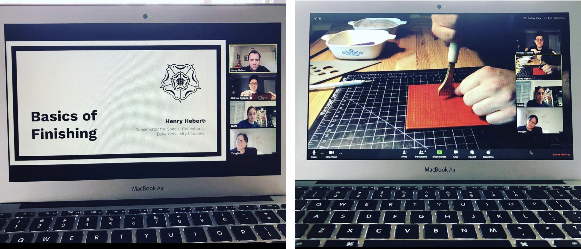
With in-person instruction suspended this semester, we decided to try a modified version of the workshop via the popular video conferencing platform Zoom.
Photos by Dr. Melissa Tedone
I had to change a lot about how I would ordinarily approach this workshop, since I usually provide paper hand-outs and bring a number of physical samples for students to examine. I was able to get around some of this by using the screen-sharing feature to display images of specific tools and diagrams of important concepts during the lecture portion of the workshop. I also shared links to specific bindings in the Folger Shakespeare Library’s Bindings Image Collection, so that each student could zoom in or navigate around the image on their own. Resources like this were a helpful stand-in for bindings from the Winterthur Library’s collection.
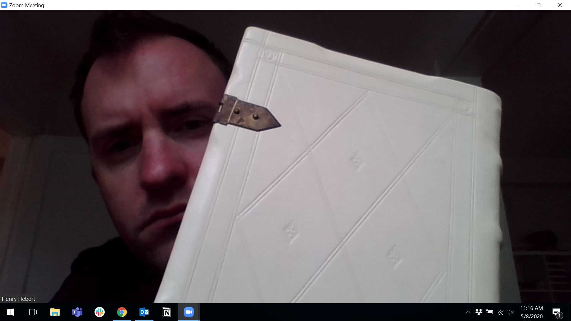
But what if you have an item on-hand which you would like your participants to examine more closely? My laptop’s webcam is thankfully good enough to show a fair amount of detail, but it can be a little tricky to orient the object in front of the camera so that your room lighting shows the surface characteristics. It might also be impossible to hold the object upright enough to view in frame.
“Can you see the decoration on this binding?”
I’ve seen some enterprising examples of detachable webcams mounted to headbands or task lights to create document cameras, but my webcam is not detachable. It turns out there is a simple way to turn your smartphone into a secondary, hand-held camera! Unfortunately, I figured this trick out too late for my own workshop – but maybe it can be useful for other folks doing instruction remotely. This trick requires you to first install the Zoom mobile app.
I start by scheduling a Zoom meeting and then either add the invitation to my calendar or email it to myself for quick access later. The meeting is launched on the primary device (in my case, a laptop) and the video and sound are set up. Instruction proceeds as usual until the hand-held camera is needed. At this point, tap the meeting link on a mobile device to join. When the meeting has launched in the mobile app, select “Join with Video” and then tap “Cancel” when asked to join audio. I learned the hard way that you will get some rather unpleasant feedback and echoing if you have audio going on two devices at once.
At this point your meeting participants will be disoriented by your competing video feeds (and maybe by your disheveled quarantine hair), but these feelings will pass.
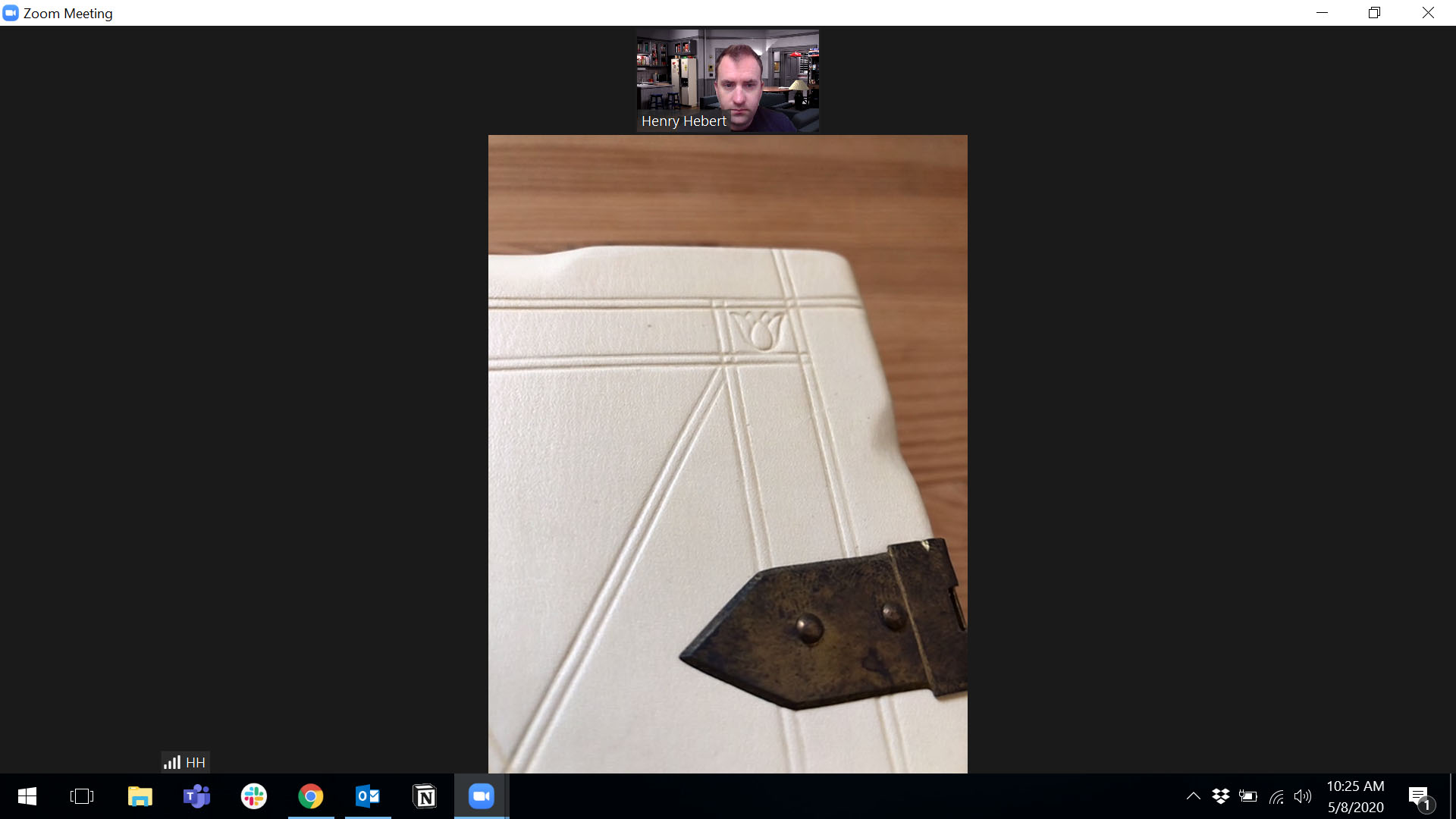
Tap the button at the top left of your mobile device’s screen to switch to the rear-facing camera. You should ask your audience to find and “pin” the video feed for your mobile device, so that it occupies the majority of the screen when they switch to the “speaker view”.
Now you can easily move your mobile device around the object during your instruction session. When you don’t need the second camera anymore, simply leave the meeting on that device. Obviously this setup will put some additional load on your home network and internet connection, but it has worked well enough in my experiments to get the job done. This method will probably also work on other video conferencing platforms, but I have not attempted it.
With so many people developing and participating in online instruction right now, I’m sure others are finding new and helpful ways to use the technology we might already have at home. What tools or tips have you found useful in your work from home situation?