Jovana Ivezic, our new Senior Conservation Technician, started work at the end of March just as we were settling into the Governor’s work from home order. Jovana comes to Duke from the Library of Congress where she was a library technician. There she performed a variety of repairs from new spines, paper repairs, and at least one very large post binding.
She housed over 2000 items from the LC Collections in the three years she was there. These skills will come in very handy once we are back onsite and we start making enclosures for our regular workflows and the Lilly Enabling project.
What is your favorite tool?
My favorite tool is a tie between a scalpel with a fresh blade and my small brass triangle.
What is your favorite treatment?
My favorite treatment is a new case, especially in a three-quarters style binding. Nothing more satisfying than giving a sad, beaten up book some new life.
What’s it like starting a new job during a worldwide pandemic?
I never thought I’d ever be starting a job in these kinds of circumstances, especially one that isn’t particularly conducive to teleworking. I will say I’ve enjoyed using the extra time in my apartment to get properly settled in, as well as catch up on readings and training videos I wouldn’t normally have the time to read/watch otherwise. I look forward to getting to work with my new coworkers and colleagues in person once we’re back on campus though, and to check out all the amazing food places I keep being told to try once the stay-at-home order is lifted.
Do you have a memorable treatment you can share?
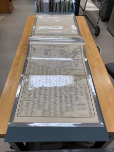
Here you can see an oversized atlas from the Library of Congress’s Geography & Maps division.
Due to its extraordinary size, the acidic nature of its pages, and the fact that this atlas was a frequently handled item, I decided that a post binding was the best housing choice. A post binding allows for safer handling by patrons, while protecting the original material better than a regular clamshell or four-flap box ever could.
Every year we celebrate Equipment Day, the day the Schimanek board shear and book presses landed on our loading dock from Germany on April 9, 2003. Although the conservation unit was formed almost a year prior in July 2002, it’s April 9th that we celebrate becoming “a lab.” So depending on how you count, we are either 17 or 18 years old this year.
April 9th was a bit of a blur this year because we are all working from home. We were going to have a celebration that included a reception and an open house for the lab. Since we can’t do that together, we thought we would post our presentation here. The biggest piece of news this year is that we have surpassed the quarter-million mark for items coming through the lab since 2002.
And if you haven’t seen the lab, we have a video tour online.
Happy birthday to us. Stay safe. Be kind. Wash your hands.
Due to Covid-19, Duke University Libraries decided to close on March 20, 2020. We are working from home until further notice.
Before we left the lab, we made sure our collections disaster plan was up to date. We have several versions of this plan.
A traditional long-form plan that many of you have. If you don’t have one, here’s some help in writing one.
A one-page “get started” plan with critical phone numbers and first-steps to take during an emergency. We keep several copies of this in our disaster closet for grab-and-go.
A Pocket Plan with a complete phone tree on one side, and first-steps on the other. This is handy for when the power goes out, and when you just need to find a phone number fast.
DUL Pocket Collections Response Plan. Good to have when the power goes out.
We coordinated with Rubenstein Library to take the materials we were working on back to the secure stacks. This posed an excellent use of several sheets of delaminating corrugated board that we have squirreled away in our supply closet.
Book trucks labeled and headed back to the secure stacks.
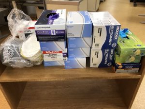
Before leaving we called the head of procurement for Duke Medical Center to ask if we could donate our PPE including N95 masks and nitrile gloves. They came over in about ten minutes to pick these up. I wish we had more to give.
Not much, but every one counts.
With that, we were off to try this work-from-home thing. So far, it is going OK. Best part is that many of us finally have an offices with windows. It might be difficult to return to the basement.
Stay home if you can. Stay well. Be kind. Wash your hands often. See you soon.
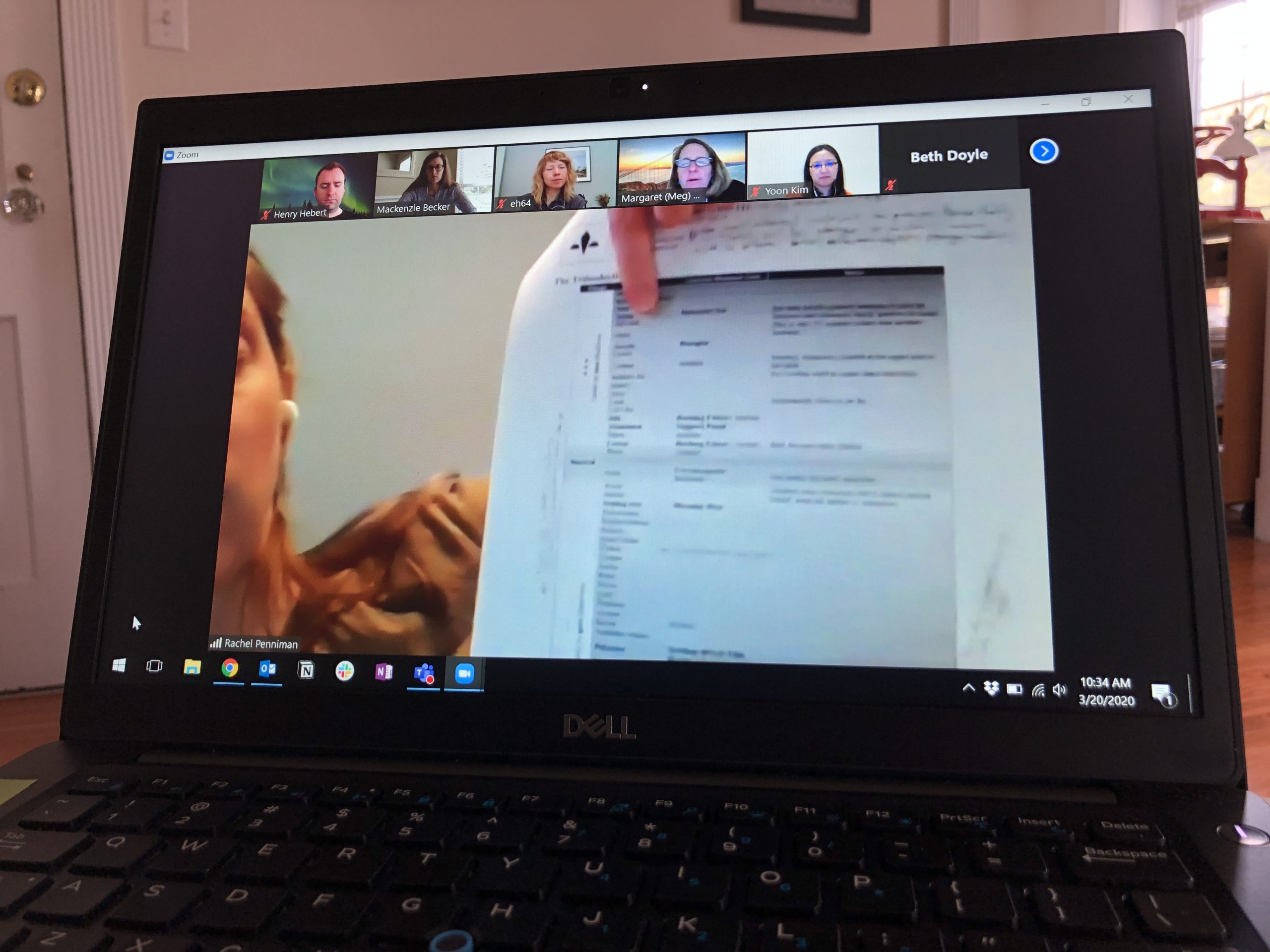
Here Rachel is showing a chart of the Triboelectric series (right before we all remembered we could just share screeens 🙂 ). It’s nice to be able to connect with colleagues so easily, despite everything that is going on.
As the Covid-19 virus spreads, we have started planning for work that Conservation staff can do at home should we be told to stay off campus. As of this publication we have not been asked to stay home but preservation professionals prepare for the worst and hope for the best. This has been a thought provoking exercise and everyone has contributed to our brainstorming.
We wanted to share what we have drafted to date in case any other labs are in a similar situation. These discussions are also happening on the AIC Community discussion boards and on social media. If you have other ideas, please share in the comments. A big thank you to Kristen St.John at Stanford for the original idea and letting us run with it.
Host a virtual “unconference” for a focused but informal online discussion on a certain topic. See “How To Run A Free Online Academic Conference: A Workbook (version 0.1)” [credit Sarah Reidell, Penn Libraries] This could include a department wide virtual meeting to discuss a reading, video, etc.
Skills/Individual Development
Write end of year performance evaluations (it’s that time of year afterall)
Create a book model that you haven’t learned before, or explore sewing structures you haven’t learned before, etc.
Did you know singing the refrain from the School House Rock Constitution Preamble episode takes just over 20 seconds (the recommended length of time to wash your hands with soap and water).
And the Preamble goes like this:
We the people,
In order to form a more perfect union,
Establish justice, insure domestic tranquility,
Provide for the common defense,
Promote the general welfare and
Secure the blessings of liberty
To ourselves and our posterity
Do ordain and establish this Constitution for the United States of America.
It’s #WorldBookDay today and we are highlighting some books that have come through recently from Technical Services.
There seems to be a new trend in publisher’s bindings: the exposed-spine binding. We call them “naked bindings” because they lack part of their cover. There’s even a subject heading for this kind of binding called “Backless Bindings (binding).”
Adhesive layer can be very thin (almost invisible) to very thick; sometimes unevenly applied
Covers are commonly chip board or binders board, but some are a heavy paper much like a paperback.
Cover attachments seem to be either tipped onto the first and last flyleaf, or a doublure attachment. Occasionally you find one that has a doublure with a sewn-on binders-board cover (this must be the “Mercedes of Exposed Spine Bindings”)
One commonality: these are very weak bindings especially those with tipped-on covers, loose sewing, and unevenly applied adhesive.
Why does this binding work for this book? The book is about a textile exhibit. The exposed threads, multi-colored thread choice, and loose threads on the front cover all relate in some way to the textiles highlighted in the text block and textile artistry.
Nice thread choice.
Lovely loose ends on the front cover.
Happy little sewing in the middle of a section.
The covers are fully adhered to a doublure, and that section is sewn onto the textblock. This creates a very stable and secure cover attachment. Overall it is a solid binding whose design connects to the contents of the book.
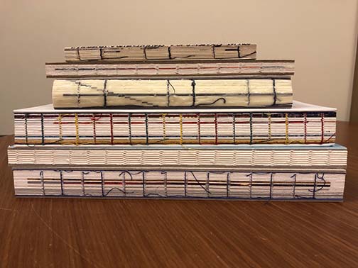
Straight Out of Coptic
These are obviously machine-sewn edition bindings but they hark back in my head to Coptic bindings with a nod towards the Sewn Board Binding originally designed by Gary Frost (which itself gives nod to Coptic bindings).
Coptic binding models.
These exposed spine bindings lay really flat because they don’t have all those pesky spine linings to control the opening. They are very vulnerable to rough handling because the binding has no protection and the board attachment is really weak.
Everyone Gets an Enclosure
This group of “Backless bindings” will have custom four-flaps created to protect the bindings. If these were special collections items we might consider a “peekaboo” box that allows the spine to be seen on the shelf. But since these are in the circulating collections, we will give them a standard four-flap enclosure or corrugated clamshell box. These provide a bit more protection from handing and reduce light exposure.
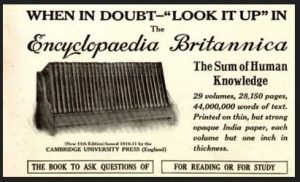
1913 advertisement for the Encyclopædia Britannica Eleventh Edition from Penny’s Poetry Pages.
Unlike millions of old reference works in declining bindings, the 11th Edition of the Encyclopedia Britannica, published in 1910, has a following. Veneration of this edition of the Encyclopedia Britannica spans beyond libraries and the antiquarian book trade into popular culture. A. J. Jacobs writes about it in his book The Know-It-All, and Hans Koning, powerhouse of New Left thought, published an eloquent meditation on the world view reflected in its pages. It is discussed as THE GREAT 11th EDITION, listed alongside the works of Heidegger, Camus, and Fukuyama as one of the 100 most important non-fiction works of the 20th Century. Two websites are devoted to 11th Edition fandom. There is even a fingernail polish.
People who praise the 11th Edition Encyclopedia Britannica point to the illustriousness of the contributors, the profusion of beautifully written biographical entries with odd, sometimes questionable details (Pedro I of Portugal disinterred his dead mistress and placed her remains on the throne of the queen, Potemkin died “…in consequence of eating a whole goose in one sitting,” etc., etc…) or the detailed, illustrated accounts of manufactures, engineering, and natural history. But the veneration of this work is more diffuse and more adoring than these particularities account for. Hans Koning writes:
“The world of the Eleventh Edition was at the zenith of those ‘encyclopedic’ prerequisites, rationality and positivism. All of humanity appeared to be on the threshold of being totally understood, described, improved, and then perfected, through the logic of Anglo-American institutions and thought…it was the high point of the Enlightenment, doomed to end when the lamps went out all over Europe in the fatal summer of 1914.”
Our favorite Encyclopedia Britannica chapter.
Kelly Lawton of Lilly Library had come across a single volume I repaired in the early 2000’s and asked Beth Doyle if it could be used as a model for repair of the remaining numbers in their original bindings. This repair had retained the section sewing and the boards but replaced the badly degraded leather spine and heavy, brittle end sheets. My goal had been to make it robust enough to be handled as part of the circulating collection without unduly sacrificing original components. Fortunately, the technician, the end sheet paper and the black book cloth involved in the process that produced that successful repair were still available to create a matched set.
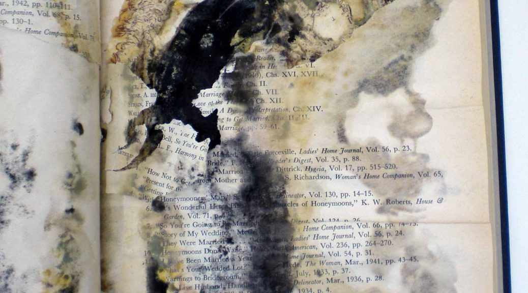
Within the week a large bin arrived and the project began. I used a combination of poulticing and manual manipulation to remove the degraded leather on the spines and the pastedowns on the inside of the covers. This was perhaps the biggest mess I have ever made in the lab, and required a thorough cleaning of tools and work surfaces each night. There were piles of degraded leather crumbles and dust, globs and slurries of poultice, all haunted by the distinctive odor of old animal hide adhesive. Poultices had to be watched closely because some of the remaining leather glued to the back still contained green pigment that jeopardized the section backs of sheer white ‘India paper.’
Repaired and new housings…ready for shelf.
Repaired and ready for its next reader.
Once all 14 volumes were clean, backed and fitted with new end sheets, I reused the original embossed covers in a case structure and filled my press with the newly cased Encyclopedia Britannica volumes.
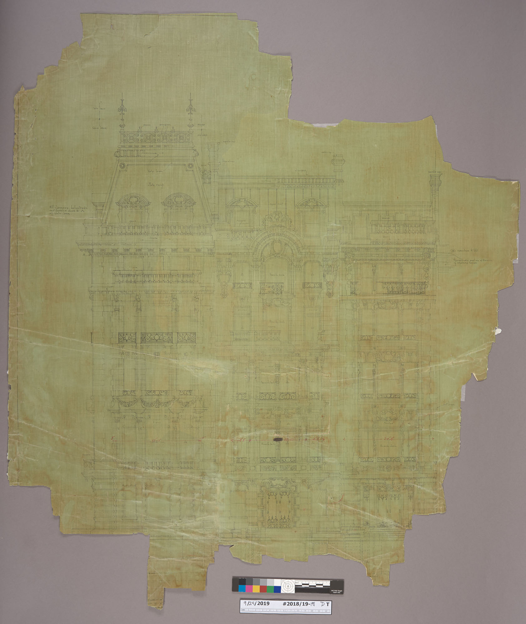
Yesterday, I was going through some collection material from the Duke family that had been transferred to the conservation lab for review and noticed an image of a very familiar-looking building. I knew I had seen it before, but I couldn’t remember where.
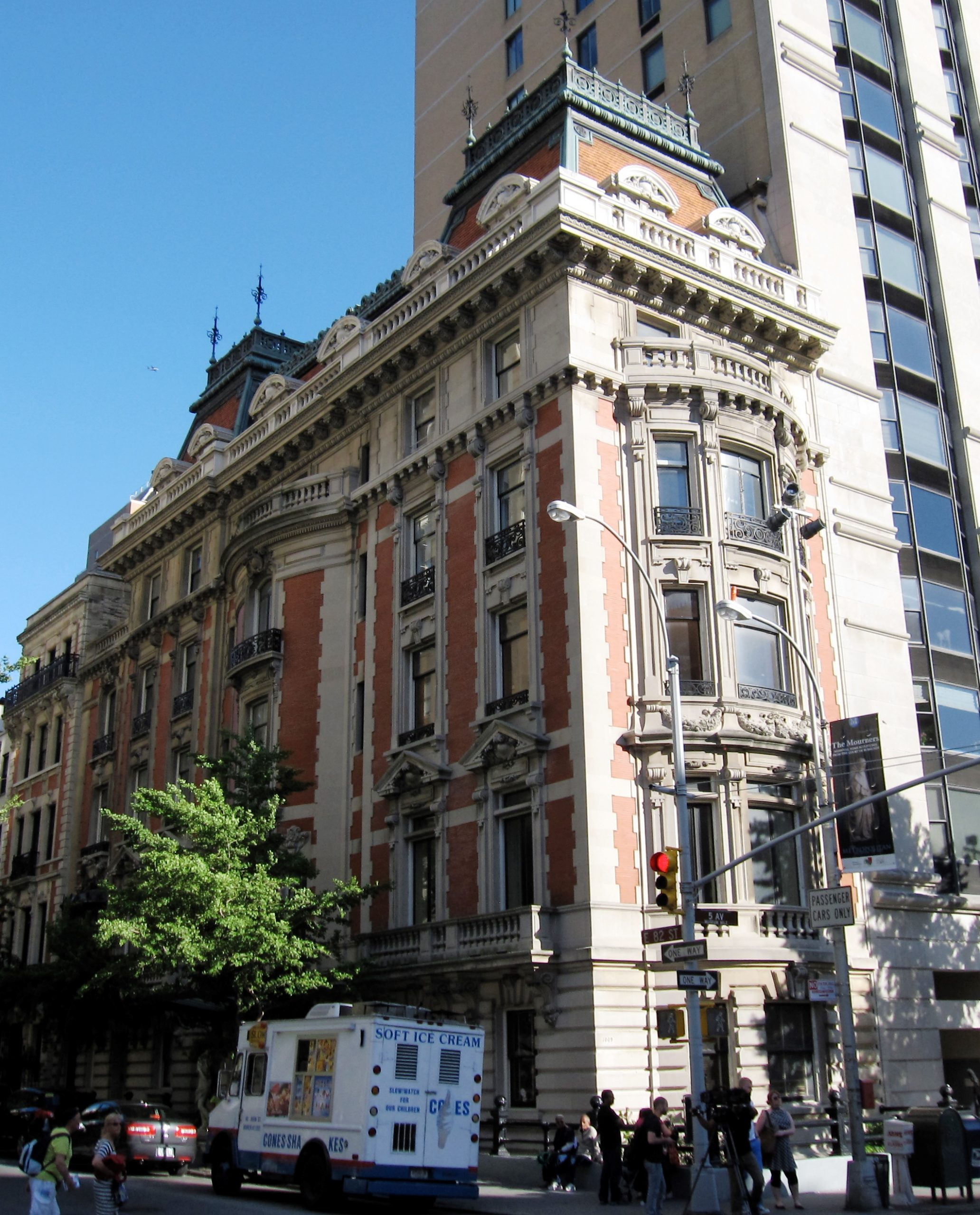
1009 5th Ave, circa 1927
It turns out, I had been looking at it for several weeks. Rachel Penniman has been treating architectural drawings of the same building!
And not only that – I had seen it in real life just a few months ago. Known as the Benjamin N. Duke House, this property is located at 1009 Fifth Avenue in Manhattan, just across from The Metropolitan Museum of Art. I had stopped by The Met after we finished our exhibit installation at the Grolier Club back in December. I stared right at it as I was leaving the museum and didn’t know what I was seeing.
The photograph and drawings that we have in the lab depict the matching limestone and red-brick facades of two other buildings along fifth avenue. Sadly, those structures have not survived.
1009 5th Ave, Today
A few years ago, the mansion received considerable attention when Mexican billionaire Carlos Slim listed it through Sotheby’s for $80 million and it became one of the most expensive public listings in New York.