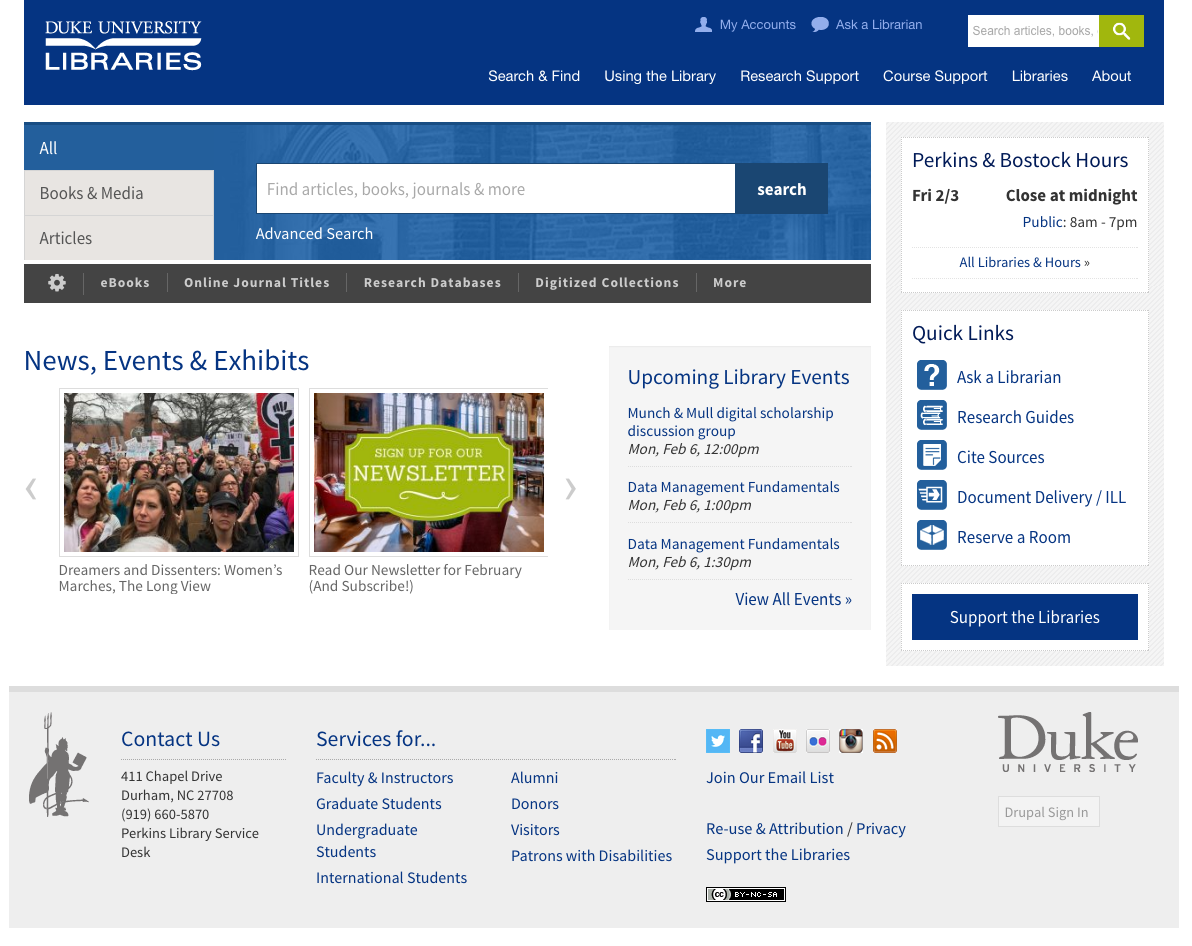
If you’ve visited the Duke University Libraries website in the past month, you may have noticed that it looks a bit more polished than it used to. Over the course of the fall 2016 semester, my talented colleague Michael Daul and I co-led a project to develop and implement a new theme for the site. We flipped the switch to launch the theme on January 6, 2017, the week before spring classes began. In this post, I’ll share some background on the project and its process, and highlight some noteworthy features of the new theme we put in place.

Goals
We kicked off the project in Aug 2016 using the title “Website Refresh” (hat-tip to our friends at NC State Libraries for coining that term). The best way to frame it was not as a “redesign,” but more like a 50,000-mile maintenance tuneup for the site. We had four main goals:
- Extend the Life of our current site (in Drupal 7) without a major redesign or redevelopment effort
- Refresh the Look of the site to be modern but not drastically different
- Better Code by streamlining HTML markup & CSS style code for easier management & flexibility
- Enhance Accessibility via improved compliance with WCAG accessibility guidelines
Our site is fairly large and complex (1,200+ pages, for starters). So to keep the scope lean, we included no changes in content, information architecture, or platform (i.e., stayed on Drupal 7). We also worked with a lean stakeholder team to make decisions related to aesthetics.
Extending the Life of the Site
Our old website theme was aging; the project leading to its development began five years ago in Sep 2012, was announced in Jan 2013, and then eventually launched about three years ago in Jan 2014. Five years–and even three–is a long time in web years. Sites accumulate a lot of code cruft over time, the tools for managing and writing code become deprecated quickly. We wanted to invest a little time now to replace some pieces of the site’s front-end architecture with newer and better replacements, in order to buy us more time before we’d have to do an expensive full-scale overhaul from the ground up.
Refreshing the Look
Our 2014 site derived a lot its aesthetic from the main Duke.edu website at the time. Duke’s site has changed significantly since then, and meanwhile, web design trends have changed dramatically: flat design is in, skeuomorphism out. Google Web Fonts are in, Times, Arial, Verdana and company are out. Even a three year old site on the web can look quite dated.


Better Code
Beyond evolving aesthetics, the various behind-the-scenes web frameworks and code workflows are in constant, rapid flux; it can really keep a developer’s head on a swivel. Better code means easier maintenance, and to that end our code got a lot better after implementing these solutions:
- Bootstrap Upgrade. For our site’s HTML/CSS/JS framework, we moved from Bootstrap version 2 (2.3.1) to version 3 (3.3.7). This took weeks of work: it meant thousands of pages of markup revisions, only some of which could be done with a global Search & Replace.
- Sass for CSS. We trashed all of our old theme’s CSS files and started over using Sass, a far more efficient way to express and maintain style rules than vanilla CSS.
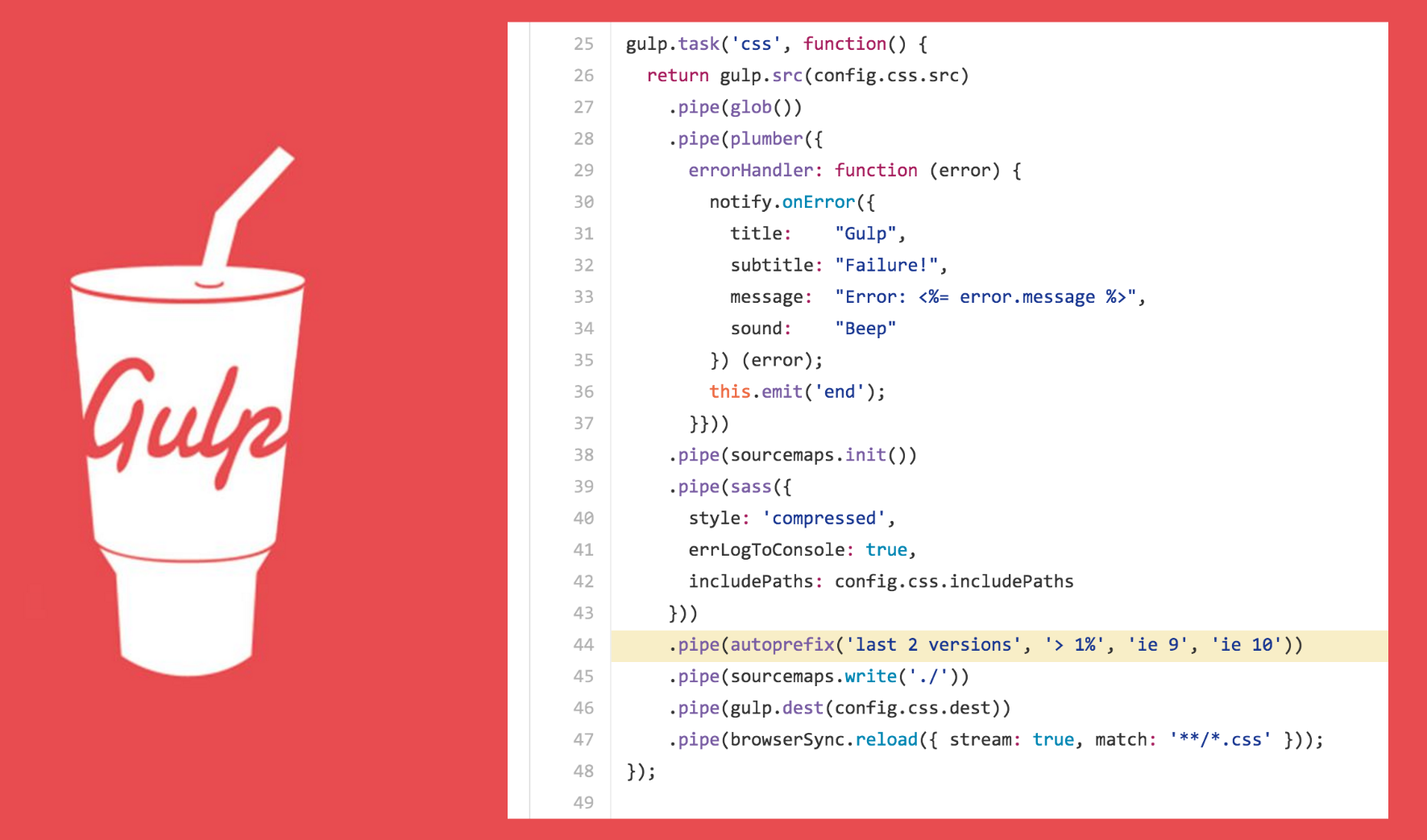
- Gulp for Automation. Our new theme uses Gulp to automate code tasks like processing Sass into CSS, auto-prefixing style declarations to work on older browsers, and crunching 30+ css files down into one.
- Font Awesome. We ditched most of our older image-based icons in favor of Font Awesome ones, which are far easier to reference and style, and faster to load.
- Radix. This was an incredibly useful base theme for Drupal that encapsulates/integrates Sass, Gulp, Bootstrap, and FontAwesome. It also helped us get a Bootswatch starter theme in the mix to minimize the local styling we had to do on top of Bootstrap.
We named our new theme Dulcet and put it up on GitHub.


Accessibility
Some of the code and typography revisions we’ve made in the “refresh” improve our site’s compliance with WCAG2.0 accessibility guidelines. We’re actively working on further assessment and development in this area. Our new theme is better suited to integrate with existing tools, e.g., to automatically add ARIA attributes to interactive page elements.
Feedback or Questions?
We would love to hear from you if you have any feedback on our new site, if you spot any oddities, or if you’re considering doing a similar project and have any questions. We encourage you to explore the site, and hope you find it a refreshing experience.


