Even though we’re working from home right now, we thought we’d add to our What’s in the Lab series with some pictures of neat items from the past that we never got a chance to share. It’s nice to revisit these pictures during this time so we can fondly remember all of the cool things that pass through the Conservation lab on a regular basis.
WHAT (WAS ONCE) IN THE LAB: ELECTRICAL HANDBOOK FOR WOMEN
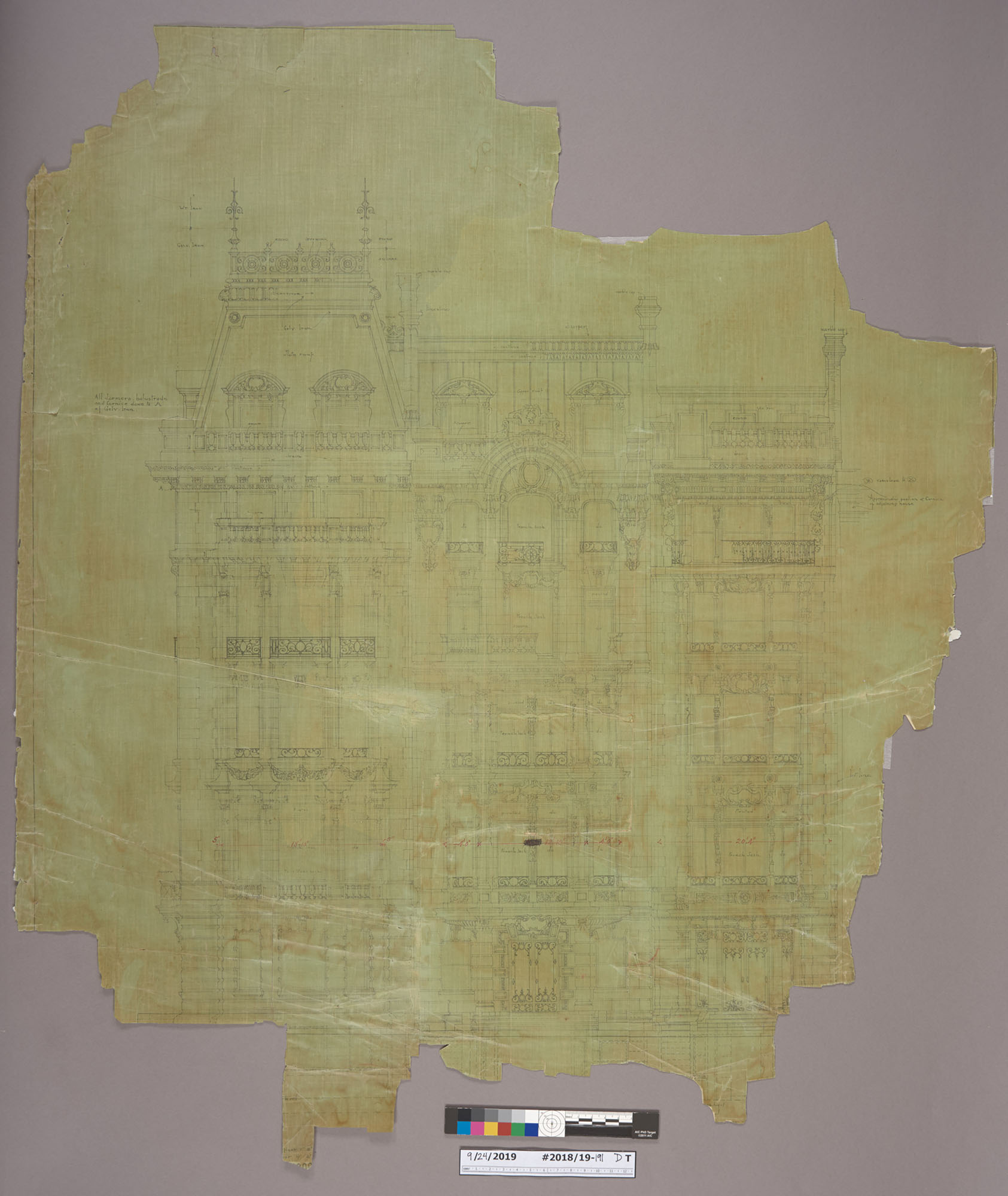
Yesterday, I was going through some collection material from the Duke family that had been transferred to the conservation lab for review and noticed an image of a very familiar-looking building. I knew I had seen it before, but I couldn’t remember where.
1009 5th Ave, circa 1927
It turns out, I had been looking at it for several weeks. Rachel Penniman has been treating architectural drawings of the same building!
And not only that – I had seen it in real life just a few months ago. Known as the Benjamin N. Duke House, this property is located at 1009 Fifth Avenue in Manhattan, just across from The Metropolitan Museum of Art. I had stopped by The Met after we finished our exhibit installation at the Grolier Club back in December. I stared right at it as I was leaving the museum and didn’t know what I was seeing.
The photograph and drawings that we have in the lab depict the matching limestone and red-brick facades of two other buildings along fifth avenue. Sadly, those structures have not survived.
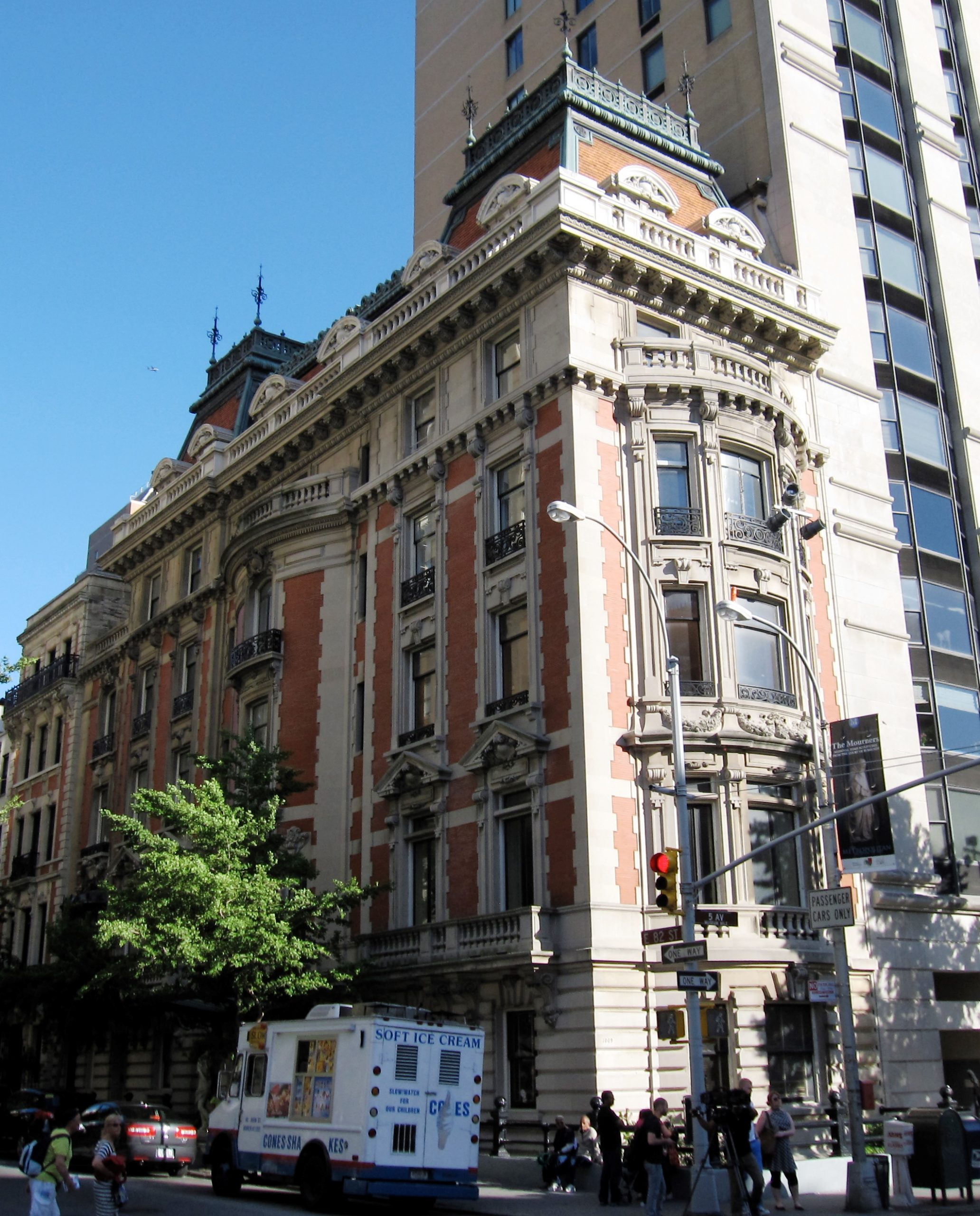
1009 5th Ave, Today
A few years ago, the mansion received considerable attention when Mexican billionaire Carlos Slim listed it through Sotheby’s for $80 million and it became one of the most expensive public listings in New York.
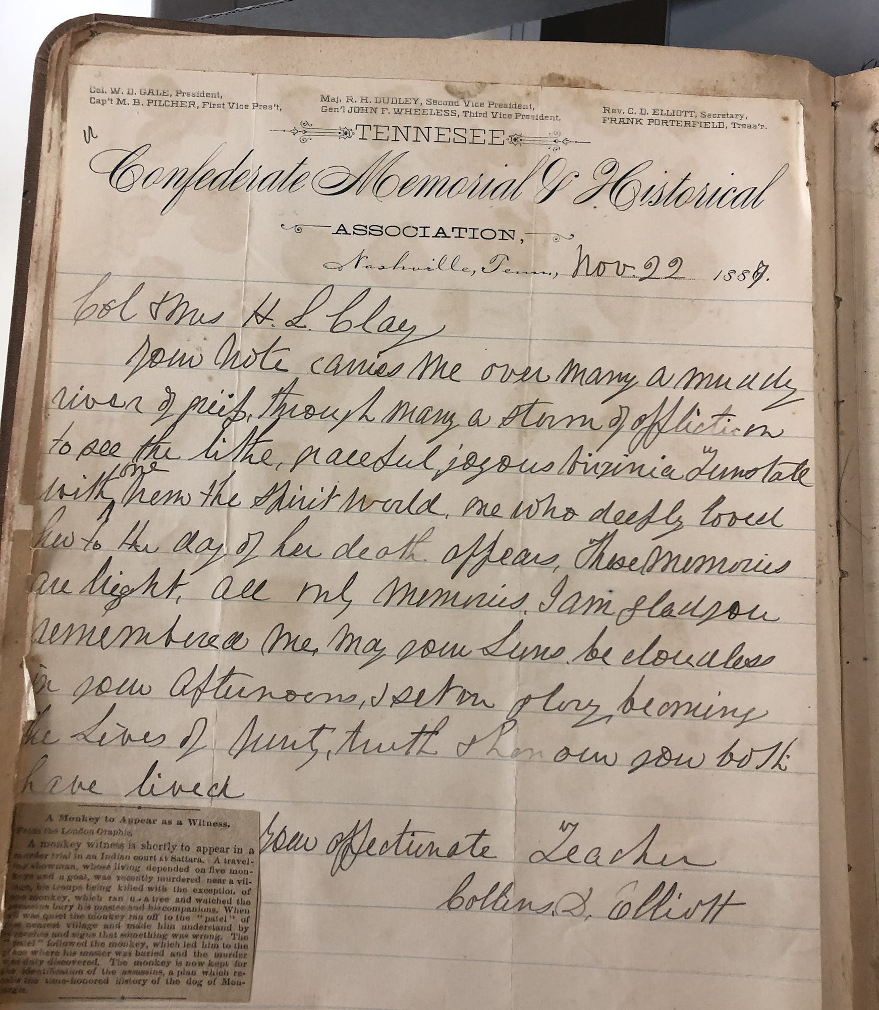
For a more adept criminal, it is probably obvious not to commit a crime in front of another person, as they can be called as a witness in court. Thanks to the scrapbooking efforts of Virginia Clay-Clopton in the late 1800s, today we learned that animals can be witnesses, too!
This scrapbook of Virginia’s (included in the C. C. Clay Papers, 1811-1925) came into the lab the other day for rehousing. It mostly includes correspondence from members of the Clay family in the post-Reconstruction period, but one little newspaper clipping caught our eye.
The clipping describes the murder of a traveling showman in India, which was apparently witnessed by one of his monkeys. I could not determine what eventually happened in this particular case, but the monkey was being detained as a witness.
The clipping’s mention of the Dog of Montargis lead us down a rabbit hole of stories about animal witnesses, historical and contemporary. In addition to monkeys and dogs, we read about legal proceedings involving a parrot named Echo, and a cat named Sal Esposito.
Here at the library, our primary position is that you shouldn’t commit crimes. I will leave it to experts in animal law to debate the admissibility of an animal witness – but if you are going to do some crimes, at least make sure there aren’t any monkeys around.
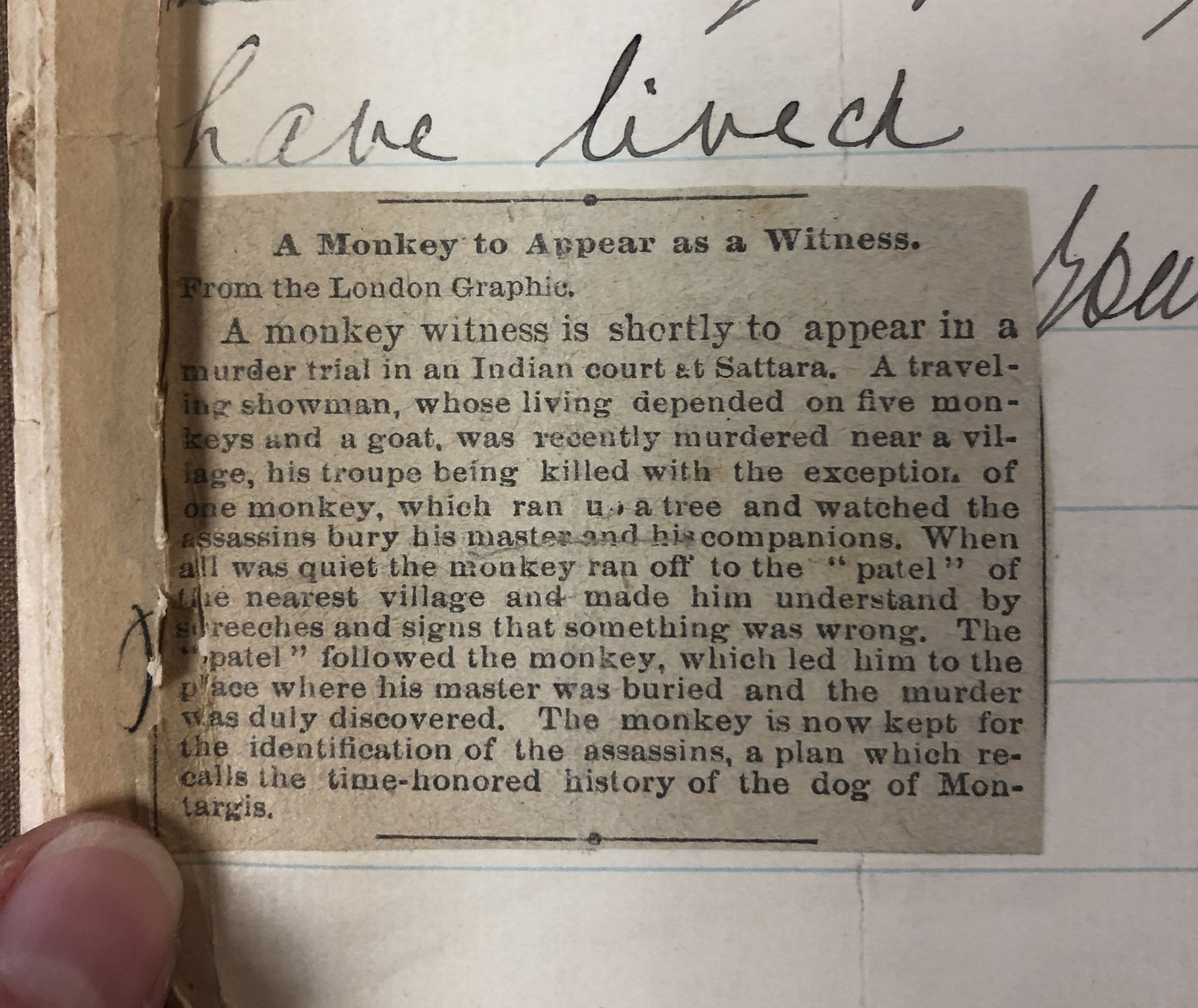
Margarita Philosophica by Gregorius Ileisch (1504), depicting a hornbook
Long used as a primer in children’s education, the hornbook originated in England in the 15th century. The books commonly take the form of a wooden paddle inscribed with the alphabet or a piece of text, which is protected with a transparent sheet of horn. The materials of construction can vary, with the paddle made of wood, bone, leather, or stone. The text can be printed or in manuscript, on parchment or on paper. The protective transparent sheet might also be made from mica. The hornbook is referenced in literature as early as Shakespeare’s Love’s Labour’s Lost and is a format that was often used in both English and the American education until the late 18th century.
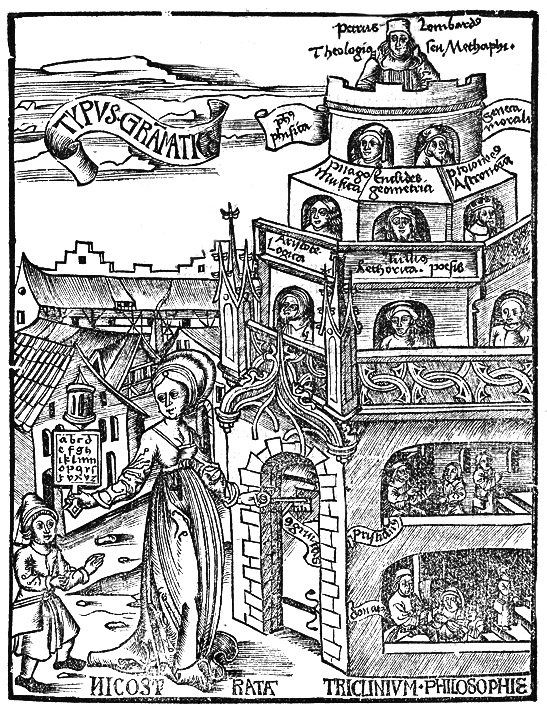
Woodcut vignette from the title page of Hornbyes Hornbook by William Hornby (1622)
We learned all this and more when a special edition of Andrew Tuer’s History of the Horn-Book came through the lab recently for boxing. The publisher’s use of the hornbook’s iconic shape in the decoration on the front cover and the spine label is quite appropriate.
But while this parchment case binding looks fairly ordinary, it contains quite a surprise. The front section of the book has been glued into a solid block, which is quite heavy.
The blocked section features a textile flap along the tail edge of the front flyleaf.
Opening the flaps reveals a hidden compartment with three facsimile hornbooks!
Don’t you wish every history book you picked up included little artifacts hidden inside a secret compartment? Thanks to Rachel Penniman for snapping some photos of this amazing object before it returned to the stacks in its new enclosure.
Erin Hammeke describes a wooden board repair to Mary Yordy and Rachel Penniman.
Caring for library collections often requires experimentation and ingenuity. In supporting the needs of library programs or researcher requests, we are regularly confronted with unusual objects or condition issues that have no obvious treatment solution. When you happen upon a novel or particularly effective approach to these complex treatments, it’s always nice to share what you have learned with your colleagues!
This week, the Conservation Services staff were treated to some tips in treating very large books and broken wooden boards by senior conservator Erin Hammeke. Hint: Both involve the liberal and creative application of clamps.
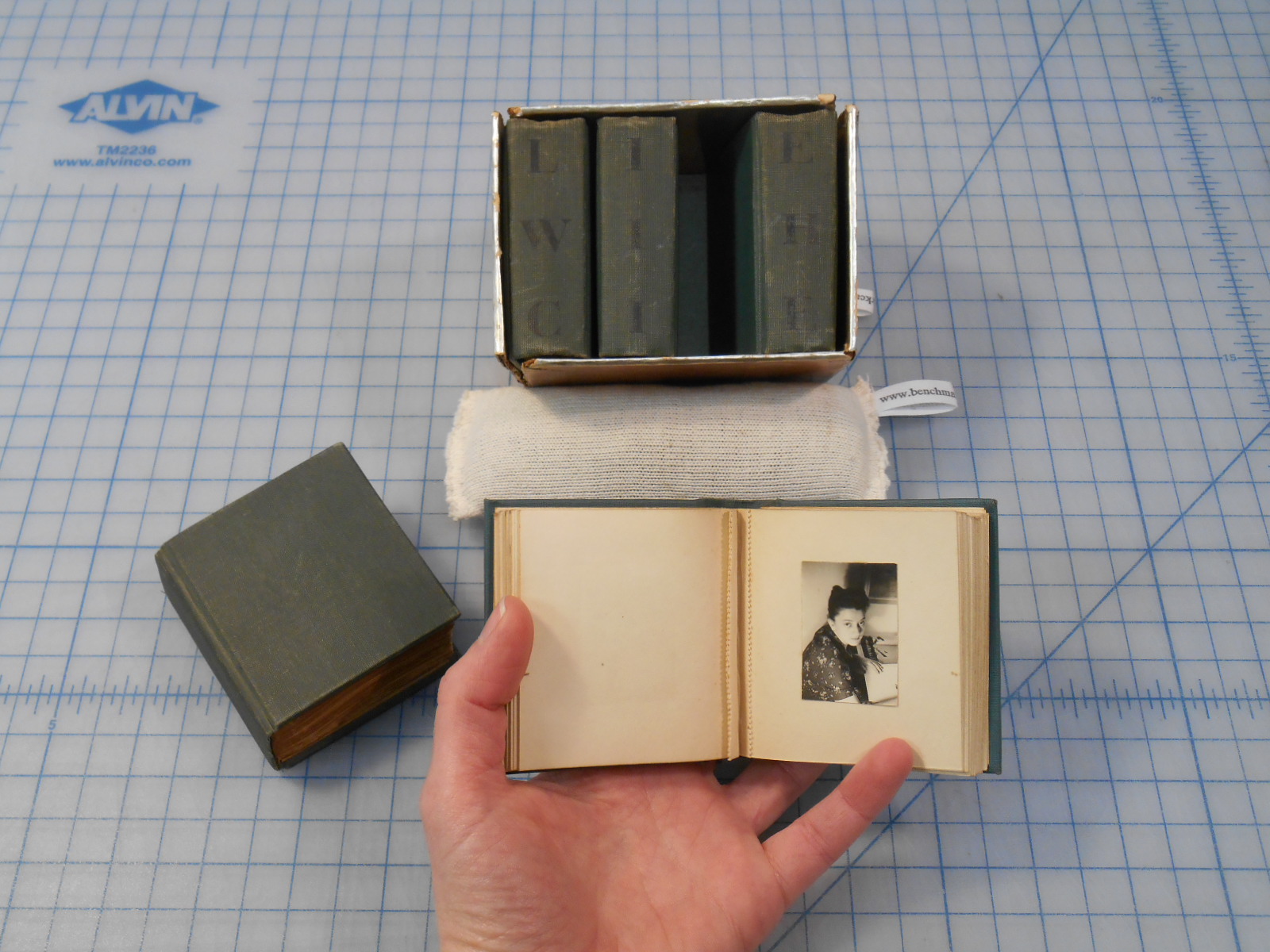
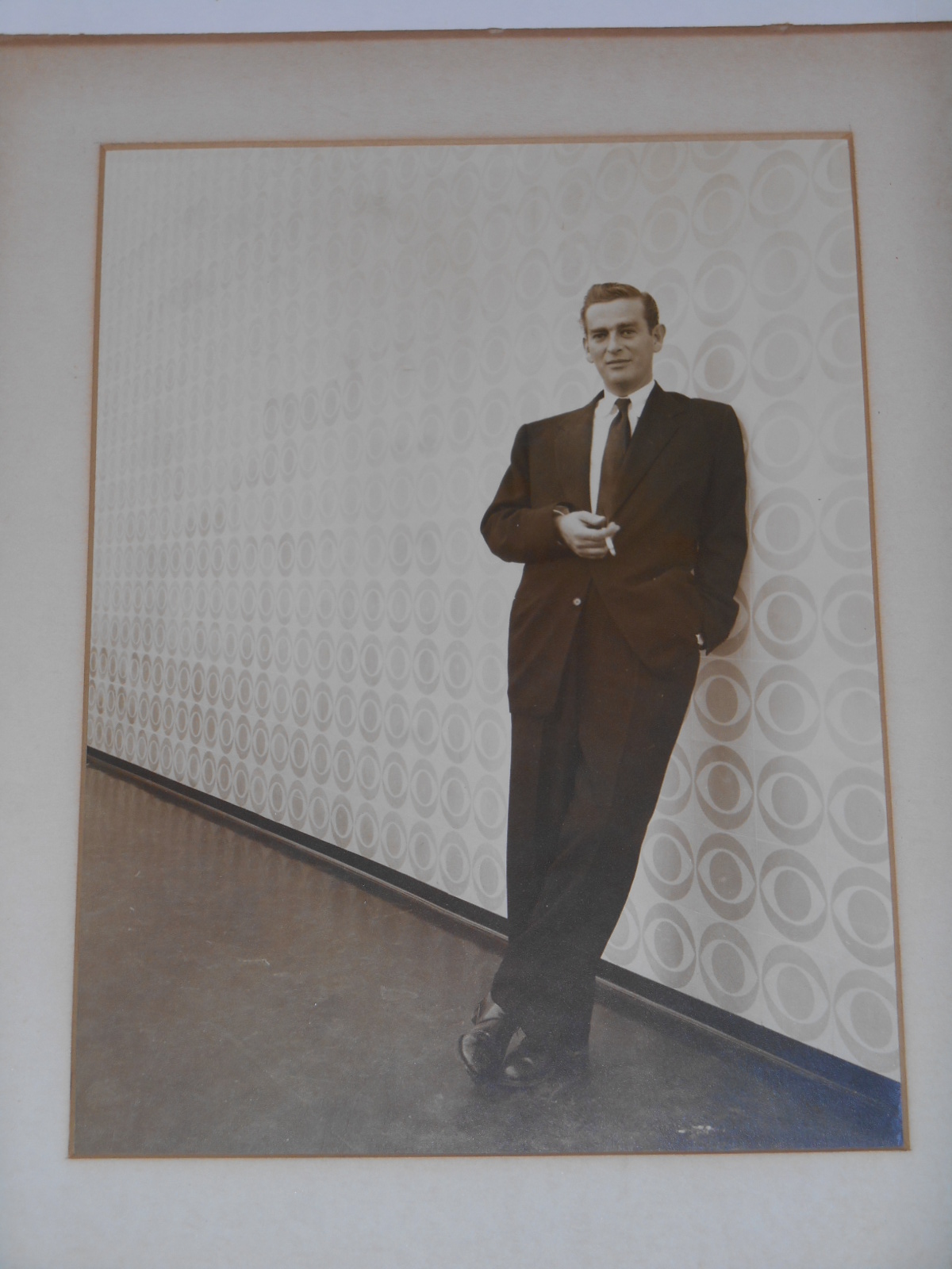
Occasionally an item will arrive in the lab that is so intriguing that I just have to know the story behind it. These five miniature photograph albums titled “LIFE WITH CIPE” caught my eye. The photographs were tiny but beautiful and I was curious about the meaning of the title. What is CIPE?
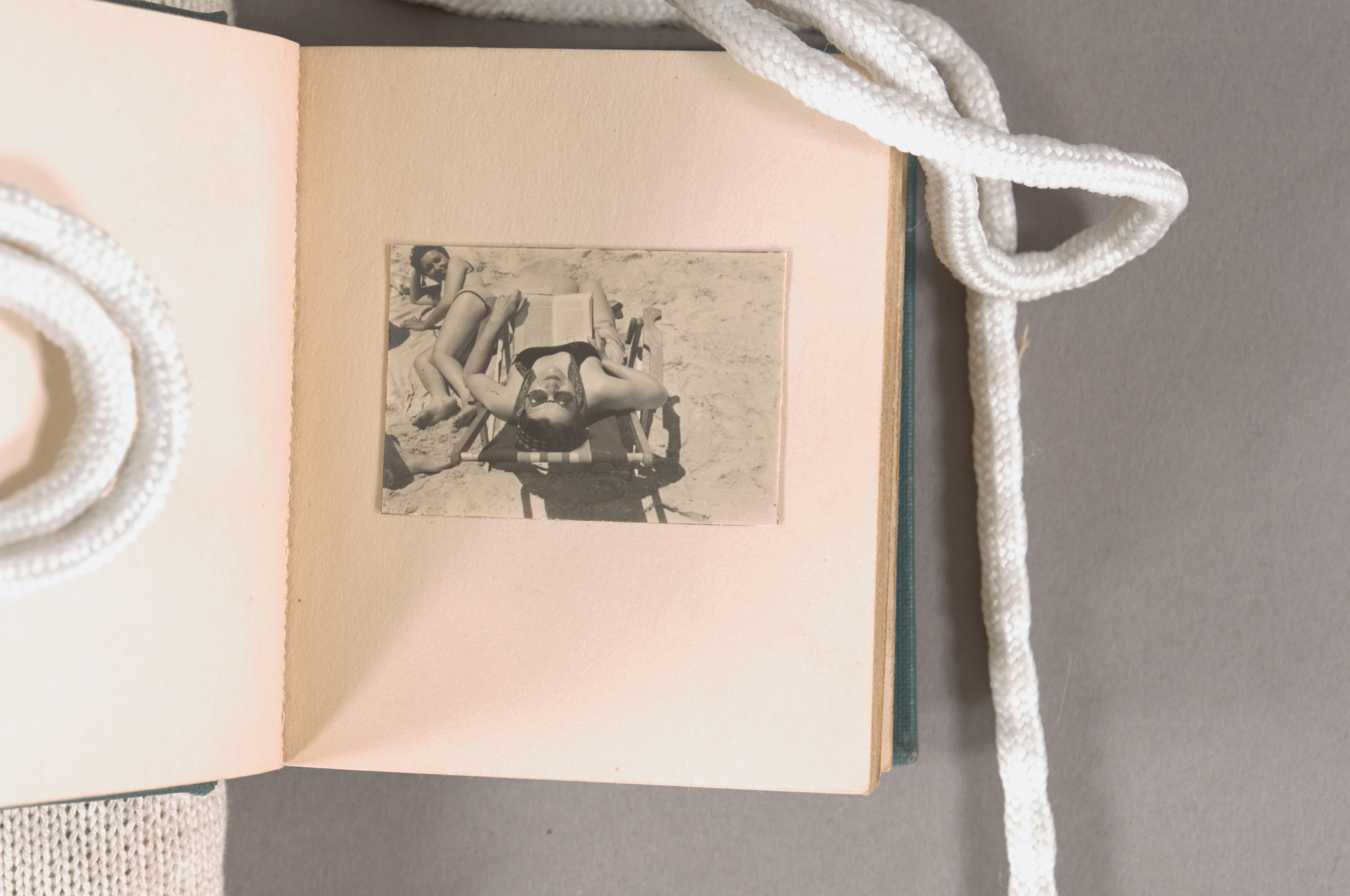
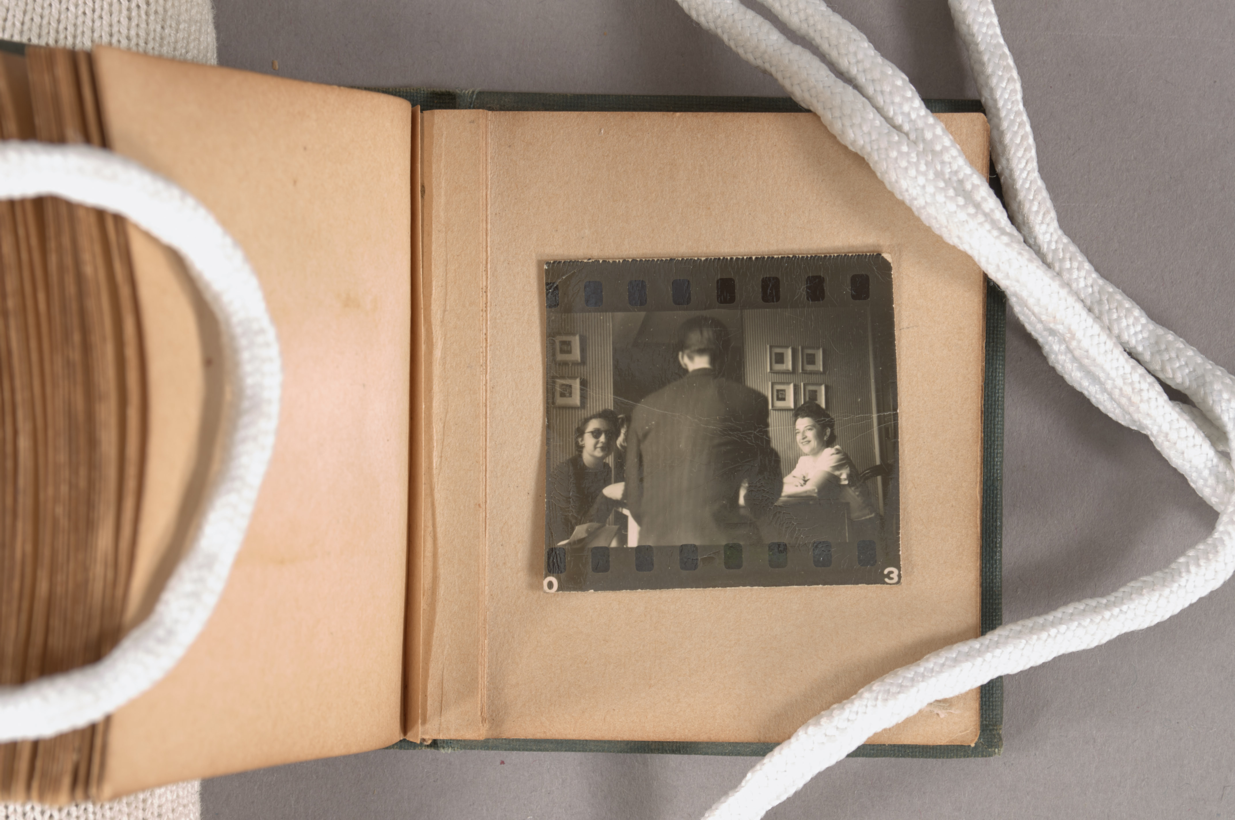
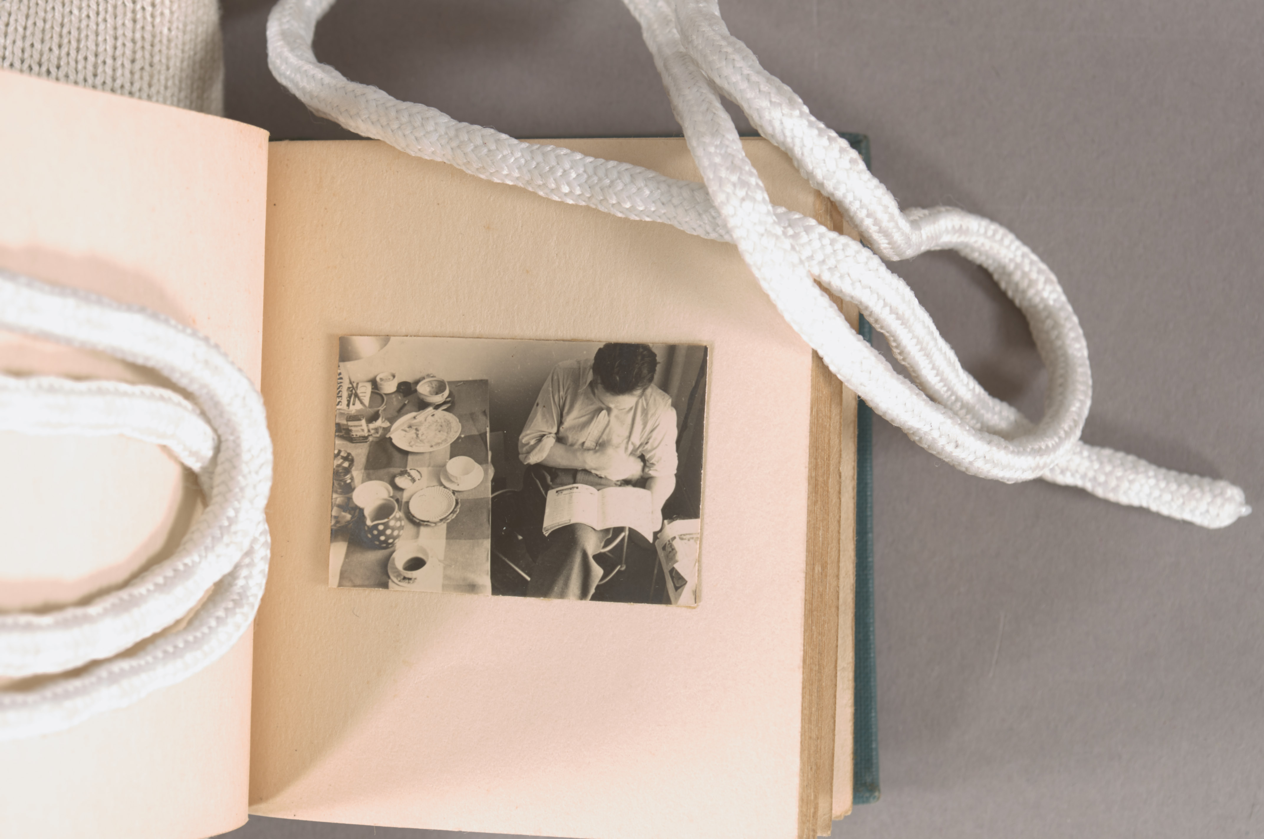
The photographs mostly look like candid vacation snapshots but there are also some still life and city scenes.
They are all so small and regular in size and proportion that they must have been printed from negatives as a contact sheet. One print even shows the holes from the film.
The images show a great sense of design and there is an eye to composition significantly better than your average family snapshots. They really felt more like an artist’s portfolio than a typical vacation album.
So it was no surprise when I heard back from archivist Rick Collier and Hartman Center Director Jackie Reid Wachholz that these are photographs from the personal collection of graphic design power couple Cipe Pineles and William Golden.
While the Creative Director at CBS in the 1950’s William Golden designed the eye logo still used by the broadcaster today.
Cipe Pineles (pronounced Cee-Pee) was the first female art director of a major magazine and the first female member of the Art Director’s Club of New York in 1943. Working at big name publications like Glamour, Seventeen, and Mademoiselle she created magazines directed at young working women that appealed to their intelligence and independence. She is also credited as being the first to commission fine artists like Ad Reinhardt and Andy Warhol for work in mass media publications.
In order to learn more about Cipe Pineles I borrowed a biography from Perkins Library and discovered it was written by none other than our very own conservation department volunteer Martha Scotford. Before becoming a volunteer in our lab, Martha was a professor of graphic design at North Carolina State University and is the reigning expert on Cipe Pineles. What a small world! I was so happy to be able to share this addition with Martha who recognized these albums from her visits to the Golden’s home when she was writing Cipe’s biography.
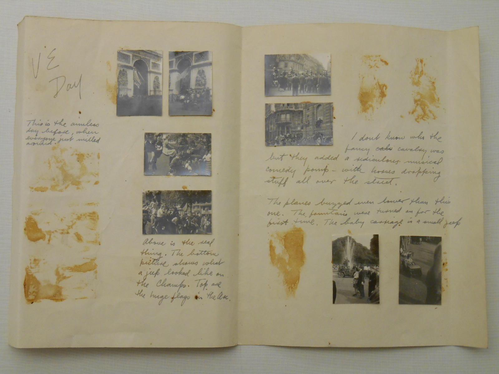
Duke Rubenstein Library also holds a collection of William Golden’s papers that I looked through for more insight into William and Cipe’s lives. One of my favorite discoveries in that collection was a letter with attached photographs that William sent to Cipe. The photos are from his time in Paris during WWII and illustrate the events he saw on VE day. The photos are the same size as the ones in LIFE WITH CIPE and I wonder if this was a precursor to the albums.
Rubenstein Library has also recently acquired a collection of Cipe’s papers too. I wonder if there are more tiny photographs there.
Some of the more intriguing objects in the collection have characteristics that show evidence of a previous owner’s interaction with them. A good example of this recently came through the lab for an enclosure.
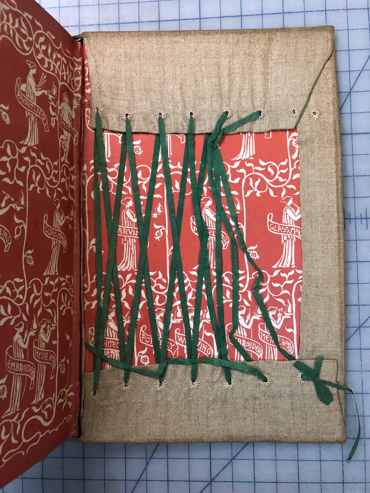
This copy of Walter Crane’s The Bases of Design (1898) is wrapped in a protective cloth cover, likely handmade by a previous owner. The cover is signed Naomi S. Gray at the tail of the spine, so we can only assume that she was the person who made it. These kinds of home-made book jackets are not all that uncommon, but the amount of detail in it’s design and construction is pretty extraordinary. The actual design of the publisher’s binding looks like this:
The design of the titling on the spine of the case is copied faithfully onto the jacket – but rather than continue with the floral motif of the publisher’s design, a small drawing of a crane is included to represent the author. A hem and single line of stitching at the head and tail of the jacket spine was added to prevent the cloth from unraveling where it is cut. The turn-ins on the interior of the boards show an equal level of care.
Lacing with ribbon or cord in this fashion is often seen in home-made book jackets of this style. In most cases, the materials used appear to be cheap scrap. Rarely do we see hemmed turn-ins and individual stitching around the lacing holes.
The attention to detail in so many aspects of the design and construction of this book jacket tells not only a great deal about the appreciation that Naomi had for this book, but showcases her excellent hand skills. In many ways, the evidence of ownership can stir a greater connection to the object than the text itself.
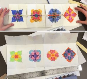
We have written here a few times about teaching bookbinding skills to local Girl Scouts so that they can get their Book Arts Badge (Post 1 and Post 2) . In addition to learning about preservation activities of cultural institutions, the workshop participants learn about the components of a book, and make three different book structures. Having done this workshop a couple of times, we thought it would be nice to change up some of the types of books that we make. Luckily, the recently acquired Lisa Unger Baskin Collection provided an object of inspiration: this movable book.
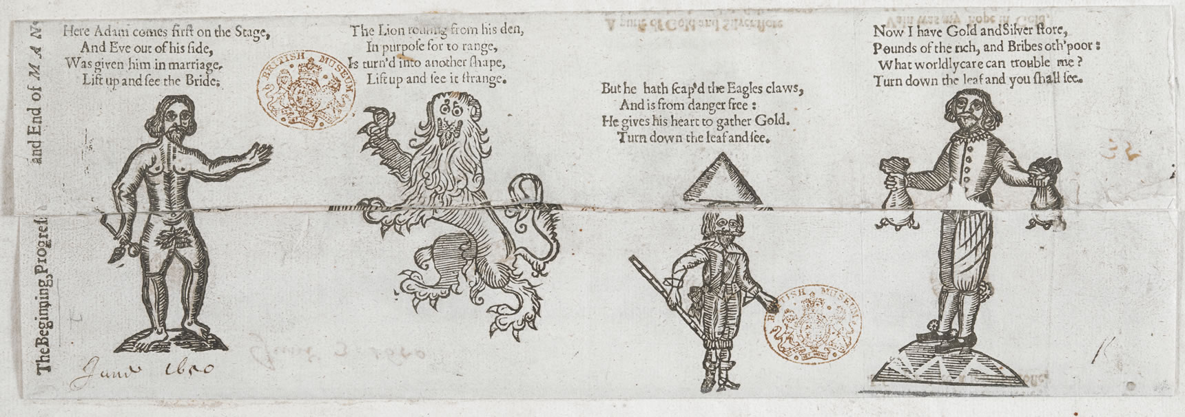
Also known as a metamorphosis or harlequinade, this item was made by Elizabeth Winspear, possibly a young woman of New England, in 1799. The book is composed of a single sheet, folded in an accordion style to form 4 panels. Each panel has a flap at top and bottom. The manuscript text and drawings tell a story using biblical figures and mythical beasts, ending with a kind of memento mori. The reader is instructed by the text to turn leaves up or down to see the transformation.
Although this item was made entirely by hand, the text and imagery are a very faithful representation of the genre. Examples of these movable books can be found from both Europe and North America, dating from the 17th to 19th centuries – and the story is remarkably consistent. See for example, this version printed in England in 1650.
The beginning, progress and end of man. (outside)(inside) London, Alsop for T. Dunster, 1650. The British Library
I’ve said before that the most popular part of our Book Arts Badge workshop is the last hour or so, in which the scouts have time to decorate their books. This type of movable book seemed like the perfect format to let the scouts unleash their creativity. After talking about Elizabeth Winspear’s book and showing them how to make the folds, we let them design their own metamorphoses. Here are some examples:
(Click each image to enlarge)
The scouts had a lot of fun with this structure and we really enjoyed seeing what they could do with it. It is amazing how an item produced by a young woman hundreds of years ago can inspire young women today to create book art of their own. Watching students interact with and respond to items from the library’s collection really brings the importance of preservation of cultural heritage into focus. We will definitely make more books like this in our future workshops.
If historical movable books are a topic of interest, you can see more examples of metamorphoses like this one at Learning as Play, hosted by Penn State University. Jacquiline Reid-Walsh has also written a book on the subject, titled Interactive Books: Playful Media Before Pop-Ups (2018). You may be interested in another genre of movable books, anatomical flap books, with many examples from Duke’s collection featured in this online exhibit. Highlights from the Baskin Collection are currently on display until June of this year in the Biddle exhibit suite, located just inside the main entrance of Perkins Library.
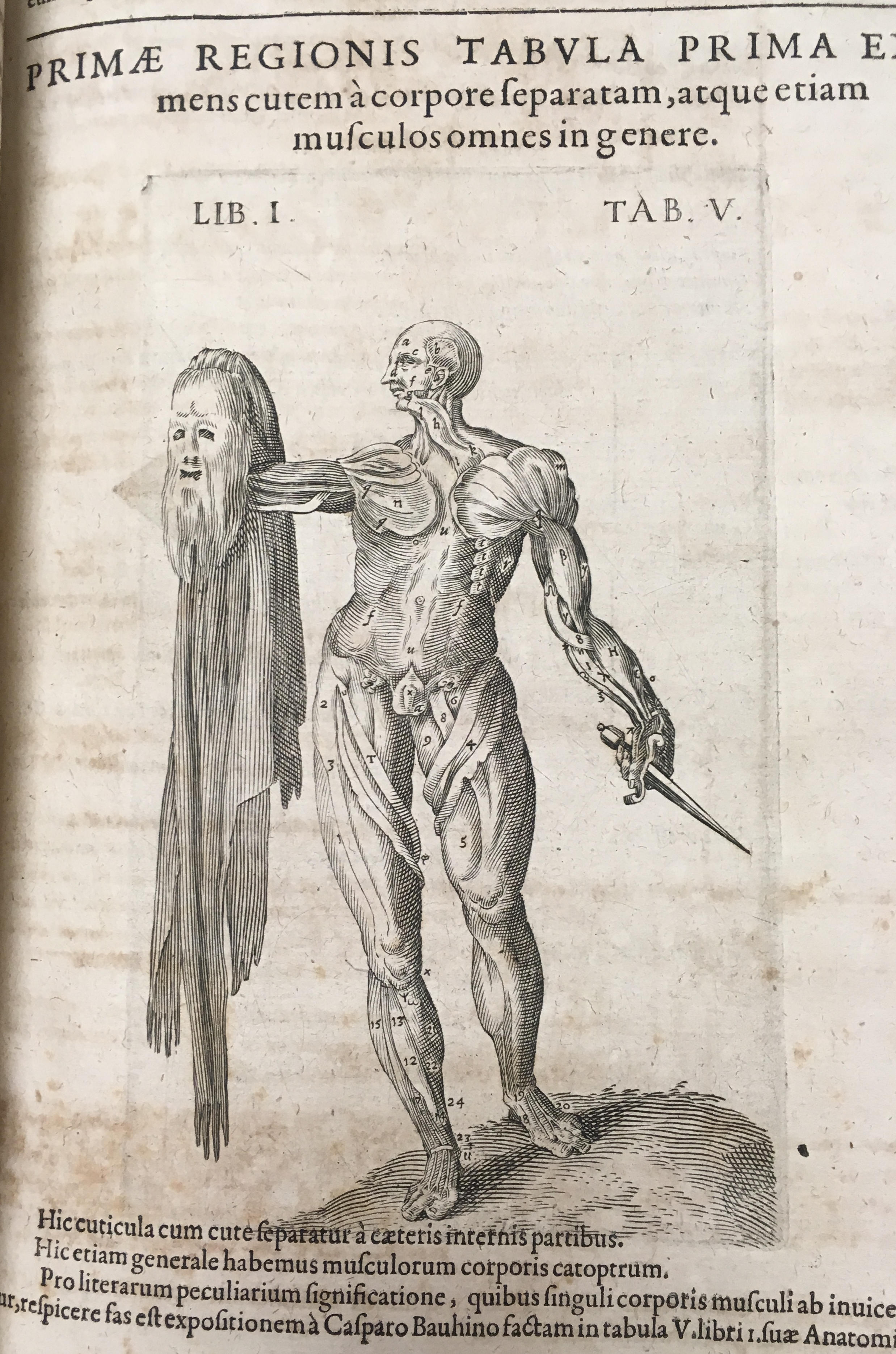
The Rubenstein Library’s History of Medicine Collection always seems to provide the most unusual examples of illustration. This text (catalog record here) by English physician Robert Fludd, published by Johann Theodor de Bry in 1623, is no exception. The anatomical specimen is both comical and gruesome…but also strangely familiar.
Johann Theodor’s father, Theodor de Bry, was also prominent publisher and engraver, and many of his works on exploration of the New World can be found in Duke’s collection. Theordor’s 1590 engraving, The Trvve Picture of One Picte from the second edition of Thomas Hariot’s book A Briefe and True Report of the New Found Land of Virginia, appears in the same pose.