Coming on board as the new Web Experience Developer in the Assessment and User Experience Services (AUXS) Department in early 2022, one of my first priorities was to get up to speed on Web Accessibility guidelines and testing. I wanted to learn how these standards had been applied to Library websites to date and establish my own processes and habits for ongoing evaluation and improvement. Flash-forward one year, and I’m looking back at the steps that I took and reflecting on lessons learned and projects completed. I thought it might be helpful to myself and others in a similar situation (e.g. new web developers, designers, or content creators) to organize these experiences and reflections into a sort of manual or “Quick Start Guide”. I hope that these 5 steps will be useful to others who need a crash course in this potentially confusing or intimidating–but ultimately crucial and rewarding–territory.
Learn from your colleagues
Fortunately, I quickly discovered that Duke Libraries already had a well-established culture and practice around web accessibility, including a number of resources I could consult.
Two Bitstreams posts from our longtime web developer/designer Sean Aery gave me a quick snapshot of the current state of things, recent initiatives, and ongoing efforts:
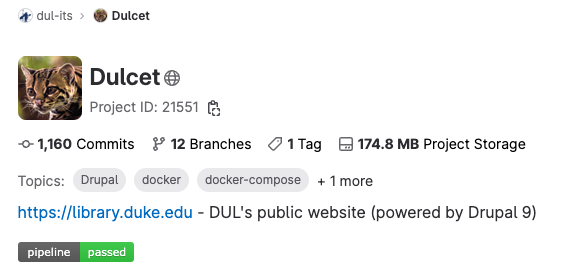
Repositories of the Library’s open source software projects proved valuable in connecting broader concepts with specific examples and seeing how other developers had solved problems. For instance, I was able to look at the code for DUL’s “theme” (basically visual styling, color, typography, and other design elements) to better understand how it builds on the ubiquitous Bootstrap CSS framework and implements specific accessibility standards around semantic markup, color contrast, and ARIA roles/attributes:
Equipped with some background and context, I found I was much better prepared to formulate questions for team meetings or the project Slack channel.
Look for guidelines from your institution
Duke’s Web Accessibility Initiative establishes clear web accessibility standards for the University and offers practical information on how to understand and implement them:
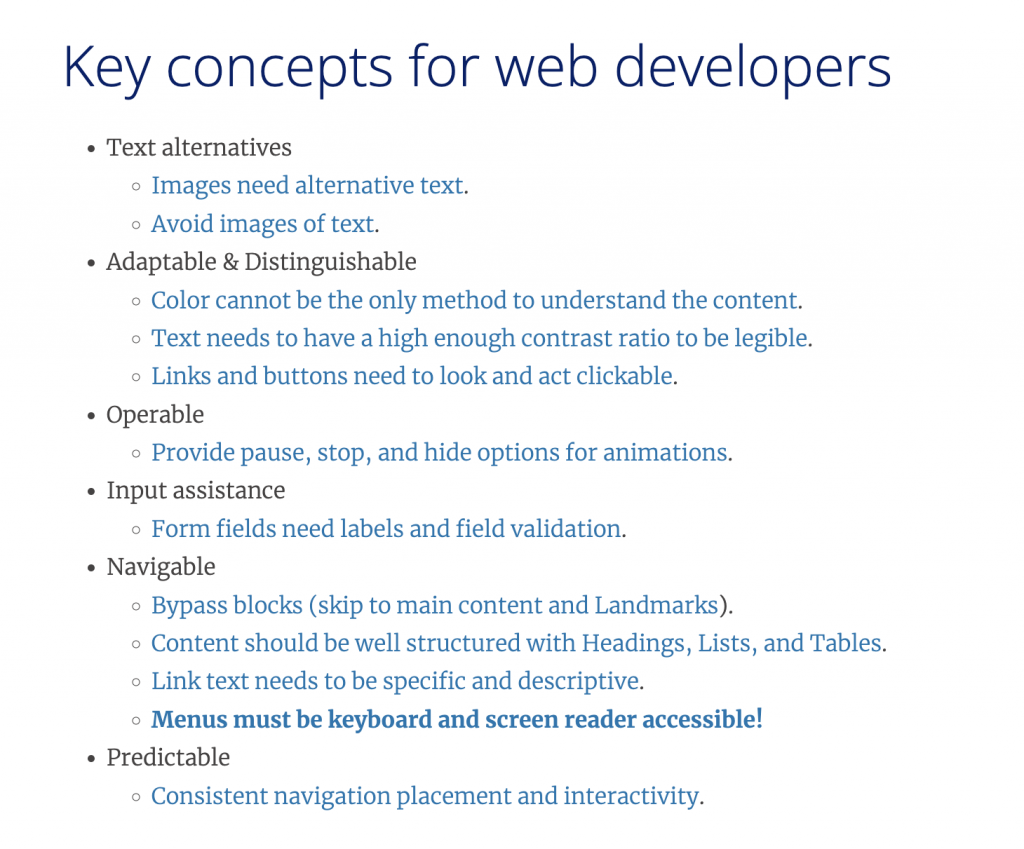
The site also offers guides geared towards the needs of different stakeholders (content creators, designers, developers) as well as a step-by-step overview of how to do an accessibility assessment.
Know your standards
Duke University has specified the Worldwide Web Consortium Web Content Accessibility Guidelines version 2.0, Level AA Conformance (WCAG 2.0 Level AA) as its preferred accessibility standard for websites. While it was initially daunting to digest and parse these technical documents, at least I had a known, widely-adopted target that I was aiming for–in other words, an achievable goal. Feeling bolstered by that knowledge, I was able to use the other resources mentioned here to fill in the gaps and get hands-on experience and practice solving web accessibility issues.
Find a playground
As I settled into the workflow within our Scrum team (based on Agile software development principles), I found a number of projects that gave me opportunities to test and experiment with how different markup and design decisions affect accessibility. I particularly enjoyed working with updating the Style Guide for our Catalog as part of a Bootstrap 3–>4 migration, updating our DUL Theme across various applications — Library Catalog, Quicksearch, Staff Directory — built on the Ruby on Rails framework, and getting scrappy and creative trying to improve branding and accessibility of some of our vendor-hosted web apps with the limited tools available (essentially jQuery scripts and applying CSS to existing markup).
Build your toolkit
A few well-chosen tools can get you far in assessing and correcting web accessibility issues on your websites.
Browser Tools
The built-in developer tools in your browser are essential for viewing and testing changes to markup and understanding how CSS rules are applied to the Document Object Model. The Deque Systems aXe Chrome Extension (also available for Firefox) adds additional tools for accessibility testing with a slick interface that performs a scan, gives a breakdown of accessibility violations ranked by severity, and tells you how to fix them.
Color Contrast Checkers
I frequently turned to these two web-based tools for quick tests of different color combinations. It was educational to see what did and didn’t work in various situations and think more about how aesthetic and design concerns interact with accessibility concerns.
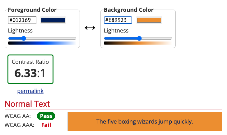
Style Guides
These style guides provided a handy reference for default and variant typography, color, and page design elements. I found the color palettes particular helpful as I tried to find creative solutions to color contrast problems while maintaining Duke branding and consistency across various Library pages.
Keyboard-Only Navigation
Attempting to navigate our websites using only the TAB, ENTER, SPACE, UP, and DOWN keys on a standard computer keyboard gave me a better understanding of the significance of semantic markup, skip links, and landmarks. This test is essential for getting another “view” of your pages that isn’t as dependent on visual cues to convey meaning and structure and can help surface issues that automated accessibility scanners might miss.


