To end preservation week we are going on a field trip to pick up materials and process them into our workflows. Our first stop is the library’s shelving unit where the staff have set aside damaged materials for us.
Pickup from shelving unit
Our next stop is Circulation on the first floor. Front line workers are often the first to see damaged books.
Picking up damaged books from Circulation
When we get back to the lab, we scan items into our library tracking system called Alma. When we scan an item in, it changes the location and availability so that everyone knows where the book is in case it is requested by a patron. We scan items when they come in, and when they leave the lab.
Scanning items into Alma
Shipping brings us materials from the East Campus Libraries and from Collections Services. We evaluate each item’s needs and sort them into our workflow by type of repair or housing they need.
Sorting scores and other small items into the pamphlet binding workflow.Sorting a couple items from Circulation into the book repair workflows.The best conservation flag this week. This will get an enclosure for sure. We want to keep these items together.
When work is finished, we often have to order shelf labels from Collections Services. When they arrive, we carefully match the barcode on the label with the barcode on the item.
Applying shelf labels
Once everything is labeled, we sort the finished materials by location and send them out.
Sorting material by shelving location. Don’t forget to record your stats!
A week in the life of Conservation is rarely boring. I hope you enjoyed coming along with us on our Preservation Week journey!
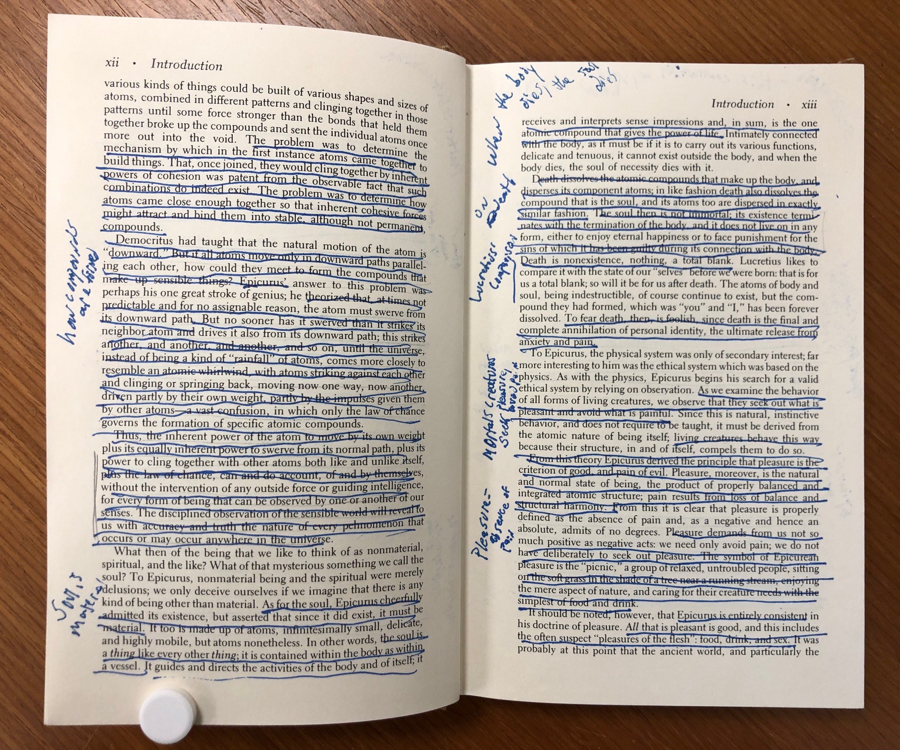
During the process of treating items from the collection, we sometimes discover interesting details about their production that can be useful for researchers. Take, for example, this repair that I completed last year on The Byrth of Mankinde, a book printed in London in 1545.
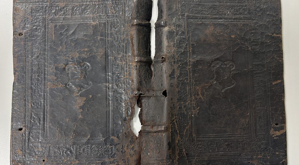
It came into the lab because the front board was detached from the textblock and the leather was split along the spine. We were concerned about further damage occurring to some of those original binding materials with use in this condition, so it was important to reattach the front board and adhere the lifting leather.
The textblock is printed on paper, but on the right side of the image above, you can see the smallest sliver of manuscript on parchment. It was common for binders to use waste material in the construction of bindings. Parchment is a very strong material that can be used to reinforce the board attachment of a book, so it was a common practice to cut up the leaves of parchment manuscripts and paste the fragments into new bindings.
It turns out that all of the adhesive attaching the leather to the boards had completely dried out and failed, so during treatment I was able to just slide it off of the book – kind of like a glove. You can see the major splits through the head of the spine and some sizable losses where the raised bands lace into the boards. At one point the binding had green silk ribbon fore-edge ties protruding from the front and back boards, but they have since broken off and only fragments remained adhered under the pastedowns.
With the leather off of the book, I had more access to view the structure of the binding. The sewing supports are made from tanned leather, which do not remain as flexible as they age. It is not surprising that they have failed. Above you can see the manuscript fragment stub wrapping around the last section of the textblock.
In addition to the failing adhesive, the sewing also broken in the first section, so I was able to release the parchment fragment from the interior of the front board and photograph both sides of it. These photos will be available to researchers when they are ingested into the Conservation Documentation Archive later this year. The text on the manuscript might provide more information about the provenance or production of this book.
I used linen thread to create new sewing supports over the front joint and sewed the first section, with it’s parchment fragment, back onto the textblock. After reattaching the front board and readhering the original leather (with some toned Japanese paper lining the interior of the spine), I decided to leave the parchment fragments loose from the boards at the front and back. Should anyone be interested in reading the text on those fragments, it will be easy to access them if they aren’t hidden under the original pastedowns. I made new pastedowns from handmade paper, so now the original pastedown just becomes the first leaf of the book. This changes the initial experience of reading the book, but from the staining and presence of bookplates, it’s pretty obvious that the now free leaf was once pasted down.
Preservation Week is here! This annual celebration, first sponsored by the American Library Association and the Association for Library Collections and Technical Services in 2010, was established to raise awareness of the role libraries and other cultural institutions play in providing preservation education and information. The theme for this year is Preserve the Past, Shape the Future: Inspiring the Next Generation.
All this week Preservation Underground will be bringing you snapshots of the different kinds of work that we do to support the collections and mission of Duke Libraries. Today we are engaged in probably our most important work: planning and prioritizing.
Each month our conservators meet with curatorial staff from the Rubenstein Library to assess collection material that has been identified for treatment and set priorities for our work. The materials that we care for come in a wide range of sizes, materials, geographic and cultural origins, and time periods. With millions of items in the collection and just a few of us in the lab, we are not able to work on everything. During these meetings, we consider the past and anticipated future use of these items (for research, instruction, exhibit, or digitization) and try to determine what treatments are most appropriate for them. Some items will receive extensive treatment, while others will just get minor stabilization or an enclosure. Collaborating with the curators on treatment plans and priorities helps us to support the work of researchers and students who come in to use these materials. Good stewardship of Duke’s collections will allow them to be usable for generations of researchers to come.
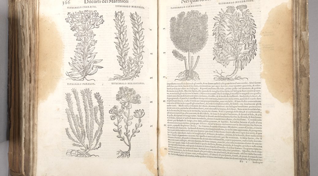
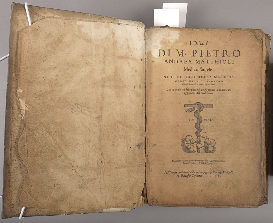
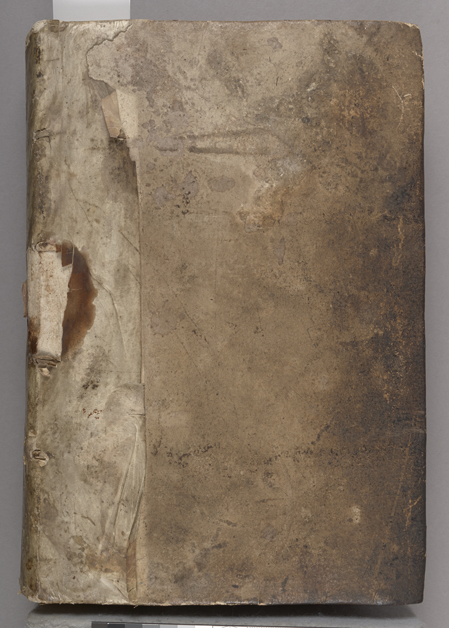
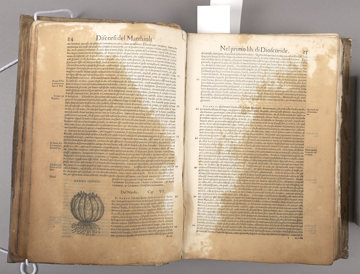
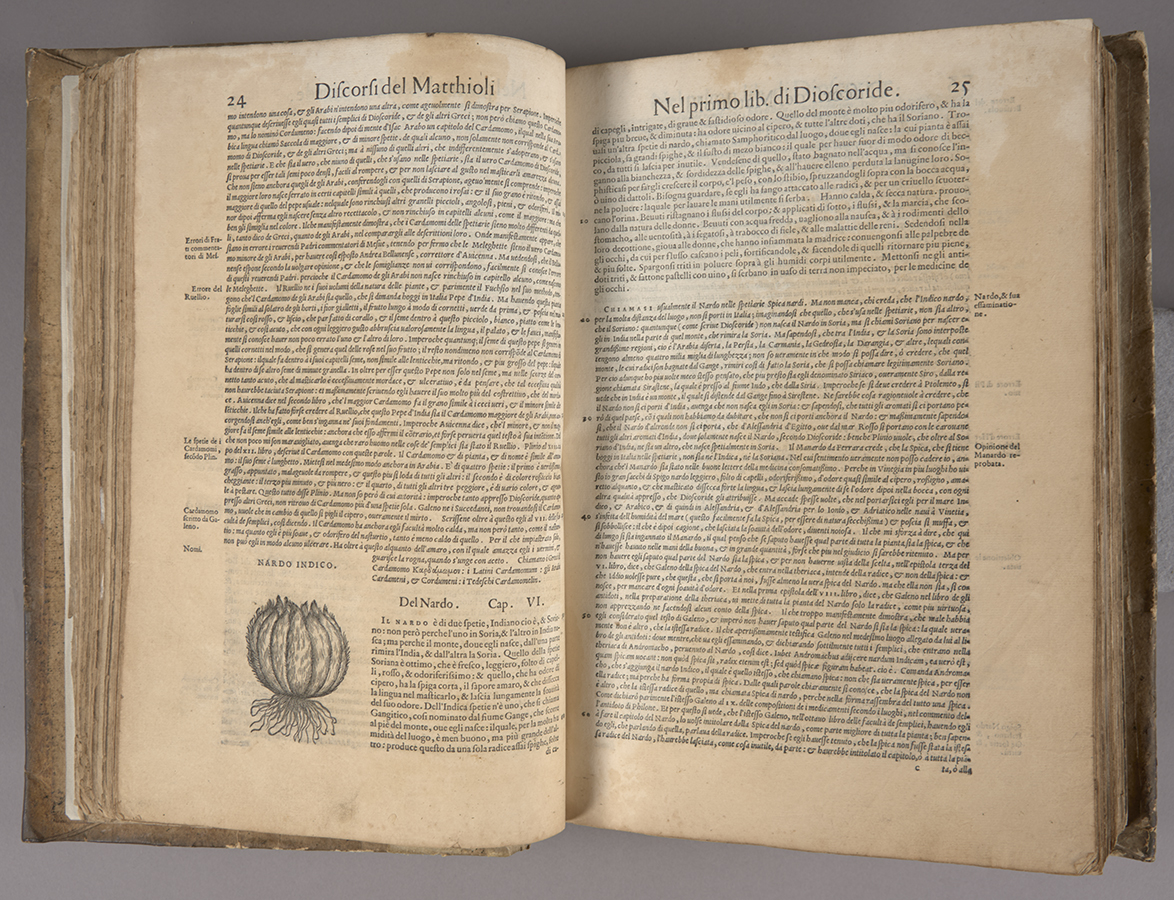
We’re preparing to launch another batch of treatment documentation in the CDA, and the process has reminded me of one of the most complicated, and ultimately, one of my favorite treatments from over the years. I discorsi di M. Pietro Andrea Matthioli, medico senese, … is an early Italian natural medicine text, printed in Venice in 1557. It contains lovely woodcut illustrations of animal and plant species that offered medicinal remedies. Rubenstein Libraries’ copy was acquired for the History of Medicine Collection in 2016 from a family in the Piedmont region of North Carolina.
Title page, before treatmentBinding, before treatmentPartial staining and plant images, before treatment
When we acquired it, about one quarter of the text and a portion of the early paper binding had long been saturated with oil, and there was less severe oil staining throughout. It was so soaked with oil that the pages were slightly transparentized and were becoming stiff and blocking together. This video demonstrates the condition and handling challenges it presented when we first received it [SOUND ON].
The text was bound in an early paper binding with a parchment spine overlay. The sewing was broken in places and pages were coming loose. Initial testing found that the oil was soluble in a couple of different solvents but I found that of the few I tested, ethanol moved only the oil but not the printing ink. With this information and considering other factors, the curators and I agreed that it was appropriate to disbind the text and to use solvent baths to remove as much of the oil from the paper as possible.
Working in our fume hood, I treated the most oil-stained sections of the text with multiple ethanol baths, which significantly drew out oily residues and moderately reduced the staining, a result that the curators were ultimately pretty happy with. These solvent baths were followed by water baths and then resizing, since the previous immersions removed most of the original sizing.
Saving some of the residual oil in ethanol, I was able to analyze it with Fourier Transform Infrared Spectroscopy (FTIR) at the SMIF facility on campus. Conservation scientists in at the Winterthur Museum in Delaware were able to identify the residue as palm oil, along with an unknown plasticizer. These results ultimately didn’t impact the conservation treatment, but the information does present another interesting detail in understanding the curious life of this item. After treating the text, I mended it and resewed it, and was able to rebind it in the original binding.
Staining before treatmentAfter solvent treatment
I Discorsi… is likely to be on display in an upcoming exhibit on early botanical texts. You can also see further images and details of this treatment in the CDA, here. Many thanks to Dr. Mark Walters, Dr. Chris Petersen, and Dr. Jocelyn Alcantara-Garcia for their assistance in oil analysis and identification.
Keeping a large circulating collection in usable shape means you are often so busy fixing or boxing books to get them back on the shelf that you don’t have time to look at the contents. When a first edition of Mary Van Kleeck’s Women in the Bookbinding Trade came into the lab, however, we all stopped to take a look.
This book, originally published in 1913, is a fascinating look into the working conditions for women in the binding trade around the turn of the century. Margaret Olivia Sage had used the considerable wealth amassed by her late husband to form the Russell Sage Foundation in 1907 for “the improvement of social and living conditions in the United States”, specifically by using scientific research to advocate for progressive reforms. The foundation funded a series of studies which documented the condition of women’s work in important trades in New York City. The 1900 US census reported that over a quarter of women bindery workers were employed in the city, so the location offered a sizable sample to extrapolate conditions across the United States.
The turn of the century was an important period of transition for the binding trade. Work that was traditionally done completely by hand had become more mechanized in the late 19th century, and the number of women working in the trade was growing rapidly. Binderies were typically gender-segregated, with women relegated to less skilled and lower wage work, like folding, gathering, and sewing textblocks and endbands. In most cases, all of the forwarding, covering, and finishing work was done by men. Van Kleeck’s book includes a lot of photographs, which offer a look at the conditions of the workspaces, the roles assigned to each gender, and the shift from fully manual to machine-assisted labor during this time.
Van Kleek notes that the introduction of more capable binding machines displaced a lot of workers in the book trade, shifting them to lower wage work or out of a job entirely. The author describes the case of one woman who learned to operate a folding machine, allowing her to double her weekly wages to $9.00. Within a few years a newer machine arrived that made multiple machine operators obsolete. She was transferred to hand folding, which was harder physical labor and only paid 4 cents per 100 sheets. Working as quickly as possible she could only earn $7.00 per week (p. 51).
As a side note, this page caught my eye when I realized that the heads of the people in the bottom photo had just been drawn in. I’m not entirely sure why – maybe they were a bit blurry because the camera exposure was long and they were moving quickly? Was it to anonymize the workers, or to make them look more the part?
20th century photoshop
It is so interesting to see photographs some of these machines in action. The technology was advancing pretty rapidly in this period and most of these models no longer exist. Some versions can be seen at the American Bookbinders Museum in San Francisco.
In the finishing department, women were often only found laying gold leaf onto covers, rather than operating stamping machines or gilding the edges of textblocks.
The introduction of electric lights in the late 19th century allowed businesses to operate at all hours. Without labor protections (and a supreme court actively hostile to organized labor), many factory workers were forced to work long hours. Van Kleek notes that binderies are legally classified as factories, and despite state laws barring any woman over the age of 16 from working more than 60 hours, workers regularly reported 14 hour shifts, 6 days a week. The book describes workers commuting to and from dangerous neighborhoods in the early hours of the morning. As a result, young women regularly went missing. The study also records rampant child labor violations in the book trade.
I think we can all relate to “artificial light all day”
By examining the details of Mary Van Kleek‘s work, one can follow a line directly from this book to the establishment of the modern work week and labor protections we enjoy today. Van Kleek began working for the Sage Foundation shortly after its founding as the secretary of the Committee on Women’s Work. There she was mentored and trained by prominent labor activists like Florence Kelley and Lilian Brandt. Her research for this publication and others like Artificial Flower Makers (1913) and Wages in the Millinery Trade (1914) was instrumental in the passage of New York state labor laws limiting working hours in 1910 and 1915. During WWI, Van Kleek was appointed by Woodrow Wilson to lead the new Women in Industry Service group in the Department of Labor. That group published a report that became the basis for the Fair Labor Standards Act of 1938, which established the eight-hour workday, five-day workweek, a federal minimum wage, overtime pay, and prohibited child labor.
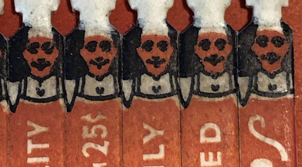
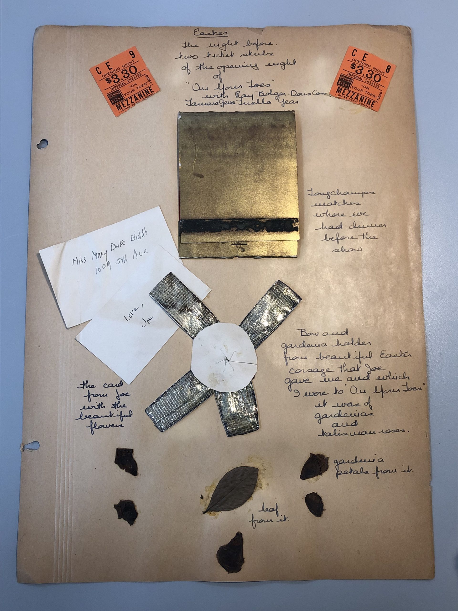
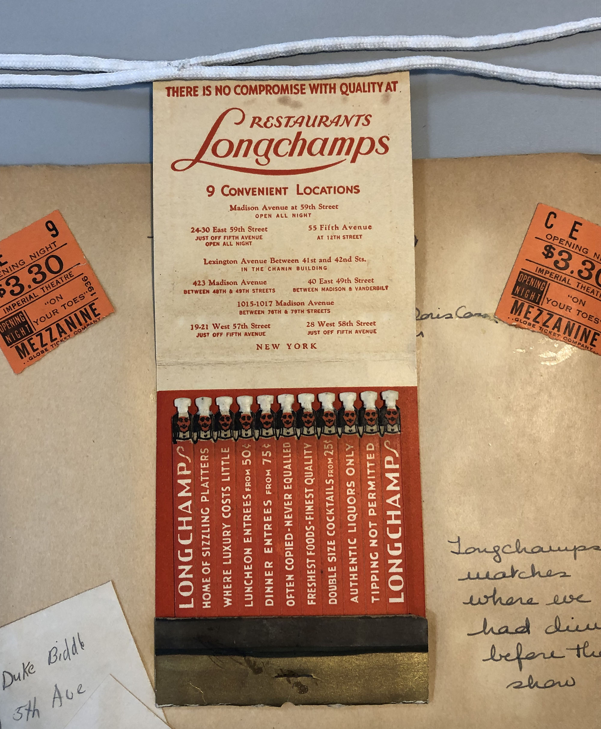
Several of the scrapbook pages have paper matchbooks mounted to them. Much like the ticket stubs that appear alongside, the printed matchbook is a keepsake to remember a special occasion. These matches come from a Longchamps restaurant, where Mary dined before attending a show. The exterior of this matchbook is a metallic gold, but the real design highlight appears inside.
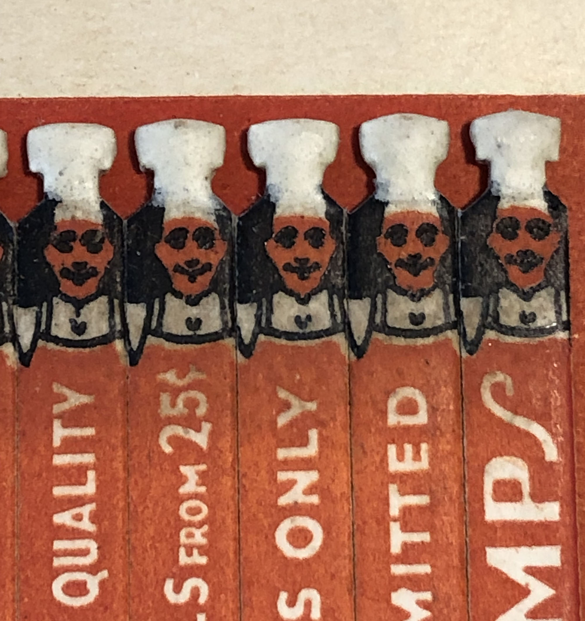
The matches are shaped and printed to look like rows of little chefs!
This scrapbook dates from the 1930s, so these are probably “safety matches” – meaning they cannot ignite without the contacting the striking strip on the cover of the matchbook. They are also quite old at this point, and may not even light using the strip. There is still a risk to the collection, however, so Rachel Penniman did some research to determine the best way to make them safe before rehousing the scrapbook.
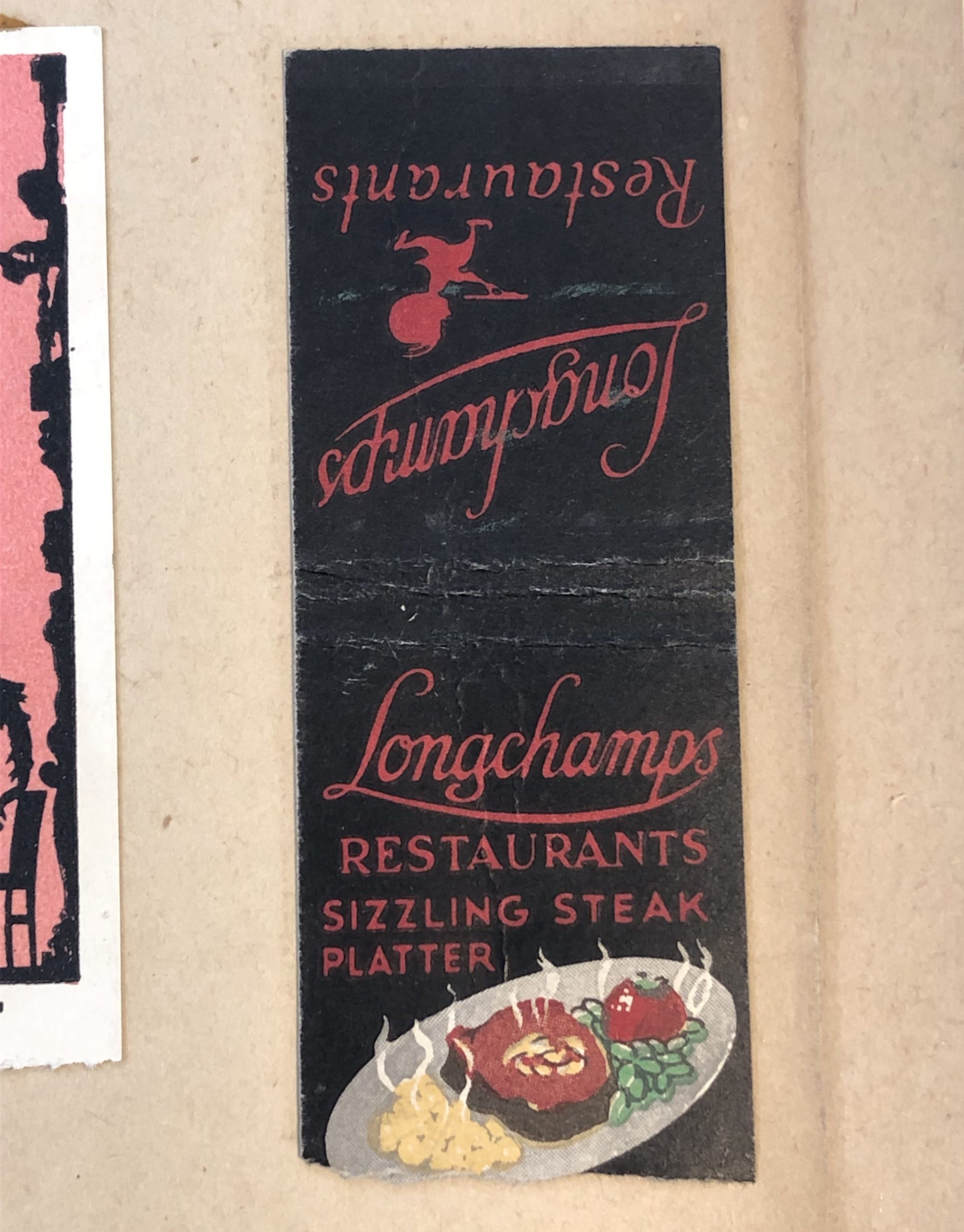
There are a couple of options for dealing with matches in a collection. The quickest solution is to physically remove the matches. In another example from the same scrapbook (pictured above), the bottom of the matchbook and all the individual matches were torn off before mounting. If all of the matchbooks were treated this way, then we wouldn’t have to worry, but a lot of information would be lost.
One of the individual matches (already used) is also taped to this page, so we can see that Longchamps used more than one chef design in their matchbooks.
Clipping off just the match head could also be a good solution for removing the potential for ignition while retaining more of the original material. If the matches in these books were more of a plain design, that could be a viable option here, but we just couldn’t bring ourselves to decapitate the little chefs. Luckily, there was another way.
Our colleagues at Northwestern University have developed a method for coating the match heads to prevent lighting. To treat the match heads, Rachel applied three coatings of a matte acrylic medium: one dilute layer to penetrate and then two coatings of undiluted acrylic to form a protective layer. After the coating had cured, the scrapbook was ready to be boxed and returned to the stacks. The acrylic medium is not tacky when dry, so it will not stick to the matchbook cover or facing scrapbook pages when the book is closed.
One of the major challenges of caring for a large research collection is the wide variety of objects and materials that are contained within it. When confronted with potentially harmful items like these matchbooks, it is so helpful to read about how other conservators have dealt with them.
One of the first lines of defense for a damaged book is a well-fitting enclosure. It can prevent loss of any loose pieces or additional strain on weaker binding materials from handling during shelving. Many of the books in special collections were boxed long ago or before their acquisition. When those items come into the lab for treatment, we evaluate the box for fit, function, and artifactual value to determine if it should be retained or replaced.
Lately I’ve been working on a 1545 edition of The Byrth of Mankynde from the Josiah Charles Trent History of Medicine collection. Originally published in 1540, this book is the oldest manual for midwifery printed in English. It contains several copper plate engravings of anatomy – apparently some of the first in England to be produced by roller press. My favorites are the figures of fetuses in utero, which look more like babies floating in light bulbs or balloons.
The book had been boxed decades ago in a very nice quarter-leather slipcase, with a shaped spine and false raised bands to make it look like a binding when sitting on the shelf. The maroon goatskin has been tooled in gold to mark the title, author, and publication information on the spine and along the “boards” where the leather meets the red cloth.
Slipcases can be damaging to a book if they fit too tightly, often causing abrasion on the boards as the book slides in and out. This slipcase avoids those problems with a 4-flap enclosure, which can be removed with a red ribbon pull tab on the fore-edge. Unfortunately that ribbon has started to split and is barely hanging on at this point.
The inside of the 4-flap is covered with a red marbled paper that matches the colors of the other materials very well. It even includes small metallic flakes that sparkle a little as you open the box.
The interior of the slipcase is covered with the same marbled paper.
While these decorative papers really enhance the visual appeal of the box, they can present a number of problems for the book itself. Often the dyes or pigments used in colored papers can rub off onto a book through normal handling; if the binding material is lighter in color you might see some staining on the board edges.
The bigger risk from these colored materials, though, is if the box ever gets wet. Much like a red sock in a load of white laundry, water-soluble dyes can easily transfer to the pages of the book and cause staining that may be impossible to remove. I worried that in a water event this box could turn all those little lightbulb babies bright pink.
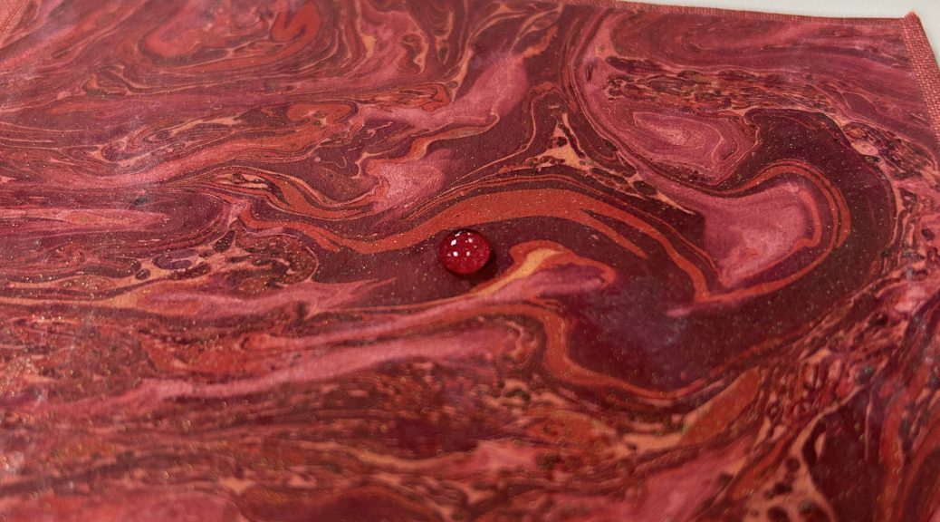
An easy way to test for solubility is with a basic water drop test. Immediately after placing a very small drop of water onto the surface of the marbled paper, I used a piece of clean blotter to wick it up. Looking at the scrap of blotter, you can see if there was any discoloration or transfer of the solubilized media. You can repeat this process a couple of times with larger drops, left for a longer duration.
I could see some transfer of red to the blotter when the water was in contact with the marbled paper for only a few seconds. The same test on the cloth produced a far more dramatic result.
I appreciate the quality of craftsmanship that went into making this enclosure. A lot of effort was put into making a very deluxe box for this significant and valuable book. The leather is pared well and the titling is very clean. The maker clearly spent time selecting leather, cloth, and marbled paper that went together. Unfortunately all those fancy materials present too much of a risk to the book and will need to be replaced. While the cloth-covered boxes that we make are pretty visually plain, that’s actually one of their strengths. The lack of decoration or color is often the safer choice… and you don’t want your box to outshine the book anyway.
Some treatments require a lot of coordination with our colleagues over in special collections to ensure that that they have a good permanent home in the stacks. We construct custom housing to meet the specific needs of the item for storage, but we also need to be sure that the enclosure we design will actually fit on a shelf and can moved from the stacks to the reading room. Sometimes the description and shelving location in the catalog also need to be updated if the item changes size during treatment.
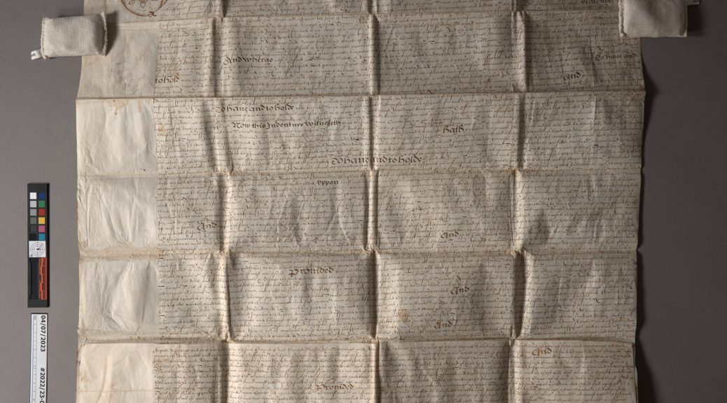
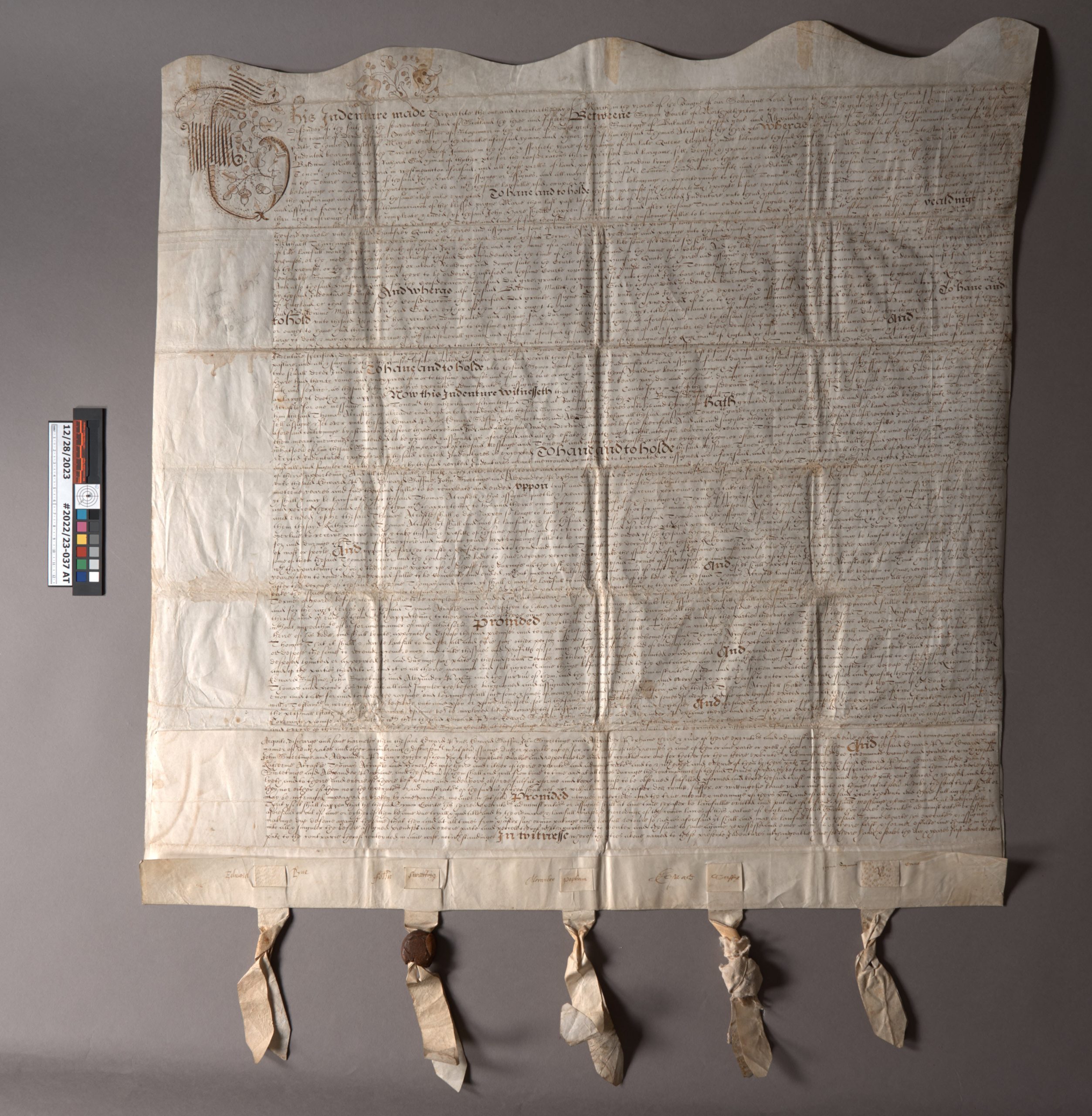
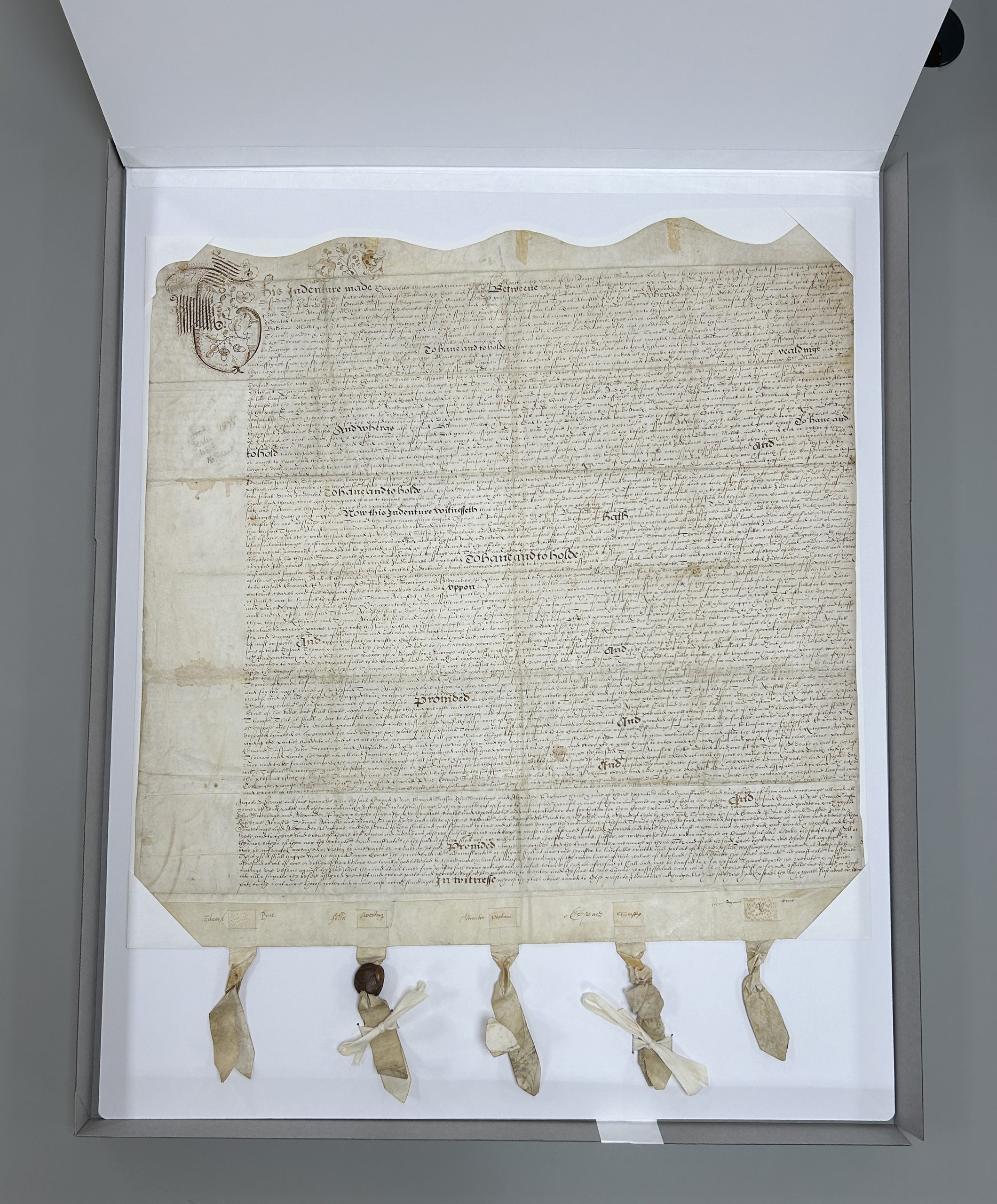
This 17th century English indenture and deed is a recent example that left the lab much larger than it arrived. It came to us folded up in a relatively small package, measuring around 7″ square. It unfolded into a pretty large (20″ x 30″) manuscript legal document, written in ink on parchment with the remains of five parchment strips and wax seals along the bottom. The earliest text dates from 1620, with five individuals (Symon Courte, Edward Pyne, Thomas Alcastle, Humfree Quicke, and yeoman John Hare) granting property rights in West Monkton to two people (Baldwine Wallet and yeoman Richard God). Additional text on the back dated 57 years later grants further inheritance of property rights to Robert Alcastle (Thomas Alcastle’s grandson and executor of his father’s estate).
Before treatment, photographed in raking light to emphasize the folds.
The bottom edge of the parchment is folded over so that the five parchment strips can lace through two layers and be held securely in place. The parchment strips were twisted together and rough balls of red wax were affixed to stop the strips from being removed. Some of the signatories wrote their names across both the document’s folded lower edge and the visible square of the parchment strip as an authentication or security measure.
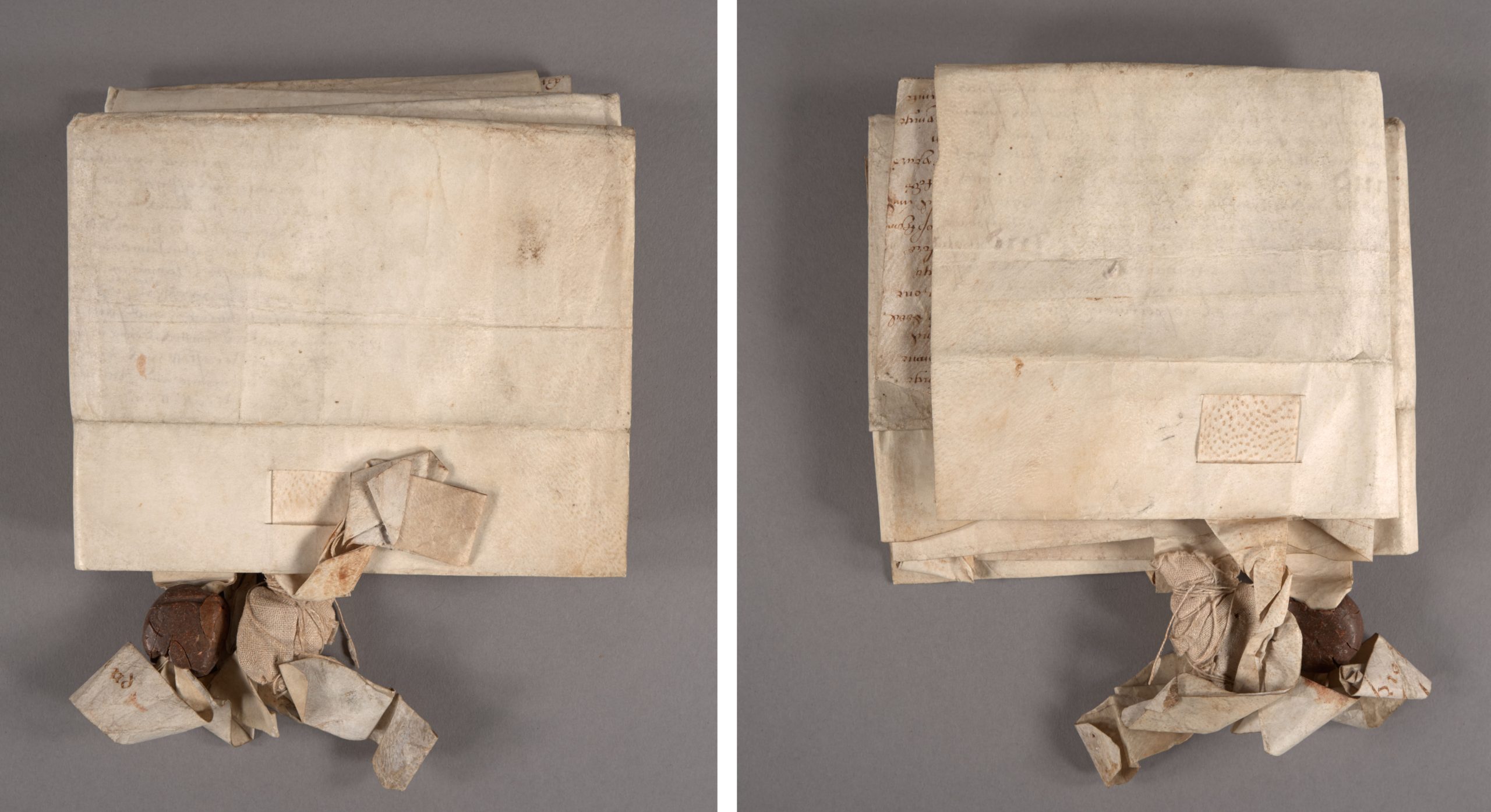
The document was folded both vertically and horizontally several times to make storage easier, but it made opening and reading the document quite a challenge. The parchment has a strong memory and will fold back onto itself without being weighted down. Yellowed adhesive residue from pressure sensitive tape was visible along the top edge – maybe used as a previous mounting solution. The wax seals had also became quite banged up over the years, so only one of the wax balls remained intact. The broken remains of another had been wrapped in a thin textile and tied onto the parchment strip with string. Little bits of red wax would sometimes fall out of the pouch when handled.
After treatment, photographed in raking light.
After dry cleaning the front and back of the parchment and removing as much of the tape residue as I could, I performed some minor flattening of the parchment sheet. My goal was to flatten it enough that the document would lay open on its own, while still retaining the evidence of how it was folded up for storage. I didn’t want any more fragments of the broken wax seal to be lost, so I took the remains out of the textile pouch and wrapped them in a little pleated package of soft Japanese paper, adhered closed with wheat starch paste. This seamed like a better solution than sealing them in some kind of stable plastic, like polyethylene, since the paper doesn’t crinkle so loudly. I tucked the package back inside the textile wrapping and secured it closed with some small stitches thin linen thread, toned to match.
My goal for the enclosure design was to protect all the different parts of the document, and also to help hold it flat should there be any changes in relative humidity. Boxes for parchment covered books often use of a restraining flap, so I thought something similar could be employed here with a rigid portfolio.
I knew this enclosure would be stored flat on the shelf, but I still didn’t want the document to move around too much inside – to protect the surface from abrasion, but also so as not to risk further damage to the parchment strips and wax. I cut a sheet of paper just a bit bigger than the dimensions of the document, then affixed wide paper corners to hold it in place. This was mounted to a sheet of matboard, which also had a sheet of E-flute corrugated board laminated to the back. This makes the matboard stiffer without adding much weight. Soft twill tape was laced through the board around where the two remaining wax seals were hanging, so they could be tied down and would not bounce around inside the box when it is served to a patron in the reading room.
The portfolio top flap is also made of laminated sheets of matboard and blue corrugated, with a Tyvek tape hinge along the top edge that attaches it to the bottom board. All of the corners were rounded and the bottom edge of the top flap’s matboard was sanded to take off the hard edge.
The custom sized portfolio ended up being larger than any of our standard metal edge boxes, so I created a custom fit telescoping lid box out of corrugated to hold it. Unfortunately we also don’t stock corrugated sheets large enough – so I had to join two sheets together with tyvek tape to make either the base or the lid. A third piece of corrugated was glued to the outside of both the lid and the base to stop the tape join from flexing when the box was lifted or tilted. The enclosure got a photo label at the bottom corner to help with identifying it on the shelf.
Removing the document from this enclosure to examine both front and back is fairly easy. After untying the twill tape, the parchment can be gently lifted out from under two of the paper corners, and then you can fully slide the document out. It actually requires two people to flip it over, since it is so large. While making this enclosure, I made sure to check that it wasn’t too large for the bigger shelves in the stacks and that it could fit through a standard-width door while resting on a cart.