We are all looking forward to a little break over the holidays, but wanted to share a book that has captured everyone’s attention in the lab this week: Edward Topsell’s History of Four-footed Beasts and Serpents from 1658. Originally published in two volumes in 1607 and 1608 (Beasts and Serpents, respectively), this is the first collected edition. It describes both real and fantastic animals, including delightful woodcut illustrations, like the camels below.
Rubenstein Library’s History of Medicine collection holds a sizable collection of anatomical flap books, which are books with illustrations featuring layers of movable paper flaps that can be lifted to reveal the layers of organs and tissues below. You can see several examples from a 2011 library exhibition here. We often get these books in the lab to correct common problems that can occur with the many layers of paper flaps: typically misfolds, tears, or detached flaps. This early 18th century work by Christoph von Hellwig, commonly known as Anatomicum vivum, came to us recently for some of those problems. During examination, something seemed a little off with the plates at the back.
Judging from the bright white wove paper and print type of the additions, it appears that in the recent past someone had glued in some modesty flaps to cover the anatomical figures. Duke acquired this volume in 2016.
The modesty flaps are supposed to look like a draped piece of cloth – but to me they just look like a cabbage leaf. So at first I thought someone was doing their own cheeky version of the “Fig Leaf Campaign“, a movement to censor classical sculpture that was carried out in the 16th century following the Council of Trent. Looking at images of other copies of the same edition, however, I have found some examples with more contemporary looking modesty flaps and some without any kind of covering flap. So now it is unclear to me how it was originally issued. Further research required.
If you are curious about the different layers in these prints, the Marion J. Siegman Archives at Thomas Jefferson University made some really great videos of a 1744 edition of this same work to demonstrate how the flaps operate. You can watch them here.
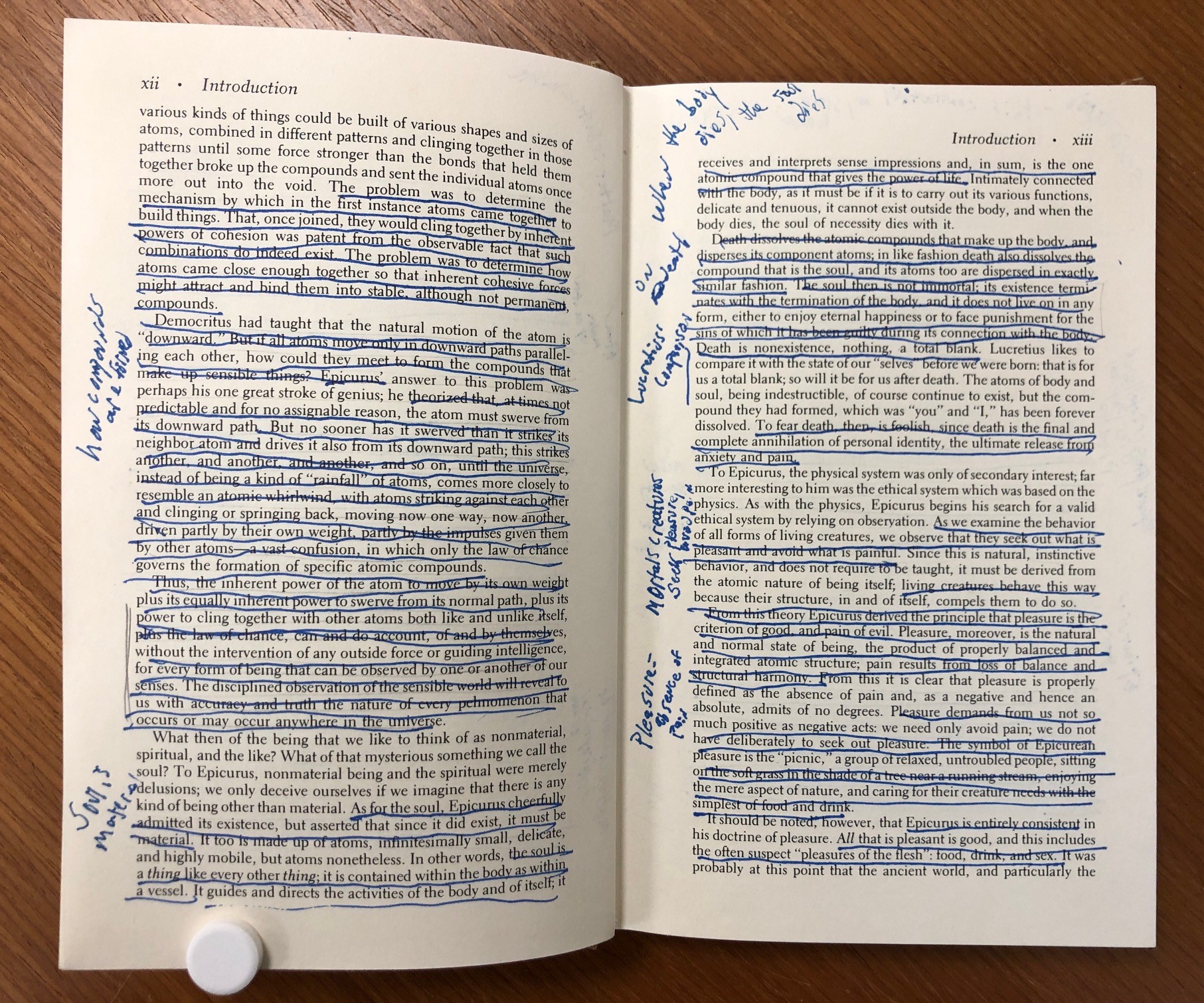
This 20th century French work of science fiction is back in the lab for evaluation for one of our imaging workflows. Published roughly 60 years after Verne’s Voyage au centre de la Terre, Creux’s novel features a ship that can drill its way into the earth – rather than the protagonists climbing down a lava tube. We just love the highly decorated cover.
The custom housing for this item was funded through our Adopt-A-Book program. Other adopted conservation treatments are currently on display in the Mary Duke Biddle room in an exhibit titled Donors Choose: Highlights from the Duke Libraries Adopt-a-Book Program. Please join us on Tuesday, October 14, 2025, from 11am to 12pm, for a gallery talk. Staff from the Conservation Services Department will be available to talk about the items on display and answer questions. We will have bookmarks and buttons for attendees!
This scribal copy of the Haitian Declaration of Independence will soon travel for exhibition at the Museum of the American Revolution. A declaration of independence by the army of black Haitians from French colonial rule made 1804, the original document strongly echoes the rhetoric of the American Revolution three decades earlier. It established the first black republic in the world.
High quality images of each page are available in the Duke Digital Repository: https://repository.duke.edu/dc/haitideclaration/hdims01001
Duke’s copy of the Declaration was found in the papers of Jean Baptiste Pierre Aime Colheux de Longpré, a French colonizer of Saint-Domingue (Haiti) who fled the country during its revolution and settled in New Orleans around 1812. The manuscript was very likely made shortly after the Declaration took effect. Few known contemporary manuscript copies are available to scholars, residing at the British Library, the French National Archives, and the National Library of Jamaica. For more background on the history and scholarship of this important document, see Julia Gaffield’s 2014 article in The Appendix.
Before any item from the collection is loaned to another institution, it undergoes thorough examination and documentation. This manuscript is written on light blue laid paper, which is traditionally manufactured by hand using a woven wire mould. Wire moulds often include a watermark from the paper mill, made by sewing wire into a design through the mould. Leonie Müller, from Harvard Museums, has written a good explainer of the process with images. Watermarks in paper can give a lot of information about the place and date of its manufacture.
Since the wires from the paper mould leave the paper slightly thinner above them during the paper making process, transmitted light can be used to clearly see the laid and chain lines, as well as any watermarks. I place the manuscript on a light table and was able to clearly see watermarks on the left and right side of the sheet.On the left side of the sheet, the words “AL MASSO” are visible. This is referring to the Al Masso paper mill, which was formed in 1782 in the city of Pescia, Italy.
On the right side of the sheet, you can see a crown-topped shield crest, featuring a bird and stone tower. The words “GIORo MAGNANI” are visible beneath it, referring to Giorgio Magnani. Magnani formed the Al Masso mill in partnership with Antonio Arrigoni. The Bernstein Consortium has some photos of the same watermark here that better show some of the details.
Pescia became known in Tuscany for papermaking as early as the thirteenth century. Due to an abundance of running water in the area, the city hosted hundreds of paper mills and by the nineteenth century became an important site of industrialization in the region. The Magnani family has been producing paper since the fifteenth century and continues to do so today.
By closely examining items in the library collection, we can start to piece together more information about their origin and manufacture from seemingly small details.
To end preservation week we are going on a field trip to pick up materials and process them into our workflows. Our first stop is the library’s shelving unit where the staff have set aside damaged materials for us.
Pickup from shelving unit
Our next stop is Circulation on the first floor. Front line workers are often the first to see damaged books.
Picking up damaged books from Circulation
When we get back to the lab, we scan items into our library tracking system called Alma. When we scan an item in, it changes the location and availability so that everyone knows where the book is in case it is requested by a patron. We scan items when they come in, and when they leave the lab.
Scanning items into Alma
Shipping brings us materials from the East Campus Libraries and from Collections Services. We evaluate each item’s needs and sort them into our workflow by type of repair or housing they need.
Sorting scores and other small items into the pamphlet binding workflow.Sorting a couple items from Circulation into the book repair workflows.The best conservation flag this week. This will get an enclosure for sure. We want to keep these items together.
When work is finished, we often have to order shelf labels from Collections Services. When they arrive, we carefully match the barcode on the label with the barcode on the item.
Applying shelf labels
Once everything is labeled, we sort the finished materials by location and send them out.
Sorting material by shelving location. Don’t forget to record your stats!
A week in the life of Conservation is rarely boring. I hope you enjoyed coming along with us on our Preservation Week journey!
During the process of treating items from the collection, we sometimes discover interesting details about their production that can be useful for researchers. Take, for example, this repair that I completed last year on The Byrth of Mankinde, a book printed in London in 1545.
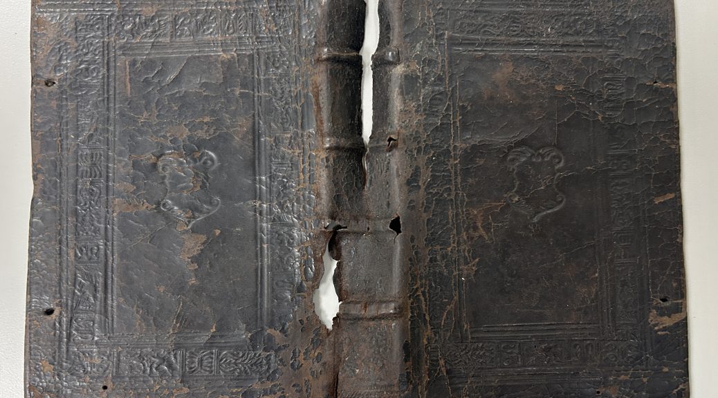
It came into the lab because the front board was detached from the textblock and the leather was split along the spine. We were concerned about further damage occurring to some of those original binding materials with use in this condition, so it was important to reattach the front board and adhere the lifting leather.
The textblock is printed on paper, but on the right side of the image above, you can see the smallest sliver of manuscript on parchment. It was common for binders to use waste material in the construction of bindings. Parchment is a very strong material that can be used to reinforce the board attachment of a book, so it was a common practice to cut up the leaves of parchment manuscripts and paste the fragments into new bindings.
It turns out that all of the adhesive attaching the leather to the boards had completely dried out and failed, so during treatment I was able to just slide it off of the book – kind of like a glove. You can see the major splits through the head of the spine and some sizable losses where the raised bands lace into the boards. At one point the binding had green silk ribbon fore-edge ties protruding from the front and back boards, but they have since broken off and only fragments remained adhered under the pastedowns.
With the leather off of the book, I had more access to view the structure of the binding. The sewing supports are made from tanned leather, which do not remain as flexible as they age. It is not surprising that they have failed. Above you can see the manuscript fragment stub wrapping around the last section of the textblock.
In addition to the failing adhesive, the sewing also broken in the first section, so I was able to release the parchment fragment from the interior of the front board and photograph both sides of it. These photos will be available to researchers when they are ingested into the Conservation Documentation Archive later this year. The text on the manuscript might provide more information about the provenance or production of this book.
I used linen thread to create new sewing supports over the front joint and sewed the first section, with it’s parchment fragment, back onto the textblock. After reattaching the front board and readhering the original leather (with some toned Japanese paper lining the interior of the spine), I decided to leave the parchment fragments loose from the boards at the front and back. Should anyone be interested in reading the text on those fragments, it will be easy to access them if they aren’t hidden under the original pastedowns. I made new pastedowns from handmade paper, so now the original pastedown just becomes the first leaf of the book. This changes the initial experience of reading the book, but from the staining and presence of bookplates, it’s pretty obvious that the now free leaf was once pasted down.
Preservation Week is here! This annual celebration, first sponsored by the American Library Association and the Association for Library Collections and Technical Services in 2010, was established to raise awareness of the role libraries and other cultural institutions play in providing preservation education and information. The theme for this year is Preserve the Past, Shape the Future: Inspiring the Next Generation.
All this week Preservation Underground will be bringing you snapshots of the different kinds of work that we do to support the collections and mission of Duke Libraries. Today we are engaged in probably our most important work: planning and prioritizing.
Each month our conservators meet with curatorial staff from the Rubenstein Library to assess collection material that has been identified for treatment and set priorities for our work. The materials that we care for come in a wide range of sizes, materials, geographic and cultural origins, and time periods. With millions of items in the collection and just a few of us in the lab, we are not able to work on everything. During these meetings, we consider the past and anticipated future use of these items (for research, instruction, exhibit, or digitization) and try to determine what treatments are most appropriate for them. Some items will receive extensive treatment, while others will just get minor stabilization or an enclosure. Collaborating with the curators on treatment plans and priorities helps us to support the work of researchers and students who come in to use these materials. Good stewardship of Duke’s collections will allow them to be usable for generations of researchers to come.
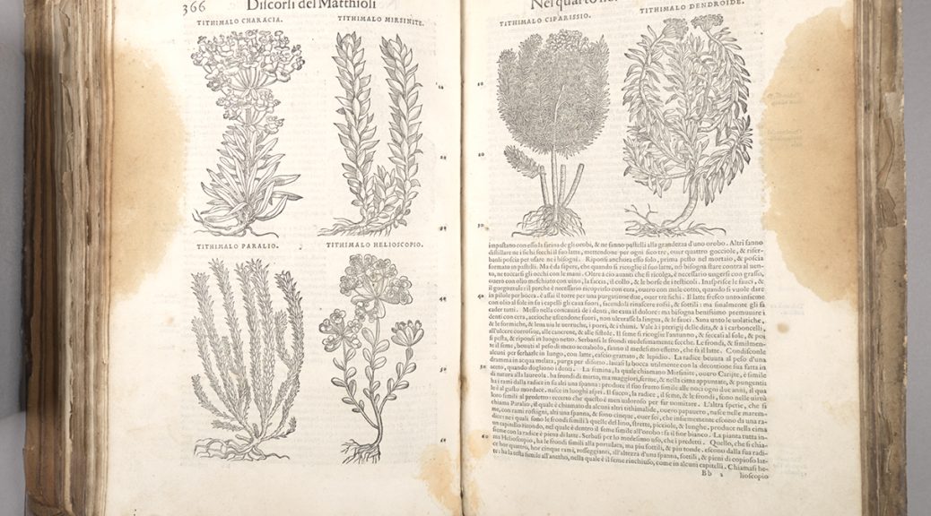
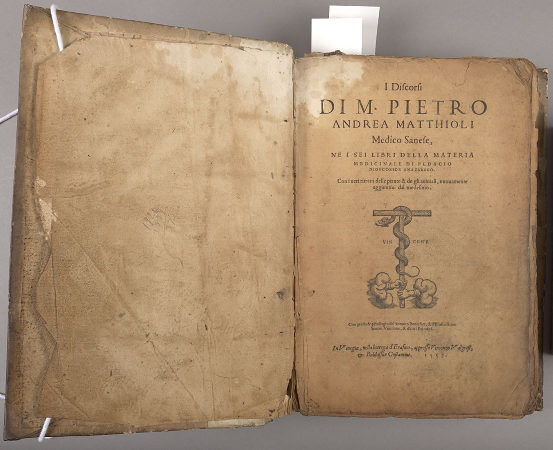
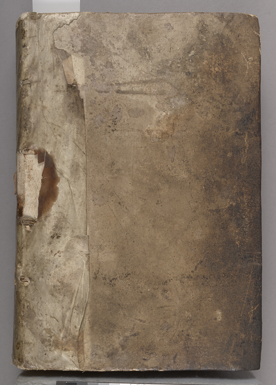
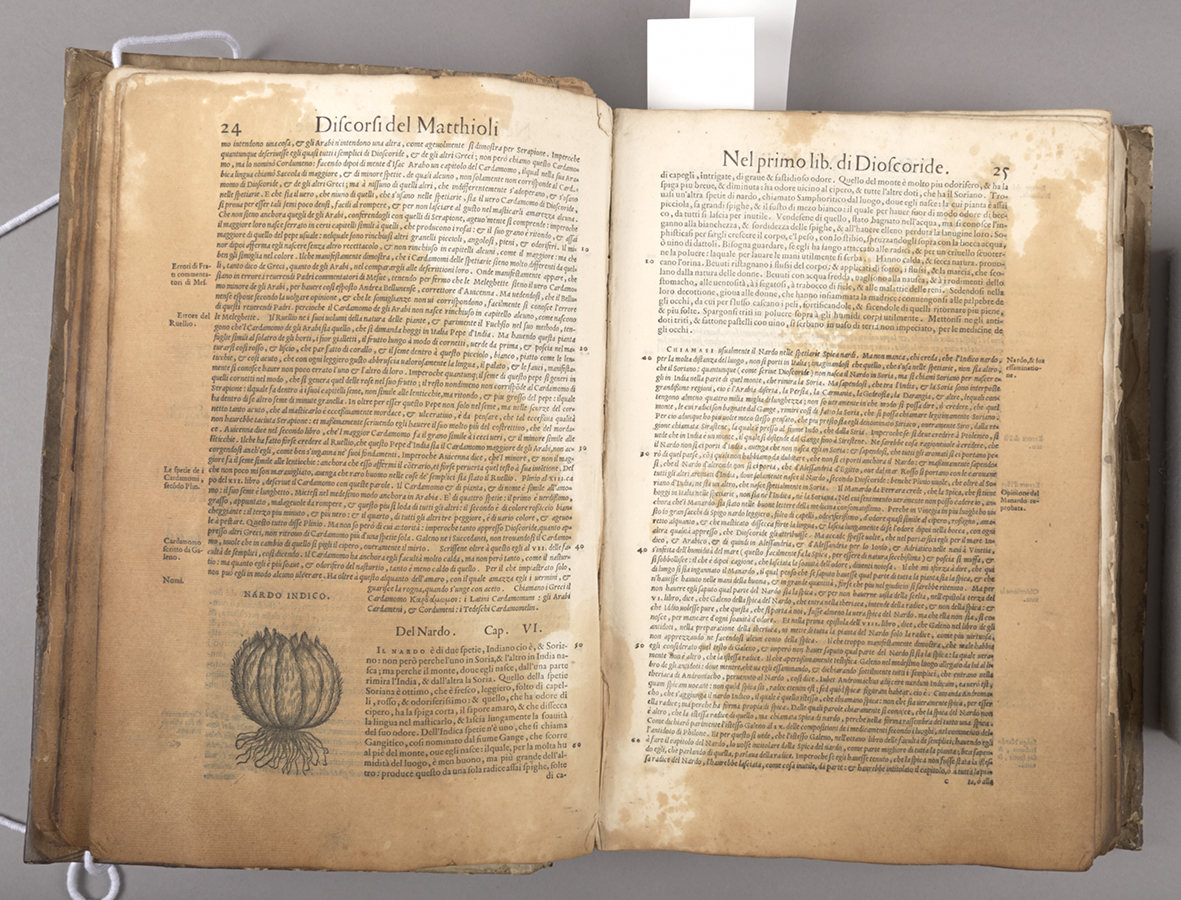
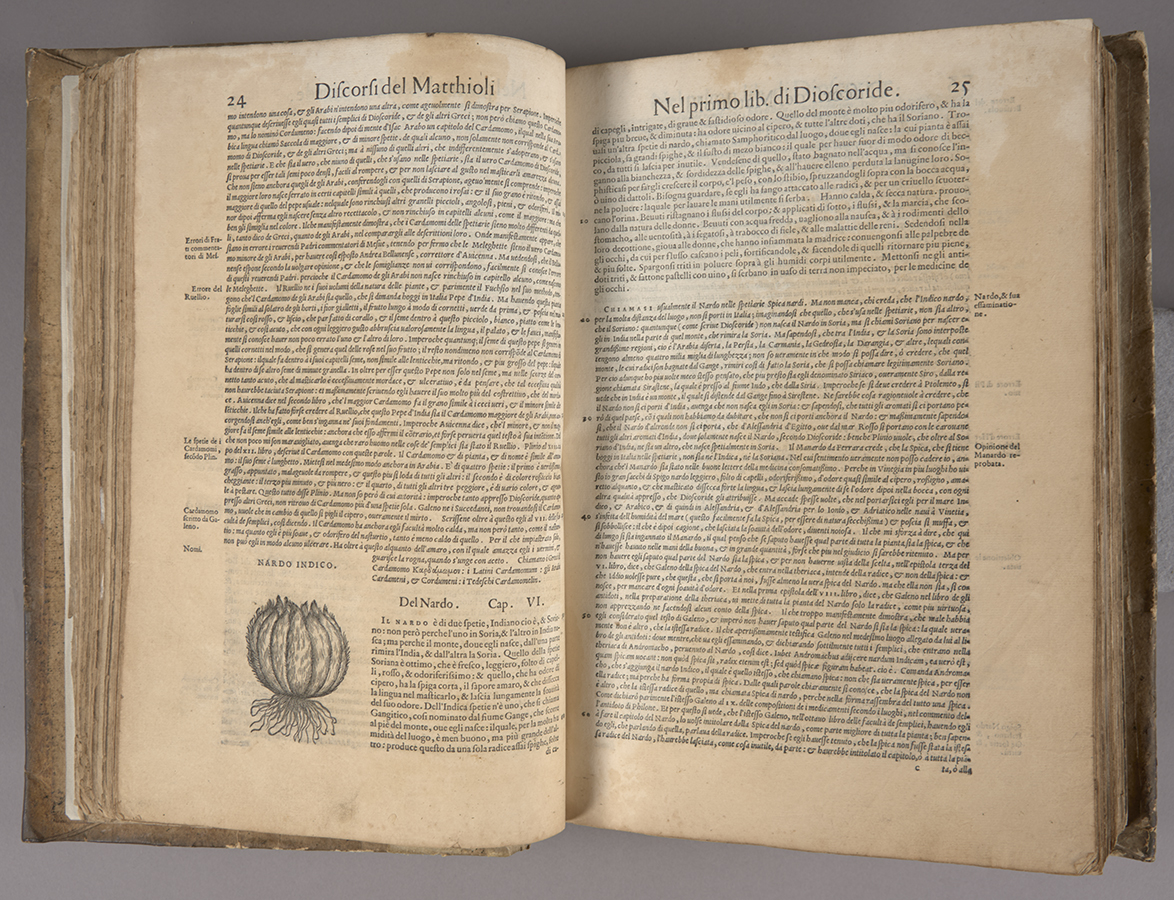
We’re preparing to launch another batch of treatment documentation in the CDA, and the process has reminded me of one of the most complicated, and ultimately, one of my favorite treatments from over the years. I discorsi di M. Pietro Andrea Matthioli, medico senese, … is an early Italian natural medicine text, printed in Venice in 1557. It contains lovely woodcut illustrations of animal and plant species that offered medicinal remedies. Rubenstein Libraries’ copy was acquired for the History of Medicine Collection in 2016 from a family in the Piedmont region of North Carolina.
Title page, before treatmentBinding, before treatmentPartial staining and plant images, before treatment
When we acquired it, about one quarter of the text and a portion of the early paper binding had long been saturated with oil, and there was less severe oil staining throughout. It was so soaked with oil that the pages were slightly transparentized and were becoming stiff and blocking together. This video demonstrates the condition and handling challenges it presented when we first received it [SOUND ON].
The text was bound in an early paper binding with a parchment spine overlay. The sewing was broken in places and pages were coming loose. Initial testing found that the oil was soluble in a couple of different solvents but I found that of the few I tested, ethanol moved only the oil but not the printing ink. With this information and considering other factors, the curators and I agreed that it was appropriate to disbind the text and to use solvent baths to remove as much of the oil from the paper as possible.
Working in our fume hood, I treated the most oil-stained sections of the text with multiple ethanol baths, which significantly drew out oily residues and moderately reduced the staining, a result that the curators were ultimately pretty happy with. These solvent baths were followed by water baths and then resizing, since the previous immersions removed most of the original sizing.
Saving some of the residual oil in ethanol, I was able to analyze it with Fourier Transform Infrared Spectroscopy (FTIR) at the SMIF facility on campus. Conservation scientists in at the Winterthur Museum in Delaware were able to identify the residue as palm oil, along with an unknown plasticizer. These results ultimately didn’t impact the conservation treatment, but the information does present another interesting detail in understanding the curious life of this item. After treating the text, I mended it and resewed it, and was able to rebind it in the original binding.
Staining before treatmentAfter solvent treatment
I Discorsi… is likely to be on display in an upcoming exhibit on early botanical texts. You can also see further images and details of this treatment in the CDA, here. Many thanks to Dr. Mark Walters, Dr. Chris Petersen, and Dr. Jocelyn Alcantara-Garcia for their assistance in oil analysis and identification.
Keeping a large circulating collection in usable shape means you are often so busy fixing or boxing books to get them back on the shelf that you don’t have time to look at the contents. When a first edition of Mary Van Kleeck’s Women in the Bookbinding Trade came into the lab, however, we all stopped to take a look.
This book, originally published in 1913, is a fascinating look into the working conditions for women in the binding trade around the turn of the century. Margaret Olivia Sage had used the considerable wealth amassed by her late husband to form the Russell Sage Foundation in 1907 for “the improvement of social and living conditions in the United States”, specifically by using scientific research to advocate for progressive reforms. The foundation funded a series of studies which documented the condition of women’s work in important trades in New York City. The 1900 US census reported that over a quarter of women bindery workers were employed in the city, so the location offered a sizable sample to extrapolate conditions across the United States.
The turn of the century was an important period of transition for the binding trade. Work that was traditionally done completely by hand had become more mechanized in the late 19th century, and the number of women working in the trade was growing rapidly. Binderies were typically gender-segregated, with women relegated to less skilled and lower wage work, like folding, gathering, and sewing textblocks and endbands. In most cases, all of the forwarding, covering, and finishing work was done by men. Van Kleeck’s book includes a lot of photographs, which offer a look at the conditions of the workspaces, the roles assigned to each gender, and the shift from fully manual to machine-assisted labor during this time.
Van Kleek notes that the introduction of more capable binding machines displaced a lot of workers in the book trade, shifting them to lower wage work or out of a job entirely. The author describes the case of one woman who learned to operate a folding machine, allowing her to double her weekly wages to $9.00. Within a few years a newer machine arrived that made multiple machine operators obsolete. She was transferred to hand folding, which was harder physical labor and only paid 4 cents per 100 sheets. Working as quickly as possible she could only earn $7.00 per week (p. 51).
As a side note, this page caught my eye when I realized that the heads of the people in the bottom photo had just been drawn in. I’m not entirely sure why – maybe they were a bit blurry because the camera exposure was long and they were moving quickly? Was it to anonymize the workers, or to make them look more the part?
20th century photoshop
It is so interesting to see photographs some of these machines in action. The technology was advancing pretty rapidly in this period and most of these models no longer exist. Some versions can be seen at the American Bookbinders Museum in San Francisco.
In the finishing department, women were often only found laying gold leaf onto covers, rather than operating stamping machines or gilding the edges of textblocks.
The introduction of electric lights in the late 19th century allowed businesses to operate at all hours. Without labor protections (and a supreme court actively hostile to organized labor), many factory workers were forced to work long hours. Van Kleek notes that binderies are legally classified as factories, and despite state laws barring any woman over the age of 16 from working more than 60 hours, workers regularly reported 14 hour shifts, 6 days a week. The book describes workers commuting to and from dangerous neighborhoods in the early hours of the morning. As a result, young women regularly went missing. The study also records rampant child labor violations in the book trade.
I think we can all relate to “artificial light all day”
By examining the details of Mary Van Kleek‘s work, one can follow a line directly from this book to the establishment of the modern work week and labor protections we enjoy today. Van Kleek began working for the Sage Foundation shortly after its founding as the secretary of the Committee on Women’s Work. There she was mentored and trained by prominent labor activists like Florence Kelley and Lilian Brandt. Her research for this publication and others like Artificial Flower Makers (1913) and Wages in the Millinery Trade (1914) was instrumental in the passage of New York state labor laws limiting working hours in 1910 and 1915. During WWI, Van Kleek was appointed by Woodrow Wilson to lead the new Women in Industry Service group in the Department of Labor. That group published a report that became the basis for the Fair Labor Standards Act of 1938, which established the eight-hour workday, five-day workweek, a federal minimum wage, overtime pay, and prohibited child labor.