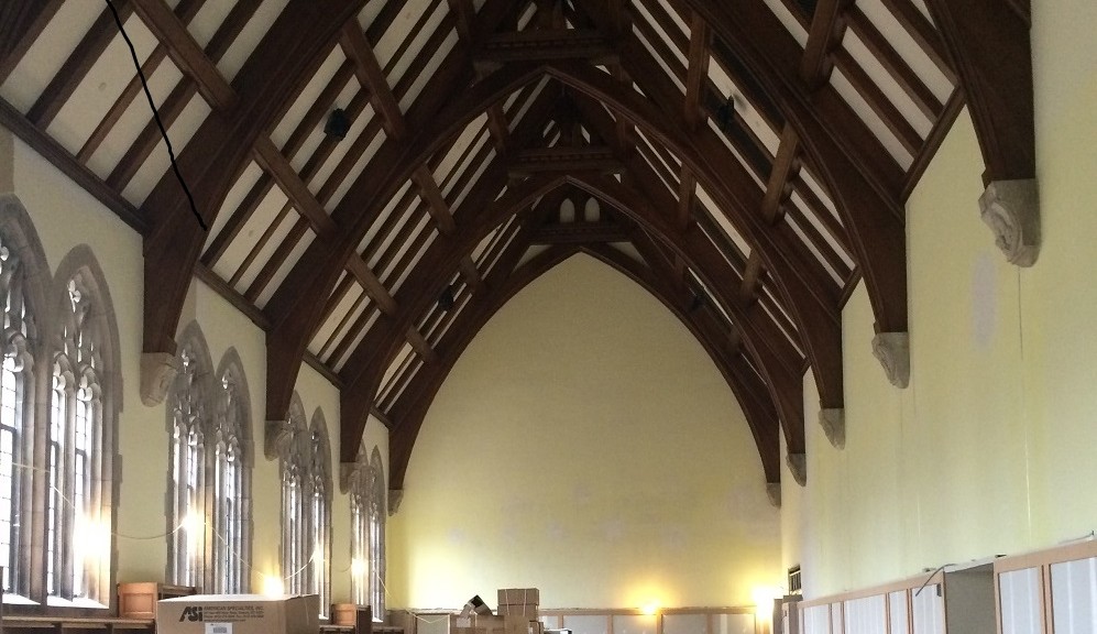
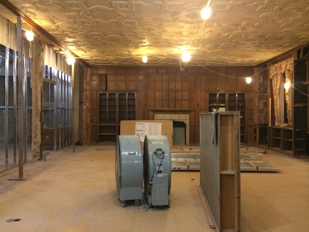
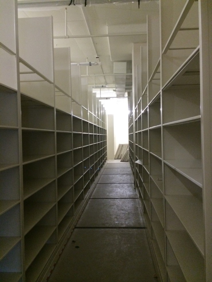
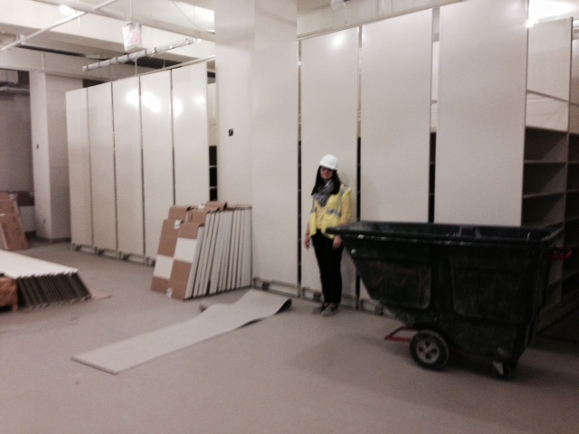
Summer is gallivanting into Durham, and with it comes the promise of a new beginning for the Rubenstein, one involving fresh paint, new shelving, and a touch of tenacity. In a month, we’ll begin moving our materials and ourselves into our beautifully renovated home. Some Rubenstein spaces—like the Gothic Reading Room—will remain lovingly preserved, testaments to the memories that came before and to the new scholars who will soon discover them. Others will be similar in name only. I’m looking at you, Rubenstein stacks.
I’ve heard a lot about the pre-renovated Rubenstein stacks during my nearly two years here. The creaky elevators, the nooks, the crannies, the many doorways. These quirks are part of the collective Rubenstein conscious, and they’re spoken of fondly, frequently.
And while we’re sad to lose those charms, we’ve also been granted an opportunity to refine systems, to make materials more visible and easy to locate. We’ll no longer have a maze of classification schemes but one: Library of Congress. All of our print materials will be clustered by size: double elephants will chill next to double elephants; folios next to folios; mini materials next to mini. This is all great news for those of us lacking inner compasses. It also brings us to a logical question: how do we go about mapping locations for thousands of materials in this brave new world?
Easy! We turn to Tableau, a nifty data visualization service the lovely folks at Data Visualization introduced to us. Tableau allows subscribers to turn data into graphic representations that move far beyond bar graphs and pie charts—although it does have options for those as well.
Because we’re moving to a standard classification scheme, we now have more ways than ever to visualize our collections: we can look at overarching trends using the main classes of LC (e.g., “P” for Language and Literature or, “N” for Fine Arts); we can also get more granular than that. Within LC, there are subclasses that further delineate topics. PR—English Literature—is a subclass of Language and Literature, as is NA—Architecture—for Fine Arts. We can even delve deeper than that, looking at how many items are within a specific range of class numbers (e.g., PR1000-PR1100). With Tableau, we can then turn these data points into visual c(l)ues:


This visualization breaks out our print holdings first by size designation (12mo = duodecimo; 8vo = octavo; 4to = quarto), then by subclass. Looking at this, we know that we have substantial chunks of duodecimos classed in “B”—Philosophy, Psychology, Religion. We can also see that there are relatively fewer quartos and folios classed in Philosophy, Psychology, Religion. By doing this legwork, we know that we should probably leave extra space in the duodecimo section for materials classed “B.” Conversely, we also know that we won’t need to leave quite as much room in the folio areas for materials classed similarly.
Using a data visualization service has allowed us to be more accurate, more efficient, in our planning today so we won’t have to do as much shifting in the future. (Sorry wonderful colleagues! I can’t promise that we’ll never do shifting.) My own hope is that by doing this methodical (and methodological!) plotting today, the new stacks will be spoken of with the same fondness as the old stacks—albeit with less reverence toward crannies.
Anxiously awaiting our renovated space? It’s coming! From July 1st-August 23rd, the Rubenstein will be closed as we move into our permanent home. On August 24th, we’ll reopen to one and all.
Thanks to Mark Zupan and the Duke Libraries Renovation Flicker page for the excellent pictures; thanks also to Data Visualization for showing us its cool offerings!
Post contributed by Liz Adams, Collections Move Coordinator


