Category Archives: Hartman Center

Fashionistas and Soldiers: Military Ads for Women

Post contributed by Claire Payton, Ph. D, Intern for John W.  Hartman Center for Sales, Advertising & Marketing History 

This is a watershed era for women in the military. In January 2017, women joined combat units for the first time. Another milestone was passed later that year, when a woman completed a punishing thirteen-week officer training program. Thirty-six women have attempted the course but until last September, none had succeeded. Marine Corp is recalibrating its tests of physical strength to be more equal between men and women.

Female soldier leaving a landed helicopter.
Recrutiment ad for the USMC, 2016

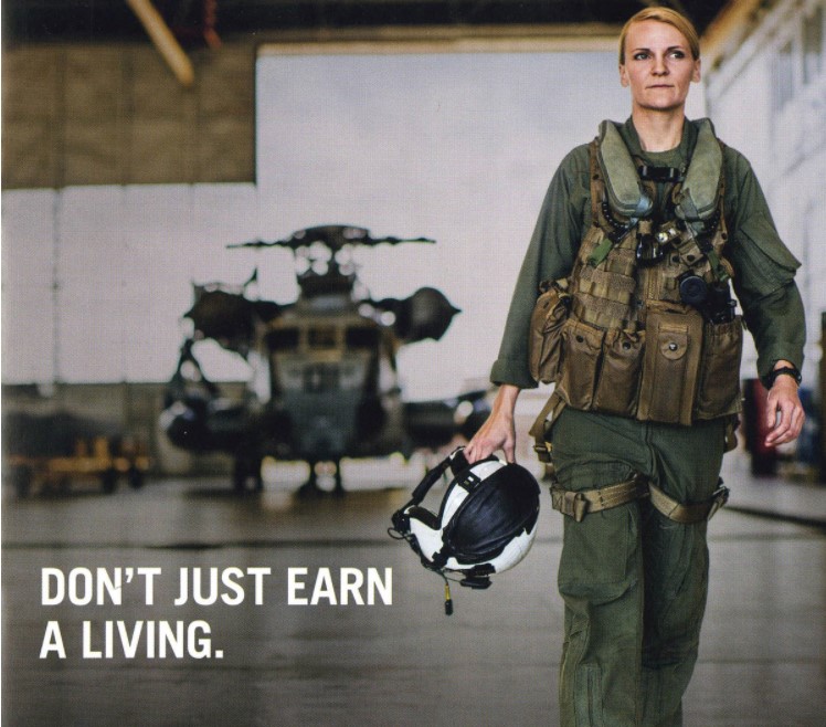
Walter Thompson (JWT) has been part of the larger conversation about gender integration of the force. The marketing firm, which has worked with the Marine Corps since 1947, took on the issue in a 2016 advertising campaign by prominently featuring images of servicewomen in action. A striking 2017 television ad, offering a sweeping depiction of the Corps’ history, included the contributions of servicewomen.

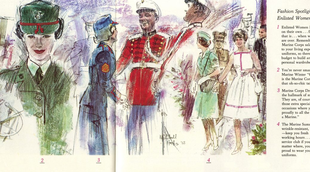
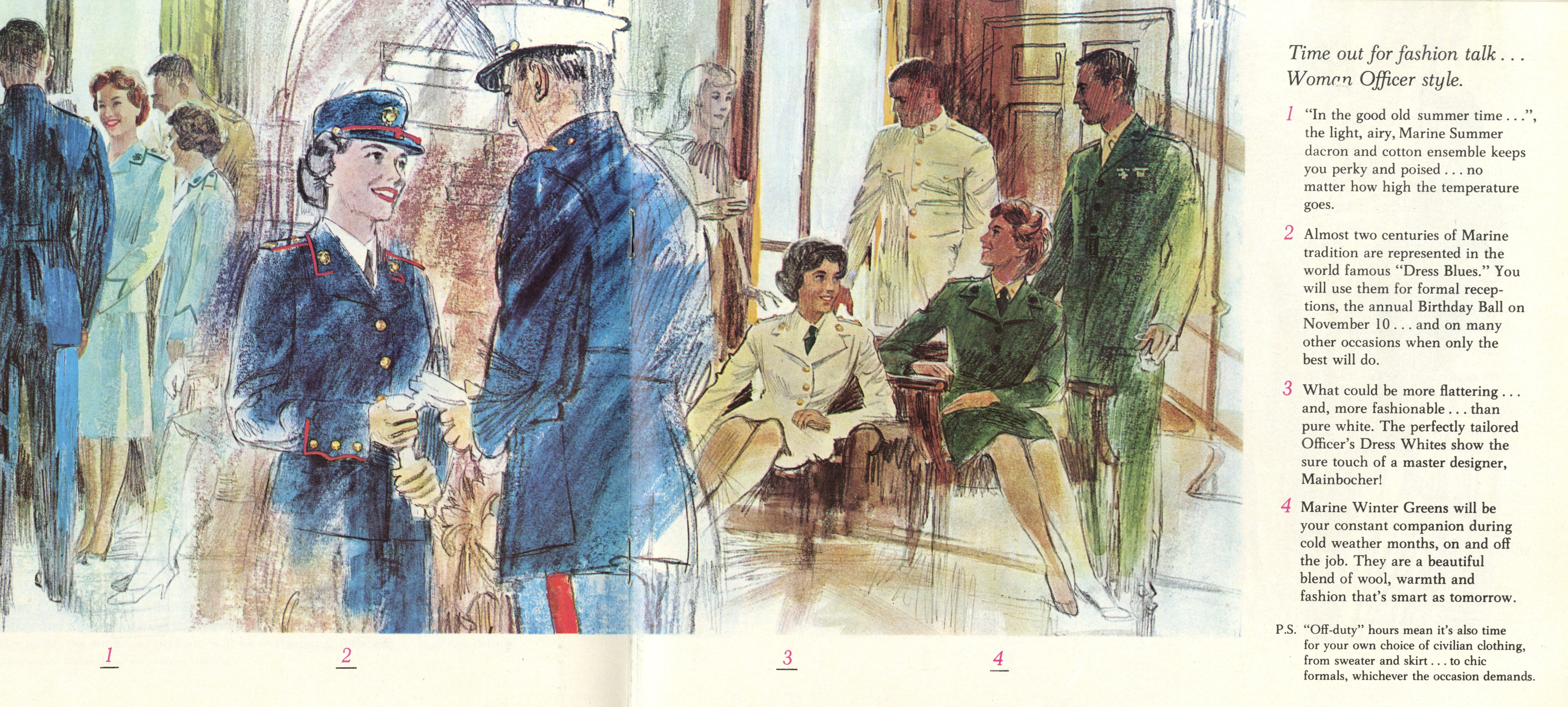
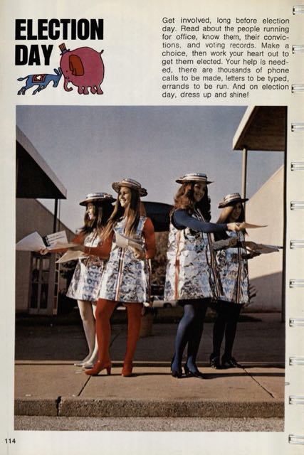
But JWT marketing materials from a few decades ago indicate how far the company—and society at large—has come with regards to gender equality in the military. In the Hartman Center’s JWT Review Board Records collection, there is a 1963 brochure inviting women to join to the USMC. Unlike the contemporaneous material targeted at men, which emphasized building physical strength and personal integrity, this brochure revolved around the outfits female marines would wear in different circumstances.

Colorful illustrations featured slender women in different settings, annotated with sartorial encouragement. “You’re never smarter than in Marine Winter ‘Greens,’” promised one passage. “This is the Marine Corps’ version of that oh-so-chic tailored look.” Another passage asked, “What could be more flattering…and, more fashionable… than pure white. The perfectly tailored Officer’s Dress Whites show the sure touch of a master designer, Mainboucher’.”

Hand-drawn depiction of men and women socializing in military uniforms.
1963 recruitment brochure from the JWT Review Board Records collection

Despite this limited vision of what might attract women to the Marine Corps, in the 1960s servicewomen made important strides. In 1964, there were 1,281 women in the Marine Corps, serving in diverse fields such as intelligence, operational communications, transportation, legal, avionics, aerology, and aviation operations. Regulation changes in 1965-1966 made it easier for women to stay enlisted after marriage, which lengthened women’s careers and gave more opportunities for advancement. In 1963, the first woman attended Amphibious Warfare School; in 1966 the first women arrived for active duty in Pacific overseas bases, including Vietnam.

Hand-drawn depiction of men and women socializing in their military uniforms.
1963 recruitment brochure from the JWT Review Board Records collection

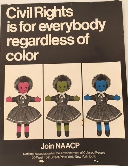
The 1963 pamphlet conveyed stereotypes of women as passive and feminine, more concerned about their appearance than their jobs. Nonetheless, the JWT marketing campaign in the 1960s contributed to growing numbers of women in the Corps, many of whom broke boundaries and redefined norms. JWT’s most recent advertisements help to normalize the image of military women active both in and out of combat. This is an important transformation, since women’s abilities and the meaning of their bodies are still highly contested.


Sources consulted:

Stremlow, Mary V., and USMCR. A History of the Women Marines, 1946-1977. History and Museums Division Headquarters, Washington DC: CreateSpace Independent Publishing Platform, 2014.


Midwifing the Rise of Consumerism in Post-War France

Post contributed by Claire Payton, John W. Hartman Center for Sales, Advertising & Marketing History intern and Ph.D. candidate, Duke University Department of History

At the end of World War II, the meaning of family changed in profound ways. In Europe and North America, young couples set about starting new families. Their enthusiasm for procreation generated the demographic explosion known as the “baby boom.” Those who could afford it filled their homes with refrigerators, television sets, and baby toys, midwifing another major post-war transformation: the rise of consumerism.

Riding these twin dynamics, an upstart Parisian advertising firm was able to build up a small French company into a famous international brand. Publicis was a small ad firm founded in 1926 by Marcel Blustein-Blanchet, the son of Jewish immigrants. Blustein-Blanchet managed to flee when the Nazis occupied France in 1940. Publicis was shuttered and the office and equipment were seized by the government. But when the war ended he returned and, in 1946, reopened Publicis. One of the first new clients he signed while rebuilding from scratch was a small new company that specialized in maternity clothes called Prénatal.

Founded by Jean-Maire Mazart in 1947, Prénatal seized upon the social transformations of the era. With the help of Publicis, the company targeted young pregnant women who were looking to overcome the war through the power of consumerism. Mazart’s idea, inspired by the United States, was to provide women with high-end clothes in different sizes depending on how far along they were in their pregnancy. The idea was an immediate hit in France, and Prénatal expanded quickly. It diversified its products to include baby items so that loyal clients could continue to have things to buy things even after pregnancy was over and motherhood began. Within two decades, there were two hundred Prénatal storefronts in France, with more around Europe and overseas.

One of the ways Publicis drummed up excitement for its clients was to design large displays at major marketing events. These photos show its Prénatal installation at a 1950s Foire de Paris (Paris Fair) which was held in the luminous Parisian marketplace, Les Halles. The photos are part of a new acquisition at the Hartman Center, a Collection of French Advertising Display Binders that feature photos of Publicis advertisements, installations, and displays from the 1950s. The Publicis-Prénatal strategy is evident in the slogan painted on the walls: “Tout pour la future maman…Tout pour le nouveau ne” (Everything for the mom-to-be…Everything for the newborn). The design of the Prénatal display showcased the message that ideal mid-century motherhood–glamorous, clean, elegant–was available with the signing of a check.

By the late 1960s, the message pedaled by Prénatal and Publicis had lost some of its charm. The very people who might have worn Prénatal clothes as infants grew up to challenge post-war ideas of consumerism and the heteronormative nuclear family that the company’s products celebrated. With the increasing availability of contraceptives in the late 1960s, women could aspire to more than a fashionable and well-heeled pregnancy. Mazart sold the company in 1972; it closed its last doors in 1997. More able than its client to adapt to changing cultural norms, Publicis today is one of the world’s leading multinational advertising and public relations agencies.

New Acquisition about The Most Famous Reindeer of All

Post contributed by Claire Payton, John W.  Hartman Center for Sales, Advertising & Marketing History intern and Ph.D. candidate, Duke University Department of History

Just in time for the holiday season, the Hartman Center for Sales, Advertising & Marketing History in the David M. Rubenstein Library has acquired a copy of the 1939 booklet that introduced Rudolph the Red-Nosed Reindeer to the world.

Rudolph was invented by a Robert L. May, a 35-year old copywriter, for a promotional campaign at the Montgomery Ward department store in Chicago. May was inspired to pen the story of the humble, resilient, reindeer to cheer his daughter Barbara, whose mother was dying from cancer. Drawing from the “Ugly Duckling” story and his own memories of being ostracized as a child, May wrote a tale of an odd-looking deer whose unusual bright-red nose saves the day after Santa asks him to light the way on a particularly cloudy and foggy Christmas Eve. In the end, Rudolph is feted and admired by reindeer-peers who previously had bullied him. May collaborated with Denver Gillen, a colleague from Montgomery Ward’s art department, to create drawings to accompany the story. Their booklet, which first appeared in November 1939, became a hit, with nearly 2.5 million copies printed and distributed.

Production of the pamphlet ceased during WWII. Montgomery Ward resumed the marketing campaign in 1946, printing another 3.6 million copies. But in January 1947, for reasons that remain unclear, department story executives turned over copyright on the Rudolph story to May. This was a boon to the May family, which was reeling from medical bills accrued during the illness and death of May’s wife.

Luckily, the delightful story continued to enchant. In 1948, Rudolph became the hero of a short animated Christmas film. The following year, May’s brother-in-law, a songwriter named Johnny Marks, composed a jingle based on the reindeer’s adventure. The song was picked up by country-singer Gene Autry, whose version would become a smash-hit, selling more than 25 million copies worldwide. This song became the basis of a 1964 stop-motion animated film by Rankin/ Bass Productions based on Rudolph’s story.  The film became a classic holiday special that continues to air today. Rudolph not only saved Christmas, he also saved the May family from bankruptcy.

This unassuming 78-year-old booklet introduced an unlikely hero who transformed the life of an Illinois family and the culture of Christmas around the world.

Uncola: Seven-Up, Counterculture and the Making of an American Brand

Post contributed by Claire Payton, John W.  Hartman Center for Sales, Advertising & Marketing History intern and Ph.D. candidate, Duke University Department of History

It was 1967, and people weren’t drinking Seven-Up. Well, a few were: consumers mostly thought of the bubbly beverage as a mixer or a tonic to calm an upset stomach. But executives at the St. Louis-based Seven-Up Company were anxious to tap into a wider market. The company wanted to rebrand its product as a common soft-drink like the more well-known cola beverages, Pepsi or Coca-Cola. It enlisted a marketing team from the Chicago office of the J. Walter Thompson ad agency to help them. Out of this collaboration came one of the most famous advertising campaigns of the 20th century.

The late 1960s were a difficult time in America. The Vietnam War and the fight for civil rights divided the country.  Disillusioned young people were building a robust oppositional counter-culture that rejected war, racial segregation, and violence. The summer of 1967 became known as the “Summer of Love,” a period when hippies gathered in San Francisco and cities around the country in the hopes of igniting “a renaissance of compassion, awareness, and love, and the revelation of unity for all mankind.”

Seizing on this oppositional energy, the JWT team designed a campaign that framed 7-Up as the ultimate oppositional drink: the “Uncola.” Rather than trying to play up the similarities the soda shared with its competitors, the new ads focused on its differences. In the company newsletter, the team explained “Seven-Up advertising tells people that, of the three top-selling soft drink brands, 7-Up, the Uncola, is the only one with distinctly different qualities.”

An early Uncola ad: "A hotdog and . . . The Uncola?"
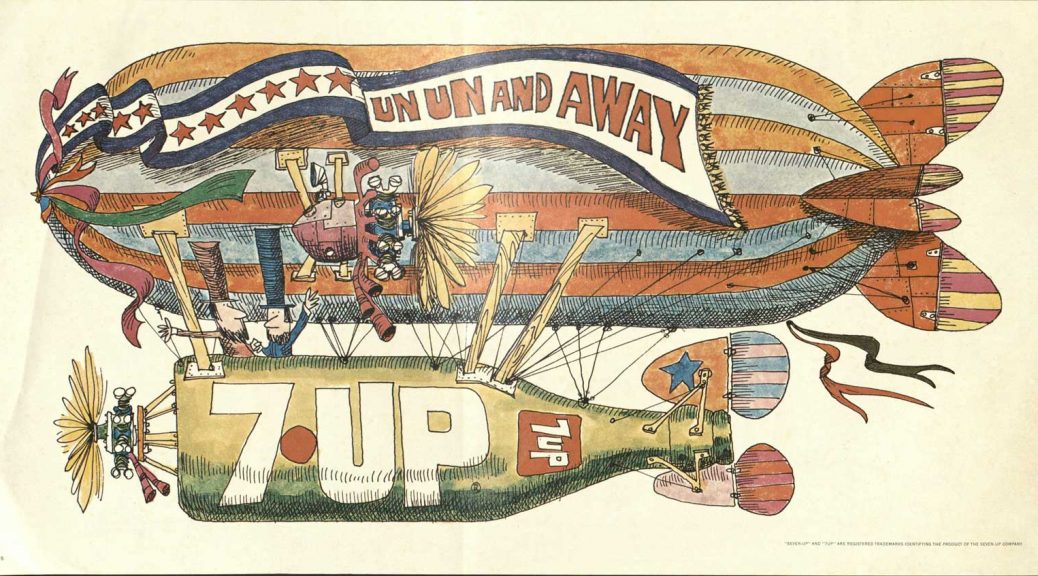
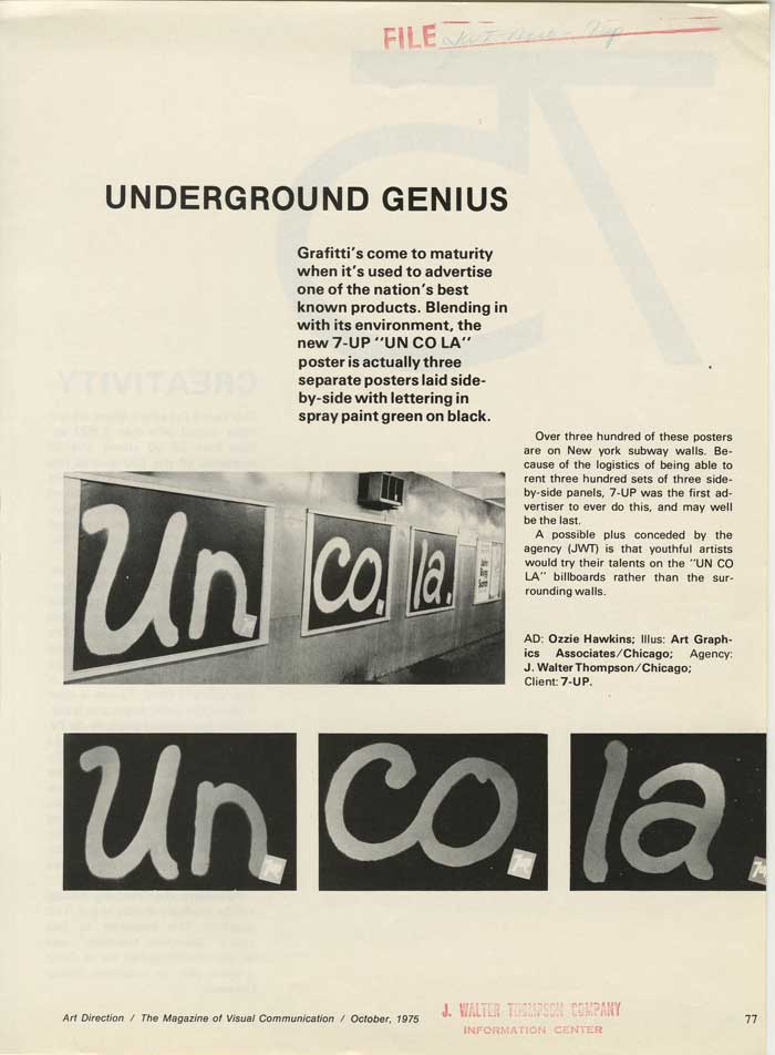
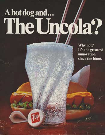
The “Uncola” struck a chord with the younger generation as the first ads appeared in 1968. They focused on puns based around “un” part of the new slogan. By portraying Coke and Pepsi as “the Establishment,” JWT effectively situated 7-Up as an alternative brand for alternative people.

The following year JWT created a contest inviting artists to submit wildly imaginative designs for 7-Up ads. The submissions were presented to the client, who chose the final images. The winner received a $2000 reward and the opportunity to work with JWT to make final versions. From this contest, JWT and the Seven-Up company built a campaign of colorful road-side billboards with psychedelic graphics. Art by young graphic designers including Pat Dypold, Ed Georges, and Milton Glaser dotted highways across the country in 1969.

A 1973 article from Southern Advertising described the success of the billboard campaign: “To zero in on the college and younger age groups, [Seven-Up executive] Roesch has developed a different approach to the use of the outdoor medium. The agency’s media department uses outdoor as a means of zeroing in on a specific target . . . instead of as a mass media that doesn’t discriminate.  The boards are located accordingly, and the art used is slated to the specific likes of the age groups. The result has been demand for Seven-Up posters to be used as room decorations, party decorations, all without any promotion by the company.”

An example of a Seven-Up Uncola billboard

The campaign complemented its print ads and billboards with television spots. The most memorable ads from this campaign featured Trinidadian dancer and actor Geoffrey Holder explaining the difference between ugly, dry, kola nuts and the tangy, juicy lemon and limes that flavor 7-Up. The ad broke racial barriers within the Seven-Up Company, which until then had never used black actors in its television ads.

The Uncola campaign continued into the 1970s. As times changed, the campaign tried to stay in dialog with oppositional culture by incorporating new visual mediums such as grafitti. JWT argued that “In 1968, the rebellious approach of youth was a workable parallel for the rebellious approach of Seven-Up. Today, in the Seventies, the attack remains viable.” However, 7-Up’s hard-won market share declined over the course of the decade, losing ground to the growing popularity of another lemon-lime soda, Sprite.

Brief article about Seven-Up Uncola grafitti posters

Perhaps the soda became a victim of its own success. The Uncola campaign had so effectively linked to the youth of the 1960s that by the 1990s, it was considered ”what old people drink,” in the words of one financial analyst, “and that’s not what you want in a soft drink.” In 1998, the company finally dropped the Uncola slogan and reinvented its formula. Since then the company has since tried several different campaigns to redefine its identity without success. Regardless, the Uncola campaign will remain a mainstay of the consumer culture of 20th century America and a sign of the times in which it was created.


‘We Try Harder’ and Other Famous Ad Campaigns by Paula Green

Post contributed by Cameron Byerly, a rising junior at St. John’s College in Annapolis, Maryland.  He helped process the Paula Green papers through St. John’s Hodson Internship Program during Summer 2017.

Photograph of Paula Green from the Paula Green papers at the Rubenstein Library.

It’s not the size of the budget
It’s the ferocity of the idea
–Paula GRRRRReen

Paula Green’s papers amounted to nearly 100 boxes of print documents, photographs and audiovisual materials, which is intimidating for a first archival processing project.

My relief was immediate when I discovered these boxes contained dozens of awards, fascinating drafts and edits to ads, pleasant correspondence, articles explaining an honest and steadfast worldview, and above all, a character who I came to deeply respect the voice and intents of through a long and successful career.

Union Label song created by Paula Green and Malcolm Dodds in 1975 for the International Ladies Garment Workers Union.

The central theme I would use to describe Paula Green’s work is ‘cause-driven’. Paula’s speeches and correspondence make it clear she chose clients she personally believed in, including the local jobs offered by the International Ladies Garment Workers Union (ILGWU), and the work she did to fight breast cancer with the U.S. government’s Public Health Service and the American Cancer Society. Perhaps her largest success was her part in creating the “Look for the Union Label” song for the ILGWU in the 70’s. The song’s importance became more tangible to me when reading President Jimmy Carter’s quote “Sometimes I have a hard time deciding which I like best, ‘Hail to the Chief’ or ‘Look for the Union Label,’” and the subsequent parodies from newspaper comics, South Park and Saturday Night Live. The song represented an enormous collective effort of the American fight for local jobs. As I pieced together Paula’s insistence on visiting local factories, employing real workers for TV spots, and saying “please buy from us” rather than “don’t buy from foreigners,” I realized that she applied her own moral standard to the work she believed in.

Paula Green created the now famous “We Try Harder” campaign for Avis in 1962.

The second notable theme in Paula Green’s work is intelligence. Her early success at Doyle Dane Bernbach with the ‘We’re No. 2’ advertising campaign for Avis car rental allowed her the economic power to create her own advertising agency in 1975, and demonstrated her intelligence in engaging with the audience. I consider how well her methods would work in today’s more image-driven and crowded advertising landscape. Records of her work include hundreds of edits of reasoned arguments and recipes used to include in her marketing of food products. She often argued against a more deceptive world of associating lifestyles with products, and instead cleanly focused on the merits of her products. Her copywriting involved well-written sentences to back up her buzz-words and intelligent methodology in expressing her ideas.  Continue reading ‘We Try Harder’ and Other Famous Ad Campaigns by Paula Green

October 31st: Screamfest V

Post contributed by Sierra Moore, Library Assistant for Research Services

Date: Tuesday, October 31, 2017
Time: 1:30-3:30 PM
Location: Holsti-Anderson Family Assembly Room
Contact: Rubenstein Library front desk, 919-660-5822

As all Hallows’ Eve draws near there are a multitude of reasons why you might traipse through all places dark, gloomy, and strange. Here at the Rubenstein Library your travels will be far less perilous. Nonetheless, we have compiled samples from collections containing chilling texts and photographs certain to both entertain, enchant, and imbibe the type of intrigue you seek. Here is a brief preview of what we have in store:

The Duke Blue Devil in a clown-like costume, ca. 1930s

An early version of our very own Blue Devil mascot lingers before the Chapel.

Photo of our limited edition copy of Stephen King's "IT."

A copy of Stephen King’s IT, ca. 1986.

Photo of four Halloween postcards

From our Postcard Collection, a selection of Halloween postcards.

Photo of a page from “Puppets and the Puppet Theater" showing puppets.

Black and white images of puppets from Puppets and the Puppet Theater.

Please join us on Tuesday, October 31st from 1:30-3:30 PM for a most festive open house certain to rouse the spirits!

Story+ Students Create “Race & Ethnicity in Advertising” Website

Sheer Elegance pantyhose advertisement
Pantyhose advertisement from the Jean Kilbourne Papers.

Post contributed by Jessica Chen. Jessica is a Duke undergraduate and  was a participant in the Story+ program during Summer 2017.

This summer marked the first incarnation of Story+, a program for humanities research and dynamic storytelling sponsored by Duke University’s Franklin Humanities Institute. Each project team consisted of a few Duke undergraduates, one graduate student mentor, and a “client” such as the NC Justice Center, the Duke Classics Lab, and the Hartman Center for Sales, Advertising & Marketing History. As an art history major interested in archival work, I applied (and was hired) for a position with the Hartman Center’s “Race and Ethnicity in Advertising” project. The other students on the project included Lizzie Butcher, Cyan DeVeaux and our mentor, Meghan O’Neil.

Perfume advertisement from the Jean Kilbourne Papers.

Our assignment was to create a digital resource for students and researchers that would serve as a portal for the Hartman Center’s resources related to underrepresented racial and ethnic groups in the United States. At first I wasn’t sure what ‘humanities research’ really entailed. I also didn’t know what the Hartman Center was, and I was confused as to why the Rubenstein Library wasn’t a normal, circulating library. Luckily, Hartman Center staff gave us an overview of the Center’s collections and the process of requesting and reserving materials for research. In the reading room, we looked at collections that featured different perspectives in the advertising industry: personal and professional documents of people of color who worked in advertising, marketing research reports analyzing and interpreting minority groups as consumer segments, and depictions of race and ethnicity in print advertising. We met with Hartman Center staff to present both our research findings and our website design ideas. We also were trained in how to build a website using Omeka.

Besides links to the various pertinent collections and a gallery of images, our website includes exhibits that each of us created with material from the Hartman Center, allowing us to pursue our individual interests in more depth. Our exhibits varied widely in topic. Lizzie Butcher’s exhibit described the “Black is Beautiful” movement in the 1960s and its effect on print advertisements, while Cyan DeVeaux’s exhibit depicted the development of professionals of color working in advertising. My exhibit, which illustrated the evolution of marketing research focused on minorities, taught me how to piece a narrative together by showcasing items from the Hartman Center’s collections and incorporating secondary sources to provide the historical context.

Screenshot from Race and Ethnicity in Advertising WebsiteScreenshot from Race and Ethnicity in Advertising Website


Through the Story+ program and this project, I learned how to conduct archival research, work in a highly interdisciplinary team, and create a website with assorted features – skills I had always wanted to develop, but didn’t have the opportunity to do so before this summer. I look forward to doing more humanities research in the future and spending more time in the Rubenstein Library, as well!

Check out the Hartman Center’s new Race & Ethnicity in Advertising website!

New Acquisitions – African American history marketing and promotional posters, 1967-1984.

Post contributed by Jacqueline Reid Wachholz, Director, John W. Hartman Center for Sales, Advertising & Marketing History

In response to the Civil Rights movement of the mid-20th century, many advertisers began to see the African American market in a new, and profitable, light. Advertising campaigns were developed over the next few decades celebrating African and African American heritage as a method of advertising products to this demographic. The Rubenstein Library’s Hartman Center for Sales, Advertising & Marketing History and John Hope Franklin Research Center for African and African American History and Culture jointly acquired this collection of 48 items showcasing black Americans through advertisements and political campaigns aimed at African Americans from the 1970s through the 1990s. Collected by a former public relations associated with the NAACP, this collection represents some NAACP marketing work and advertising images depicting notable African Americans and significant moments in African American history. These posters include biographical sketches of African American writers, scientists, professional athletes, soldiers, civil rights workers, entertainers, and other historical figures. Included are also a number of posters produced by and for the NAACP that the organization’s campaigns to reduce poverty and school dropout rates and increase voter registration and membership in the NAACP. Notable advertising campaigns include Budweiser’s “Great Kings of Africa” Series, Pepsi Cola’s “The Black Presence” Series, and the CIBA-GEIGY Corporation’s “Exceptional Black Scientists” Series.

Great Kings of Africa. A marketing campaign started in 1975 by the Anheuser-Busch Corporation designed to appeal to an African American audience while at the same time promoting African History. During its over 25-year campaign and with a total of 30 different images, it has been either celebrated as a means of showcasing and promoting African history or criticized for, as Rev Michael Pfleger of South Side Chicago’s St. Sabina Catholic Church puts it “one more attempt by the alcohol and tobacco industries to buy a reputation in the African-American community.” The campaign consisted of a series of paintings done by African-American artists commissioned by Anheuser-Busch that were accompanied by a short history of the subject being portrayed

Exceptional Black Scientists, CIBA-GEIGY, 1980-1984: These posters are meant to celebrate current scientific leaders of African American descent and inspire minority students to pursue careers in science. Each individual selected had recently made a substantial scientific discovery in their respective field. The posters are derived from portraits done by noted black artist and illustrator Ernest Chrichlow. This series was advertised directly to teachers, and was meant to be placed in the classroom, science fairs, or community centers.

Black Presences, PepsiCo, circa 1980s: A series of posters, that celebrated the African American ‘presence’ in America’s history and culture. Each poster features a portrait of the individual selected, a short biography, and is entitled by the category of culture (arts, sports, history, etc.) that the individual belongs to.


These posters are available to researchers in the Rubenstein Library.

Lillian Boxfish Takes a Walk

Post contributed by Ashley Rose Young, a Ph.D. candidate in History at Duke University and the Business History Graduate Intern at the Hartman Center.

Brimming with wanderlust, Lillian Boxfish traveled to Manhattan to start her career as a “daring and unmarried” woman in 1926. And so opens the first chapter of Lillian Boxfish Takes a Walk.

This fascinating premise is inspired by the life of Margaret Fishback, a poet and pioneer in the advertising industry whose papers are part of the Hartman Center Collections. Kathleen Rooney, the author, uncovered the intriguing history of Fishback in the spring of 2007. With the support of a Hartman Center travel grant, Rooney looked through hundreds of documents, piecing together Fishback’s life story. Fishback was raised in Washington D.C., earned her bachelors from Goucher College in 1921, and became a divisional copywriter for Macy’s in 1926. She was immensely successful and employed her playful and witty language in diverse advertising campaigns. Her early career success was recognized by local newspapers, one of them describing her as “the highest paid advertising woman in the world.” She went on to work at several other advertising agencies including Cecil & Presbrey, Warwick & Legler, Young & Rubicam, and Doyle Dane Bernbach whose clients ranged from Chef-Boyardee to Simmons Beauty Rest. All the while, she built her poetry career, publishing several books, the most widely received One to a Customer: Collected Poems of Margaret Fishback (1947).

Black and white photograph portrait of Margaret Fishback
Margaret Fishback during her time at Doyle Dane Bernbach, c. 1950-1964, photograph by G. Maillard Kesslere, Margaret Fishback Papers, John W. Hartman Center for Sales, Advertising & Marketing History, David M. Rubenstein Rare Book & Manuscript Library, Duke University.

Inspired by the remarkable career of Margaret Fishback, the story of Lillian Boxfish provides a mesmerizing glimpse into the personal life and inner most thoughts of a career-oriented, gregarious woman living and working in one of America’s most dynamic cities. The main character is an octogenarian residing in Murray Hill. She has an effortless routine, stopping by local establishments and regularly visiting old friends in the neighborhood. Rooney plays with time like she plays with language, seamlessly weaving flashbacks of Lillian’s young adult life in New York with the octogenarian’s meanderings.

Photograph of a stack of 5 books related to women in the advertising industry. "Lillian Boxfish Takes a Walk" is on the top

Early on, we learn that Lillian grew up in Washington D.C. in a family that valued poise and polish over her natural adventurousness and inquisitive mind. Her mother strongly disapproved of these latter characteristics, hoping that Lillian would marry and pursue the domestic arts with great fervor. Instead, Lillian modeled her dreams after the life of her unconventional aunt, Sadie Boxfish. It was her aunt who introduced Lillian to poetry, which became one of her passions, through a series of postcards written about a fictional adventurist named Phoebe Snow.

Lillian’s mother seethed with disapproval whenever a new postcard arrived, painted with vibrant, playful words.

Miss Phoebe Snow has stopped to show
Her ticket at the gate, you know.
The Guard, polite, declares it right.
Of course—it’s Road of Anthracite

As Lillian recalls, “In [my mother’s] contralto above my ear I could hear, in her neat bosom behind my head I could feel, her disapproval: not of Phoebe, but of Sadie.” Although strong, her mother’s opinions were not strong enough to keep Lillian in D.C. and so the novel recounts a young woman’s quest of self discovery and professional success at a time when the diadem of the Chrysler Building first sparkled on the New York skyline.

Lillian Boxfish Takes a Walk is a refreshing and poetic novel. The prose is captivating, the characters are compelling, and the topics are relevant, ranging from discussion over equal pay to sexual liberation. A thrillingly progressive character for her time, Lillian Boxfish is delightfully portrayed in this historically-inspired novel by Kathleen Rooney. As the academic years comes to a close, Lillian Boxfish Takes a Walk should make your short list for summer reading.

Kerry Cake and Sadie Seal (1971) – Rubenstein Library Test Kitchen

Post contributed by Erin RyanDrill Intern for the Duke University Archives. 

When I first signed up to do a Rubenstein Test Kitchen blog post, my plan was to do something from an early-to-mid 20th-century vegetarian cookbook in our collections. I’ve been a vegetarian since the mid-’90s.

Photograph of the cover ofr "401 Party and Holiday Ideas for ALCOA"
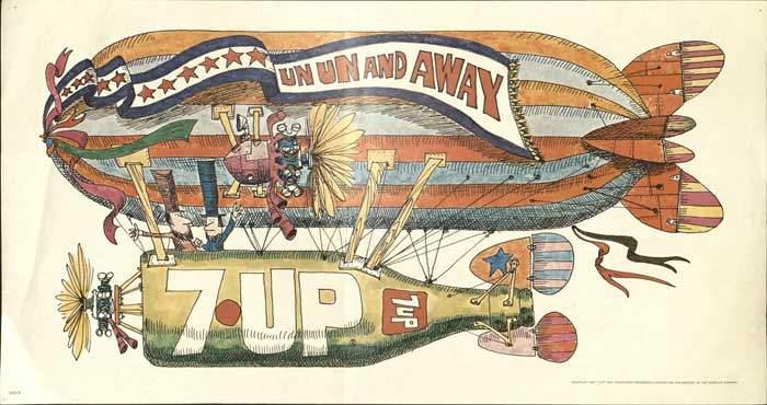
But then, as I was browsing our library catalog, I came across 401 Party and Holiday Ideas from ALCOA (Aluminum Company of America, 1971) in our Nicole Di Bona Peterson Collection of Advertising Cookbooks. I was intrigued; my grandfather—my dad’s father—worked for ALCOA for about 35 years, until his retirement in the early ’80s.

Pretty soon, I was hooked.

This amazing book features the creations of one Conny von Hagen, who worked as a designer for ALCOA, still one of the largest producers of aluminum.

Conny was also behind 1959’s Alcoa’s Book Of Decorations: A Year-Round Treasury of Easy-to-do Decorations for Holidays and Special Occasions. According to the timeline on their website, ALCOA introduced aluminum foil to the U.S. in 1910—you can see some “Alcoa Wrap” next to Conny in the picture below. This introductory page also explains that her designs appeared on TV, in newspapers and in magazines.

Photograph of page from "401 Party and Holiday Ideas" showing the author Connie Van Hagen  showing off the aluminum foil crafts she has created

401 Party and Holiday Ideas from ALCOA has ideas for 24 separate occasions, from Christmas and Hanukkah to “Teen-Age Party” and Election Day.

Photograph of page from book showing Election Day craft. Features four young women wearing dresses made of aluminum foil over red, white, and blue shirts and tights.  They area lso wearing hats made of aluminum foil and appear to be handing out campaign literature or other election material.

For this post, I decided to make (1) a food recipe; (2) a foil creation.

The food: Kerry Cake

I made Irish Apple Cake, or Kerry Cake, from the “Saint Patrick’s Day” chapter of 401 Party and Holiday Ideas. Criteria: It had to be vegetarian, and it had to be easy (I was pressed for time). I also wanted to serve it at my Easter family gathering. I didn’t like any of the Easter recipes, though. So a quick look through the rest of the book, and I settled on this:

Photograph of original "Kerry Cake" recipe

My ancestry is mostly Irish, but I did not know anything about Kerry Cake until I read here that it is a traditional Irish apple bread that was baked in an iron cooking pot called a bastible, hung over the fire.

Photograph of ingredients for Kerry Cake recipe
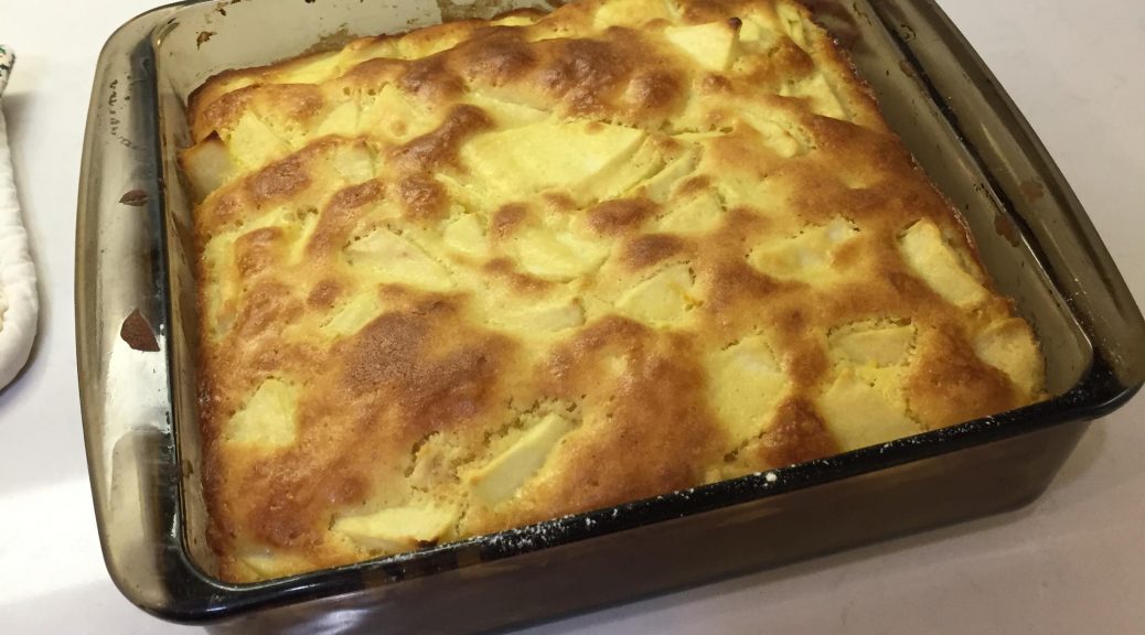
But this 1971 recipe just called for an 8-inch cake pan in a regular oven, and that’s what I used. I was making this in my mom’s kitchen, so I got to use the sifter that had belonged to her mom. Mom told me we had relatives from County Kerry, too.

I’m a pretty laissez-faire cook, in general. So I didn’t mind that the recipe didn’t specify what kind of apples to use, how big to cut the pieces, etc. I went for Granny Smith. They were pretty huge apples, so Mom and I decided I should just use two, to equal the “three medium” the recipe called for.

In all, it took me about 50 minutes to grate the lemon rind, cut up the apple, and put the batter together. I greased the pan with butter, baked it exactly according to instructions (30 minutes at 375), and it came out perfectly.

Photograph of finished Kerry Cake in pan on countertop

I whipped some heavy cream and served this cake at our Easter dinner. I was afraid it would be bland without spices, or that the lemon would taste strange. But it was delicious. Moist, not too sweet, and the lemon was exactly the right amount to accentuate the apples and butter. There were six adults at dinner, including a guest from Colombia, and everybody loved the Kerry Cake. Almost the whole cake was gone by the end of the night.

The foil creation: Sadie Seal

So many ideas here! It was tough to choose, but I settled on Sadie Seal, one of the circus animals on offer in the Kids’ Korner section.

Photograph of page in book giving directions for making a variety of animal out of aluminum foil, including "Sadie Seal"

In her introduction, Conny said to use things that were lying around the house to construct our decorations, so I rounded up a bunch of felt, foam balls, pompoms, and other supplies I had left over from a Halloween costume I never made. I already had a roll of heavy-duty foil in my cabinet. The instructions were not very detailed, as you can see from the photos below, but I did my best.

Two photographs of "Sadie Seal" in progress. The first shows a pom pom and foam ball on aluminum foil. The second shows the foil wrapped around the pom pom and foam ball but not yet looking like a seal.
Making the “mouth” was not easy. Once I cut off the extra foil, I was left with a hard, solid lump of metal that was sharp and nearly impossible to shape.

No guidance either on how to make the flippers. My first attempt gave her absurdly long arms; then I shortened them so much they didn’t touch the floor; and then went with my imperfect third try. I pinned the flippers on the body, cut some eyes out of black felt and pinned those on too. I couldn’t find any ribbon for her neck …  so … voila!

Photo of finished Sadie Seal which looks a little like a bird.

I was disappointed at first. It took me about 40 minutes to make this odd little bird-like creature and she didn’t look like the picture at all. But … I took her home on Easter weekend to show her to my gathered family. Once she had ridden with me in the car for 2.5 hours, looking at me with her little felt eyes, I felt like we’d bonded. Plus, everybody thought she was cute. (Mom thought she looked like a turtle.)

*I promise: all extra foil scraps from this project were duly recycled! But I’m not recycling Sadie any time soon. I’m pretty fond of her now. She’s staying on my desk.